Quick answer: A premium POD site isn’t about flashy visuals, it’s about intentional design with clean branding, clear product pages, and a smooth checkout that makes people trust you and actually buy.
It’s the small details that make the big money moves.
The premium tag isn’t just for good looks; it’s a trust builder, conversion driver, and will justify the higher prices.
And after checking out and analyzing 50+ print-on-demand (POD) websites, I’ve come to one clear conclusion: a fancy design won’t build you a premium brand, but intentional design will.
From consistent branding to slick product pages and a seamless checkout flow, premium POD stores put the limelight on the users to deliver luxury as an experience.
If you’re starting out, platforms like Printify and Printful are solid go-to options for running your POD business without the headaches of handling fulfilment yourself.
Let me show you how.
Craft a Cohesive Brand Identity
I’ve noticed that in every successful premium POD store, all the elements, such as their logo, product photos, and the tone of the product descriptions, work together.
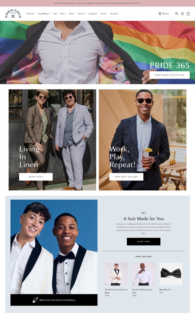
Take, for example, Kirrin Finch. I perceive that brand with a chill, old-money vibe because of:
- Their clean, timeless serif-based wordmark logo — minimal, easy to recognize
- The muted, natural color palette with soft blues, neutrals, and charcoal tones — calm and “chill”
- Modern, readable typography is consistently used across CTAs, headlines, and descriptions, giving the clean look
- Their high-res product photography is consistently styled with natural lighting, minimal background clutter, and “old money” lifestyle-focused frames
And my favorite part: their confident, inclusive, and smart tone.
Headlines like “Beyond Tradition, Beyond Limits” and CTAs like “Cool Folks Rocking Androgynous Looks” reflect a strong brand POV without trying too hard.
Here’s how you can do it, too:
- Create a unique but not too complex logo that’s easy to remember
- Build a standard brand kit with a fixed color palette and typography, and use it consistently
- Ensure high-resolution graphics with a common visual DNA (style)
- Craft a unique voice for all your brand’s copy
Curated Homepage & Collection Layouts
Think of your homepage as your storefront’s display window. The displays for premium stores should be clean, minimalist, and inviting.
I love how Aarke has done it with its minimal design, beautiful product images, and well-balanced whitespace. The premium quality speaks for itself.
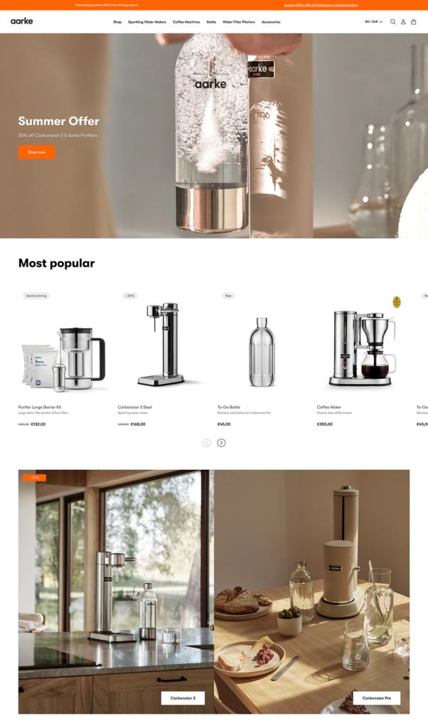
My takeaway from Aarke:
- Don’t overwhelm your visitors with everything at once
- Do curate your homepage to highlight a few key things like:
- A stunning hero image of your flagship product
- A tagline that sums up your brand
- A clear call-to-action (“Shop the Collection”)
- Don’t clutter like dozens of flashing banners or too many competing messages
- Do use plenty of white space, high-quality images, and a logical flow with:
- Each section naturally flows to the next
- Grid arrangements that offer a clean and consistent look
- Use collection layouts that make browsing enjoyable
Pro tip: Treat your homepage like a landing page and guide the user’s eye from top to bottom. As per store designs and optimizing tactics that actually convert and rank, you should structure homepages with a hero, some trust signals, and then a clear path to shop.
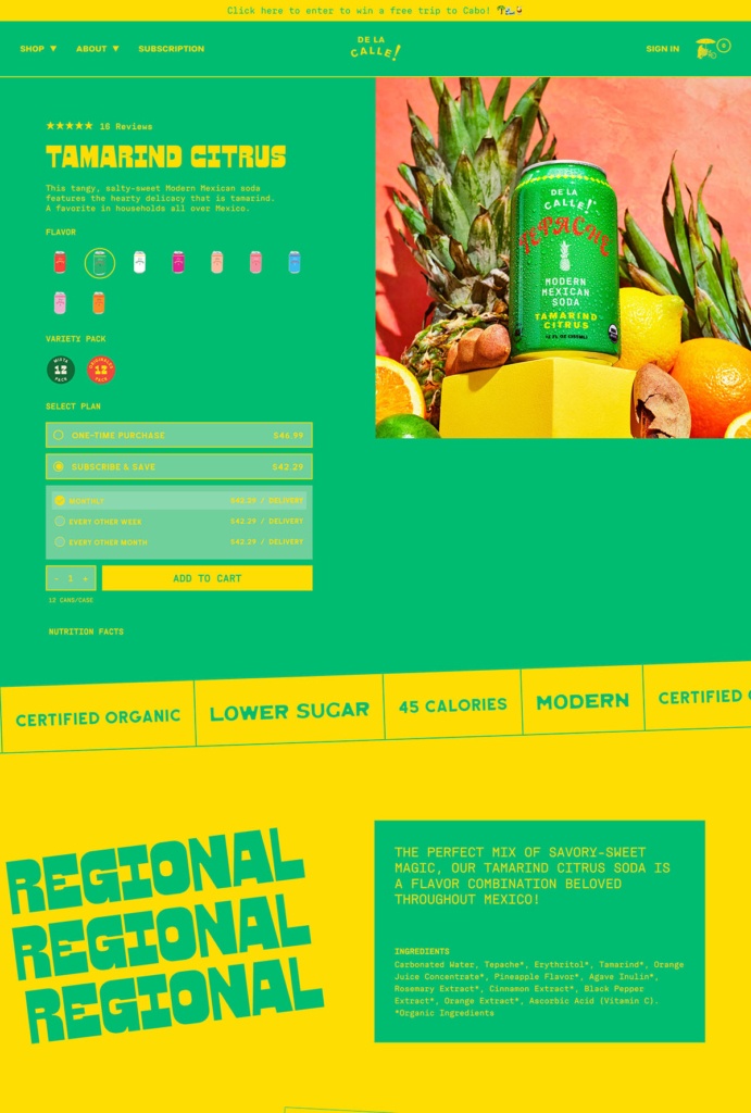
High-Impact Product Detail Pages
Your product pages are where the shopper decides, “Is it worth it?”
About 75% of shoppers depend on product photos to make a purchase decision. And since shoppers can’t touch your products, all the elements of the page must virtually put them in their hands.
Here how:
- Use high-res/zoomable photos or videos with different angles, close-ups, and in-context shots
- Give product details like the materials, sizing, fit, and care instructions (especially for apparel)
- Maintain your brand’s tone and voice in description and details
- Highlight what makes this item special (eg, limited edition, eco-friendly, hand-drawn, etc.)
- Use storytelling instead of a bland list of features
- Display customer reviews and ratings to build social proof
- Make the CTA stand out with a distinct, contrasting color
Pro tip: Premium shoppers appreciate transparency. If you offer easy returns or quality guarantees, mention it to reduce purchase anxiety and position your brand as customer-centric.
De La Calle’s product page checks all the above requirements to sell its premium-priced soda:
Seamless Customization Experience
One of the superpowers of print-on-demand is personalization. If I visit an online storefront that lets me add my name or choose colors, I want it to be easy.
Because believe me, nothing kills that excitement faster than a clunky design tool or a confusing interface.
So, say you’re using a product personalization app or feature to sell custom clothing, make sure it feels like a natural extension of your brand and not a jarring third-party widget from 2010.
Keep the steps simple and minimal: Choose a product → Add your text/image → Preview → Add to cart.
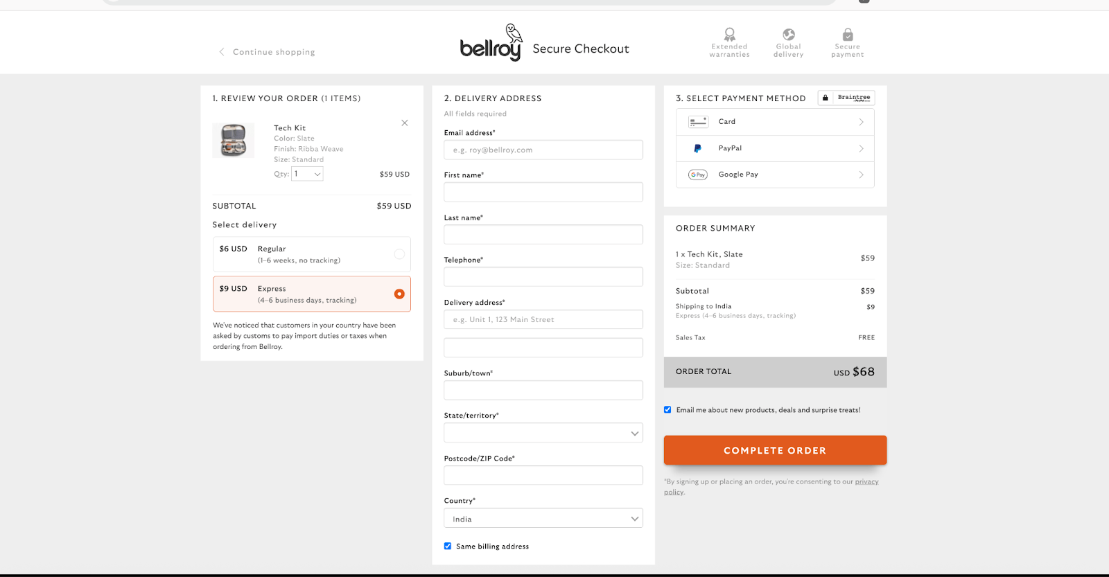
Luxury-Grade Checkout & Fulfillment Flow
I’ve seen too many beautiful print-on-demand sites fall apart as soon as you hit “Add to Cart.” And if there’s one area you don’t want to feel “cheap,” it’s the checkout.
A clunky, multi-step checkout is often all it takes for a premium shopper to bounce. And personally, I’m the girl who’ll let go of a $2,500 cart for a surprise $50 delivery charge calculated at checkout.
So, if you want to design a luxury-grade experience, craft it intentionally by:
- Minimizing the steps to check out and showing a progress indicator
- Allowing guest checkouts and offering SSO options
- Offering multiple payment methods
- Using microcopy to guide users with the contents of the order forms
- Highlighting CTAs with clear and distinctive colors and shapes
- Displaying trust signals with secure payment icons
I love Bellroy’s seamless checkout experience. Check it out and take some inspiration:
Trust, Authenticity & Sustainability Signals
Premium design brings people in, and trust keeps them around and gets them to hit “Buy.”
Here are some trust, authenticity, and sustainability signals to include:
- A short, confident story about who you are and what your brand stands for on the about page
- Real reviews, even if they’re just a few
- Custom visuals in addition to mockups
- Branded domain email (like help@yourstore.com)
- Feature mention like “As seen in…” bar mid-page, or a blog, podcast, or Instagram shoutout
Sustainability and ethical practice are also premium signals. Over 80% of consumers pay more for sustainable goods. So, if you are using sustainable materials or practices, flaunt it.
Shopify print on demand even allows for adding a vegan, natural, recyclable & compostable menu.
Performance, Accessibility & Mobile Polish
No matter how beautiful your design or compelling your story, if your website takes forever to load or glitches on mobile devices, no amount of branding will save it.
- Keep it fast with lightweight themes, compressed images, and avoid unnecessary apps or animations that slow things down
- Test on every device to ensure it’s as polished on a phone as it is on a desktop
- Use responsive design and avoid themes that don’t work on mobile
- Make everything readable with high contrast between text and background, legible fonts, and comfortable spacing
- Add alt text to all images (This isn’t just for accessibility, but it’ll also help with SEO)
- Avoid scroll-hijacking or aggressive pop-ups
- Fix broken links and test checkout flow regularly to avoid 404 page or cart bugs
Future-Ready Enhancements
Let me make one thing very clear: Future-proofing doesn’t mean chasing every trend. It means adapting intentionally.
I recommend keeping your radar on what’s next and consider mindful integration of tech, tools, and trends that contribute more value to what already exists.
Some things I found to keep an eye on:
- AR and 3D previews
- AI to personalize the shopping journey
- Advanced interactive content like quizzes, lookbooks, or in-app communities
- UGC content shifts
- Social shopping
- Social listening tools
- Bundles, loyalty, or subscription models
Conclusion
A premium print-on-demand store isn’t design-heavy; it’s design-smart. Each element on every touchpoint carries an intention.
From the moment someone lands on your homepage to the second their order arrives, you want them to feel that you care about the experience.
From what I’ve noticed, the best websites focus on clarity, consistency, and clean execution. A quality logo, great product photography, transparent policies, and a smooth checkout flow go further than any fancy plugin.
Nail these, and your POD store won’t just look premium, it’ll feel like a brand customers would want to pay for.


