Building a B2C website isn’t just about looking professional or having a nice product grid. The design has to do the heavy lifting. It has to attract attention, guide emotion, remove friction, and drive action.
Whether you’re selling fashion, tech, fitness gear, or skincare, your B2C site needs to convert casual visitors into paying customers.
To do that, you need more than product pages. You need fast performance, simple navigation, and content that resonates with your ideal shopper.
In this guide, I’ll walk you through the essential elements of strong B2C website design. You’ll learn how to make a site that not only looks good but sells well.
What Is B2C Website Design?
B2C stands for business to consumer. That means you’re selling directly to individual customers, not other businesses.
These are shoppers who are browsing, discovering, comparing, and buying based on need, desire, or price.
When people shop online, they expect an experience that is fast and frictionless. Every second counts. Every click matters. The role of your design is to guide them from curiosity to checkout with as few distractions as possible.
A strong B2C website is built around:
- Speed and responsiveness
- Mobile-first layouts
- Emotionally-driven copy and visuals
- Trust-building elements
- Clear calls to action
- Smooth checkout process
Think about the last time you bought something on your phone. The experience likely felt easy, focused, and quick. That’s what a good B2C site needs to replicate every single time.
B2C vs. B2B Website Design
Your website should be shaped by who you’re trying to reach. Selling to individual consumers looks very different than selling to businesses.
Here’s how the two compare:
| Element | B2C (Business to Consumer) | B2B (Business to Business) |
|---|---|---|
| Motivation | Emotion, convenience, instant gratification | Data, ROI, long-term partnerships |
| Tone and Style | Casual, lifestyle-oriented, visually engaging | Formal, professional, content-heavy |
| Conversion Goal | Buy now | Contact sales, request demo, download whitepaper |
| Content Focus | Photos, videos, reviews, concise benefits | Charts, case studies, product specs |
| Decision Timeline | Hours or days | Weeks or months |
If you’re running an ecommerce brand that sells directly to consumers, your job is to make the sale simple, fast, and emotionally satisfying. Everything else is noise.
Why Speed Comes First
Speed is not just a performance metric. It’s a sales tool.
A slow site can ruin everything, even if your products are great. Customers will bounce before your page finishes loading. In fact, research from Portent shows that a website that loads in 1 second converts three times more than one that loads in 5 seconds.
If your website takes more than 3 seconds to load, your conversion rates are already in trouble.
How to improve website speed:
- Choose a fast, lightweight theme optimized for ecommerce
- Compress images using tools like TinyPNG or WebP format
- Use browser caching to store resources locally
- Minimize third-party scripts and heavy plugins
- Implement lazy loading for images and videos
- Use a reliable hosting platform with a CDN (Content Delivery Network)
Here’s a quick speed checklist:
| Speed Metric | Target |
|---|---|
| Page load time | Under 3 seconds |
| First contentful paint | Under 2 seconds |
| Page size | Under 2 MB |
| PageSpeed Insights | Score of 90 or above |
Test your website speed using tools like Google PageSpeed Insights or GTmetrix. Speed is the silent killer of ecommerce sales, so address it early.
Mobile-First Design for B2C Customers
Over 60 percent of ecommerce traffic comes from mobile devices. That means your website must not only be responsive, but truly mobile-optimized.
Mobile shoppers expect the same speed, clarity, and simplicity as desktop users. If they have to zoom in, pinch, or scroll sideways, they’re gone.
Key mobile-friendly features:
- Fluid grids that resize across screen sizes
- Large, clickable buttons spaced for thumbs
- Minimal popups or overlays that block the experience
- Mobile-optimized images that load fast
- Sticky navigation bars for easier browsing
Designing for mobile forces you to prioritize. It strips away clutter and makes you focus on what matters most. That’s a good thing.
Use mobile emulators or tools like Chrome DevTools to test your site across different screen sizes. Your mobile version shouldn’t feel like a squeezed desktop layout. It should feel custom-built for the smaller screen.
Emotional and Lifestyle-Focused Design
When people shop online, they’re rarely just buying a list of features, they’re buying the outcome those features promise. Whether it’s looking better, feeling more confident, saving time, or improving their daily routine, the decision to buy is often driven by emotion.
That’s why creating an emotional connection through your website design is so important in the B2C space. It helps shoppers see how your product fits into their life, not just their cart.
Your website should make people imagine themselves using your product. This is where visuals, copy, and layout all come together to tell a story.
Design strategies that build emotional connection:
- Use lifestyle photography with real people in real situations
- Focus on benefits instead of just features
- Match your color scheme and fonts with your brand mood
- Write headlines that speak to identity and values
- Include customer testimonials that tell relatable stories
Here’s an example of how to turn a plain product description into something more emotional:
| Plain Copy | Emotion-Driven Copy |
|---|---|
| Moisturizing face cream | Glow like you slept 8 hours, even when you didn’t |
| Stainless steel water bottle | Keeps your drink cold all day while you chase your goals |
| Wireless earbuds | Block out the noise and stay in your zone |
Make your brand feel human. Show your customers what life looks like with your product in it.
Make Your Value Proposition Instantly Clear
Visitors should understand what you sell, why it matters, and what to do next, all within the first few seconds of landing on your site.
Your value proposition sits at the top of your homepage, usually in a hero section. It tells people why your brand is worth their time.
What to include above the fold:
- Clear headline (what you sell)
- Subheadline (why it matters)
- Call-to-action button (what to do next)
- Supporting image or video
Example:
Headline: Plant-based protein that powers your day
Subheadline: Clean ingredients. No fillers. Just fuel.
CTA: Shop the Collection
This should be supported by visuals and reinforced across other pages, not just the homepage. Make sure your product pages, collection pages, and even your checkout reflect the same brand promise.
Urgency and Scarcity That Actually Converts
Urgency and scarcity are powerful psychological triggers that, when used thoughtfully, can significantly improve your conversion rates.
They encourage customers to act faster by creating a sense of limited opportunity or availability, which taps into the fear of missing out.
You don’t need to manufacture pressure or rely on gimmicks to make this work. Instead, focus on showcasing genuine stock limitations, accurate shipping cutoffs, or real-time flash sales that give your offers a stronger sense of immediacy without compromising trust.
Tactics that create urgency:
- Countdown timers for flash sales or shipping cutoffs
- Low stock alerts like “Only 4 left in stock”
- Seasonal or limited-edition product launches
- Free shipping thresholds that expire soon
Clarity and honesty go a long way in building customer trust, especially when you’re using urgency in your messaging. Modern shoppers are sharp, and they can quickly spot overused or misleading tactics.
If you promote a “limited time offer” but it’s always running, they’ll begin to tune out those prompts and lose confidence in your brand.
Urgency doesn’t have to be loud or overbearing to be effective. In fact, the most successful applications feel natural and supportive, like a timely reminder rather than a hard sell.
When used with care, urgency can guide a hesitant customer toward making a confident decision without feeling pressured.
Social Proof Builds Instant Credibility
Before making a purchase, most shoppers want some level of confirmation that others have already bought the product and had a positive experience.
This is where social proof becomes a critical part of your website strategy. It provides reassurance, builds trust, and validates the customer’s interest by showing that real people have already taken the leap, and are happy they did.
According to BrightLocal, 87 percent of consumers read online reviews for local businesses. That number holds strong for ecommerce too.
Types of social proof to include:
- Verified customer reviews with photos
- Product ratings out of 5 stars
- Video testimonials or influencer endorsements
- UGC (user-generated content) from social media
- Trust badges (secure checkout, guarantees, payment logos)
- Mentions in press or blogs
Here’s where to place social proof:
| Type of Social Proof | Best Placement |
|---|---|
| Reviews and Ratings | On product pages and cart pages |
| UGC Galleries | On homepage or product detail pages |
| Video Testimonials | On homepage or dedicated testimonials page |
| Trust Badges | At checkout or in the site footer |
Make it a regular part of your post-purchase process to request customer reviews, especially while the product experience is still fresh.
You can encourage responses by offering small incentives, such as a discount on their next order for leaving a photo review.
Over time, collecting a steady stream of authentic feedback will not only enhance your credibility but also give new visitors the confidence they need to move forward with their purchase.
Make Checkout Easy and Friction-Free
One of the biggest reasons people abandon their cart is because checkout feels like a chore. A good B2C checkout is fast, intuitive, and reassuring.
According to the Baymard Institute, 70 percent of online shopping carts are abandoned. Many of those are preventable.
Ways to simplify checkout:
- Offer guest checkout with no account required
- Use a progress bar to show steps
- Display total cost (including shipping) early
- Reduce form fields to the essentials
- Offer one-click payment methods like Shop Pay or PayPal
- Add cart auto-save for returning visitors
You can also improve checkout with small touches like:
- Visual trust signals near the payment form
- Estimated delivery dates
- Flexible payment options like Buy Now, Pay Later
- Live chat or chatbot for last-minute questions
Here’s what a streamlined checkout flow looks like:
| Step | Best Practice |
|---|---|
| Cart Page | Show summary with costs and delivery info |
| Checkout Step 1 | Shipping info with autofill support |
| Checkout Step 2 | Payment method and billing details |
| Checkout Step 3 | Confirmation and thank you message |
Every step in the checkout process should feel intuitive and predictable, guiding the customer smoothly from cart to confirmation without unnecessary interruptions.
Avoid popups, hidden fees, or unexpected steps that can create hesitation. Instead, focus on creating a straightforward path to purchase that feels seamless from start to finish.
Examples of Strong B2C Website Design
Learning by example is one of the best ways to improve your own site. These brands show what it looks like when B2C design is done right.
Allbirds
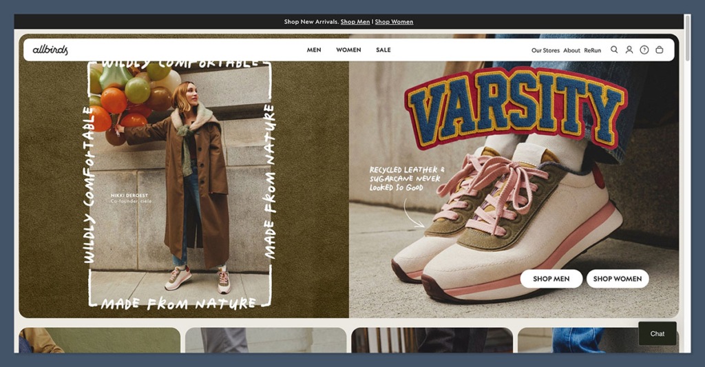
Allbirds, the sustainable footwear and apparel company, is a standout when it comes to clean, frictionless B2C design. The homepage immediately communicates its value proposition with lifestyle imagery and a focus on eco-consciousness.
Product pages are minimal but informative, with crisp photography, detailed sizing info, and prominent reviews.
Why it works:
- Clean, white space-heavy layout that keeps the focus on products
- Product filtering is simple and mobile-friendly
- Sustainable mission is woven throughout the copy and visuals
- Checkout process is fast, with easy guest options
This site is a great example of how to blend lifestyle storytelling with ecommerce functionality.
Glossier
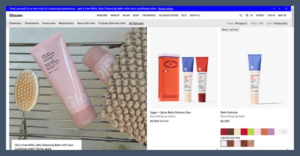
Glossier’s website reflects its brand: approachable, fresh, and community-driven. Their product pages feel more like curated experiences than traditional ecommerce layouts.
Reviews are integrated seamlessly, and customer photos often outnumber studio shots, making the site feel more social and inclusive.
Why it works:
- Heavy use of user-generated content builds trust and relatability
- Clean design supports strong mobile performance
- Smart upsells with product bundles and complementary items
- Email opt-in and CTA prompts feel helpful, not aggressive
Glossier proves that when you build a strong emotional brand, your website becomes an extension of that connection.
Brooklinen
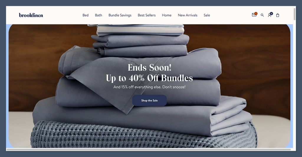
Brooklinen sells luxury bedding and home goods, and their website immediately communicates comfort, quality, and ease.
The homepage highlights bundles, customer favorites, and reviews, making it easy for visitors to shop by outcome, not just product type.
Why it works:
- Strong value proposition is visible above the fold
- Simple navigation with helpful category breakdowns
- Transparent pricing and shipping info is front and center
- Checkout includes Shop Pay and express options for quick conversion
The brand mixes direct sales language with soft lifestyle design, giving shoppers both clarity and emotional appeal.
Final Takeaway
Your B2C website design should never come across as a placeholder or simply a digital version of your storefront.
It’s one of the most powerful sales tools you have, and every element on the page, from images and headlines to buttons and layout, should serve a specific purpose.
Together, these elements guide the customer’s attention, create an emotional connection, and gently move them closer to making a purchase.
When everything works in harmony, your website becomes more than just a marketing asset. It functions as a round-the-clock salesperson, quietly and consistently driving revenue by turning interest into action.
Focus on:
- Fast load times
- Mobile-first design
- Clear messaging
- Emotional visuals
- Smart trust signals
- Seamless checkout
These are the core elements that distinguish high-performing ecommerce stores from those that struggle to gain traction.
The difference often comes down to thoughtful design choices that prioritize the customer experience and remove barriers to purchase.


