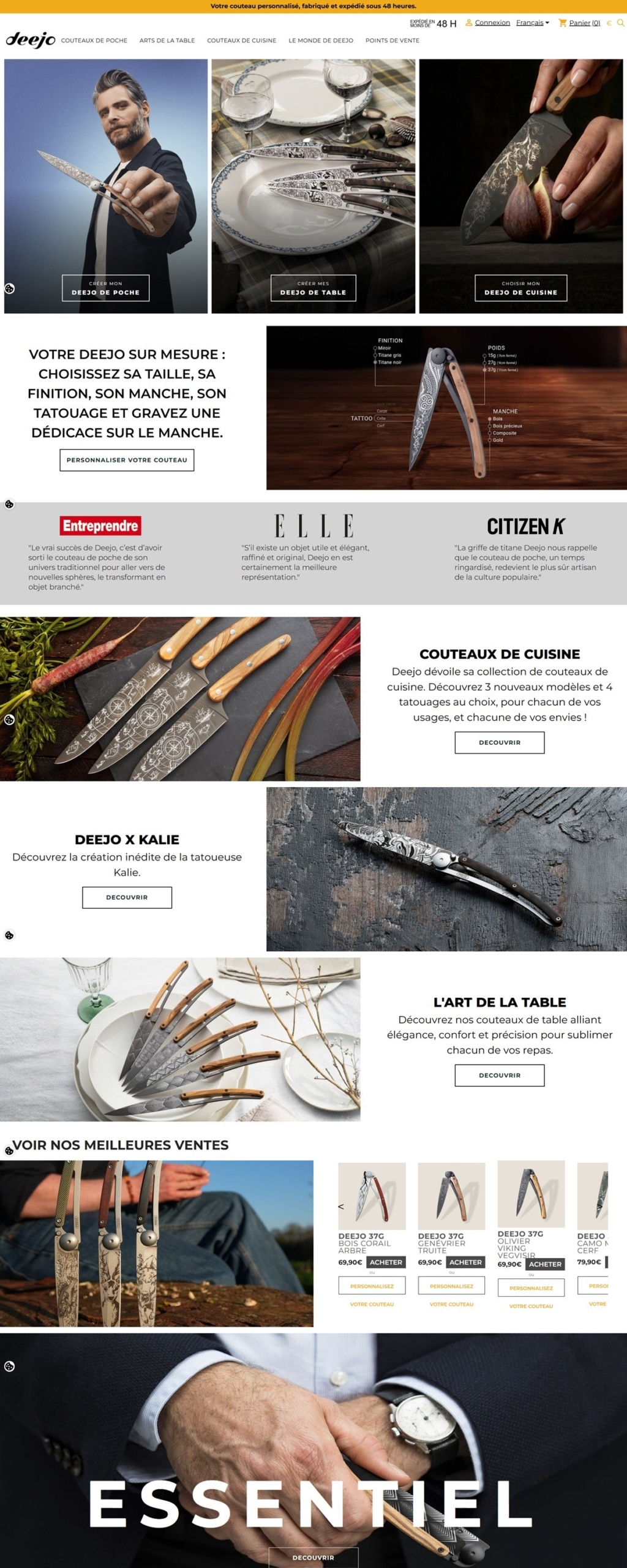
Deejo 
Deejo sells lightweight, customizable pocket knives in 27g and 37g weights, alongside table cutlery and kitchen knives including chef, office and carving models. The site is French-first, and the homepage headline promises a personalized knife made and shipped within 48 hours. Positioning treats the pocket knife as a design object rather than a purely functional tool.
Website Design
Montserrat for structure, Roboto for detail. Headings and navigation use Montserrat at several weights, while body copy and finer interface text sit in Roboto, a common but deliberate pairing of a geometric display face with a neutral workhorse font.
Black used sparingly against white. Interface elements such as popup titles and close controls are set in plain black on white, without a signature brand color asserting itself across buttons or links in the markup.
Three product families as the entry point. The homepage opens on large imagery for pocket knives, table arts and kitchen knives, each with its own call to action, rather than a single catalogue grid. Icon-based navigation elements, including a Material Icons font, are loaded across the theme for cart, search and account controls, keeping interface chrome consistent between product families.
Shopping Experience
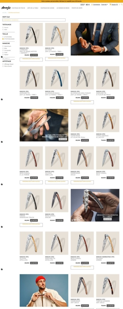
Customization is shown on the product card. Pricing and personalization options, handle material, finish, pattern, appear directly on the product tiles rather than only after a click through, letting shoppers gauge configuration before opening a page.
A consistent price point for the core range. Most pocket knives are shown at 69.90 euros, with a smaller set at 79.90 euros, giving the flagship range a narrow and predictable pricing band.
Filtering runs by construction detail. Shoppers can narrow by size, finish, handle material and pattern, suiting a product where the personalization options are the main differentiator between otherwise similar knives.
Brand Storytelling
The knife is framed as a wardrobe choice. Product cards lead with handle material and finish rather than blade specification, treating pattern and color as the primary decision the way a clothing or accessory site would.
Retail locations reinforce a physical presence. A dedicated section lists stockists and retail points, tying the online store to real-world distribution rather than presenting as online-only.
Notable Features
A 48-hour production promise on the homepage. The manufacturing and shipping window is stated as the primary headline rather than buried in shipping policy text, making speed part of the core pitch.
Damascus and DIY engraving as distinct product lines. Beyond the standard 27g and 37g ranges, Damascus-finish knives and a DIY engraving kit are called out separately, targeting collectors and gift buyers apart from the everyday-carry range.
A recruitment section under About. Career listings are folded into the About Deejo area rather than isolated in a footer link, a smaller-company touch not typical of most direct-to-consumer product sites.
Deejo Shop Category page example
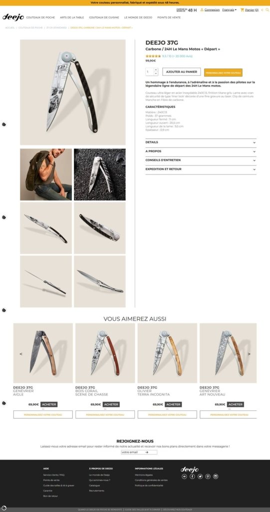
Deejo Product page example
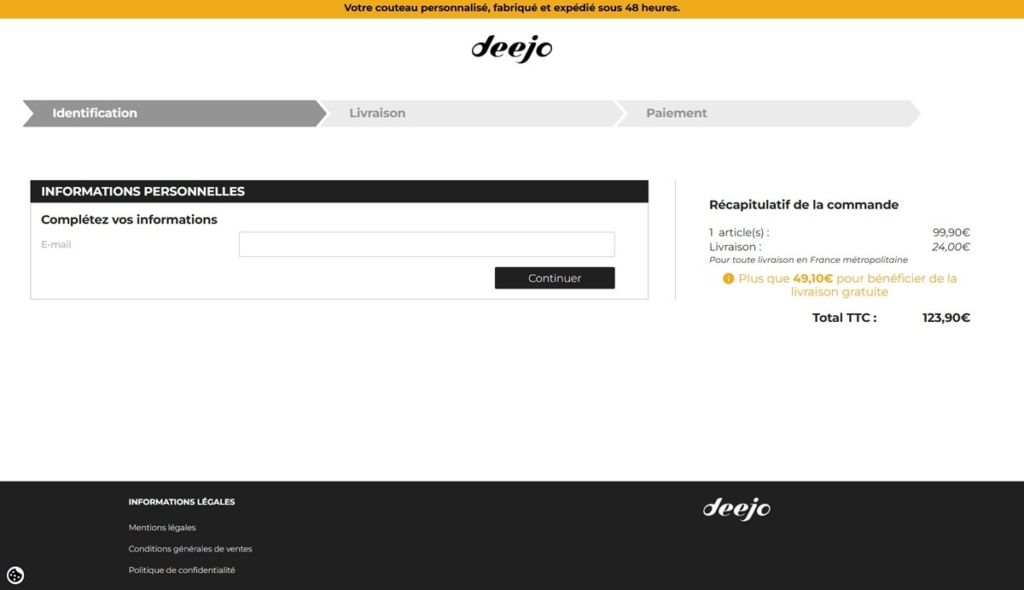
Deejo Checkout page example
Deejo footer example

eCommerce Platform:
Tech Stack: