One product. One offer. One goal.
That’s the approach thousands of ecommerce brands are taking with their Shopify stores — and for good reason. One-product stores can be easier to scale, simpler to market, and faster to launch.
But making a single-product store succeed takes more than just removing the extra items from your catalog.
It takes smart design, strategic positioning, and an ultra-clear user experience.
In this article, we’ll break down the best one product Shopify store examples that nail both performance and design — plus what makes them work, and how you can apply those lessons to your own store.
What is a One Product Shopify Store?
A one-product Shopify store is exactly what it sounds like: a Shopify-powered ecommerce site that focuses entirely on selling a single product.
The layout, branding, and customer journey are all centered around that one offer.
Unlike general stores or niche stores with multiple SKUs, one-product sites rely on deep product storytelling and high-converting design elements to win over shoppers.
Benefits of One Product Stores:
- Simplified user journey – No menu overwhelm or product browsing confusion
- Lower ad testing cost – Focus on a single message = more efficient A/B testing
- Stronger branding – The entire site revolves around one identity and message
- Easier conversion optimization – Only one funnel to test and refine
Many successful DTC brands (especially in their early stages) start with a single flagship product before expanding their range. Think of brands like Oura Ring or Truff — they focused on one clear solution first, and scaled from there.
1. Truff – Luxury Hot Sauce
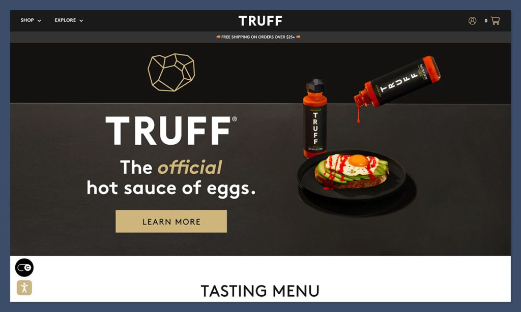
Truff is a masterclass in premium product branding. While they’ve expanded their product line now, they started with one standout item: truffle-infused hot sauce.
Why it works:
- Luxury presentation – Matte black and gold packaging, minimal layout
- Aspirational imagery – Product photos look like magazine ads
- Smart landing structure – Hero section > reviews > product carousel > benefits
- Strong influencer backing – Celebrity UGC, shoutouts, and PR mentions
Their pricing reflects the premium positioning, with bottles starting at $17.98. That high-margin model is one reason they scaled so quickly.
Lessons for your store:
- Use minimal design to highlight premium quality
- Anchor the product with real-world social proof
- Invest in packaging – it’s part of the experience
2. Oura Ring – Sleep and Health Tracking Ring
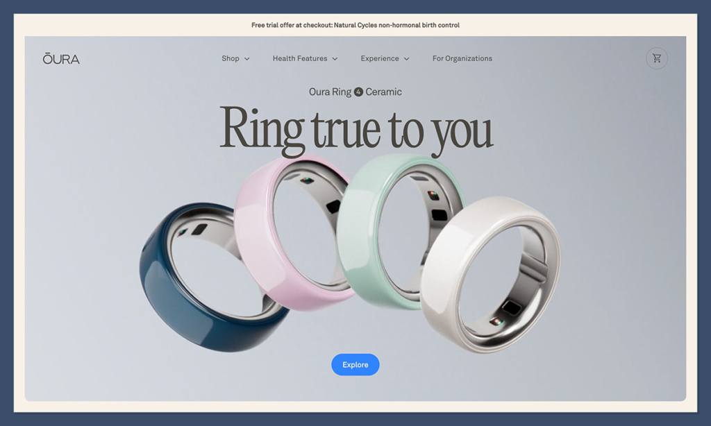
Oura is a leading example of how a tech-forward product can be positioned as a lifestyle essential. The brand initially offered just one product: a sleep and health tracking ring. The store’s design matches the sleekness of the product itself.
Key elements:
- Interactive landing experience – Scroll-triggered animations and dynamic visuals
- High-trust indicators – Backed by studies, used by pro athletes
- Subscription-based upsell – $5.99/month for advanced tracking features
- Strong educational content – Deep pages on sleep, readiness, and recovery
Their one-product setup helped them streamline their marketing across wellness, fitness, and productivity audiences.
Lessons from Oura:
- Use data and studies to build credibility
- Offer content-rich landing pages that build interest and trust
- Position the product as a lifestyle enhancement, not just a gadget
3. Pillow Slides – Viral Comfort Footwear
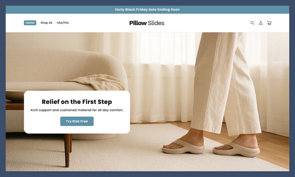
Pillow Slides exploded on TikTok and Instagram by promoting a single, ultra-comfy pair of slides. The product appealed to a wide range of people, especially those spending more time at home or recovering from foot pain.
What stands out:
- Aggressive UGC strategy – Real people, short clips, pain-point-driven copy
- Simple product page – Big visuals, bold benefits, clear call-to-action
- Urgency triggers – Limited stock messages, countdown timers
- Strong mobile experience – Perfectly optimized for scrolling and tapping
They keep the offer clear and simple: one type of slide, in a variety of colors and sizes, priced around $29.99. That kind of accessibility helps boost conversion rates.
Takeaway strategies:
- Lean heavily into social content
- Nail the pain point clearly (“Say goodbye to foot pain”)
- Make the mobile site lightning-fast
4. Talgh – Minimalist Hourglass Candle
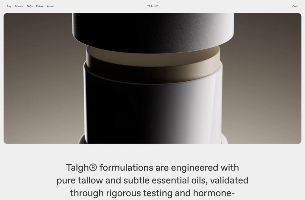
Talgh sells one thing — an elegantly designed hourglass-shaped candle — and does it with striking visuals and a calm, premium aesthetic. It’s a great showcase of how to position a simple product as a luxurious, thoughtful item for gifting or personal use.
Why it stands out:
- Ultra-clean layout – White space, large fonts, soft colors
- High-end branding – Product feels like art, not just a candle
- Emotive copy – Focus on presence, ritual, and slowing down
- Premium price point – Candle sells for $65.00, supported by design-first storytelling
Takeaways from Talgh:
- Less is more when your visuals and copy hit the right emotion
- A single item can feel like a full brand experience
- Thoughtful product positioning helps justify a higher price
5. The Comfy – Oversized Wearable Blanket
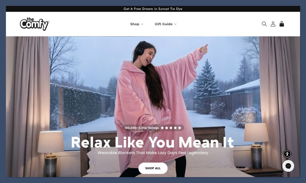
Born from Shark Tank, The Comfy is a single-product success story that went viral thanks to its quirky, cozy appeal. It’s essentially a wearable blanket, and the entire store design leans into the comfort-first branding.
Why it’s effective:
- Personality-driven copy – Light-hearted and playful tone
- Bright, engaging visuals – Lifestyle shots with families, pets, and couches
- High-volume reviews – 30,000+ verified reviews create instant trust
- Product customization – Offers size and color options without overcomplicating
The Comfy typically retails at $49.95, and their Shopify store focuses heavily on storytelling and community.
What you can learn:
- Don’t be afraid to show personality
- Let customer photos sell the product
- Simplicity scales when your message is clear
6. Bala – Stylish Fitness Weights
Bala sells sleek, design-forward fitness weights. Their success started with one product: the Bala Bangles. These weighted wrist and ankle accessories became Instagram-famous and fueled a broader brand expansion later on.
How they did it:
- Modern branding – Pastel colors, geometric visuals, clean typefaces
- Content-first layout – Focus on lifestyle, movement, and self-expression
- Strong DTC funnel – First-time discounts, reviews, and free shipping
- Product-focused storytelling – Why they made it, how it helps, who it’s for
The Bala Bangles are priced at $55.00, a sweet spot for giftable health and wellness products.
Design takeaways:
- Match your visuals to your target audience’s aesthetics
- Build story-driven pages that go beyond product specs
- Let your brand grow organically from one powerful product
7. HydroJug – Smart Water Bottles
HydroJug is another example of a single product — in this case, a large reusable water jug — being turned into a viral brand. The product solves a real pain point: not drinking enough water throughout the day.
Key elements:
- Visually bold product photos – Big jugs, bold colors, lifestyle backdrops
- Social proof with fitness influencers – Tons of UGC and ambassador content
- Customization without confusion – Sleeves, straws, accessories offered as upsells
- Cross-selling pop-ups – Bundling options right before checkout
Their jugs start at $19.99, with add-ons pushing AOV up by 30-50%.
What to apply:
- Bundle products around your hero item
- Use color options to boost personalization
- Position the product in an aspirational lifestyle (fitness, hydration, self-care)
8. Lasso Clock – Modern Magnetic Wall Clock
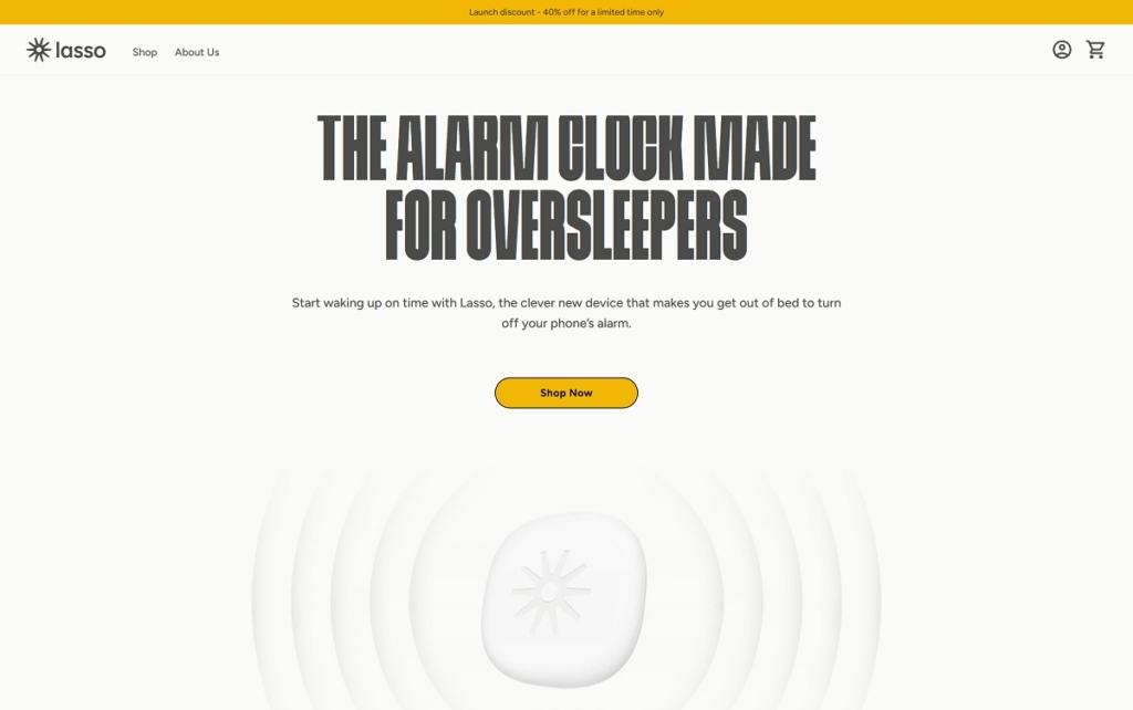
Lasso Clock is a minimalist, design-focused Shopify store that sells one thing: a unique magnetic wall clock. It’s a perfect example of how product-led design and storytelling can drive conversions on a one-product site.
What makes it work:
- Sleek product imagery – High-quality visuals showcase the unique build
- Minimalist site layout – No distractions, just the product
- Clever use of motion – Animations highlight how the magnetic movement works
- Focused branding – Strong identity around simplicity, creativity, and design
Lasso Clock is priced at $129.00, positioning it as a premium gift or home decor piece for design-conscious customers.
What you can take from Lasso:
- Keep your layout clean and modern
- Let your product stand out with space and motion
- Build curiosity through visuals before introducing the full pitch
One Product Store Design Best Practices
Based on the examples above, here’s a checklist of what top-performing one-product stores tend to include:
| Element | Why It Matters |
|---|---|
| Hero Image/Video | Shows product in action instantly |
| Clear CTA | No confusion on what to do next |
| Reviews & UGC | Builds trust fast |
| Social proof / press logos | Adds authority |
| Benefit-driven copy | Speaks to the outcome, not just features |
| Mobile optimization | Drives conversions on small screens |
| Scarcity/urgency cues | Pushes buyers to act sooner |
| Simple navigation | No menus to get lost in |
Do One Product Shopify Stores Actually Work?
Yes — especially when done right. Most of the examples above started with one product and scaled to 7 or 8 figures.
Real-World Data:
- Stores with fewer than 10 SKUs are 3x more likely to hit $100k in monthly revenue
- Single-product Shopify sites convert 2.7x higher than stores with large catalogs
- Brands like Truff and Oura generated $100M+ off the back of one core product
Key Success Factors:
- Laser-focused branding
- High-margin product
- Clear funnel design
- Powerful reviews and UGC
- Smart email and retargeting flow
Final Thoughts
If you’re planning to build a one-product store on Shopify, you’re in good company.
From luxury hot sauces to high-tech health rings, these brands show that less can be more — if your offer is strong and your design supports the story.
Start with a clear pain point, wrap it in an irresistible offer, and design your Shopify store around just that.
That’s the real shortcut.


