Bijou de M. 
Bijou de M is a Japanese jewelry label selling casual, everyday pieces described as a finishing spice for personal style rather than formal fine jewelry. The range covers earrings, necklaces, rings and pearl pieces, with a bridal line handled separately by inquiry. The bilingual storefront supports the brand’s physical stores and sits alongside a gallery and Instagram presence.
Website Design
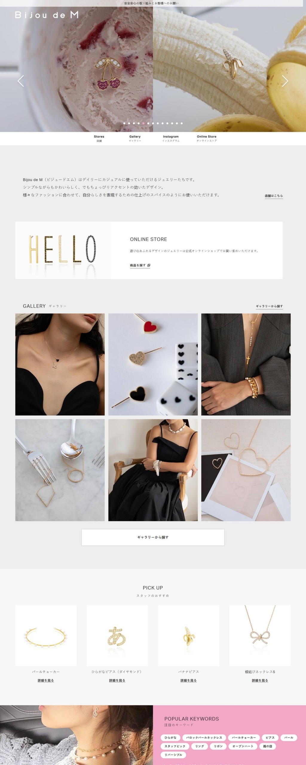
A blush and gold palette. Backgrounds run mostly white and pale grey, set off by two pinks, a rose tone and a lighter blush, plus a muted gold used sparingly against black text and near-black panels. The effect is soft rather than saturated, closer to packaging than to a typical retail palette.
Sans-serif Latin, native Japanese type. Body copy sets in Aktiv Grotesk for Latin characters and switches to Hiragino Kaku Gothic Pro for Japanese text, keeping both scripts legible without leaning on a serif for either.
Photography-led homepage. A hero carousel opens onto a gallery of model photography, then a Pick Up strip of four staff-recommended items, so the page reads as a lookbook first and a shop second.
Shopping Experience
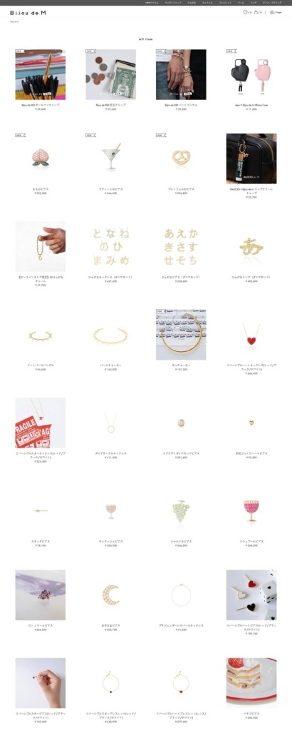
Keyword-driven browsing. Below the gallery, a popular-keywords block links out by motif, hiragana, pearl, earrings, ribbons, reversible items, letting shoppers browse by design detail instead of a conventional product category tree.
Three-way homepage split. Three calls to action, Gallery, Online Store and Bridal inquiry, sit side by side on the homepage, treating the shop as one of three equally weighted paths rather than the default destination.
Reversible pieces named for their mechanism. Several lines, reversible hearts among them, are described by how the piece works rather than by a generic style name, a detail that carries into the product naming itself.
Brand Storytelling
A stated one-line mission. The brand’s own description, simple yet cute designs with a little added accent, sets the positioning directly: pieces built for daily wear, not occasion wear.
Bridal kept inquiry-only. Rather than listing bridal pieces for direct purchase, that category routes to an inquiry form, separating everyday stock from a consultative, made-to-order line.
Notable Features
Instagram folded into the homepage. A dedicated Instagram section sits among the shop sections rather than only in the footer, tying the social feed to the same model-photography style used across the site.
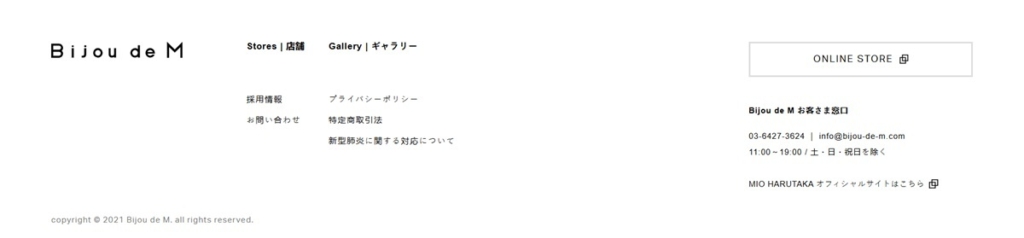
Direct customer service contact. The footer lists a phone number and stated service hours alongside the support email, a level of direct contact detail that is unusual among sites of this size.
Parent company credited in the footer. The footer names MIO HARUTAKA as the parent company with a link to its own site, keeping the jewelry label distinct from the wider business behind it.
Store locations listed alongside the shop. A dedicated Stores section sits in the primary navigation next to the Online Store link, treating the physical retail locations as equally prominent as the ecommerce catalogue rather than as a secondary footer item.
Bijou de M. Shop page example
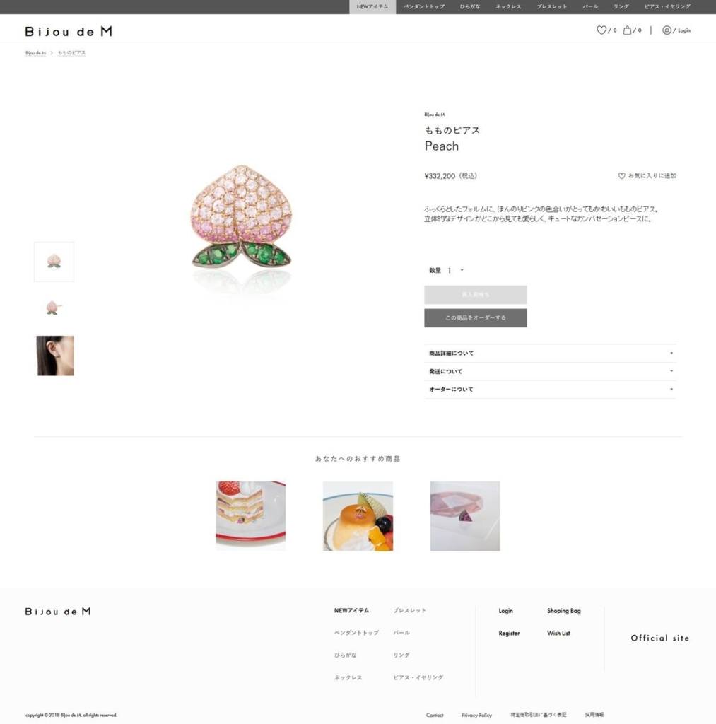
Bijou de M. Product page example
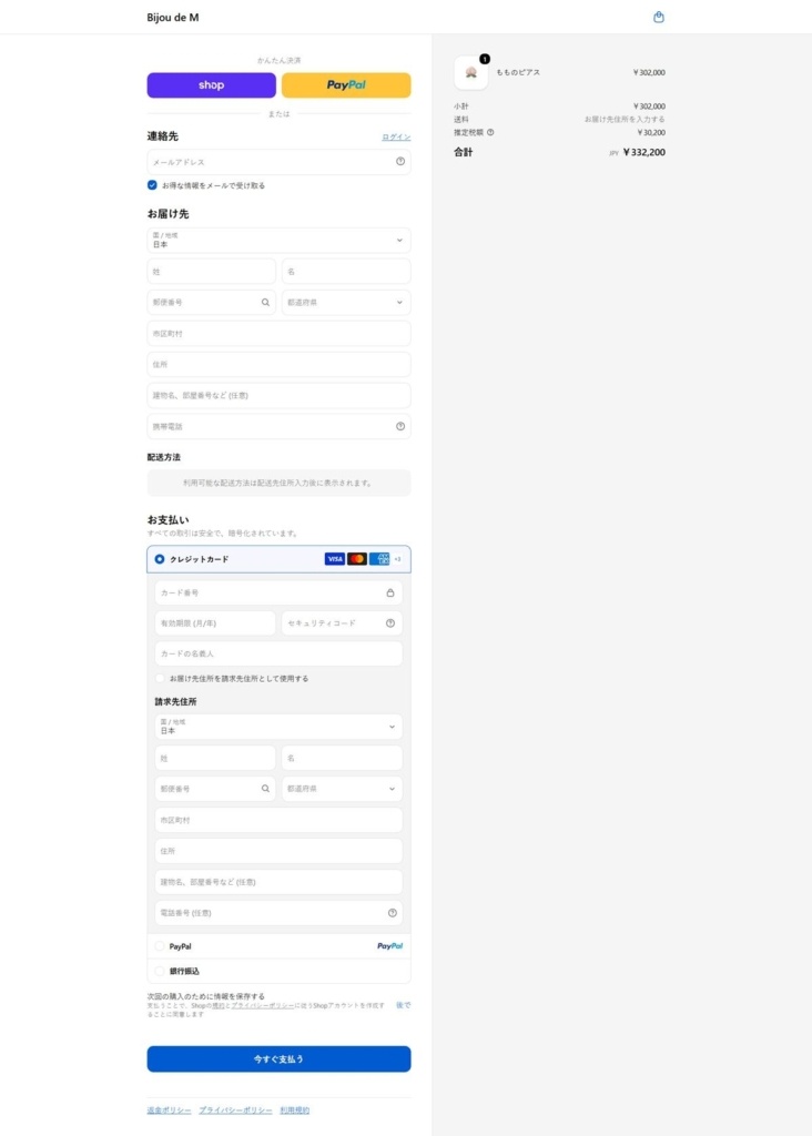
Bijou de M. Checkout page example
Bijou de M. footer example
eCommerce Platform:
Tech Stack: