The Northern Block 
The Northern Block is an independent British type foundry founded in 2006 by Jonathan Hill, selling retail typefaces to brands, creatives and makers. The library runs to 73 families, from single style designs such as Tondu and Zabawa to Lintel Next at 96 styles and Mynor at 85. Alongside font licences the foundry sells custom typeface design and multi script work covering Arabic, Cyrillic, Greek and Georgian. The site is a Next.js and Sanity build, with the store, font delivery and testing tools provided by Fontdue.
Website Design
Black on white, and nothing else. The stylesheet resolves to #000 on #fff with grey reserved for secondary text, the only departure being a near black surface behind the type testers. No brand colour competes with the letterforms.
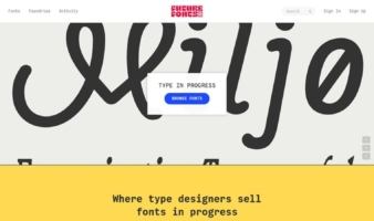
The catalogue is the specimen. The homepage is one long list of families, each name set large in its own face with a style count beside it, so scrolling the index is also scrolling the library. Recent releases carry a New! flag.
The site is set in its own fonts. The footer credits “Website Typefaces: Grobart and Leida”, naming the two faces the interface itself uses.
Shopping Experience
Two actions per family. Every row in the index offers Learn more and Buy, splitting the browsing route from the purchase route at first contact.
The family page is a testing rig. Each style gets a tester row with its name, a size control, an OT Features panel and an editable pangram defaulting to “Brick quiz whangs jumpy veldt fox.” Feature toggles appear as checkboxes: Case-Sensitive Forms, Denominators, Fractions, Lining Figures, Lowercase a, Lowercase g and Tabular Figures.
Trials offered ahead of pricing. Download Free Test Fonts and Download PDF Specimen sit at the top of every family page, above any Buy control, so evaluation comes before the licence decision.
Purchase opens over the page. Buying runs through a modal layered on the family page rather than a separate cart route, with account and cart links held in the header.
Brand Storytelling
A one paragraph position. The homepage closes with the foundry calling itself “an independent type foundry internationally recognised for producing modernist fonts for brands, creatives and makers”, then naming the founder and the custom and multi script services.
Every family gets a written case. Family pages carry an Information section explaining the reference and the intent. Boxal is introduced as a pixel font drawn from classic arcade gaming, with five style variants and over 610 characters across 15 weights.
Notable Features
A full character viewer. Family pages expose the whole glyph set by Unicode block, from Basic Latin through Currency Symbols to Emoticons, with a readout giving glyph name, Unicode decimal and hex, plus cap height, x height, ascender and descender.
Feature demos with real strings. OpenType features are shown in use rather than listed, with Fractions on “Add 1/2 cup and 3/4 tsp”, Oldstyle Figures on “Established in 1842” and Superscript on “E = MC2”.
Licensing set out before purchase. A dedicated page defines Desktop, Web, Application and Canva licences, then lists the cases handled by quotation instead, among them broadcast and streaming, video games, OEM products and logo licences.
Tag based filtering. The index Filter is keyed to descriptive tags such as sharp, contemporary, elegant and headline rather than to formal classification.
eCommerce Platform:
Tech Stack: