ITA Leisure external link icon

ITA Leisure sells outdoor leisure goods, beach chairs, blankets and throws, apparel, bags and gift cards, built around a stated mission that “leisure is for everyone.” The catalogue includes a limited-edition Venus Flytrap collection made with artist Joiri Minaya, and the site runs a parallel content section called Explore alongside the shop. Built on Squarespace.

Website Design

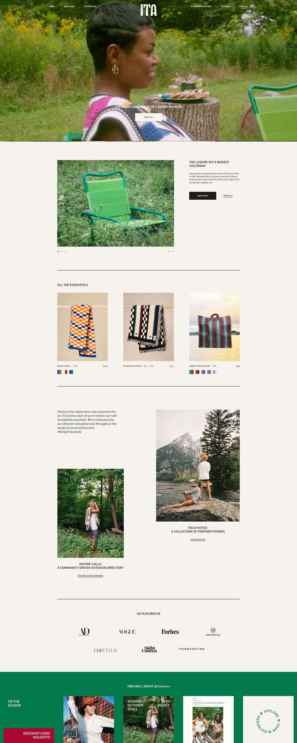
A warm cream base with near-black text. The background runs an off-white cream (#f4f3ec) against a near-black, brown-toned text color (#1d1c15), a warmer pairing than a pure white-and-black system.

Two custom typefaces do the work. Fann Grotesque Medium and Chap Regular are both loaded as custom web fonts rather than a stock Google Fonts pairing, giving the brand its own type identity.

A deep green accent marks key actions. The site’s accent color sits in the green family, a saturated, dark tone, with a muted tan and a blue used as secondary accents across buttons and highlights.

Shopping Experience

Shop and Explore share top billing. The main navigation splits evenly between commerce (Furniture, Textiles, Apparel, Bags, Gift Cards) and editorial content (Guidebook, Lookbook, Trailblazers, Roots & Routes, Field Notes).

A Leisure Club replaces a standard newsletter signup. Joining grants early access and discounts rather than a generic percentage-off popup.

Limited editions are called out separately from the core range. The Venus Flytrap collaboration with artist Joiri Minaya sits in its own section rather than folded into general apparel or bags.

Gift cards sit inside the main Shop menu rather than tucked in the footer. Listing them alongside Furniture, Textiles, Apparel and Bags treats a gift purchase as an equal product line, not an afterthought.

Brand Storytelling

Cultural representation is the stated reason for the shop’s existence. Copy on the site reads: “So we do this for us, for the culture, and for the ancestors whose wildest dreams may have been to rest, to connect, and to be present.”

Press and social proof lean on name recognition. Logos for Forbes, Vogue, GQ and Architectural Digest appear alongside Instagram-sourced customer photos.

Artist partnerships extend past the Venus Flytrap drop. The Explore section profiles the curators and artists ITA Leisure works with under headings like Trailblazers and Roots & Routes, tying product to named collaborators.

Furniture and textiles share billing with apparel. Chairs, tables, beach towels, blankets and throws are given the same visual weight as clothing, a broader mix than most single-category outdoor brands carry.

Notable Features

Field Notes reads as a running journal. It sits inside Explore as a content series distinct from the Guidebook and Lookbook, adding a third editorial format to the site.

The footer keeps contact deliberately simple. A single email address and Instagram and Facebook links are the only contact points, with a developer credit to SHADOWNUT.

Everyday language replaces outdoor-industry jargon. Product copy talks about choosing the outdoors and finding comfort, confidence and connection, steering away from technical spec sheets in favor of a lifestyle framing.

ITA Leisure Shop Category page example

ITA Leisure Product page example

ITA Leisure Checkout page example

ITA Leisure footer example

#Chairs #Designs #leisure #Outdoor

eCommerce Platform:

Leave a Reply

Your email address will not be published. Required fields are marked *