Veil 
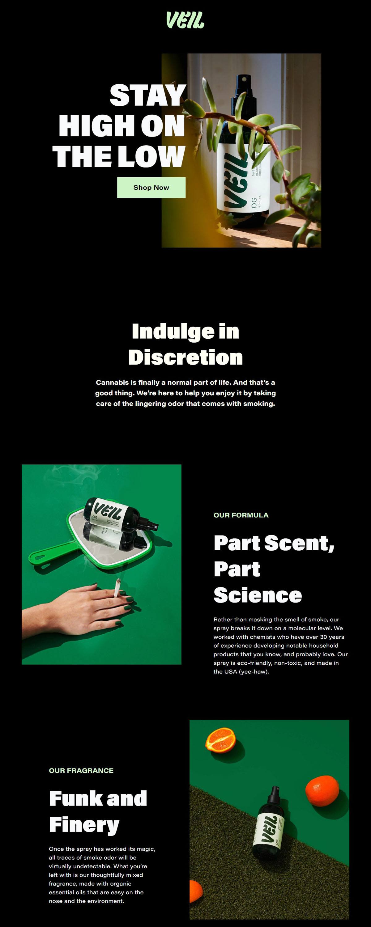
Veil sells one thing: a spray that eliminates the smell of cannabis smoke. The pitch is chemistry rather than cover up. The formula is described as breaking smoke odour down at a molecular level, developed with chemists who had spent decades on household products, and stated to be non toxic, eco friendly and made in the USA. What it leaves behind is a fragrance of organic essential oils. The catalogue is two bottle sizes and three bundles, sold direct and through a long list of retailers. The store runs on Shopify using the Cascade theme, with a footer currency selector although pricing and stockists are both US oriented.
Website Design
A monospace only type system. Headings, body copy and navigation are all set in Courier New, with no webfont loaded anywhere on the page. Everything sits at a single weight, so hierarchy comes from size, spacing and upper case rather than contrast between faces. For a consumer product it reads as unusually plain, almost clinical.
Pale green on green. The primary ground is a pale mint, with a deep forest green for accents and a near black green for body text. White is held back for active and overlay states, and there is no leaf imagery.
Full height banners between short sections. The homepage opens on an image banner sized to the viewport, then alternates brief upper case headers, OUR FORMULA, OUR FRAGRANCE, AVAILABLE IN 2 SIZES, with product photography on flat colour.
Shopping Experience
Five choices in one grid. The shop is a single collection holding the 8 ounce bottle at $19.99, the 2 ounce at $9.99 and three bundles: Home-and-Away at $34.99, Stock Up at $59.99 and The Gifter at $64.99. Prices sit on the cards, so the bundle arithmetic is visible without opening a product page.
Bundling carries the upsell. With no subscription and no variants beyond size, the bundles do the work of lifting order value, and the homepage states the structure plainly: two sizes a la carte and three separate bundles.
A stockist list rather than a store locator. Stockists is a plain list split into Online and IRL, naming retailers from Urban Outfitters and Bespoke Post to dispensary groups and smoke shops. There is no map and no postcode search.
Brand Storytelling
Normalisation as the opening line. The lead copy states that cannabis is finally a normal part of life and frames the product as housekeeping rather than concealment. The recurring line is odour elimination for the considerate cannabis consumer.
Formula and fragrance split apart. Two adjacent sections divide the claim, one on how the spray breaks the odour down, the next on what replaces it.
Notable Features
A travel size framed as a response. The 2 ounce bottle is introduced as arriving by popular demand, TSA approved and pocket sized, with the suggestion of one for the car and one for the home.
Press logos without pull quotes. An As Featured In row runs publication logos only, each linking out to the coverage rather than quoting it.
Utility pages kept in the menu. FAQs, Testimonials, Blog, Terms of Service, Privacy Policy and an Accessibility Statement sit in the expanded navigation rather than only in the footer.
eCommerce Platform:

Tech Stack: