ActiveHop 
ActiveHop is an Italian beverage brand centered on sparkling hop water designed for people who spend time outdoors, from hikers and cyclists to athletes and other active consumers. The range is deliberately compact, built around three drinks—Drop, Trail, and Rad—along with a Discovery Box containing all three flavors. Across the site, the company positions the product between functional hydration, alcohol-free refreshment, and outdoor lifestyle culture, with an emphasis on natural ingredients, zero sugar, zero calories, and reusable aluminum packaging.
Website Design
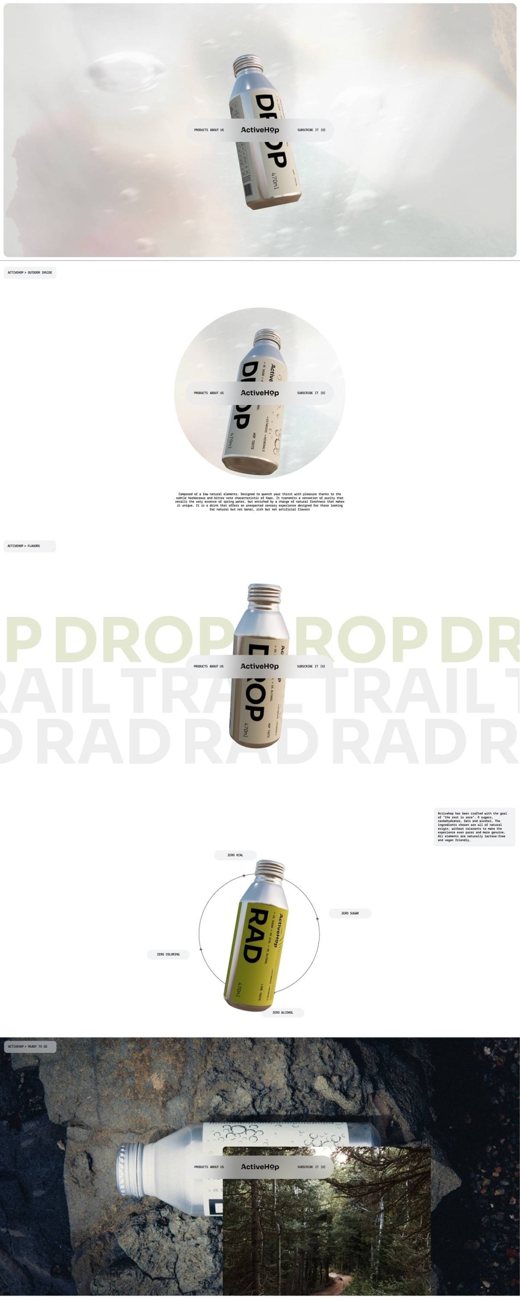
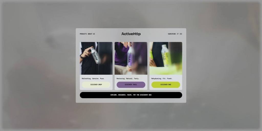
ActiveHop’s website takes a graphic, contemporary approach that sits somewhere between sports branding, outdoor editorial, and modern beverage packaging. The visual identity relies heavily on bold sans-serif typography, oversized product names, and a relatively stripped-back interface. The large DROP, TRAIL, and RAD lettering seen on the bottles carries directly into the digital experience, giving each flavor an immediate visual identity.
Color is used selectively rather than across the entire interface. The underlying website remains fairly neutral, while individual products introduce their own accent colors: Drop uses a predominantly pale, minimal treatment, Trail is associated with purple, and Rad with a bright yellow-green. This keeps the visual hierarchy closely connected to the packaging.
Photography plays a central role in establishing the brand world. Rather than relying exclusively on conventional studio packshots, ActiveHop places its aluminum bottles in rocky landscapes, outdoor environments, and active lifestyle settings. Cropped hands, tactile surfaces, sportswear, stone, and natural textures create a more physical art direction. The bottles often appear as objects carried and used rather than simply displayed.
The layouts use large imagery, substantial spacing, and alternating text-and-image sections. Repeated typography and product-name treatments introduce movement and rhythm without making the interface dependent on dense decorative elements.
Shopping Experience
The ecommerce architecture is unusually concise because the catalog itself is small. The primary navigation focuses on Products and About Us, with direct access to the cart and language selection. Instead of requiring shoppers to work through categories and filters, the homepage immediately introduces Drop, Trail, and Rad with short descriptors and individual “Discover” calls to action.
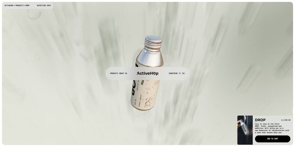
Each core flavor is sold in a six-bottle format for €30, while the Discovery Box offers three bottles—one of each flavor—for €15. This sampler becomes an important product-discovery tool for visitors who do not yet know which variation they prefer.
Product pages keep the conversion path short. The product image, name, pack quantity, price, brief flavor description, nutrition information, quantity controls, and Add to cart button are concentrated around the main purchasing area. There is little need for search, filtering, or complex variant selectors, making the experience closer to a focused direct-to-consumer landing page than a large beverage catalog.
The cart is accessible globally and includes a clear empty-cart state that directs users back into shopping. Overall, the commerce layer stays visually secondary to the brand presentation while remaining easy to reach.
Brand Storytelling
A significant portion of the homepage is devoted to explaining what distinguishes ActiveHop from standard flavored water or soft drinks. The site organizes this information around themes including flavor, “Target Zero,” hops, functional ingredients, and packaging.
Product benefits are presented through concise nutritional claims—zero alcohol, coloring, calories, and sugar—followed by more detailed sections on hop extract, vitamins, magnesium, potassium, and folic acid. The storytelling therefore combines lifestyle imagery with a more technical explanation of ingredients and functionality.
The About page describes the brand’s audience as “outdoor hedonists,” linking physical activity with enjoyment rather than adopting a purely performance-driven sports tone.
Notable Features
Packaging is given unusually prominent treatment. ActiveHop uses aluminum bottles with screw caps rather than conventional disposable cans, allowing bottles to be resealed. The site also suggests reusing an empty bottle as a water bottle or small container and emphasizes aluminum’s recyclability through its “Leave No Trace” messaging.
The Discovery Box provides a simple conversion device for first-time buyers, while a newsletter signup supports ongoing customer acquisition. With only a few products, ActiveHop avoids unnecessary ecommerce complexity and instead uses strong photography, repeated graphic motifs, and long-form product education to turn a compact storefront into a broader outdoor lifestyle experience.
ActiveHop Shop page example
ActiveHop Product page example
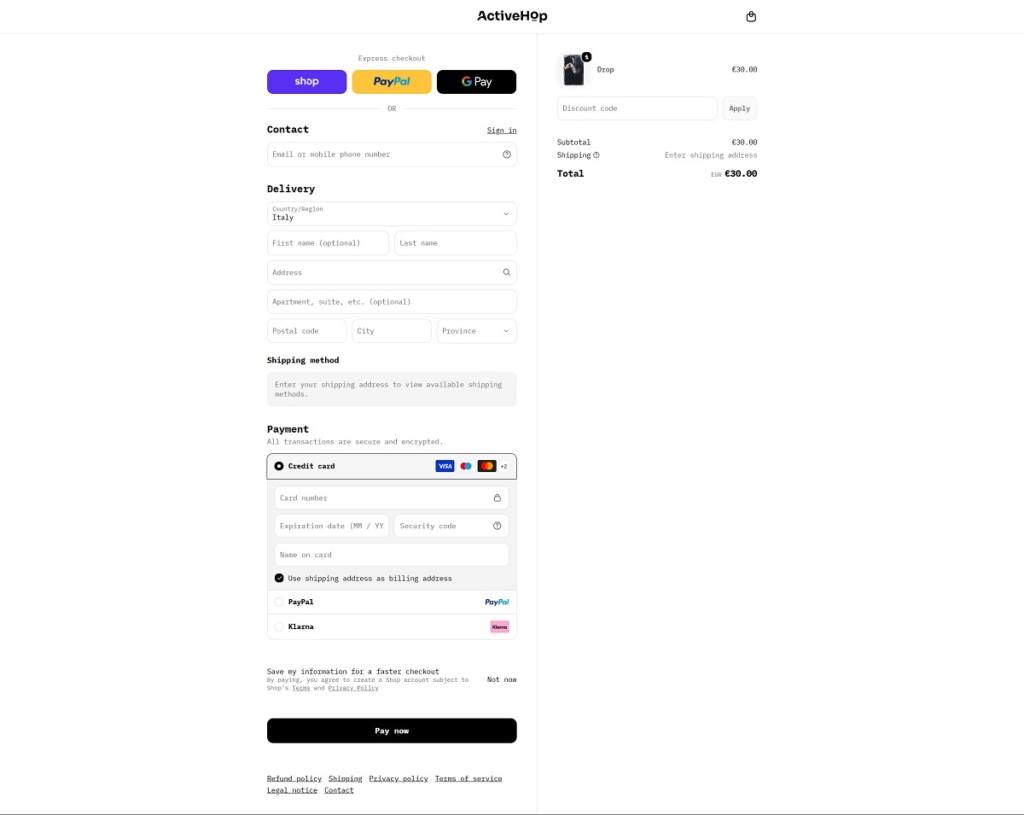
ActiveHop Checkout page example
eCommerce Platform:

Tech Stack: