As far as new, independent denim brands go, DSTLD jeans is one of the biggest players on the market right now. The company launched in April 2014 with the mission of bringing quality denim at a lower price to consumers by going straight from the factory to the website
Soulland is a Copenhagen menswear label selling ready-to-wear clothing and accessories directly through its own store, organized into Outerwear, Suiting, Shirting, Trousers, Jersey, Knitwear, Denim, Sweatshirts, Shorts, Footwear and Accessories. The catalogue runs alongside a Library, a Tapes section and a Community hub, positioning the brand as a media outlet as much as a retailer. The current season is Autumn/Winter 2026’s “The Scavenger Hunt” collection. Built on Shopify.
Website Design
A black and white base. The interface runs on a grayscale scheme, near black (#111, #212121) against white, with a single red accent (#bf171d) reserved for sale pricing and flagged items.
Manrope and Inter carry the type. Headings and navigation lean on Manrope, a geometric sans, while Inter handles body copy and product details; both load from Google Fonts with a system-ui fallback stack for speed.
Video opens the homepage. An autoplaying, muted hero video sits above the fold, followed by editorial product photography rather than plain studio shots throughout the collection pages.
Shopping Experience
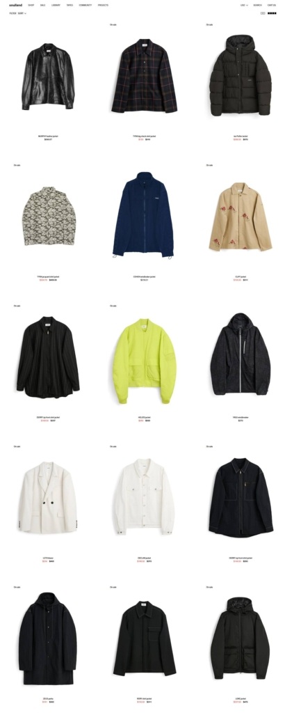
An eleven-way wardrobe split. The main shop divides into Outerwear, Suiting, Shirting, Trousers, Jersey, Knitwear, Denim, Sweatshirts, Shorts, Footwear and Accessories, a finer breakdown than most menswear sites use.
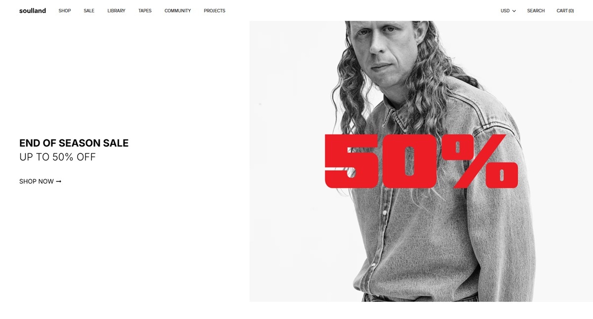
Sale is framed as a countdown. An “End of Season Sale” banner promises up to 50 percent off, sitting alongside the regular-price Scavenger Hunt collection.
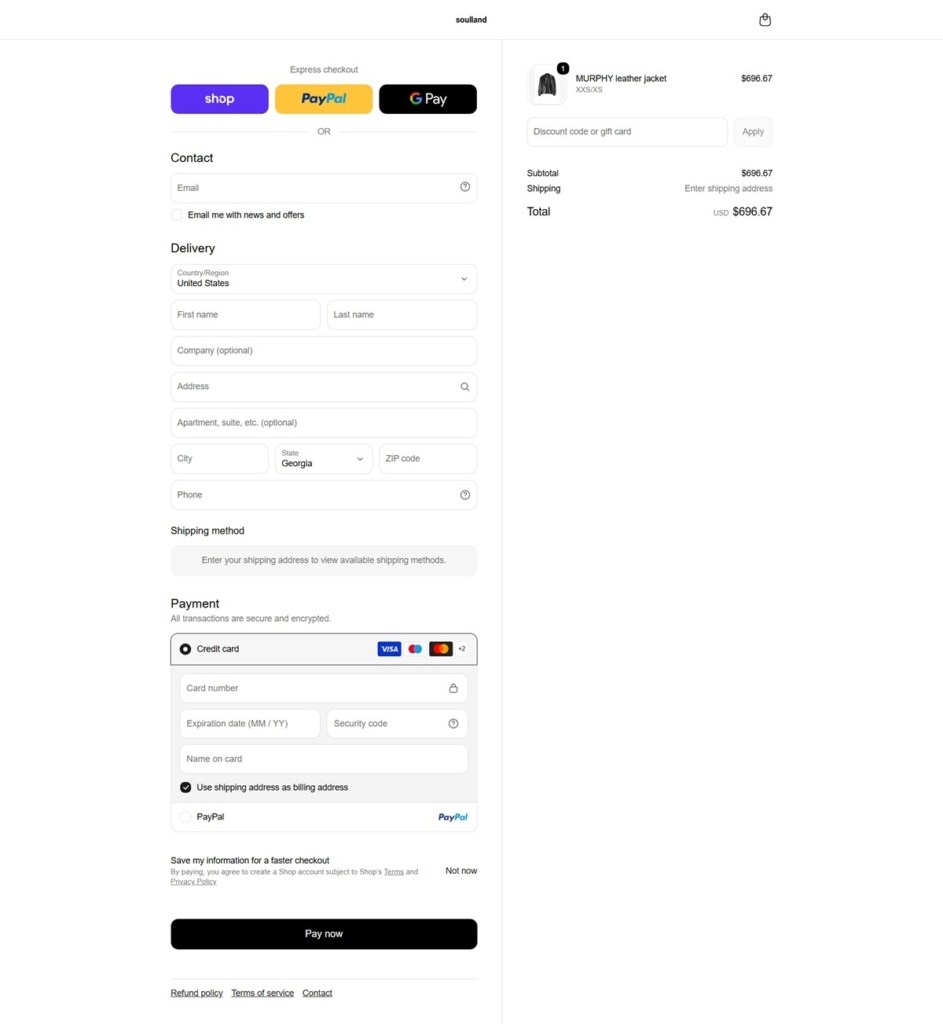
Checkout supports four currencies and 15-plus payment methods. EUR, DKK, GBP and USD are all selectable, and payment options include Klarna, Apple Pay and PayPal. Returns run through a dedicated FloatAnalytics portal rather than a generic contact form.
Brand Storytelling
The Library section functions as a mood board. Its own copy explains the intent: “The library holds the music, films, books, and visuals that sit behind our work. They shape moods, spark details, and help tell stories that find their way into the collections.”
A Tapes and Community section extends the shop into media. VHS-style content and community pages sit in the main navigation next to product categories, treating the site as a publishing outlet as well as a store.
Sustainability is documented, not just claimed. A Code of Conduct, a Preferred Material List and a Family of Fabrics page back up the brand’s environmental statements with named policies.
Notable Features
A pre-owned resale program runs alongside new stock. Customers can buy secondhand Soulland pieces through a reseller integration rather than only new-season product.
Care guidance sits ahead of the sale. A “Before You Buy” page and product care guides are linked from the main navigation, aimed at extending garment life rather than just describing fabric content.
Locale detection redirects by region. A Sleeknote-powered script offers separate Denmark, US and UK site versions based on the shopper’s location.
Vintage stock is sold through the same navigation as new arrivals. The pre-owned program does not sit in a separate app or subdomain, keeping resale inside the main shop structure rather than treating it as a side project.
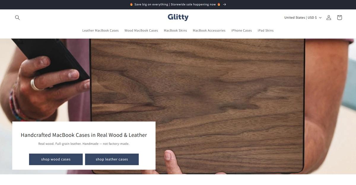
Glitty sells handcrafted wood and full-grain leather MacBook cases, matching skins for keyboards and trackpads, plus iPhone cases and iPad skins, aimed at MacBook owners who want protection with visible material craft. The brand states it has been “Hand Crafting Superior Products since 2014” and counts more than 25,000 customers. It runs on Shopify using a Dawn-based theme.
Website Design
A near-black and cobalt system. The theme defines a dark scheme in near-black (18,18,18) against white and light gray grounds (243,243,243 and 255,255,255), with a cobalt blue (51,79,180) reserved for buttons and badges. A darker navy (23,35,81) appears as a contrast tone behind badge elements.
One sans-serif throughout. Both headings and body copy are set in Assistant, a grotesque sans, so category titles and product descriptions share the same letterforms and the page reads as a single typographic voice rather than a display-plus-body pairing.
Wood grain as the hero image. Product photography favors close, cropped shots of an open MacBook with the case or skin installed, letting the walnut and Irodori-dyed wood grain fill the frame rather than showing the product isolated on white.
Shopping Experience
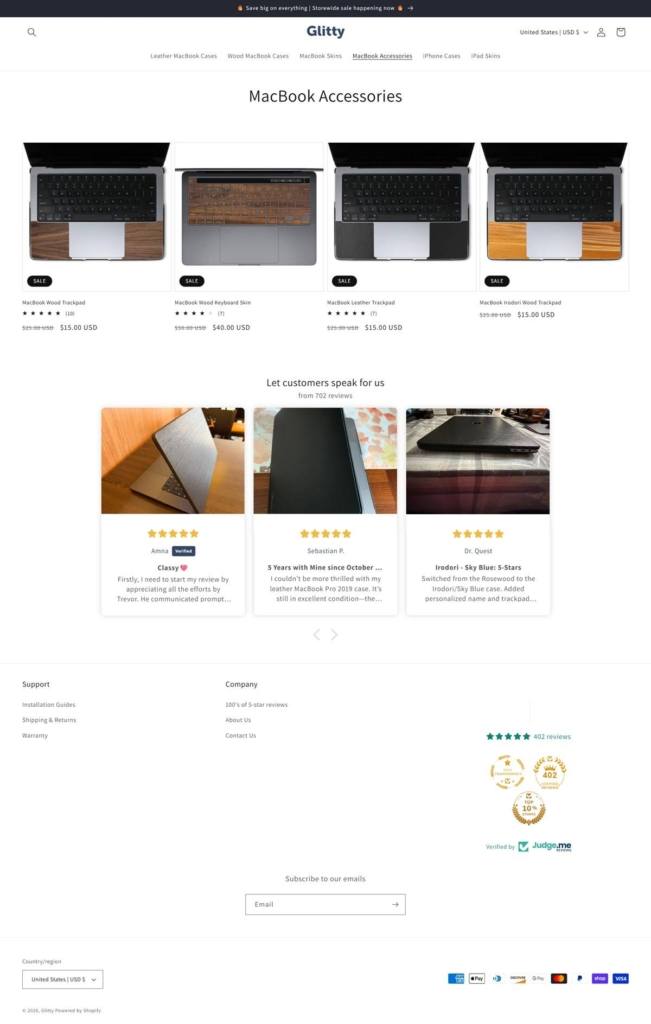
A six-category top nav. Leather MacBook Cases, Wood MacBook Cases, MacBook Skins, MacBook Accessories, iPhone Cases and iPad Skins sit in a flat horizontal menu with no dropdown megamenu.
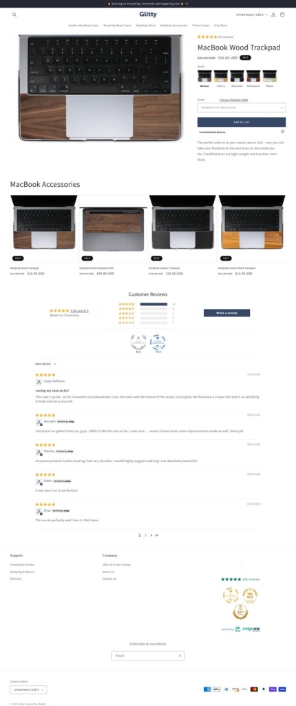
Fit selection on the product page. Each product page carries a “Find your MacBook model” dropdown next to the finish swatches, so the case is matched to a specific MacBook generation before it can be added to cart.
Reviews embedded twice. A star rating with review count sits under the product title, and a full Judge.me review block with a star-distribution bar chart and photo reviews from customers sits further down the page, separate from the “let customers speak for us” testimonial carousel on the homepage.
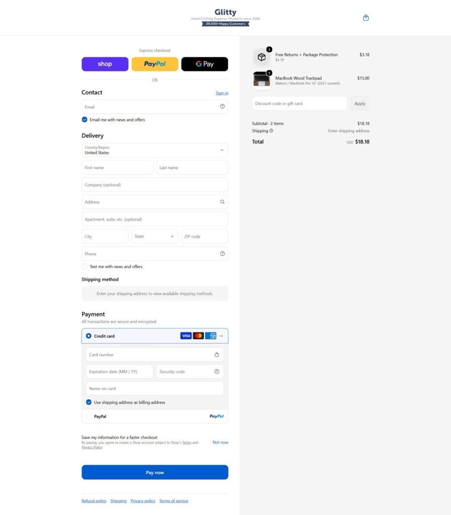
Standard Shopify checkout with an add-on. Express options are Shop, PayPal and Google Pay. Below the order summary, a “Free Returns + Package Protection” line item is added automatically at a small fixed charge, ahead of the discount code field and the blue “Pay now” button.
Brand Storytelling
Handmade positioned against factory-made. The site repeats a maker framing, crediting the cases to hand construction rather than mass production, with the Irodori dyed wood line singled out for its color process.
Customer photos carry the proof. Rather than founder or workshop imagery, the homepage testimonial carousel and the product-page review block both lead with customer-submitted photos of the case in use.
Notable Features
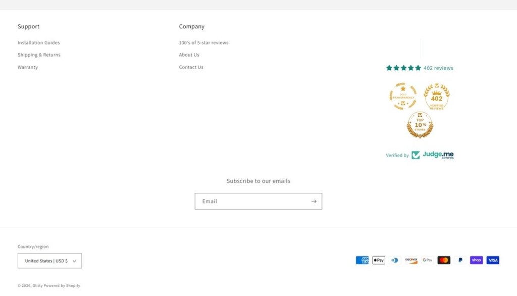
Trust badges in the footer. A Judge.me “Gold Transparency” mark, a “402 Verified Reviews” seal and a “Top 10% Stores” badge sit beside the review count in the footer, next to Support and Company link columns.
Storewide sale banner. A top announcement bar runs a sitewide discount message above the main navigation on every page.
Email capture in the footer. A single-field subscribe form sits centered in the footer, above the country and currency selector and the row of accepted payment icons.
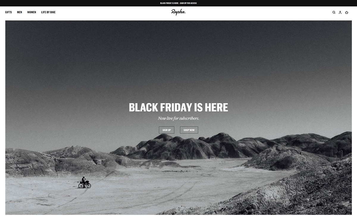
Rapha is a premium cycling apparel and accessories brand founded in 2004, dedicated to creating high-quality products for road cyclists. Their offerings include jerseys, bib shorts, jackets, and accessories designed for performance and comfort across various riding conditions. Rapha emphasizes both functionality and style, catering to the needs of cyclists worldwide. The Rapha website features a sleek, modern design that reflects the brand’s premium positioning in cycling apparel.
Steven Alan (born Steven Alan Grossman) is an American fashion designer, and founder of the chain of Steven Alan boutiques and Steven Alan Collection, a heritage-inspired line of men’s and women’s casual wear.
Join our community for the latest trends and ecommerce tips.