Archives: Websites

eCommerce Websites

Sneakerbox

Sneakerbox is a Canadian sneaker and streetwear retailer founded in 2008, with a mix of ecommerce and physical stores in British Columbia. Its catalog spans sneakers, apparel, and accessories from brands including Nike, Jordan, adidas, New Balance, Puma, Y-3, HOMME+, Vans, Reebok, and others. The assortment is particularly focused on contemporary sneakers, seasonal releases, collaborations, and streetwear, positioning the store toward customers who follow footwear launches as well as those looking for everyday styles from established sportswear brands.

Website Design

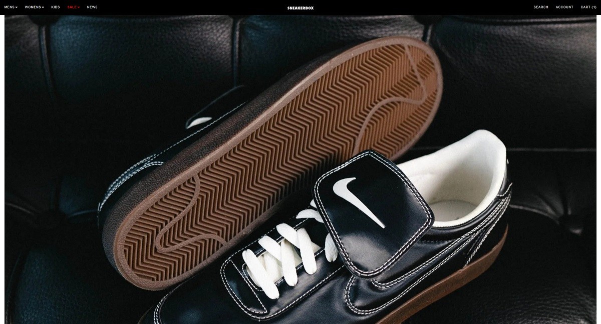
The Sneakerbox website uses a restrained, product-first visual system that allows individual brands and releases to provide most of the personality. A predominantly neutral interface, straightforward sans-serif typography, and minimal decorative styling create a relatively quiet framework around colorful footwear and campaign imagery.

The homepage opens with a sequence of large visual campaign features highlighting current launches and seasonal collections. Rather than relying on a single static hero, the page gives multiple releases prominent space, including brand-specific stories from Nike, adidas Y-3, and HOMME+. This creates the feel of a sneaker boutique window, where the newest arrivals and notable drops change frequently.

Below the campaign imagery, Featured Products move the site into a more conventional ecommerce grid. Product photography is largely clean and merchandise-focused, while sale pricing and sold-out labels are immediately visible. Generous spacing around the grid prevents the extensive catalog from feeling excessively compressed.

The overall art direction is intentionally flexible. Because the store carries many brands, photography ranges from straightforward sneaker packshots to more expressive seasonal campaign imagery. The interface remains consistent enough to hold these different visual languages together.

Shopping Experience

Sneakerbox organizes its assortment through broad shopping categories such as footwear, clothing, accessories, men’s products, brands, and sale merchandise. Dedicated brand collections provide another important route into the catalog, particularly for customers who already know which label they want to browse.

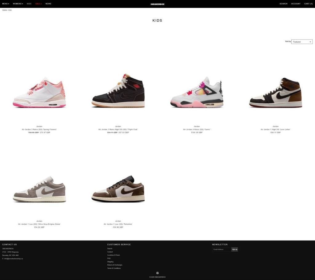
Collection pages use a familiar multi-column product grid with brand, product name, regular or discounted price, and stock status visible before opening an item. Sorting controls help reorganize larger collections, while the relatively direct structure keeps product discovery focused on browsing rather than a complex set of interactive tools.

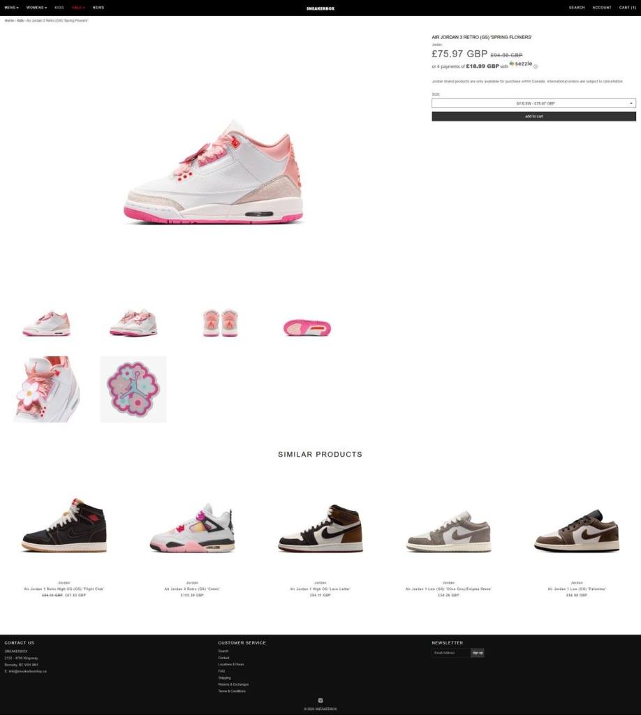
Product pages place a gallery of product photography alongside the essential purchasing information. Shoppers see the model name, brand, price, colorway, product code, descriptive copy when available, and a size selector followed by the Add to Cart call to action. Unavailable sizes are explicitly marked as sold out.

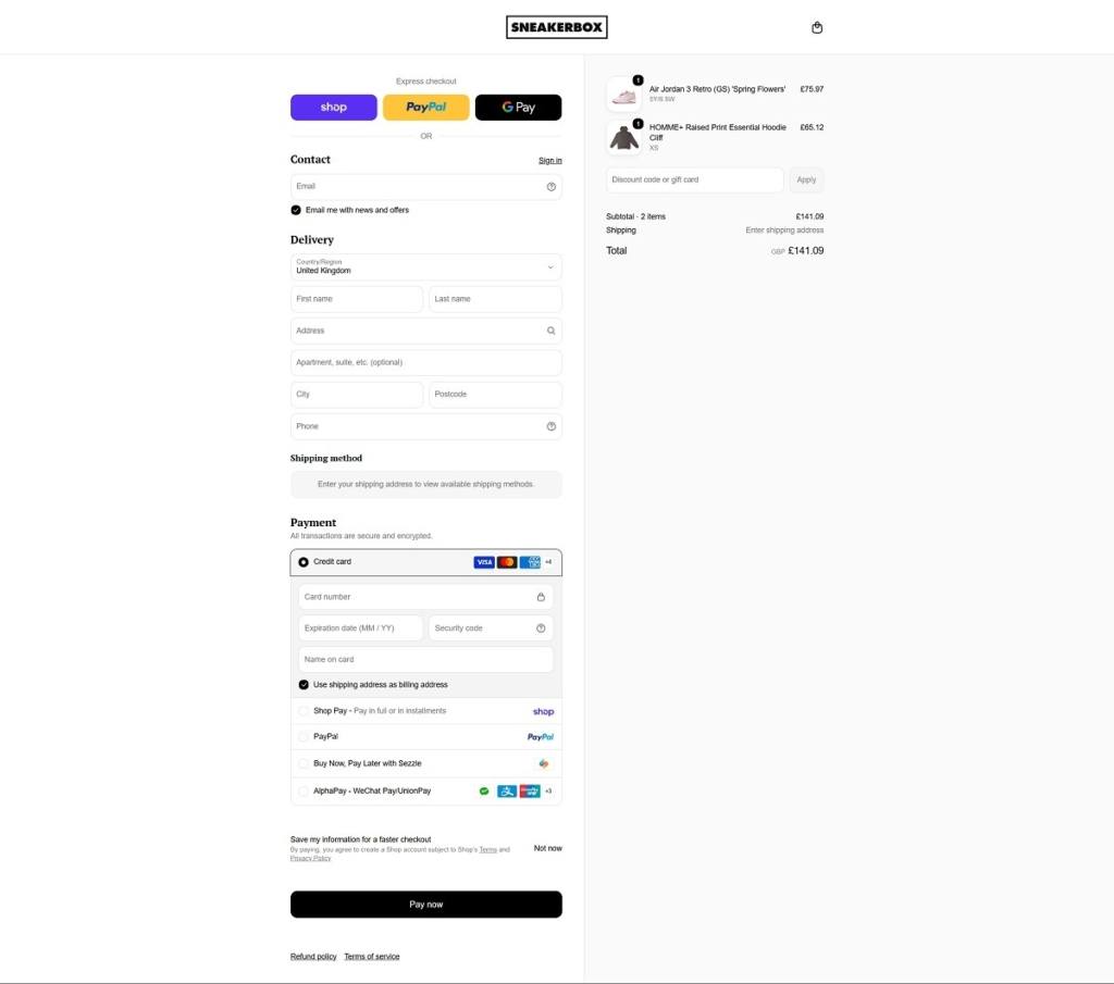
Some products also support installment payments through Sezzle. Checkout can be completed without creating an account, with express payment options including PayPal, Apple Pay, and Google Pay.

The site reflects the particular logistics of sneaker retail as well. Certain high-demand “Launch Products” carry special conditions, including final-sale status, purchase limits, and exclusions from promotional discounts or free shipping. Nike and Jordan products are restricted to Canadian delivery.

Brand Storytelling

Sneakerbox describes itself as a streetwear and sneaker boutique rather than simply a footwear marketplace, and much of its storytelling is organized around individual releases.

Its News section functions as an editorial archive covering collaborations, limited releases, collection launches, and sneaker histories. Articles typically combine background on the brand or collaborator with details about materials, colorways, sizing, pricing, and release mechanics. This creates a bridge between editorial content and commerce, particularly for products whose cultural context is part of their appeal.

The homepage follows a similar model, using campaign-led features to frame selected products before introducing the broader catalog.

Notable Features

Launch management is one of the more distinctive parts of the Sneakerbox experience. Limited products can carry one-per-customer rules and specific final-sale conditions, reflecting the scarcity-driven mechanics common to sneaker releases.

The store also connects online and physical retail. Customers in British Columbia can choose free in-store pickup, while online inventory reflects stock held in physical locations.

Additional ecommerce features include optional Route order insurance, customer accounts with order history and tracking information, gift cards, promotional pricing, and an email newsletter. Overall, Sneakerbox combines a relatively conventional product grid and purchasing flow with release-oriented editorial content and campaign imagery, creating a storefront shaped around the rhythms of sneaker and streetwear launches.

Sneakerbox Shop Category page example
Sneakerbox Product page example
Sneakerbox Checkout page example
Sneakerbox Footer example

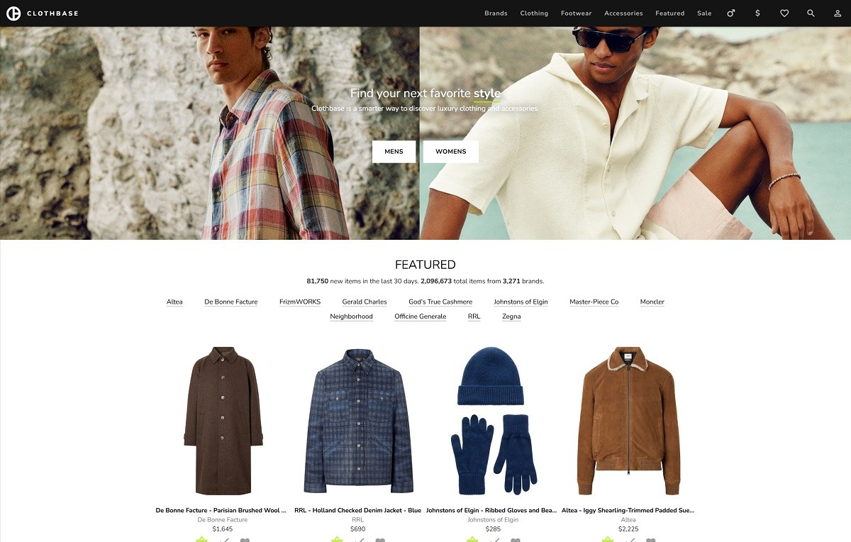
Clothbase

Clothbase is a fashion discovery platform that aggregates luxury clothing, footwear, accessories, watches, beauty products, and lifestyle goods from thousands of brands and multiple retailers. Rather than operating as a conventional store with its own inventory and checkout, Clothbase works as an affiliate shopping index: customers discover products on the platform and use the “Buy It” action to continue their purchase with the relevant retailer. With more than two million indexed items from over 3,000 brands, the site is designed primarily for shoppers who want to search and compare a very large luxury-fashion catalog from one interface.

Website Design

Clothbase uses a deliberately restrained visual system built around black, white, neutral backgrounds, and clean sans-serif typography. The interface itself rarely competes with the merchandise. Navigation labels, prices, product names, filters, and controls are presented functionally, while product photography supplies most of the color and visual variation.

The homepage combines a simple introductory hero with product-led sections such as Featured and Best Sellers. Large amounts of whitespace around headings and merchandise help prevent the extensive catalog from feeling overly dense. Product cards follow a consistent grid structure, typically placing the image first, followed by the product title, designer, and price. Discounted products show both current and original pricing.

Because Clothbase pulls together products from many brands and retailers, its photography is naturally less art-directed than that of a single-brand ecommerce store. Studio backgrounds, model imagery, cropped packshots, and retailer-specific photography coexist throughout the catalog. The neutral interface acts as a framework that gives this varied imagery a degree of consistency.

Brand pages use the same understated presentation, combining basic company information and a short brand introduction with a grid of the latest available items.

Shopping Experience

Product discovery is the main focus of the experience. The primary navigation provides access to Brands, Clothing, Footwear, Accessories, Featured products, and Sale, along with search, favorites, account controls, gender selection, and currency options.

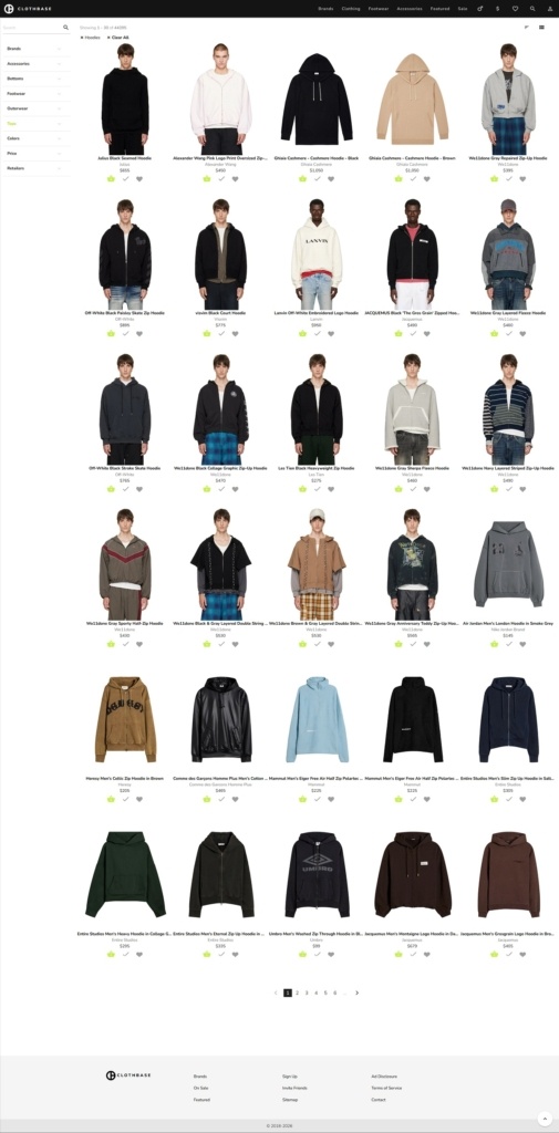
Search and category pages are built for narrowing down a very large inventory. Filters cover brands, detailed product categories, colors, price range, sale status, and participating retailers. Categories extend several levels deep, allowing shoppers to move from broad groups such as Accessories or Tops into specific types including backpacks, cardholders, hoodies, knitwear, denim, sneakers, and watches. Results can also be sorted by price, newest or oldest additions, and price changes.

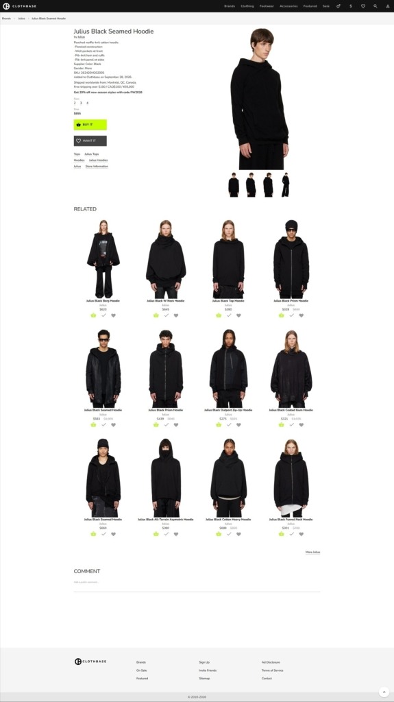
Individual product pages consolidate information sourced from the retailer, including product descriptions, materials, available sizes, SKU, pricing, shipping or return information, and the retailer responsible for fulfilling the order. A prominent “Buy It” call to action moves the shopper toward the external retailer rather than an internal Clothbase checkout.

A secondary “Want It” action supports saved-product behavior for signed-in users. Category and brand links on product pages also provide useful paths back into discovery rather than leaving each item as a dead end.

Brand Storytelling

Clothbase keeps its own brand personality relatively quiet. The homepage describes the service as a smarter way to discover luxury clothing and accessories, and most of the experience is structured around utility rather than editorial storytelling.

Instead, individual designers receive contextual treatment through dedicated brand pages. These can include information such as headquarters, founding date, a short overview of the label, and its latest products. The approach positions Clothbase closer to a searchable fashion database than a traditional digital department store.

Notable Features

One of Clothbase’s most distinctive features is the breadth of its filtering system. With millions of indexed products, filters are not supplementary controls but a central part of the interface.

Selected product pages also include price history, showing how the retailer’s original and sale prices have changed over time. This adds a comparison-oriented layer that is unusual for luxury fashion discovery sites and can help shoppers put current discounts into context.

The alphabetical brand directory offers another route through the catalog, while Featured and Sale sections provide more curated entry points for users who are browsing without a specific search in mind. Together, these features create an ecommerce experience centered on aggregation, filtering, comparison, and onward purchase rather than a conventional single-retailer conversion funnel.

Clarify the target audience and purposeReduce repetition around discovery and filtering

Clothbase Shop Category page example

Clothbase Product page example

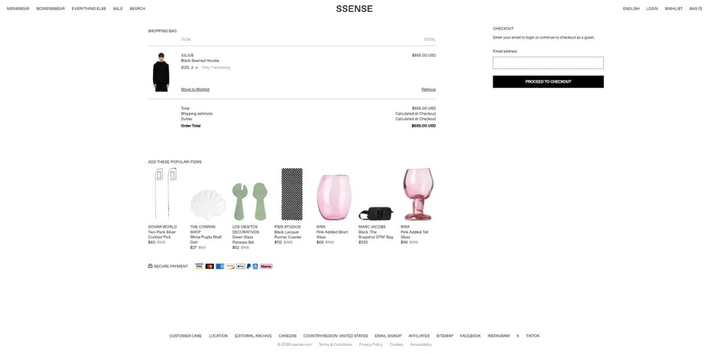
Clothbase Checkout page example

Clothbase Footer example
ActiveHop

ActiveHop is an Italian beverage brand centered on sparkling hop water designed for people who spend time outdoors, from hikers and cyclists to athletes and other active consumers. The range is deliberately compact, built around three drinks—Drop, Trail, and Rad—along with a Discovery Box containing all three flavors. Across the site, the company positions the product between functional hydration, alcohol-free refreshment, and outdoor lifestyle culture, with an emphasis on natural ingredients, zero sugar, zero calories, and reusable aluminum packaging.

Website Design

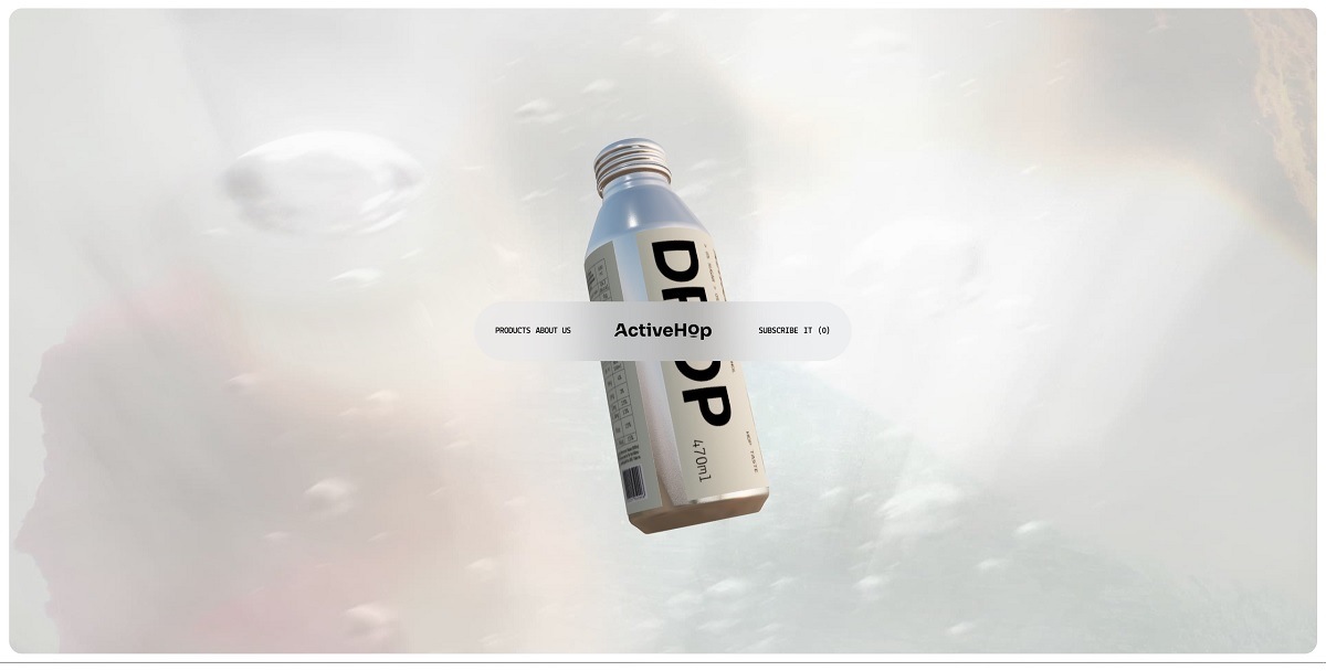
ActiveHop’s website takes a graphic, contemporary approach that sits somewhere between sports branding, outdoor editorial, and modern beverage packaging. The visual identity relies heavily on bold sans-serif typography, oversized product names, and a relatively stripped-back interface. The large DROP, TRAIL, and RAD lettering seen on the bottles carries directly into the digital experience, giving each flavor an immediate visual identity.

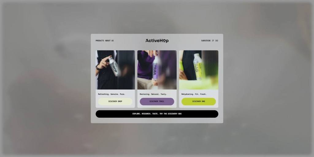
Color is used selectively rather than across the entire interface. The underlying website remains fairly neutral, while individual products introduce their own accent colors: Drop uses a predominantly pale, minimal treatment, Trail is associated with purple, and Rad with a bright yellow-green. This keeps the visual hierarchy closely connected to the packaging.

Photography plays a central role in establishing the brand world. Rather than relying exclusively on conventional studio packshots, ActiveHop places its aluminum bottles in rocky landscapes, outdoor environments, and active lifestyle settings. Cropped hands, tactile surfaces, sportswear, stone, and natural textures create a more physical art direction. The bottles often appear as objects carried and used rather than simply displayed.

The layouts use large imagery, substantial spacing, and alternating text-and-image sections. Repeated typography and product-name treatments introduce movement and rhythm without making the interface dependent on dense decorative elements.

Shopping Experience

The ecommerce architecture is unusually concise because the catalog itself is small. The primary navigation focuses on Products and About Us, with direct access to the cart and language selection. Instead of requiring shoppers to work through categories and filters, the homepage immediately introduces Drop, Trail, and Rad with short descriptors and individual “Discover” calls to action.

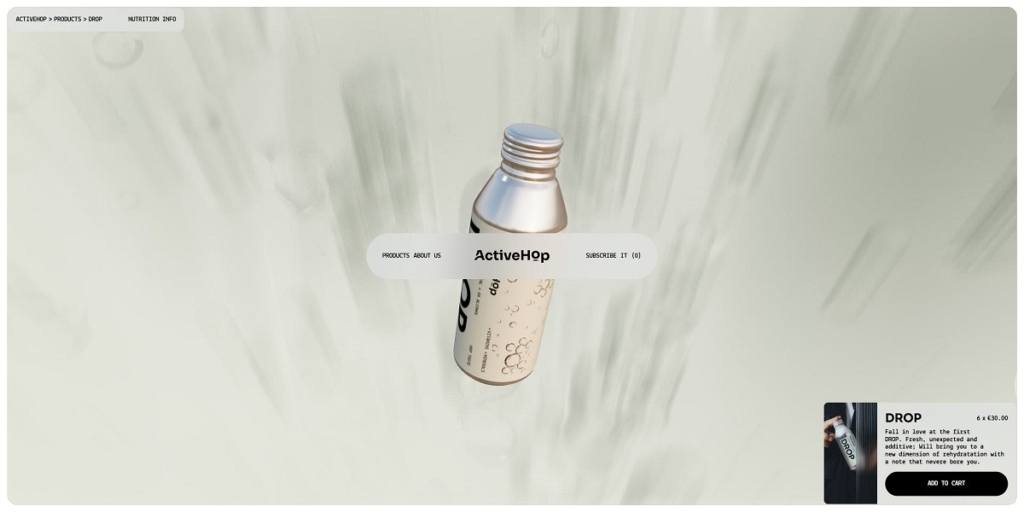
Each core flavor is sold in a six-bottle format for €30, while the Discovery Box offers three bottles—one of each flavor—for €15. This sampler becomes an important product-discovery tool for visitors who do not yet know which variation they prefer.

Product pages keep the conversion path short. The product image, name, pack quantity, price, brief flavor description, nutrition information, quantity controls, and Add to cart button are concentrated around the main purchasing area. There is little need for search, filtering, or complex variant selectors, making the experience closer to a focused direct-to-consumer landing page than a large beverage catalog.

The cart is accessible globally and includes a clear empty-cart state that directs users back into shopping. Overall, the commerce layer stays visually secondary to the brand presentation while remaining easy to reach.

Brand Storytelling

A significant portion of the homepage is devoted to explaining what distinguishes ActiveHop from standard flavored water or soft drinks. The site organizes this information around themes including flavor, “Target Zero,” hops, functional ingredients, and packaging.

Product benefits are presented through concise nutritional claims—zero alcohol, coloring, calories, and sugar—followed by more detailed sections on hop extract, vitamins, magnesium, potassium, and folic acid. The storytelling therefore combines lifestyle imagery with a more technical explanation of ingredients and functionality.

The About page describes the brand’s audience as “outdoor hedonists,” linking physical activity with enjoyment rather than adopting a purely performance-driven sports tone.

Notable Features

Packaging is given unusually prominent treatment. ActiveHop uses aluminum bottles with screw caps rather than conventional disposable cans, allowing bottles to be resealed. The site also suggests reusing an empty bottle as a water bottle or small container and emphasizes aluminum’s recyclability through its “Leave No Trace” messaging.

The Discovery Box provides a simple conversion device for first-time buyers, while a newsletter signup supports ongoing customer acquisition. With only a few products, ActiveHop avoids unnecessary ecommerce complexity and instead uses strong photography, repeated graphic motifs, and long-form product education to turn a compact storefront into a broader outdoor lifestyle experience.

ActiveHop Shop page example
ActiveHop Product page example
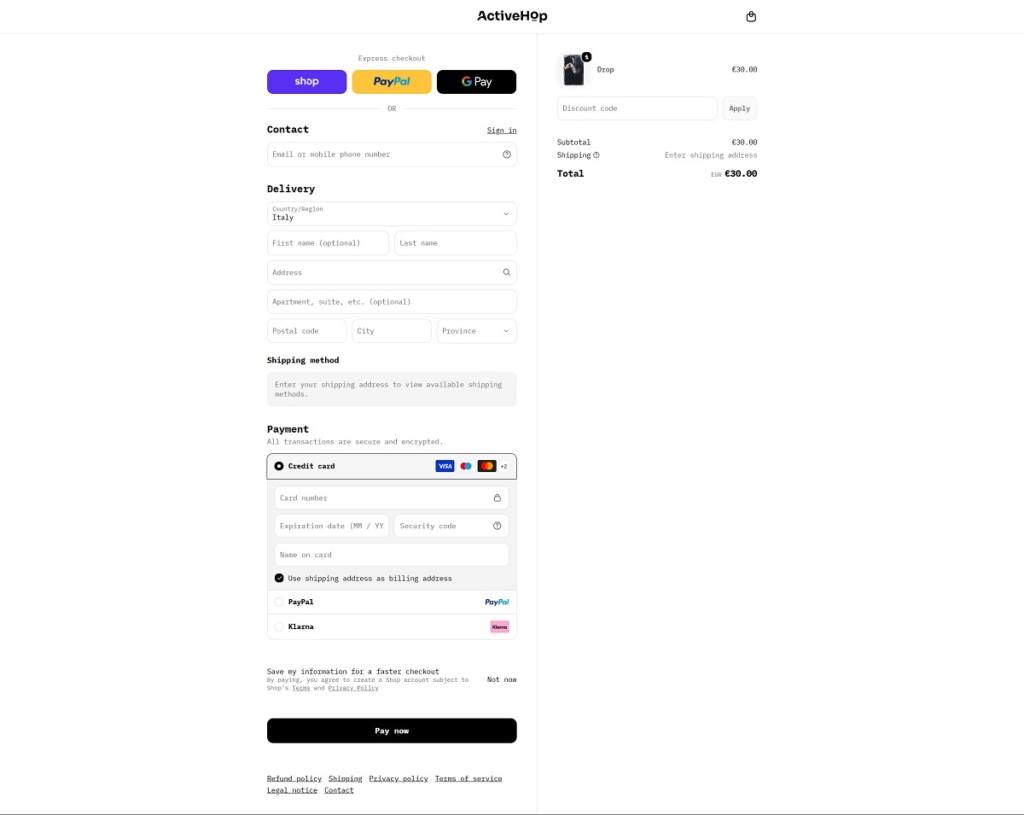
ActiveHop Checkout page example
Bloom & Wolf

Bloom & Wolf is a lifestyle and interiors brand specializing in premium silk flowers, arranged bouquets, individual stems, vases, floral sculptures, and limited-edition wall prints. The range spans relatively compact decorative pieces through to large sculptural arrangements, with options aimed at both private interiors and commercial spaces. Alongside one-off purchases, the company also offers a rotating flower subscription for businesses and tools for customers who want to compose their own bouquet.

The brand positions silk flowers less as a substitute for fresh flowers and more as permanent interior objects. Art, fashion, floral design, and sustainability all play a role in that positioning, giving the website a more editorial character than a conventional florist storefront.

Website Design

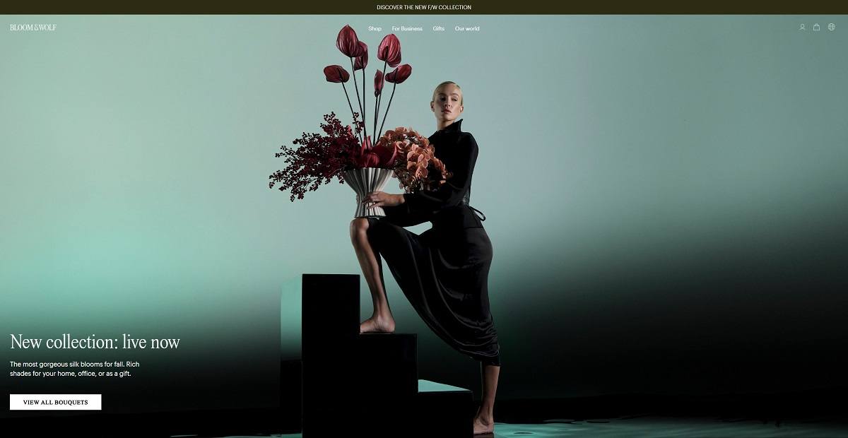
Bloom & Wolf uses a spacious, image-led layout that gives its floral photography considerable room to breathe. Large campaign images and generous blocks of whitespace create the feel of an interiors or fashion publication, while product carousels break the homepage into clearly defined shopping moments.

Typography is restrained and relatively minimal, allowing oversized photography, floral forms, and product color to provide most of the visual personality. The palette around the products remains subdued, with soft neutral backgrounds and understated interface elements rather than strong ecommerce colors. This works particularly well with the bouquets, which introduce their own reds, greens, yellows, pinks, and more muted seasonal tones.

Photography shifts between clean product presentation and more styled editorial imagery. Bouquets appear both as individual design objects and in interiors, while some campaign photography incorporates models and a more fashion-oriented art direction. Bloom & Wolf has extended this visual identity into a product category of its own by offering selected campaign photographs as limited-edition wall prints.

Spacing is consistently generous, and sections tend to focus on one idea at a time. Instead of compressing products, promotional messages, and editorial content into dense grids, the site frequently alternates between collections, full-width imagery, storytelling, and social proof.

Shopping Experience

The main navigation provides direct routes to bouquets, single flowers, vases, wall prints, the Mini Collection, gifts, business subscriptions, and the custom bouquet experience. Separate links to the mission, lookbook, stores, and company information support visitors who are exploring the brand rather than immediately shopping.

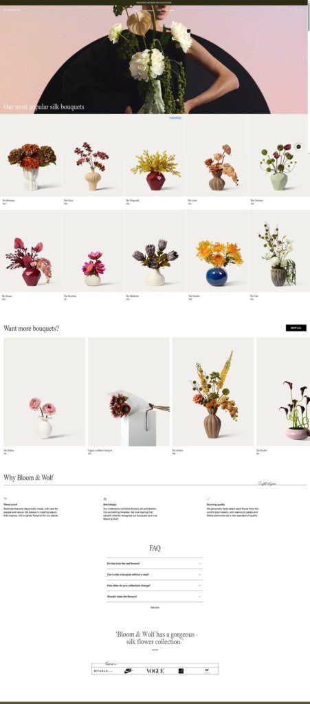
Homepage merchandising combines new arrivals and popular products with editorial collection highlights. Product cards communicate names, prices, and availability states such as low stock or temporarily sold out without overwhelming the imagery.

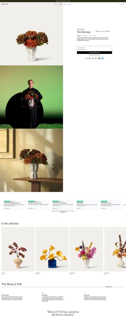
Product pages keep the primary purchasing decision relatively simple. Customers can often choose between a bouquet with its recommended vase or without it before adding the item to their shopping bag. Delivery information and free-return messaging sit close to the main call to action, reducing the distance between product evaluation and practical purchasing information.

Further down the page, dimensions, care information, FAQs, craftsmanship details, and imagery provide additional context. Out-of-stock products replace the standard purchase action with a notification signup.

Brand Storytelling

Storytelling is integrated throughout the commerce experience rather than being isolated on an About page. Bloom & Wolf repeatedly frames its products through the idea of “crafted not grown,” emphasizing longevity, reusable arrangements, pesticide-free production, and a reduced dependence on disposable fresh flowers.

Art is another recurring reference point. The brand explains that its bouquets are named after notable female artists, while collections, photography, floral symbolism, and sculptural arrangements reinforce the idea of flowers as designed objects.

The Journal expands this approach with articles about interiors, collaborations, individual flowers, company projects, and the thinking behind the collections. Case-study-style content also shows arrangements used in homes and commercial environments.

Notable Features

One of the site’s more distinctive ecommerce tools is its “Create your own bouquet” experience. Customers select individual flowers, filter them by color, and combine up to ten stems before generating an AI-created visual preview of the arrangement. The preview is presented as inspiration rather than an exact representation; customers receive the individual silk stems and arrange the final bouquet themselves.

Bloom & Wolf also supports business customers through a subscription model with different bouquet sizes and rotation frequencies. For larger decorative requirements, floral sculptures extend the range beyond traditional vase arrangements, including custom work.

Together, these elements make the site feel part ecommerce store, part interiors editorial and part digital floral studio, with a shopping experience designed around visual exploration rather than high-density product browsing.

Bloom & Wolf Shop Category Page Example
Bloom & Wolf Product Page Example
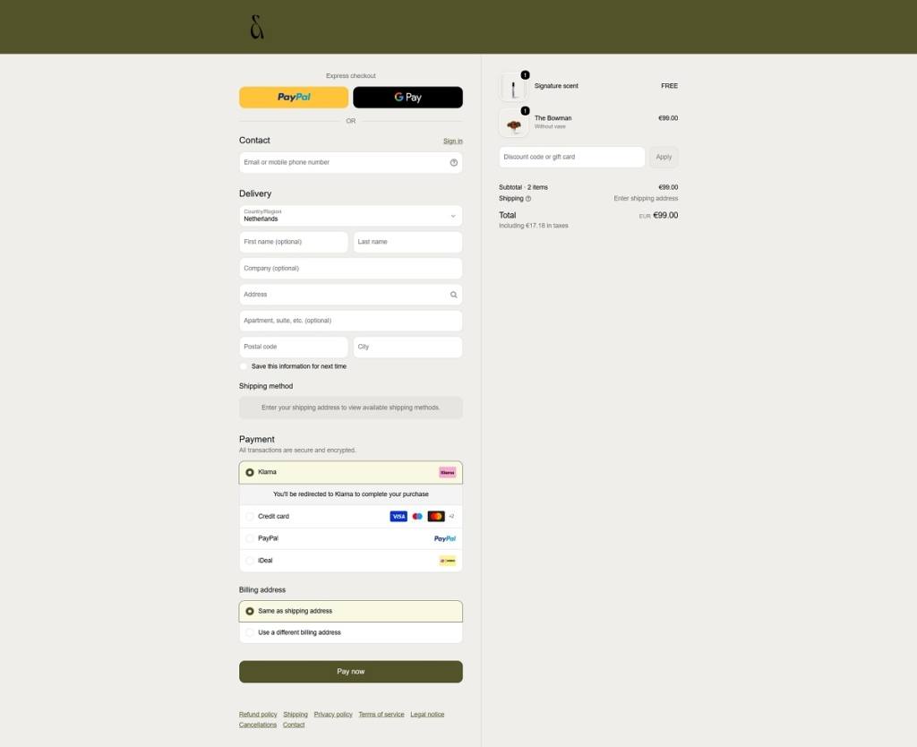
Bloom & Wolf Checkout Page Example
Bloom & Wolf Footer Example
Gielly Green

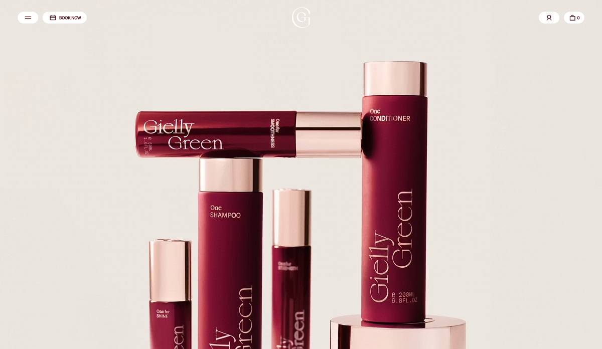
Gielly Green is a London hair salon group with its own haircare line, running a flagship on George Street in Marylebone and a second site at the Four Seasons Hotel at Tower Bridge. The store sells The One System, covering shampoo, conditioner and mask plus targeted treatments for scalps, strength, smoothness and shine, alongside salon booking and gift cards. The positioning is stated directly: the brand “combines the luxury of bespoke beauty and the innovation of breakthrough science”. Built on Shopify with a custom front end.
Website Design

A burgundy and blush system. The palette runs a burgundy scale from near-black to mid oxblood, offset by three blush tones and a warm off-white. Colour arrives in full-bleed blocks rather than accents, so pages alternate between deep burgundy panels and pale product grounds.

Serif display, mono detail. Type pairs Sagittaire, a high-contrast serif, for headings with GT America for body copy and GT America Mono for eyebrow labels and metadata. The mono is set small and upper case, giving captions a clinical quality against the softer serif.

Photography as art direction. Bottles are shot as objects on plain grounds, then reappear in styled still lifes with saffron threads and a gold spoon. Layouts are two-column and heavily spaced, and several sections split the screen between a flat colour field and one photograph.

Shopping Experience

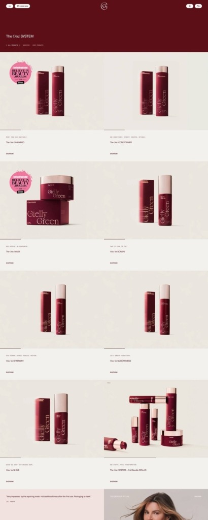
A short, deliberate catalogue. The One System holds eight items in a two-column grid with generous whitespace. Each card carries a line of eyebrow copy, the product name and a Shop now link.

No prices on the grid. Collection cards omit price entirely, pushing that decision to the product page. It suits a small luxury range but removes at-a-glance comparison.

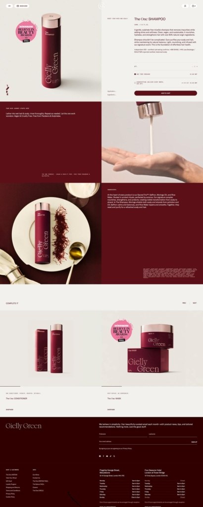
Split-screen product pages. Imagery sits on burgundy to the left, detail to the right, with quantity, a purchase-type choice and an Add to cart button. An Ingredients accordion sits beneath, and alternating panels below cover how to use the product and its formulation claims.

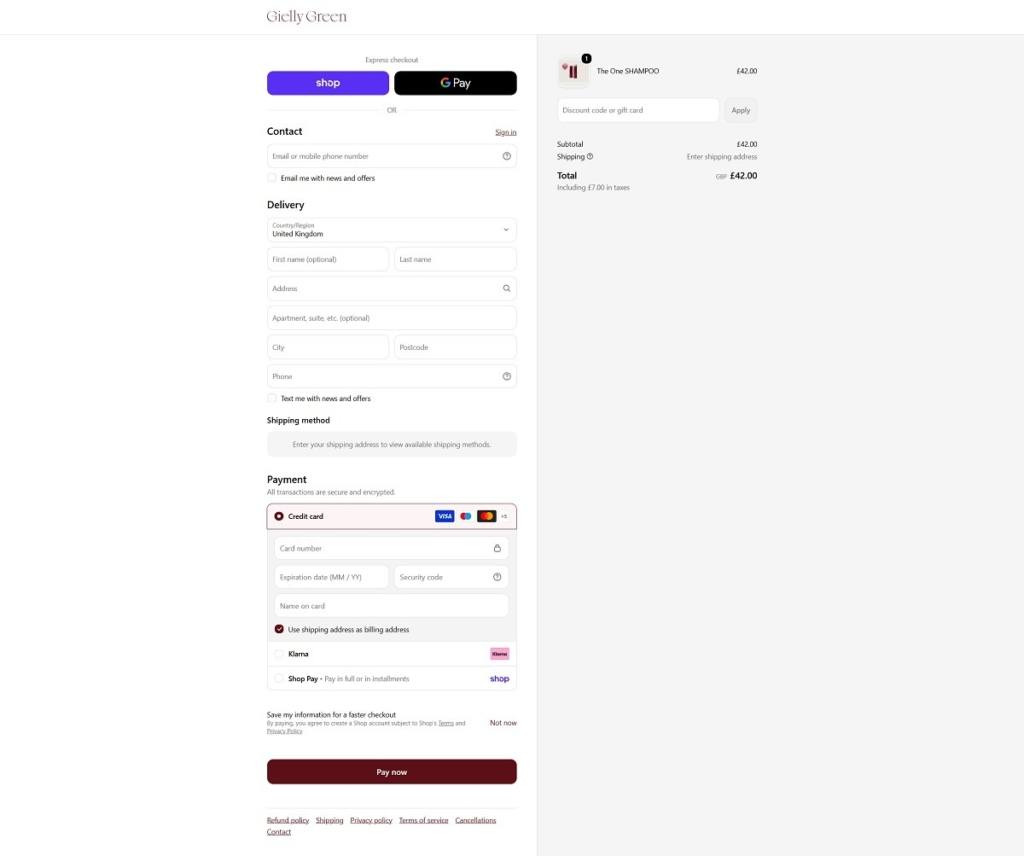
Brand-coloured Shopify checkout. Express options include Shop Pay and Google Pay, with Klarna and card payment below. The summary states tax within the total, and the Pay now button carries the brand burgundy.

Brand Storytelling

One idea, repeated. The naming does the work: The One Shampoo, The One Mask, One for Scalps, The One Head Spa, The One Quiz and The One Circle loyalty programme all resolve to the same word.

Ingredients as the proof point. A dedicated panel introduces the Sacred Trio of saffron, moringa oil and rice water, with vegan, cruelty free and free from parabens and sulphates stated separately.

Notable Features

Subscription in the buy box. Shoppers choose a one-time purchase or a monthly delivery at the point of adding to cart, rather than through a separate flow.

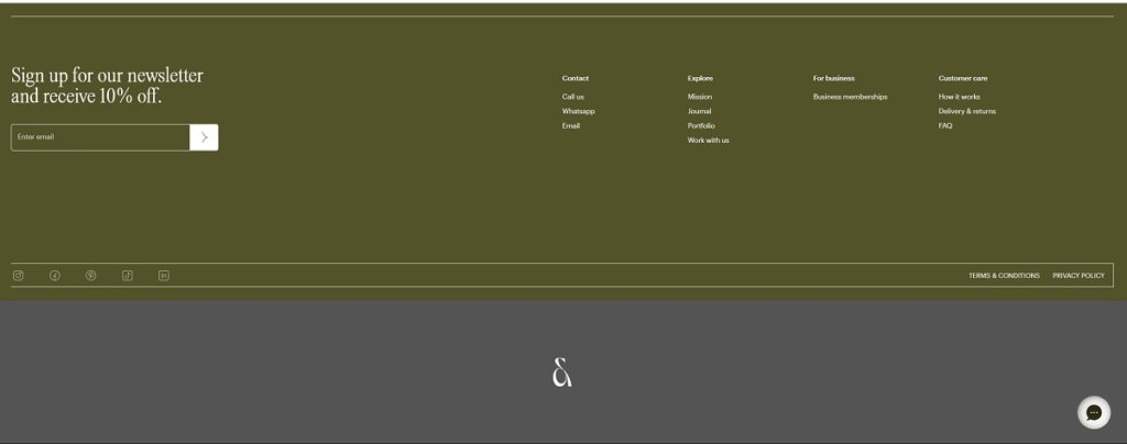
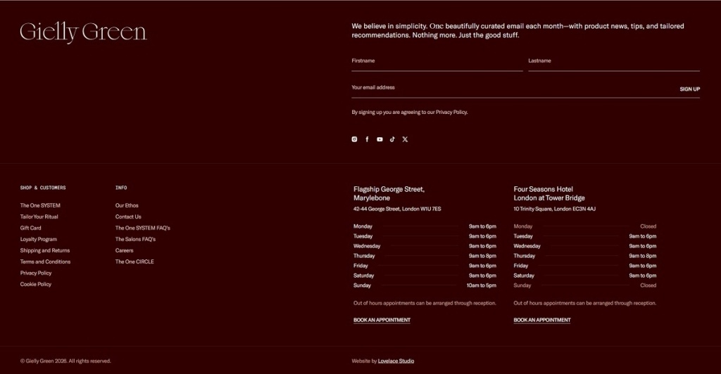
Salon and shop in one footer. Both addresses appear with full opening hours and booking links alongside the shop columns, so appointments and product sales are served from the same page.

Quiz, loyalty and bundling. A product quiz and The One Circle loyalty programme are promoted on the homepage, and the full range is offered as a bundle at 10% off.

Gielly Green Shop Page Example

Gielly Green Product Page Example

Gielly Green Checkout Page Example

Gielly Green Footer Example

Elev8 H2O

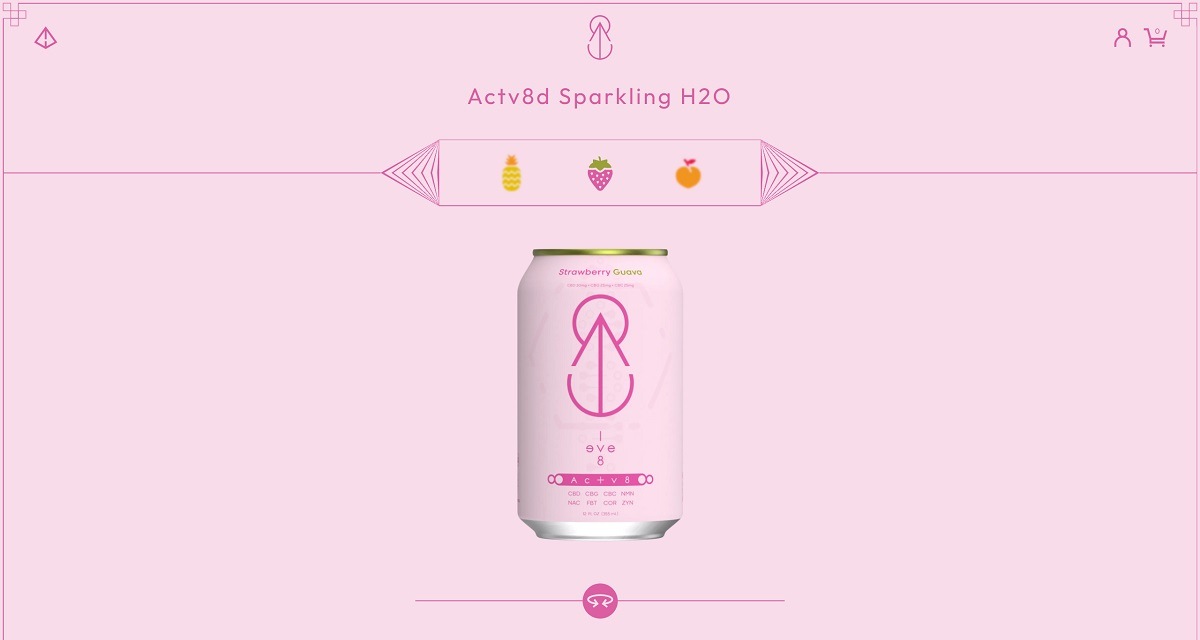
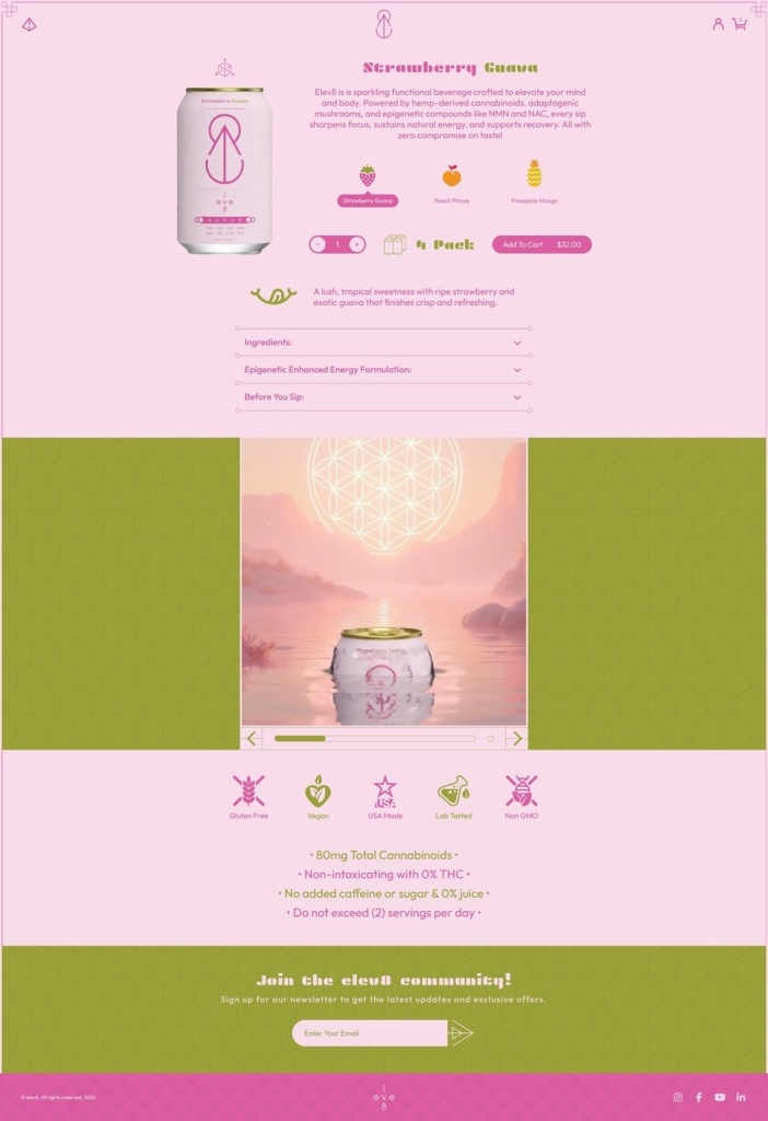
Elev8 H2O’s website uses a simple ecommerce design with minimal navigation, product-focused sections, cart/search controls, and direct “Buy Now” calls to action. The business sells Actv8d Sparkling H2O, a functional sparkling water product featuring NMN and non-intoxicating cannabinoids with 0% THC. The brand is positioned around wellness, cellular energy, recovery, and performance-focused hydration.

Elev8 H2O Product Page Example

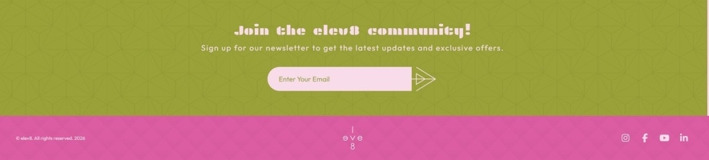
Elev8 H2O Footer Example

Reale Actives

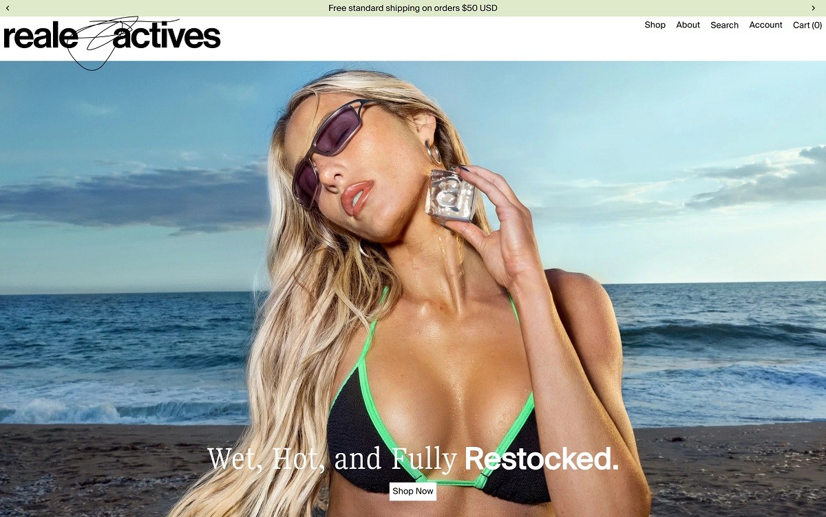
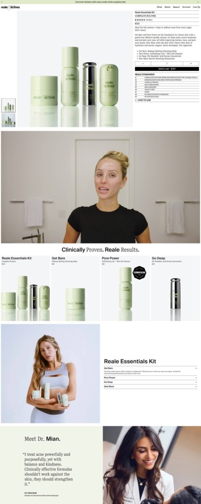
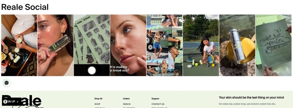
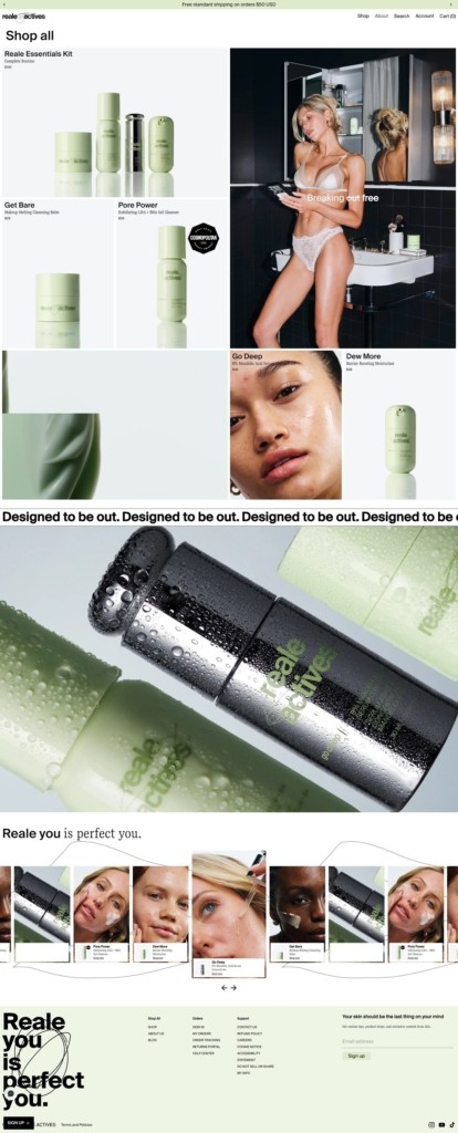
Reale Actives’ website uses a bold, social-first skincare ecommerce design with product cards, before-and-after imagery, testimonials, ingredient education, and strong founder/influencer-led messaging around Alix Earle. The business sells acne- and blemish-focused skincare products, including a cleansing balm, exfoliating gel cleanser, mandelic acid serum, barrier moisturizer, and complete routine kit. The brand is positioned around clinically proven active ingredients, simple routines, and confidence-focused “real results” for everyday skin concerns.

Reale Actives Shop Page Example

Reale Actives Product Page Example

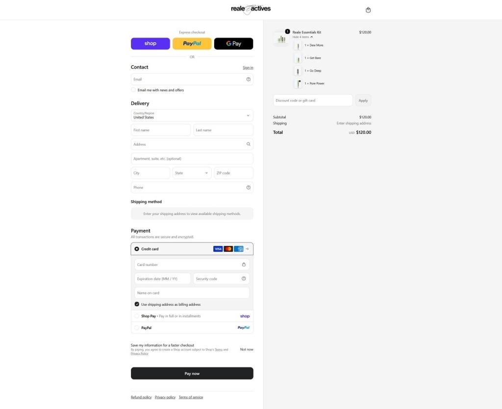
Reale Actives Checkout Page Example

Reale Actives Footer Example

Polestar

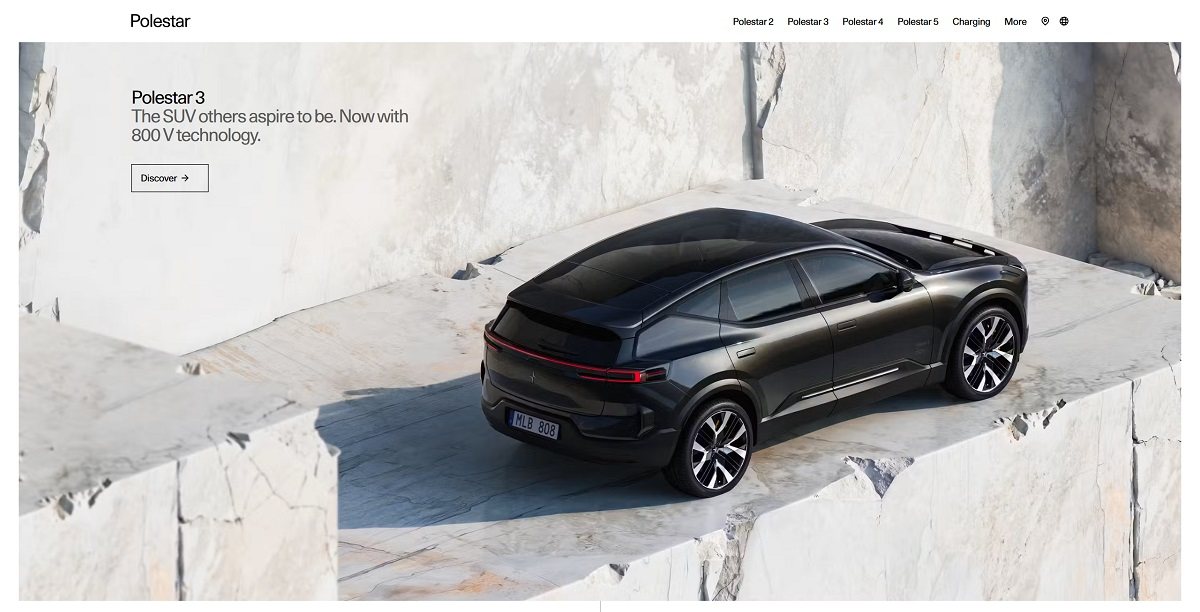
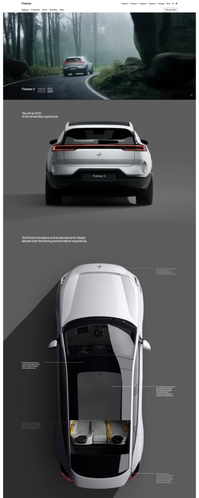
Polestar’s website uses a premium, minimalist automotive design with large vehicle imagery, clean navigation, model pages, configurators, test-drive prompts, offers, and ownership tools. The business sells electric vehicles, including Polestar 2, Polestar 3, Polestar 4, pre-owned cars, accessories, financing, fleet services, and charging/ownership support. The brand is positioned around Scandinavian design, performance EVs, sustainability transparency, and a direct digital shopping experience.

Polestar Product Page Example

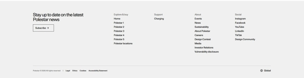
Polestar Footer Example

CoType Foundry

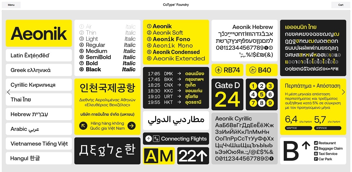
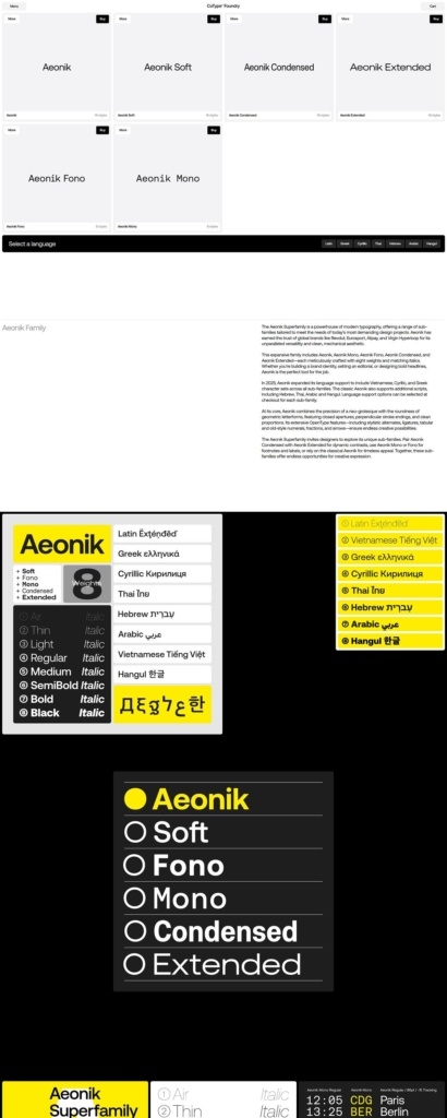
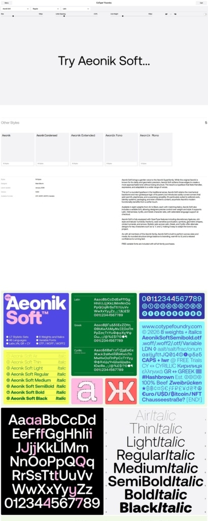
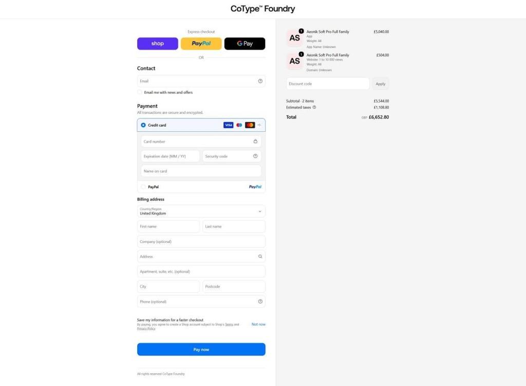
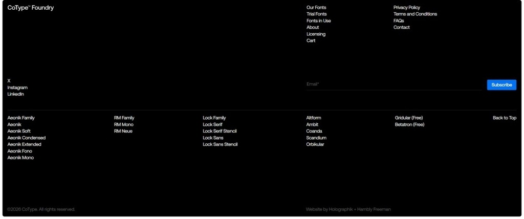
CoType Foundry’s website uses a clean, typography-led ecommerce design with large type specimens, minimal navigation, font family listings, licensing links, and “fonts in use” case examples. The business sells digital typefaces and font families, including Aeonik, RM, Lock, Altform, Ambit, Coanda, Scandium, and free experimental fonts. The brand is positioned as a modern type foundry for designers, agencies, and brands needing professional font licensing.

CoType Foundry Shop Page Example

CoType Foundry Product Page Example

CoType Foundry Checkout Page Example

CoType Foundry Footer Example

Agronomy Workshop

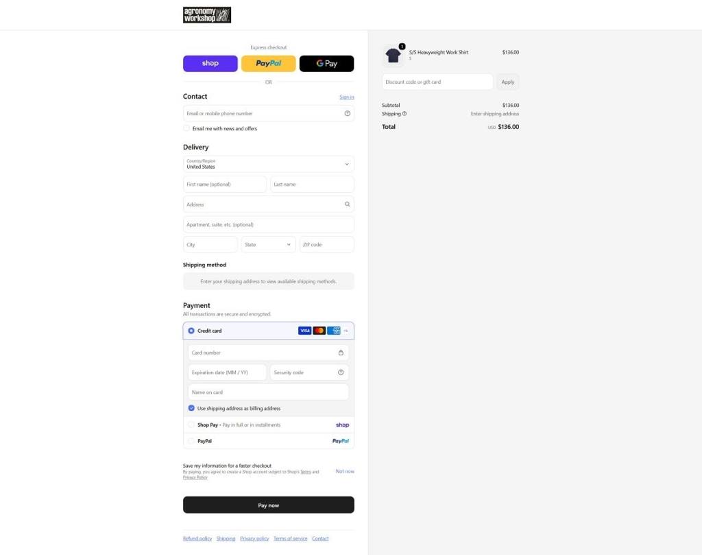
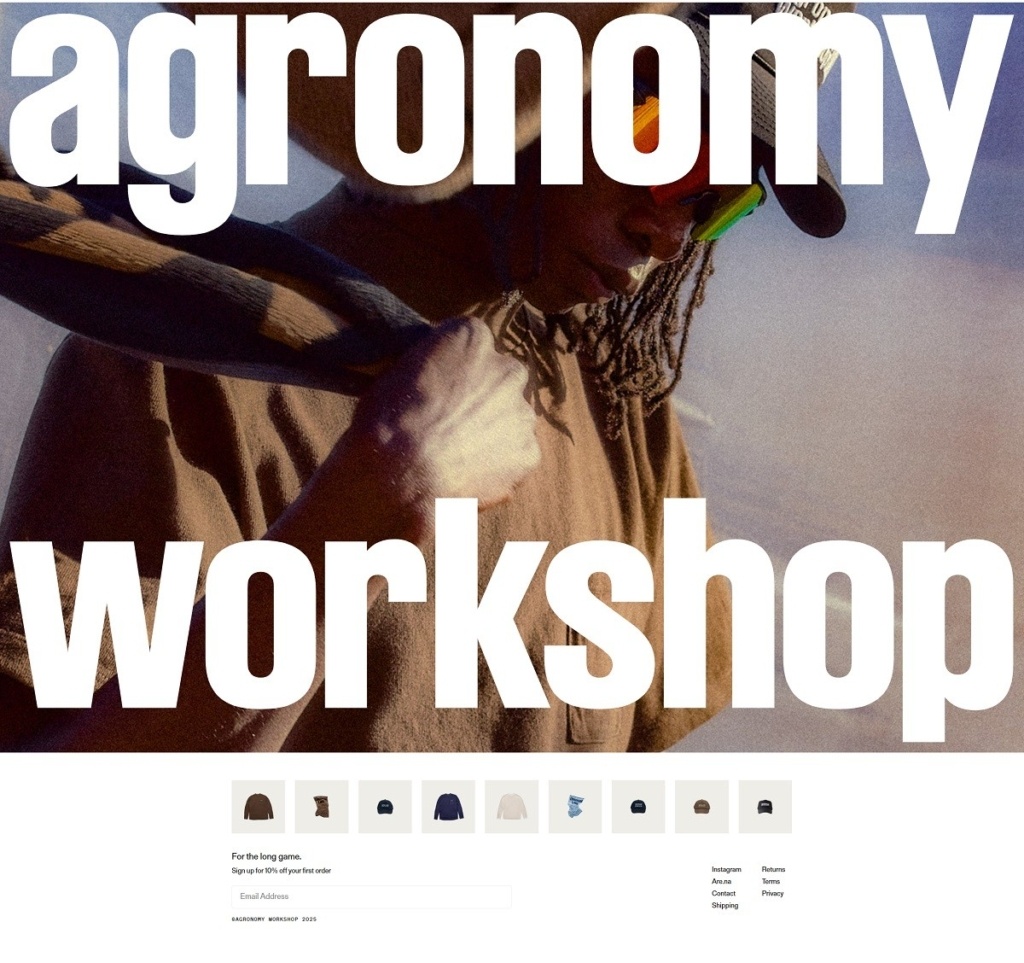
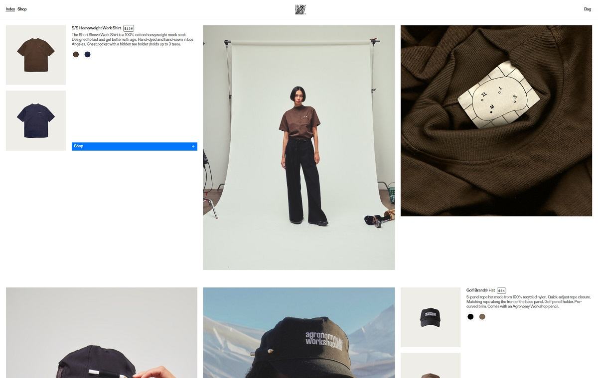
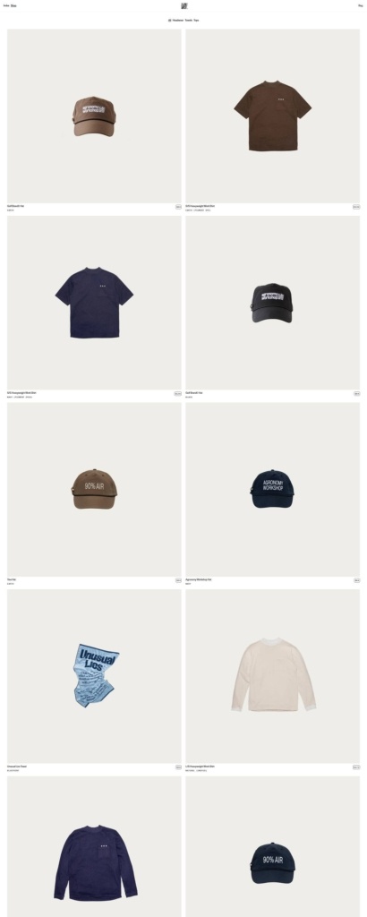
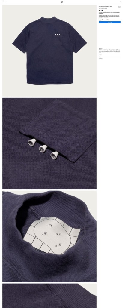
Agronomy Workshop’s website uses a minimal, editorial ecommerce design with large product imagery, sparse navigation, and thoughtful copy around golf apparel design. The business sells golf-inspired clothing and accessories, including heavyweight cotton work shirts, 5-panel rope hats, and golf towels. The brand is positioned around durable, subtle, natural-material golf products made as an alternative to synthetic, fast-fashion golf apparel.

Shop Category Page Example

Product Page Example

Checkout Page Example

Footer Example

Seilin

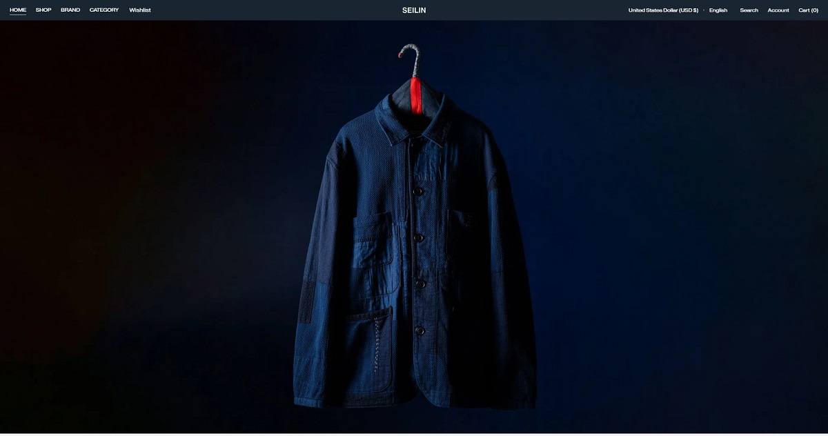
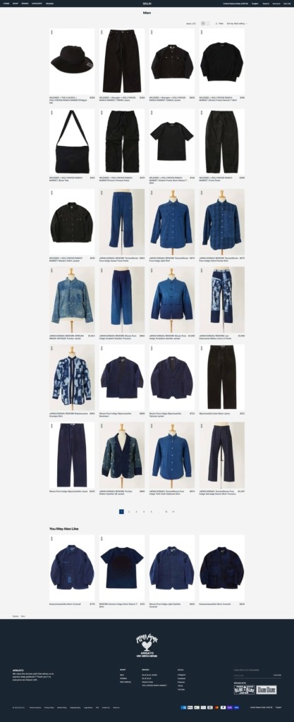
Seilin’s website uses a clean, boutique fashion ecommerce design with structured navigation by brand, gender, and category, plus a restrained visual style centered on Japanese craft and casualwear. The products focus on made-in-Japan apparel and accessories from brands such as BLUE BLUE JAPAN, BLUE BLUE, Stretch Fraise, and Hollywood Ranch Market.

Seilin Shop Category Page Example

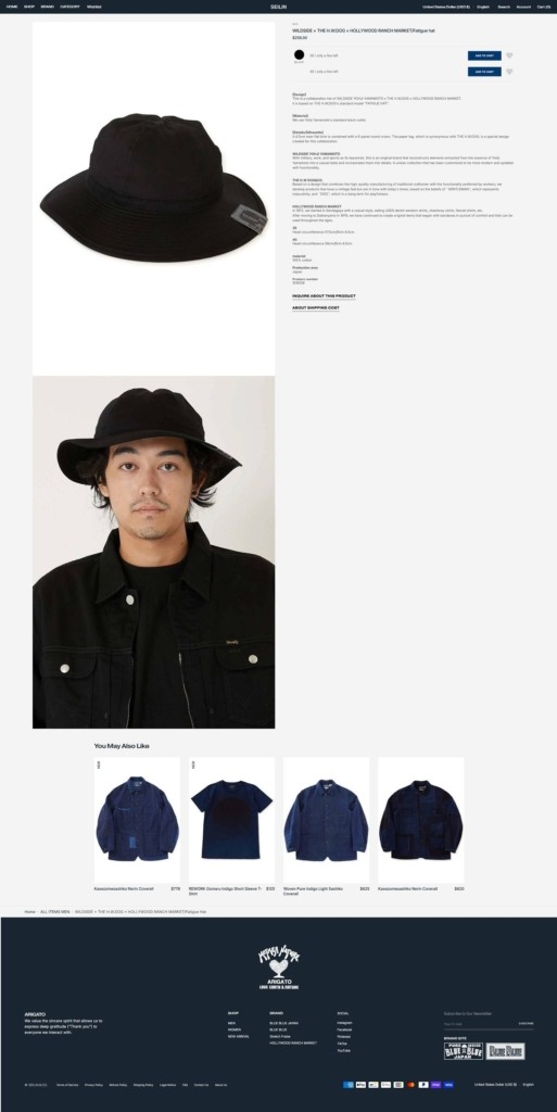
Seilin Product Page Example

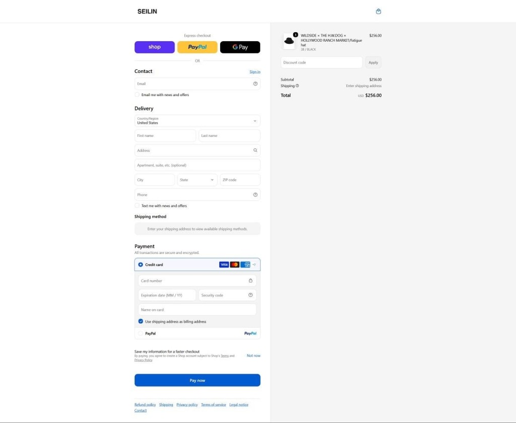
Seilin Checkout Page Example

Seilin Footer Example

Notom

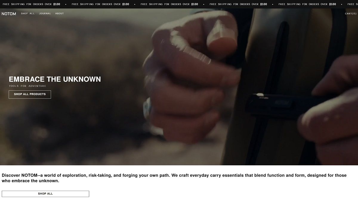
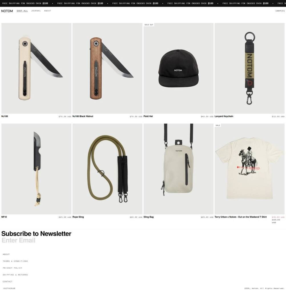
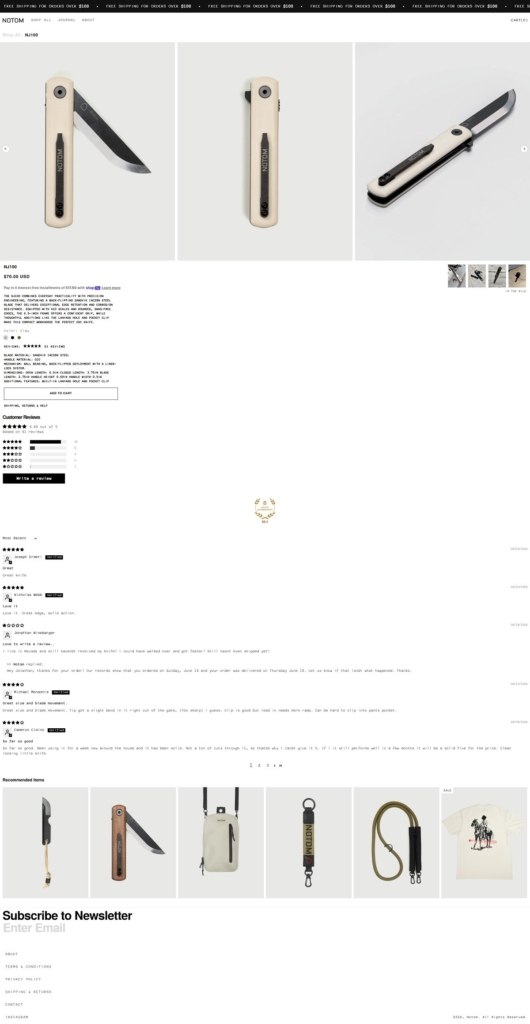
NOTOM’s website uses a stark, adventure-led ecommerce design with bold monochrome visuals, minimal navigation, product photography, and messaging around “everyday carry” tools. The products focus on functional carry essentials, including the NJ100 folding knife, sling bag, and NF10. The brand positions its products around utility, dependable materials, considered design, and exploration.

Notom Shop Page Example

Notom Product Page Example

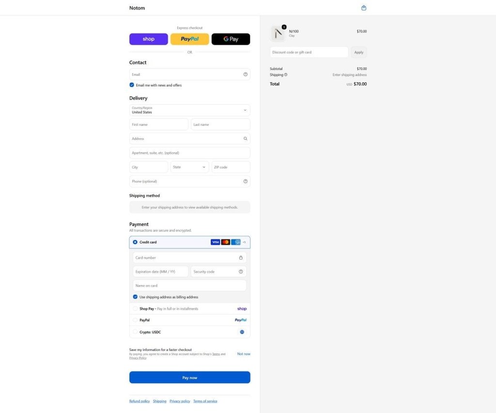
Notom Checkout Page Example

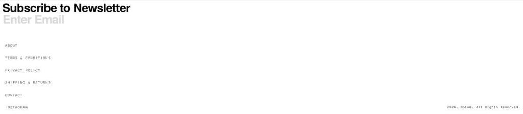
Notom Footer Example