Archives: Websites

eCommerce Websites

Swoon Editions

Swoon is a British furniture retailer selling direct to consumer in pounds, covering sofas, chairs, beds, tables, storage, lighting and accessories. The catalogue is organised as much by style as by room, with Mid-century, Scandi, Art deco, Industrial and Contemporary sitting alongside Living Room and Bedroom. The store runs on Magento Enterprise with a headless React front end built on Magento PWA Studio.

Website Design

Navy with a named accent set. The core colour is a deep navy, extended into light, medium and shade steps, and the accents are named rather than numbered: antique brass, salmon, honey, coral, ash grey and a warm off-white called spring wood. The neutral ramp adds a dozen further steps, from liquorice and anthracite to platinum and aluminium.

One typeface, three weights. JuliSans carries the entire site in Light, Regular and Medium over a Helvetica and Arial fallback. There is no serif and no display face, so hierarchy comes from size and weight alone.

An app shell rather than pages. The front end loads as a single JavaScript application with a minicart and drawer navigation, so category and product views swap in without a full page load.

Shopping Experience

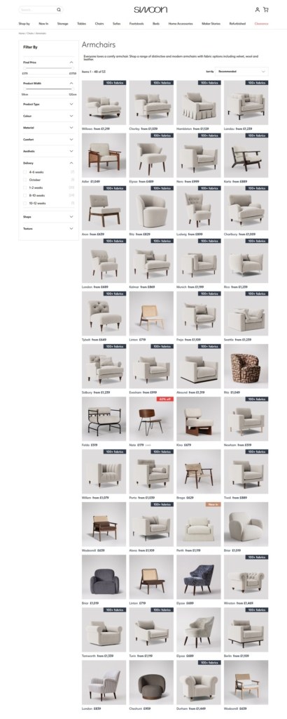
Depth over curation. The default category holds 4,865 products, including 1,043 sofas, 485 storage pieces, 475 tables, 459 chairs and 457 bedroom items. Clearance alone runs to 2,368 lines.

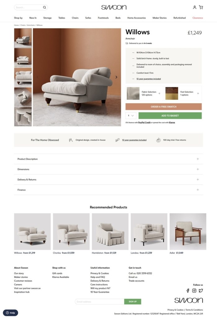
Fabric chosen as a swatch, not a dropdown. Upholstery is a configurable option with labels that name the weave, the colour and its family, for example “Easy Velvet | Bordeaux | Pinks & Purples” or “Smart Wool | Porcelain | Warm Neutrals”, and a separate Swatches section lets shoppers order samples first.

Speed as a merchandising axis. A Speedy Designs category of 1,661 products sits beside the made to order ranges, so lead time becomes a way to shop rather than a footnote at checkout.

Prices stated on the grid. Homepage cards show the figure directly, such as £329 for Penfold, £729 for Noah and £1,019 for Sandon, with configurable pieces marked “As low as” and a from price like £2,099.

Brand Storytelling

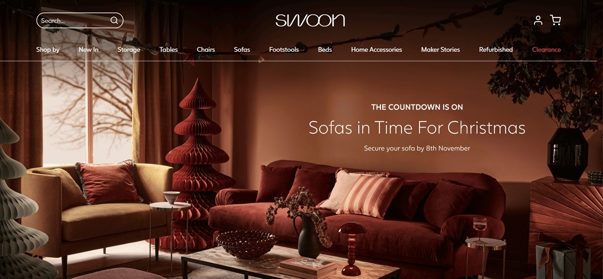
A promise in one line. The homepage opens with “Designed for the home obsessed. Made to keep forever.”, and the store positions itself on making rather than discounting.

Copy written in the first person. Product descriptions argue for the piece in the brand’s own voice. The Nygard sofa page opens “We think the Nygard sofa is your ‘One’. Why? Because we spent 14 gruelling months getting it just right”, then works through the cushion domes, the arm wadding and the spring and foam mix.

Notable Features

A 100 day home trial. The trial and a 10 year guarantee are stated as homepage pillars, with free returns inside the trial window.

Klarna at the payment layer. The Klarna web SDK loads on every page, placing instalment messaging alongside the standard card path.

Address lookup at checkout. A postcode lookup service loads site wide to complete UK addresses from a partial entry.

Live chat on every page. A Zendesk support widget loads across the storefront, so the help route sits in the same layer as the basket rather than behind a contact form.

Swoon Editions Shop Category page example
Swoon Editions Product page example
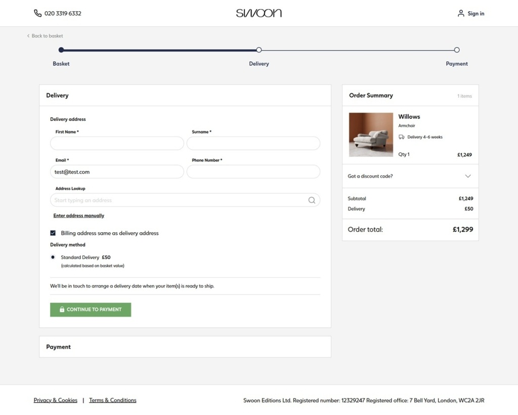
Swoon Editions Checkout page example
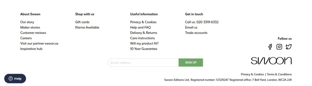
Swoon Editions footer example
Greats

GREATS sells premium leather sneakers, loafers and slip-ons for men, with women’s sizing available, positioned around “Premium materials. Timeless design. Everyday comfort.” Navigation splits by style, material (leather, suede, Polartec, vegan leather) and color, alongside an accessories range of laces, socks and shoe care. Built on Shopify.

Website Design

A near-black and white system. Buttons, headlines and structural text run on a near-black close to #141415 against white and off-white panels, with mid grey used only for supporting copy. There is no accent color; contrast alone carries the hierarchy, and the same near-black repeats across buttons, borders and hover states rather than introducing a second tone.

A condensed display face over a workhorse body font. Headlines use a heavy, condensed style close to Archivo Black and HelveticaNeue-CondensedBlack, while running copy sits in Helvetica Neue. The pairing gives headlines a poster-like weight against plain body text.

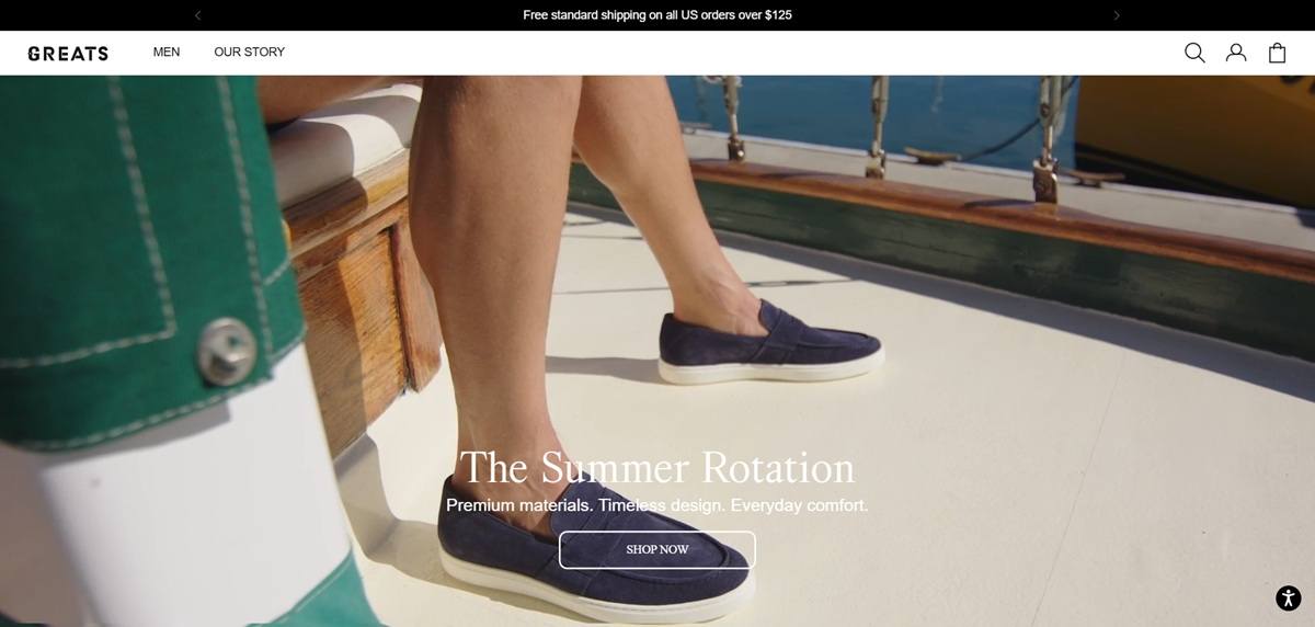
Campaign-led hero, restock strip beneath. The homepage opens on a seasonal campaign, “The Summer Rotation” at the time of research, then moves into a “Just Restocked” section before featured collections, so returning shoppers see availability news ahead of the catalogue.

Shopping Experience

Filters run three ways. Style, material and color each get their own filter group on the men’s landing page, letting shoppers narrow by construction as easily as by look.

A stated free shipping threshold. A banner across the top states free standard shipping on US orders over 125 dollars, set above the main navigation rather than inside cart or checkout only.

Zoom and gallery tools on product pages. Product imagery uses a magnifying zoom plugin and a lightbox gallery, letting shoppers inspect leather grain and stitching detail beyond a standard product photo set.

Reviews sit directly under the buy box. Star ratings and written reviews load in a dedicated page section rather than a separate tab, keeping social proof visible without an extra click while a shopper is deciding on size or color.

Brand Storytelling

Origin story as a tagline. “Born in Brooklyn” is used as shorthand brand heritage, tying the product to a specific place rather than a generic craft narrative.

Everyday framing over performance claims. Positioning stays on comfort and material quality for daily wear, with lifestyle use cases named directly: travel, weddings and casual wear, rather than technical performance specifications.

Notable Features

A referral program in the footer. Alongside standard return and FAQ links, a referral program link sits in the footer, incentivizing existing customers to bring in new ones.

A detailed size guide. The footer links to a size guide with specific measurements rather than a generic sizing chart, useful for a leather goods category where fit varies by material.

Accessibility statement given its own footer link. Alongside privacy and data-request pages, an accessibility statement is listed separately, a less common inclusion among direct-to-consumer footwear sites.

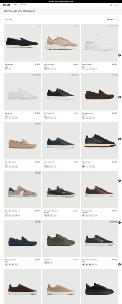
Greats Shop Category page example

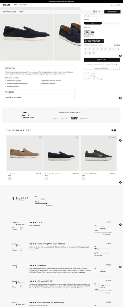
Greats Product page example

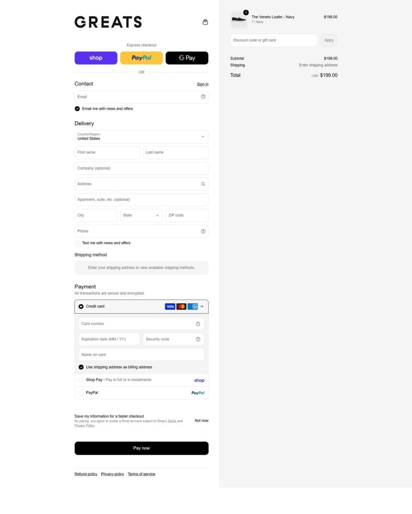
Greats Checkout page example

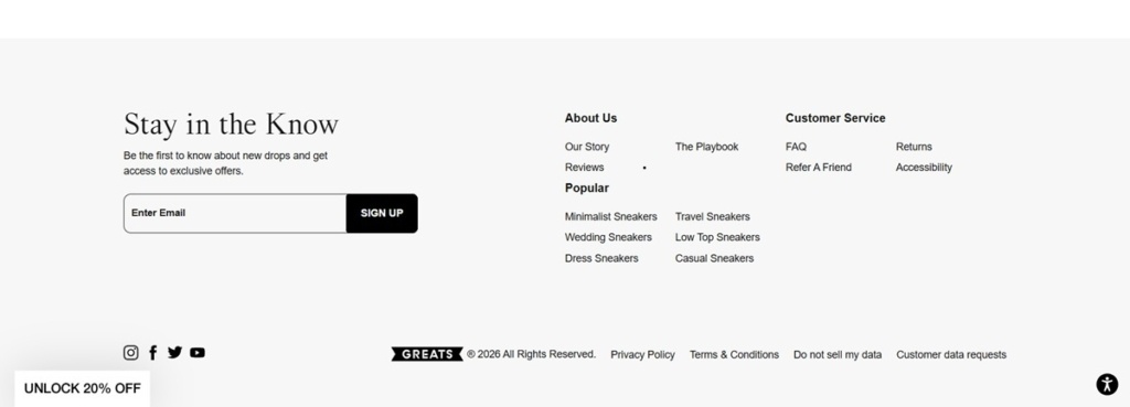
Greats footer example

Finery London

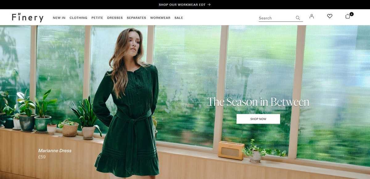
Finery London is a British womenswear label trading as LFG Ltd, selling dresses, tops, skirts, trousers, knitwear, jumpsuits and outerwear to UK shoppers. Prices top out at £200 on dresses, and the sale section is merchandised by price band, with rails such as Dresses under £30. Workwear and occasion dressing get their own navigation, and every style comes in Regular and Petite lengths. Built on Shopify using a theme derived from Dawn.

Website Design

Monochrome with no brand colour. The theme defines five colour schemes and none introduces a hue: white, pale grey, near black, dark navy and a warm stone. Buttons, links and badges resolve to the same near black, so the garments carry the only colour on the page.

System typography throughout. Heading and body families both resolve to Helvetica, Arial, sans-serif. No webfont is loaded, leaving weight and spacing to do the hierarchy work.

Mega menus built from product shots. Each top-level menu opens into a wide panel of link columns plus three named product images, so browsing Dresses or Workwear shows actual stock rather than category art.

Shopping Experience

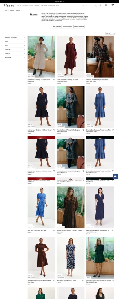
Filtering is the strongest part. The Dresses collection holds 200 products, with facets for category, price, size, colour, length, neckline and availability. Size runs UK 8 to 26 with separate R and P counts, and colour lists nineteen options.

Sale is sorted by size and budget. The Sale menu adds Shop By Sizes across UK 8 to 24 and Shop By Prices, a direct way to cut a markdown rail.

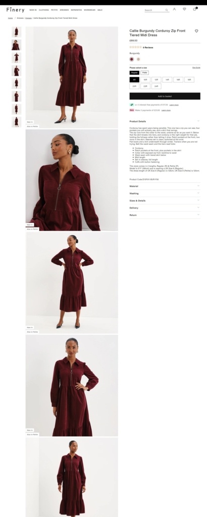
Product pages stack accordions. A £69 dress shows Regular and Petite variants in one size selector, a size guide with bust, waist, hip and inside leg tables, then Product Details, Material, Washing, Delivery and Return panels. Split payment is offered as four instalments of £17.25 or three of £23.00.

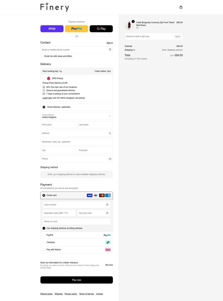
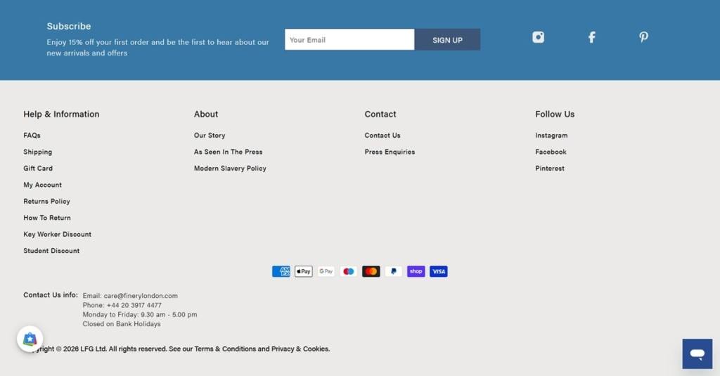
Costs stated before checkout. Delivery is quoted up front at £3.95 standard or £5.95 next working day, and the cart drawer carries a subtotal with View Bag and Checkout. Payment marks cover Apple Pay, Google Pay, Shop Pay, PayPal and the major cards.

Brand Storytelling

The copy lives in the product, not an about page. The About Us page renders as a heading with no body text; the product descriptions carry the voice: “Corduroy has spent years being sensible. This one has a zip you can see, four pockets you will actually use, and a skirt that swings.”

Every style has a first name. Callie, Veronica, Marianne, Mavis and Imani run through the grids, which keeps the colourways of one shape legible as a set.

Seasonal edits do the merchandising. Velvet Edit, Corduroy Edit, Autumn Edit, Floral Edit and Monochrome Edit sit alongside the permanent categories in the same menu.

Notable Features

Petite treated as a size, not a sub-brand. R and P variants share one selector and the page quotes measured lengths for both, 128cm at UK 8 Regular against 120cm Petite.

Wishlist gated behind an account. Saving a favourite prompts a sign-in or registration step rather than storing it locally.

Discount schemes in the footer. Key Worker Discount and Student Discount sit beside the newsletter offer of 15% off a first order.

Finery London Shop Category page example

Finery London Product page example

Finery London Checkout page example

Finery London footer example