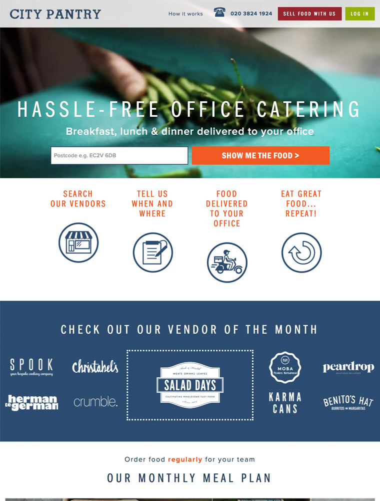
Easily order catering from London’s best independent food vendors. Make breakfasts, lunches, meetings and events more interesting & hassle free.

eCommerce Websites

Easily order catering from London’s best independent food vendors. Make breakfasts, lunches, meetings and events more interesting & hassle free.
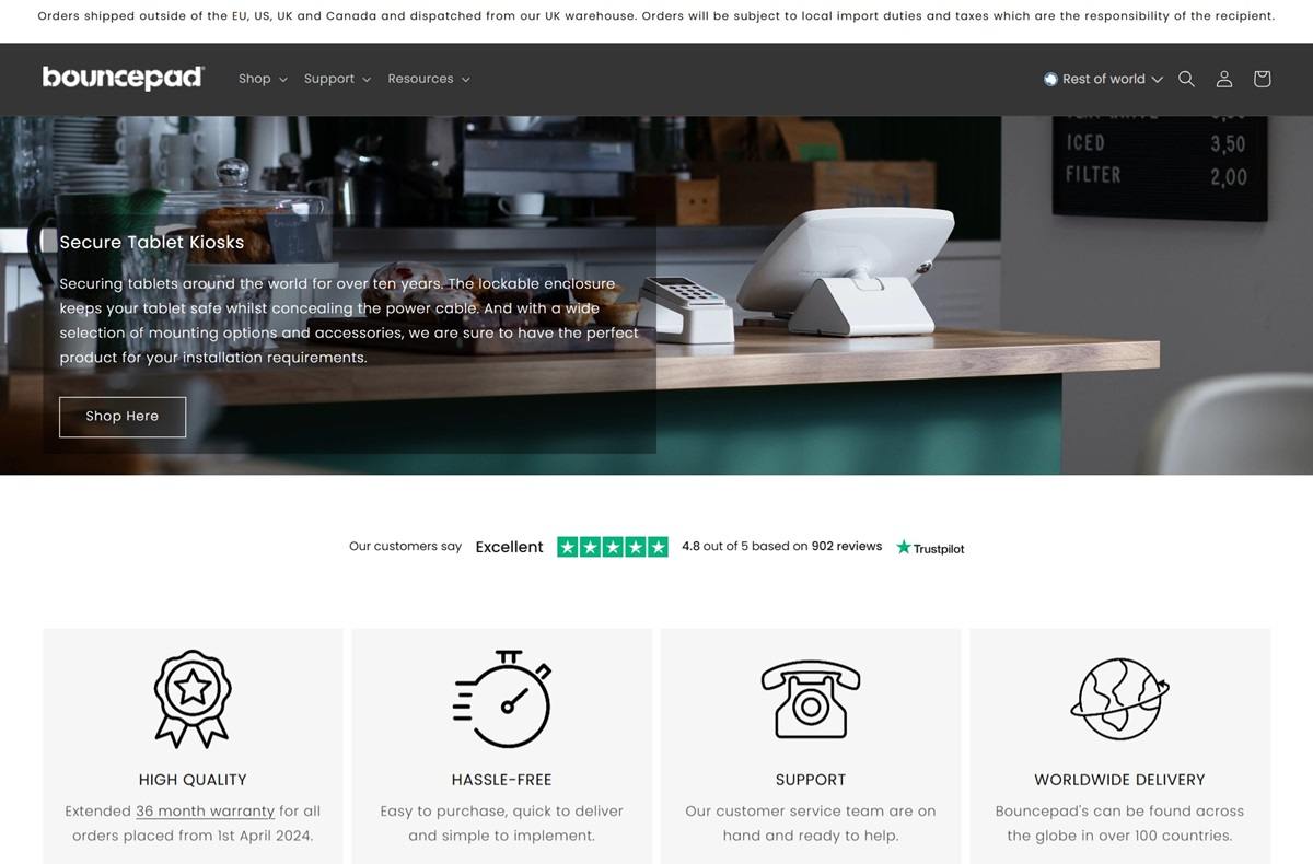
Bouncepad designs secure tablet and iPad kiosks, stands, and mounts compatible with various devices, including iPad, Samsung, and Microsoft tablets. Their website features a clean, intuitive design, showcasing products with high-quality imagery and detailed descriptions, providing an engaging and user-friendly shopping experience.
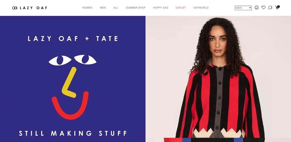
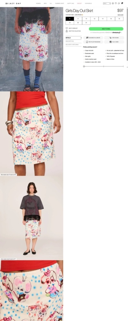
Lazy Oaf is a London independent streetwear label, founded in 2001, selling playful, illustration-heavy menswear and womenswear including skirts, shorts, dresses, t-shirts and jackets, alongside seasonal brand collaborations, on a Shopify storefront. Pricing shown on site runs in the low hundreds, such as a Girls Day Out Skirt at $97.
A wide-tracked wordmark. The “LAZY OAF” logotype sits centered at the top of every page in widely letter-spaced capitals, set in the Helvetica Neue family named in the site’s stylesheet.
Mostly black and white, with one coral accent. The shop, product and checkout pages read as black text on white, with a single coral-pink named in the CSS close to #F45866 used sparingly for tags such as a low-stock label.
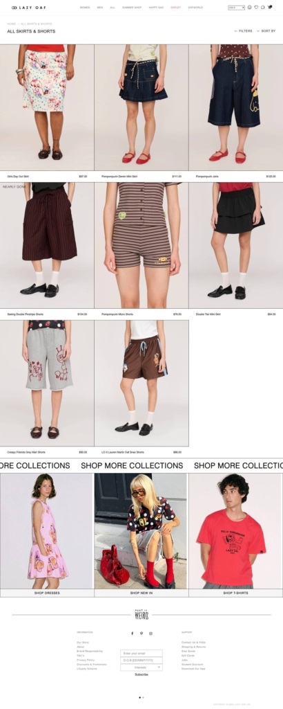
Cropped, plain-ground product shots. Category grid photography crops models at the neck against a flat grey backdrop, while the product page switches to full-body studio shots against a plain wall for the same garment.
A three-column grid with stock flags. The All Skirts & Shorts page lists items three across, with a red “Nearly Gone” tag on select pieces and the price sitting under each product name.
A collection strip breaking the grid. Partway down the category page, three full-bleed lifestyle photos under “Shop More Collections” link out to Dresses, New In and T-Shirts, interrupting the plain product grid with styled imagery.
A detailed product page. The Girls Day Out Skirt page stacks several images in a vertical scroll, a size run from 6 to 18 with a Low Stock flag, a green Add To Bag button, a Clearpay installment note, and a bulleted Details list covering fabric, waist and country of manufacture.
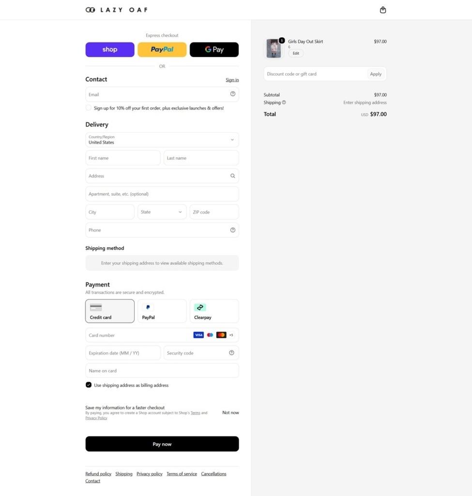
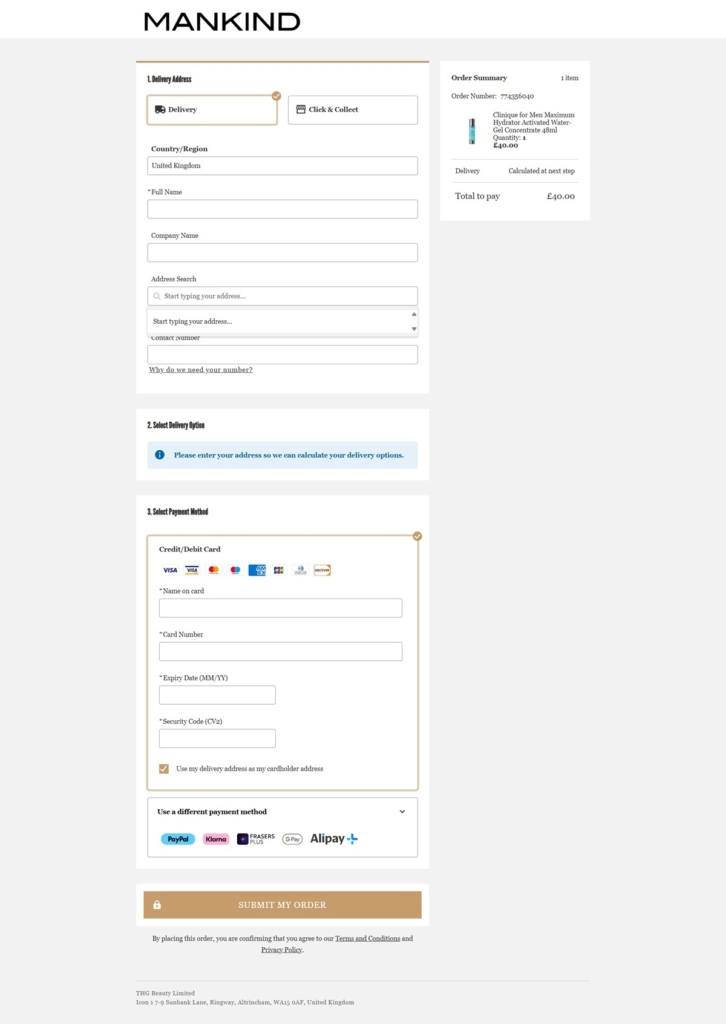
Three express buttons and three payment tabs at checkout. Shop, PayPal and Google Pay sit above the standard delivery fields, and the payment section offers Credit Card, PayPal and Clearpay as separate tabs, ending in a black Pay Now button.
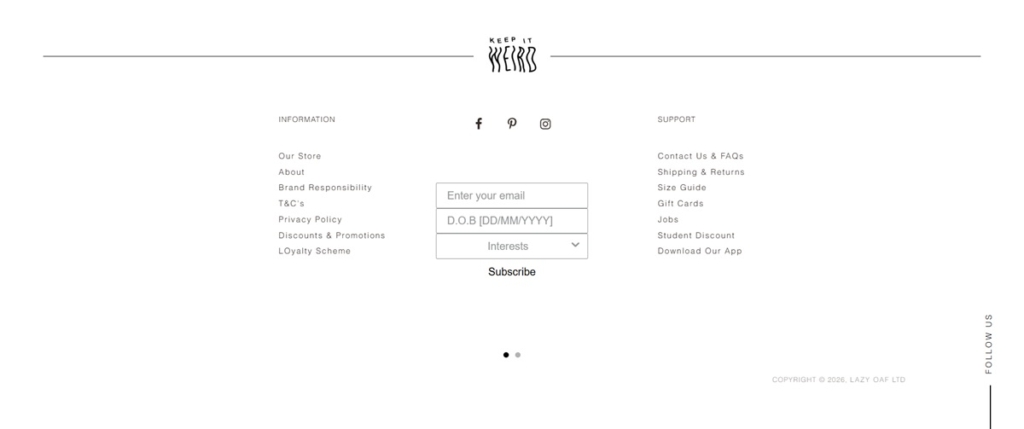
“Keep It Weird” over the newsletter form. The footer centers a hand-lettered, wavy version of the phrase above the email signup, distinct from the wordmark’s straight capitals used elsewhere.
A newsletter form that asks for more than an email. Beneath the email field sit a date-of-birth entry and an Interests dropdown, extending the signup past a single field.
Brand Responsibility listed beside legal pages. The Information column in the footer places Brand Responsibility next to T&C’s, Privacy Policy and Discounts & Promotions, treating it as a standard footer link rather than a separate page.
Loyalty and student pricing as standalone links. A Loyalty Scheme link sits in the Information column and a Student Discount link sits in Support, kept apart rather than combined into one rewards page.
An app download in the support column. Download Our App appears in the footer’s Support list alongside Contact Us & FAQs, Shipping & Returns and Size Guide.
A first-order discount folded into checkout contact. Rather than a popup, the checkout’s Contact section carries an unchecked box offering “10% off your first order, plus exclusive launches & offers” tied to signing up for email at the point of purchase.
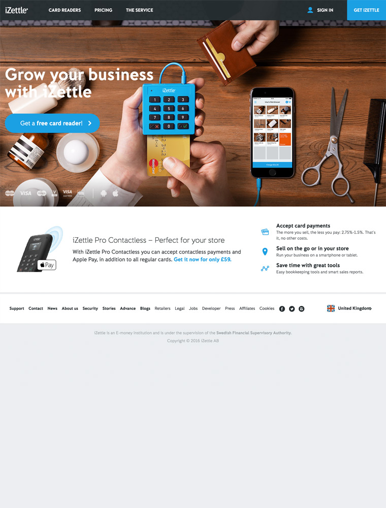
Accept credit card payments on the go with iZettle.
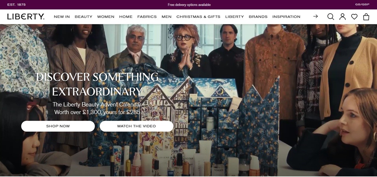
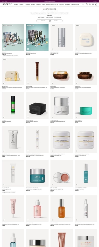
Liberty is the London department store on Regent Street, trading online at libertylondon.com across women’s and men’s fashion, jewellery, beauty, homeware and its own Liberty Fabrics. The site carries third-party luxury labels alongside Liberty’s own lines, including LBTY. Fragrance, and ships to the UK, US, EU, Australia, Hong Kong, Canada, the UAE and China. Built on Salesforce Commerce Cloud.
Aubergine, gold and near-black. The palette leans on a deep aubergine purple against a near-black text colour and white grounds, with a brass gold for hover states and a terracotta and cream pairing used on promotional panels.
Akzidenz Grotesk with an editorial serif. Navigation and interface text run in Akzidenz Grotesk Pro Extended across light, regular, medium and extended cuts. Portrait, in regular and medium with matching italics, carries editorial headings alongside Lasenby Sans, and a heavy display face is reserved for campaign lockups.
A three-column mega menu. Each department opens to Shop by Category, Shop by Brand and Inspiration side by side, so a shopper can enter by product type, by label, or by an editorial route such as Christmas Shop, Engagement Rings or Trending: Tonal Textures.
A stacked promotional bar. Three rotating lines sit above the header covering the Advent Calendar, The Beauty Drop membership and the free delivery threshold, with a GB/GBP market selector to their right.
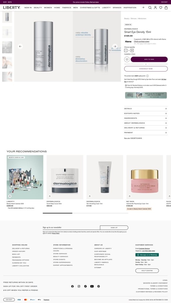
Product pages that read like a magazine. Beneath price and availability, listings run Details as a bulleted spec list, How To Use, an Editor’s Notes paragraph and an About section on the brand itself, then delivery and returns and payment methods by country.
Loyalty points quoted at the item level. A line under the buy button states how many loyalty points the product earns, tying the Liberty Collective scheme to the individual purchase rather than to the basket.
Delivery promises stated inline. The buy box lists the next-day DPD cutoff, the free standard delivery threshold of £100 against a normal £5.95, and any active gift-with-purchase offer. Rates for every market it ships to are tabled below.
Klarna and Click & Collect. Payment options vary by market and include Klarna, PayPal Express, Amazon Pay and Giro Pay. A persistent strip repeats free UK standard delivery, 30 day returns and free collection in store.
EST. 1875 in the header. The founding date is set above the navigation on every page, and Our Heritage sits in the footer next to careers and corporate social responsibility.
The physical store treated as a product. A homepage panel headed Our Store links to Plan Your Visit, with separate footer columns for store services, beauty services, events, experiences and expert appointments.
Two membership schemes running in parallel. The Beauty Drop offers seasonal discovery boxes and members-only events, while Liberty Collective returns a £10 voucher for every £200 spent.
WhatsApp alongside phone and email. Customer services publishes a London phone number, an email link, a WhatsApp option and staffed hours for weekdays, Sunday and bank holidays.
Fabrics as a commercial category. Liberty Fabrics appears in the main navigation, and the footer carries a wholesale route for trade buyers.
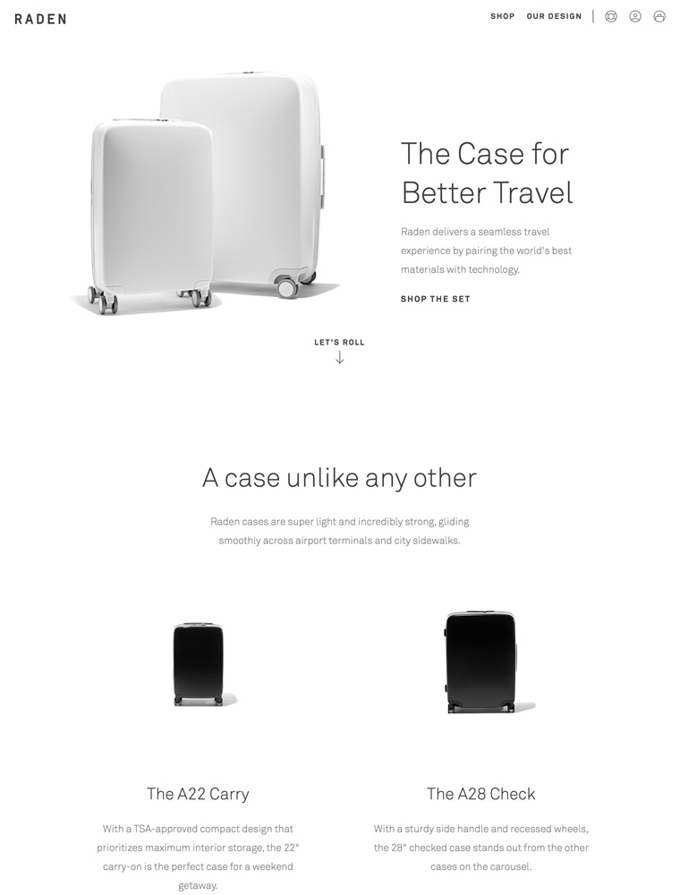
Raden is the case for better travel. It’s everything you need to seamlessly get from point A to point B — an end to end experience for better travel by pairing the world’s best materials with technology.
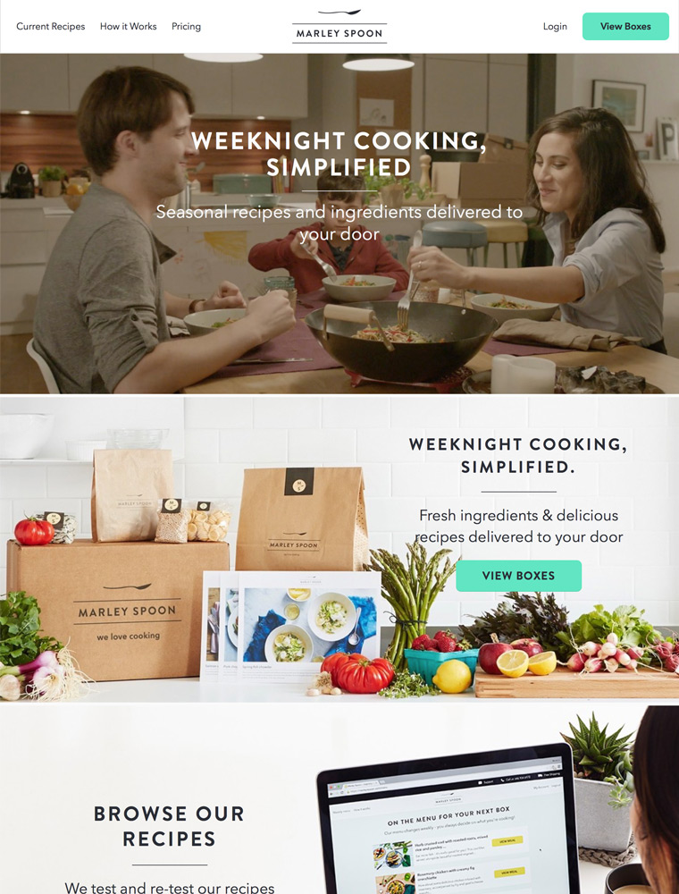
Every week, Marley Spoon’s chefs create seven inspiring, tasty meals. You simply choose what you want to cook and Marley Spoon sends all the recipes.
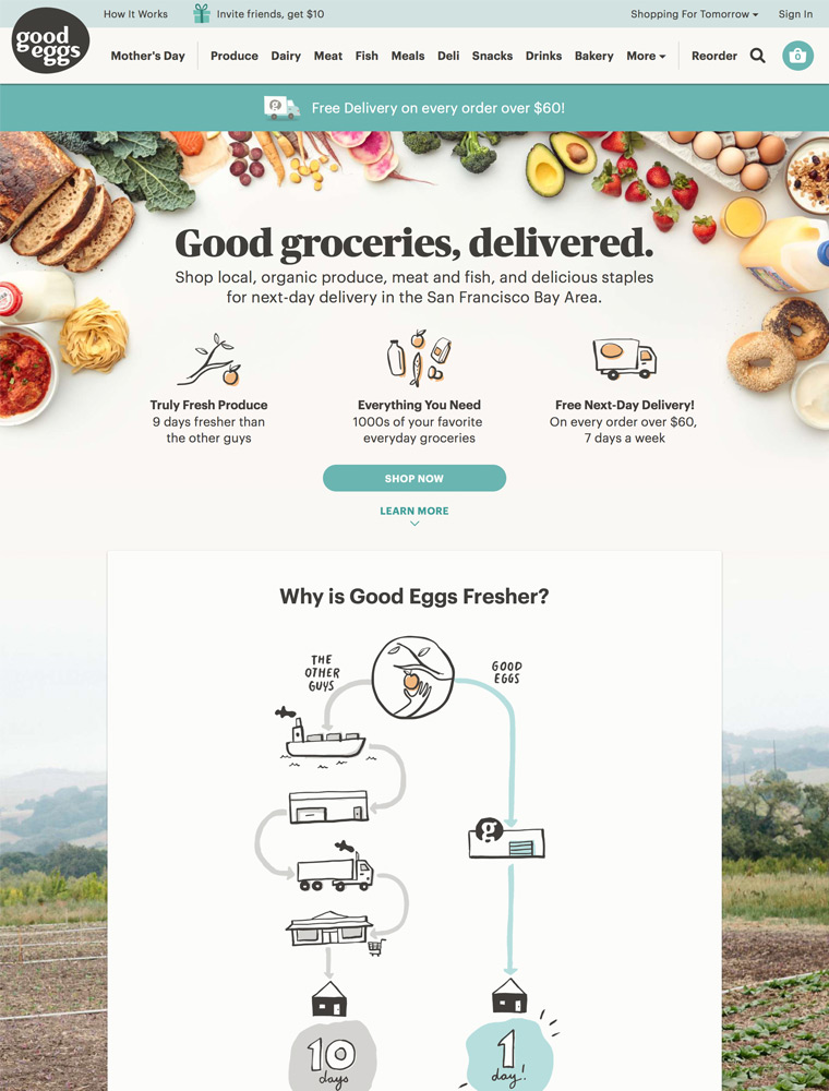
Shop local and organic produce, sustainable meat and fish and tasty groceries for next-day delivery in The San Francisco Bay Area.
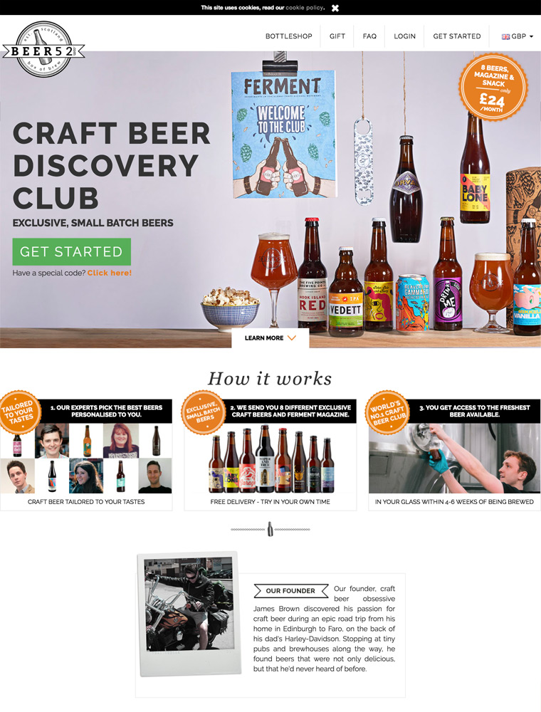
World’s No.1 Craft Beer Club. We deliver a monthly case of craft beers from the best independent microbreweries around the world.
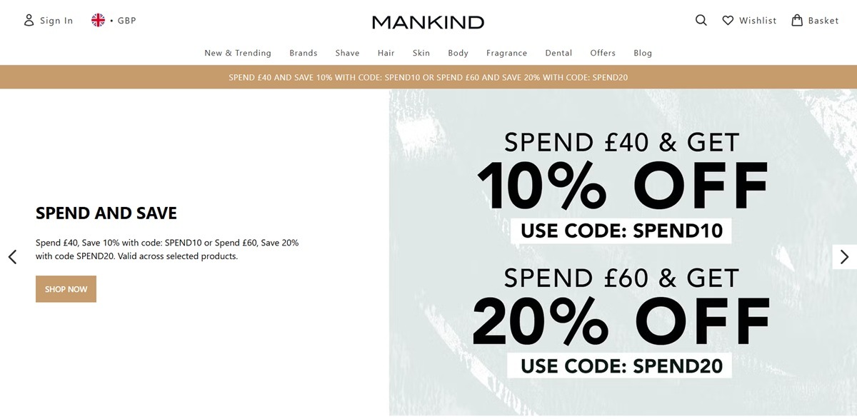
Mankind is a UK online retailer of men’s grooming, toiletries and beauty products, stocking more than 100 brands ranging from mass names like Aveeno and Braun to prestige lines such as Aesop, Clinique for Men and Elemis. The catalogue is organized by need into skincare, haircare, shave and beard care, bodycare, fragrance and dental, alongside a brand directory and rotating outlet and student discount sections, on a custom Astro-based build rather than a templated cart platform.
A white ground with utility-built styling. The homepage sits on a plain white background with near-black body text and a mid gray, coded #333333 in the shared stylesheet, used for footer icons. The markup runs on Tailwind CSS utility classes, giving spacing and type scale a standard, tool-generated rhythm rather than a bespoke one.
One branded accent color. Outside that grayscale base, the only named color in the shared CSS is a tan gold, #c69c6d, applied to the site-wide offer banner and deepening to #b38a5c on hover, the single point of color across an otherwise neutral interface.
Banner-led merchandising. The homepage opens on a full-width promotional banner, currently launching the brand Heath with its own photography, above a horizontal strip of brand tiles linking straight to each brand’s shop.
Rendered rather than templated. Response headers and inline markup (x-astro-rewrite, per-component data-astro-cid attributes) point to a custom Astro-built front end rather than a Shopify or Magento theme.
A deep, filterable catalogue. The Mens Essentials listing runs to 257 items across nine pages, roughly 24 to a page. A left sidebar filters by brand, price, department and key ingredients, with sort by popularity, price, name or discount.
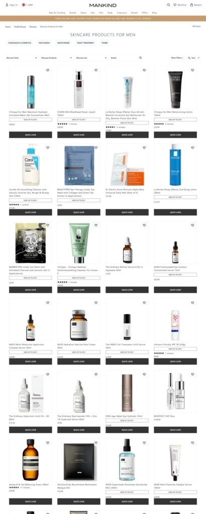
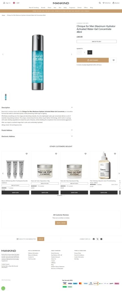
Ratings on the grid, not just the product page. Each product card carries its image, name, price, a “Save up to X%” badge where relevant, a star rating with review count, and a Quick Look button for an inline preview.
Brand hub pages. Selecting a brand from the directory opens a listing with a short description above the grid; the Aesop page, for example, frames the range as “simple yet effective products” in “stylish, simplistic packaging.”
No single house voice. Rather than a founder story on the homepage, Mankind gives its top banner slot to partner brand launches, currently Heath, and leaves narrative copy to each brand’s own hub page, so positioning language shifts with whichever brand is being viewed.
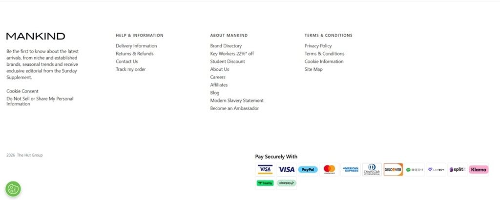
Editorial framing in the newsletter pitch. The signup copy positions the retailer beyond a straight catalogue, inviting shoppers to hear about “latest arrivals…seasonal trends and exclusive editorial” rather than only discounts.
Layered spend discounts. A homepage banner offers tiered codes, spend 40 pounds for 10 percent off with SPEND10 or spend 60 pounds for 20 percent off with SPEND20, alongside separate always-on student and 22 percent key-worker discounts.
A long payment method list. The basket footer displays “Pay Securely With” above a dozen logos, from Visa and PayPal to Klarna, Clearpay and Laybuy, more buy-now-pay-later options than most single-brand stores carry.
Reviews surfaced early. Star ratings and review counts sit on the listing grid itself, so shoppers can compare products for social proof before opening a single product page.
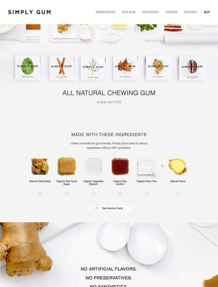
All Natural Chewing Gum. We set out to make a better chew. The regular chewing gum you see on grocery store shelves is filled with artificial substances, including some of the same components used in the manufacture of car tires, plastic bottles, and white glue, as well as artificial sweeteners like aspartame.

Miniature Cinder Blocks and Miniature Pallet Coasters.


