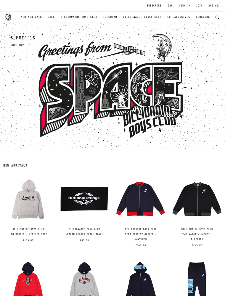
Billionaire Boys Club is a creative collaboration between Japanese luxury street wear designer Nigo and infamous music producer Pharrell Williams.

eCommerce Websites

Billionaire Boys Club is a creative collaboration between Japanese luxury street wear designer Nigo and infamous music producer Pharrell Williams.
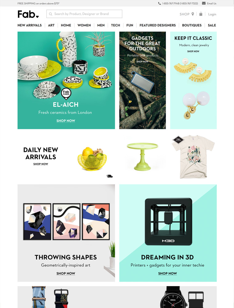
Explore a curated selection of unexpected men’s, women’s, home, art and tech accessories from the world’s most exciting designers on Fab.com.
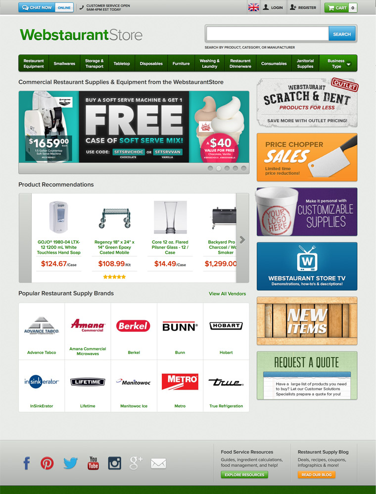
Shop over 124,340 restaurant supplies in our restaurant supply store. Fast shipping and wholesale restaurant supply pricing on all restaurant supplies from the leading restaurant supply company.
Brand Name Watches + Discounts + Free Shipping = A really good time.
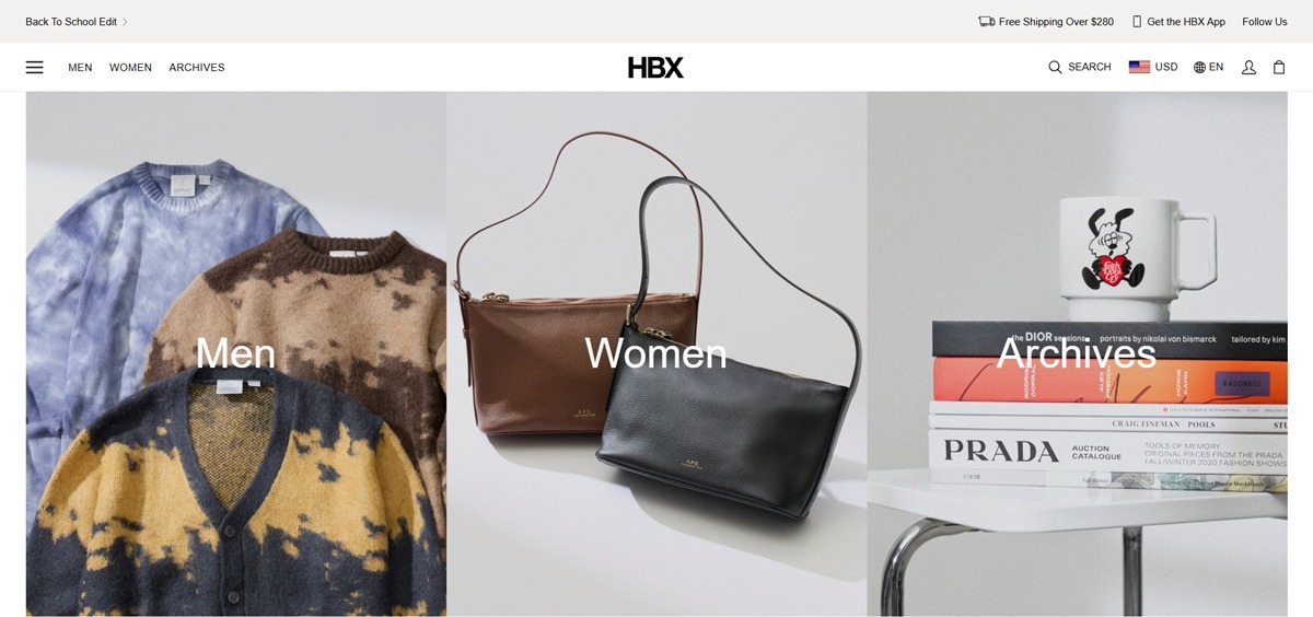
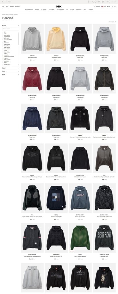
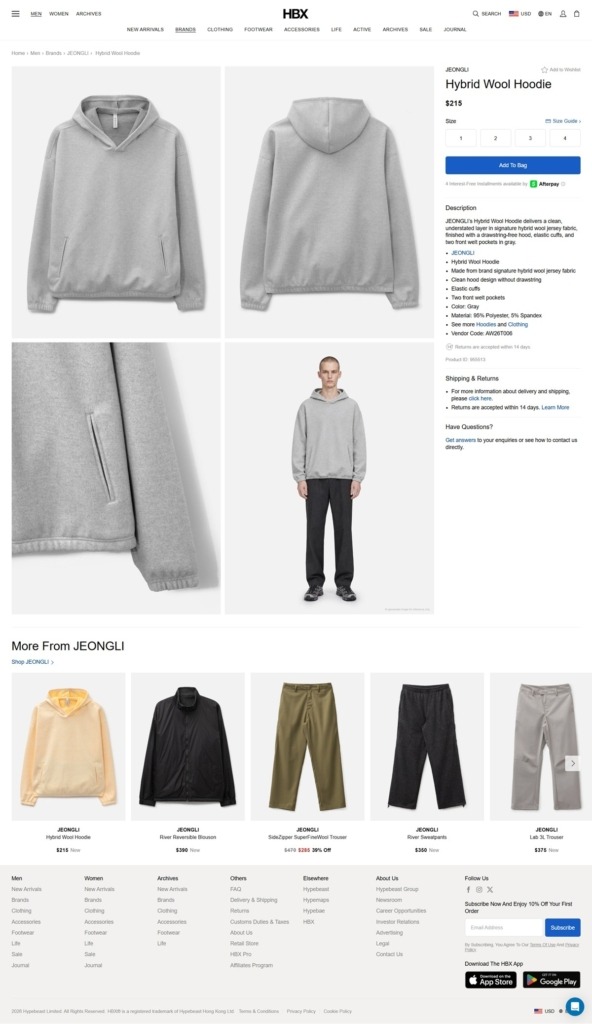
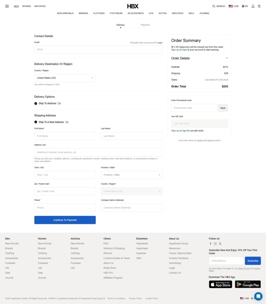
HBX is the retail arm of Hypebeast, operated by Hypebeast Limited from Hong Kong and selling men’s and women’s clothing, footwear, accessories and lifestyle goods. The buy covers streetwear, technical outdoor and luxury labels in the same grid, Acne Studios, Asics, C.P. Company, Gentle Monster, Gramicci, Human Made, Loewe, Maison Margiela, New Balance, Nike and Salomon Advanced among them, with a separate Archives channel for vintage and hard to find pieces. Built on a custom stack rather than a hosted platform.
Black, white and grey with red reserved. The palette is near black text on white with two pale greys for panels, and a single red kept for alerts and sale flags. Product photography on plain grounds supplies the contrast.
Helvetica Neue with script fallbacks. Heading and body stacks both resolve to Helvetica Neue, backed by dedicated Traditional Chinese, Japanese and Korean faces and Microsoft YaHei, so the same layout holds across the site’s regional versions.
Centred cards in a responsive grid. Listing tiles run two across on mobile, three at large and four at extra large, each showing the image, the brand in bold upper case and the product name in upper case beneath it, centre aligned.
Four shopping worlds in one header. Unisex, Men, Women and Archives sit side by side, each carrying its own New Arrivals, Brands, Clothing, Accessories, Footwear, Life, Sale and Journal sub-navigation.
Archives graded like resale. Products in that channel use a condition vocabulary of Brand New, Excellent, Good, Fair, Imperfect and Vintage, which is a different contract from the main catalogue and is handled inside the same product template.
Product pages are tight and factual. A sneaker page shows breadcrumb, brand, name, price, a short description, a spec bullet list, colour and material lines, a vendor code and a product ID, then shipping caveats stated plainly, including oversized item surcharges and cases where returns are not accepted.
Built for an international shopper. The size selector is backed by a conversion table covering US men’s, US women’s, EU, UK and centimetre values, while currency and language switchers sit next to the cart, locale paths exist for Mainland China, Taiwan, Japan and Korea, and the free shipping threshold is shown in the selected currency.
Campaigns packaged as editorial issues. The top of the page carries titled edits such as Street Cuts: The Graphic Issue and a Back To School Edit, borrowing the language of a magazine rather than a promotion.
The publishing network is stated. The footer links out to Hypebeast, Hypemaps and Hypebae under an Elsewhere heading, and to Hypebeast Group, Newsroom and Investor Relations under About Us, placing the shop inside a listed media company.
A membership tier. HBX Pro is offered from the account dropdown as access to extra features and benefits.
An app and a physical store. The header promotes an app download and the footer links a retail store and an affiliate programme.
Progressive rendering with a fallback grid. Listing pages paint skeleton placeholders before hydrating, and a noscript version ships images, brands and names without prices.
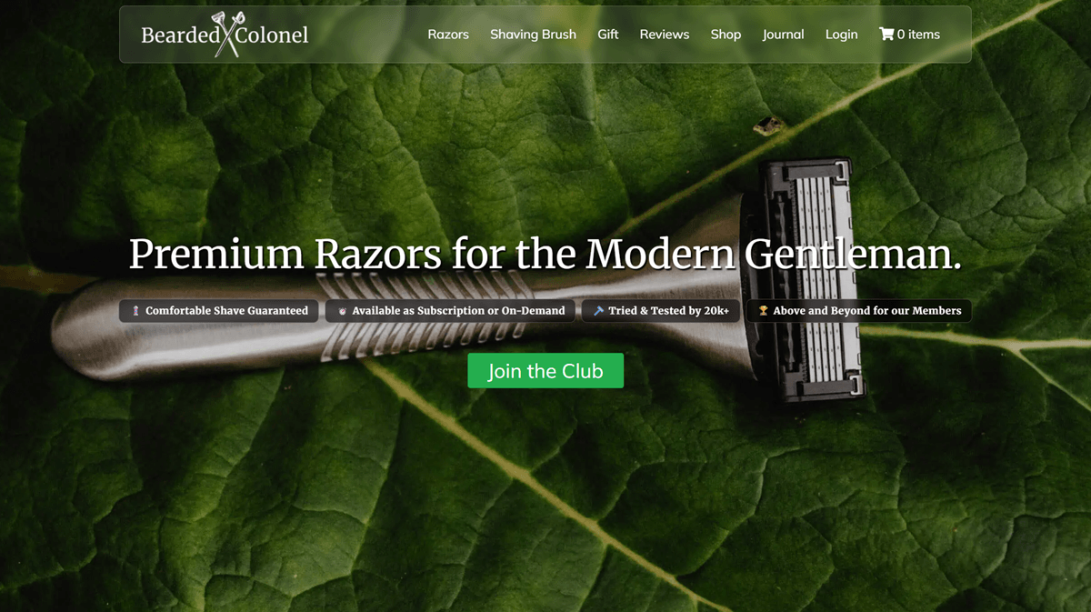
The Bearded Colonel is a UK direct-to-consumer shaving brand selling razor blade subscriptions, on-demand razors, beard oil, shaving brushes and cream bundles. The footer states the offer plainly: “Quality razor blades and grooming essentials, fairly priced and posted through your letterbox.” The storefront runs on WordPress with WooCommerce.
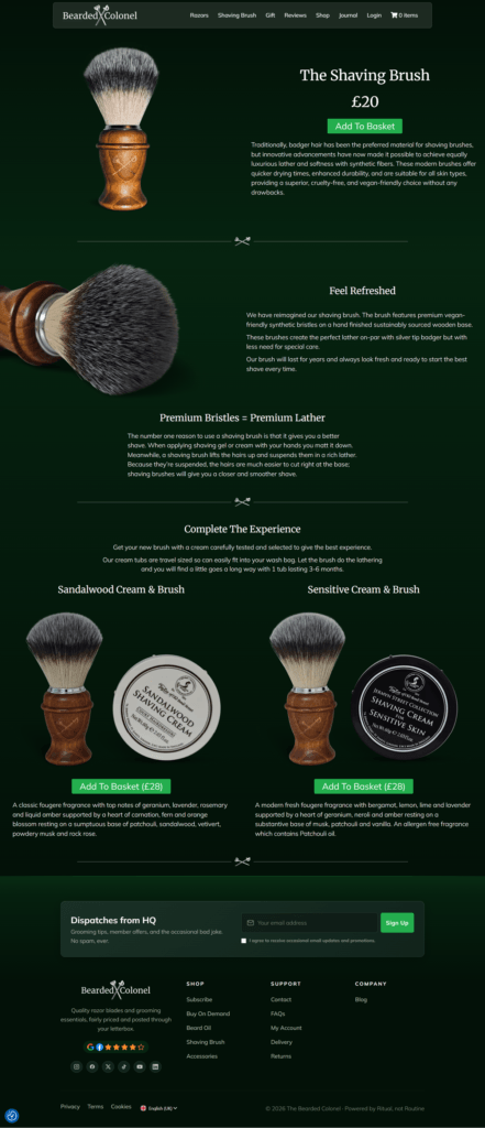
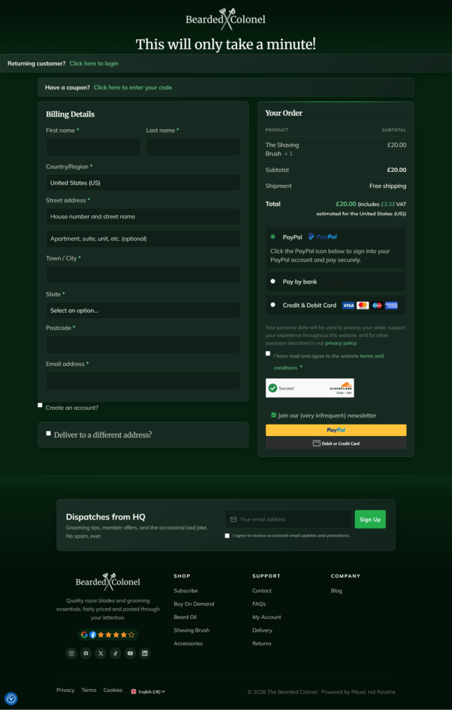
A deep forest green ground throughout. The homepage, product pages and checkout all keep the same near-black green background with white text and pale hairline dividers, so the mood stays constant regardless of what the page is doing.
A crossed-razor logo mark. The wordmark reads “Bearded X Colonel,” with the X formed from two crossed razors, and the same small icon reappears as a section divider further down the page.
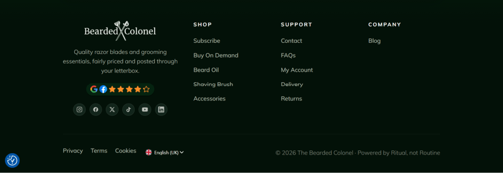
One bright accent reserved for trust signals. Against the dark palette, a gold five-star rating badge carrying Google and Facebook icons is the single saturated color element, placed in the footer rather than the header.
A single-product landing page, not a grid. The Shaving Brush page runs as one long page: photo, name, price and a green “Add To Basket” button up top, followed by explainer sections rather than a multi-item category listing.
Bundles sold as their own line items. Below the main brush, two preset sets, Sandalwood Cream & Brush and Sensitive Cream & Brush, are priced and sold individually at GBP 28 each, complete with their own fragrance description and Add To Basket button.
A coupon field collapsed at checkout. “Have a coupon? Click here to enter your code” sits closed above the billing form, and the order summary lists subtotal, free shipping and a total that states VAT inline, for example “Total GBP 20.00 (includes GBP 3.33 VAT).”
A rationale for the brush mechanism. A centered text block titled “Premium Bristles = Premium Lather” explains that a brush lifts and suspends hair so it is easier to cut, arguing the product’s function rather than only listing its materials.
A reformulated-brush claim. A “Feel Refreshed” section states the brush now uses “vegan-friendly synthetic bristles on a hand finished sustainably sourced wooden base,” framing the update as both cruelty-free and higher quality.
A joke in place of a platform credit. The footer copyright line reads “Powered by Ritual, not Routine” instead of naming an ecommerce platform, turning a technical line into a brand aside.
Newsletter copy that undercuts itself. The signup checkbox at checkout reads “Join our (very infrequent) newsletter,” echoing the homepage panel’s line, “Grooming tips, member offers, and the occasional bad joke. No spam, ever.”
A verification badge inline with payment. A Cloudflare “Success” badge sits directly in the payment column, ahead of the PayPal and card buttons, rather than running invisibly in the background.
A three-column footer built around delivery. Shop, Support and Company columns sit beside the star rating badge and six social icons, Instagram, Facebook, X, TikTok, YouTube and LinkedIn, with a language selector set to English (UK) at the very bottom.
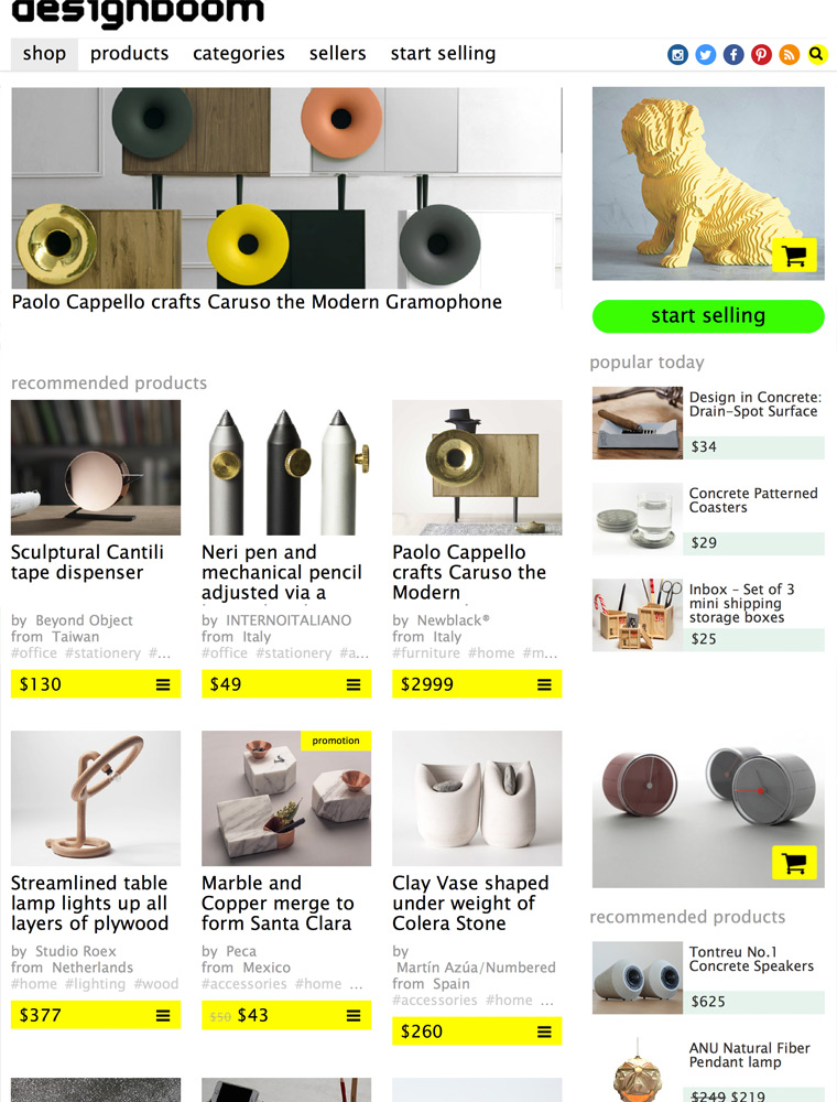
A curated-commerce-space for exclusive products and collector items sold directly from emerging/established designers and brands.

Designer clothing and accessories for men, women, boys and girls.
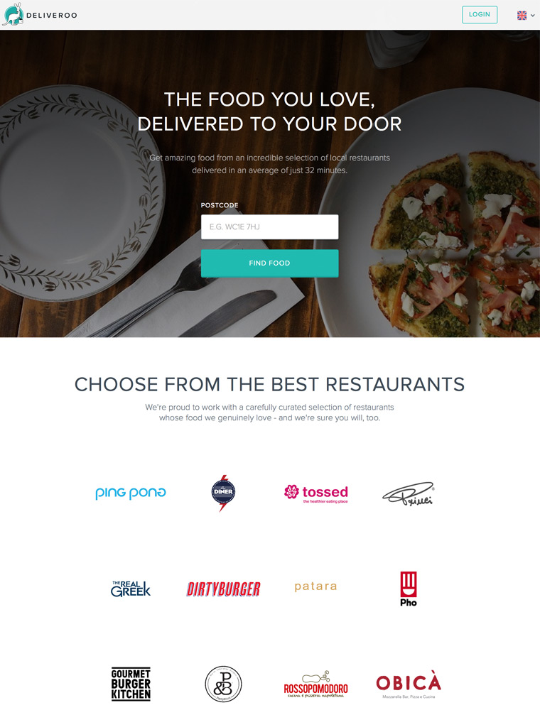
Order high-quality takeaway online from top UK restaurants, fast delivery straight to your home or office.
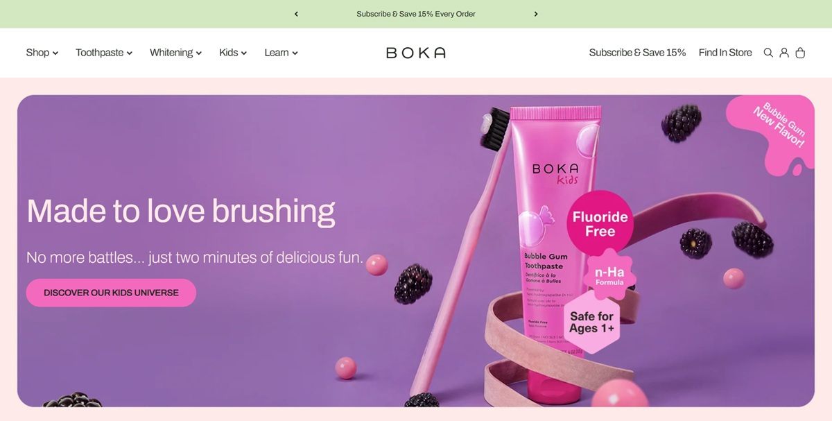
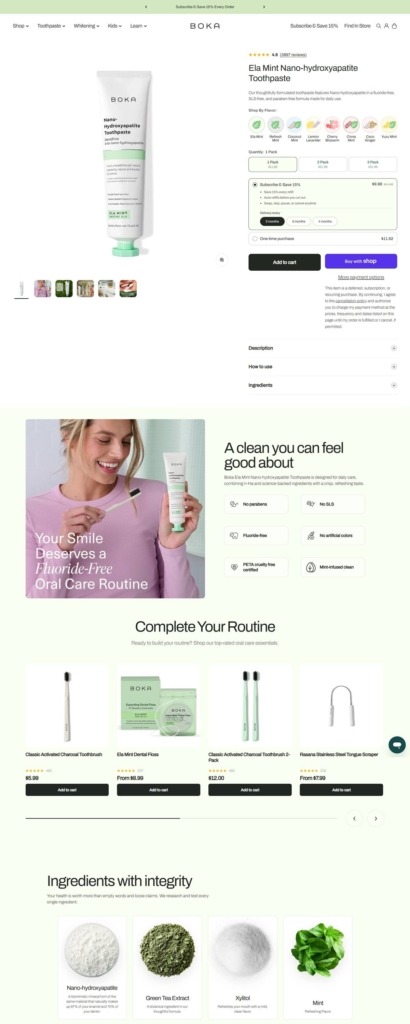
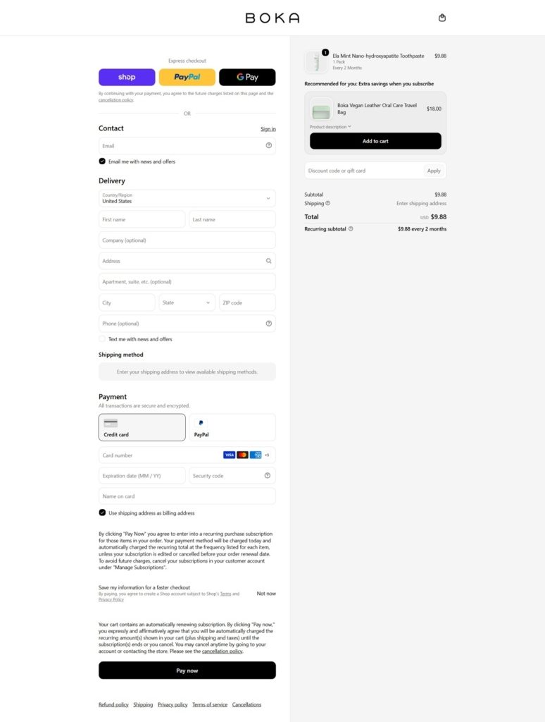
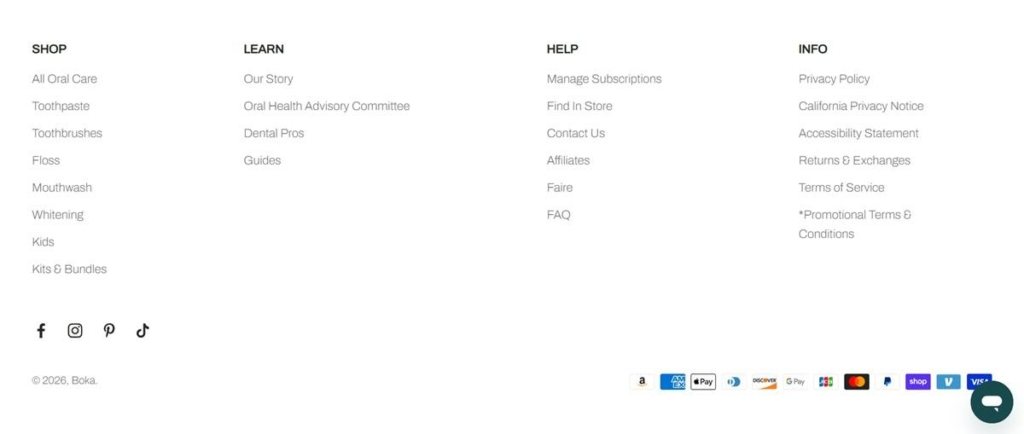
Boka is a US oral care brand built around nano-hydroxyapatite, selling fluoride-free toothpaste, mouthwash tablets and liquid mouthwash, charcoal toothbrushes, floss, tongue scrapers and a full children’s line. Products are sold individually, in multipacks and on subscription, with a retail locator for shoppers who buy in store. Built on Shopify with Recharge handling recurring orders.
Archivo throughout, with one exception. Headings and body copy share Archivo at a light body weight, while a separate rounded display face is loaded only for the children’s sections, so the kids universe reads as a different place without leaving the site.
Deep purple against pale pink. The palette pairs a dark violet with a soft pink used for overlays and carousel controls, set over white and a near-black green for text.
Three routes through one menu. The shop mega menu is split into By Product, By Formula and By Collection columns, with a fourth Featured column carrying current launches and restocks.
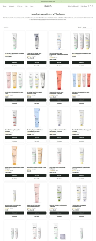
Ratings on every tile. Each card carries a star average and a review count, from 4.8 out of 3,897 reviews on the Ela Mint toothpaste to 4.2 out of 305 on the whitening powder, so relative popularity is legible across the grid.
Two buttons per card. Tiles offer both Add to cart and View options, letting a repeat buyer skip the product page while a new shopper opens the detail.
Subscription priced beside the one-off. The buy box shows the subscribe price against the one-time price on the same screen, offers two, three or four month intervals, and carries an explicit consent line about recurring charges before checkout.
Full formulas on the page. Description, How to use and Ingredients are set out as plain text with complete INCI lists, and a separate panel explains individual actives such as PAP, perlite and kaolin.
A named advisory committee. Five experts appear with photographs, roles, quotes and expandable bios, including a former Colgate-Palmolive R and D executive, a founding dean of a school of dental medicine and a London-based functional dentist.
One ingredient carries the argument. Nano-hydroxyapatite is written into almost every product title as n-Ha, and an explainer describes it as a biomimetic form of the material that makes up 97 percent of enamel and 70 percent of dentin.
Guides as a content layer. A Learn menu links practical pieces such as taking toothpaste on a plane and a comparison of hydroxyapatite brands.
Scale stated as proof. A homepage line reports 4.6 stars from more than 950,000 customers.
A separate kids universe. Children’s products get their own flavour menu, from bubble gum to blueberry dragon fruit, plus a parent-facing page answering whether the paste is safe to swallow.
Machine-written review summaries. Product review sections open with an AI generated summary and a set of topic tags above the individual reviews.
Formula filters used as navigation. Fluoride-Free, SLS-Free, Vegan and Sugar-Free are menu entries rather than facets buried in a sidebar.
Find In Store in the header. A stockist locator sits in the top bar next to the subscription link, giving the retail channel equal prominence.
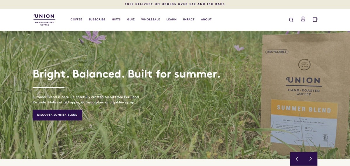
Union Coffee, trading as Union Hand-Roasted Coffee, sells specialty coffee roasted to order in wholebean, ground and pod formats, bought as a one-time purchase or through a weekly CoffeeClub subscription. Blends and single origins run from about 7.95 to 13.85 pounds, with four-pack bundles at 29.95. The main navigation runs Coffee, Subscribe, Gifts, Quiz, Wholesale, Learn, Impact and About. The store is built on Shopify, billing in GBP with UK delivery fields.
Deep purple against warm cream. The site’s core pairing is a near-black purple for text, buttons and navigation set on a warm off-white background, with navy blue reserved for the footer headings.
Three typefaces doing three jobs. Running text and navigation use Brown, a geometric sans, while the bold blend names stamped on each product’s colored label band use Knockout, a heavy condensed display face, with Caveat’s handwriting style reserved for lighter editorial touches.
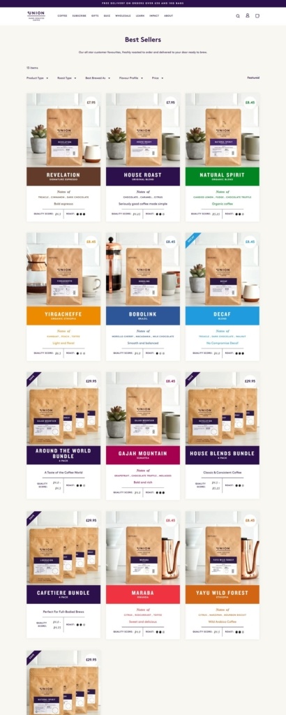
A label band color-coded by coffee, not by brand. Product cards carry a different color bar under each photo, brown for Revelation, dark purple for House Roast, green for Natural Spirit, orange for Yirgacheffe, so the grid reads as a spread of distinct coffees rather than one repeated brand accent.
Facets built for a coffee drinker’s questions. The Best Sellers grid filters by Product Type, Roast Type, Best Brewed As and Flavour Profile, and each card shows tasting notes, a numeric Quality Score and a roast-level bean icon alongside the price.
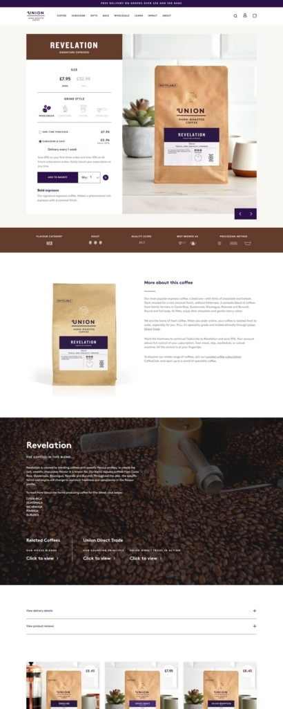
Grind style chosen before format. The product page leads with Wholebean, Cafetiere, Filter and Espresso grind icons, then a One-time purchase versus Subscribe and Save choice, the subscription priced noticeably lower and set to weekly delivery.
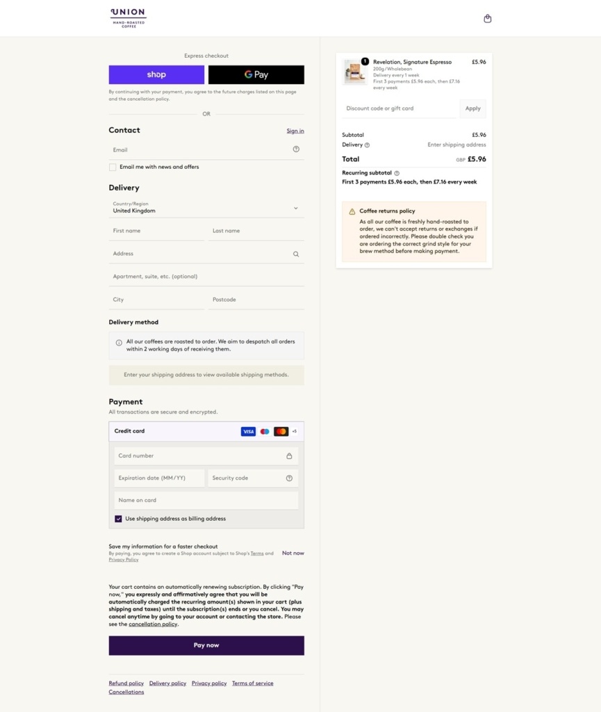
A returns warning specific to roasted coffee. Checkout carries its own amber notice: because coffee is roasted to order, the store cannot accept returns or exchanges over the wrong grind style, and asks buyers to double check before paying.
Recurring pricing spelled out in the summary. For a subscription item, the order summary states the schedule directly, first payments at one rate then a higher weekly rate after, rather than hiding the future price change until a later email.
Union Direct Trade named, not implied. The sourcing program appears as its own link on the product page and its own footer entry, rather than a general ethical sourcing sentence.
Origins as clickable facts. A blend’s growing countries, Costa Rica, Guatemala, Nicaragua, Rwanda and Burundi for Revelation, are listed as links to origin pages directly under the product description.
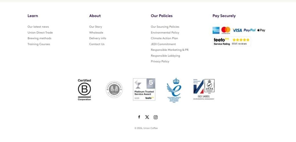
Certifications stacked in the footer. B Corporation, a Queen’s Award for Enterprise, and ISO 14001 badges sit together beneath a Feefo rating built from nearly 6,600 reviews.
A quiz sits beside wholesale in the main menu. Quiz, Wholesale and Impact all appear as top-level navigation items next to Coffee and Subscribe, serving retail, trade and values-driven visitors from one bar.
An unusually long policy list. The footer separates Our Sourcing Policies, Environmental Policy, Climate Action Plan, a JEDI Commitment and Responsible Lobbying into their own pages rather than folding them into one about page.
The same styled shot across every bag. Each coffee on the shop grid is photographed with a small succulent plant and a cup beside the kraft paper bag, standardizing the photography across dozens of origins.
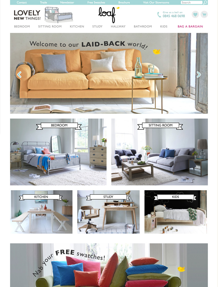
Our range of seriously comfy sofas, beautiful beds and wicked furniture are perfect for laid-back living. Shop online or visit us in our London showrooms.


