Vintage-inspired prescription eyeglasses starting at $95. Find a great pair today with our free Home Try-On Program. Fast free shipping both ways.
Warby Parker


eCommerce Websites
Vintage-inspired prescription eyeglasses starting at $95. Find a great pair today with our free Home Try-On Program. Fast free shipping both ways.
The most luxurious department store in the world, since 1707, Fortnum and Mason provides a treasure trove of hampers, tea, coffee & sweet treats.
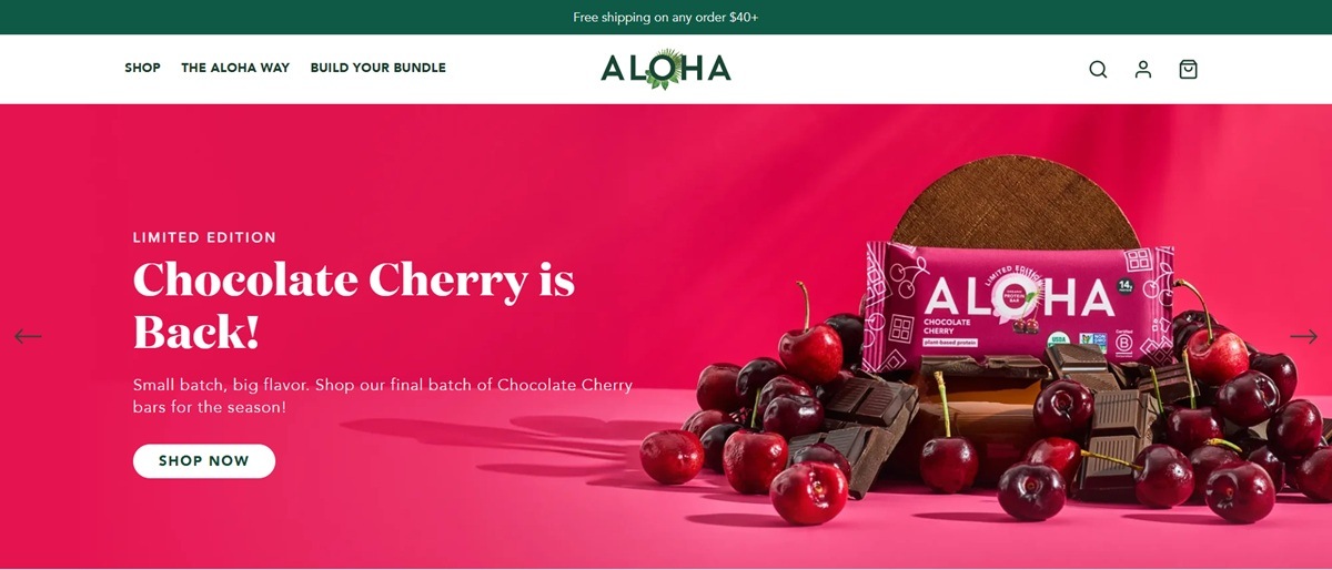
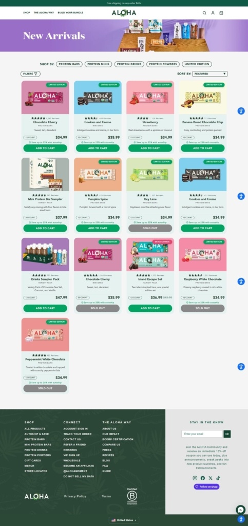
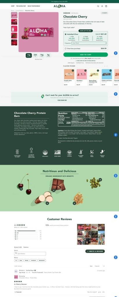
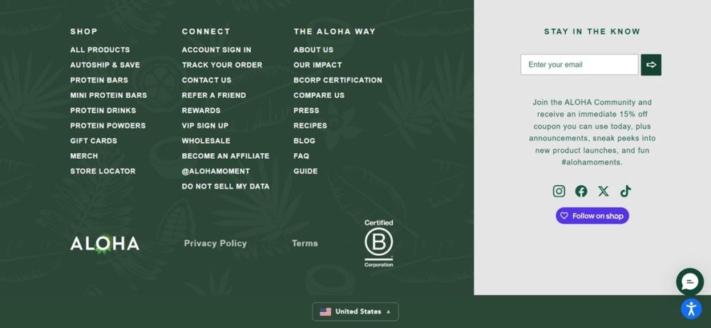
Aloha sells plant-based protein bars, mini bars, ready-to-drink shakes and powders, positioned as "The Better Plant-Based Protein Brand" for shoppers who want clean-label nutrition without giving up flavor. Products consistently list 14 grams of protein, 5 grams of sugar or less, and 10 grams of fiber, and are USDA Organic and Non-GMO Project Verified. Bars run 34.99 dollars for a 12-count box, with mini bars priced slightly higher at 35.99 dollars for 20.
Avenir for structure, a serif for statement. Body and interface text run in Avenir, in both a heavier Black weight and a lighter Book weight, while larger display moments switch to a serif face named domaine-display, giving headline copy more weight than the surrounding sans-serif text.
A forest green built into every component. A single deep green, defined once as both primary and accent color, drives buttons, headings and dots, paired with white text on top of it and a soft mint green used as a background field elsewhere on the page.
Ingredient photography over studio shots. Product presentation leans on the raw ingredients themselves, brown rice, pumpkin seed protein, coconut, tapioca fiber and organic peanut butter, rather than posed lifestyle scenes.
Four product lines, not one long list. The shop separates Protein Bars, Mini Bars, Protein Drinks and Protein Powders into their own sections rather than mixing formats into a single grid, with a Build Your Bundle option for combining them.
Nutrition stated on every card. The protein, sugar and fiber figures appear consistently across product listings, functioning as the primary comparison point between flavors rather than price or packaging.
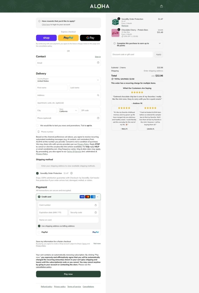
Autoship built into the funnel. Subscription discounts run from 10 to 25 percent depending on order size, and free shipping applies above 40 dollars, both surfaced before checkout rather than as a late add-on.
"The Aloha Way" as a dedicated section. Mission and impact content is broken out into its own navigation item rather than folded into an About page, separating the company's ownership model and sourcing story from the shop itself.
Employee ownership stated as a fact, not a slogan. The site describes itself as employee-owned alongside its B-Corp certification, giving the mission messaging a structural claim to point to rather than only sustainability language.
Limited flavors marked as such. Pumpkin Spice, Chocolate Cherry, Strawberry and Banana Bread Chocolate Chip are flagged as limited editions, distinguishing them from the standing lineup.
A wholesale and affiliate footer. Beyond standard account links, the footer carries dedicated wholesale and affiliate program links, pointing to a business-to-business channel alongside direct-to-consumer sales.
Free-from labeling as a checklist. Products are marked vegan, gluten-free, and free from stevia, dairy and soy as a standing list rather than a one-off callout on select items.
A green account and cart system. Account management and cart indicators carry the same forest green used in buttons, keeping the utility elements visually tied to the rest of the interface rather than left neutral.
Deny Designs is a Colorado home furnishings company that prints artwork by independent artists onto furniture, textiles, wall art and everyday accessories. Founded in 2011 and based in Englewood, the company now runs denydesigns.com as a trade channel: the FAQ states that Deny Designs is the wholesale brand for Society6.com artists, pricing is released once a free wholesale account is approved, and personal shoppers are pointed to Society6. Built on Shopify.
A catalogue-first header. The main menu opens into five product groups, Wall, Furniture, Bed + Bath, Home Decor and Lifestyle, each unfolding into a long list of named formats, from credenzas and sling chairs to yoga towels and Apple Watch bands. Create Your Own, Trending Collections, Our Story, Art, Wholesale and FAQ sit alongside it.
Avenir with a serif footnote. Type is Avenir Next almost everywhere, with an Avenir Ultralight cut used for large display lines and Bell MT appearing in a few serif moments. The interface palette is black, white and a grey scale, with a rust accent and a pale pink reserved for highlights.
The art supplies the colour. Chrome is deliberately quiet because every tile is a photograph of a printed product, so pillows, duvets and prints carry all the hue on the page.
Variants priced on the grid. Collection cards do not stop at a from price. A throw pillow tile lists all eight size and construction combinations with individual prices, from a 16 by 16 cover only to a 26 by 26 cover with insert, plus a quantity field and an Add to cart button.
Buying is gated. Product pages replace the buy button with the line “Deny Designs is for wholesale customers only” and a Wholesale Login link, so the catalogue browses openly while ordering stays behind an approved account.
Specification-heavy product pages. A breadcrumb trail, artist credit, SKU, description, a Details and Product Specs block, warranty and care instructions, an estimated ship date of three to five business days and the note that every order is custom printed in the USA.
Artist credit is structural. Product titles lead with the artist name, and a dedicated Artists index lists 362 names alphabetically. The Our Story page puts the gallery at over 180 artists and 15,000 pieces of art, with artists earning part of the proceeds on every gallery purchase.
Press listed plainly. The same page names Better Homes and Gardens, Good Housekeeping, InStyle, Redbook, HGTV, 5280 and Sunset.
A loose house voice. The 404 page reads “Oopsie doopsie. The page you’re looking for must’ve been eaten by unicorns.”
Trends merchandised beside formats. Romantic Botanica, Eclectic Revival, Cozy Heirloom and Holiday Collections give the menu a seasonal entry point next to the product-type lists.
A side by side trade comparison. The FAQ sets the Deny Designs Wholesale Program against the Society6 Trade Program row by row, covering discount, dedicated account rep, drop ship, payment terms, order minimums and curation support.
Create Your Own. A separate collection lets buyers place a personal image on the same product formats rather than choosing from the gallery.
Sells clothing, jewelry, accessories, home decor, and housewares. Online shop, news, and a list of designers.
With every product you purchase, TOMS will help a person in need.
CustomMade is an online marketplace that connects customers with independent artisans who produce custom-designed furniture, jewelry, home décor, and other personalized items.
Blue Apron makes cooking fun and easy. We’ll provide you with all the ingredients that you need to make a delicious meal in exactly the right proportions.
Nest Labs is a home automation producer of programmable, self-learning, sensor-driven, Wi-Fi-enabled thermostats, smoke detectors, and other security systems.
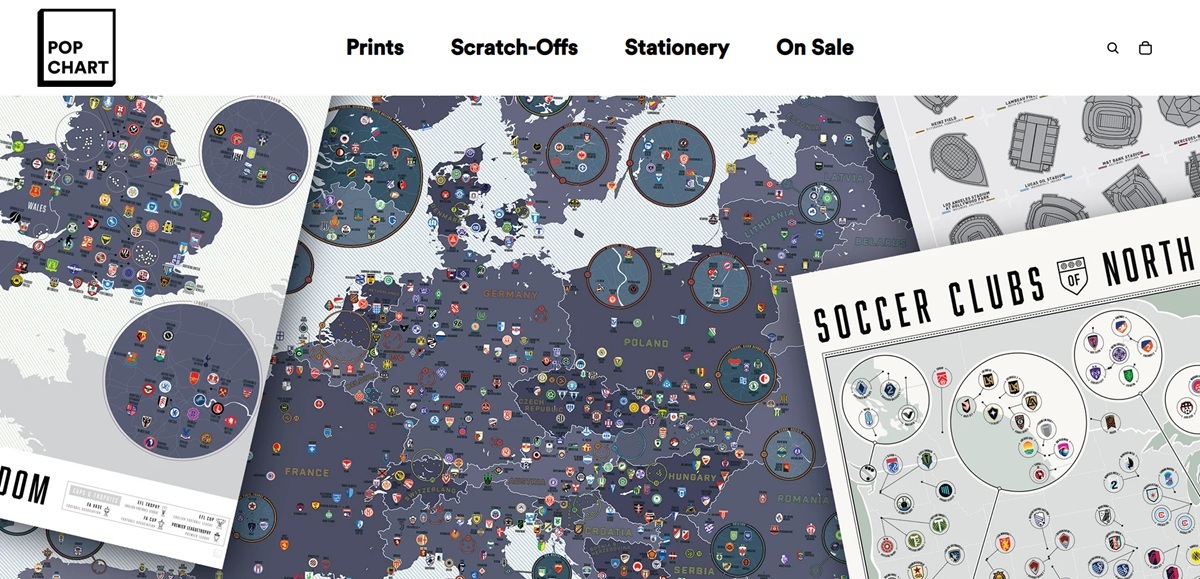
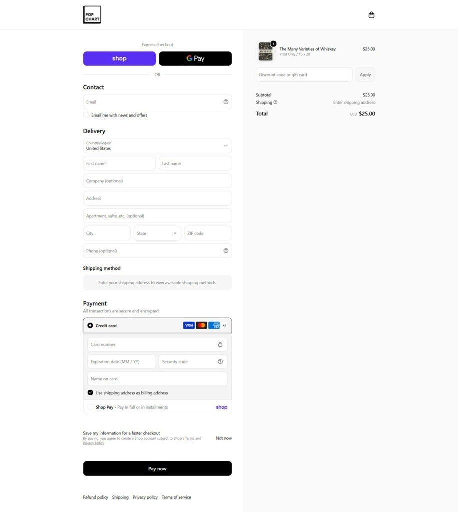
Pop Chart, formerly Pop Chart Lab, publishes infographic posters and sells them direct, alongside scratch-off prints and stationery. The subject matter is deliberately broad: the store’s own summary is that it “makes infographic posters about everything”, from space missions and baseball uniforms to parts of speech and the wineries of Napa. Prices sit between $15 and $40 for a print, and the store runs on Shopify.
Display sans against a slab body. Headings use Circular Std in Book, Bold and Black, while body copy is set in Pitch and Pitch Sans. The whole site is set at a bold default weight, which keeps navigation and product titles in the same register as the posters themselves.
Hero slides on flat colour panels. Each homepage slide pairs artwork with a solid tinted block, cycling through a cream, a pale mint and a soft yellow, with near-black type and a small white-on-black badge. The colour changes per slide rather than across the site.
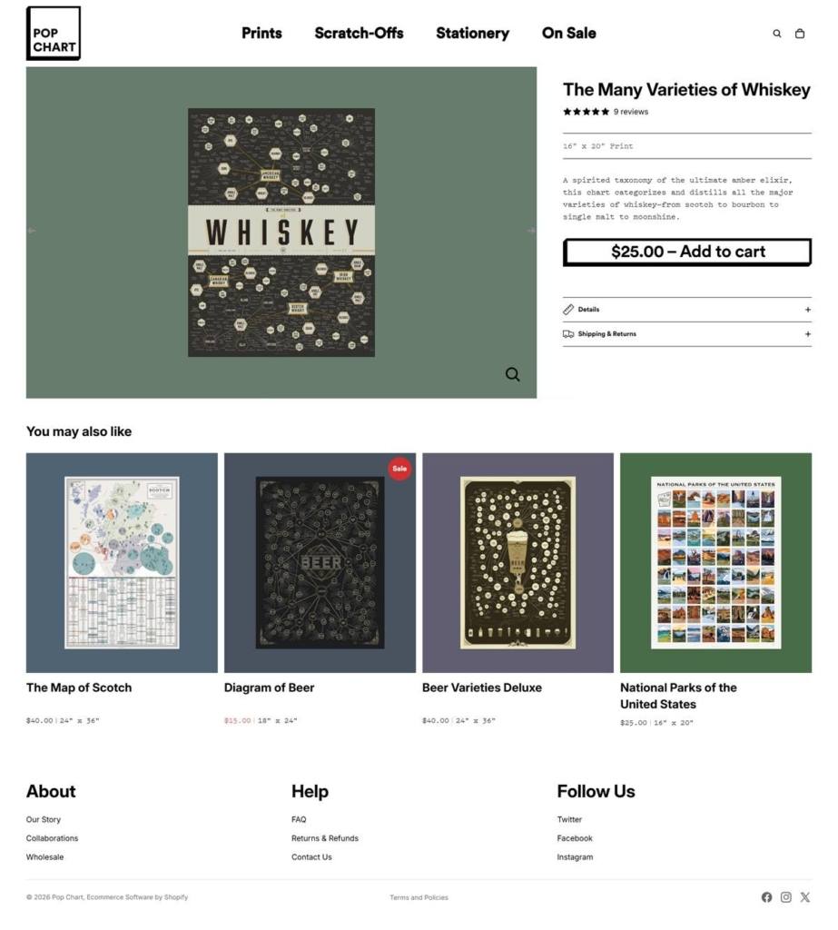
An oversized buy button. The add to cart control scales up to 31px type on wide screens and sits full width in a pale grey field, so the primary action is the largest element on the product page.
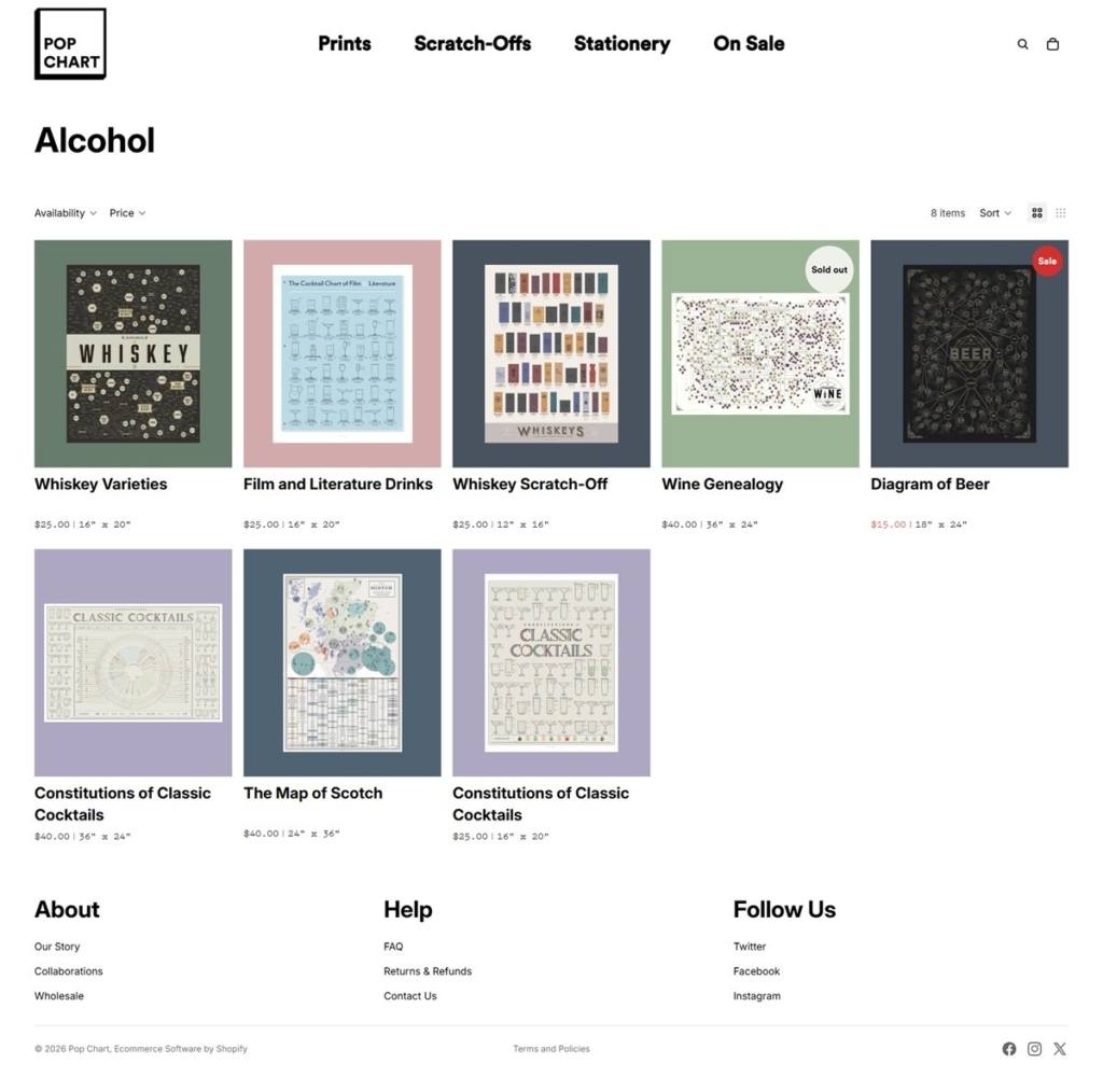
Browsing by subject, not by format. The Prints menu opens into topic filters covering Alcohol, Beer, Coffee, Comics, Design, Food, Hip-Hop, Literary, Maps, Movies/TV, Music, Nature, Outer Space, Sports and Tech, with Best Sellers and New Arrivals as separate entries.
Two variants that change the object. Every print selects on Size and on Finishing options, which turn a flat poster into a mounted or framed piece. The finishing choices are described with their own manufacturing detail: birch plywood panels and Cherry, Maple and walnut-stained frames made in the company’s Indiana woodshop, each with a keyhole slot for hanging.
Lead time attached to the choice. A notice in the cart states that framed and panel-mounted orders take an extra three to six business days, so the cost of the upgrade is stated in time as well as money.
International shipping set out in full. The cart carries a delivery table for Canada, the United Kingdom, the European Union and everywhere else, with standard, expedited and FedEx International windows and a note on customs and VAT.
A tagline that doubles as a brief. “The things you love. Charted.” sits in the page title, and product copy leans on the research behind each chart, such as a space travel print covering more than 400 crewed missions from Vostok to Artemis II.
Press quotes as social proof. A rotating band of pull quotes describes the work as turning encyclopedic pop-cultural knowledge into detailed infographics, carried under both the homepage and the story page.
Scratch-offs as a category of their own. Ballparks, national parks, films, horror movies, football stadiums and hockey arenas are all sold as scratch-off prints at $25.
A partnership collection. The Big Think Collection is promoted as a homepage takeover, and those prints carry a scannable code linking to an external archive.
A 10% newsletter incentive. A persistent Save 10% control sits in the header beside the cart.
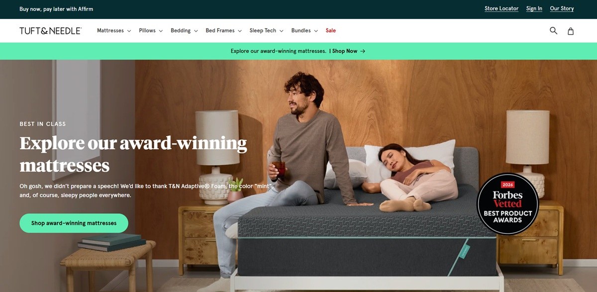
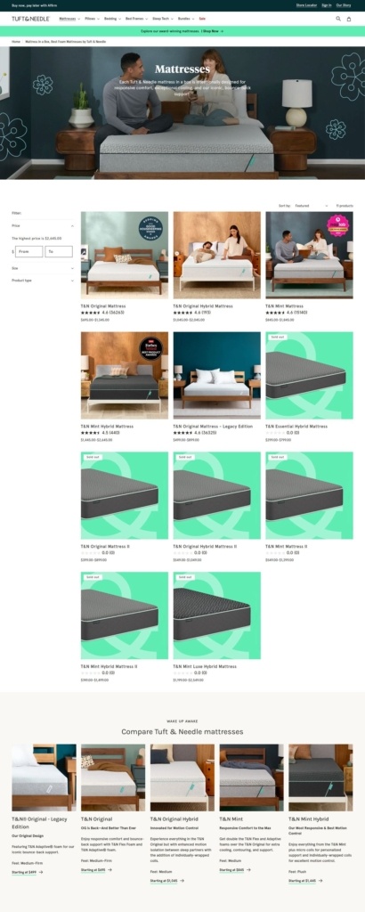
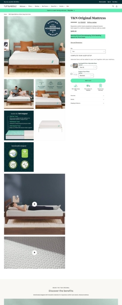
Tuft and Needle sells mattresses across several tiers, Essential Hybrid, Original, Mint and Mint Luxe Hybrid, alongside pillows, bedding, bed frames and two sleep-tech products it distributes, a SNOOZ white noise machine and a Loftie alarm clock. Entry prices start at $499 for legacy foam mattresses and run to $1,445 for newer hybrid models, with every order covered by a 100-night trial and a 10-year warranty. The brand sits within the Serta Simmons portfolio alongside Beautyrest and Serta, referenced directly in the footer.
Work Sans and Karla. Body copy is set in Work Sans, a grotesque sans, with headings in Karla, a rounder geometric sans, a pairing that keeps the page legible at the dense information density a mattress purchase requires.
Section-based color rather than a fixed palette. The theme assigns each homepage section its own background and accent, cycling through cream and oatmeal neutrals and near-black panels, with a rust-red used consistently for sale badges and promotional pricing callouts.
Promotion-first hero. The homepage leads with a value statement, “Give your old mattress an inferiority complex,” rather than a product photograph, and the “Tuft Love” language recurs as a section header lower on the page.
Six-way navigation plus Sale. The main menu splits the catalogue into Mattresses, Pillows, Bedding, Bed Frames, Sleep Tech and Bundles, with a separate Sale entry, and each category opens a sub-menu of specific products alongside promotional imagery.
Trial and warranty stated at the top of the funnel. The 100-night trial and 10-year warranty are positioned as standard messaging rather than fine print, alongside free shipping and returns, so purchase risk is addressed before a shopper reaches a product page.
Financing built into the price. Affirm financing across 3, 6 or 12 months, with rates from 0 to 36 percent APR, is offered directly against mattress prices rather than only at checkout.
Bundling as its own category. Bundles sits as a top-level nav item rather than a checkout upsell, pre-configuring mattress, frame and bedding combinations across price tiers.
Plain-spoken positioning. The brand states its philosophy directly, “Mattress shopping feels chaotic. We make it easy by focusing on what matters: more value and less nonsense,” a tone maintained in headline copy like “Give your old mattress an inferiority complex.”
Legacy models kept, not retired. Older foam and hybrid Original and Mint mattresses remain listed as legacy editions alongside current lines, letting returning customers find the exact product they bought before.
Sleep tech beyond the mattress. SNOOZ white noise machines and Loftie smart alarms are sold as part of the sleep ecosystem, extending the catalogue past bedding into consumer electronics.
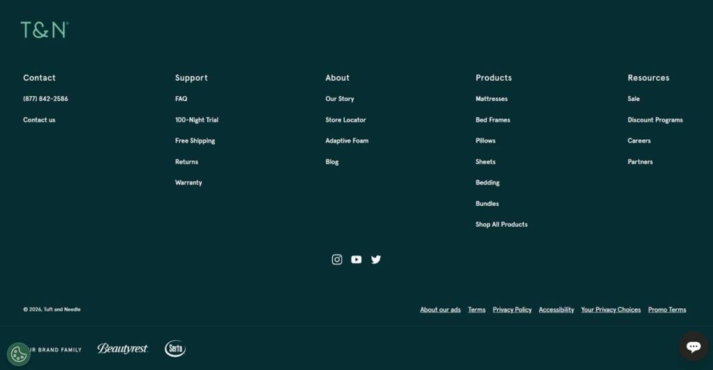
Corporate family disclosed in the footer. Serta Simmons ownership, with Beautyrest and Serta named, is visible in the footer rather than only in legal documents.
Sale as a permanent nav item. Rather than a seasonal banner, Sale holds a fixed place in the main navigation next to the product categories.
The Conran Shop offers a unique and personal blend of furniture, lighting, home accessories and gifts from some of the most iconic designers.


