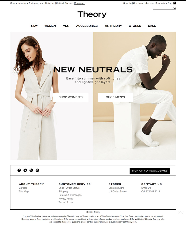
Shop Theory.com, our best selection of contemporary pants, blazers, shirts, dresses, suits, & sweaters for today’s modern women and men.

eCommerce Websites

Shop Theory.com, our best selection of contemporary pants, blazers, shirts, dresses, suits, & sweaters for today’s modern women and men.
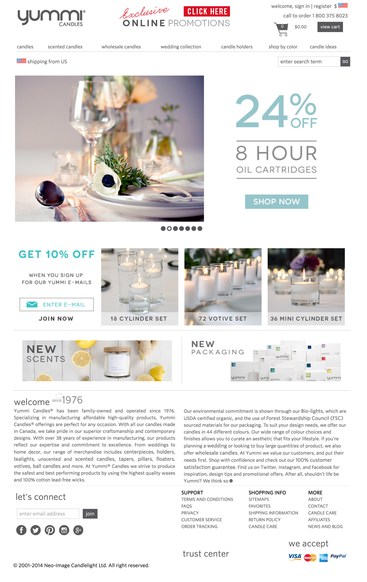
Yummicandles.com offers Wholesale Tealight Candle Holders, Floating Candle Centerpiece, a large beautiful variety of candles and supplies.
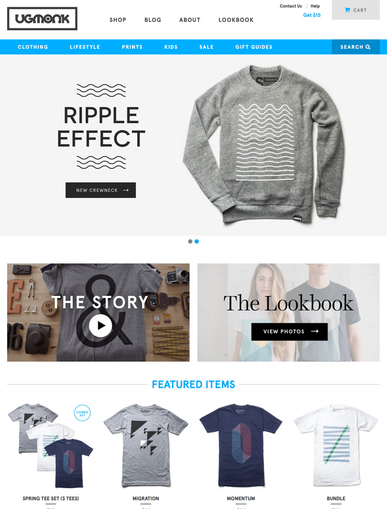
Ugmonk was founded by designer Jeff Sheldon with a mission to produce high-quality products with simple, fresh designs.
We offer a contemporary, unique and world leading brand mix including Thom Browne, VISVIM, Nigel Cabourn, Stone Island, Comme des Garcons and many more, to a discerning customer base through the friendliest and most helpful service.
Retails Nike, Adidas, Puma, Reebok, K-Swiss, Timberland and other brands. Also provides information on several lines of shoes.
Noritake chinaware, dishes, glasses, stemware, crystal, bone china, porcelain china, stoneware china, giftware, Noritake, casual dinnerware, dinnerware.
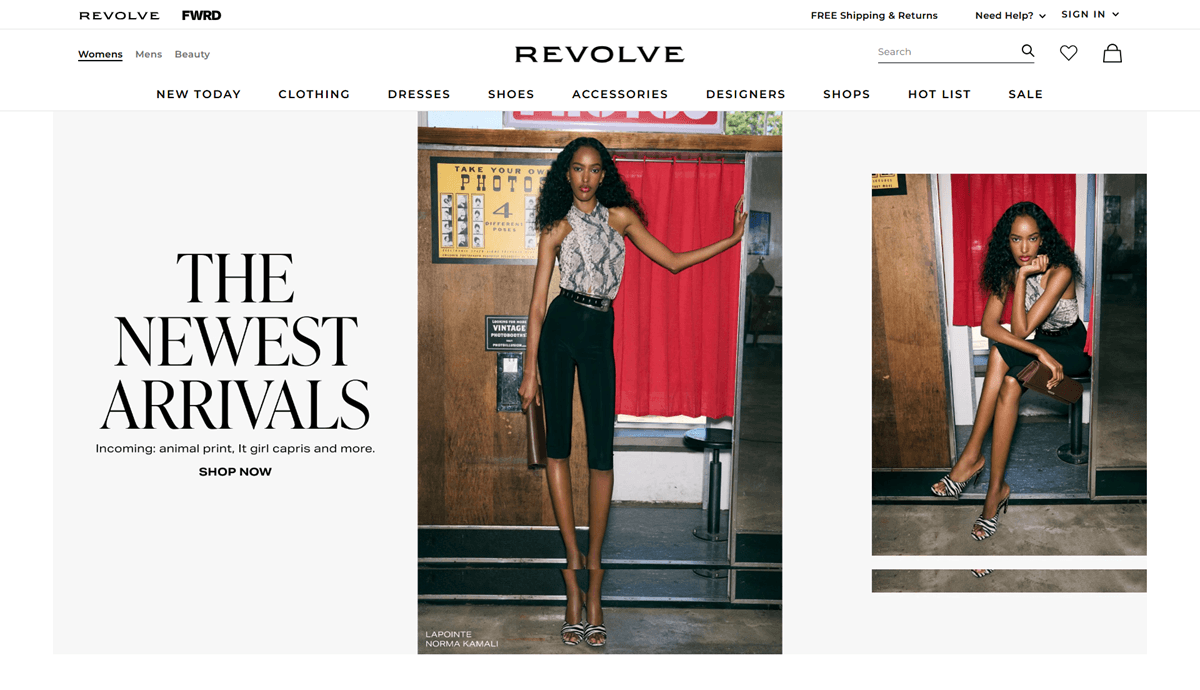
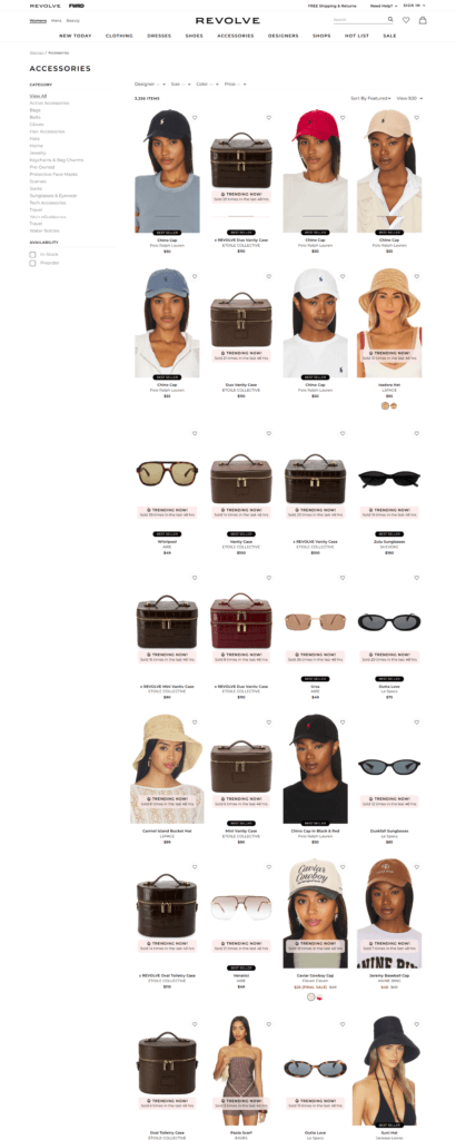
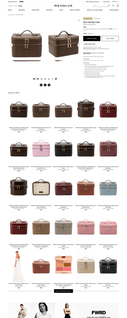
REVOLVE is a large online fashion retailer selling womens and mens apparel, shoes, accessories and beauty from a mix of established and emerging designer labels, alongside its own in-house lines. The top navigation runs Womens, Mens, Beauty and Revolve, with Designers, Shops, Hot List and Sale as a secondary row. The homepage reads more like a fashion magazine than a catalogue, mixing seasonal campaigns, designer collaborations and trend features around the product grid. The storefront runs on a proprietary platform built by Eminent, Inc., operating as Revolve Group.
Montserrat for interface, serif for editorial. The site sets its functional text in Montserrat, defined as the primary font across the stylesheet, while headline and logo treatments pull in Didot and ivypresto-display, pairing a plain grotesque with a classic high-contrast serif.
A neutral grey and white base. Backgrounds and dividers run through a family of light greys, and body text sits in mid grey rather than pure black. Color is used sparingly rather than as a brand system.
Red reserved for status, not branding. A single deep red appears consistently for final-sale badges, sold-out labels and error states, while a muted gold tone fills star ratings. The red functions as a signal color rather than a decorative one.
Editorial hero blocks. The homepage stacks themed sections rather than a single banner, seen at the time of research as a Porsche capsule collaboration, a “Hot List” trend roundup and a homecoming dresses push, each with its own headline and photography.
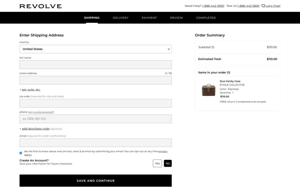
Region-aware checkout messaging. The site detects location and currency, showing a free shipping threshold stated in local currency, for example a Canadian dollar figure when browsing from Canada.
Consistent sale and sold-out styling. On-sale items show the original price struck through in grey next to the current price in black, and sold-out or final-sale items carry the same deep red used for badges and error text across the site.
A newsletter discount at signup. A popup offers 10 percent off a first purchase in exchange for an email address, valid for 30 days, with the promo code emailed and some brands and categories excluded.
Campaigns instead of a static about page. Rather than a fixed brand statement, the homepage tells the brand story through rotating capsule collections and named editorial features, letting each collaboration or trend push carry its own messaging.
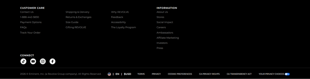
A large-company footer structure. The footer splits into Customer Care, REVOLVE and Information columns, the last separating About Us, Social Impact, Careers, Ambassadors, Affiliate Marketing, Investors and Press, signaling a retail group rather than a single-label shop.
Its own shopping app. The footer promotes a dedicated REVOLVE app for iPhone, iPad and Android as an alternative to browsing the mobile site.
Multiple support channels, with live status shown. Customer care lists phone, chat and email options, and at the time of research the chat option displayed as temporarily unavailable rather than being hidden, directing shoppers to email instead.
A detailed US privacy footer. Alongside standard Terms, Privacy and Cookie Preferences links, the footer separately lists California Privacy Rights and the California Transparency Act, reflecting compliance obligations sized for a large retailer.
Monthly mystery subscription service delivering collectibles and more featuring your favorite pop culture franchises starting at less than $20.
The #1 destination for stylish men’s accessories including neckties, bow ties, tie bars, pocket squares, socks and a host of other products.
Stadium Goods are a premium sneaker + streetwear marketplace selling only the most sought after footwear, apparel and other hard-to-find items on behalf of their sellers.
Never lose your keys, wallet or anything again! Tile’s bluetooth tracking device works with our phone app for Android and iPhone devices.
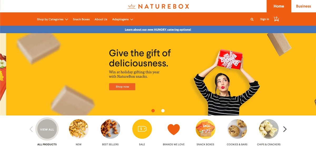
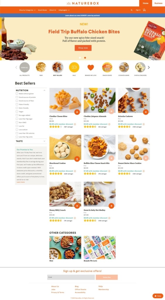
NatureBox sells snack foods, cheese bites, spiced nuts, cookies and trail mixes, sold as single bags or through a monthly membership plan, plus a separate business ordering track for office snack programs. The catalogue is organized by dietary filters such as gluten free, protein content and sodium level, and by taste tags including savory and sweet. The captured pages show a bright, list-driven catalogue built for repeat snack buyers rather than one-time shoppers.
An orange and cream palette. The identity relies on a bright orange for the logo, promotional banners and buttons, set against a white page and pale peach or beige card backgrounds. Product photography, bags of nuts, cookies spilling from packaging, carries most of the remaining color.
A flat, utilitarian layout. Pages run in simple horizontal bands: a top navigation bar, a promotional strip, a hero banner, a row of round category icons, then a grid of product cards, with no illustration beyond food photography.
Icon-led category browsing. Below the hero, a horizontal row of circular thumbnails, All Products, New, Best Sellers, Sale, Brands We Love, Snack Boxes, Cookies and Bars, Chips and Crackers, lets shoppers jump into a subcategory without opening a menu.
Filterable by diet and taste. A left-hand sidebar on the category page carries checkbox filters for Nutrition, gluten free, high protein, low fat, vegan, keto friendly, non-GMO, and a separate Taste filter group, alongside a box explaining a 15-day trial and membership pricing.
Member pricing shown up front. Each product card lists a standard price crossed against a lower member price, with a ratings count and an orange quick-add button, so the incentive to join the paid membership is visible before checkout.
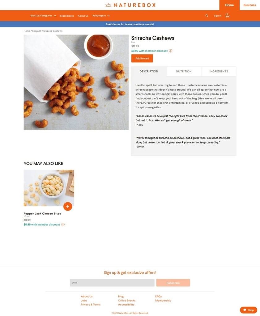
A tabbed product page. Individual products carry a large photo, price, an add to cart button, and three tabs for Description, Nutrition and Ingredients, with two customer quotes placed under the description.
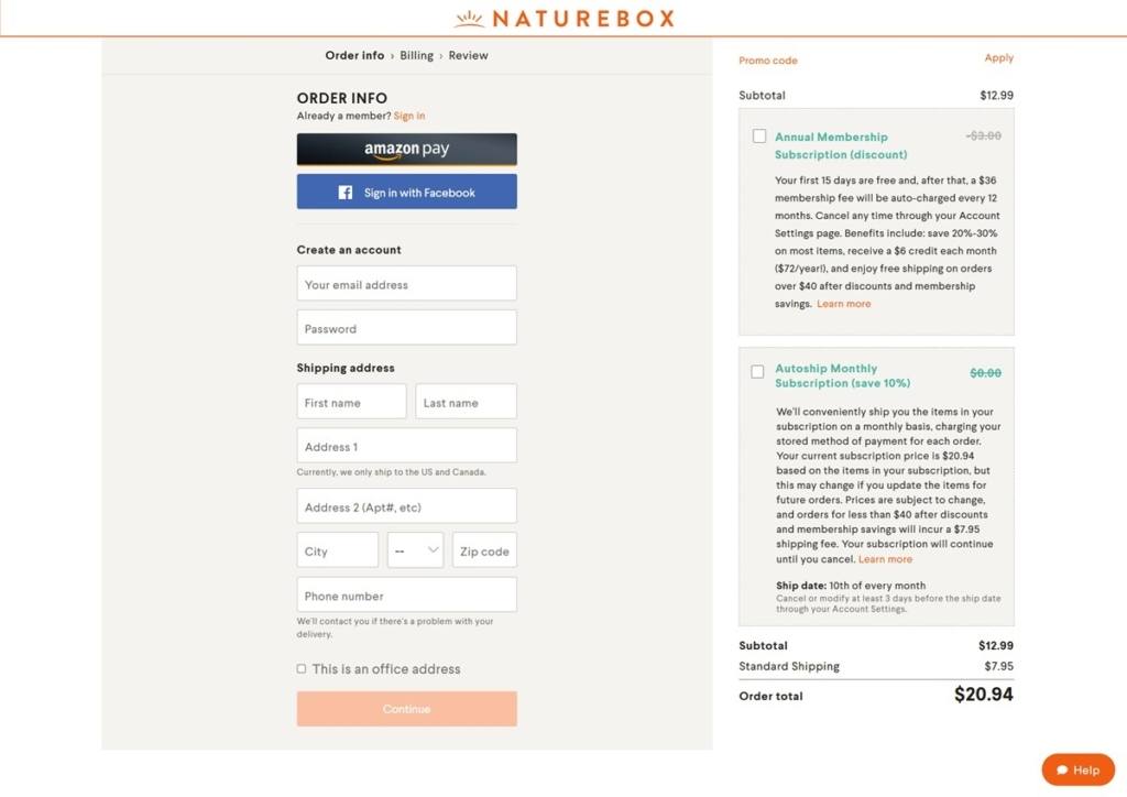
Membership pitched again at checkout. The checkout flow, Order Info, Billing, Review, offers Amazon Pay and Facebook sign-in, then two upsell boxes before the order form: an annual membership subscription at a discounted signup fee, and a monthly autoship subscription saving 10 percent.
Snacking as a subscription habit. The repeated presence of membership and autoship offers, on the category page, the checkout and the footer, positions NatureBox less as an occasional snack shop and more as a recurring delivery service shoppers opt into.
A workplace angle. A separate Business tab in the header, and a banner promoting snack boxes for offices and events, extends the brand beyond individual shoppers into corporate snack programs.
Persistent help widget. An orange chat bubble in the bottom corner offers live help on every page, including checkout.
Newsletter capture in the footer. The footer leads with an email signup for exclusive offers ahead of the standard link columns, About Us, Blog, FAQs, Membership, Accessibility.
Quotes used as product proof. Individual product pages carry two short customer quotes with a first name, used in place of a star-rating summary; star counts appear only on the category grid.