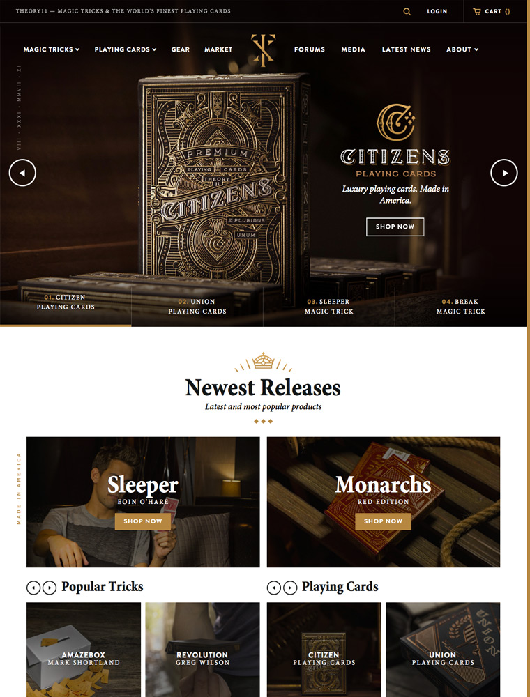
theory11 is the largest producer of premium, designer playing cards – and the best place to learn incredible, mind-blowing magic tricks and cardistry.

eCommerce Websites

theory11 is the largest producer of premium, designer playing cards – and the best place to learn incredible, mind-blowing magic tricks and cardistry.
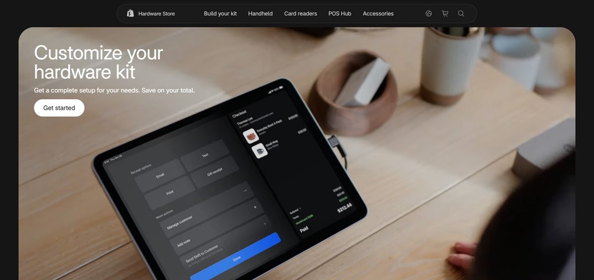
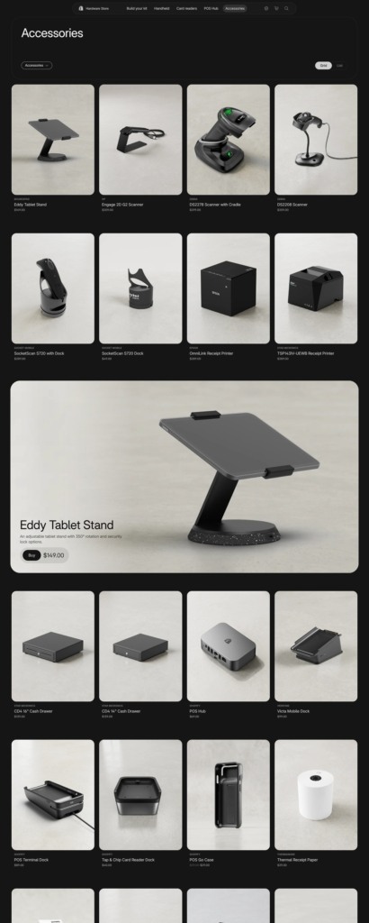
The Shopify Hardware Store is Shopify’s own direct storefront for point of sale equipment, sold to merchants running Shopify POS. The catalogue covers card readers and terminals, all-in-one handhelds, a POS Hub, receipt printers, cash drawers, barcode scanners, label printers, labels and tablet stands, about 94 listings in total. Own-brand Shopify units sit beside hardware from Verifone, Zebra, Star Micronics, DYMO and Epson, with headline items such as a POS Terminal at $349.00, an OmniLink receipt printer at $289.00 and a Victa Mobile dock at $99.00.
One typeface, Shopify Inter Variable. The store loads a single variable font and uses weight rather than a change of family to separate headings, specifications and interface text.
Dark chrome, orange action. Surfaces alternate between white and near-black, rgb(21 21 21) and rgb(42 42 42), with Shopify’s orange, rgb(255 68 0), as the only accent. Borders move from #d0d0d0 on light panels to #414141 on dark ones, and secondary cart text drops to #cfcfce and #91918f.
Hardware shot as hardware. Product imagery is studio work on plain grounds showing ports, feet and docking surfaces, matching the specification-led copy rather than styling the devices into a scene.
Navigation by job. The menu is Products, Build your kit, Handheld, Card readers, POS Hub and Accessories, and each entry carries a one line explanation underneath, such as “Wired for strongest connections” or “Tablet stands, receipt printers, cash drawers”.
A kit builder ahead of the grid. The first homepage action is not a product but a configurator, offering a complete setup and a saving on the total. Individual products sit below it.
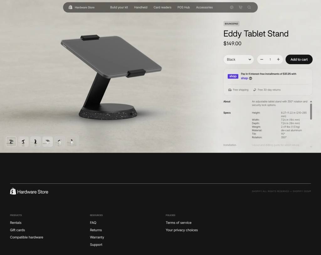
Product pages are spec sheets. A page runs About, then Specs listing dimensions in millimetres, port stack height, form factor, docking method, feet, drainage, branding plate, ports and status indicators, then Compatibility and In the box. Free shipping and free 30 day returns are stated in the buy box beside the quantity stepper.
A region gate before anything else. A Select your region step covers 18 markets, several with a language choice, and pricing follows from it. The search panel returns recommended products with prices attached rather than a plain list of links.
Positioned as an extension of the software. The homepage frames the devices as “Powered by software built for what’s next”, and a merchant strip names Venus et Fleur, Sukhmani Designs and Monos as users of Shopify POS.
Shop floor language, not developer language. Copy describes checkout moving with the staff member and devices wired for reliability, keeping the argument on retail operations rather than integration detail.
Rentals alongside purchase. The footer lists Rentals as a product line next to Products and Gift cards, so short term needs such as markets and pop-ups are served without a sale.
Physical gift card design. A gift card block sits on the homepage and leads into its own purchase path, bridging hardware and merchandising in the same store.
Support material grouped in the footer. Compatible hardware, FAQ, Returns, Warranty and Support are collected as a Resources column, so post-purchase questions have a fixed home.
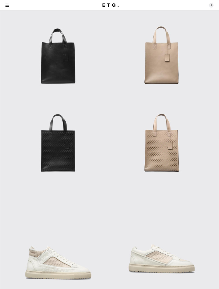
Footwear label based in Amsterdam, The Netherlands.

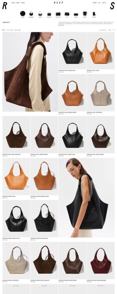
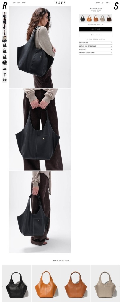
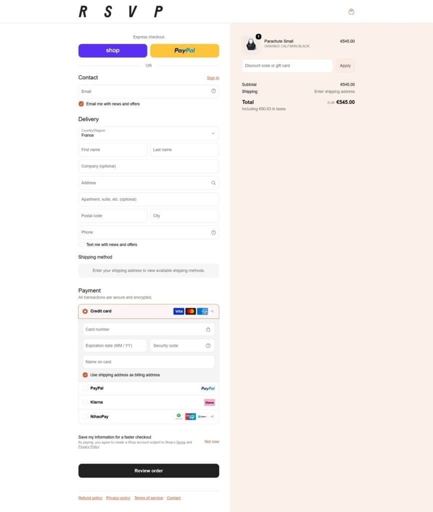
RSVP is a Paris leather goods house selling handbags, small leather goods and caps under named styles rather than generic categories, sold internationally with multi-currency pricing, multi-language content and a bookable video shopping appointment. Built on Shopify.
Baton carries the typography. The brand’s display type is a custom font called Baton, set in italic for the video-appointment modal heading and for player controls, giving those touches a scripted, invitation-card quality distinct from a standard sans.
A terracotta accent against near-black text. Body copy runs in a dark charcoal (#212121) rather than pure black, with a rust-terracotta tone (#c95f34) used as the accent color and a cream-blush ground (#fcf0ea) appearing in feature panels.
Courier as a technical counterpoint. A monospace font, Courier Prime, appears alongside Baton for smaller labels, giving detail text a stamped, technical look against the more expressive display type.
Bags are the anchor category. Named styles including Batman, Parachute, Munchkin, Golden Eyes, Duo, Low Five, Milkman and Skinny B lead the catalogue, organized by season (SS26, FW25, SS25, FW24) rather than by bag type.
A wide currency selector. Beyond default euro pricing, the site offers pound sterling, US dollar, Korean won and further regional currencies, aimed at an international, tourist-inclusive customer base.
Video shopping in place of live chat. Instead of a chat widget, the site offers 30-minute private video appointments with a sales associate, bookable across the week, a format suited to a considered leather-goods purchase.
Accessories and caps sit beside the bags. A secondary Accessories category and a caps line round out the catalogue, giving repeat customers a lower-cost entry point next to the named bag styles that anchor the shop.
Craftsmanship broken into named sections. The About area is split into Design, Craftsmanship, Materials and Sustainability, each its own page rather than folded into one brand story.
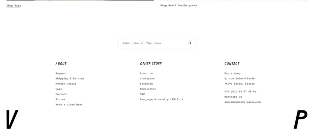
A single Paris address anchors the brand. The store references one boutique, at 8 rue Saint-Claude in the Marais, giving the multi-currency, multi-language storefront a specific physical home.
Four languages served. Content is available in French, English, Korean and Japanese, a broader localization set than most stores in this set, matching the currency options offered at checkout.
A dedicated Return Center. Returns are handled through a separate linked portal rather than a page of policy text, alongside FAQ pages split by Payment, Shipping and Returns, and Care.
Store finder alongside the shop. A Stores link sits in the main navigation next to E-Shop and About, treating physical retail as equal to the online catalogue rather than a footer afterthought.
Social presence kept to two channels. Instagram and Facebook are the only social links carried in the footer, a narrower spread than the site’s language and currency options might suggest, keeping the brand’s public voice concentrated rather than spread thin.
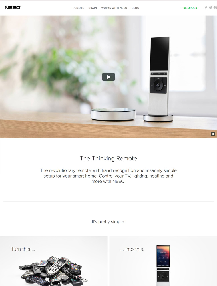
The revolutionary remote with hand recognition and insanely simple setup for your smart home. Control your TV, lighting, heating and more with NEEO.
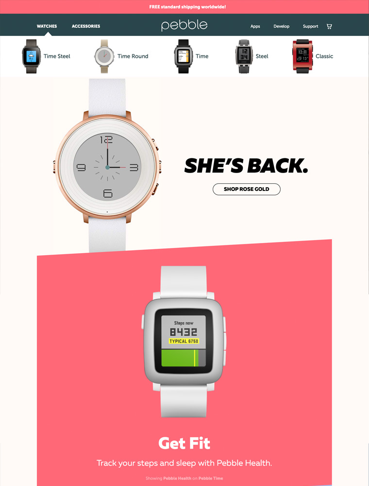
Smartwatch that is waterproof, sunlight readable and affordable. Plus enjoy 24/7 fitness tracking and up to 7 days long battery life. Free shipping worldwide.
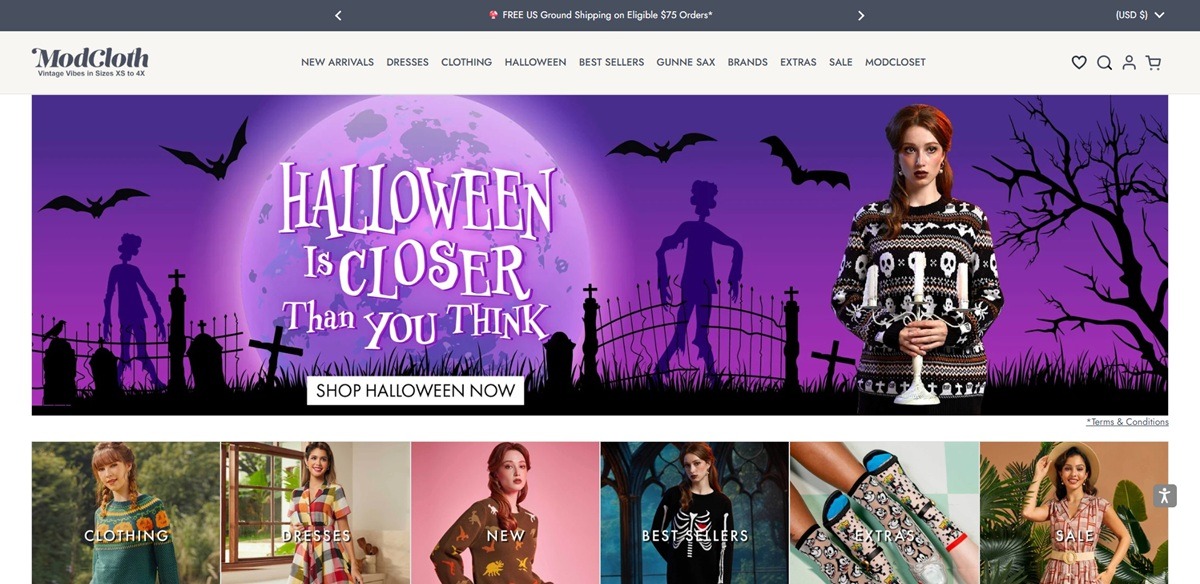
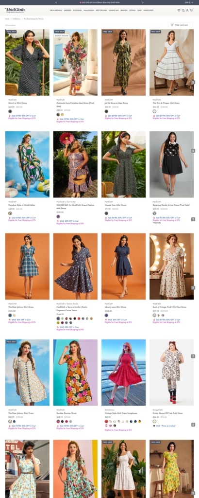
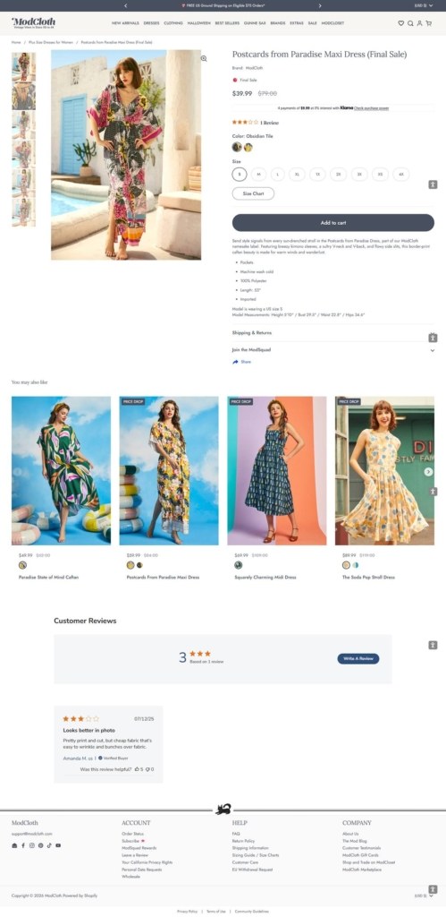
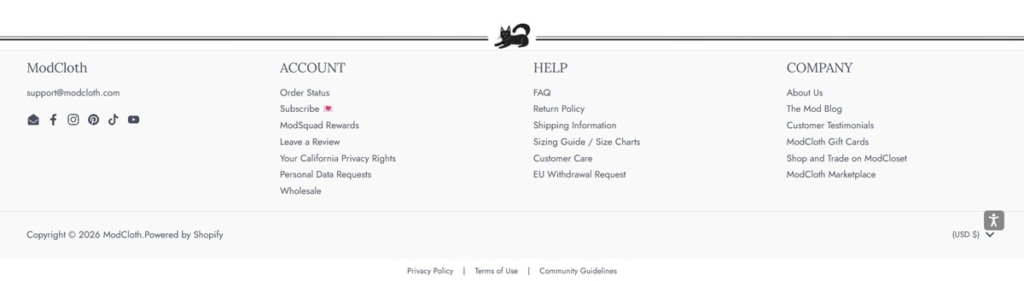
ModCloth sells vintage-inspired women’s clothing across dresses, tops, bottoms, skirts, sweaters, jumpsuits, rompers, denim and matching sets, with a dedicated accessories range covering jewelry, sunglasses, hats and shapewear. Sizing runs from XS to 4X with its own plus-size sections rather than a filtered afterthought, and the catalogue mixes proprietary ModCloth designs with partner labels such as Princess Highway and Chelsea Crew.
Warm neutrals with a grey accent. The page backgrounds split between white product areas, a slightly warmer off-white header and a cool light grey footer, with a mid-grey used consistently for accent text and icons rather than a saturated brand colour.
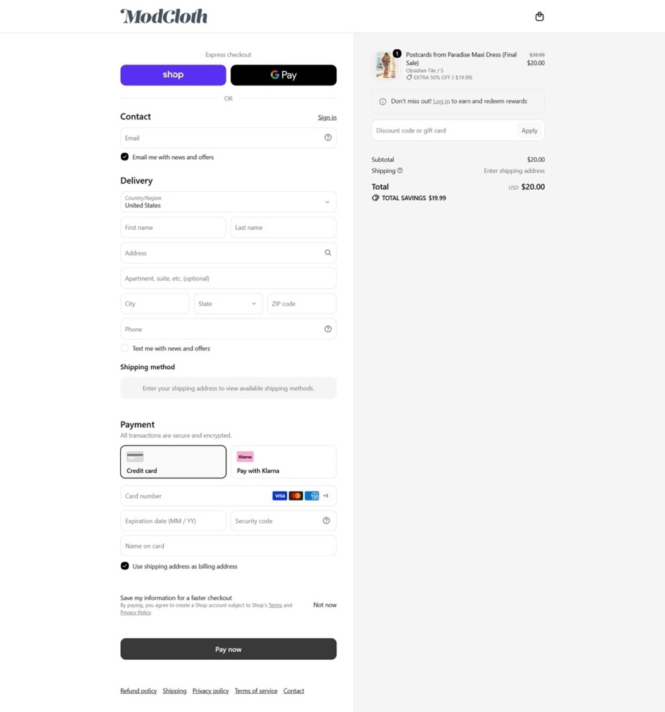
Jost for the interface, Lora for accents. Jost, a geometric sans-serif, carries navigation and body copy, while Lora, a serif, appears for selected accent text, giving the otherwise clean-lined store a softer, editorial touch where it is used.
Category tiles built around product photography. The homepage relies on image-led category tiles, Tops, Shoes, Dresses, Bottoms, rather than text-forward banners, letting the styled photography carry the vintage positioning.
Emoji used inside primary navigation. Menu labels pair with emoji, a shopping bag, a mushroom, a bow, a sock, a stylistic choice that sets the navigation apart from the plain text menus typical of apparel retailers.
A dedicated seasonal category alongside core sections. Halloween sits as its own top-level navigation item next to Dresses and Clothing, treating a seasonal assortment as permanent site structure rather than a temporary banner.
Gunne Sax given its own navigation slot. The vintage-revival label Gunne Sax is broken out as a distinct top-level section rather than folded into Brands, a sign of its weight within the catalogue.
Discount messaging stated in percentage terms. Promotional copy at the time of research stated savings of up to 40 percent off, along with free ground shipping on eligible orders over 100 dollars.
A named designer collaboration. A ModCloth x Tamara Arcilla collection is called out separately from the general catalogue, using a collaborator’s name to signal a limited or capsule assortment.
Vintage positioning stated without qualification. Copy across the site uses vintage-inspired and unique directly to describe the aesthetic, rather than a more roundabout description of the style.
A resale platform linked from the footer. ModCloset, a secondhand or resale arm of the brand, is linked directly from the footer alongside standard account and support links, extending the vintage identity into resale as well as new stock.
ModSquad Rewards as a named loyalty program. Rather than a generic points system, loyalty is branded as ModSquad Rewards and given its own footer link, consistent with the brand’s community-oriented tone.
Five social platforms linked in the footer. Facebook, Instagram, Pinterest, TikTok and YouTube are all listed, a broader social footprint than most sites in this gallery carry.
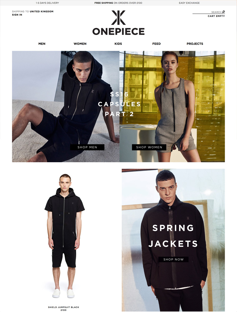
Active leisurewear from Norway. Adult onesies and jumpsuits, joggers, hoodies, sweaters and jackets.

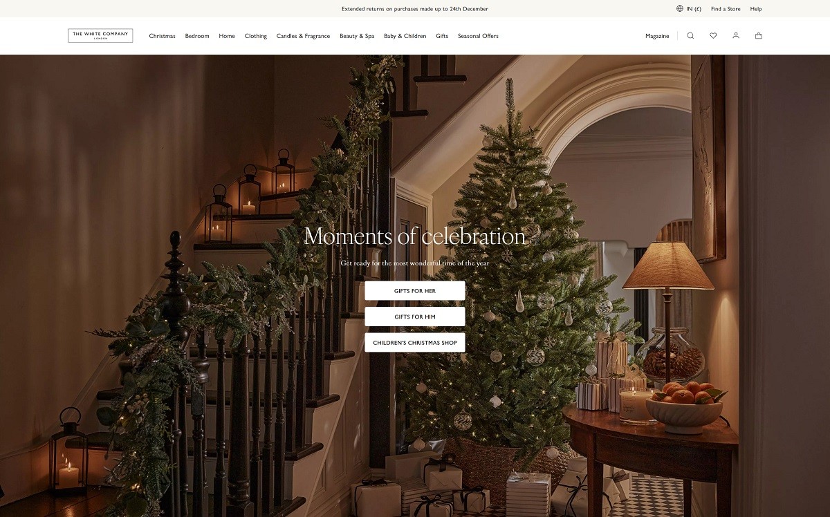
The White Company offers a curated selection of luxury clothing, homeware, and gifts, emphasizing timeless elegance and quality craftsmanship. Their product range includes women’s apparel, bedding, home décor, and fragrances, all designed with a minimalist aesthetic and a focus on comfort and style. The website features a clean, user-friendly design that reflects the brand’s sophisticated ethos. High-quality imagery and intuitive navigation allow customers to easily explore product categories and detailed descriptions, enhancing the overall shopping experience.
Bath and hair, skin care, fragrances, soap, and gift boxes.
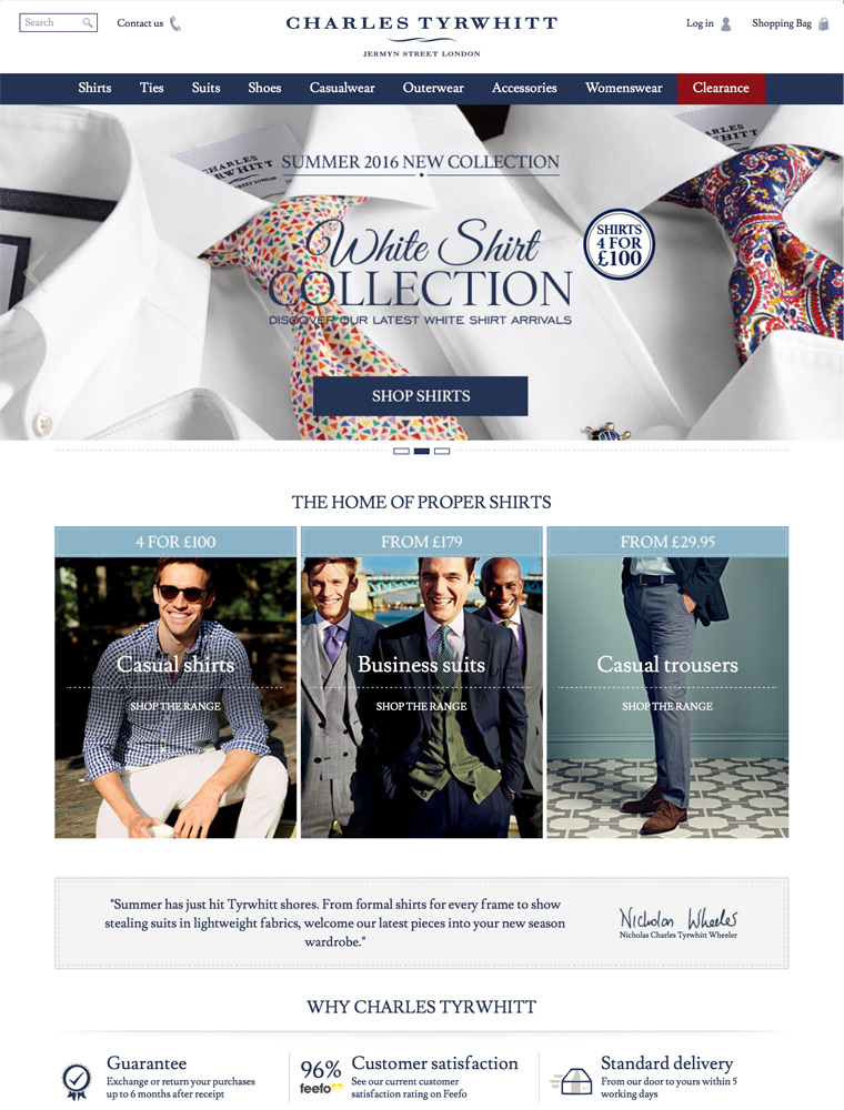
Charles Tyrwhitt is a multi-channel British clothing retailer, specialising in formal men’s shirts, shoes, suits, knitwear and accessories, as well as lines of womenswear and a casual range.


