
The World’s Number 1 Destination for Men’s & Women’s Luxury Fashion Shopping.

eCommerce Websites

The World’s Number 1 Destination for Men’s & Women’s Luxury Fashion Shopping.

Competitively priced and environmentally friendly shaving subscription service.

Beard care products from the best beard company. Shop for natural beard oil, mustache wax, soap, combs and beard kits from Beardbrand.
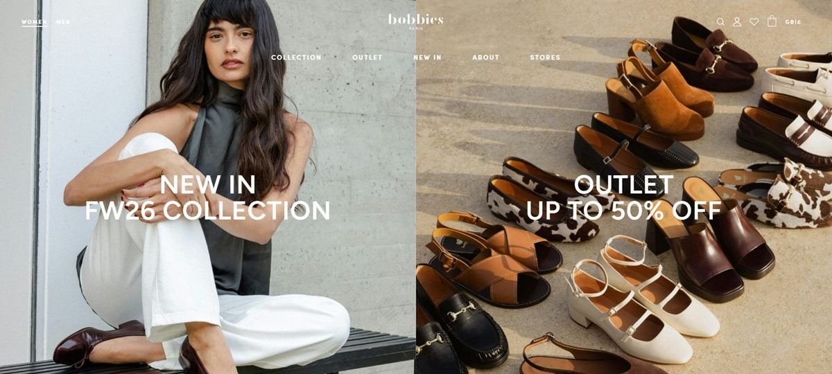
Bobbies is a Paris leather goods label selling women’s and men’s shoes, from ballet flats and mules to heeled sandals, loafers and espadrilles, alongside leather bags. The range is handcrafted in Portugal and Spain and sold direct to a worldwide audience through a custom-built storefront.
An off-white ground with near-black type. Pages run on a warm off-white background (the Bobbies wordmark and body copy sit in a near-black #232323) rather than pure white, giving the site a softer, paper-like base.
Sofia Pro for reading, Didot for identity. Body text, filters and buttons use Sofia Pro, a plain grotesque sans, while the “bobbies” logo, product names in the buy box, and section titles switch to Didot, a high-contrast serif set in uppercase with wide letter spacing.
Editorial lifestyle photography. The homepage leads with a large photograph of a model on a red velvet-toned scene under the handwritten-style line “From Montmartre with love,” and product grids mix worn-on-foot shots with flat product photography rather than showing only studio images.
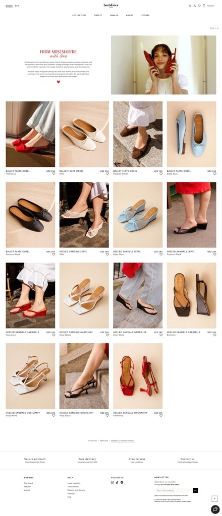
A dense, image-forward grid. The women’s shoe collection lists items in a four-column grid, each card showing the style name, colorway and price with a heart icon for wishlisting, and multiple colorways of the same style (for example Ballet Flats Orsel in Flamenco red, Milk, Rockies Brown and Baby Blue) appear as separate cards.
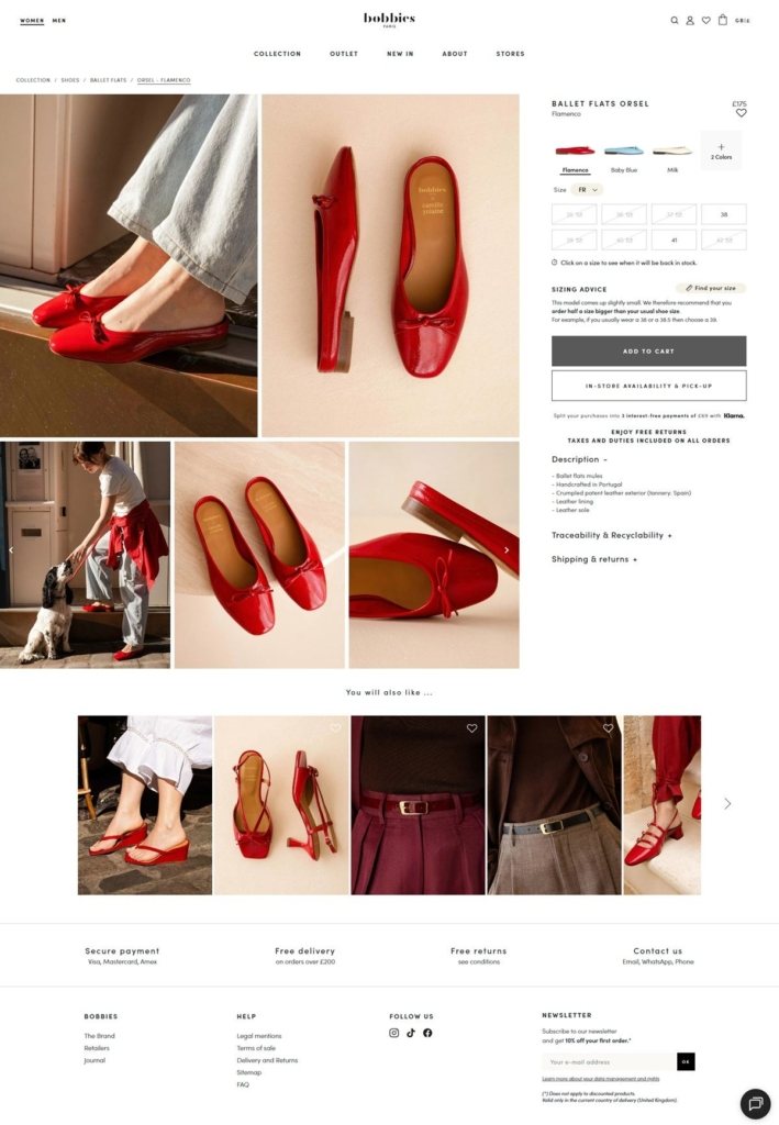
A detailed product page. The Orsel ballet flat page opens with four images including an on-foot lifestyle shot, then lists color swatches, a size grid with restock click-to-notify, a sizing advice note (“order half a size bigger than your usual shoe size”), an Add to Cart button and a separate in-store availability check.
Klarna installments at the buy box. Below Add to Cart, the page offers 3 interest-free payments through Klarna, plus a line stating free returns and taxes and duties included on all orders.
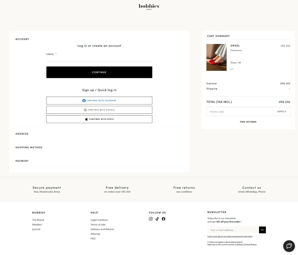
Account-first checkout. Checkout opens on an account step offering continue with Facebook, Google or Apple ahead of a guest path, then proceeds through address, shipping and payment sections, with a persistent cart summary and promo code field on the right.
Craft details surfaced on the product page. A Description accordion lists specifics like “Handcrafted in Portugal,” “Crumpled patent leather exterior (tannery: Spain)” and “Leather lining,” putting sourcing detail directly next to the buy box rather than in a separate about page.
Traceability as its own section. A dedicated “Traceability & Recyclability” accordion sits alongside Description and Shipping & Returns, giving material origin equal billing with sizing information.
A named “You will also like” carousel. Product pages close with a horizontal scroll of five related items mixing the same shoe in other colors with adjacent accessories like belts.
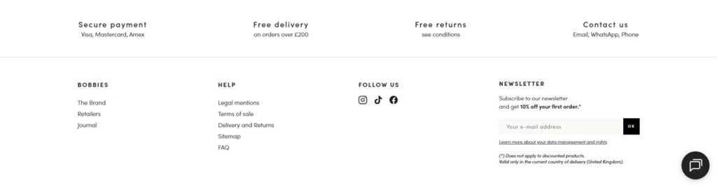
Threshold-based free delivery. Free delivery applies on orders over 200 in the shopper’s local currency (shown as GBP 200 or US$200 depending on region), stated consistently in the footer and at checkout.
Multi-channel support links. Contact options list email, WhatsApp and phone together in the footer, rather than routing everything through a single contact form.

Stay ahead of the trends with an unparalleled selection of chic fashion jewelry at BaubleBar.
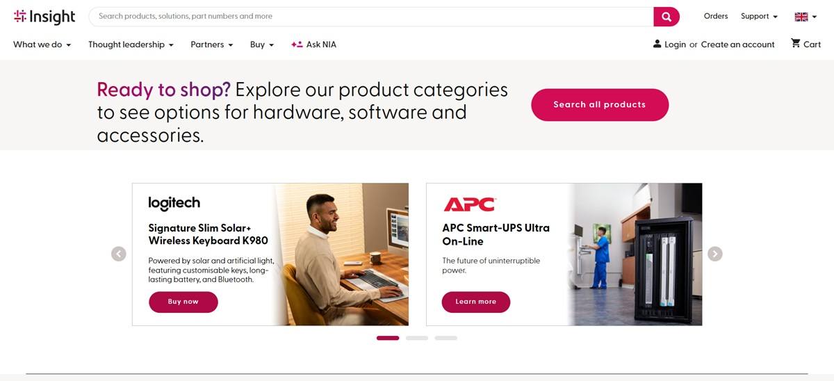
Insight is a B2B technology reseller and solutions integrator, selling computing hardware, software, cloud and IT services to business, government, education and healthcare buyers through its UK storefront. The catalogue spans ten top-level categories, from Mobile Devices and Computers to Data Centre and Software, with named subcategories under each. Positioning is stated directly: Insight describes itself as a “Leading Solutions Integrator” that will “align your business with the right technology and solutions to modernise, compete and grow.”
Typography built on a commercial type family. Headings use Allumi Std, including its extended and hairline weights, while Klinic Slab appears in select UI elements; Helvetica Neue is the body fallback.
Color is used to code categories, not to brand the whole page. The palette carries a wide spread of hues, crimson red, teal, warm grey, dark brown, magenta, purple, pale blue and a gold yellow, rather than one or two signature tones.
Vendor logos double as visual anchors. Samsung, Intel, Apple, Red Hat and AWS banners sit across the homepage promotional space, giving the page a partner-directory feel alongside its own product tiles.
Ten categories, each with its own subcategory tree. Computers alone splits into laptops, tablets, smartphones, desktops, workstations and servers, a depth of navigation aimed at procurement buyers rather than casual browsers.
A product selector tool replaces manual filtering. The site describes “easy-to-use tools” that let a shopper “choose your needs and requirements, and then generate the results that are the best match.”
Account login is framed as a feature, not an afterthought. Signing in promises “a smarter shopping experience,” and a dedicated top-brands section groups Lenovo, HP, HPE, Cisco, Microsoft and Apple by vendor.
The pitch is business alignment, not product excitement. Where a consumer electronics retailer might lead with a hero image, Insight leads with the promise to modernise, compete and grow a client’s operations.
A search bar sits ahead of any lifestyle content. With no models or editorial photography on the homepage, the design treats the catalogue itself, plus its category tabs, as the primary content.
A dedicated deals section is called out by name. A direct link to view the site’s top tech deals sits apart from the general catalogue.
Category tabs carry their own colors. The ten product categories are each rendered in a distinct hue from the palette described above, functioning as a visual index across the tabbed homepage navigation.
The catalogue serves four buyer types by name. Business, government, education and healthcare are each named as served sectors, a sign the site is built for procurement across public and private buyers rather than a single audience.
Software sits as its own top-level category, not a subcategory of hardware. Licensing and cloud solutions are given equal footing with physical devices in the ten-way navigation, reflecting a reseller that sells services alongside boxed product.

Shop for an eclectic mix of exclusive, unusual Gifts, Tech, Food, Drink, Gadgets, Art, Books, Home, Clothing, Games, Toys, Lifestyle, Pop Culture and Oddities.

A design and production platform based in Stockholm, Sweden.

Lightweight materials, thoughtful features, and timeless styles. Smartly designed bags for travel and work.

We source unique fragrances directly from perfumers. We believe that your money should go towards quality ingredients, not big marketing budgets.
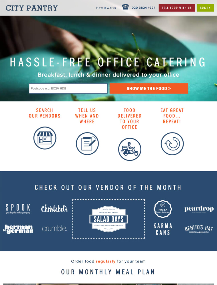
Easily order catering from London’s best independent food vendors. Make breakfasts, lunches, meetings and events more interesting & hassle free.
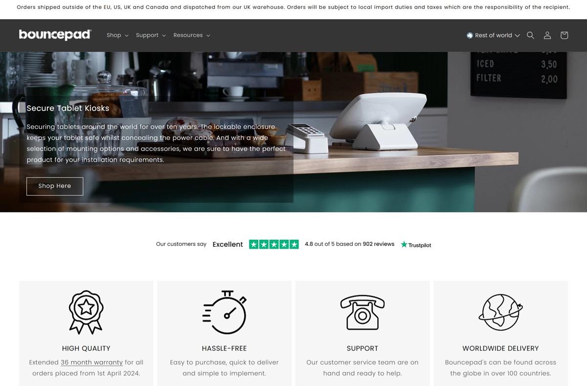
Bouncepad designs secure tablet and iPad kiosks, stands, and mounts compatible with various devices, including iPad, Samsung, and Microsoft tablets. Their website features a clean, intuitive design, showcasing products with high-quality imagery and detailed descriptions, providing an engaging and user-friendly shopping experience.


