P&Co™ CLOTHING TO LIVE IN, GOODS TO RELY ON

eCommerce Websites

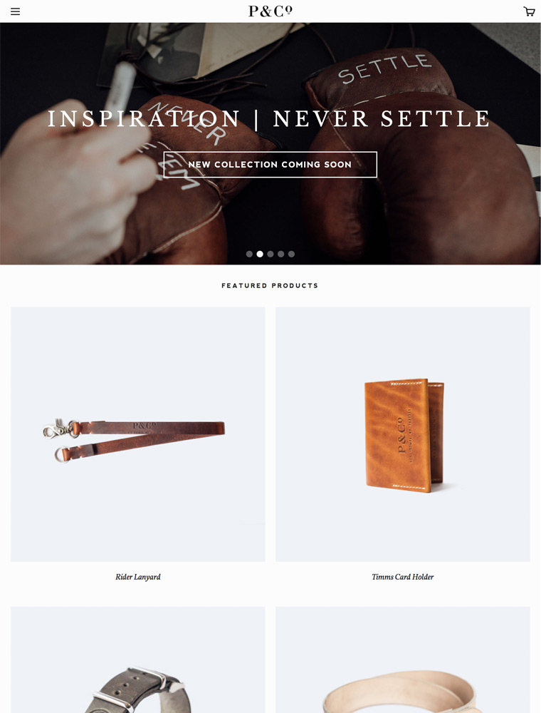
P&Co™ CLOTHING TO LIVE IN, GOODS TO RELY ON

Bellroy exists to slim your wallet. Rather than bulging pockets and bulky design, our leather wallets are more efficient, have better access, better protection
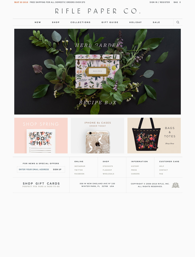
Rifle Paper Co. creates original greeting cards, art prints, calendars, stationery, journals, notepads, recipe boxes, wallpaper, and a host of other paper goods.
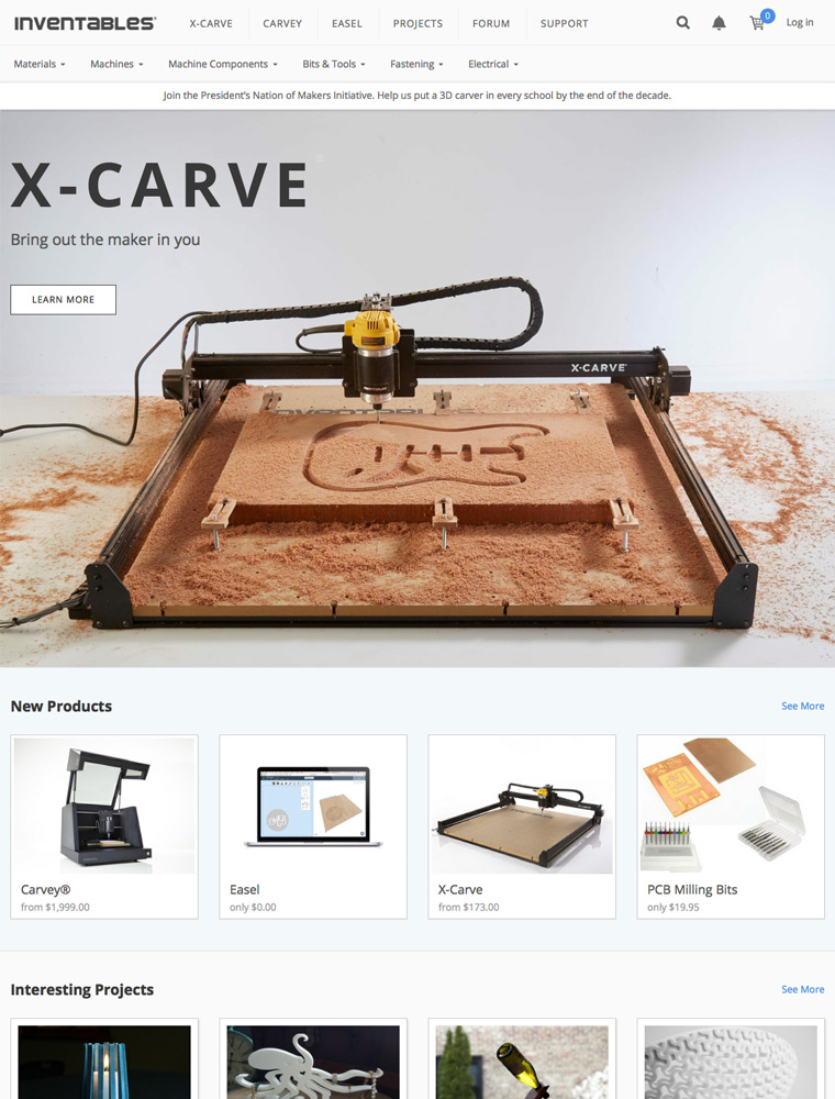
Inventables: the hardware store for designers. We help designers buy the products they need.
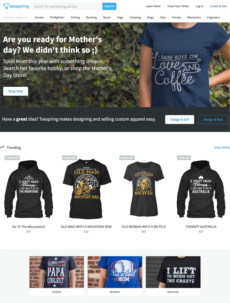
Teespring is a platform that makes it easy for anyone to create & sell high-quality products people love, with no cost or risk.

Beautiful designs at up to 70% Off. Article offers stylish modern, mid-century and scandinavian furniture from world renowned designers at accessible prices.
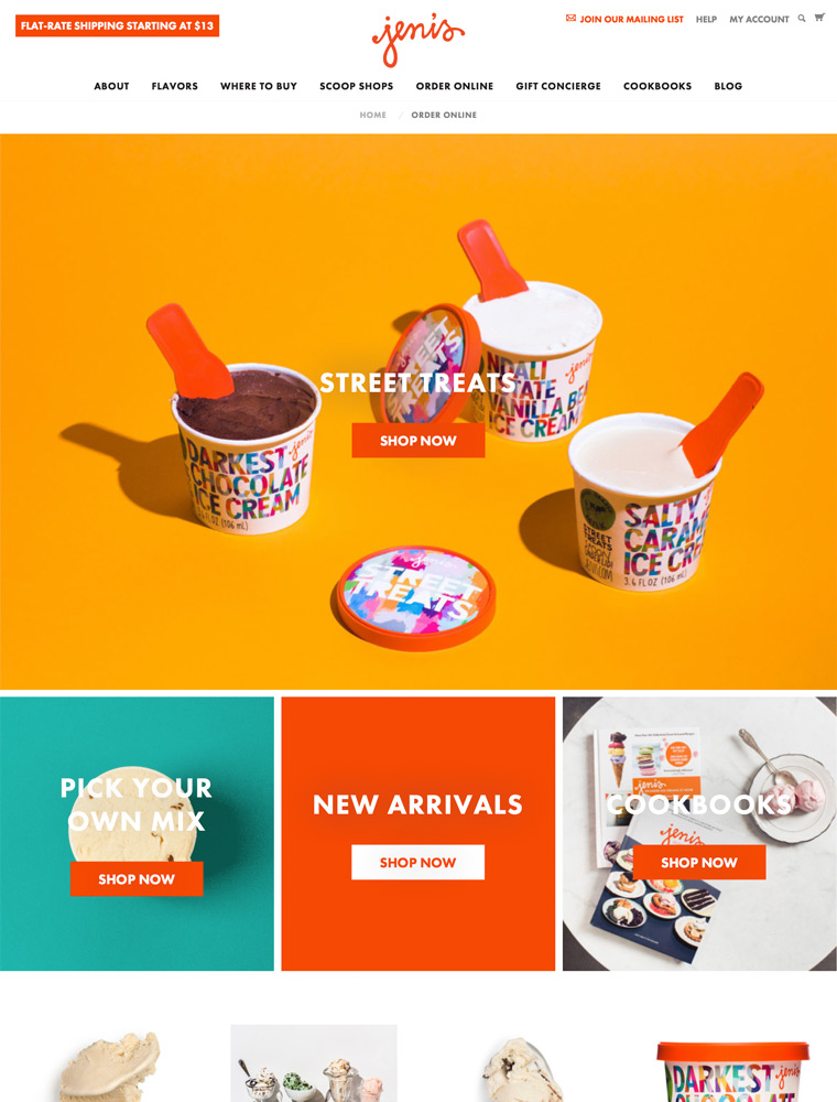
Jeni’s Splendid Ice Creams sells pints, ice cream bars, sandwiches and single serving mini cups direct to shoppers across the United States, alongside merch, gift cards and a monthly subscription. The same site carries three other routes to the product: scoop shops, a grocery store locator and corporate gifting. Frozen delivery is the core promise, repeated three times on the homepage, with pints shipped in an insulated box packed with dry ice and free shipping in the contiguous US. The store runs on Shopify with a custom theme.
Green, rust and cream. The theme colours are a deep green #445958 and a rust #9d572c against a warm cream #faf1e9 and white, with body copy in a near black #1a1b18. A hot orange #ee3900 is held back for button hover states. Colour arrives as full width bands, so the homepage reads as a stack of panels.
Moderat, and only Moderat. One family sets headings and body, loaded in bold and medium with matching italics. Headings take the bold weight, body copy the medium, and nav labels such as GIFT and SHOP BEST SELLERS are set small and upper case.
Two shots per flavour. Product cards pair a styled pint photograph with a close up of the ice cream texture, swapped in on hover. Editorial bands use lifestyle imagery, and at least one brand panel is a looping motion file.
Build a box, not a cart. The flavours index is a grid of cards, each with a name, a one line tasting description and an ADD button that drops the pint into an order box rather than opening a product page. The collection header states the rule: “Our order minimum is 5 pints. But after that it’s up to you. Our boxes are designed to neatly hold up to 6, 9, or 18 pints.”
Prebuilt collections sit beside single pints. Fixed assortments such as The Fall Collection at $79.00, The Queen’s Diamond Collection at $89.00 and the Birthday Party Collection at $101.00 carry Add to cart buttons on the homepage, so a shopper can skip the box builder.
Reviews are summarised before they are listed. Product pages show an aggregate score, then an AI Generated Review Summary with percentage weighted topics such as Overall Flavor and Ice Cream Texture, then three highlights, then the full list and a Q and A block.
Flavour descriptions do the writing. Each product gets one sentence of ingredient led copy, for example “Oven-toasted oat streusel and a sweet-tart brambleberry jam layered throughout vanilla ice cream.” The homepage states the position in the same register: “Flavor is everything.”
A seasonal drop structure. The announcement bar, hero and a dedicated collection run the current seasonal release together, and a separate merch drop gets equal billing on the homepage.
Three delivery models in one nav. Nationwide shipping, local pickup and delivery, and a grocery locator each get their own menu section, repeated in a Need Jeni’s now? footer block.
Subscription and loyalty run side by side. Pint Club ships four curated pints a month, and Splendid Rewards adds a signup upgrade, early access to new flavours and a birthday scoop.
A deep company footer. Beyond the shop columns it carries a founder page, events and catering, fundraising, franchising, wholesale and a Flavor Vault.
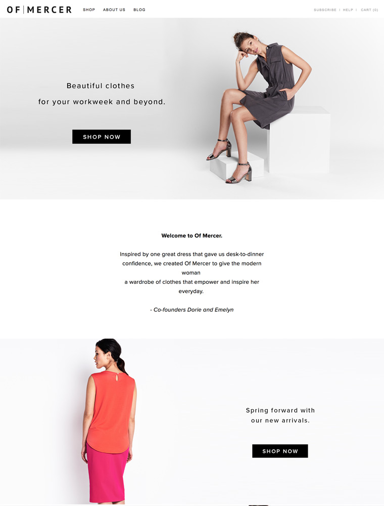
Makers of fashionable and work-appropriate dresses, blazers, suiting & accessories for desk to dinner and beyond.
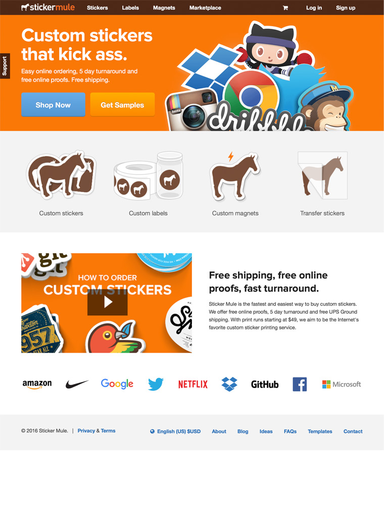
Sticker Mule prints custom stickers and roll labels.
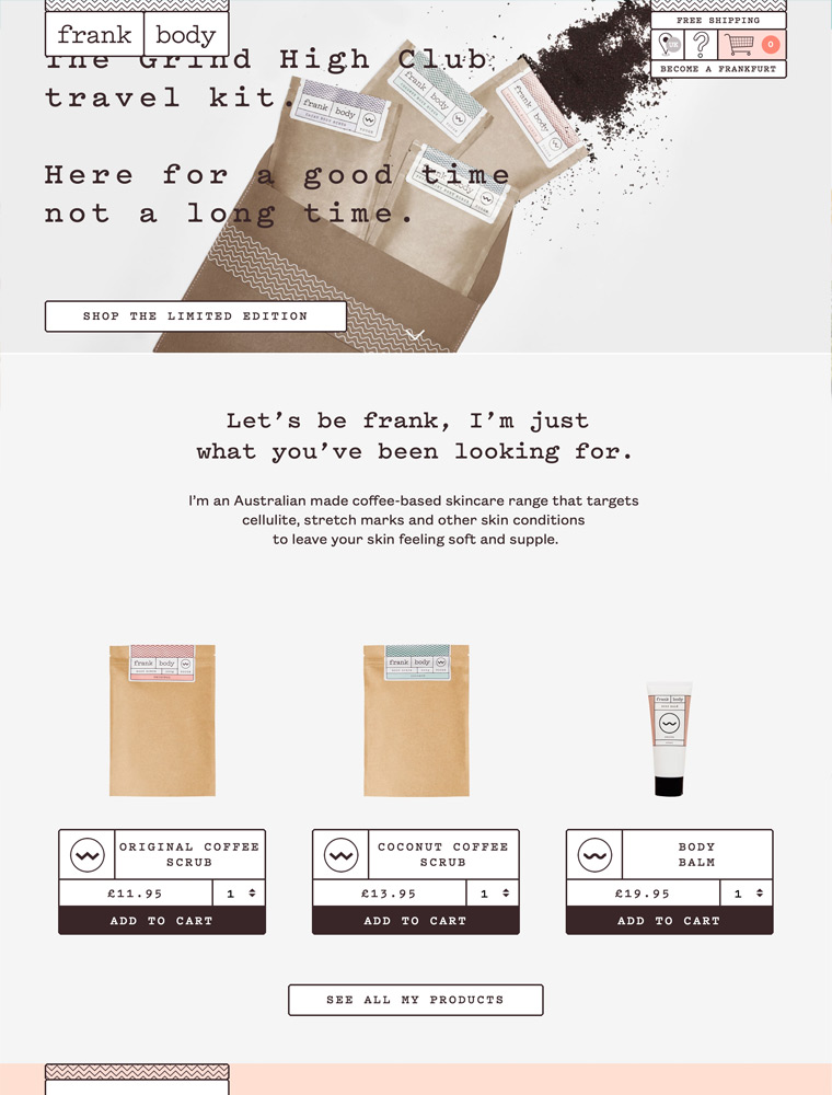
Coffee-based skincare, made in Australia and tested on babes.
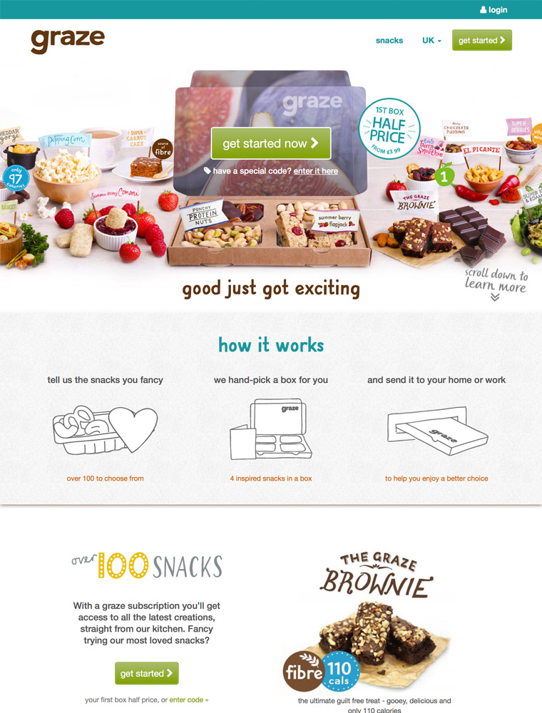
With a graze subscription you’ll get access to all the latest creations, straight from our kitchen.
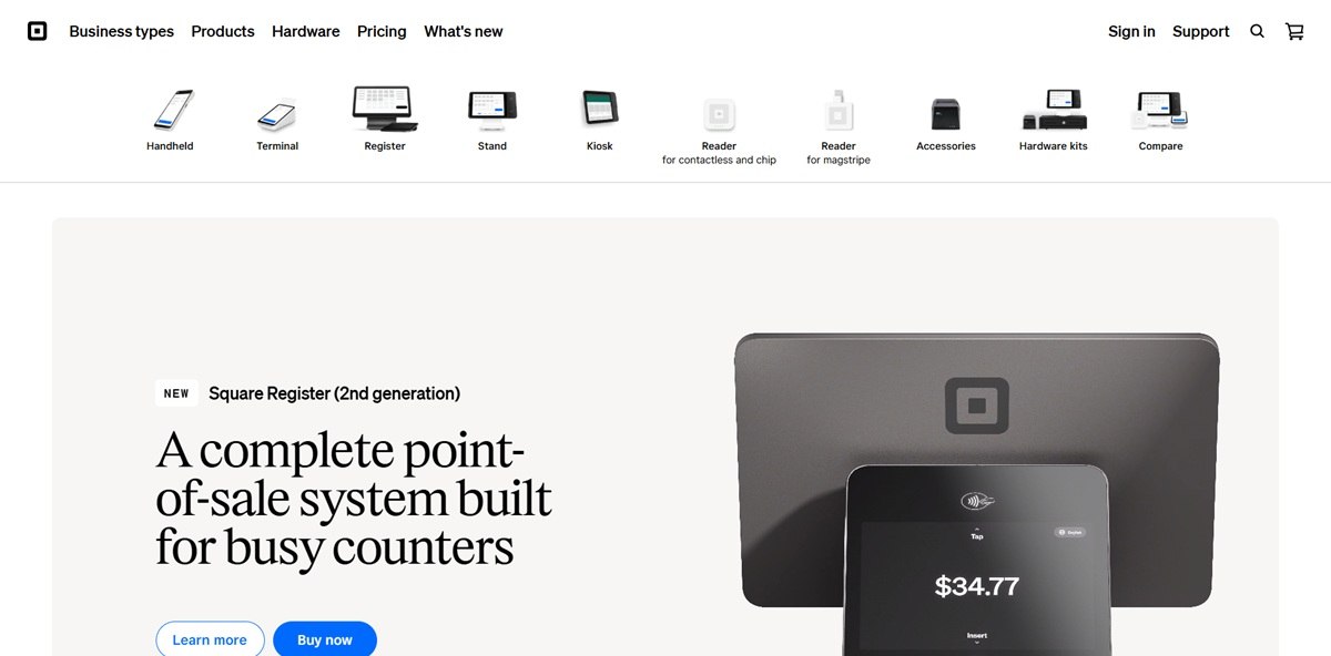
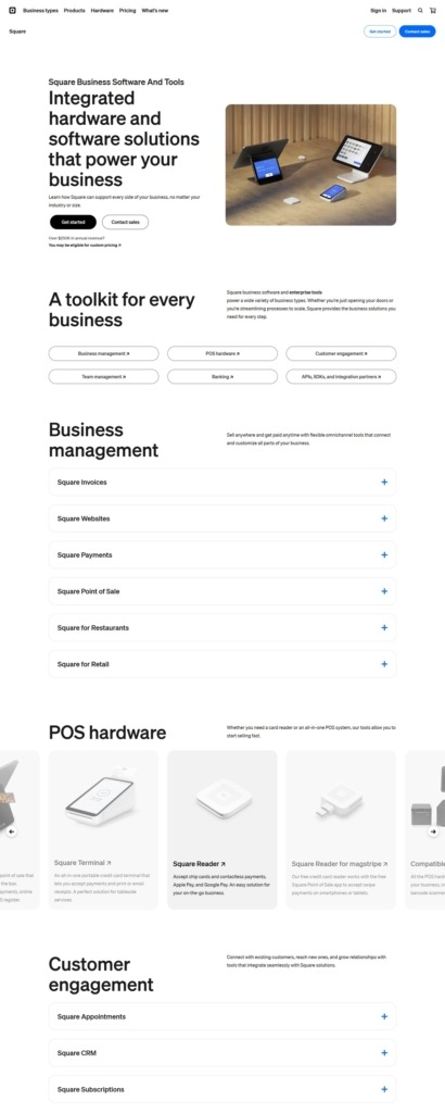
Square Hardware is the point-of-sale equipment arm of Square, selling the Register, Handheld, Terminal, Stand and Kiosk devices along with card readers and accessories to small businesses. The site organizes content by business type, food and beverage, retail, beauty and services, alongside categories for hardware, payments, staff and banking. The current hero promotes Register, a dual-screen checkout system, reached at squareup.com/us/en/hardware after a locale redirect from squareup.com/shop.
Square blue as the single accent. The design system’s blue token, #006aff, is used consistently for links, buttons and the blue-text variant across both light and dark modes, against a pure white or black base.
Cash Sans for interface text. The site’s font variables name Cash Sans as the primary sans-serif, falling back to Helvetica Neue, with a separate serif variable pointing to a font named Exact Block for display use.
A full light and dark token system. Nearly every surface, background and border color is defined twice, once for color-mode-light and once for color-mode-dark, for example a background of #ffffff in light mode against #000000 in dark.
A pale blue badge color for pricing. Pricing tier badges use a light blue background, #cce1ff, with blue text, #005ad9, distinct from the primary interactive blue used elsewhere.
A tiered hardware lineup with financing built in. Register lists at $899 or $44 a month over 24 months, Handheld at $399 or $37 a month, Terminal at $299 or $27 a month, and Stand and Kiosk at $149 or $14 a month, so every device carries both a cash price and a monthly plan.
Business type as the entry point. Rather than one generic storefront, the site routes shoppers first by vertical, naming quick service, coffee shops and hair salons specifically, before narrowing to hardware.
Capabilities listed alongside hardware. The same navigation that holds Hardware also lists Payments, Customers, Staff and Banking, framing the devices as one part of a broader software stack rather than a standalone shop.
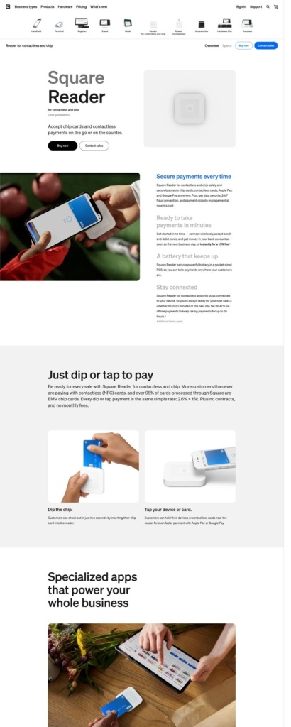
Card readers kept separate from the larger devices. Contactless, chip and magstripe readers are grouped apart from Register, Terminal and Kiosk, giving shoppers a distinct lower-cost entry point.
The Register is framed as the flagship. Homepage copy calls it “a complete point-of-sale system built for busy counters,” giving the newest device the lead position over older hardware like the Stand or Terminal.
Industry-specific language throughout navigation. Menu items speak directly to named trades rather than generic retail copy, positioning Square as built for specific business types.
A locale-aware storefront. The hardware store resolves through a country and language path, us/en here, reflecting a company built to serve markets beyond a single country from one property.
Monthly financing on every device. Each hardware product is priced with an explicit monthly alternative to the upfront cost, surfaced at the point of comparison rather than only at checkout.
A developer-facing section in the main nav. Alongside commerce categories, Developers appears in the site’s navigation, signaling part of the audience is technical rather than purely retail.
Dual-screen hardware as the differentiator. The Register’s headline feature, two responsive screens, is called out directly in its page title rather than buried in a specs list.