Archives: Websites

eCommerce Websites

Yodo Coffee

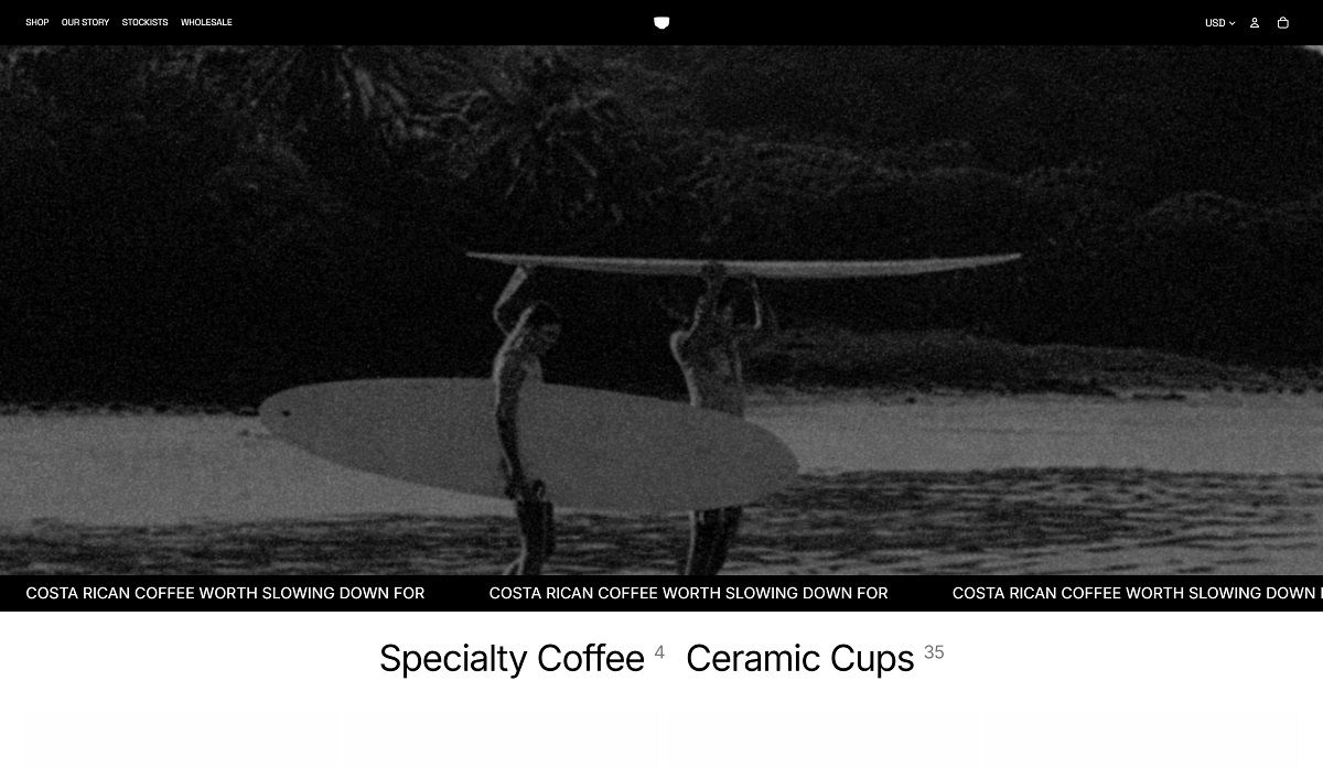
YODO roasts single origin coffee from Costa Rica and ships it from Miami, selling 200g whole bean bags such as TABA and NAJO in the $20 to $30 range alongside a subscription option. The brand states it holds no warehouse inventory, roasting each lot to order and working direct with growers on the Nicoya Peninsula. Coffee is sold direct to consumer and through a network of roughly 25 stockists across the United States and Canada. The store runs on Shopify.

Website Design

A Mac OS 9 desktop, rebuilt in a browser. The homepage opens as a working desktop simulation, complete with a menu bar reading Sleep, Restart and Shut Down, a startup chime prompt, and draggable windows labelled About This YODO, The Catalog, Stockists, Origin and Instagram. Each window behaves like a Finder folder, listing files such as README.txt, SOURCING_TRIP.png and stockist_nyc.png with fake kilobyte sizes.

Shop templates drop the costume. Once a shopper clicks into the catalog or a product page, the interface reverts to a plain, conventional Shopify layout in black text on white. The retro treatment is confined to the homepage and its windows rather than applied throughout.

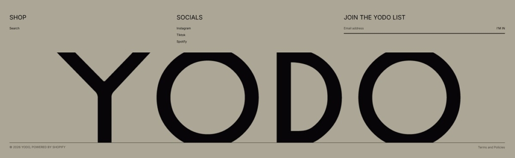
A kraft and near-black palette. The desktop background and footer run in a warm taupe close to #8a877e, text sits in a near-black #211F1A, and panels lighten to an off-white #F2F0EA. These tones match the kraft paper coffee bags photographed on the product pages.

Shopping Experience

The catalog reads like a spreadsheet. Inside its desktop window, the product list appears as a table of Name, Price and Order columns rather than a conventional image grid, before the shopper reaches the standard bag photography on the shop page itself.

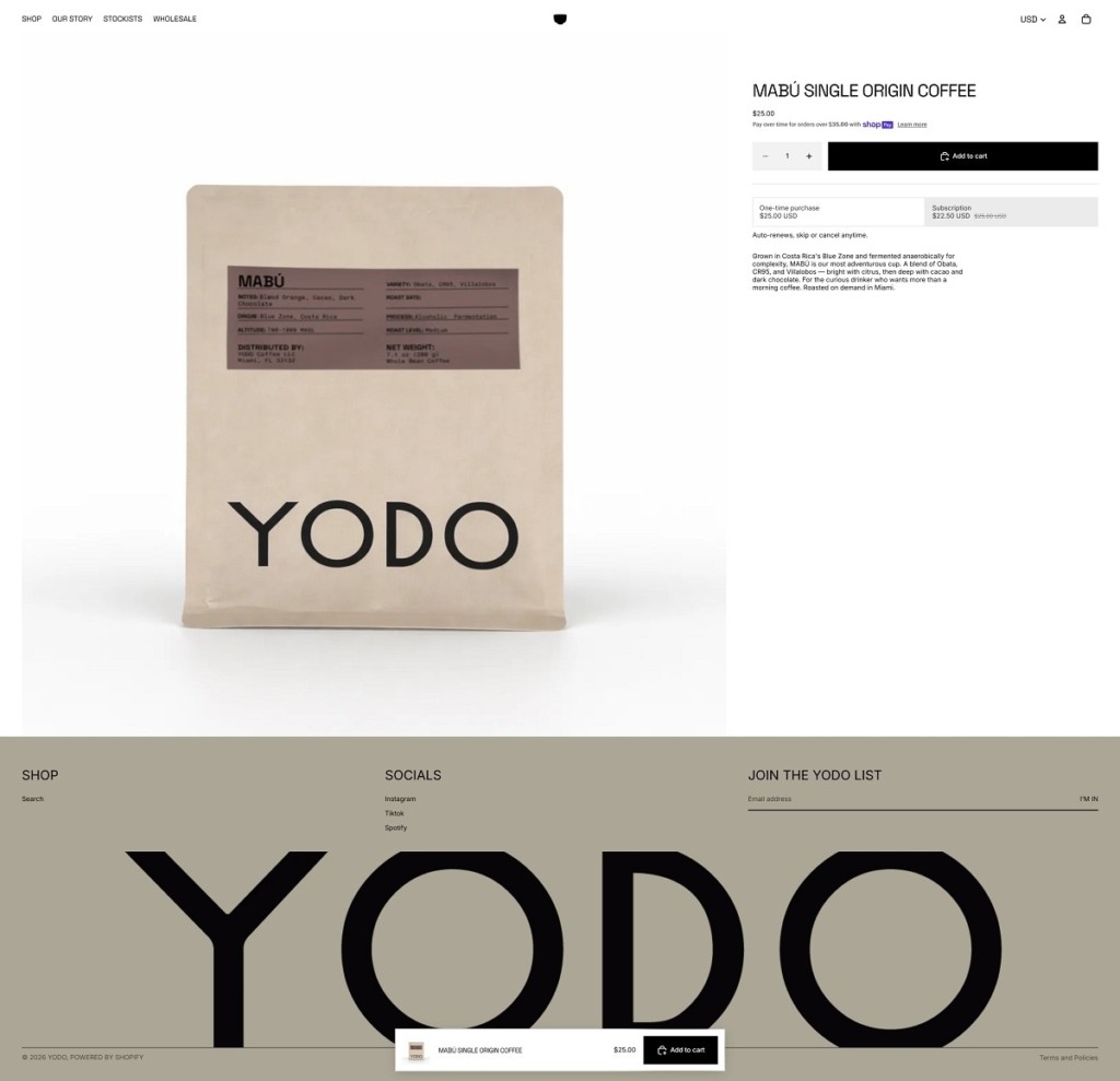
A one-time or subscription choice at the buy box. Each product page offers a one-time purchase alongside a discounted subscription that auto-renews and can be skipped or cancelled, set directly beside the Add to Cart button.

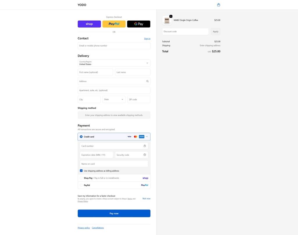
Standard Shopify checkout. Express options for Shop Pay, PayPal and Google Pay sit above the card fields, with a summary column listing the single item and its subtotal.

Brand Storytelling

A joke file among the real ones. The desktop includes a decaf.txt document that cannot be opened, its tooltip reading “nice try,” a small aside on a brand that otherwise centers caffeine and freshness.

Surf report as sourcing metaphor. A widget styled as a morning surf report for Nosara sits beside the origin notes, tying the Costa Rican coastline directly to the sourcing story rather than treating it as decoration alone.

Notable Features

A Spotify window on the desktop. A Now Playing panel links out to a YODO Sessions playlist, framed as another open application rather than a simple embedded player.

Stockists as a card catalog. The store locator lists partners such as Happier Grocery in New York and Basquet in Miami in a record format, with fields for city, address and stock status rather than a plain list or map pin.

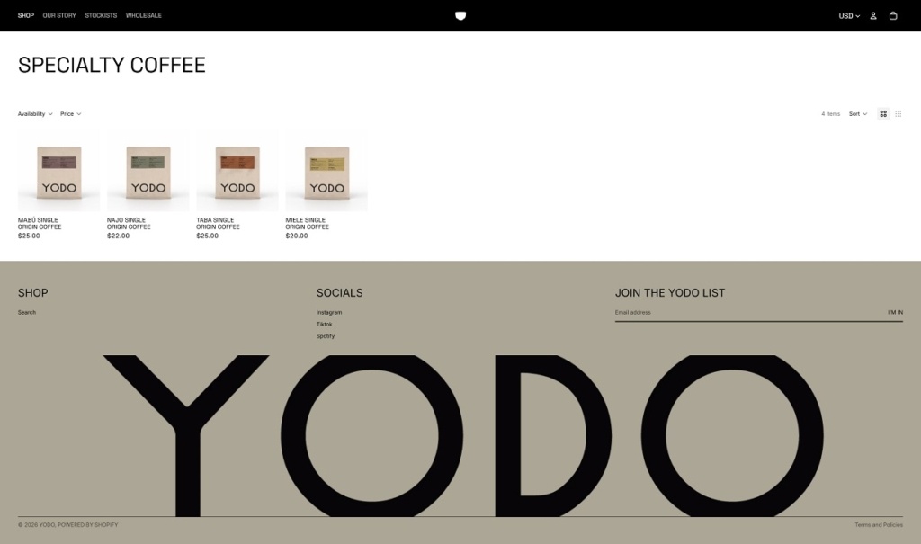
Yodo Coffee Shop Page Example
Yodo Coffee Product Page Example
Yodo Coffee Checkout Page Example
Yodo Coffee Footer Example
Motif

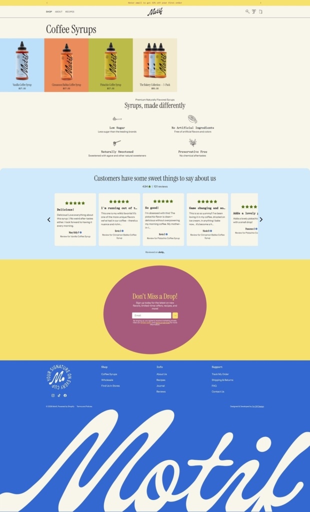
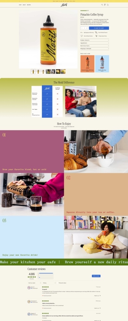
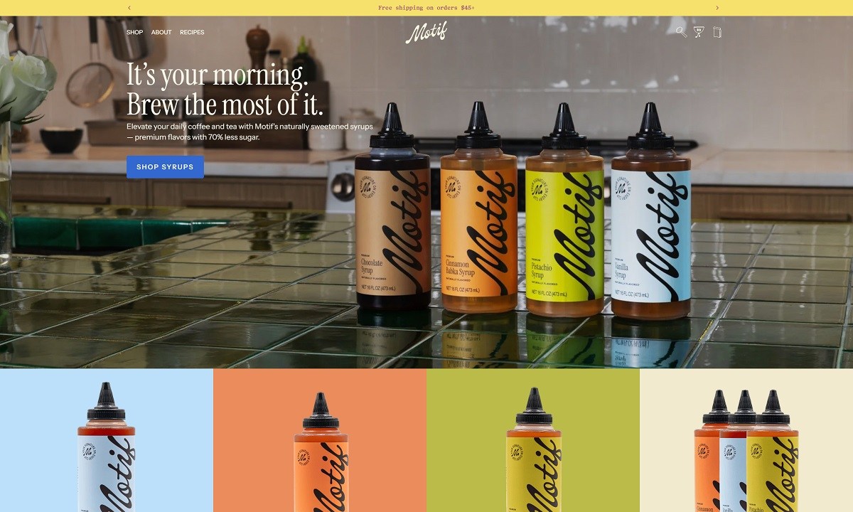
Motif’s website uses a polished, modern Shopify design with glossy product photography, cafe-inspired messaging, recipe content, reviews, and a clear direct-to-consumer shopping flow. The products focus on naturally sweetened coffee and tea syrups with 70% less sugar, including flavors like Cinnamon Babka, Vanilla, Pistachio, and bakery-style bundles.

Motif Shop Category Page Example

Motif Product Page Example

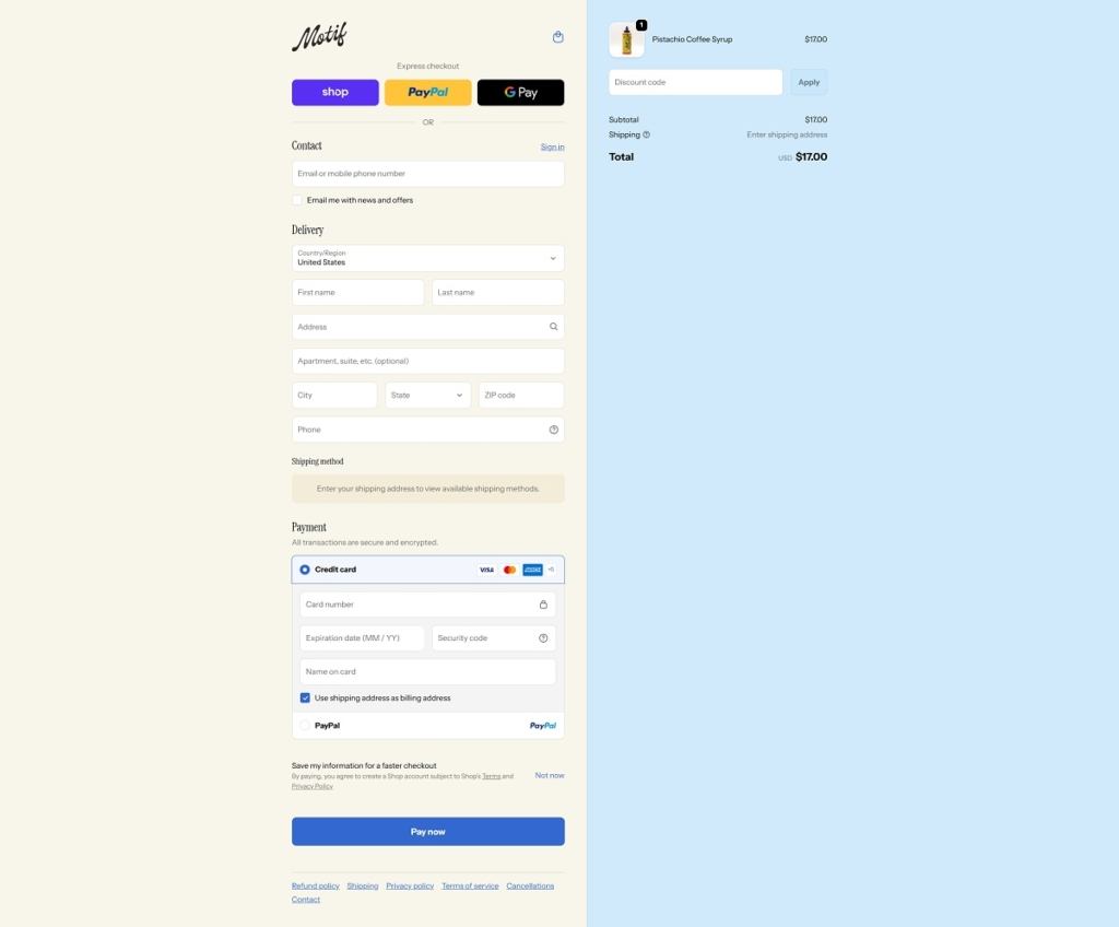
Motif Checkout Page Example

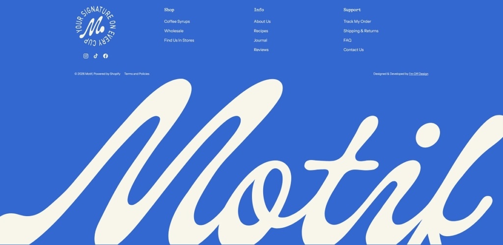
Motif Footer Example

HEYDOH

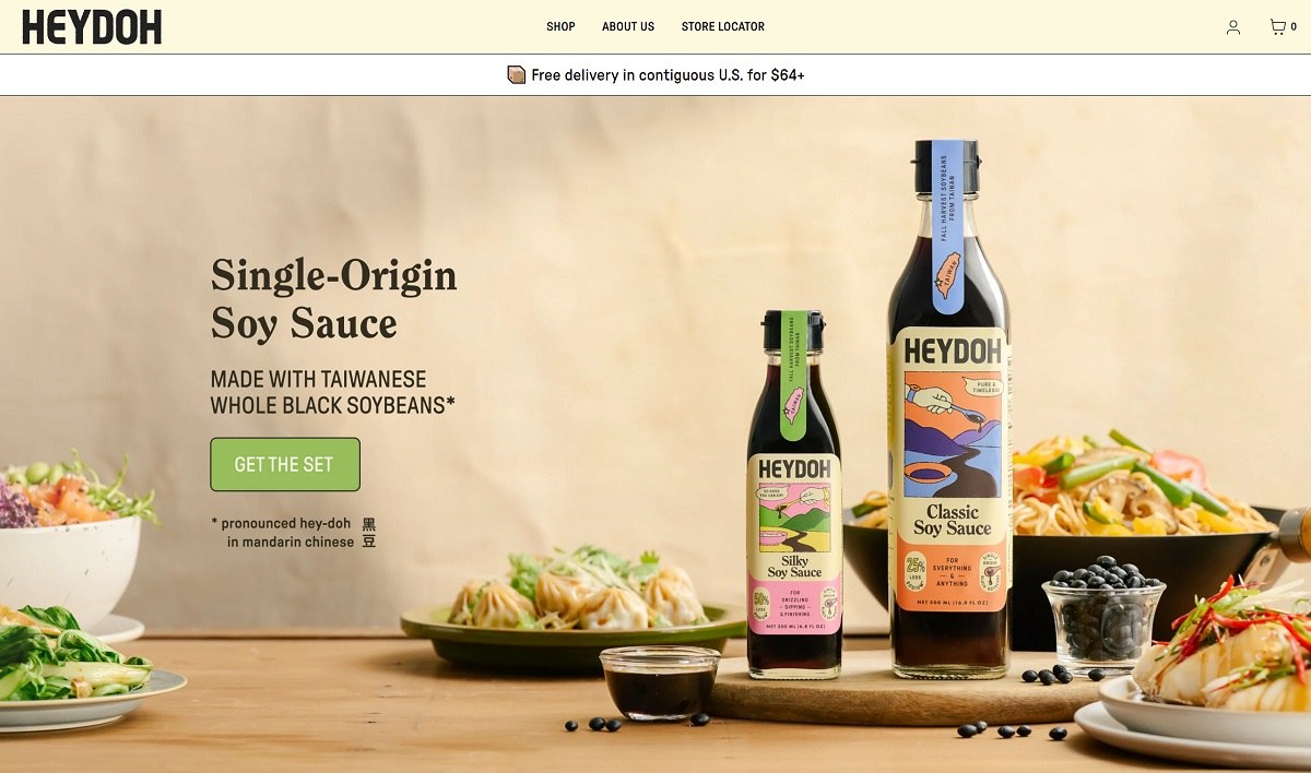
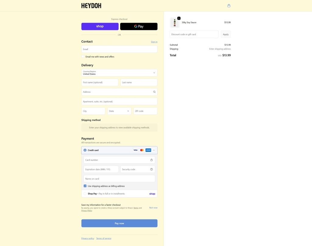
HEYDOH sells single-origin soy sauce made from Taiwanese black soybeans, positioned against mass-market sauces brewed from industrial yellow soybean grits. The range covers Classic and Silky Soy Sauce, a brown rice vinegar, and The Works bundle, sold direct on Shopify with free delivery over $64 in the contiguous United States. The site also runs a store locator, a restaurant supply page and a wholesale channel alongside the direct shop, and a loyalty program called Soy Society sits in the main navigation next to Shop and About Us.

Website Design

A cream ground with black rule lines. Pages run on a soft cream background with black text, borders and buttons, giving the layout a stationery-like contrast rather than a food-brand palette of reds and browns.

A heavy serif for headlines, a technical sans for everything else. Display copy is set in a bold slab serif while body text, prices and navigation use a condensed grotesque, pairing a pantry-label voice with a modern retail interface.

Olive and yellow as the only accent colours. Promotional blocks and callouts introduce an olive green and a bright yellow against the cream and black base, used sparingly enough that they read as highlights rather than a secondary palette.

Shopping Experience

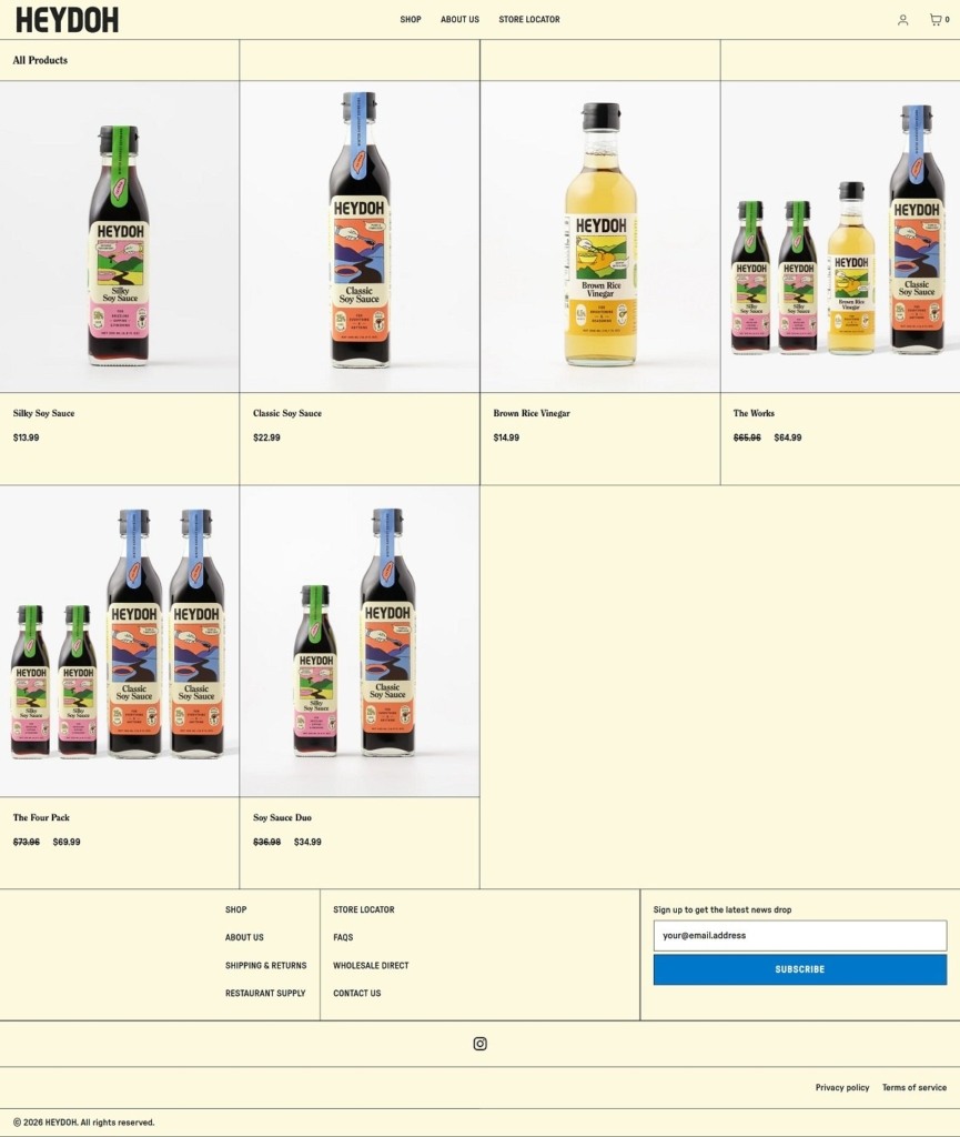
Four SKUs, one bundle. Silky Soy Sauce runs $13.99, Classic Soy Sauce $22.99, and Brown Rice Vinegar $14.99, with The Works bundling the range at $64.99 against a $65.96 line-item total, a small but visible bundle discount.

A running free-shipping banner. A ticker across the top of every page repeats the $64 free delivery threshold, keeping the bundle price positioned just past that line.

Add to cart without leaving the grid. Featured products on the homepage carry inline variant selectors and an Add to cart button, so a first-time visitor can buy without opening a product page.

Brand Storytelling

The soybean itself is the pitch. Homepage copy explains the difference between whole, single-origin black soybeans and the industrial yellow soybean grits used in most commodity soy sauce, framing slow fermentation as the source of a rounder umami flavor.

Testimonials with a diary-entry format. Quotes are attributed by first name, age bracket and location, for example a customer in her thirties in New York or a professor in Massachusetts, giving the reviews a personal, unpolished register rather than star ratings.

Notable Features

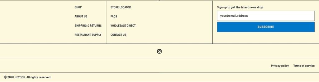
A trade-facing footer. Restaurant Supply and Wholesale Direct sit alongside Shipping and Returns and FAQs, treating foodservice buyers as a served audience rather than a separate business.

Store locator for retail discovery. A dedicated locator page lets shoppers find HEYDOH on shelves near them, supporting the online shop with an offline distribution signal.

A named community program. Soy Society is promoted as its own navigation item rather than folded into a generic rewards or newsletter signup, giving repeat customers a branded identity.

HEYDOH Shop Page Example

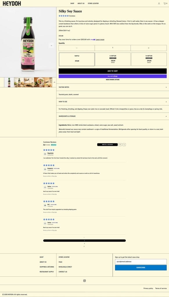
HEYDOH Product Page Example

HEYDOH Checkout Page Example

HEYDOH Footer Example

Talkhouse Encore

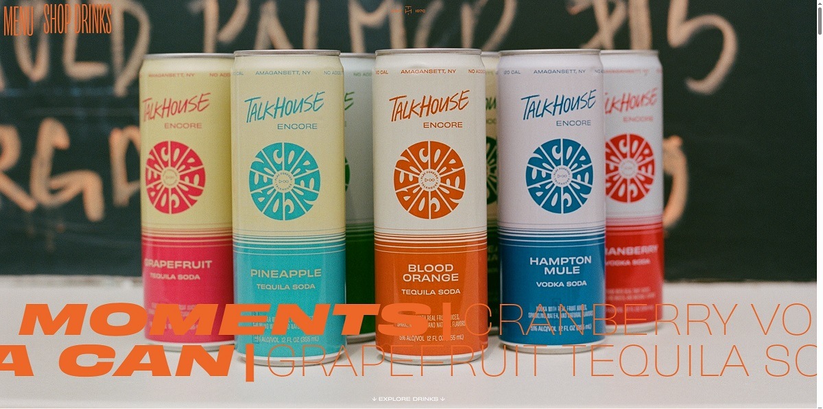
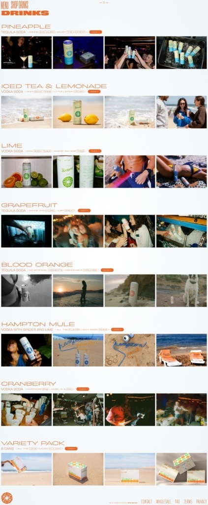
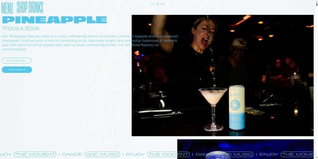
Talkhouse Encore’s website uses a bold, nightlife-inspired design with animated product imagery, punchy copy, playlist elements, and a strong connection to the Stephen Talkhouse venue in the Hamptons. The products are ready-to-drink canned cocktails made with real vodka or tequila, fruit juice, and sparkling water. Flavors include vodka sodas, tequila sodas, Hampton Mule, and Iced Tea & Lemonade.

Talkhouse Encore Shop Page Example

Talkhouse Encore Product Page Example

Alya Health

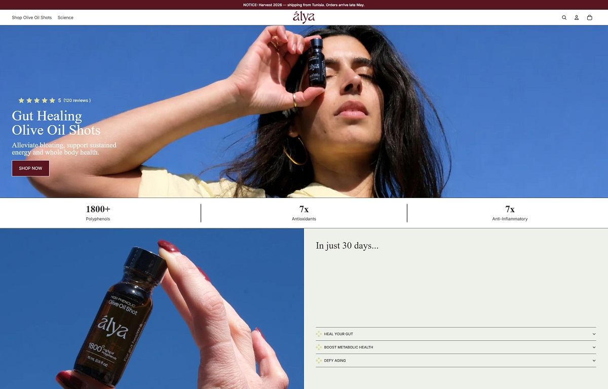
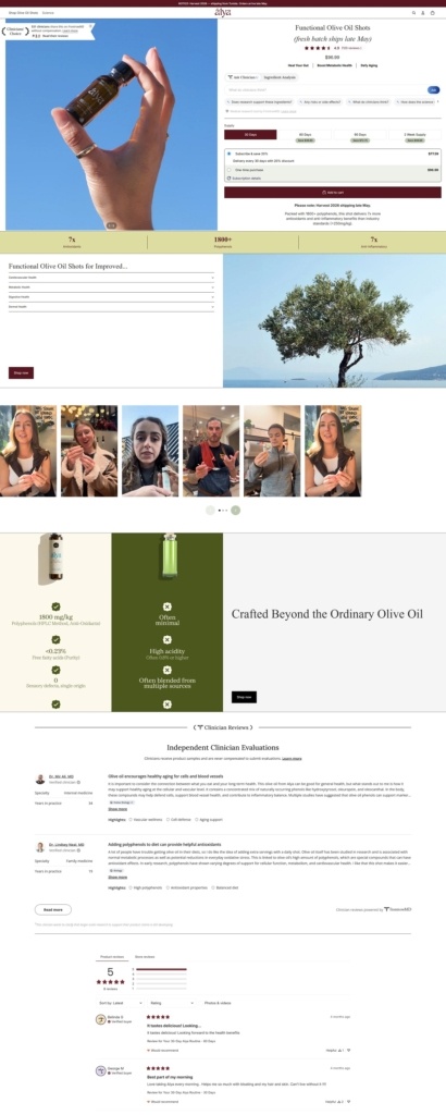
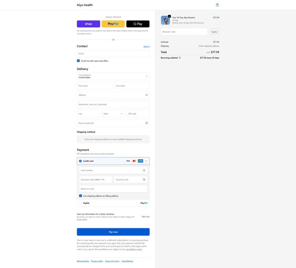
Alya Health features a clean, modern ecommerce website with a premium wellness aesthetic, using soft colours, minimal layouts, and clear, product-focused sections. The design emphasises simplicity and science-backed benefits, with straightforward navigation and educational content. The brand offers personalised supplements and health programmes, including vitamins and functional blends tailored to individual needs.

Alya Health Product Page Example

Alya Health Checkout Page Example

Alya Health Footer Example

Bink

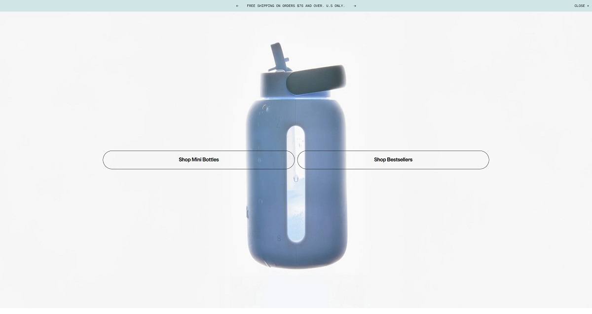
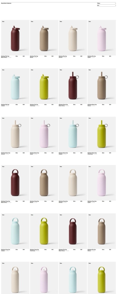
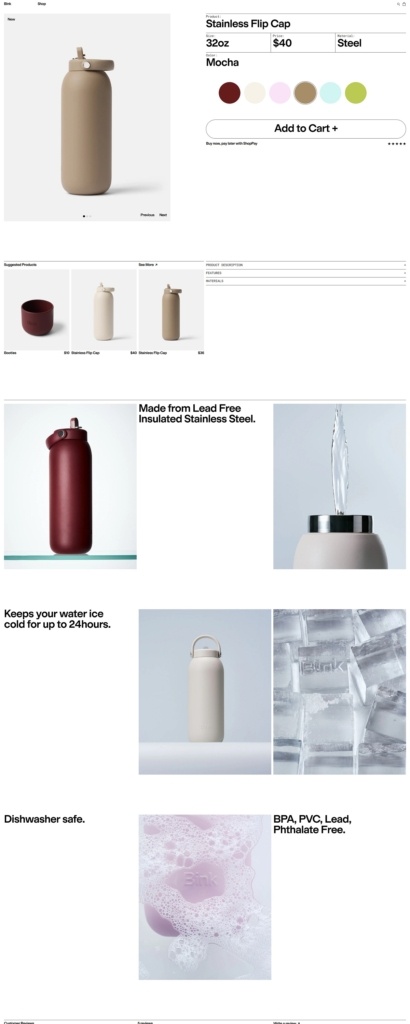
Bink features a clean, modern ecommerce website with a minimalist design, soft colours, and strong lifestyle imagery that emphasises simplicity and everyday use. The layout is product-focused with smooth navigation, highlighting functionality, materials, and design details. The brand offers glass water bottles, tumblers, and hydration accessories with protective silicone sleeves, positioned as stylish, sustainable alternatives to plastic drinkware.

Bink Shop Page Example

Bink Product Page Example

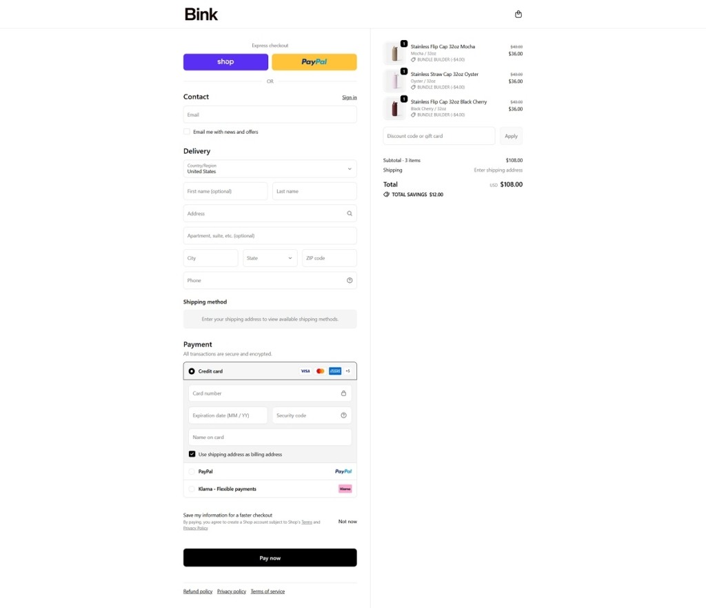
Bink Checkout Page Example

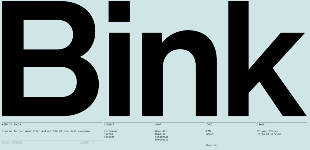
Bink Footer Example

Honey Department

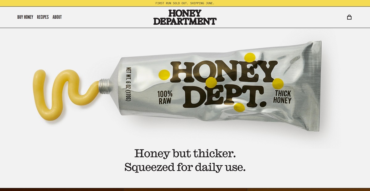
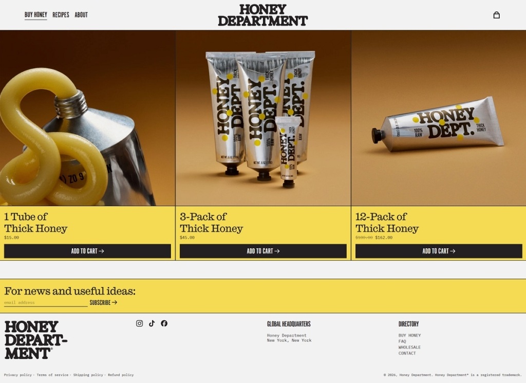
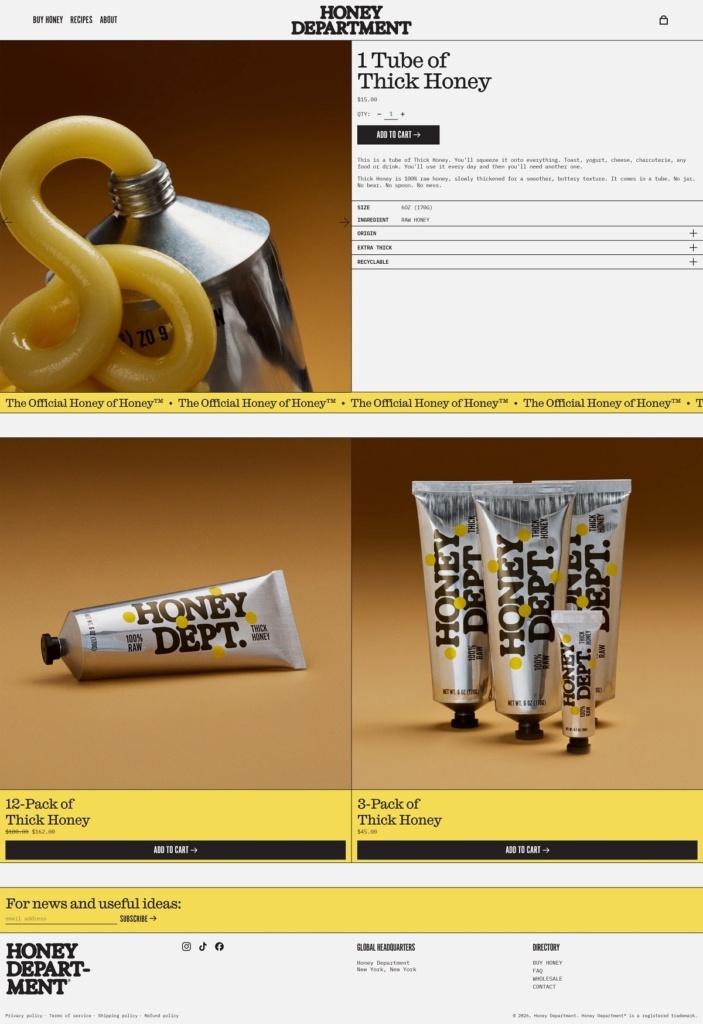
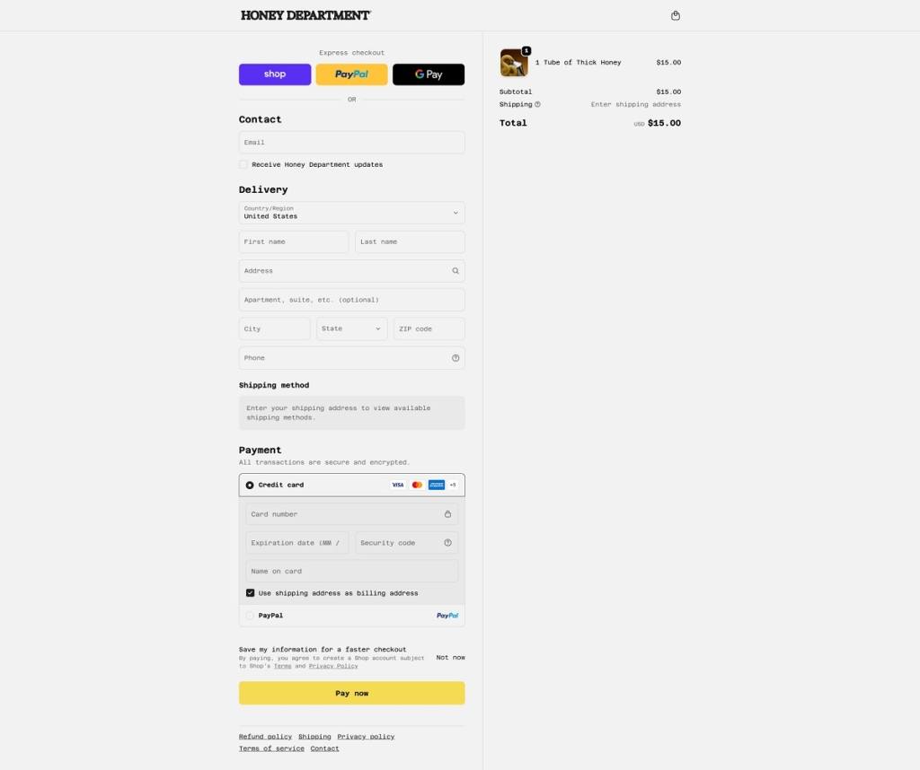
Honey Department features a bold, editorial-style ecommerce website with a minimal yet expressive design, combining strong typography, clean layouts, and lifestyle imagery. The site feels creative and brand-driven, focusing on storytelling and community as much as products. The brand offers raw and infused honey products, along with honey-based goods, positioned as premium, natural, and design-forward pantry items.

Shop Page Example

Product Page Example

Checkout Page Example

Footer Example
Retrouvé

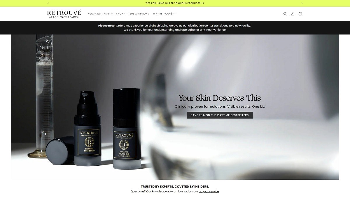
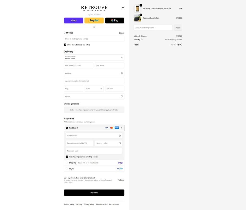
Retrouvé features a sleek, high-end ecommerce website with a minimalist, editorial design, using neutral tones, refined typography, and elegant product photography. The layout is clean and product-focused, with strong emphasis on science, ingredients, and luxury skincare rituals. The brand offers premium anti-aging skincare, including serums, creams, cleansers, and treatments formulated with advanced, clinically driven ingredients. Overall, the site positions the brand as a sophisticated, science-backed leader in luxury skincare.

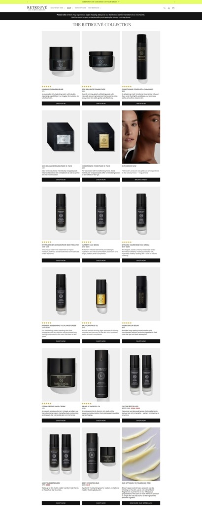
Retrouvé Shop Page Example

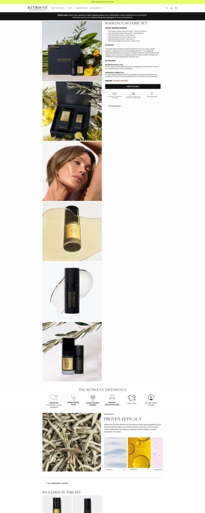
Retrouvé Product Page Example

Retrouvé Checkout Page Example

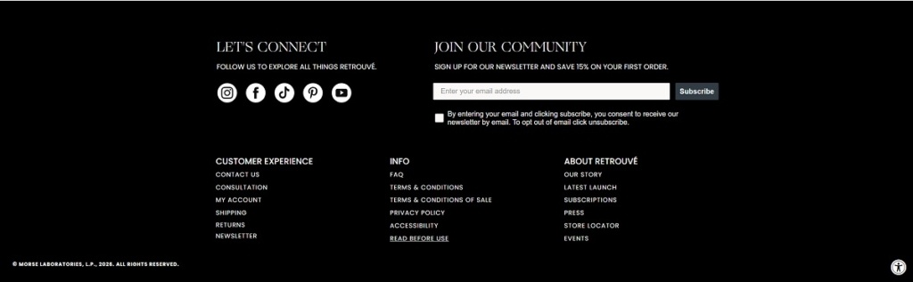
Retrouvé Footer Example
Wizard Wellness

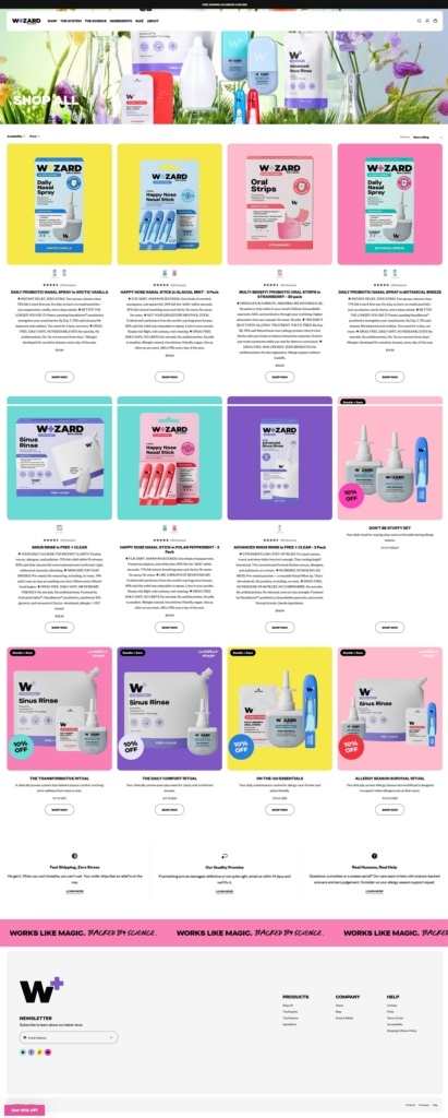
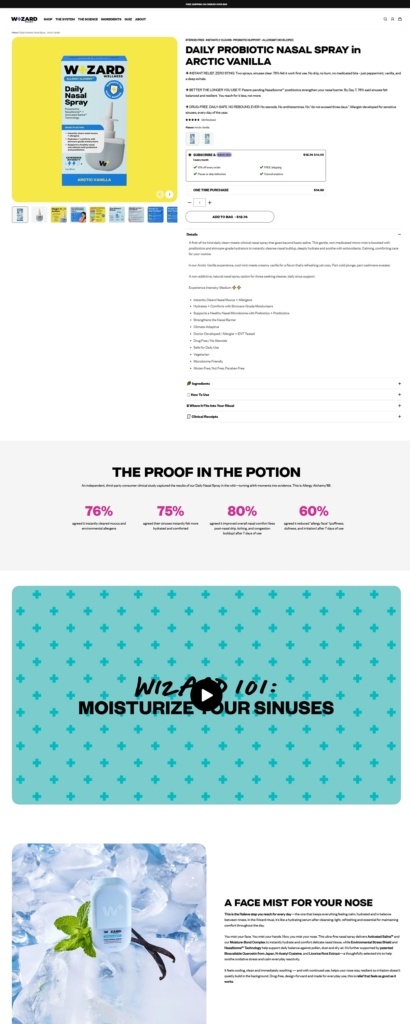
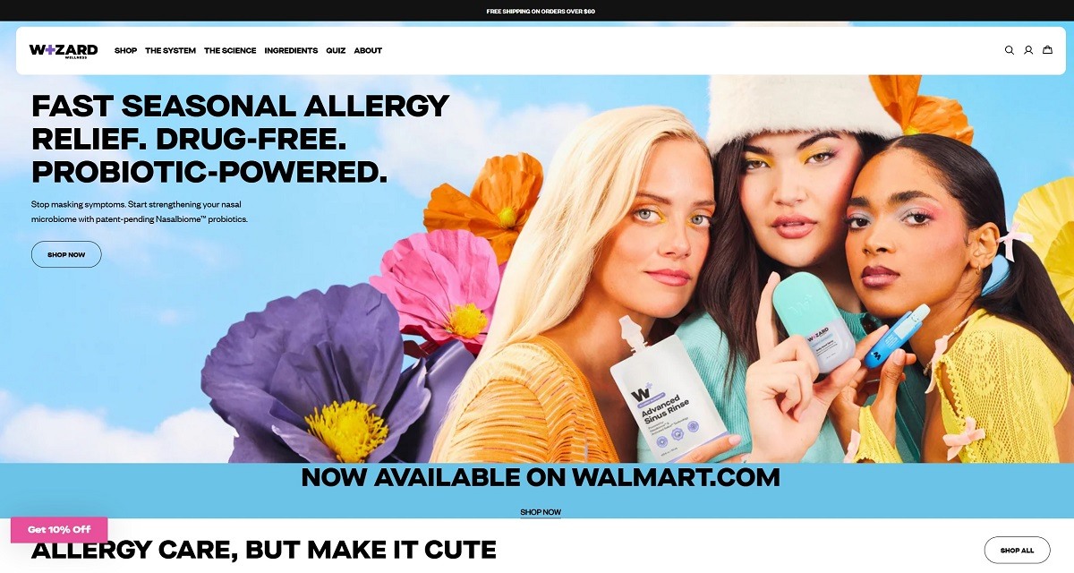
Wizard Wellness features a bold, playful ecommerce website with colourful visuals, quirky illustrations, and a slightly mystical, fun-first aesthetic. The design is highly expressive yet simple to navigate, focusing on benefits and personality over heavy technical detail. The brand offers functional wellness supplements, including gummies and powders, positioned around mood, stress relief, and overall wellbeing.

Shop Category Page Example

Product Page Example

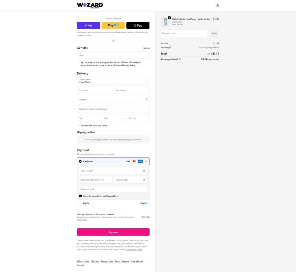
Checkout Page Example

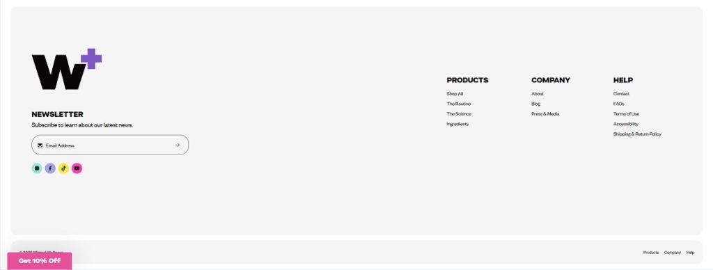
Footer Example
Biibs the Bee

Biibs the Bee is a Singapore-based indie art shop run by a solo creator (Biibs) who makes quirky illustrated goods – stickers, keychains, cosy socks, phone grips, notepads, tote bags, prints, and mystery bags – while raising awareness about ADHD and neurodiversity, especially as experienced by women in Asian societies. The shop ships free within Singapore and S$5 flat internationally (including the USA), and is powered by Payhip.


Stesh Butter

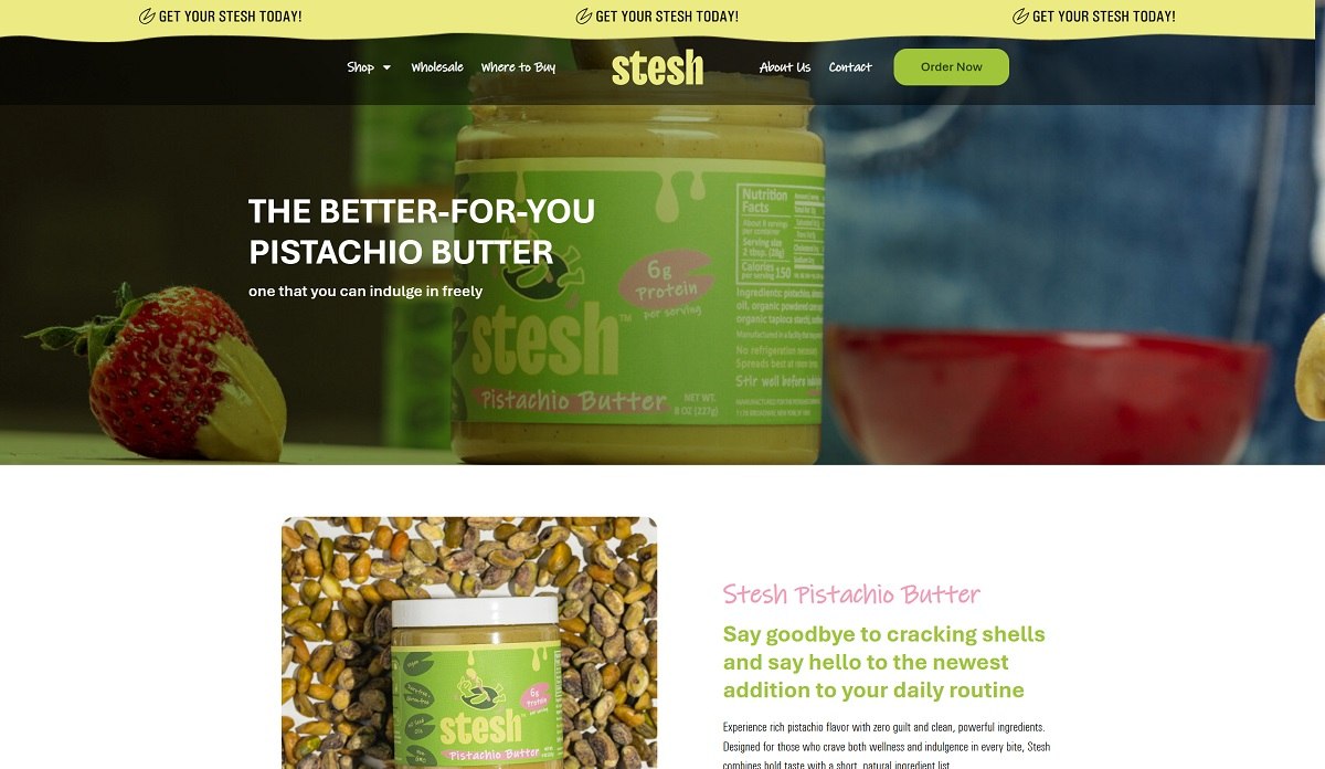
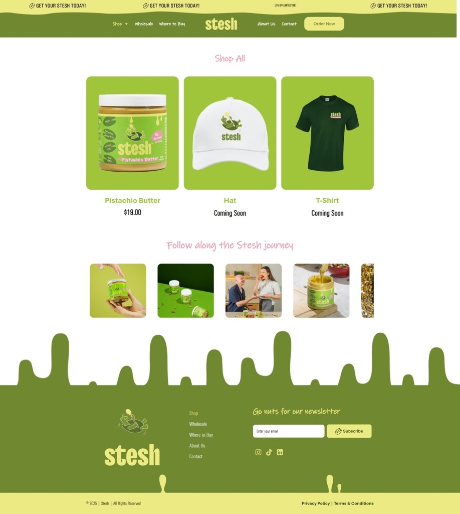
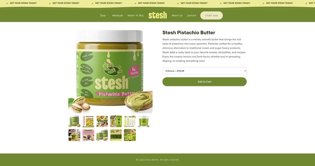
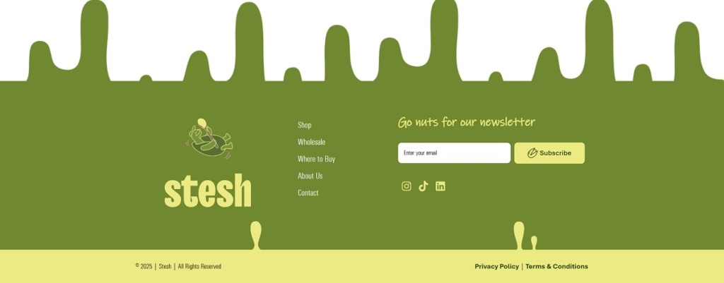
Stesh Butter features a clean, modern ecommerce website with warm, natural tones, minimal layouts, and a strong focus on ingredient transparency and lifestyle imagery. The design is simple and product-first, highlighting texture, flavour, and everyday versatility. The brand offers flavoured nut butters made with high-quality ingredients, positioned as wholesome, indulgent spreads for snacks and recipes.

Stesh Butter Shop Page Example

Stesh Butter Product Page Example

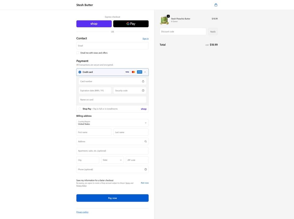
Stesh Butter Checkout Page Example

Stesh Butter Footer Example
Rocky’s Matcha

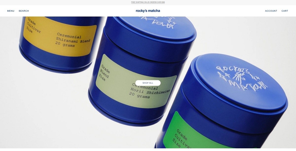
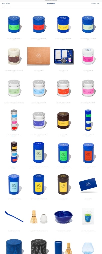
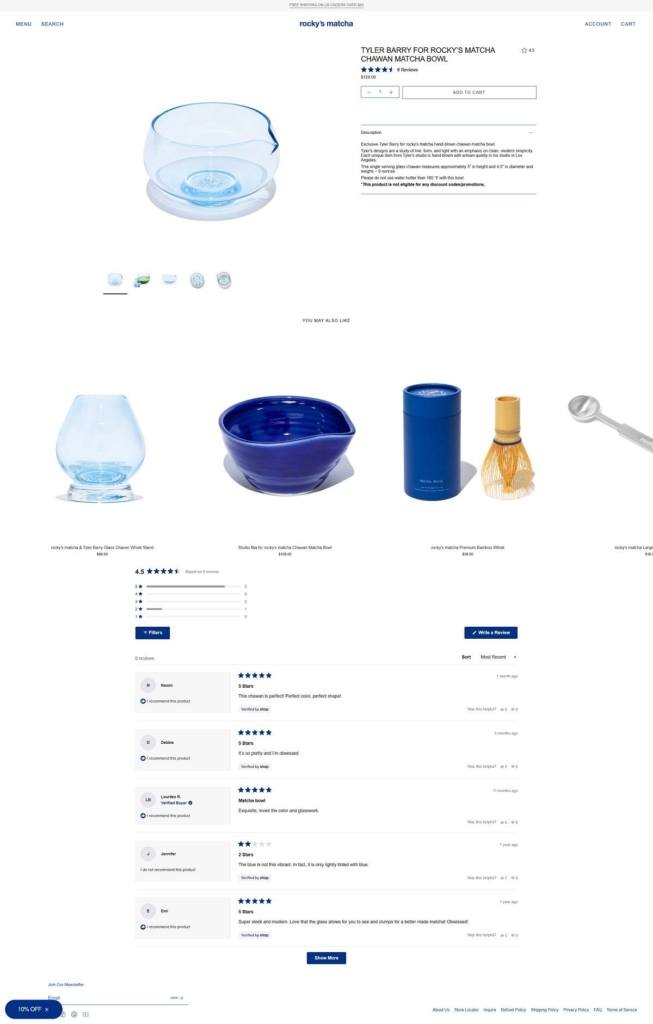
Rocky’s Matcha features a clean, modern ecommerce website with a minimalist design, soft green tones, and strong product-focused visuals that emphasise quality and ritual. The layout is simple and calming, blending lifestyle imagery with educational content around matcha preparation and benefits. The brand offers premium ceremonial-grade matcha and accessories, positioned as a high-quality, everyday wellness ritual.

Rocky’s Matcha Shop Page Example
Rocky’s Matcha Product Page Example
Rocky’s Matcha Checkout Page Example
Rocky’s Matcha Footer Example