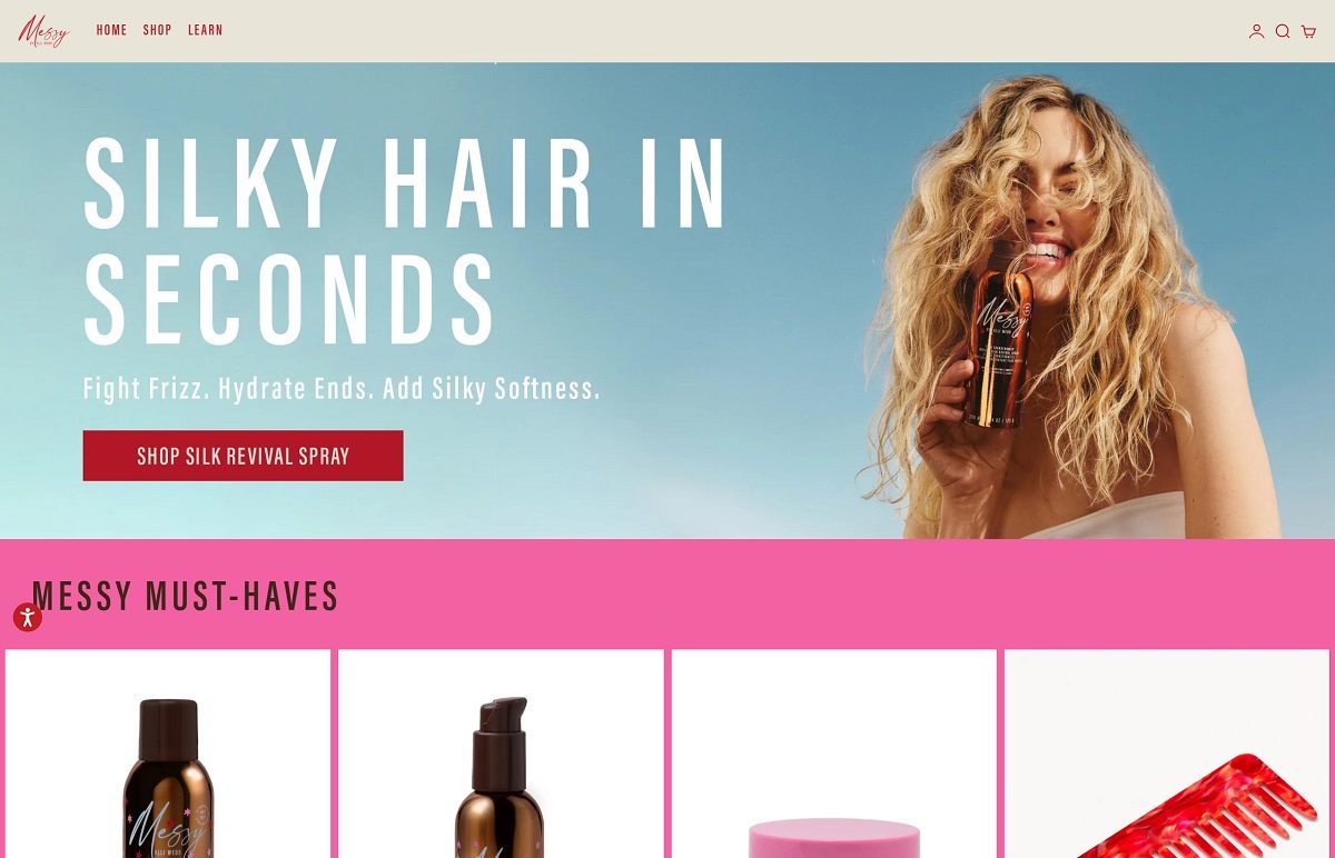
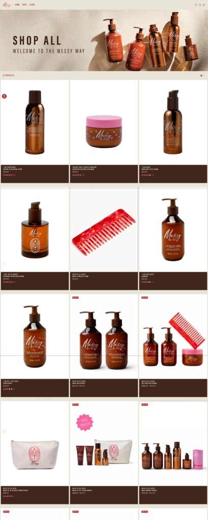
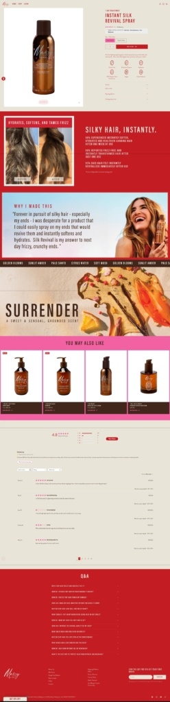
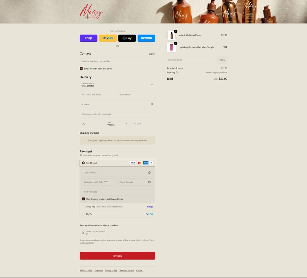
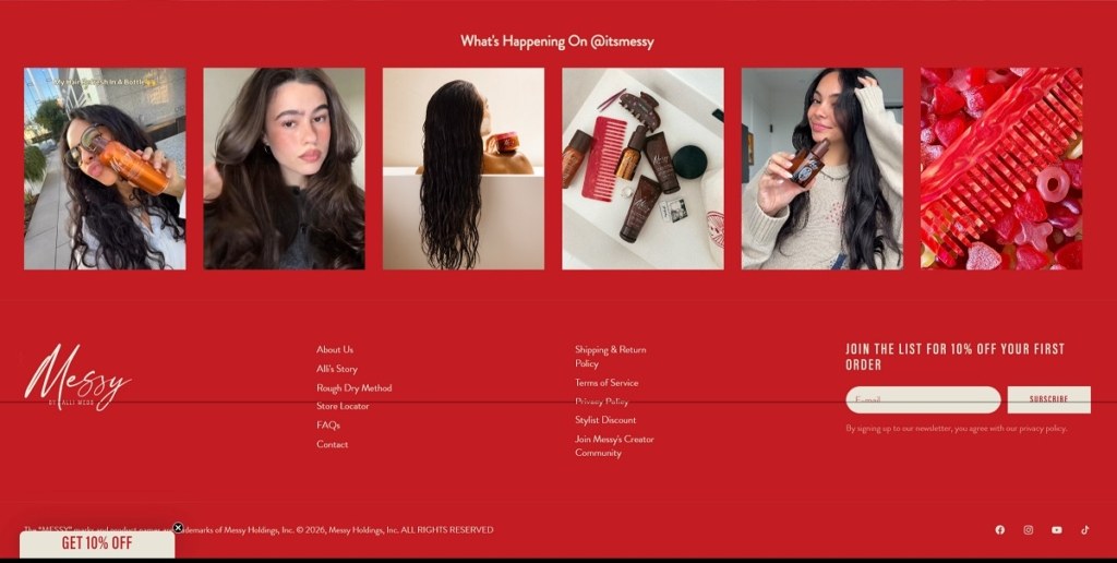
ItsMessy is a modern beauty brand with a clean, editorial-style ecommerce website that uses soft colours, large lifestyle imagery, and minimal navigation to highlight its hair-care collection. The site focuses on a small range of products—including shampoo, conditioner, styling cream, hair serum, spray, and treatment masks—designed to enhance natural hair texture and support a relaxed “rough-dry” styling method rather than heavy heat styling. The brand promotes vegan, cruelty-free formulas and positions its products as simple essentials for healthy, effortless hair.
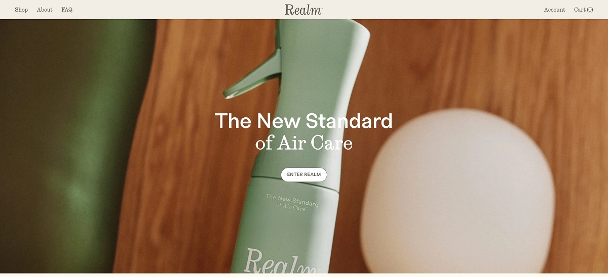
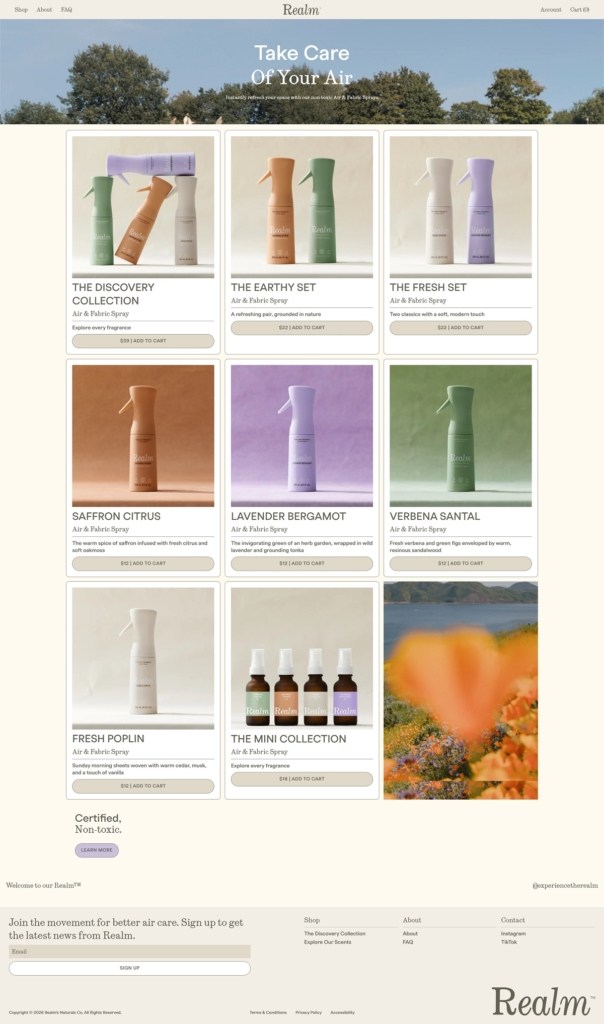
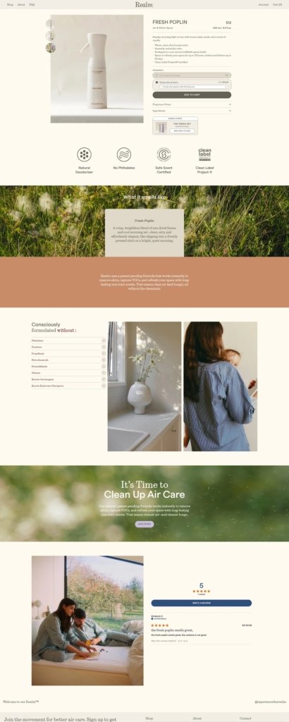
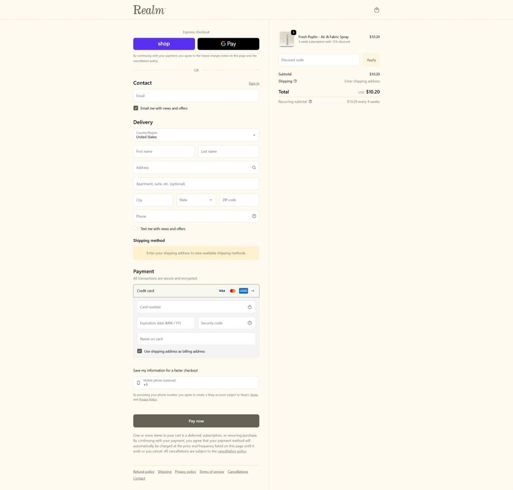
Breathe Realm is a modern air-care brand with a sleek, minimalist ecommerce website that highlights clean design, soft colours, and large lifestyle imagery to showcase its scent products. The site focuses on non-toxic air and fabric sprays made with Safe Scent Certified ingredients and odor-neutralizing technology, presented as a healthier alternative to traditional air fresheners. Products are organized around refined fragrances such as Fresh Poplin, Wild Lavender, Saffron Citrus, and Verbena Santal, with refillable packaging and a strong emphasis on safe, elevated home scenting.
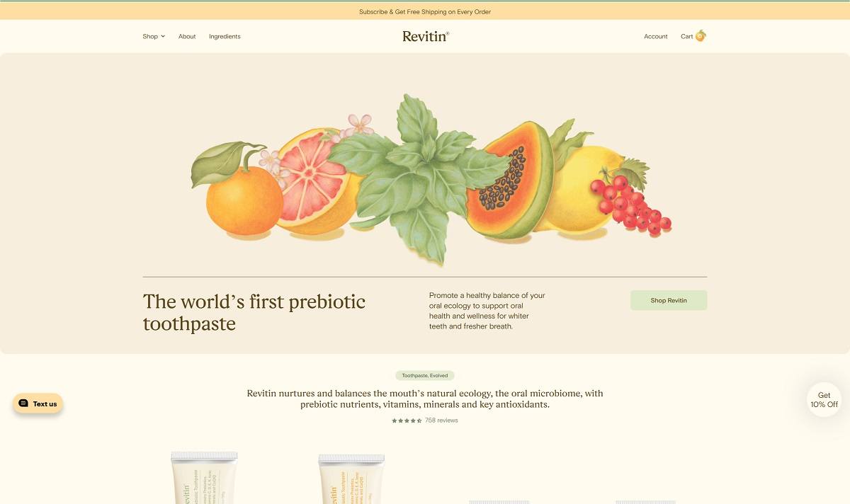
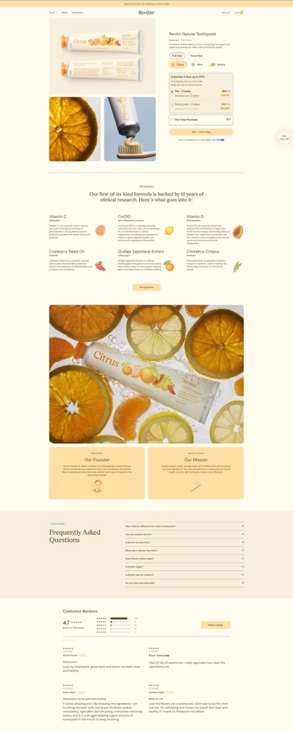
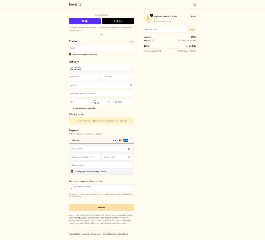
Revitin is a natural oral-care brand with a clean, modern ecommerce website that focuses on education and simple product presentation. The site highlights its flagship prebiotic toothpaste, designed to support the oral microbiome using natural ingredients, vitamins, antioxidants, and plant-based nutrients rather than harsh chemicals. Products are presented in mint and citrus variations, with messaging centered on fluoride-free, SLS-free, and microbiome-supporting formulas that promote healthy gums, fresher breath, and balanced oral health.
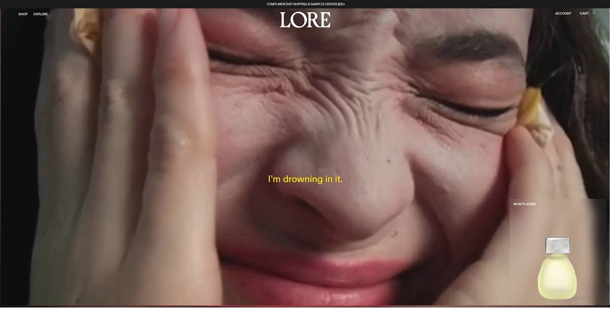
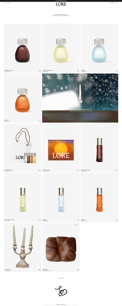
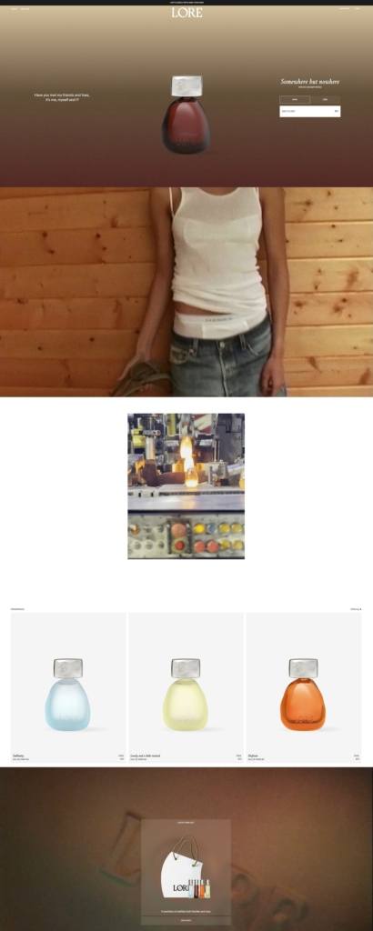
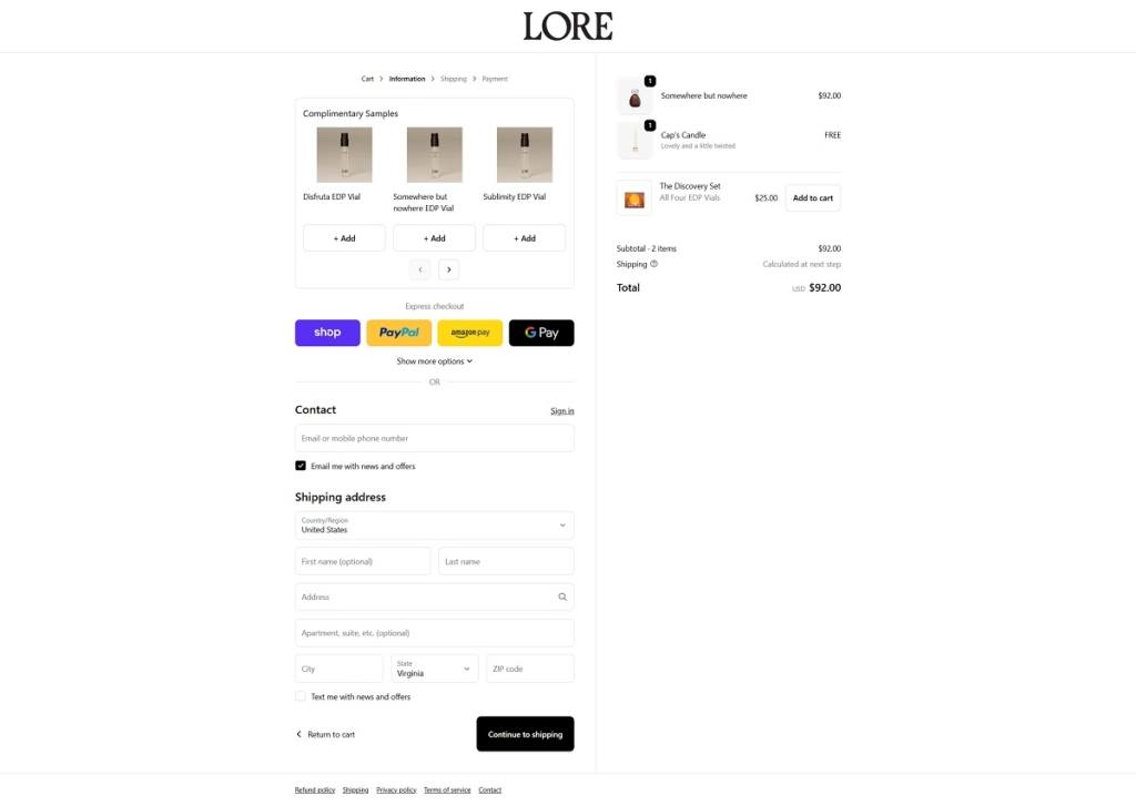
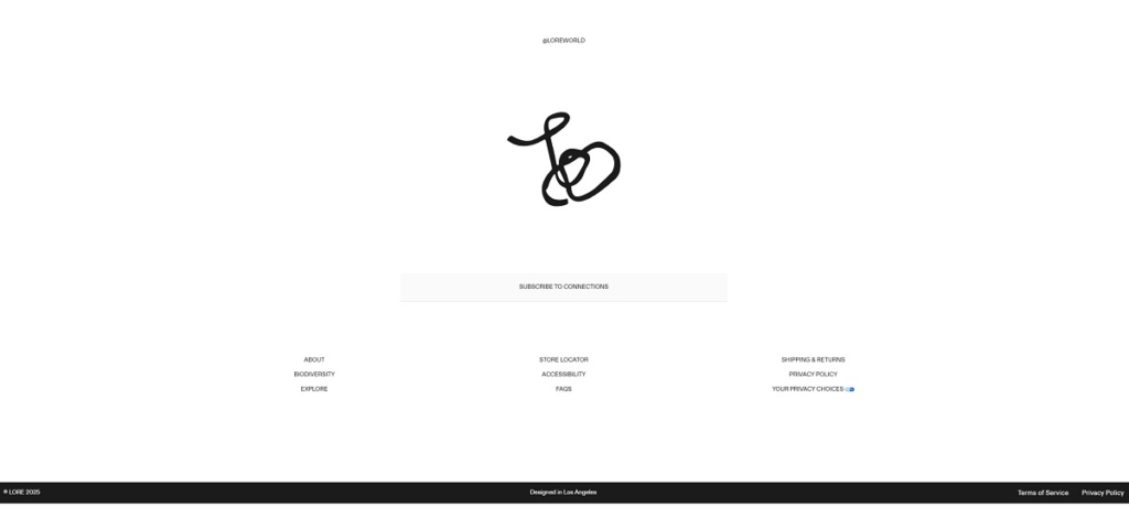
Lore is a modern fragrance brand with a sleek, editorial-style ecommerce website that uses minimalist layouts, poetic copy, and immersive visuals to present its perfumes as sensory storytelling experiences. The site highlights a small collection of design-forward eau de parfums, each crafted to evoke specific places, moods, or memories through layered scent compositions. Products are displayed in sculptural glass bottles with artistic photography, positioning the brand as a luxury fragrance label focused on emotion, narrative, and experiential scent design.
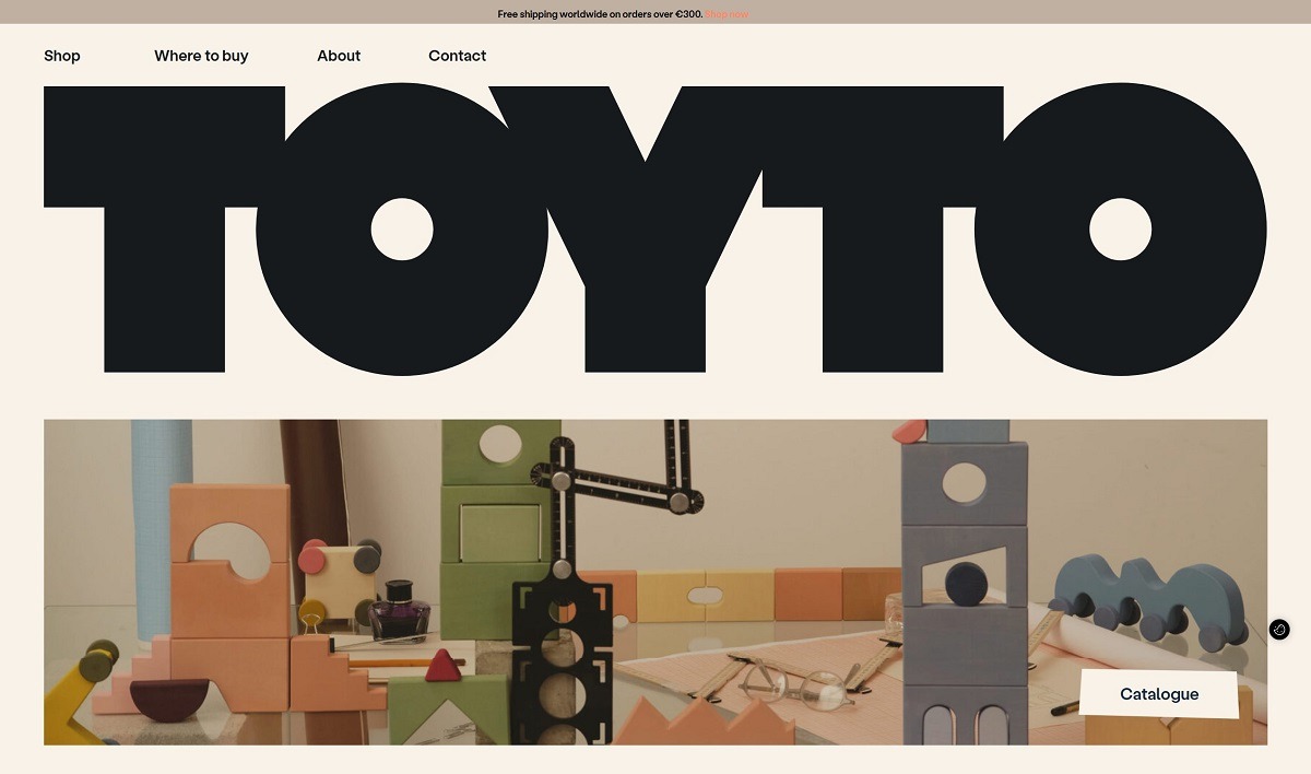
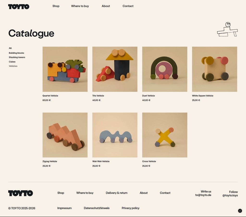
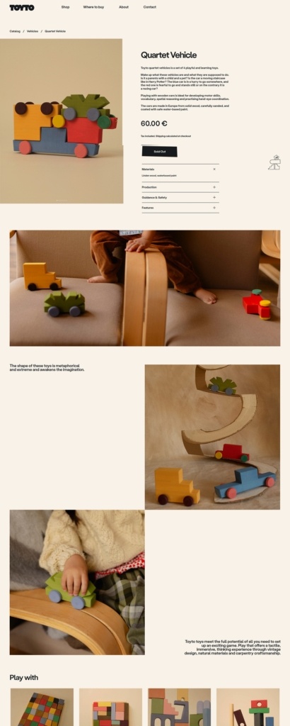
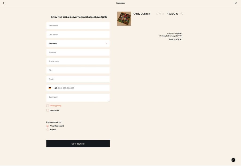
Toyto is a design-led toy brand creating handcrafted wooden toys such as building blocks, cubes, stacking pieces, and small vehicles made by carpenters in Eastern Europe. The website design is minimalist and art-focused, with large photography, sparse text, and simple category navigation (building blocks, cubes, vehicles, stacking towers) that highlights the objects like a catalogue. The layout emphasizes craftsmanship and material quality, keeping the shopping experience clean and visually driven.
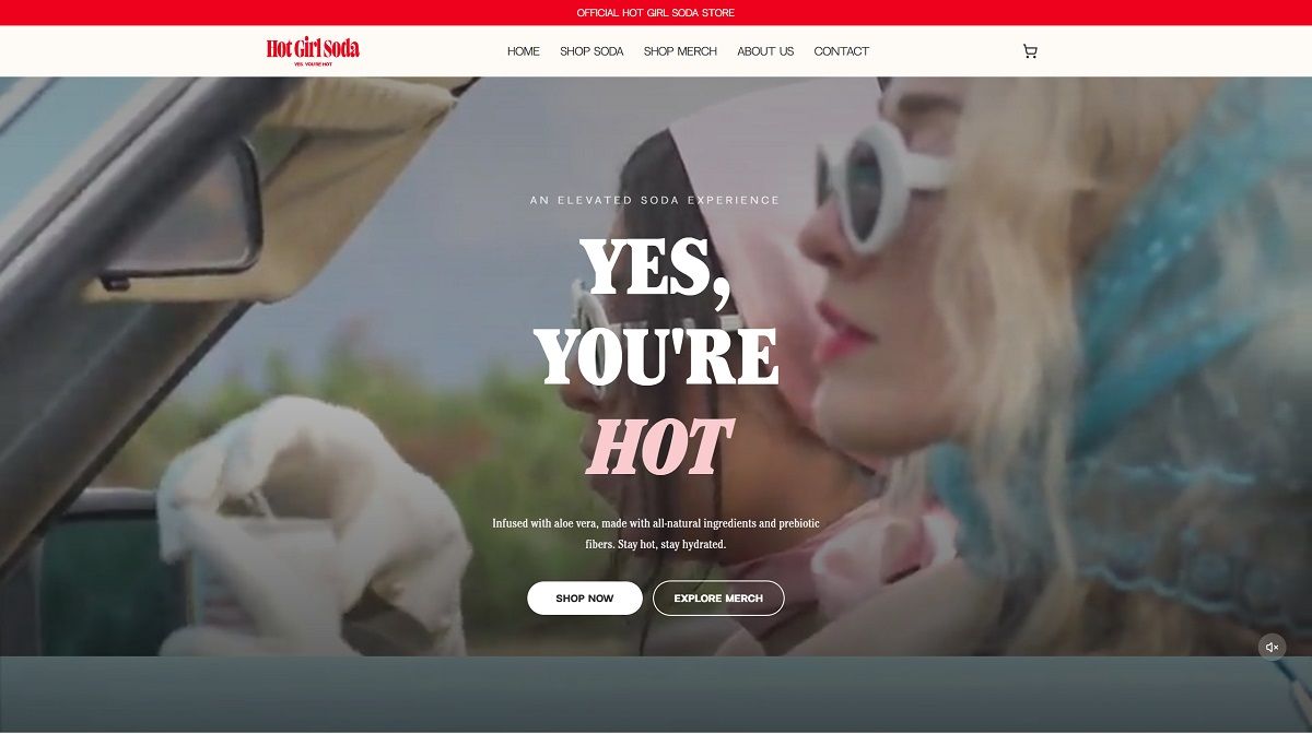
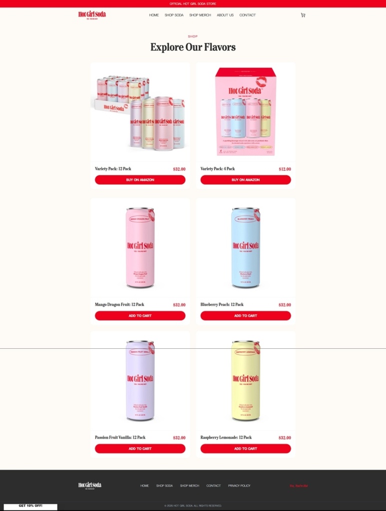
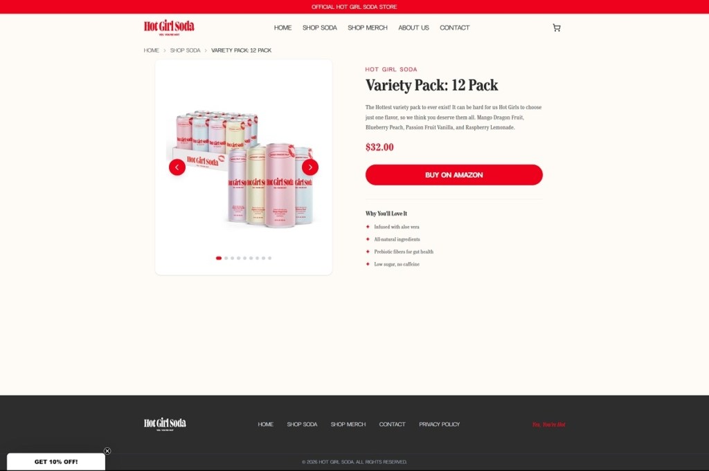
Hot Girl Soda is a beverage brand selling aloe-vera–infused sodas with prebiotic fiber in flavours like Mango Dragon Fruit and Passion Fruit, positioned as a “better-for-you” alternative to traditional soft drinks. The website design is bold and playful, using bright colours, oversized headlines, and large product imagery that keep the focus on the cans and flavour lineup. Navigation is simple and shop-forward, guiding visitors quickly into the soda collection and related merchandise.
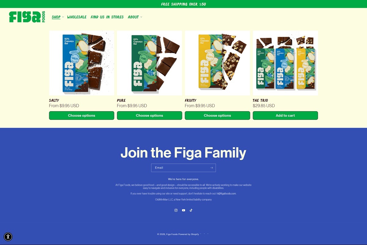
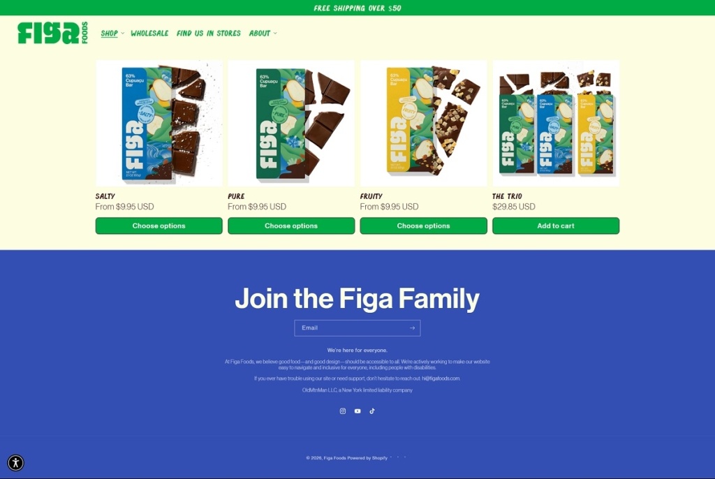
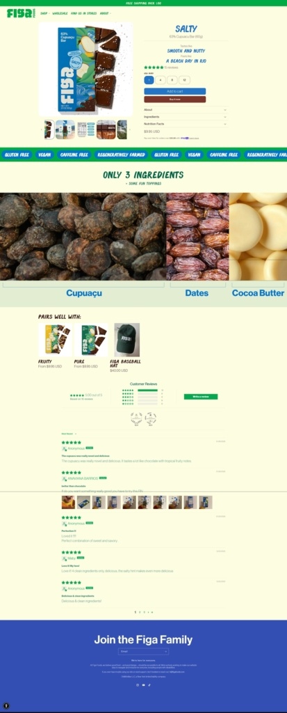
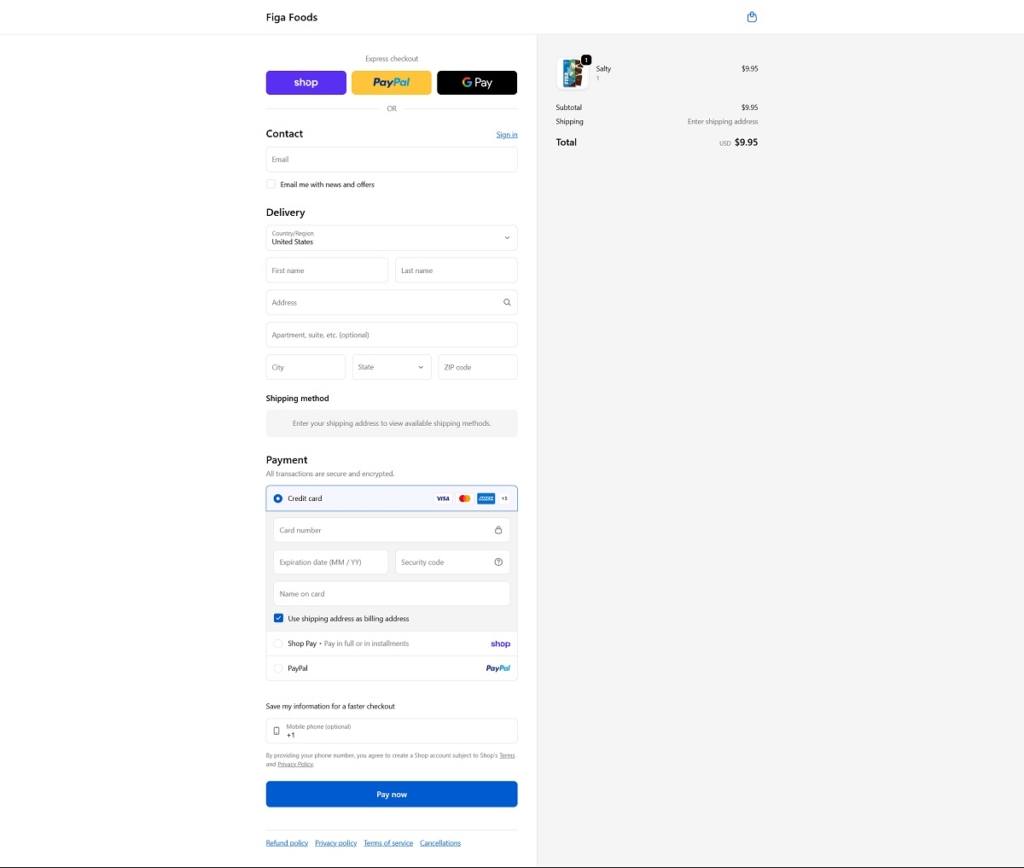
Figa Foods is a modern snack brand with a clean, minimalist ecommerce website that highlights its signature cupuaçu-based bars, a chocolate-like treat made from the seeds of the Brazilian superfruit cupuaçu. The site features bold product photography, earthy colours, and simple navigation focused on showcasing the bars’ flavours, ingredients, and sustainability story. Products are presented as vegan, gluten-free treats made with just a few ingredients, positioning the brand as a healthier, caffeine-free alternative to traditional chocolate.
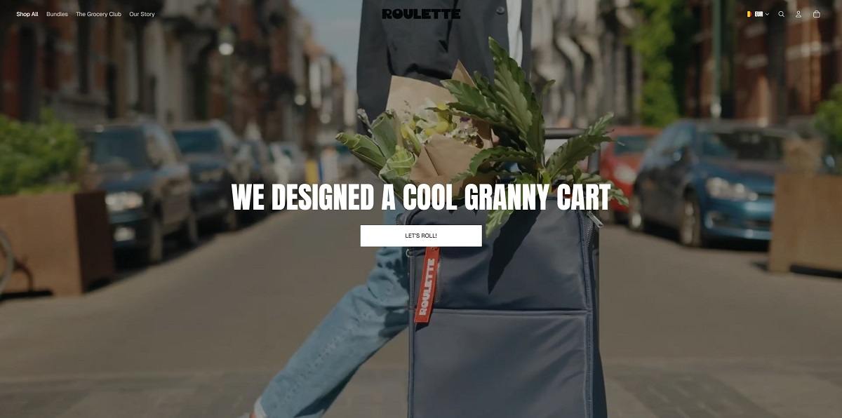
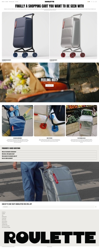
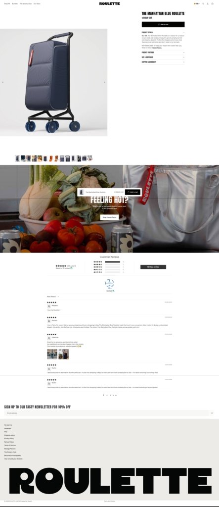
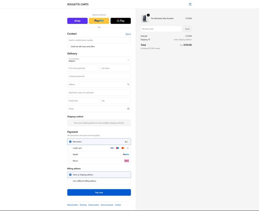
Roulette Carts is a stylish ecommerce store with a bold, playful design that showcases a modern take on the traditional grocery trolley. The website uses vibrant colours, large lifestyle images, and minimal navigation to highlight its products, including designer shopping carts, insulated freezer packs, and customizable wheels that make grocery shopping more convenient and visually appealing. The brand focuses on functional urban carts with detachable bags, organised compartments, and interchangeable accessories for a personalised shopping experience.
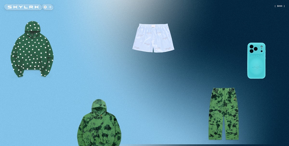
Skylrk is a fashion brand with a sleek, modern ecommerce website that emphasizes bold visuals and a minimal, hype-driven aesthetic. The site highlights colorful streetwear and accessories such as hoodies, tank tops, beanies, slide sandals, sunglasses, and phone cases, presented through large product images and simple navigation focused on new drops. The products lean toward comfort-focused streetwear in bright, playful colours, blending casual apparel with statement accessories for a contemporary lifestyle look.
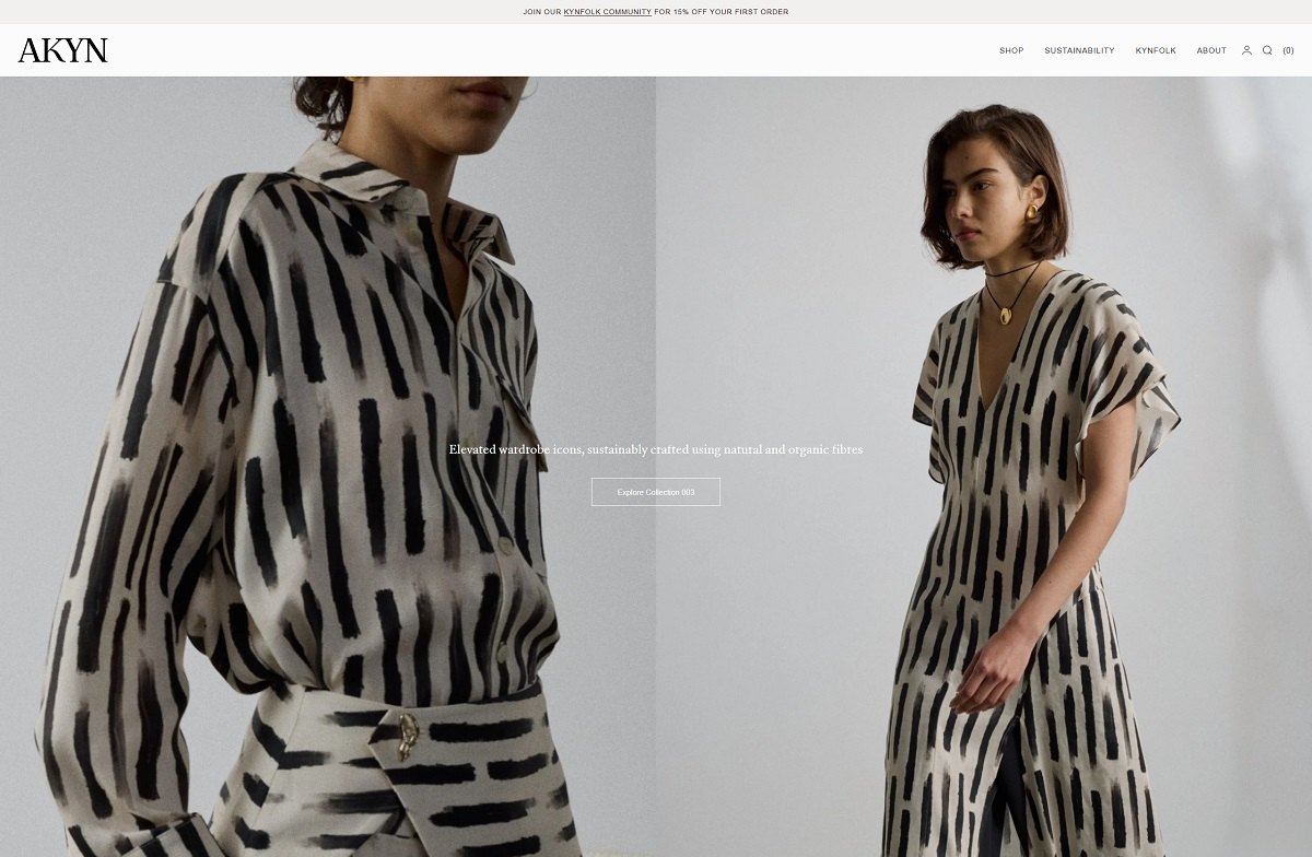
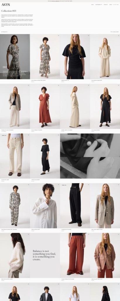
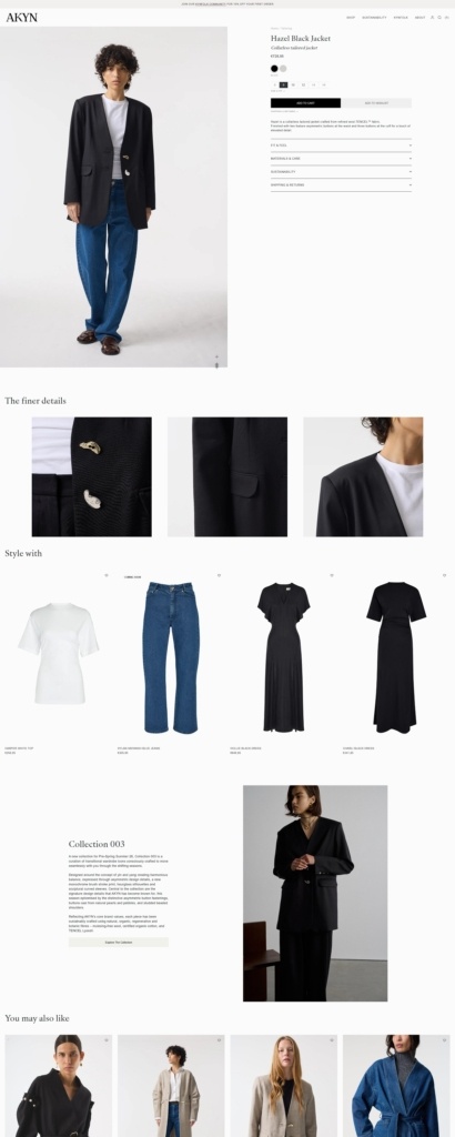
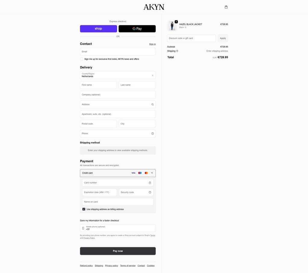
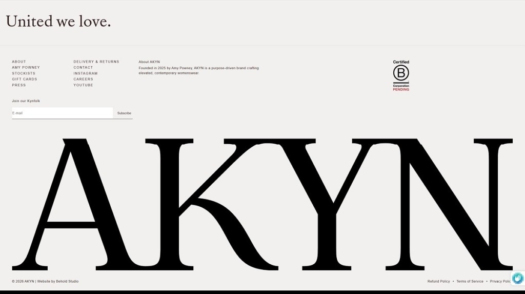
AKYN is a contemporary womenswear brand with a refined ecommerce website that combines minimalist design, editorial imagery, and clean navigation to highlight its collections. The site showcases elevated wardrobe pieces such as organic cotton denim, tailored coats, knitwear, dresses, and statement T-shirts, presented with a focus on craftsmanship and sustainability. Products emphasize natural materials like organic cotton, wool, flax, and Lyocell, positioning the brand as a modern, responsible fashion label with timeless yet sophisticated clothing.
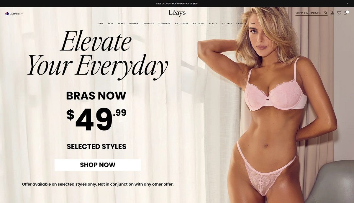
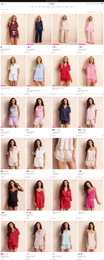
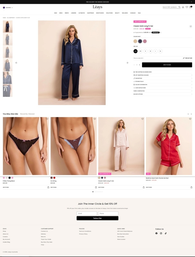
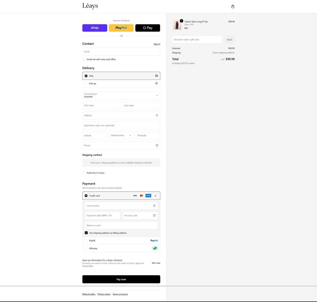
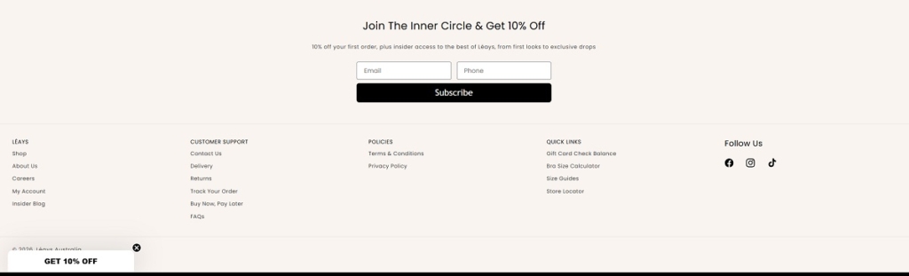
Léays is a lingerie and sleepwear brand selling bras, underwear, bodysuits, and sleepwear, with an added beauty range (for example, body scrub and related self-care products). The website design is clean and shop-forward, using large product imagery, simple category navigation (lingerie, bras, sleepwear, beauty), and an easy grid-based browsing experience that moves quickly from collections to product pages.
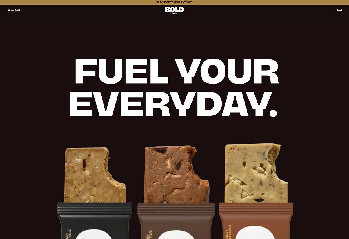
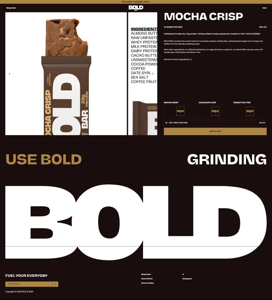
Bold Bar is a high-protein snack brand offering flavour-forward nutrition bars in individual packs, multipacks, and subscription options. The website design is bold and energetic, using high-contrast visuals, oversized typography, and large product imagery that keeps the focus on flavour and protein content. Navigation is simple and shop-first, guiding visitors quickly into flavour collections and purchase options with clear calls to action.
BOLD BAR Product Page Example
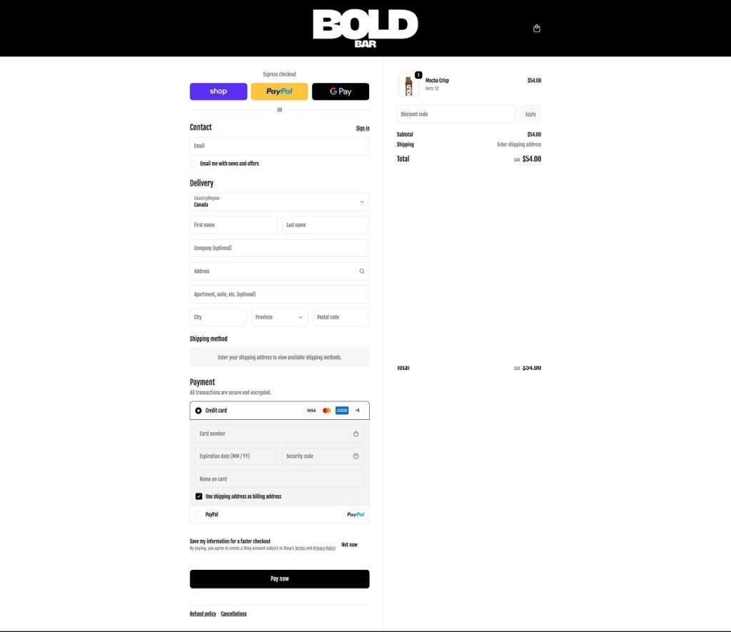
BOLD BAR Checkout Page Example
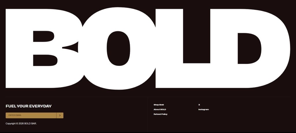
BOLD BAR Footer Example
Join our community for the latest trends and ecommerce tips.

 By Jibin Kumar