Archives: Websites

eCommerce Websites

FrutaPOP

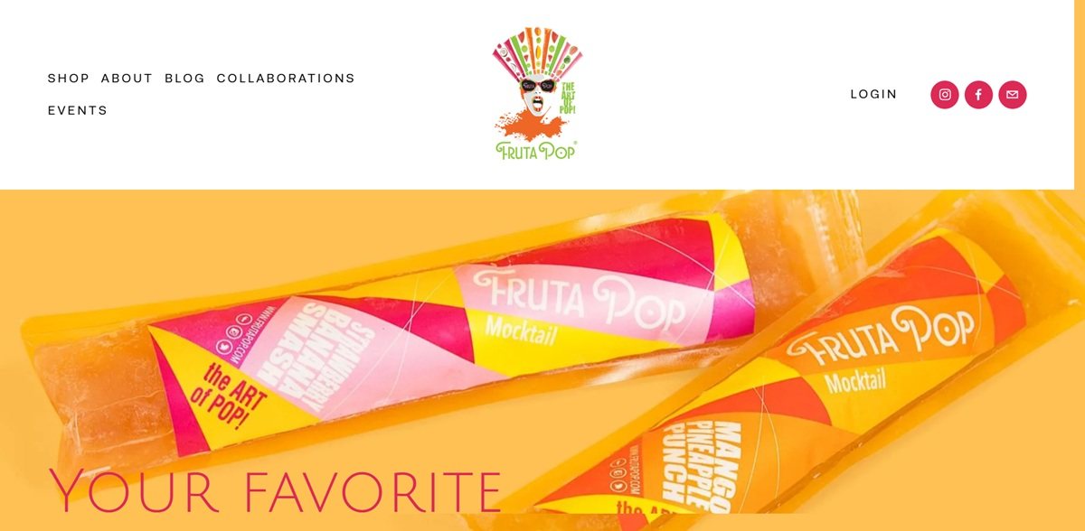
FrutaPOP is a New York based maker of gourmet ice pops, founded by Tracy Memoli and Laurance Rassin and sold direct in 12, 24, 32 and 48 count packs. The brand launched in 2017 with alcohol-infused pops and the site now states that it offers non-alcoholic mocktail pops only, covering fruit and vegetable juice, coffee and matcha. Alongside the shop it runs wholesale, corporate and wedding, charitable event and contract manufacturing lines. Built on Squarespace, with the design credited in the footer to Hued.

Website Design

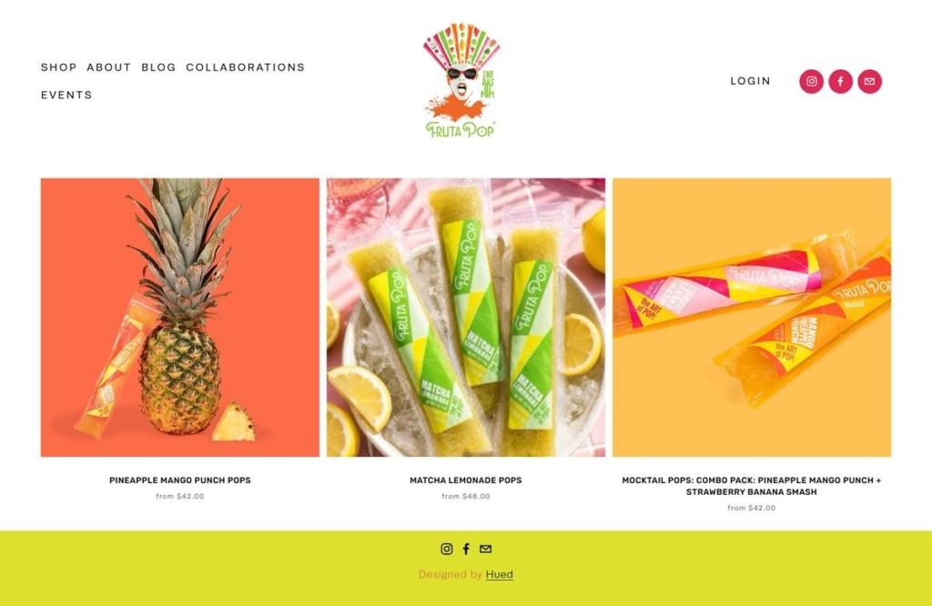
Flavour shot on saturated grounds. Every pop is photographed flat against a single colour field, lime green water, marigold, coral pink, so the grid reads as six blocks of colour with the packaging centred in each.

Three typefaces doing separate work. Julius Sans One sets the wide-tracked capitals, with Poppins and Rubik carrying body copy and interface labels.

A lime footer bar. The page ends on a full-width acid green band holding only the social icons and the designer credit, and the same green returns as the header bar in checkout.

Letterspaced small capitals. Navigation and product titles are set in tracked uppercase at small sizes, which keeps long flavour names on a single line under each image.

Shopping Experience

A three-up grid with from pricing. Collection tiles carry one image, the name in tracked caps and a from price, currently 42 and 48 dollars depending on the line.

Pack size is the only variant. Each product sells in four counts, 12, 24, 32 and 48, chosen from a single Select Quantity dropdown labelled either Quantity or Variety Pack.

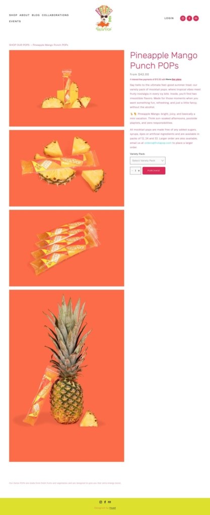
Purchase rather than add to cart. The buy button is labelled PURCHASE and sits beside a quantity stepper, with Klarna instalments offered directly beneath the price.

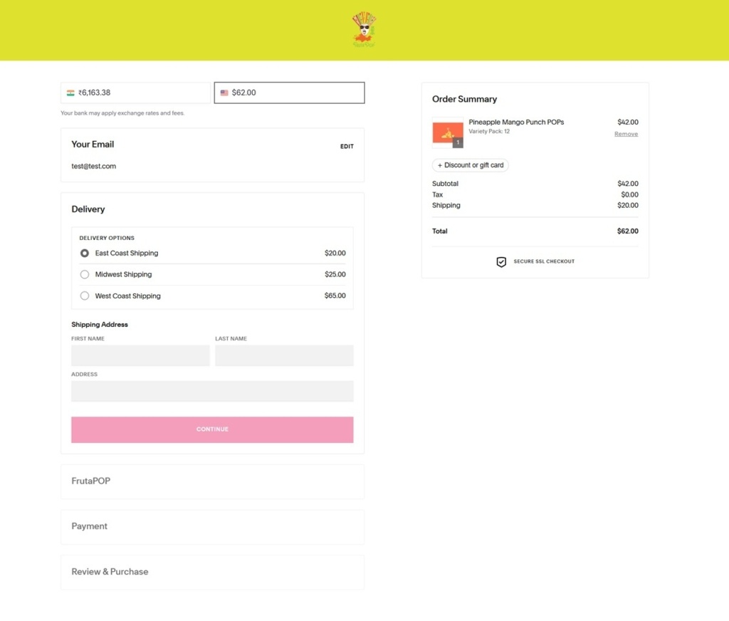
An accordion checkout. Squarespace’s five-step flow runs email, delivery, a brand-named step, payment and review down the left, with a persistent order summary, gift or discount code field and a secure SSL mark on the right.

Large orders leave the cart. Product copy directs bulk buyers to email the orders address rather than scaling the pack selector.

Brand Storytelling

A category claim stated outright. The homepage says the brand is reinventing the ice pop, “a product that hasn’t seen an innovation in the last 70 years”.

Founder bios at length. Both co-founders get several paragraphs on the homepage covering press appearances, trade judging and professional affiliations, which is unusual placement for a food brand.

Ingredients framed by omission. The quality section defines the product by what it leaves out, describing pops made without added sugars, syrups or dyes.

Collaboration as content. The Collab Lab and a long-running blog document partnerships with hotels, bars and drinks brands, giving the site a second reason to update.

Notable Features

Services sit beside the shop. Wholesale, Corporate and Weddings, Charitable Events and contract manufacturing are top-level menu items, so the site serves event buyers as directly as it serves consumers.

Rental listed as a product. Retro coolers appear in the accessories collection at 200 dollars, with the copy explaining they are rented for events and handled by email.

FrutaPOP Shop Category Page Example
FrutaPOP Product Page Example
FrutaPOP Checkout Page Example
Footer Example

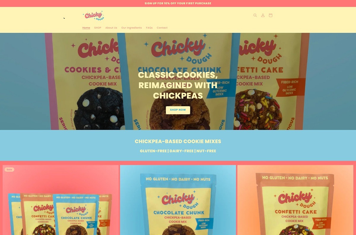
ChickyDough

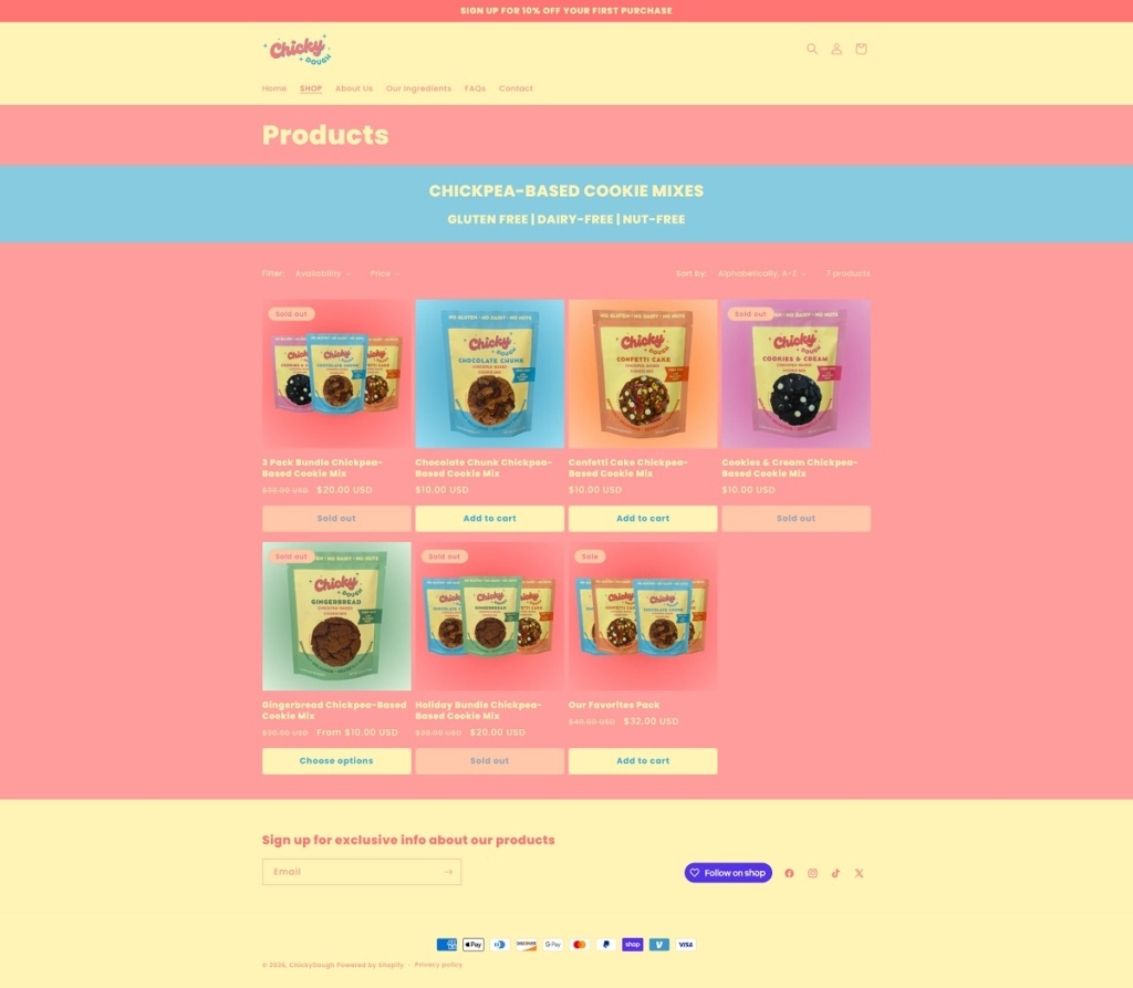
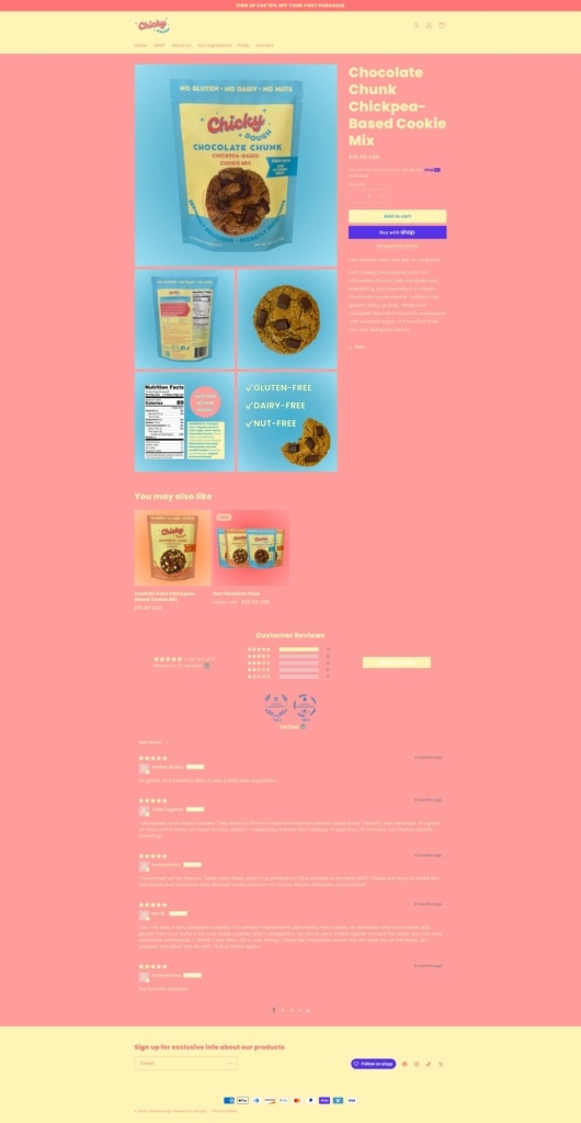
Eatchicky has a bright, modern website with a clean, playful design that makes the products feel fun and approachable. It focuses on chickpea-based cookie mixes, with allergy-friendly options and colourful baking products presented in a simple, easy-to-shop layout.

ChickyDough Shop Page Example

ChickyDough Product Page Example

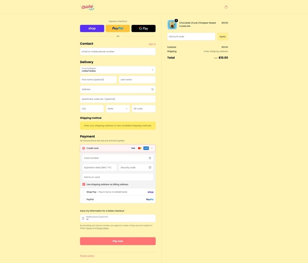
ChickyDough Checkout Page Example

ChickyDough Footer Example

Mushroom Compadres

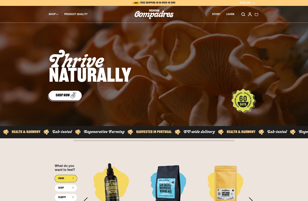
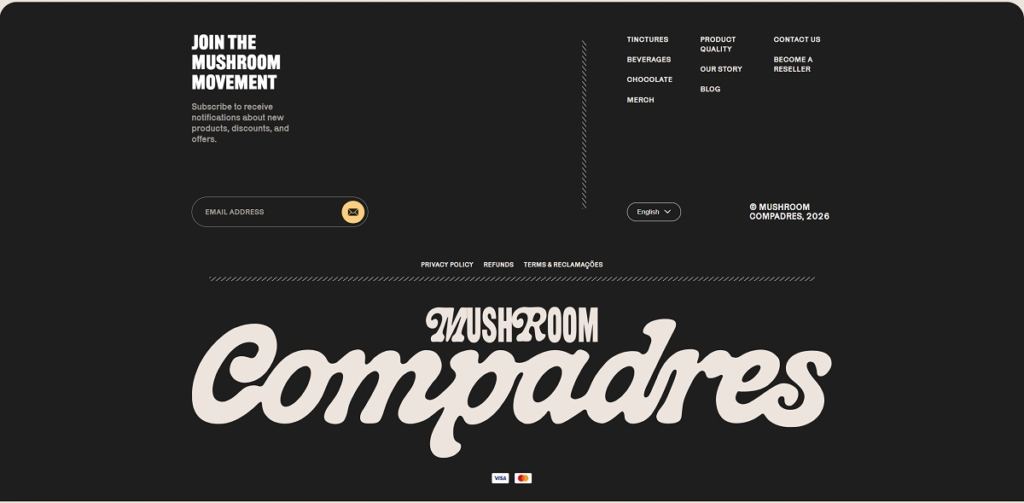
Mushroom Compadres grows and processes functional mushrooms in its own facility in Rogil, Portugal, and sells them across Europe. The range covers tinctures, mushroom coffee and cacao, chocolate, powders and capsules, plus caps, t-shirts and a tote, from 8,00 EUR to 60,00 EUR. The buyer is shopping for a stated outcome rather than an ingredient. Built on Shopify, priced in euro for around thirty European markets in English and German.

Website Design

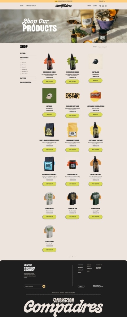
A condensed display face over a quirky text face. Display type is Railroad Gothic CC, a narrow sans set large and tight, with Karrik for body copy and Assistant for interface labels. The logotype is a heavy brush script that reappears at full page width at the foot of the shop.

Warm paper and acid green. Grounds sit in a beige around #F4ECE5 with near-black #121212 text, and a chartreuse carries every Add to cart button and the full-width quality guarantee band. Gold and a strong blue appear inside illustrated sections, not in the interface.

Cut-outs and hand-drawn shapes. Product photography is cut out and set on soft painted blobs, apparel cards show garments held by illustrated arms, and explainer sections sit on irregular grounds rather than rectangles.

Shopping Experience

Filter by feeling. The homepage opens the catalogue with “What do you want to feel?” and six answers: Focus, Sleep, Clarity, Defense, Anti-Stress and Gut Health. The shop repeats this as a BY BENEFIT checkbox filter above BY TYPE and BY MUSHROOM.

A three-column grid that sells in place. Cards carry a name, one line of copy, a “FROM 35,00 EUR” style price and a green Add to cart button that greys to Sold out where stock has run.

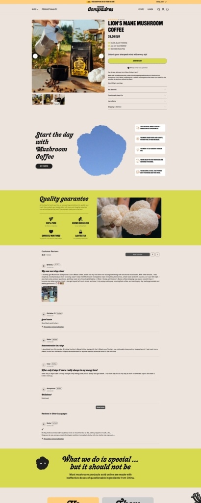
Product pages lead with outcomes, then evidence. The Lion’s Mane coffee page opens with three ticked claims above the buy button, then folds detail into accordions for size, traditional uses, benefits, ingredients and shipping. Judge.me reviews below carry photographs and a translate option.

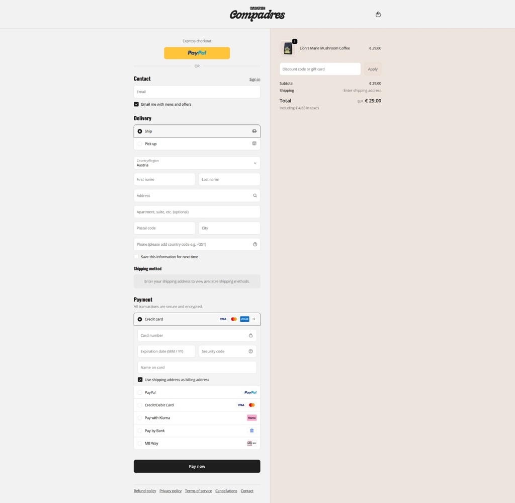
A checkout built for Portugal and the EU. Shoppers pick Ship or Pick up, with PayPal as express checkout above the form. Payment lists card, PayPal, Klarna, Pay by Bank and MB Way, and the summary states the tax included in the total.

Brand Storytelling

A direct us-and-them table. A section headed “What we do is special … but it should not be” sets grown in house, higher dosage and fruiting bodies only against a nameless source, low dosage and cheap mycelium with fillers.

Method given as numbers. The FAQ states a double extraction at a one-to-eight ratio of mushroom to solvent in alcohol and water, a 280 square metre facility and a sixty-day return window.

Notable Features

A quiz that pays to finish. A one-minute “Find your mushroom” quiz opens as an overlay, asks what the shopper wants across seven mushrooms and offers 15% off on completion.

Shipping terms stated in the bar. The announcement bar rotates free shipping on subscriptions and free EU shipping above 50 EUR, and a country selector sets the market while the currency stays euro.

A reseller route in the main navigation. “Become reseller” sits in the header beside Product Quality, Our Story and the blog, with a Mushroom Index in the footer.

Mushroom Compadres Shop Category Page Example

Mushroom Compadres Product Page Example

Mushroom Compadres Checkout Page Example

Mushroom Compadres Footer Example

Lil Luv Dog

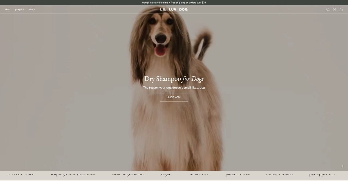
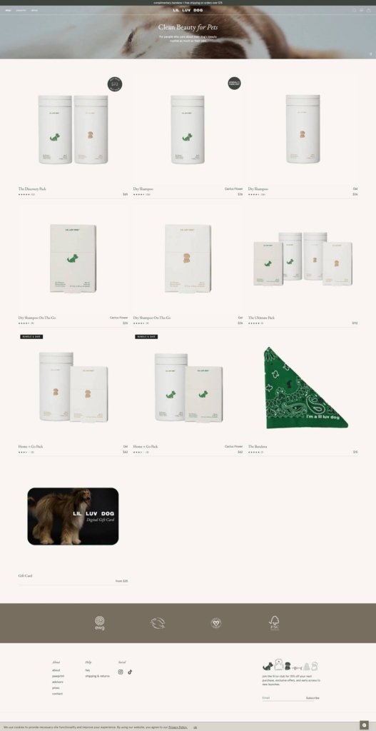
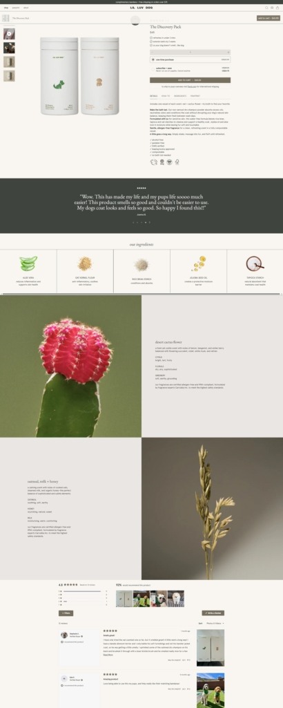
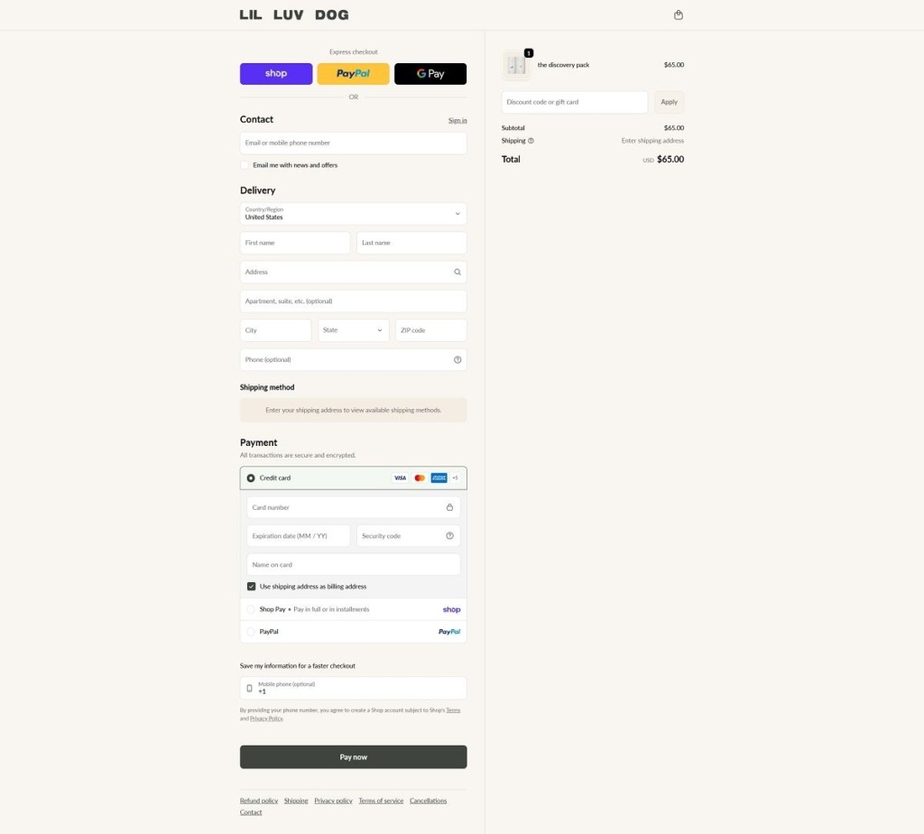
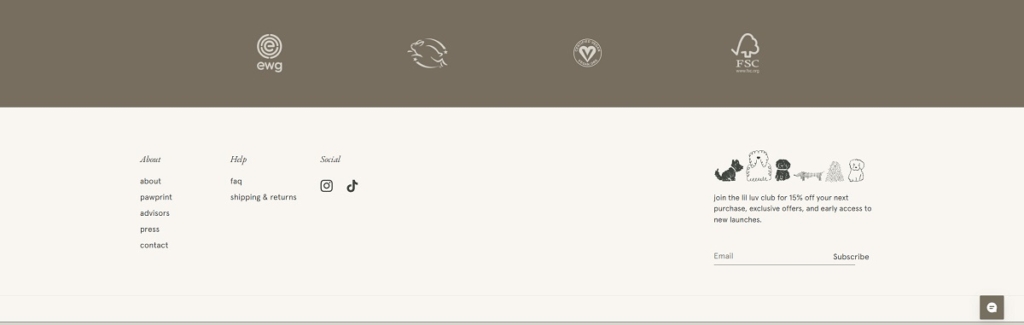
Lil Luv Dog has a sleek, editorial-style ecommerce website with minimal layouts, soft colours, and refined product imagery that feels closer to a beauty brand than traditional pet care. The design is highly aesthetic and lifestyle-driven, with a strong emphasis on clean ingredients and sustainability. The brand offers premium dog grooming products, including plant-based dry shampoos in innovative formats like compostable shakers and dissolvable sachets. Products focus on non-toxic formulas and eco-friendly packaging. Overall, the site positions the brand as a modern, design-led “clean beauty” brand for pets.

Lil Luv Dog Shop Page Example

Lil Luv Dog Product Page Example

Lil Luv Dog Checkout Page Example

Lil Luv Dog Footer Example

Kip Life

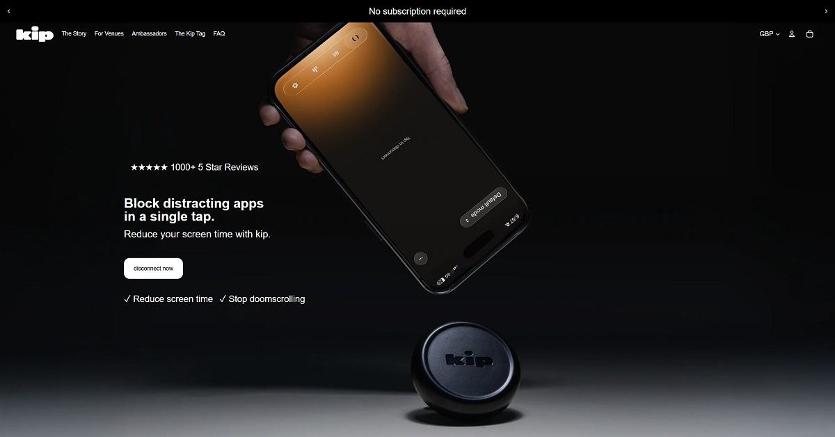
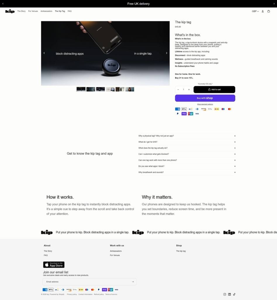
Kip Life is a sleep-focused wellness brand with a clean, minimal ecommerce website that uses calm colours, simple layouts, and soft visuals to promote relaxation and better nighttime routines. The design is distraction-free, mirroring its core message of reducing digital noise and improving sleep habits. The brand’s main products include a “Disconnect Tag” device that blocks distracting apps and a companion mobile app offering sleep guidance, breathing exercises, and soundscapes.

Kip Life Product Page Example

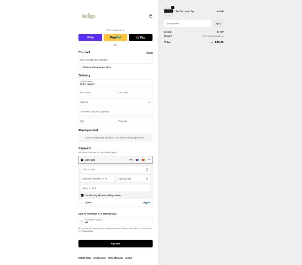
Kip Life Checkout Page Example

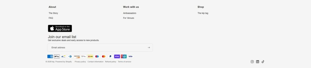
Kip Life Footer Example
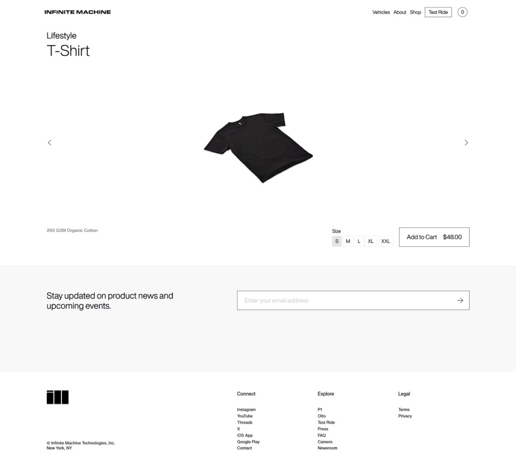
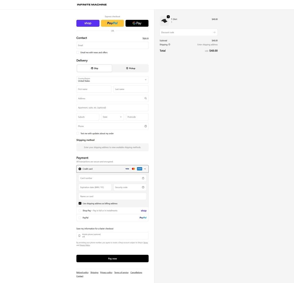
Infinite Machine

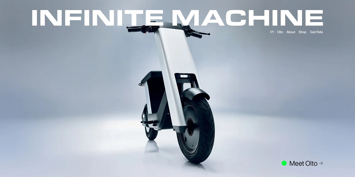
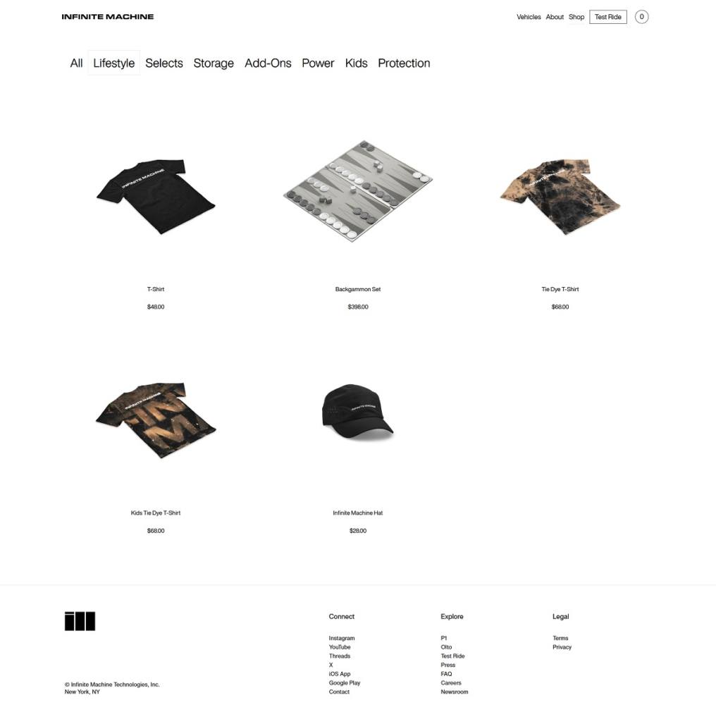
Infinite Machine has a bold, futuristic ecommerce website with a dark, minimal design, cinematic visuals, and strong product storytelling. The layout feels premium and immersive, focusing on design, performance, and technology through large renders and smooth sections. The brand offers high-performance electric vehicles like the P1 scooter and Olto, designed for urban mobility as alternatives to cars. Products feature removable batteries, app connectivity, security systems, and modular accessories. Overall, the site positions the brand as a cutting-edge, design-led player in next-gen personal transport.

Infinite Machine Shop Category Page Example

Infinite Machine Product Page Example

Infinite Machine Checkout Page Example

Infinite Machine Footer Example
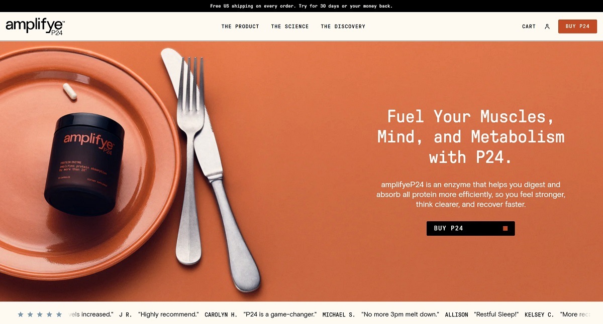
AmplifyME

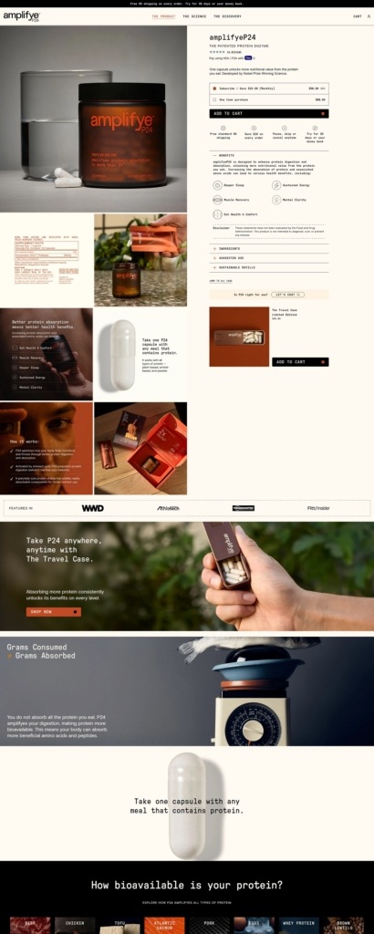
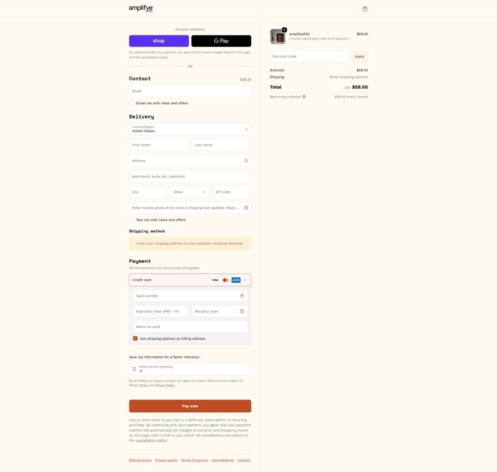
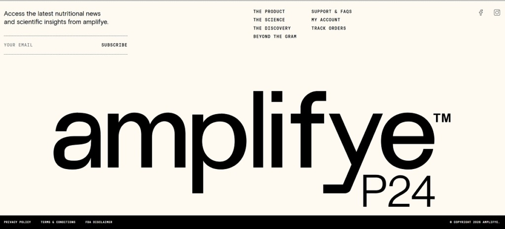
AmplifyME features a clean, modern website with a professional, performance-focused design, using clear layouts and bold messaging to highlight its product benefits. The site is product-centric, with simple navigation and strong emphasis on results like strength, recovery, and mental clarity. Its core product, amplifyeP24, is an enzyme supplement designed to improve protein digestion and absorption. Overall, the brand positions itself as a science-driven solution for better performance and recovery.

AmplifyME Product Page Example

AmplifyME Checkout Page Example

AmplifyME Footer Example

AIM Nutrition

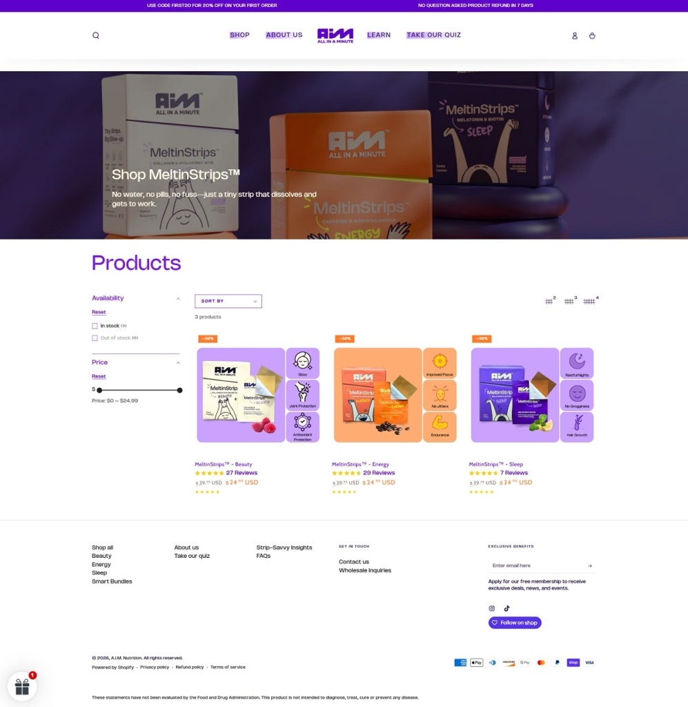
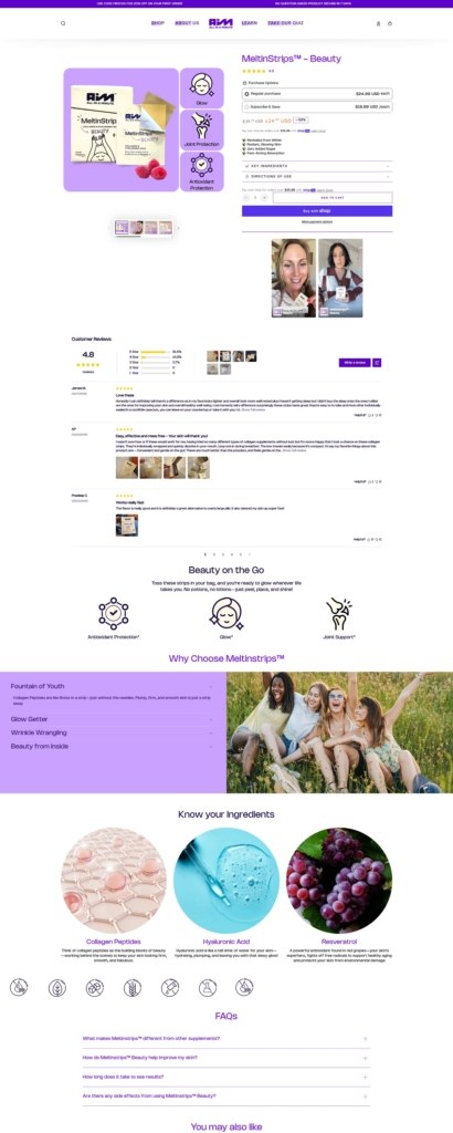
AIM Nutrition has a clean, modern ecommerce website with bold visuals and simple navigation, focused on showcasing its innovative supplement format. The design is product-first, with clear sections highlighting benefits like energy, sleep, and beauty. Its core products are MeltinStrips™, vegan, sugar-free oral strips that dissolve on the tongue for fast, convenient nutrient delivery. The brand positions itself as a portable, easy alternative to traditional pills and powders.

AIM Nutrition Shop Page Example

AIM Nutrition Product Page Example

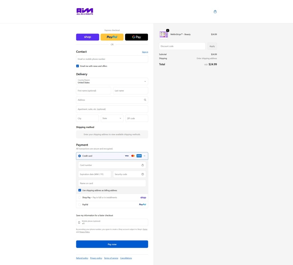
AIM Nutrition Checkout Page Example

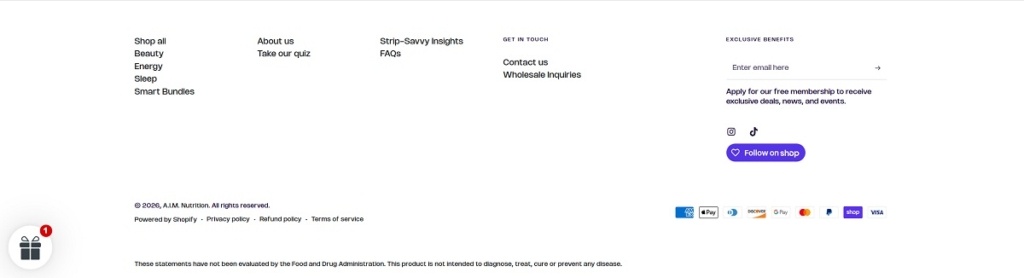
AIM Nutrition Footer Example
HYQ

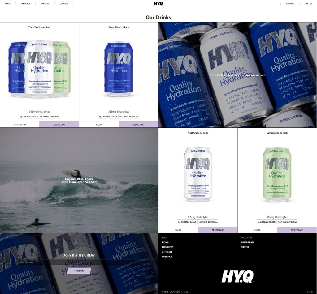
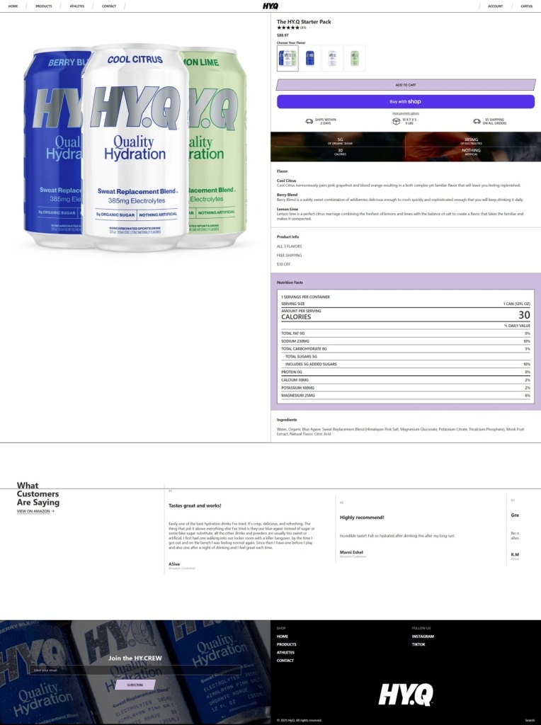
Drink HYQ is a modern hydration brand with a bold, minimalist ecommerce website that uses clean layouts, strong typography, and product-first visuals to emphasise simplicity and performance. The design focuses on clarity—highlighting key benefits like electrolytes, low sugar, and “nothing artificial” messaging with minimal distractions.

HYQ Shop Page Example

HYQ Product Page Example

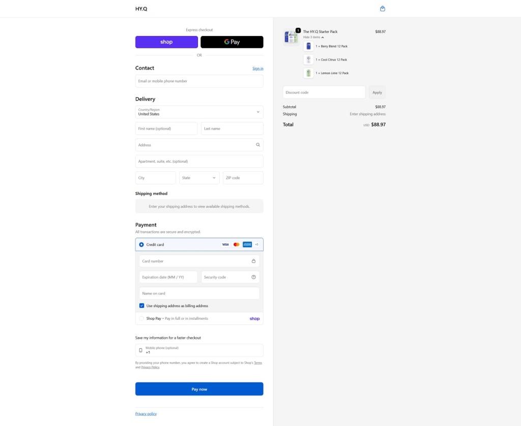
HYQ Checkout Page Example

HYQ Footer Example
Sips

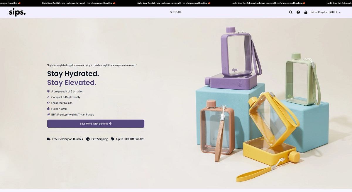
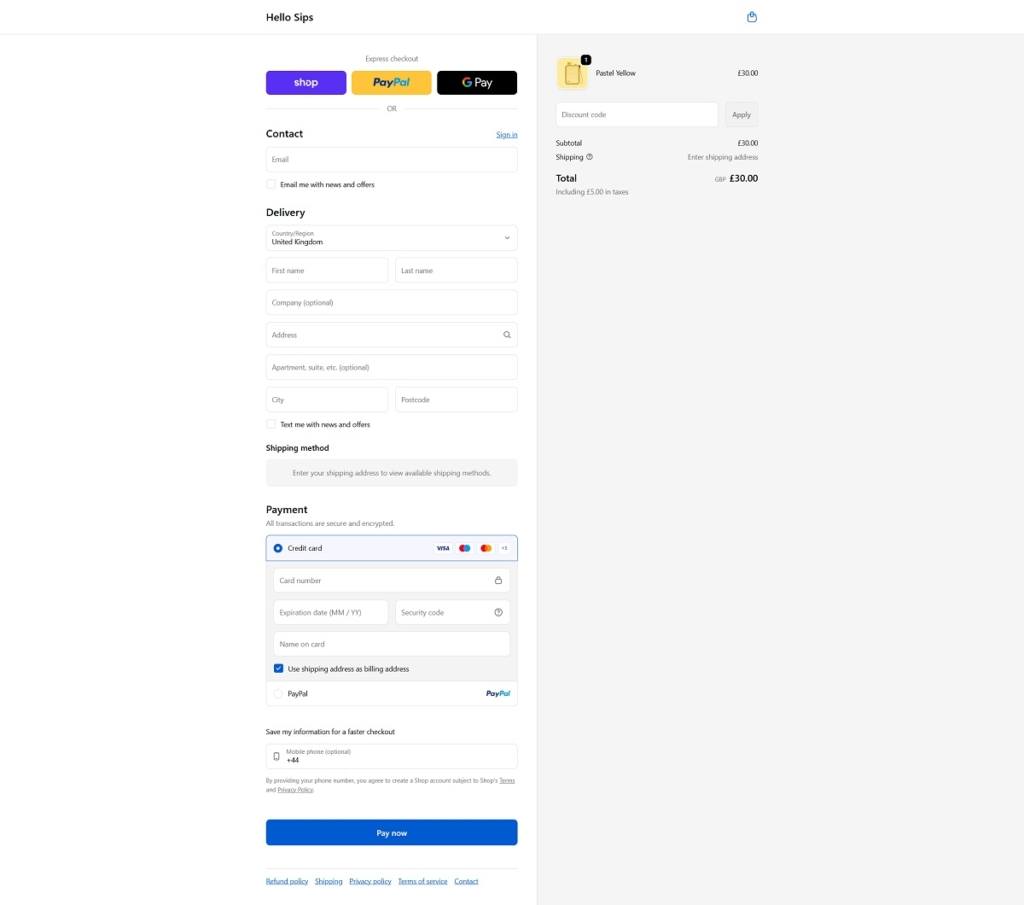
Hello Sips is a lifestyle brand with a vibrant, modern ecommerce website that uses clean layouts, bold colours, and smooth navigation to create a fun, expressive shopping experience. The site is built for clarity and conversion, with strong visuals and a simple flow that highlights the product quickly and effectively.

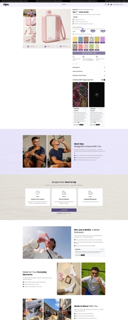
The brand focuses on a single core product: a stylish, compact 480ml water bottle, available in multiple colours and designed to be lightweight, leak-proof, and easy to carry with features like wrist straps and slim, flat shapes.

Overall, the website reflects the product itself—minimal, playful, and lifestyle-driven—positioning hydration as both functional and a form of personal expression.

Sips Product Page Example

Sips Checkout Page Example

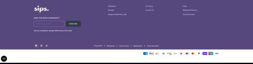
Sips Footer Example
Brick

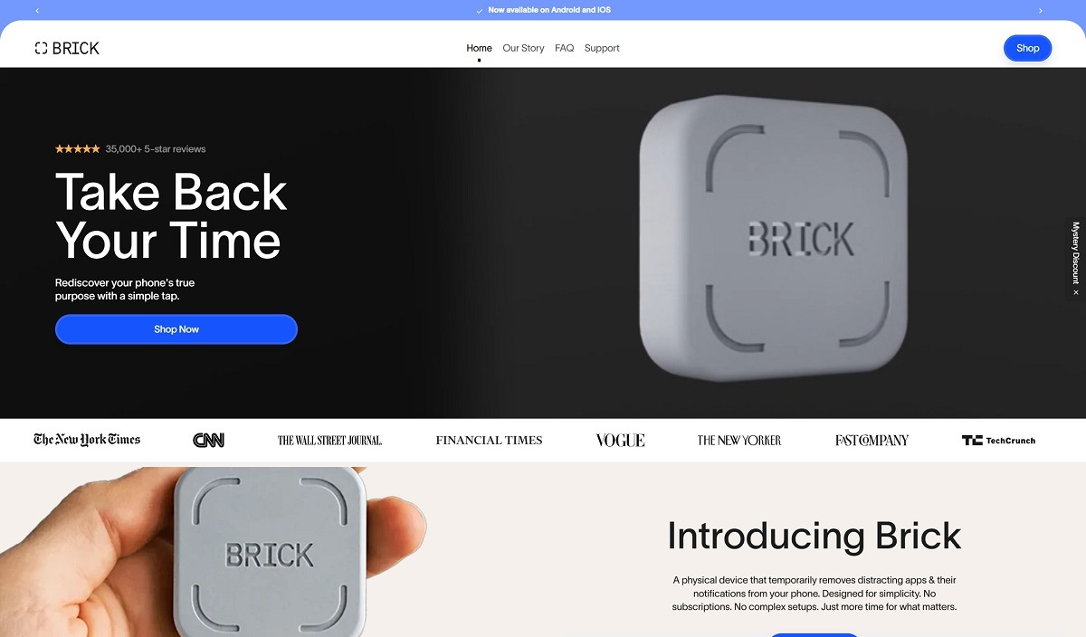
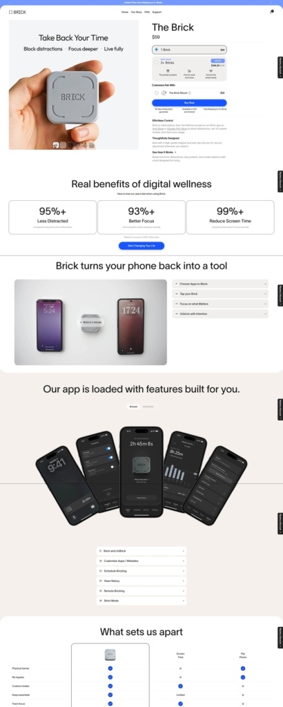
Brick is a minimalist tech brand with a clean, modern ecommerce website focused on a single productivity gadget designed to reduce smartphone distractions. The site uses simple layouts, bold product visuals, and straightforward messaging to highlight the Brick device, a small NFC-enabled square that works with a companion app to temporarily block selected apps and notifications on your phone. By tapping your phone on the device, users can lock or unlock distracting apps, turning their smartphone into a more focused, minimalist tool while keeping essential functions like calls, messages, or maps.

Brick Product Page Example

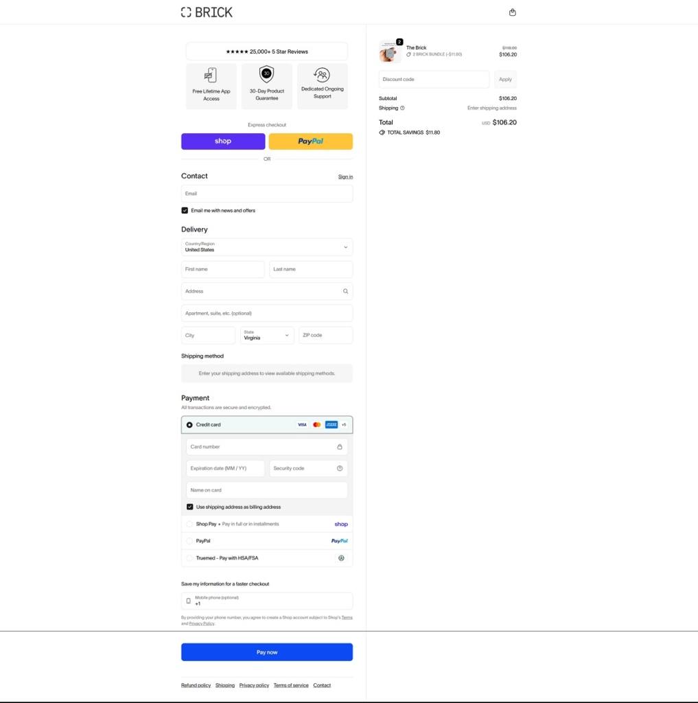
Brick Checkout Page Example

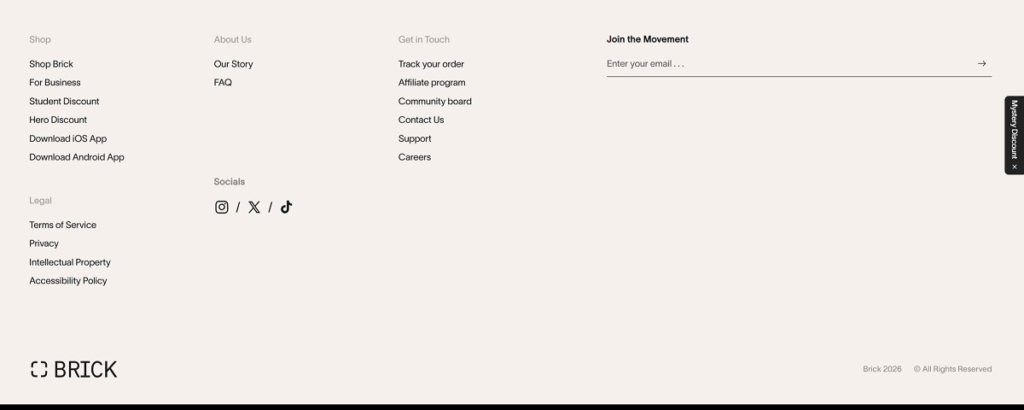
Brick Footer Example
ItsMessy

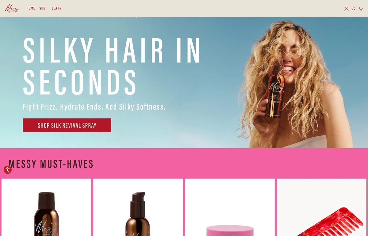
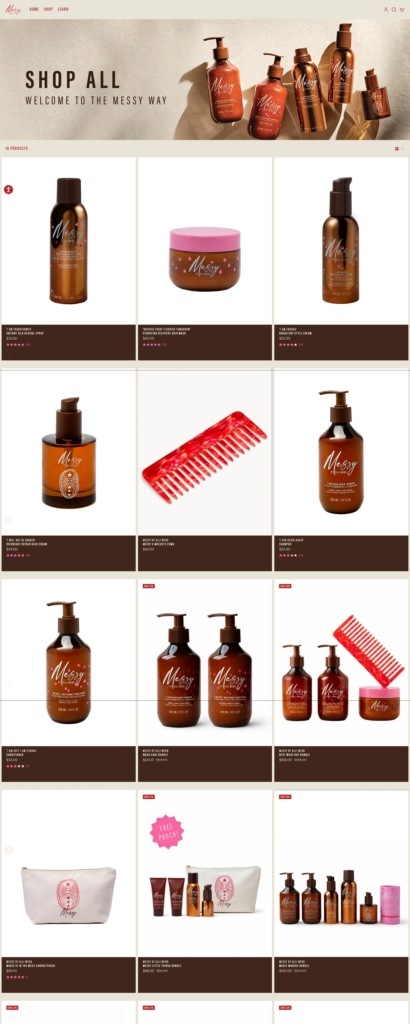
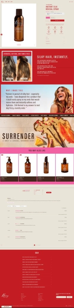
ItsMessy is a modern beauty brand with a clean, editorial-style ecommerce website that uses soft colours, large lifestyle imagery, and minimal navigation to highlight its hair-care collection. The site focuses on a small range of products—including shampoo, conditioner, styling cream, hair serum, spray, and treatment masks—designed to enhance natural hair texture and support a relaxed “rough-dry” styling method rather than heavy heat styling. The brand promotes vegan, cruelty-free formulas and positions its products as simple essentials for healthy, effortless hair.

ItsMessy Shop Page Example
ItsMessy Product Page Example
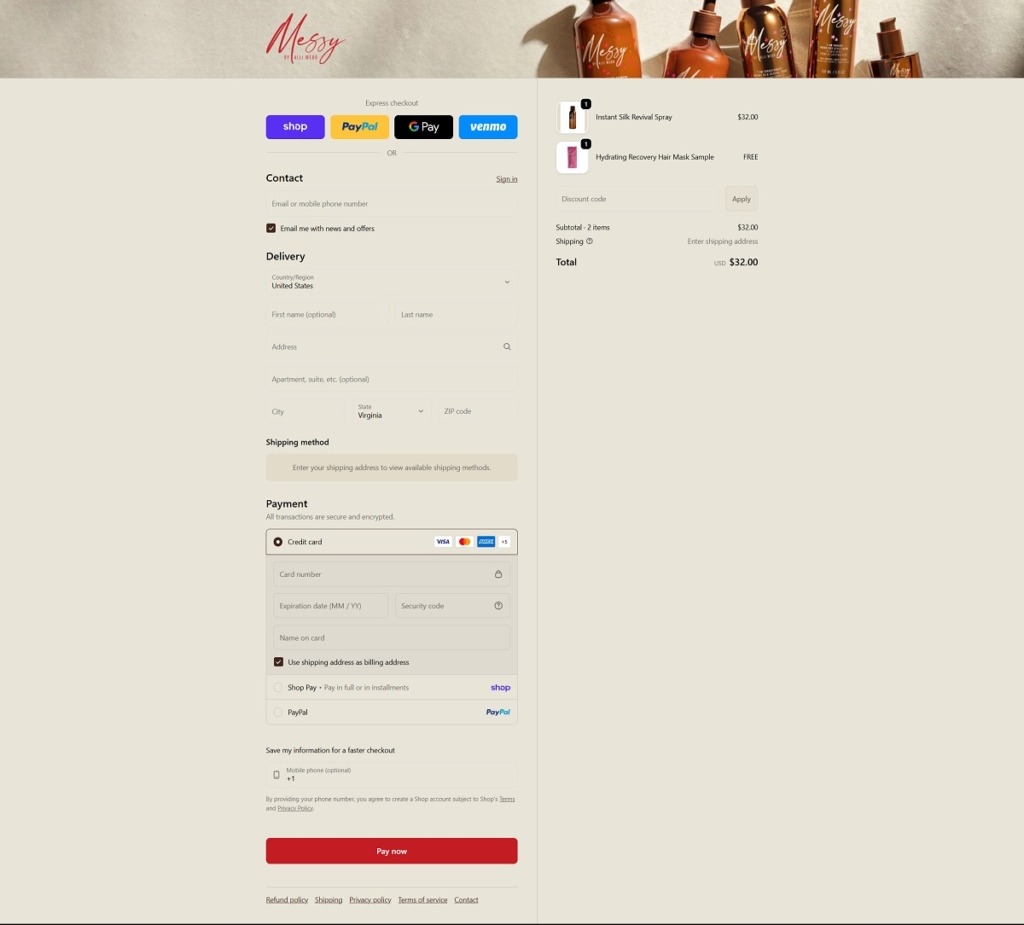
ItsMessy Checkout Page Example
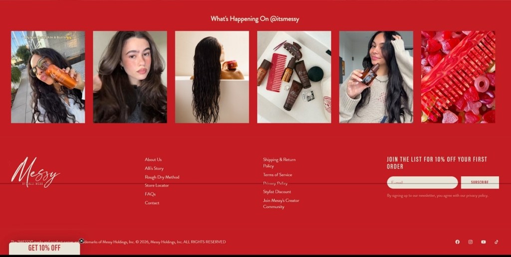
ItsMessy Footer Example