De Lune 
De Lune is a menstrual health company selling herbal and nutritional supplements, tinctures, an adaptogen tea and a rescue kit, aimed at period pain, hormone balance and energy, through a Shopify store built around the stated line "Nutritionist-formulated. Female-founded. Naturally effective."
Website Design
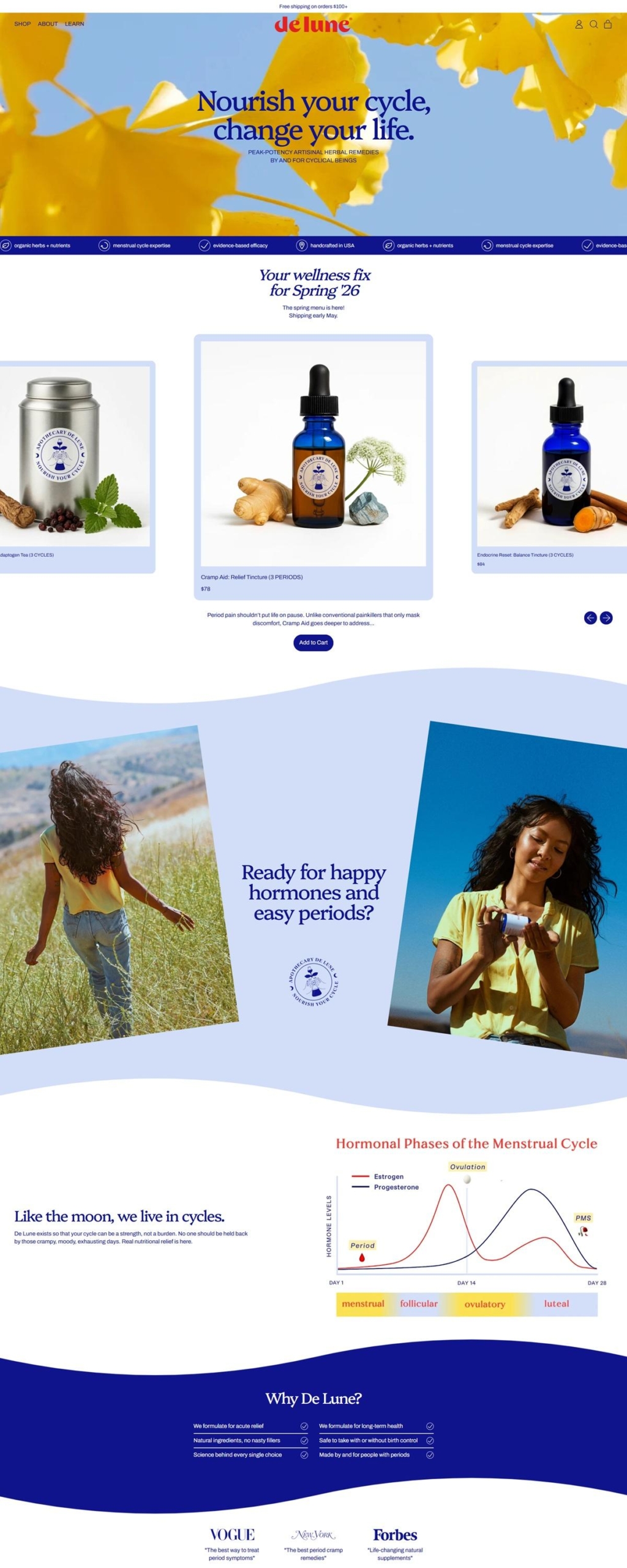
Navy serif against a coral wordmark. The de lune logotype runs in coral red while section headings like "Products" and "Why De Lune?" sit in a navy blue serif, giving the palette one bright accent color against a mostly white ground.
Platypi for headings, Archivo for body copy. The pairing keeps titles rounded and slightly editorial while product descriptions, labels and buttons stay in a plain grotesque sans-serif.
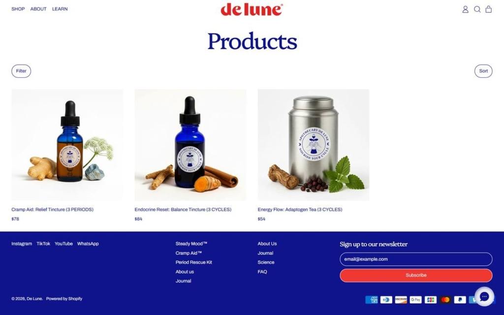
Roots and stones styled around apothecary bottles. Product photography surrounds the cobalt glass bottles with ginger root, cinnamon sticks, dried dong quai root and rose quartz, rather than showing the products alone on white.
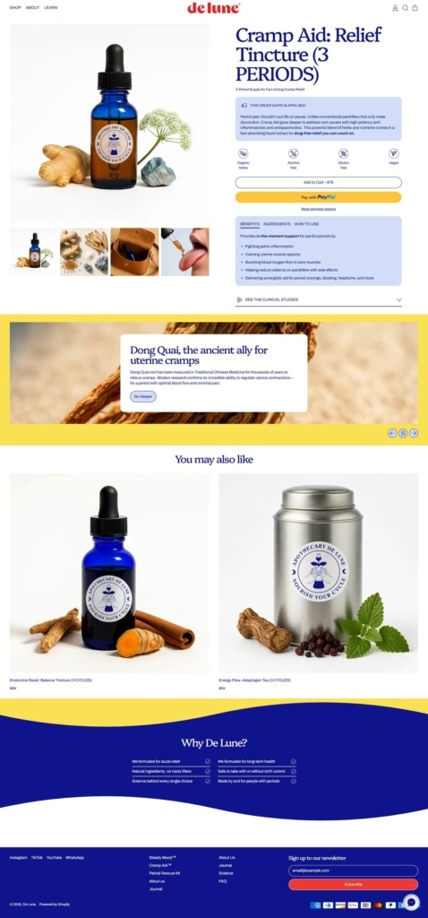
Wave-shaped section dividers. Instead of straight horizontal breaks, the yellow ingredient callout and the navy "Why De Lune?" banner both curve into the white sections above and below them.
Shopping Experience
Cycle counts built into product names. Titles state the supply directly, such as "Cramp Aid: Relief Tincture (3 PERIODS)" or "Endocrine Reset: Balance Tincture (3 CYCLES)," so the purchase quantity is legible from the grid alone.
A benefit icon row above the description. The product page opens with small icons for claims like organic herbs, alcohol free and vegan, ahead of the price and Add to Cart button.
Tabbed detail beneath the buy box. Benefits, Ingredients and How to Use sit as separate tabs, with a "See the clinical studies" link that expands into cited research rather than only marketing copy.
Two purchase paths side by side. Add to Cart sits next to a yellow Pay with PayPal button, and a separate subscription option is offered elsewhere on the page for repeat orders.
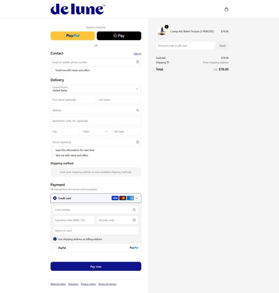
Checkout with express payment. PayPal and Google Pay sit above the standard delivery fields, and the confirm button reads Pay now in navy blue.
Brand Storytelling
A three-part tagline repeated on-site. "Nutritionist-formulated. Female-founded. Naturally effective." appears in the page meta description and functions as the shorthand brand promise.
Claims backed by a dedicated science link. Rather than resting on herbal tradition alone, product pages link out to clinical studies, and the footer separates a Science section from the Journal blog.
A stated four-point pitch. The "Why De Lune?" section lists acute relief, long-term health, safety alongside birth control, and formulation "by and for people with periods" as its core claims.
Notable Features
WhatsApp as a listed contact channel. The footer groups WhatsApp with Instagram, TikTok and YouTube rather than treating it only as a support tool.
A live chat bubble in the corner. A round chat widget sits fixed at the bottom right of every page for direct questions during shopping.
An ingredient explainer mid-page. On the product page, a yellow panel breaks from the buy box to explain one named ingredient, Dong Quai, with a "Go deeper" link before returning to related products.
De Lune Shop page example
De Lune Product page example
De Lune Checkout page example
De Lune footer example

eCommerce Platform:

Tech Stack: