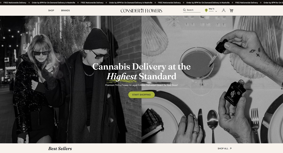
Consider It Flowers is an online cannabis boutique offering premium THCA flower, edibles, vapes, and concentrates, all compliant with the 2018 Hemp Farm Bill. The website features a clean, user-friendly design with intuitive navigation, high-quality visuals, and detailed product information, reflecting the brand’s commitment to quality and innovation.
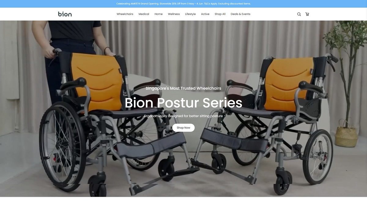
Bion SG is a Singapore-based provider of homecare and mobility solutions, offering a wide range of products including wheelchairs, medical devices, homecare furniture, and wellness accessories. Their website features a clean, user-friendly design with intuitive navigation, high-quality visuals, and detailed product information, reflecting the brand’s commitment to quality and innovation.
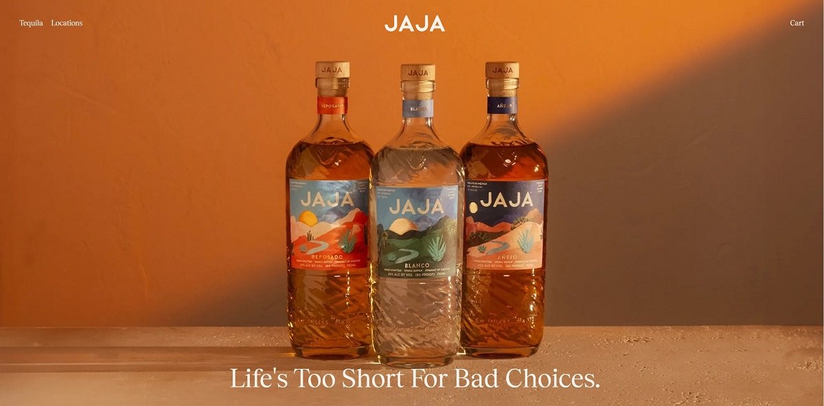
JAJA Tequila offers a vibrant range of small-batch tequilas—Blanco, Reposado, and Añejo—crafted from 100% blue Weber agave in Jalisco, Mexico. Each expression features distinct flavor profiles, from the crisp citrus and pepper notes of the Blanco to the rich vanilla and oak of the Añejo, aged in American oak barrels.
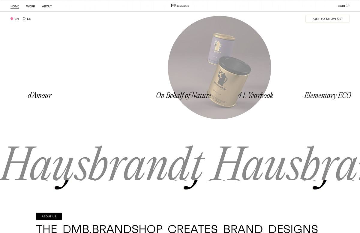
DMB. Brandshop is the design atelier of DMB., dedicated to crafting distinctive brand worlds and products that inspire and stand out. Backed by over 50 years of expertise from the Demner.Group, the studio blends clear visual brand strategies with creativity and passion. Their website showcases this mission through a refined, modular layout and high-quality visuals that reflect their commitment to design excellence and brand storytelling.
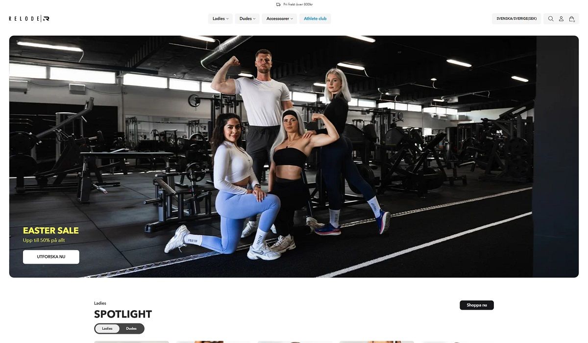
Relode is a Swedish activewear brand offering a wide range of stylish and functional workout clothing and accessories for both women and men. Their collections include leggings, joggers, shorts, sports bras, tank tops, and more, designed to support various fitness activities. The website features a clean, user-friendly design with intuitive navigation, high-quality visuals, and detailed product information, reflecting the brand’s commitment to quality and innovation.
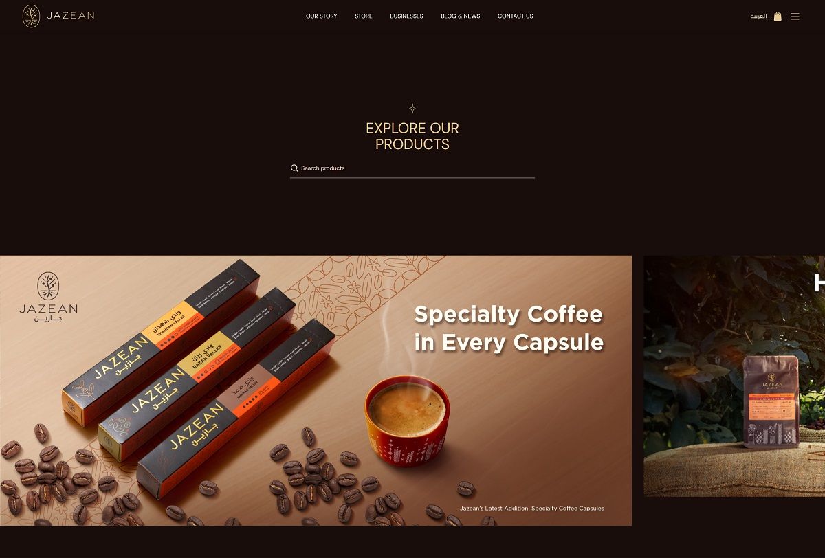
Jazean Coffee offers a curated selection of specialty Arabica blends sourced from Saudi Arabia’s Jazan region and international origins like Ethiopia, Colombia, and Guatemala. Their product lineup includes single-origin beans, capsule sets, brewing accessories, and premium gift boxes. The website features a clean, bilingual interface with high-quality visuals and intuitive navigation, reflecting the brand’s commitment to quality and innovation.
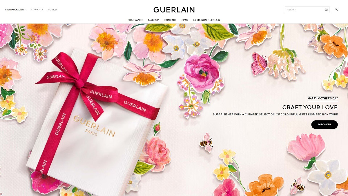
Guerlain offers a luxurious range of fragrances, skincare, and makeup, including iconic products like Shalimar, Abeille Royale, and Rouge G. Their website features an elegant, immersive design with high-resolution visuals and intuitive navigation, reflecting the brand’s heritage and commitment to innovation.
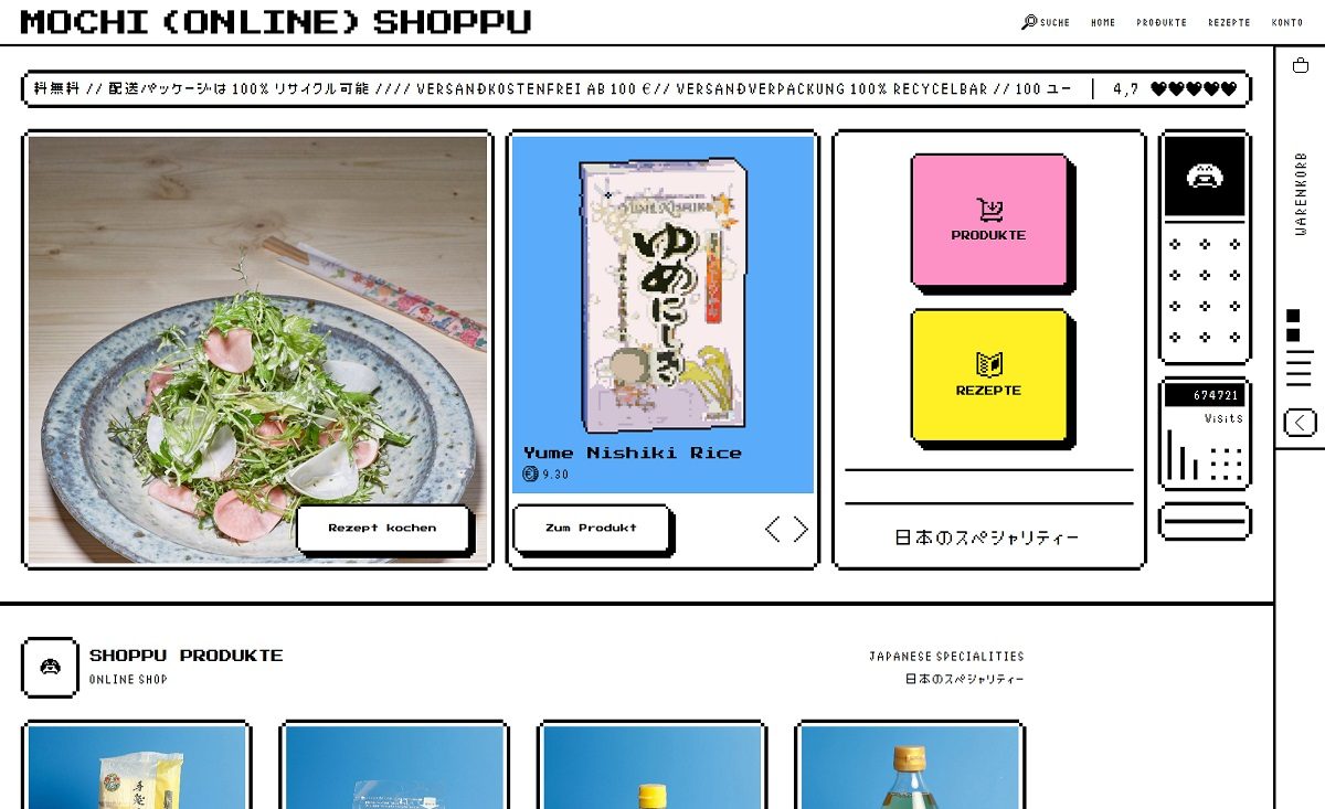
Shoppu by Mochi is an online store offering a curated selection of Japanese culinary products, including artisanal sauces, pantry staples, kitchenware, and cookbooks. The website features a playful, pixel-art-inspired design influenced by 1990s Japanese pop culture, providing an engaging and nostalgic shopping experience.
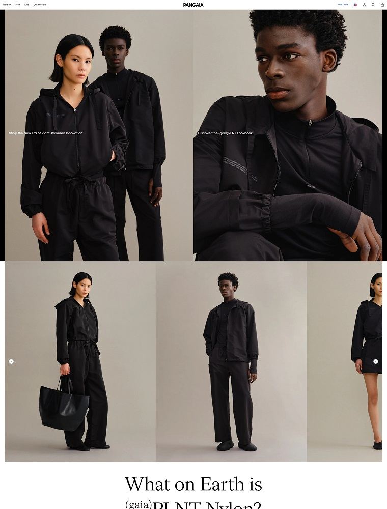
PANGAIA offers sustainable, science-driven apparel made from eco-innovative materials like FLWRDWN™ and C-FIBER™. Their website combines clean, modular design with educational storytelling, delivering a seamless and engaging shopping experience.
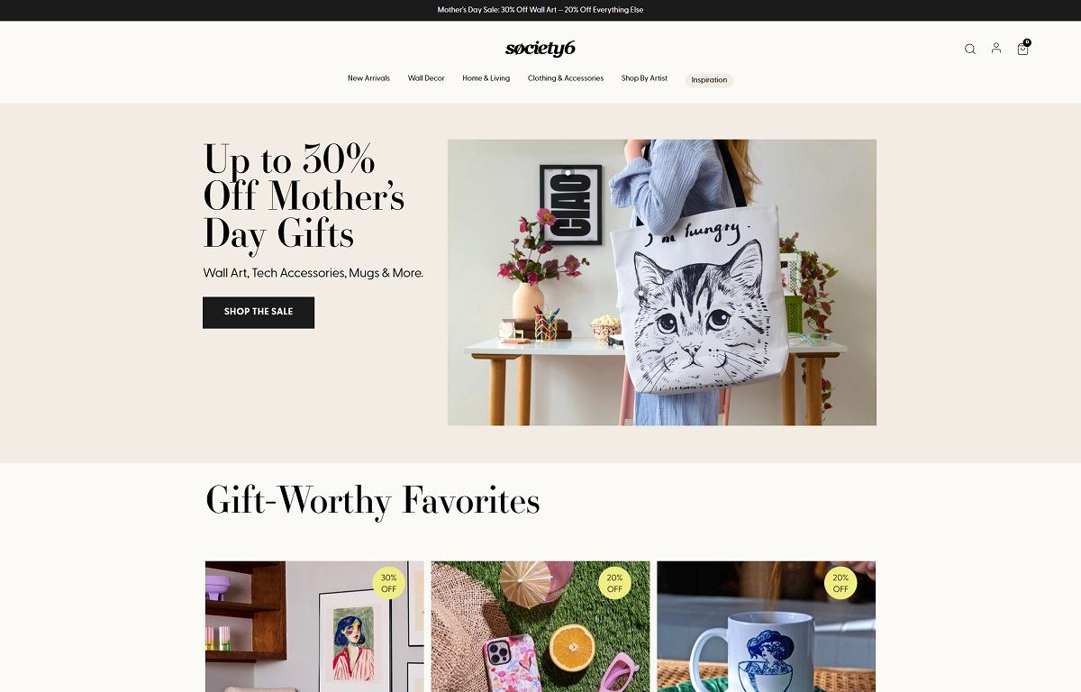
Society6 is a vibrant online marketplace that offers a wide array of artist-designed products, including wall art, home decor, furniture, apparel, and tech accessories. Their platform features unique designs from independent artists worldwide, allowing customers to personalize their spaces with distinctive, high-quality items. The website boasts a clean, user-friendly design with intuitive navigation and high-resolution visuals, enhancing the shopping experience.
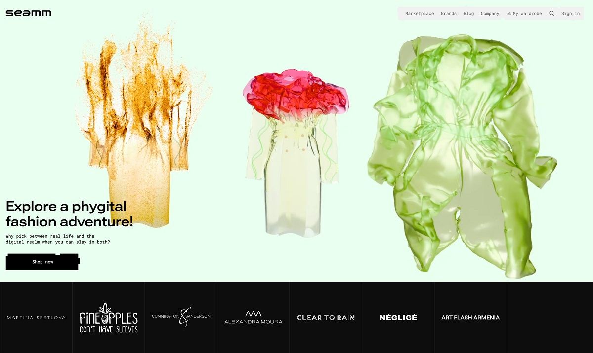
Seamm is a phygital fashion platform that merges physical garments with digital experiences. Users can virtually try on clothing via AR, customize items, and receive digital twins for use in games like Roblox and Minecraft. The website features an immersive design with intuitive navigation, showcasing products through high-quality visuals and interactive elements.
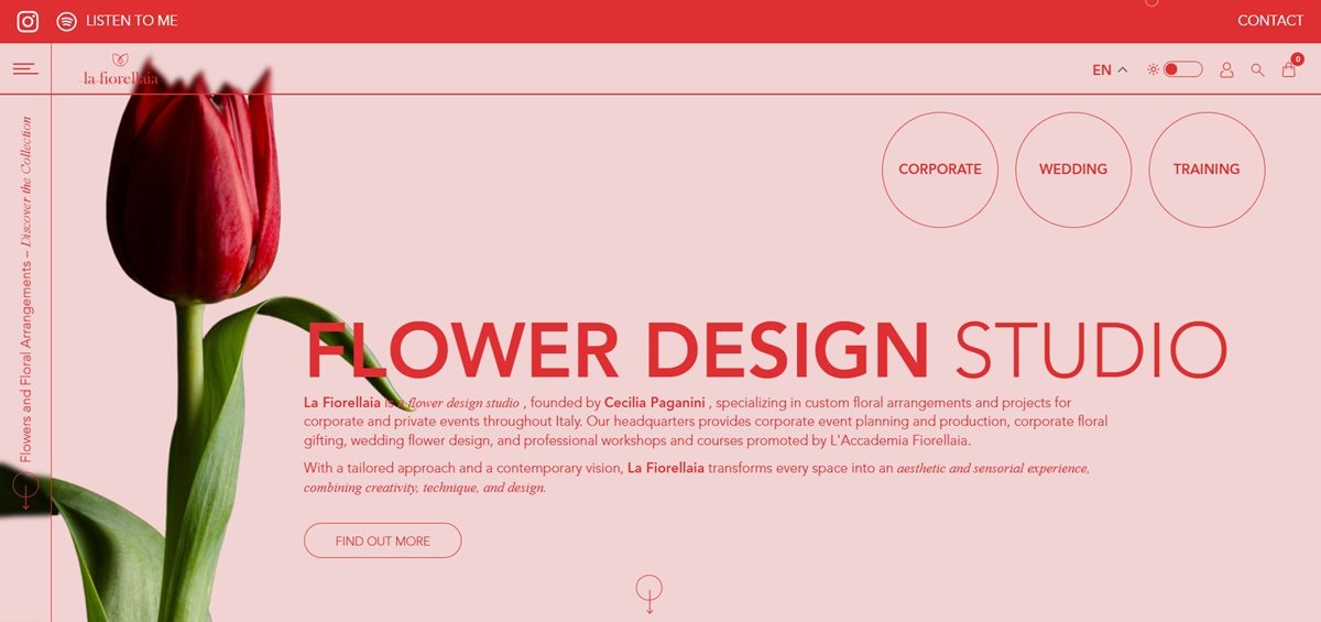
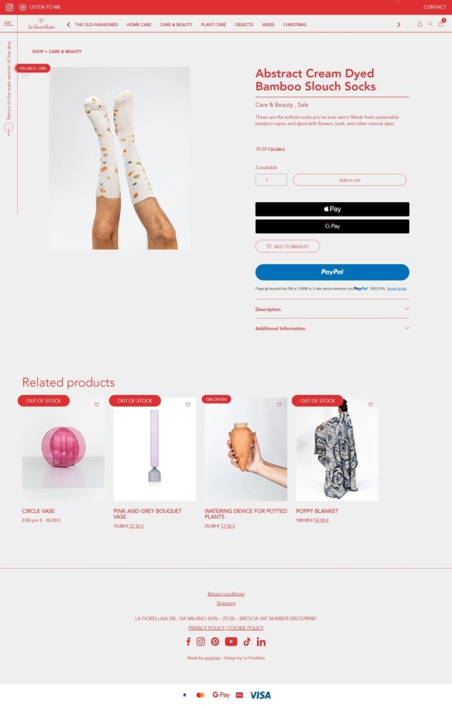
La Fiorellaia is an Italian flower design studio selling bespoke floral arrangements, decorative objects, vases and plant and home care products, alongside event installation, wedding and corporate gifting services and a floristry academy. Founded by Cecilia Paganini, the business operates from locations in Brescia and Ostuni and runs its shop on WooCommerce, a WordPress commerce plugin.
Website Design
A dark, muted working palette. Interface elements such as add-to-cart and wishlist buttons use a near-black charcoal rather than a bright brand colour, with a lighter grey for hover states, keeping the interface restrained so product and event photography carry the colour.
Avenir in two weights. Type is built from avenir-heavy for headings and emphasis and avenir-light for body copy, a single family used at contrasting weights rather than a paired display and text face.
Verb-based navigation as structure. The main menu is organised around Italian verbs rather than nouns: Ammira (admire, covering corporate and wedding work and press), Compra (buy, the shop), Impara (learn, the academy and blog), Conosci (know, team and history) and Trova (find, physical locations), which frames the site around what a visitor does rather than a product taxonomy.
Shopping Experience
A shop section separate from the services. Compra holds the transactional catalogue, organised loosely under headings such as “La demode,” home care, beauty and care, plant care, decorative objects, vases and a seasonal Christmas range, with a Clearance area for reduced items.
No prices shown at the level reviewed. Product and collection listings describe items without surfacing pricing on the pages checked, more typical of a studio business where custom floral work is quoted rather than catalogue-priced.
Courses sold alongside products. The Impara section lists professional academy tracks and amateur courses as purchasable offerings in their own right, distinct from the flower and object shop.
Brand Storytelling
Flowers framed as language. The site states “Every flower has its own language, a secret meaning to communicate,” used to introduce the design philosophy behind arrangements rather than as decoration alone.
Named client work as proof. Corporate case studies reference recognisable names, including work associated with Netflix’s Bridgerton and telecom brand Iliad, presented as evidence of the studio’s event and installation capability.
The academy positioned as an incubator. Training content describes L’Accademia Fiorellaia as “an incubator of ideas,” extending the brand from retail florist into professional education.
Notable Features
Multiple physical locations linked from Trova. The site directs visitors to specific city locations rather than a single storefront, reflecting a studio with more than one physical base.
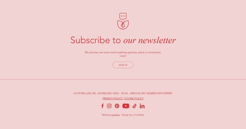
Newsletter copy pitched informally. The signup promises subscribers the brand will never send “spammy or strange things,” a more conversational tone than the rest of the site’s descriptive copy.
Corporate and wedding treated as distinct service lines. Ammira separates corporate event work from wedding florals, each with its own dedicated content rather than a single combined services page.
La Fiorellaia Shop Category page example
La Fiorellaia Product page example
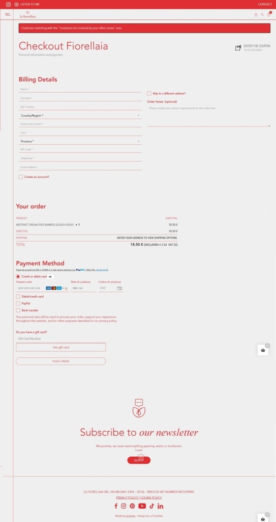
La Fiorellaia Checkout page example
La Fiorellaia footer example
Join our community for the latest trends and ecommerce tips.

 By Jibin Kumar