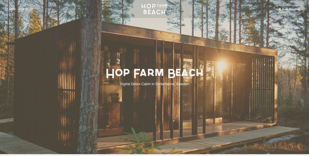
Hop Farm Beach offers a secluded cabin rental in Söderhamn, Sweden, designed for digital detox and immersion in nature. The cabin provides amenities like a mobile lockbox, board games, and encourages screen-free relaxation. The website features a minimalist design with intuitive navigation, high-quality visuals, and detailed information about the cabin, its history, and the surrounding environment.
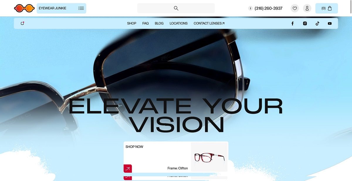
Eyewear Junkie offers a curated selection of stylish and affordable eyewear, including prescription glasses, sunglasses, and accessories. Their website features a clean, user-friendly design with high-quality visuals and detailed product descriptions, reflecting the brand’s commitment to quality and innovation.
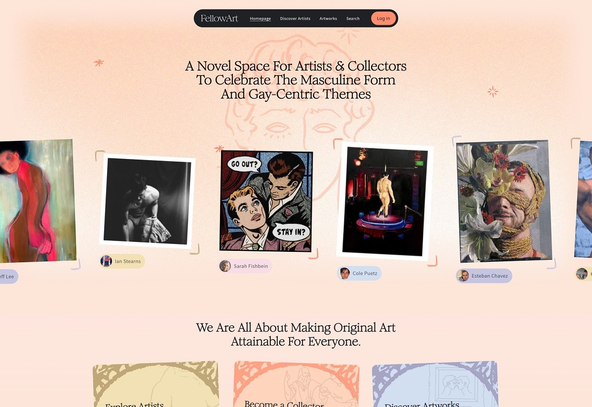
FellowArt is an online platform that empowers creators to showcase their work while offering collectors a seamless journey to discover pieces that truly resonate. The website features a clean, user-friendly design that effectively highlights their work and design philosophy.
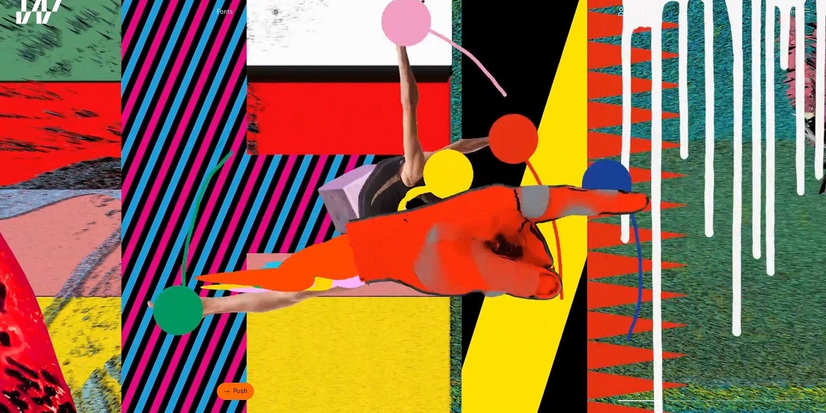
Jeroen van der Put is a visual designer and art director whose portfolio showcases work across digital design, branding, and motion graphics. His website features a bold, experimental layout with dynamic transitions and interactive elements, reflecting a strong focus on creativity, storytelling, and cutting-edge design aesthetics.
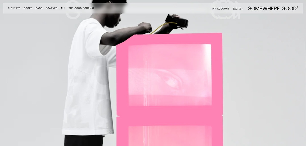
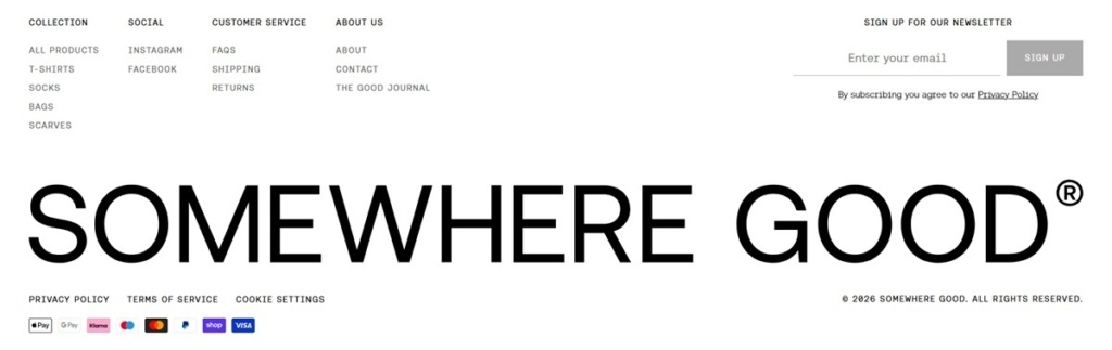
Somewhere Good is a London streetwear label selling its own debut collection of oversized T-shirts, socks, tote bags and scarves. The catalogue is small and ships only within the UK, running from £10 socks to a £125 scarf, and the brand describes the range as blending “individuality with an obsessive attention to detail”. Built on Shopify with a custom front end.
Website Design
Monochrome with one yellow. The stylesheet defines black and white surfaces, one mid grey and a light rule colour, with a single saturated yellow held back as the accent. Product copy calls it “our signature yellow”, and it lands in print details rather than backgrounds.
One typeface, two weights. AeonikFono carries headings, body and navigation in light and regular. There is no serif and no secondary display face, so hierarchy comes from size, tracking and upper case rather than contrast between families.
Motion in the header and hero. Homepage panels run muted autoplaying video that pauses once scrolled past, and the fixed header slides out of view on downward scroll. Grids are wide and gutters tight.
Shopping Experience
Twenty products in four categories. T-Shirts, Socks, Bags and Scarves each get a nav entry alongside an All view. T-shirts sit at £65 and £75, sock twin packs at £16, the Ellis Ripstop Nylon Bag at £55 and the scarves at £125.
Sizes on the collection card. Every grid tile exposes its size options, S, M and L for shirts and UK 4-7 or UK 7.5-10 for socks, so an item reaches the bag without opening its product page. Filter and Sort sit above the grid.
Product pages lead with specification. Below the price and size row sit three accordions: Size and fit, Details, and Delivery and Easy Returns. Details names construction down to “350gsm long-staple high-twist organic OEKO-TEX cotton”, and the fit note quotes the model’s height against the size worn.
UK shipping stated up front. An announcement bar carries free Royal Mail postage applied at checkout, and returns run to 14 days for an exchange or refund request.
Brand Storytelling
The S-G signature. Graphics are built from the letters of the brand name, then intersected with cut and sew panels and multi-print techniques. The About page frames the label as the meeting point of streetwear, design and materials.
Supply chain named, not implied. Copy states organic and OEKO-TEX cottons, manufacture in Italy, Portugal and the UK, and direct work with the factories. Product pages repeat the country of make rather than leaving it to a policy page.
The Good Journal. A separate editorial section runs long interviews with artists, photographers, type designers and community organisers, presented as a reading index rather than product-adjacent blog posts.
Notable Features
A dust bag as part of the product. Each garment ships in a reusable ripstop nylon bag, described in the product details rather than treated as packaging.
Measurement toggle in the size guide. The chart switches between centimetres and inches, listing chest, sleeve, shoulder drop and total length.
Country-aware newsletter capture. The signup modal switches mailing list by shipping country and offers 10% off a first order, so UK and international visitors see different copy.
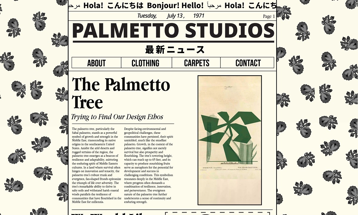
Palmetto Studios is a creative agency specializing in art direction and graphic design, based in London. Their portfolio showcases a diverse range of projects, reflecting a commitment to innovative and aesthetically compelling design solutions. Their website features a minimalist, user-friendly design that effectively highlights their work and design philosophy.
Fontwerk is a boutique type foundry offering a curated library of precision-crafted fonts, including families like Pangea, Neue DIN, and McQueen. Their website features a clean, user-friendly design with high-quality visuals and intuitive navigation, reflecting their commitment to quality and innovation.
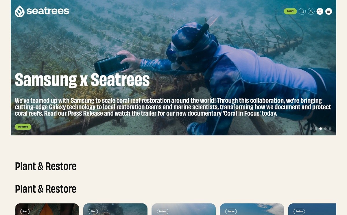
SeaTrees focuses on ocean restoration by funding projects that restore coastal ecosystems, including mangroves, kelp forests, and coral reefs. Their website features a clean, eco-conscious design with engaging visuals and interactive elements that highlight their mission, impact, and ways to contribute.
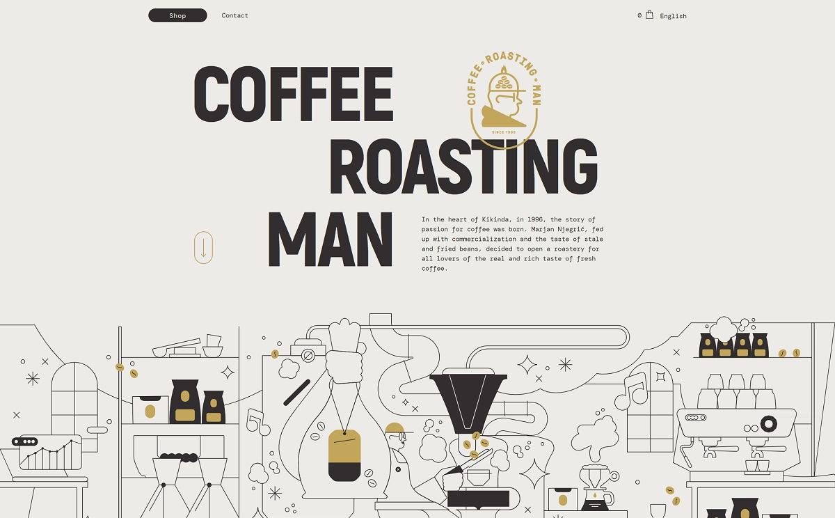
Coffee Roasting Man offers freshly roasted specialty coffees, emphasizing light roasts to preserve the beans’ natural flavors. Their product range includes single-origin beans from regions like Indonesia, Ethiopia, and Colombia. The website features a minimalist, user-friendly design with high-quality visuals, reflecting their commitment to quality and innovation.
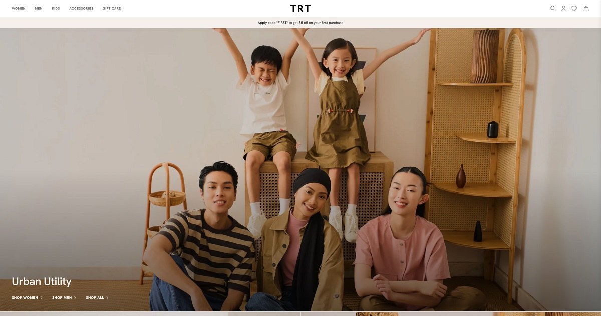
TRT Concept is a Singapore-based fashion brand offering contemporary women’s and men’s apparel, accessories, and children’s clothing. Their collections emphasize modular designs and minimalist aesthetics, providing versatile pieces that cater to various styles and occasions. Their website features a sleek, minimalist design that reflects the brand’s ethos. The online store offers intuitive navigation, immersive shopping experiences, and advanced features like personalized discounts and product bundling.
The Analogue aF-1 is a premium point-and-shoot film camera designed for both photographers and creatives. The website showcases these features through a minimalist design, emphasizing high-quality visuals and intuitive navigation, reflecting the brand’s commitment to quality and innovation.
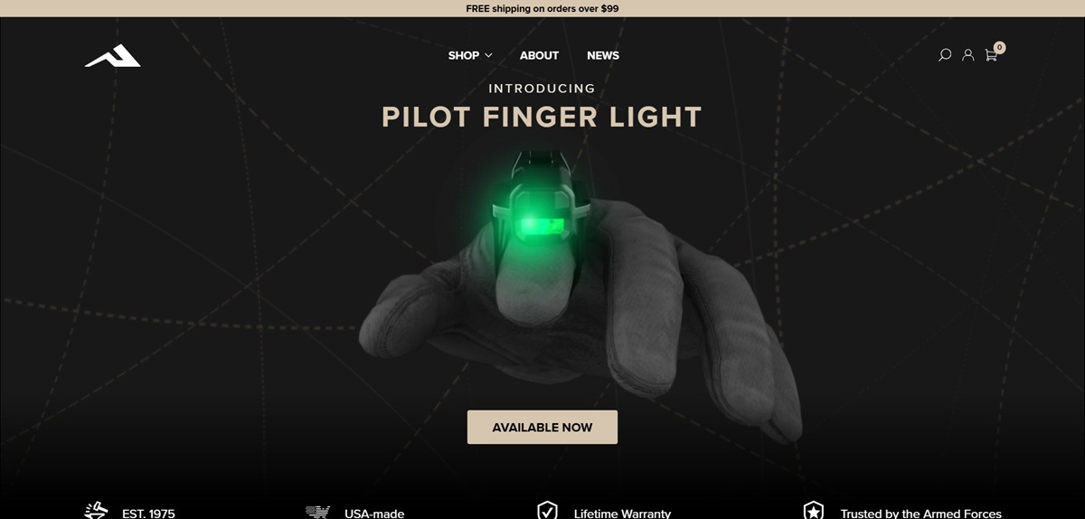
Princeton Tec is an American lighting manufacturer based in Pennsauken, New Jersey, selling headlamps, helmet lights, handhelds, marker lights and accessories to divers, hunters, campers, runners and tactical and industrial users. The catalogue is split into three collections, Tactical, Adventure and Industrial, and runs to six pages of twelve products, with headlamps at $69.99 and $99.99 and a dual fuel model at $154.99. Built on WordPress with WooCommerce.
Website Design
Bone and black with a brass accent. Pages sit on a warm off white, #F5F0E5 and #F0EBE3, with near black #232426 for buttons and a tan range around #B49360 and #C8A978 used for rules and secondary text.
Proxima Nova with Noto Sans. Headings and body copy both use Proxima Nova, with Noto Sans loaded for interface text. Body type is set at 18px and headings run upper case and tightly tracked.
Specification as decoration. Product cards are not just image and price. Each carries four data chips: lumen output, run time, IP rating and weight. Repeated across a grid, those chips become the dominant visual texture of the shop.
Shopping Experience
Three entry points into one catalogue. The main menu offers Collections, Activities and Categories side by side, so the same headlamp is reachable through Tactical, through Diving and through Headlamps.
A filter panel built for spec buyers. The shop page filters on collection, category, LED colour covering blue, green, infrared, red, ultraviolet and white, IP rating, battery type covering alkaline, coin cell, CR123, dual fuel and lithium rechargeable, and activity. Selections are confirmed with an Apply button rather than reloading on each click.
Product pages lead with performance data. The Ghost X page opens with a 360 degree viewer and a product video, then a performance table listing all fourteen modes with lumens, runtime and beam pattern, then a beam distance scale in metres. Colour and LED pattern selectors sit under the price.
Checkout inside the cart drawer. The slide out bag shows SKU, variant, subtotal, a flat $4.99 shipping line, tax and total, with a promo code field and a Pay Now button, so an order can be completed without opening a separate checkout page.
Brand Storytelling
Four claims under the hero. EST. 1975, USA-made, Lifetime Warranty and Trusted by the Armed Forces are set as a row immediately below the banner and are not elaborated further.
Instagram as evidence. A long feed of @pteclights posts runs above the footer, mostly field photographs captioned with product hashtags and references to service use.
Notable Features
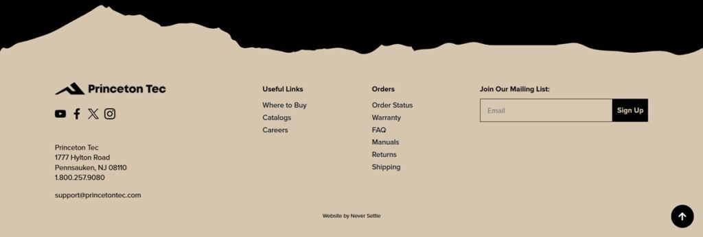
Support content held in the footer. Where to Buy, Catalogs, Manuals, Warranty, Order Status, Returns and Shipping are grouped as a standing block on every page, serving a product that is also sold through dealers.
Free shipping threshold in the header. A free shipping over $99 line sits in the top bar and repeats inside the cart.
Email capture tied to a discount. A ten per cent offer in exchange for an email address is placed in the header menu rather than in a pop up.
Princeton Tec Shop Category page example
Princeton Tec Product page example
Princeton Tec Checkout page example
Princeton Tec footer example
Join our community for the latest trends and ecommerce tips.

 By Jibin Kumar