Archives: Websites

eCommerce Websites

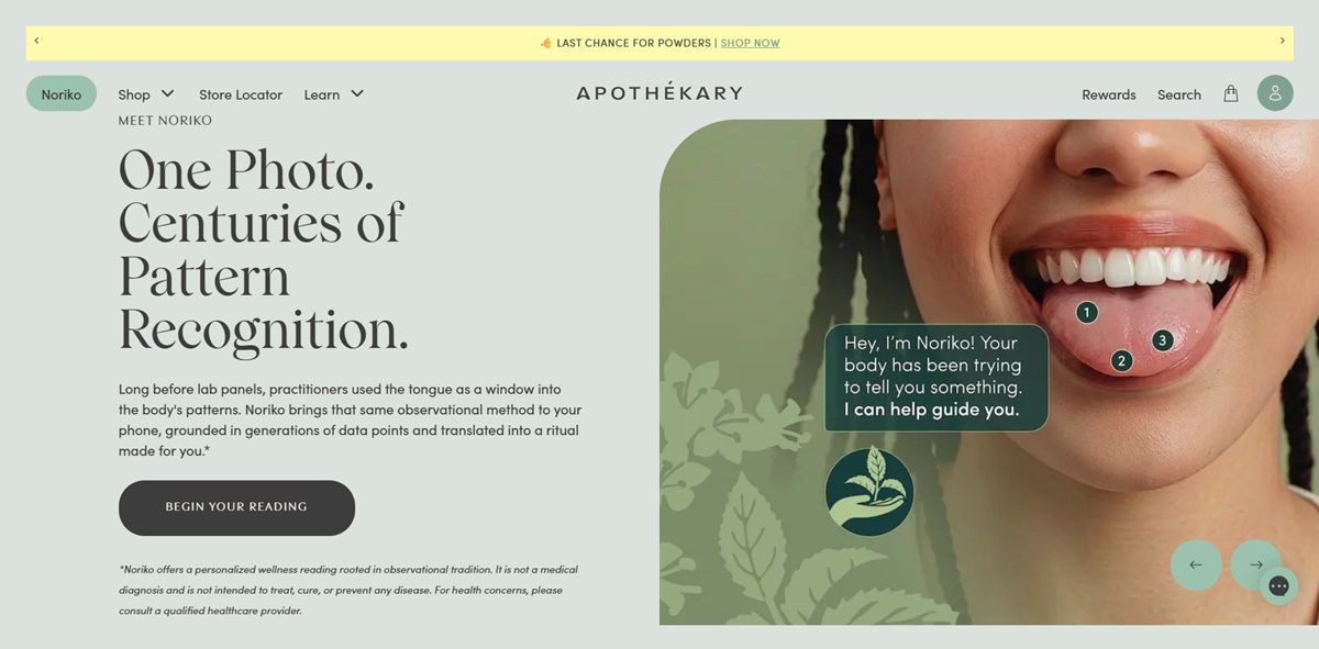
Apothékary

Apothekary sells herbal wellness products positioned as swaps for conventional habits, framed directly in copy such as “Swap wine for” and “Swap melatonin for.” The range spans a non-alcoholic Wine Alternatives line, Stop Your Wine-ing and Take the Edge Off, sleep and cognitive blends, Do Not Disturb and Mind Over Matter, a relaxation blend, a silica-rich hair growth formula and a collagen skincare product, alongside pre-built Value Sets such as a Peak Performance Set. The brand’s original .co domain now redirects to apothekary.com, with the storefront otherwise unchanged.

Website Design

Blush on near-black. The palette pairs a near-black charcoal with a soft blush-salmon accent and a muted purple-gray, set against an off-white page background rather than a clinical white, giving the wellness range a warmer, cosmetics-adjacent look. The storefront blocked direct font inspection, so no typeface is named here.

Claims stated as a tag list. Product and brand pages present qualifiers, 100 percent natural, fair trade, sustainably sourced, no dairy, no gluten, no sugar, as a repeated set of short tags rather than paragraph copy, letting shoppers scan dietary and sourcing claims quickly.

Press mentions used as visual proof. References to New York Times, Forbes and Well+Good coverage sit within the page as brand credibility markers rather than being confined to a press page.

Shopping Experience

A quiz-first path to product. A Fix Finder Quiz is offered as a primary route into the catalogue, matching shoppers to specific blends by wellness goal rather than requiring them to browse categories directly.

Human consultation offered pre-purchase. Complimentary 15-minute consultations with clinical herbalists are offered directly through the site, an unusual addition for a direct-to-consumer wellness brand and one that positions the purchase as a guided decision rather than a self-serve one.

Value Sets bundle by use case. Curated bundles such as the Peak Performance Set and Essential Farmacy Set group multiple blends under a single goal-oriented purchase, sitting alongside individual product listings.

Named formulas replace generic categories. Rather than shopping by sleep aids or supplements, the catalogue is organized around named products, Do Not Disturb, Mind Over Matter, Chill The F* Out, each mapped to a single stated benefit.

Brand Storytelling

The swap as a recurring device. “Swap wine for” and “Swap melatonin for” repeat the same rhetorical structure across product categories, positioning each herbal blend as a direct substitute for a specific conventional habit or product.

Herbalism framed as expertise, not lifestyle. The offer of consultations with clinical herbalists, alongside the farmacy branding, positions the products as backed by trained practitioners rather than presented purely as lifestyle goods.

Notable Features

A named skincare crossover. Plump It Up, a collagen-containing creamer, extends the brand from ingestible blends into topical skincare under the same herbal-swap framing.

Deliberate wordplay in naming. Chill The F* Out is left partially censored in on-site product naming, a tonal choice that stands out against the otherwise clinical farmacy positioning.

Sourcing claims paired with dietary exclusions. Fair trade and sustainable sourcing claims are listed alongside allergen-style exclusions, no dairy, no gluten, no sugar, as one combined claims block rather than separated sections.

Apothékary Shop Category page example

Apothékary Product page example

Apothékary Checkout page example

Apothékary footer example

Misuko

Misuko prepare juices daily with the finest organic ingredients. The juices are cold-pressed so that they retain all the important vitamins and minerals.

Aather

AATHER was born from the desire to connect people with each other. AATHER is a candle to share time with loved ones and to enhance the quality of time spent together.

Hard.clo

HARDCLO is a fashion brand offering a range of apparel and accessories, including hoodies, t-shirts, shirts, pants, headwear, and swimwear. Their designs feature minimalist aesthetics and oversized fits, with products like the HardClo Classic T-Shirt crafted from 100% cotton for comfort and style. The brand emphasizes quality materials and contemporary design, providing versatile pieces for modern wardrobes.

Clyde

Clyde is a product lifecycle platform that aims to assist businesses to increase profits and provide their clients with high-quality services.

Resident

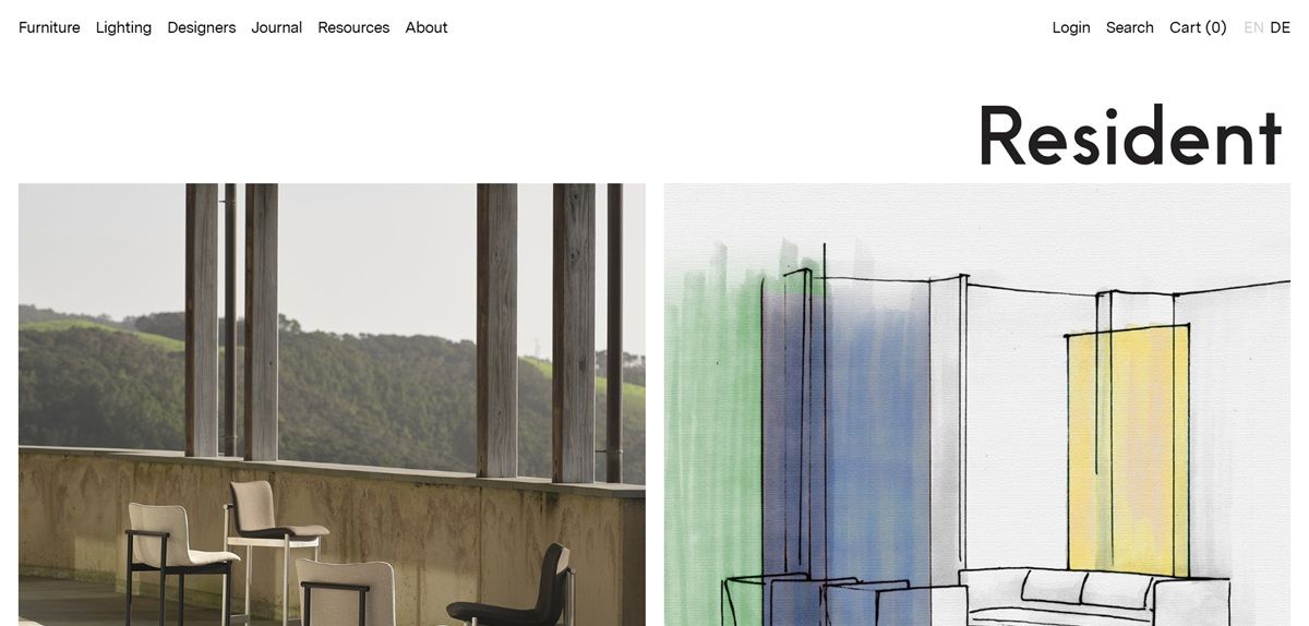
Resident is a New Zealand furniture and lighting company headquartered in Albany, Auckland, selling seating, tables, storage, pendants, table lamps and floor lights designed in collaboration with named international studios. Pieces are credited to designers including Tim Rundle, Philippe Malouin, Jamie McLellan, John Tree, Michael Young, Daniel Schofield, ASCA and NOTE, and are made through a production network that runs from an Auckland lighting workshop to timber joiners in Lithuania and upholsterers in London, Los Angeles and Melbourne. The site describes the company as “a visionary design house based in New Zealand”. Built on a custom platform, with English and German versions.

Website Design

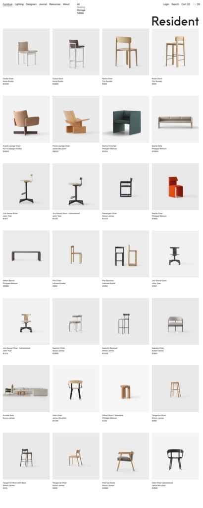
Near-monochrome by design. The interface is white and near-black with two grays for panels and rules, and no accent colour anywhere. Product photography and the fabric swatches are the only source of colour on the page.

Messina Sans throughout. Headings, navigation and body copy all run in a single self-hosted grotesque, Messina Sans, with no serif or display face for contrast. Type is set small and widely spaced, keeping the interface subordinate to the imagery.

Editorial layouts over catalogue grids. The homepage alternates full-width photography with short paragraphs on new releases, showroom residencies and completed architectural projects, so it reads closer to a design journal than a shop front.

Shopping Experience

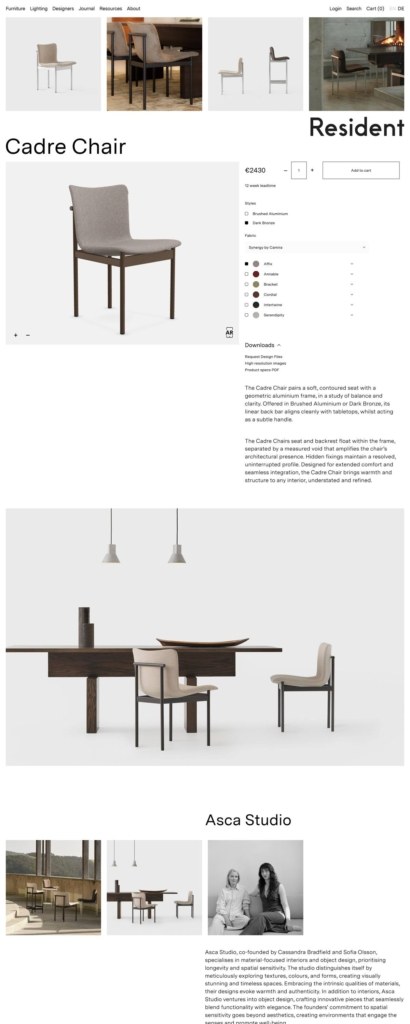
Configuration before price. A product page opens on a quantity stepper, an Add to cart button and a Pre-order option, then works through Styles such as Brushed Aluminium and Dark Bronze before reaching upholstery.

Fabric choice documented in detail. Upholstery is grouped by mill, covering Maharam, Camira, Kvadrat and Sorensen, and every named colourway carries its own Info panel listing fibre composition and a Martindale abrasion rating, for example 78% post-industry recycled polyester at 100,000 Martindale.

No prices on public pages. Neither category grids nor product pages show a figure. Pricing sits behind an account, and registration asks for a full postal address and country, which places the store closer to trade ordering than to direct retail.

A stockist network instead of a checkout for most buyers. A Stockists page maps showrooms across Australia, the United States and other markets, each with an address, phone number, website and an Enquire link.

Brand Storytelling

Longevity as the argument. The About page states that “luxury is not defined by excess or status” but by “investing in essential objects that bring enduring pleasure over a lifetime of use”, and ties a resourceful approach to the company’s island origins.

A working journal. A news section carries new releases, project features and interviews with architects and owners, giving finished pieces a context beyond the product page.

Notable Features

A specification library. Downloads collects press releases, product image sets, LED dimmer and driver manuals, upholstery references, designer portraits, webinar replays and a B2B user manual.

3D product viewing. Pages load a model viewer component, so pieces can be rotated rather than only photographed from fixed angles.

Bilingual switching. A language toggle moves the whole site between English and German from the header.

Resident Shop Category page example

Resident Product page example

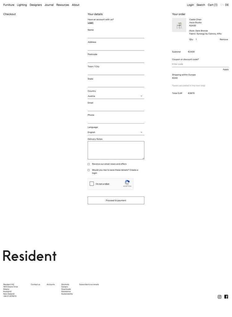
Resident Checkout page example

Resident footer example