Knix is a women’s underwear brand that offers human-centric intimate apparel. It sells lightweight anti-chafing shorts, wireless bras that are sexy and supportive, or overnight period protection
Archives: Websites
eCommerce Websites
Atoms
Atoms is a New York footwear brand selling everyday sneakers direct to consumer, alongside socks, laces and a tote. The range is small: Model 000 at $145, Model 001 at $179, the Model 251 designed with Marques Brownlee at $189, and Kids Model 123 at $75. The pitch is comfort rather than performance: “Work. Fun. Daily Sprints. All in the same shoes”. Built on Shopify with a custom headless front end served from Shopify Oxygen.
Website Design
Near-black on white, with colour held back. The interface palette is a single near-black against white and a grey scale. Amber, lime, lilac and blue appear only as system colours for badges and status messages, so the shoes supply nearly all the colour on the page.
Helvetica Now Display with a Garamond counterweight. Body and interface text run in Helvetica Now Display, with a condensed Garamond loaded in extra light and light weights for display lines, giving the neutral grid one softer voice.
Three rotating announcements above the nav. The top bar cycles a tote launch, a socks colourway and a Model 000 restock, each ending in a right arrow. The nav below reads Men, Women, Kids, About, Find Your Fit and Support.
Shopping Experience
One grid, grouped by model. The shoes collection stacks models as labelled blocks rather than a flat list. Each carries the model name, a review count in brackets, one price, a one-line benefit such as “Cloud-like comfort, lightweight”, and a row of colourway tiles flagged New, Bestseller, Coming Soon, Water-Repellent or Few Sizes Left.
Colourways sorted into named series. On the product page those tiles regroup under New Collection, Limited Edition, Water-Repellent Series, Classics, Best Sellers and Last Chance, turning a long colour list into a browsable structure.
Quarter sizes and a gender toggle in the buy box. Sizing switches between Women’s and Men’s, then runs in 0.25 increments from 3.5 to 15. A spec strip under the price covers cushioning, antimicrobial lining, stretch laces and an 8mm heel to toe drop, each with a tooltip.
Buy Now next to Add to bag. Instalments are quoted inline as “0% APR or as low as $36.25/mo”, with Afterpay and Shop Pay, above two lines on US shipping and 30-day US returns.
Brand Storytelling
Endorsement carries the homepage. A “250,000+ customers love their Atoms” band leads into named quotes from Marques Brownlee, the CEO of Shopify, Pixar’s Pete Docter, Jony Ive and Chris Anderson of TED.
A question instead of a mission statement. The About page opens “Why start another shoe company?” and answers in the first person, closing on a link to the founders’ Humans of New York feature.
Notable Features
Find Your Fit sits in the main navigation. Fit guidance is a primary destination rather than a modal buried in the product page.
Review volume is used as merchandising. Model 000 shows 4,074 reviews on the grid, and its product page reports 94 percent of reviewers would recommend it.
Subscription, referral and gifting in one footer. The footer sets a subscription link, Refer a Friend, a discount programme, corporate gifting and an ambassadors page beside the support columns.
Get the Drop
The Drop Store is a simulated grocery store built as a campaign about the water crisis, an initiative of the Kingdom of The Netherlands with partner organisations. The disclaimer states that product data is supported by Water Footprint Implementation and that all prices and products are “mostly fictional”. Twenty everyday items are priced for a worsening crisis: bottled spring water at 198 dollars for 15ml, a beef burger at 2899 dollars for 35 grams. Built as a Next.js front end with Tailwind.
Website Design
A four colour signal palette. The stylesheet defines a near black at #161819 alongside orange #ff7e49, pink #ed76b6, yellow #f8d62c and a pure red #ff0100. Those colours arrive as flat fields behind product tiles and section panels, so pages read like supermarket packaging rather than a campaign microsite.
One grotesque, no second voice. Type is Neue Haas throughout, with no serif and no display cut. Product name, weight and price sit at the same size and weight in every tile, which keeps the pricing deadpan rather than shouted.
Products built from frame sequences. Each item is a 1200 by 1200 image sequence played at 60 frames per second rather than a still photograph, so objects turn as the page moves. A loading screen counts the assets in before the aisle appears.
Shopping Experience
A single scrolling aisle. All twenty products sit in one continuous grid of tiles carrying a name, a weight or volume and a price. There is no category navigation, no search and no filter, so the only route through the catalogue is to keep scrolling.
Product pages written as packaging. A page opens with eyebrow copy and a claim, then runs a benefit paragraph and shopper quotes attributed to “@somebody”. The bottled water is described as “just like ordinary water, but drinkable” and sold as “a status symbol of the times”.
The evidence sits under the sell. Below the sales copy each page turns to figures: 14 litres of water to produce 1 litre of bottled water, 7 litres for a single half litre plastic bottle, then a passage on contamination and rising treatment costs.
The cart is the reveal. Add to cart opens a panel that marks the item “Soon in stock!” and explains that the product is not available because it does not exist yet, then hands off to a Learn more link.
Brand Storytelling
Three named problems. The campaign organises itself around too little water, too much water and too dirty water, each with an explainer and a route to partner organisations. The recurring line is that the crisis affects “the products we use, the food we eat, the clothes we wear”.
A scripted break in character. Every product page ends with a section that drops the retail voice, credits the photography and links out to partners including Simavi, IRC and the Resilient Cities Network.
Notable Features
A downloadable social kit. The footer offers a zip of campaign assets beside the Instagram and Twitter links, so the store doubles as a distribution point.
Related products that are all fictional. Pages close with a You may also like rail carrying the other nineteen items, keeping the browsing loop running without ever reaching a checkout.
Timeline Nutrition
Swiss longevity brand committed to delivering clinically proven products to promote cellular health.
Dance
Dance is an electric mobility subscription company that makes it easy to explore your city with an electric bike or moped.
Påfyll
På(fyll) is a digital platform and circular service that delivers and picks up popular home goods right at your doorstep.
Work Louder

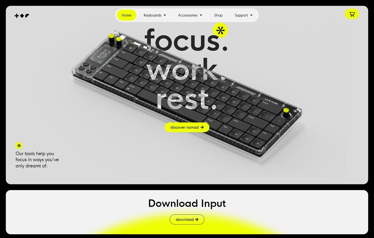
Work Louder designs modular, low-profile mechanical keyboards tailored for creative professionals. Their products, such as the Nomad [e] and Knob1, feature customizable layouts and integrated displays to enhance productivity. The website showcases these innovative tools with a clean, intuitive design, high-quality imagery, and detailed product information, providing an engaging user experience.
Mammut
Mammut is a Swiss premium outdoor company providing high quality products and unique brand experiences to mountain sports enthusiasts around the world
Good Garms
Good Garms is a place to discover clothes made with love and learn about sustainability. Good Garms put sustainable brands front and centre.
Dynamo Typefaces
Dinamo is a Swiss type design agency offering retail and bespoke typefaces, design software, research, and consultancy.
Pangram Pangram Foundry
The Pangram Pangram Foundry is dedicated to making Trend-Conscious Quality Fonts that are free-to-try and that can be used in everyday designs.
On Running
On is an athletic shoe and performance sportswear company originating in Switzerland that designs and markets sports clothing and running shoes.