Archives: Websites

eCommerce Websites

Avantera

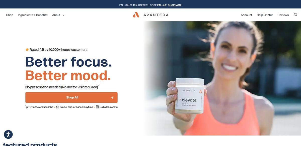
Avantera is a US supplement brand selling a short line of nootropic and adaptogen products direct to consumers: elevate for energy and focus, unwind for sleep and stress, a kids gummy, a gummy version of elevate, an ageless formula and a combined bundle. The pitch targets people who want the effect of a stimulant without a prescription, and the site leans on ingredient dosing rather than lifestyle imagery. Built on Shopify with a Recharge subscription layer.

Website Design

Navy and burnt orange on cream. Headings and dark panels use a deep navy, calls to action a burnt orange, and the page grounds run warm off-white rather than plain white. The same two values theme the cart drawer and the subscription portal.

FormaDJR Deck with Assistant. The display face handles product names and section headings, Assistant does the body. Product names are set lower case and prefixed with a plus sign, so the brand reads as a formula rather than a title.

Claims typeset as small print. Almost every benefit line ends in an asterisk, and the footnote block at the foot of the page runs to several paragraphs of FDA and medical disclaimer. The asterisk is a visible part of the type system.

Shopping Experience

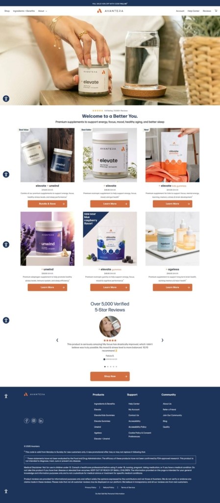
Six products, one carousel. The catalogue is small enough that the homepage lists it in full, as a slider where each card gives the name, a two-word category line such as energy + focus, and one sentence of description.

Subscription framed as the default. The buy box leads with the subscription price against the one-time price and a percentage-off flag, described as a 28-day supply delivered every four weeks, with pause or cancel at any point. A one-time purchase is available but presented second.

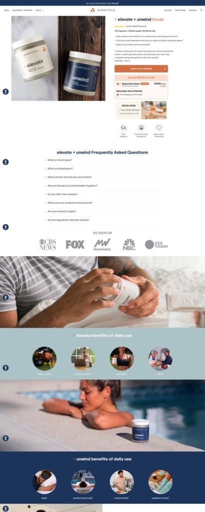
Product pages run very long. The elevate page moves through a dosing argument, five numbered benefits, a how-it-works section, a results timeline, an ingredient breakdown with milligram figures and a FAQ, with review pull-quotes cut in between blocks.

Promotion applied sitewide. A seasonal discount code sits in the announcement bar, on the cart drawer and in the buy box, with a footnote restricting it to new customers.

Brand Storytelling

Underdosing is the enemy. The core argument is stated directly: “Underdosing is the number one reason a supplement quietly does nothing.” Full clinical doses, no proprietary blends and a published label are repeated on every product page.

Reviews carry the proof. Named customer quotes with cities appear under the hero, a five-star wall sits mid-page, and a third-party rating widget runs in the header. A disclosure states that not all reviews are displayed.

Notable Features

A ten-badge attribute row. Made in the USA with globally sourced ingredients, clinically tested, vegan, soy free, dairy free, low sugar, nut free, non-GMO, gluten free and safe for daily use, all in one strip.

Bundling built into the range. A dedicated block sells elevate and unwind together on a day-and-night argument rather than on price alone.

A guarantee with its limits written out. The 30-day money-back offer states that it applies to first orders only and that renewal orders are not eligible.

Avantera Shop page example
Avantera Product page example
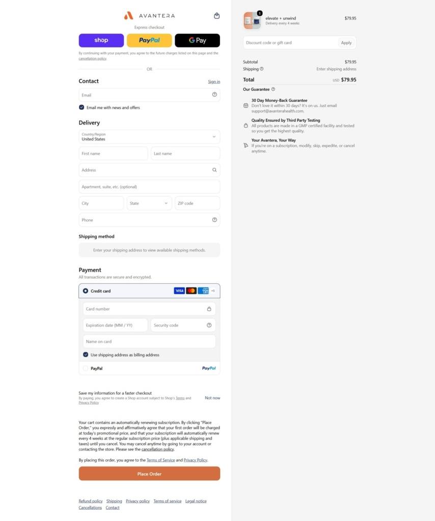
Avantera Checkout page example
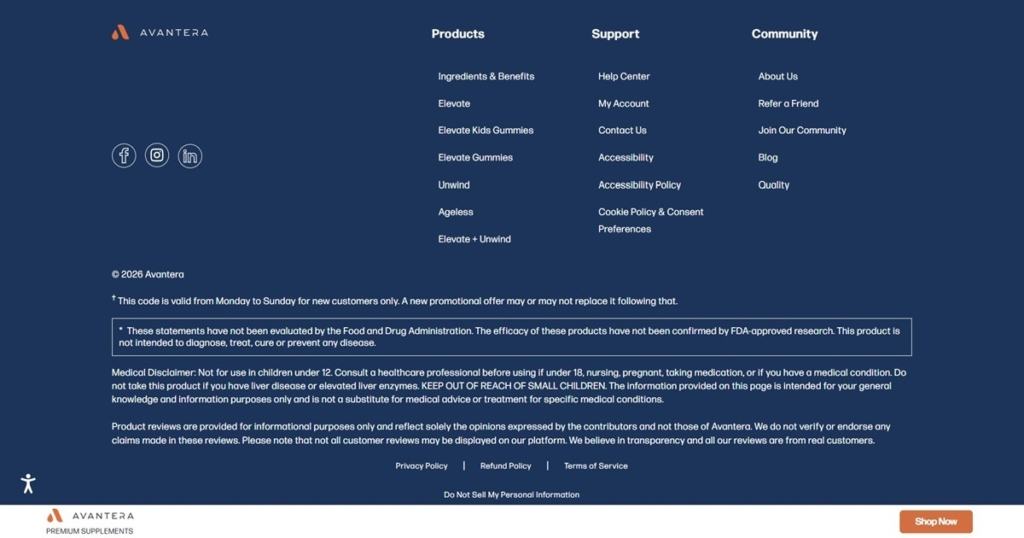
Avantera footer example
Wing on Wo & Co. (W.O.W.)

Wing on Wo & Co. (W.O.W.) is the oldest continuously operating store in Manhattan’s Chinatown boasting a five-generation long legacy in the heart of the neighborhood on Mott St. They sell primarily porcelain ware and cultural goods. The shop works to breathe new life into cultural craft by reinterpreting tradition through an Asian American lens.

Solarsport

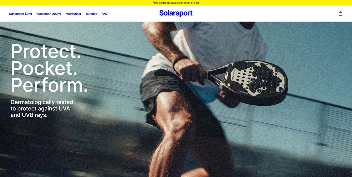
Solarsport is a UK sunscreen and skincare brand selling SPF 30 sunscreen sprays, a moisturiser and bundled sets aimed at athletes and active users, running on Shopify. The site states it is the official sun protection partner of Scottish Golf and uses the tagline “Protect. Pocket. Perform.” Products are marketed on dermatological testing and a 97 percent UVB prevention claim at SPF 30.

Website Design

A yellow and blue system. The top of every page carries a yellow banner announcing free shipping, and the wordmark and primary text links are set in a deep blue. Buttons for adding to cart and completing checkout use the same yellow, while the shop background stays plain white with light grey product panels.

Inter for text, a wider display face for headings. Body copy and navigation run in Inter, in a medium and a regular weight. Larger titles such as the Bundles heading switch to a bolder, wider-set sans face named in the stylesheet as MonumentExtendedBold.

Product photography on a grey ground. Bottles and tubes are shot in matching sets grouped by bundle, tightly cropped against light grey backdrops with a small Best Seller tag in the corner of each card.

Shopping Experience

Prices on the grid. Unlike stores that hide pricing until the product page, the Bundles page shows the price on each card: 15.00 pounds for the Twin Pack, marked down from 19.98, 34 pounds for the Skincare Trio, 22 pounds for the Essential Skincare Set and 48 pounds for the Fitness Bundle, each noted as Free P&P.

A five-item top nav. The header lists Sunscreen 50ml, Sunscreen 200ml, Moisturiser, Bundles and FAQ, with a cart icon on the right and no account or search icon visible.

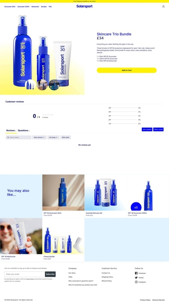
Cross-sell beneath the fold. Product pages carry a You may also like grid of five related items with from-prices, placed under a reviews block that read 0 out of 5 with no reviews yet at the time of capture.

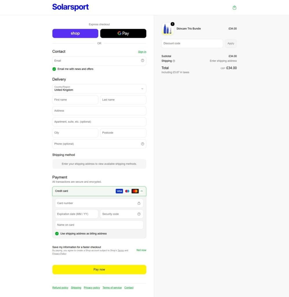
Two express options at checkout. The checkout offers Shop Pay and Google Pay buttons above the standard contact, delivery and card fields. The order summary breaks out UK tax within the total and the Pay now button is rendered in the site’s yellow.

Brand Storytelling

A sport partnership as proof. The brand states it is the official sun protection partner of Scottish Golf, a specific sponsorship claim rather than a generic endorsement.

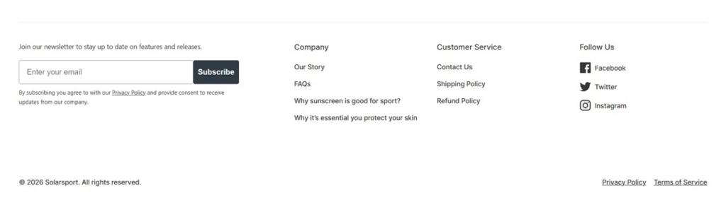
Education over lifestyle imagery. The footer links to articles titled Why sunscreen is good for sport? and Why it’s essential you protect your skin, alongside an Our Story page, favoring instructional content over aspirational imagery.

Notable Features

A free shipping banner throughout. A yellow strip reading Free Shipping available on all orders runs across the top of every page captured, including the checkout.

Bundle-first merchandising. Three of the four items on the main shop grid are multi-product bundles rather than single items, with the twin pack sunscreen the only non-bundle offer and the only one showing a percentage discount.

A newsletter gate with consent language. The footer signup asks for an email address next to explicit subscription consent text tied to the site’s Privacy Policy link.

Solarsport Shop Category page example

Solarsport Product page example

Solarsport Checkout page example

Solarsport footer example

OEM

OEM calls itself a “new drugstore,” selling wellness topicals, electrolyte drink mix and sensory goods such as Hinoki incense, in place of the CBD-led range it carried earlier. Founder Shun Kinoshita frames the brand around a broader view of care shaped by his own MS diagnosis, positioning it against symptom-only medicine. Navigation splits into Shop, About, Events, Journal and Sounds, on a Shopify store with a Tailwind-built theme.

Website Design

Black, white and one coral accent. The interface leans on Tailwind utility classes for near-black text at varying opacity (black10, black30, black50) over white and an off-white, #fafafa, background, with a single coral-red, #ff3f61, reserved for announcement dots and error states.

Inter for everything. The theme loads Inter at three weights (400, 500, 700) as its only typeface, used across headings and body copy alike rather than pairing a display face with a body face.

A soft green for emphasis. Away from the coral alerts, a pale mint green, #baecb7, is used as a highlight background, giving the otherwise grayscale interface its second and calmer accent color.

A Sounds section built like a playlist library. Outside the shop, a dedicated Sounds area organizes curated Spotify playlists into collections, an unusual navigation item for a product store carrying the same minimal styling as the shop pages.

Shopping Experience

A narrow, single-SKU product structure. The sampled Soothing Cream comes in one size, 1.8oz, at $36, with a quantity selector and Add to Cart but no subscribe-and-save toggle, keeping the buy box short.

Ingredients broken out individually. Below the buy box, five named ingredients (Hinoki wood oil, menthol, shea butter, green tea leaf extract, glycerin) each get their own benefit line rather than a single ingredient list.

Use instructions written as directions, not marketing. A “How to Use” block gives literal application steps: “Massage into muscles, joints, and areas of concern. Apply to chest and throat to soothe your airways.”

Shipping timing stated in days. Domestic standard shipping is quoted at 3 to 4 business days and express at 1 to 2 days, with international timing given separately on the product page itself.

Brand Storytelling

No sale language, by design. The brand states directly that its products are “worth every penny,” using order-value perks instead of discounts: orders over $100 receive a hand-wrapped Furoshiki cloth and personalized card.

A named founder story. The homepage attributes the brand’s philosophy to Shun Kinoshita’s own health experience rather than an anonymous founding team, tying the wellness positioning to a specific person.

Community events over influencer marketing. Sound bath events pairing a modular synthesizer with crystal bowls, and collaborations with galleries, running and climbing groups, are presented as brand activity alongside the product line.

Notable Features

A print magazine tie-in. The brand has launched its own magazine, “On Earth Momentarily,” extending the brand beyond the product catalogue into editorial publishing.

Stockists listed openly. A dedicated Stockists page in the footer points to physical retail locations carrying OEM, alongside standard Journal, FAQ and Policy links.

Are.na used as a community channel. Alongside Instagram, the footer links to Are.na, a less common choice that signals the brand’s design-forward audience.

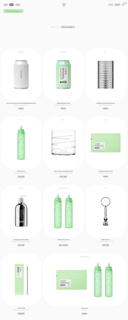
OEM Shop page example

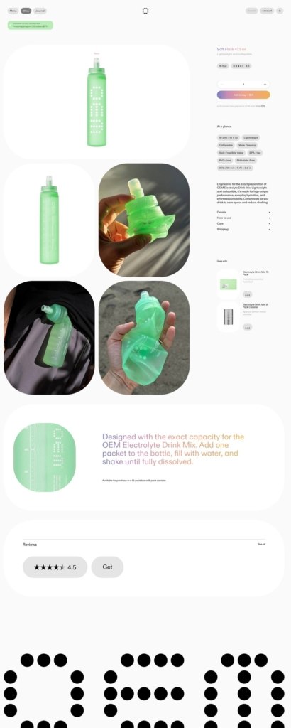
OEM Product page example

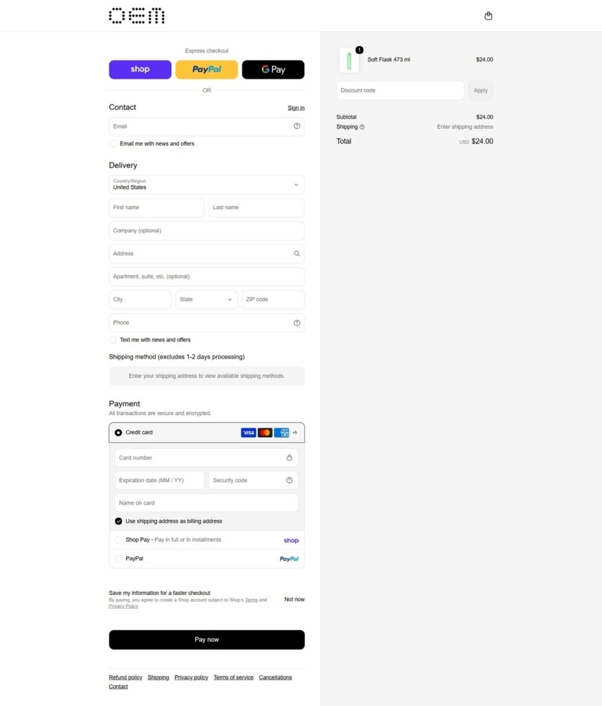
OEM Checkout page example

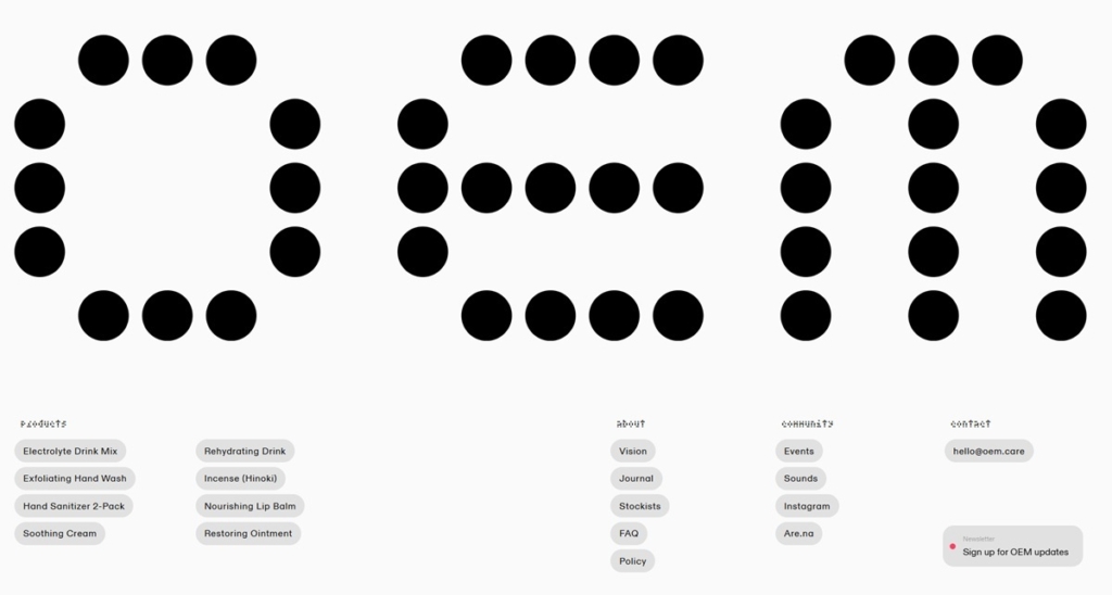
OEM footer example