An educational resource as well as a platform that will help in strengthening the consumer’s trust and confidence in natural diamonds.
Diamond Journey


eCommerce Websites
An educational resource as well as a platform that will help in strengthening the consumer’s trust and confidence in natural diamonds.
Odorne is a curated collection of inspiring home spaces, each one complete with the products that make it so unique.
Opal web camera makes it easy to look and sound professional on video calls.
Sandy Shore Farms is Canada’s largest grower and shipper of fresh asparagus handling product from approximately 750 acres
Through capital and collaboration, Shopify Ventures partner with founders to define the future of commerce.
The Figma Store features a collection of Figma apparel (layers) and accessories (components) designed for Figma community.
Its minimalistic approach to web design resulted in a neat layout, coupled with intuitive navigation and high-quality and bold visuals.
It is completely responsive and optimized for loading, hence performing on any device. Key features include discoverable categories, detailed product pages, interactive elements, user accounts, and the whole Figma look.
The store also has wide and very detailed support and community sections that must surely add more vibrant colors to the platform for users to explore and purchase design resources.
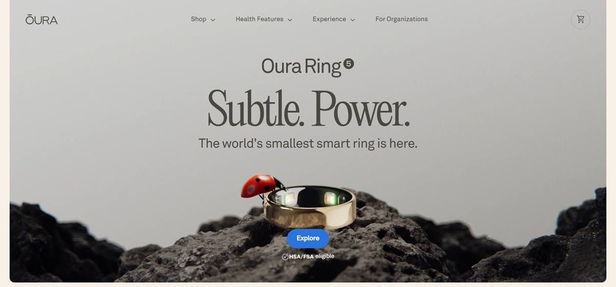
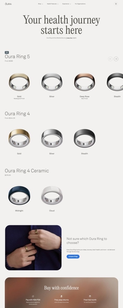
Oura Health Oy sells the Oura Ring, a smart ring that tracks sleep, activity, heart health, stress and women’s health through the Oura app, with three ring lines (Oura Ring 5, Oura Ring 4 and Oura Ring 4 Ceramic) sold direct at ouraring.com alongside an HSA/FSA eligible Oura Membership. The site targets health-conscious consumers weighing wearables against a subscription-backed insight layer, and a separate For Organizations path serves workplace wellness buyers.
A warm neutral ground. Pages sit on a cream and off-white base rather than pure white, with near-black text and a single blue reserved for buttons and links. The palette stays quiet outside that one accent.
Serif headlines over a plain sans nav. Large section headings such as “Your health journey starts here” are set in a high-contrast serif (Editorial New), while the OURA wordmark, navigation and body copy run in the sans-serif AkkuratLL. The pairing marks editorial statements apart from utility text.
Close-up product photography. Rings appear on hands mid-gesture, tying a jacket, holding a phone, adjusting a bag strap, rather than on plain studio backgrounds. Shop-page tiles use flat renders instead.
Rings grouped by generation. The shop page runs three rows, Oura Ring 5 (from $399), Oura Ring 4 (from $244.30) and Oura Ring 4 Ceramic ($279.30), each scrollable with arrow controls and a finish name under every render: Gold, Silver, Deep Rose, Stealth, Midnight, Cloud.
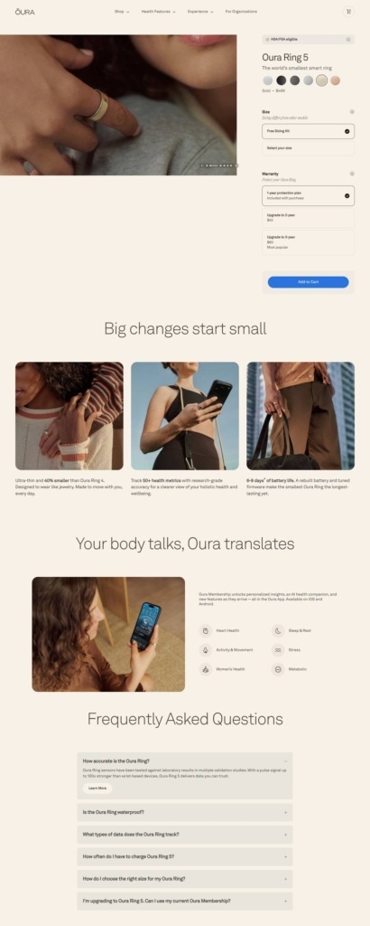
Split-screen product pages. A left-hand image carousel sits beside a fixed purchase panel: finish swatches, a choice between a free sizing kit and a self-measured size, then a warranty tier (one year included, two years for $45, three years for $60 marked “Most popular”) above the blue Add to Cart button.
HSA and FSA badges throughout. Both the shop grid and product pages carry an HSA/FSA eligible tag, and a “Buy with confidence” band restates free 30-day returns and a free trial month for new members.
Membership framed as the real product. Copy repeatedly positions the ring as the sensor and the Oura Membership as the payoff, citing “50+ health metrics” and an AI health companion, with a claim that 86 percent of members see their health improve.
Six tracked domains, one grid. Sleep & Rest, Activity & Movement, Heart Health, Stress, Women’s Health and Metabolic appear as a fixed icon set repeated across the homepage and app-promotion sections.
A ring comparison tool. A “Compare Rings” button sits beside app screenshots for shoppers unsure which generation or finish to choose.
An open FAQ accordion. The homepage embeds a multi-question accordion (accuracy, waterproofing, tracked data, charging, sizing) rather than routing shoppers to a separate help page.
Warranty upsell inside the buy box. Extended warranty tiers are chosen at the same step as color and size, ahead of Add to Cart, rather than offered after purchase.
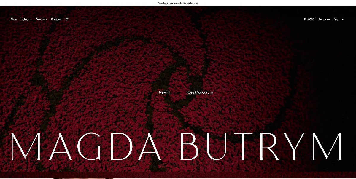
Magda Butrym is a luxury fashion brand known for its contemporary ready-to-wear collections that blend romanticism with modern design. The brand offers a range of women’s clothing, including dresses, outerwear, and accessories, characterized by intricate details, high-quality fabrics, and a unique aesthetic that combines elegance with a touch of edginess. The website features a clean, minimalist design that reflects the brand’s sophisticated style. Intuitive navigation allows users to easily explore various collections.

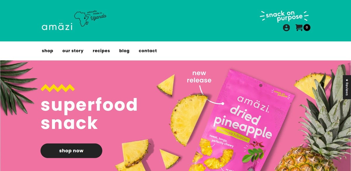
Amazi Foods is a Washington, DC snack brand selling dried tropical fruit and plantain chip snacks sourced from Ugandan farmers, sold as single-flavor packs, 1 oz minis and variety packs priced between about $29.99 and $35.99, on a Shopify storefront. The brand states its line as “eat good. feel good. do good.” and “BOLD FLAVOR. BOLD MISSION.”
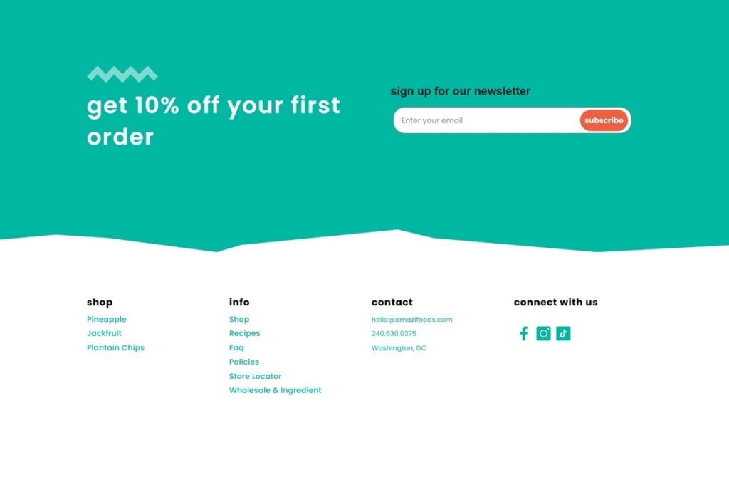
A teal band top and bottom. The header and the newsletter section both sit on a solid teal ground, named in the site’s stylesheet close to #00b7a2, bordered by a jagged wave-edge shape rather than a straight line, with a white body in between.
A lowercase wordmark with a continent mark. The logo reads “amazi” in lowercase beside a small line drawing of the African continent, paired with a rounded sans typeface set in the CSS as Poppins.
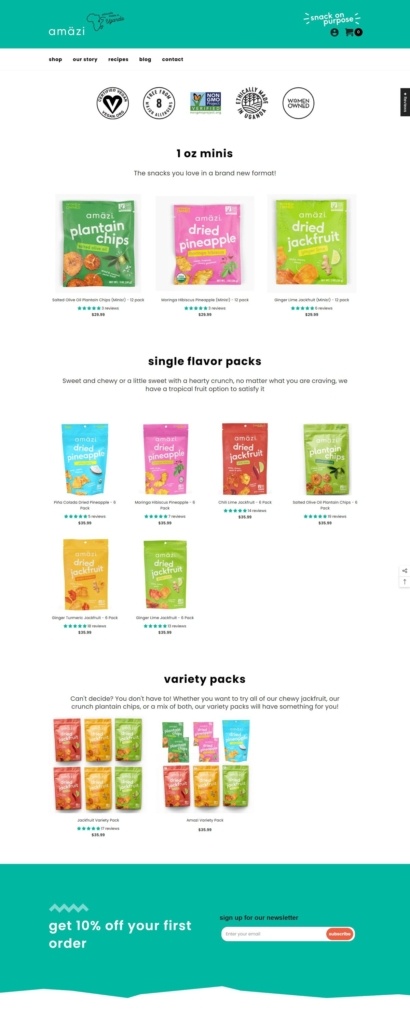
A row of certification badges. Six circular icons for claims including vegan, Fair Trade, non-GMO, an 8-allergen-free mark, Ethically Made in Uganda and Women Owned sit directly under the main navigation on the shop page.
Three named product groups instead of one grid. The shop page separates items into “1 oz minis,” “single flavor packs” and “variety packs,” each under its own heading and short line of copy rather than one undivided catalog.
Star ratings on every card. Each package shows a star rating with a review count and its price beneath the product photo, visible across all three groups.
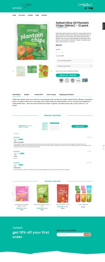
A subscribe option inside the buy box. The Salted Olive Oil Plantain Chips page offers a quantity stepper next to a One Time Purchase versus Subscribe and Save choice, with the discounted price shown alongside the standard price before the Add to Cart button.
Tabbed detail content. Below the buy box, a tab row reading Description, Details, Made With, How To Enjoy and Shipping and Return replaces a single block of copy, followed by a Product Reviews section with a star histogram and a Write a Review button.
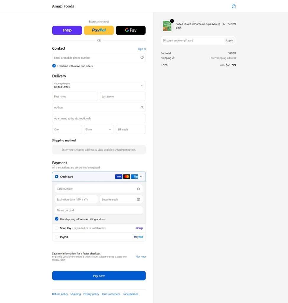
Three express payment options at checkout. Shop, PayPal and Google Pay sit above the standard delivery and card fields, with Shop Pay and PayPal listed again beside the card entry, and the Pay Now button rendered in blue.
Badges instead of in-copy claims. Sourcing and ethics statements appear as the certification icon row rather than as paragraphs of text on the shop and product pages themselves.
Wholesale grouped with ingredient information. The footer’s info column lists a single “Wholesale & Ingredient” link, folding B2B inquiries and ingredient transparency into one destination.
A first-order discount banner spanning the page. A full-width teal strip reading “get 10% off your first order” sits above the footer with its own newsletter signup field, separate from any on-page popup.
A four-column footer split by product category. The Shop column in the footer lists Pineapple, Jackfruit and Plantain Chips as separate links rather than a single Shop link, mirroring the three product groups on the shop page itself.
A compact social row. The footer links only three channels, Facebook, Instagram and TikTok, each a small square icon rather than a longer list.
Sol is a reading technology company that aims to enhance the reading experience. They focus on creating tools that help people engage with reading in a more meaningful and immersive way.
Mana is a Montreal based company that creates and distributes Yerba Maté. Their products give a big boost of energy that’s good for you, so go ahead and drink as many as you want!
Air Company is the world’s leading carbon utilization company, creating consumer and industrial products from carbon dioxide (CO2)


