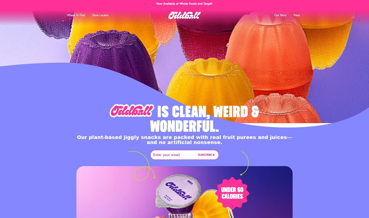
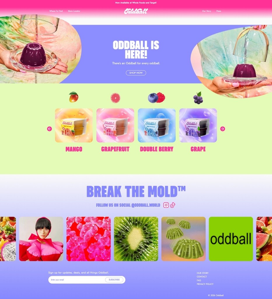
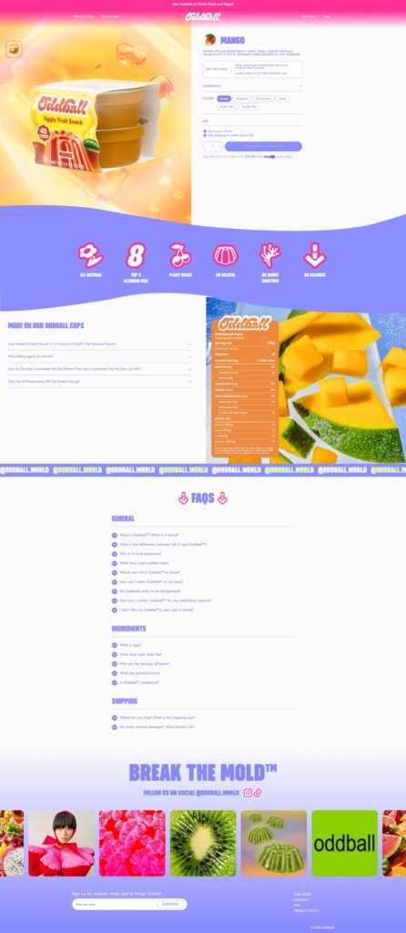
Oddball.world is an ecommerce site for Oddball, a “jiggly” fruit snack (a better-for-you Jell-O style cup) made from real fruit and agar, sold in flavours like Mango, Grapefruit, Double Berry, and Grape, plus multi-pack bundles. The website design is bold and modern, using big product photography, punchy headlines like “Break the Mold,” and quick paths to shop by flavour or find stores via a built-in store locator. It also leans on simple, icon-style ingredient claims (no artificial flavours or colours, real fruit purees and juices) to keep the page highly scannable
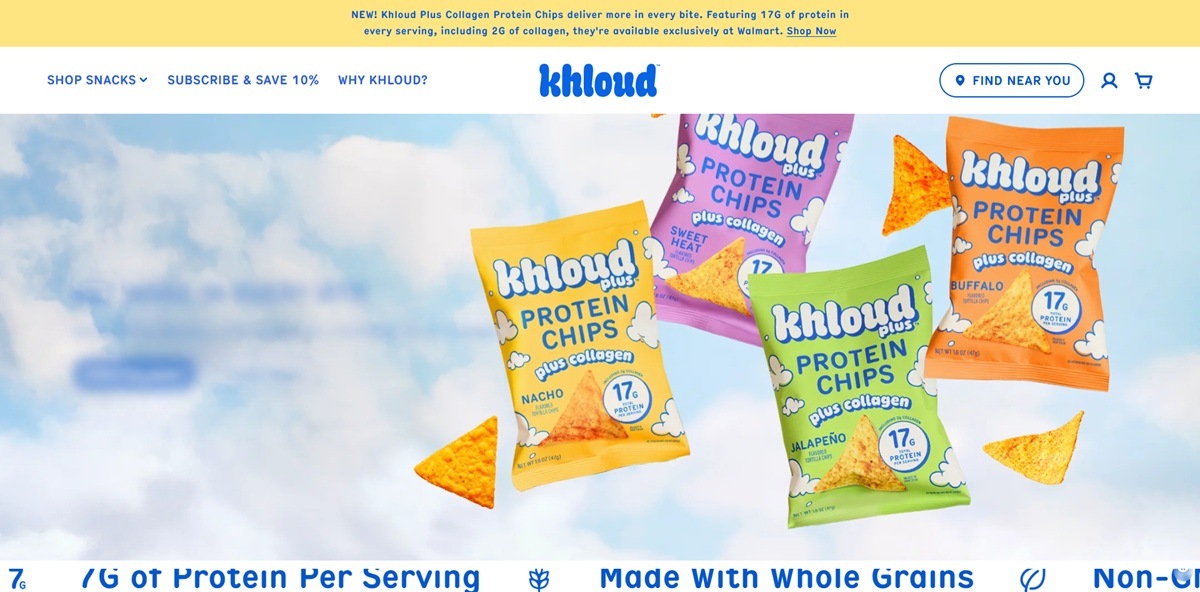
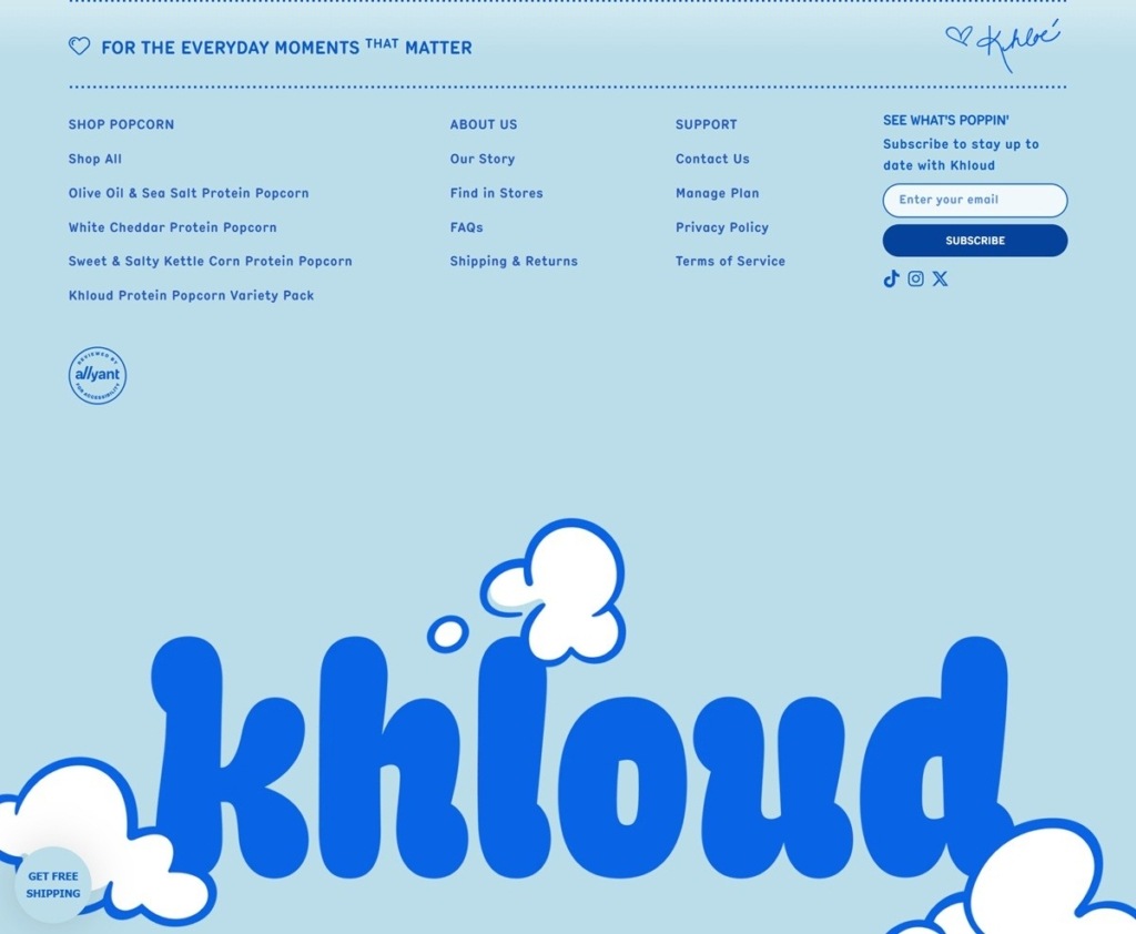
Khloud is a snack food brand associated with Khloe Kardashian, selling protein chips, protein popcorn and collagen protein chips across flavors including Nacho, Buffalo, Sweet Heat, White Cheddar, Jalapeno Queso and Birthday Cake, plus variety packs and a subscribe-and-save option, retailing from about $23.99 to $58.00 depending on format. The Shopify storefront targets health-conscious snackers with claims of 7g of protein per serving, whole grains, non-GMO ingredients and no seed oils, and lists retail availability at Target, Walmart and Kroger alongside direct sales.
Website Design
A bright, saturated palette. Colors run sky blue (#0963E5), sunshine orange (#FF9E10), sunset pink (#FFC8E2), morning yellow (#FFE582) and cherry red (#F7214A) against a beige ground, closer to the packaging’s own colorway than a muted ecommerce default.
One condensed font for everything. Headings, body copy and navigation all run in Hermes Condensed at a heavy weight, with headings set in uppercase and tight negative letter-spacing; there is no separate serif or script for contrast.
Rounded, pill-shaped interface elements. Buttons and input borders use a fully rounded radius, matching the bag-shaped product photography that dominates the hero and category banners.
A Canadian availability banner up top. The homepage opens with an announcement that the range is now sold in Canada, ahead of any product content, signalling a market expansion is a current priority.
Shopping Experience
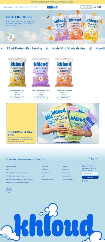
Three top-level shop categories. Collagen Chips, Protein Chips and Protein Popcorn sit as separate primary nav items alongside Variety Packs, rather than being nested under one Shop menu.
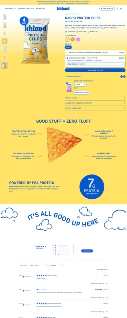
Icon-led nutrition claims on the grid. Product cards on category pages carry the price and an Add to Cart button beneath the pack image, with a row of flat nutrition icons (protein grams, whole grain, non-GMO, no seed oils) repeated across the page rather than only on product detail.
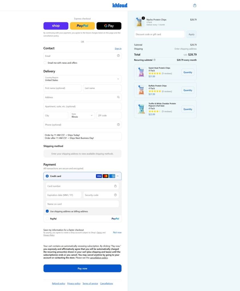
Subscribe and Save built into the nav. A “Subscribe & Save 10%” link sits in the primary menu itself, alongside a separate on-page subscription callout reading “One bag is never enough.”
Brand Storytelling
Retail logos as third-party proof. Target, Walmart and Kroger logos appear in a dedicated band, positioning the brand as already validated on shelf rather than direct-to-consumer only.
A “good stuff, zero fluff” framing. A values section contrasts what the product contains against what it leaves out, reinforcing the no-seed-oil, whole-grain claims already stated on category pages.
Flavor showcases separated from the shop grid. Beyond the category pages themselves, a standalone flavor spotlight section walks through individual varieties with larger imagery, functioning as a secondary browsing path into the same catalog.
Notable Features
A store locator in primary navigation. Store Locator sits alongside the shop categories, unusual for a direct ecommerce nav and reflecting the brand’s omnichannel retail presence.
“Why Khloud?” as a dedicated nav item. Rather than folding brand explanation into an About page, the site gives it a standalone top-level link.
New-product badges on the grid. Flavor launches are marked with a visible new tag on category pages rather than only announced via a banner.
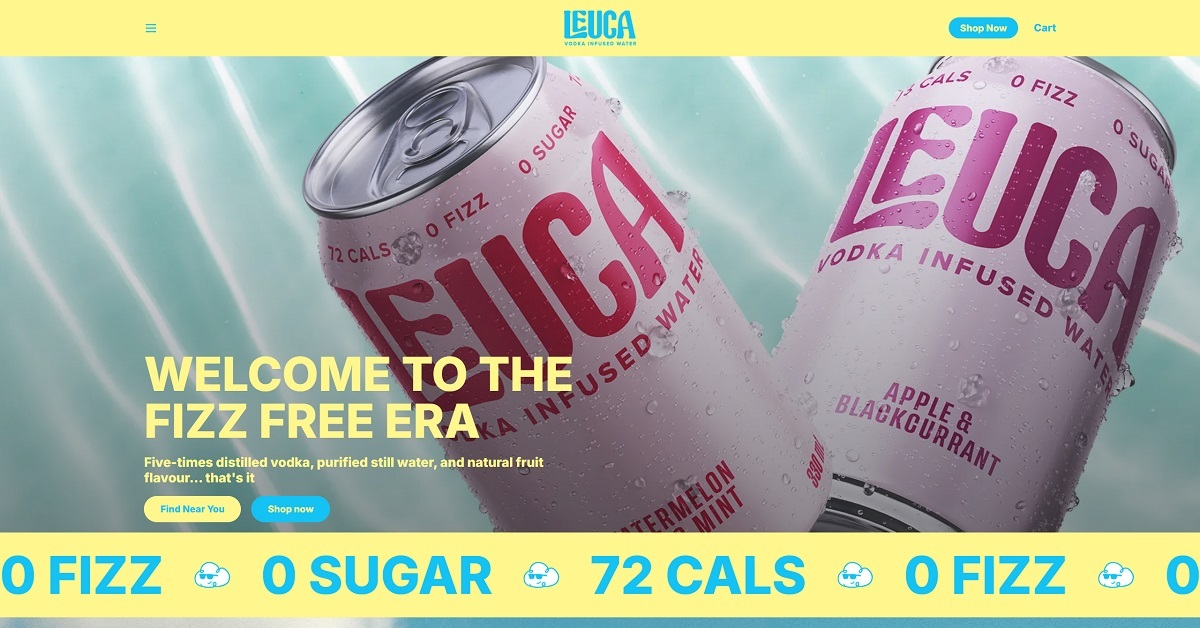
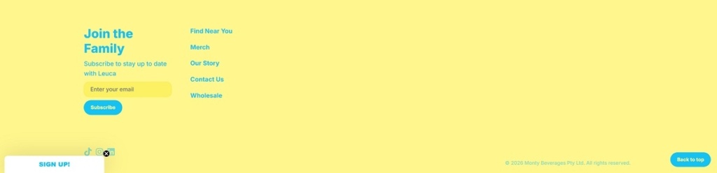
Drinkleuca.com showcases Leuca, a canned “vodka infused water” drink made with five times distilled vodka, purified still water, and natural fruit flavor, positioned as a fizz free alternative to typical canned alcohol. The site highlights a small range of flavors such as Lime Crush, Apple & Blackcurrant, and Watermelon Lime & Mint, with clear paths to buy online or find local stockists. Its design is bold and minimal, using oversized typography, simple benefit icons (0 fizz, 0 sugar), and prominent “Shop Now” and “Find Near You” calls to action.
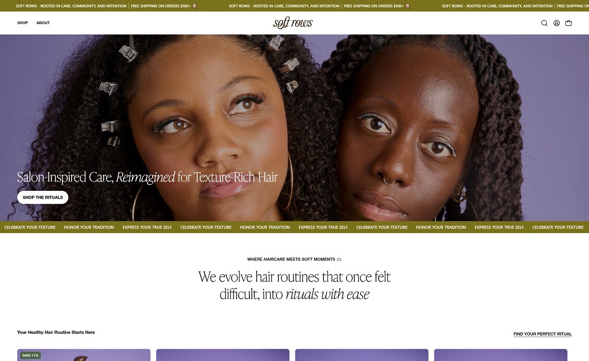
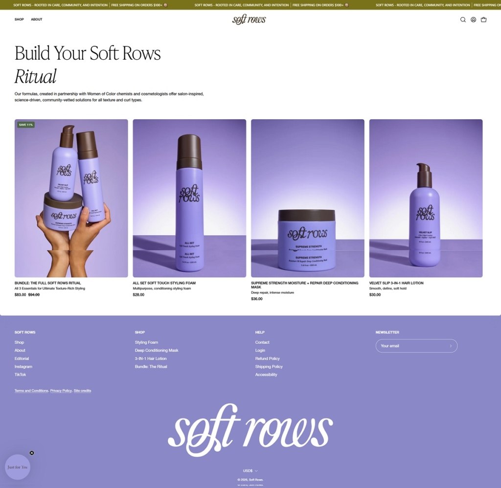
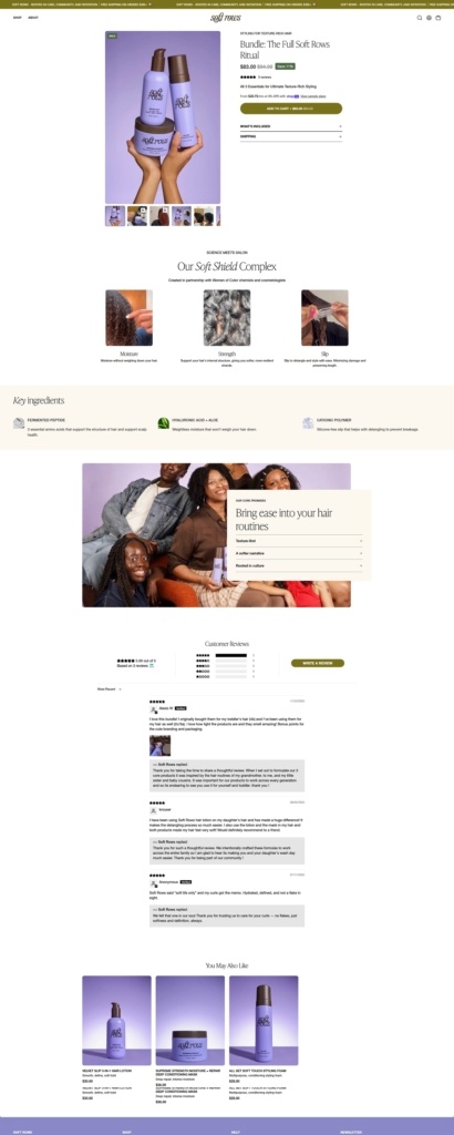
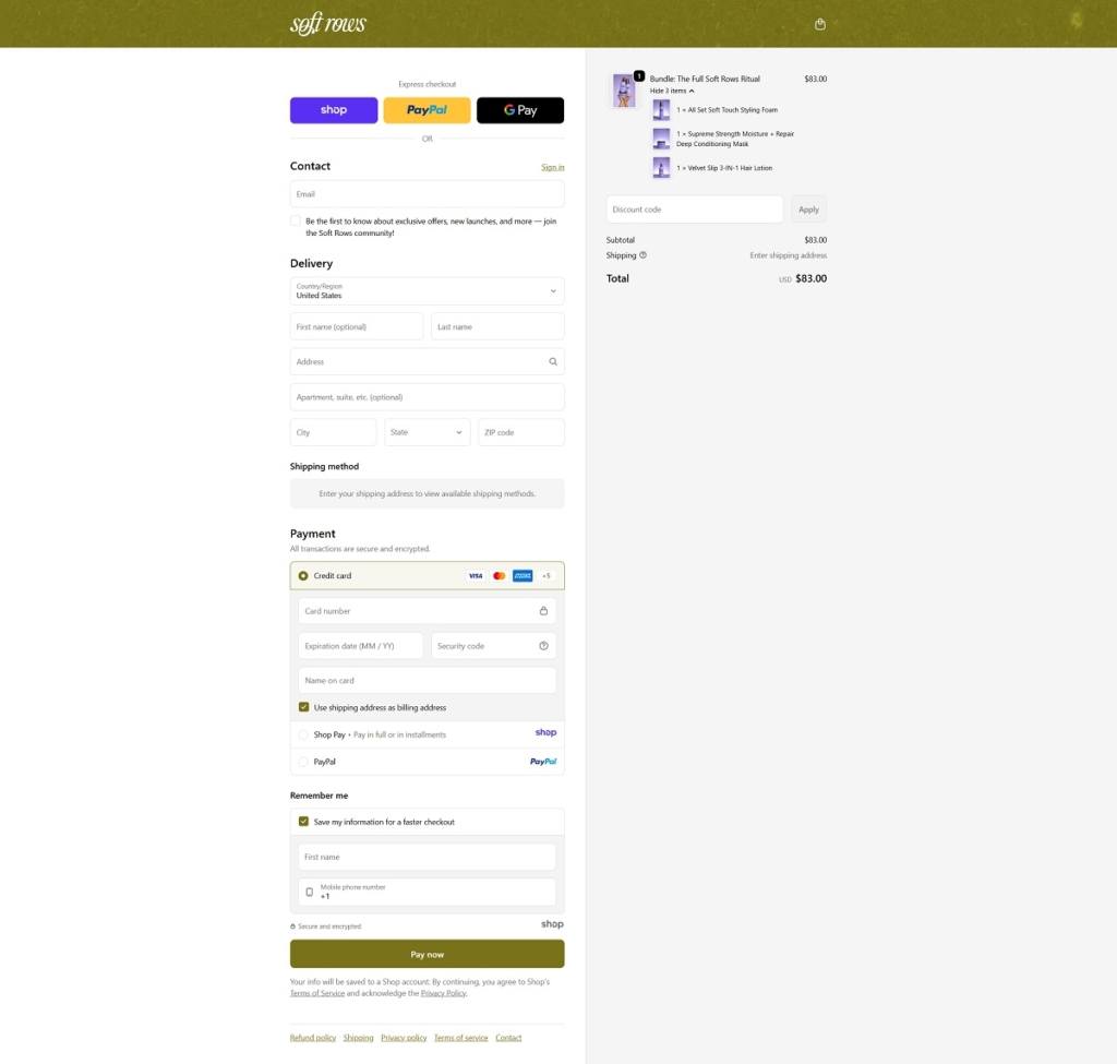
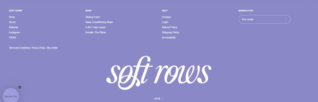
Softrows.com is a texture rich haircare brand selling a tight, curated lineup of styling essentials: a soft touch styling foam, a 3 in 1 hair lotion, and a moisture plus repair deep conditioning mask, plus a bundled “Ritual” set. The website design feels clean and editorial, with big lifestyle visuals, generous whitespace, and simple navigation that blends shopping with brand storytelling through the manifesto, founder story, and an “Editorial” blog.
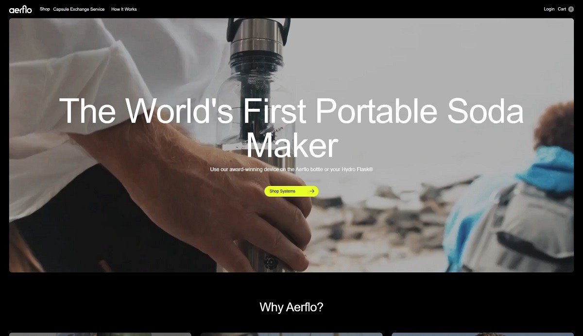
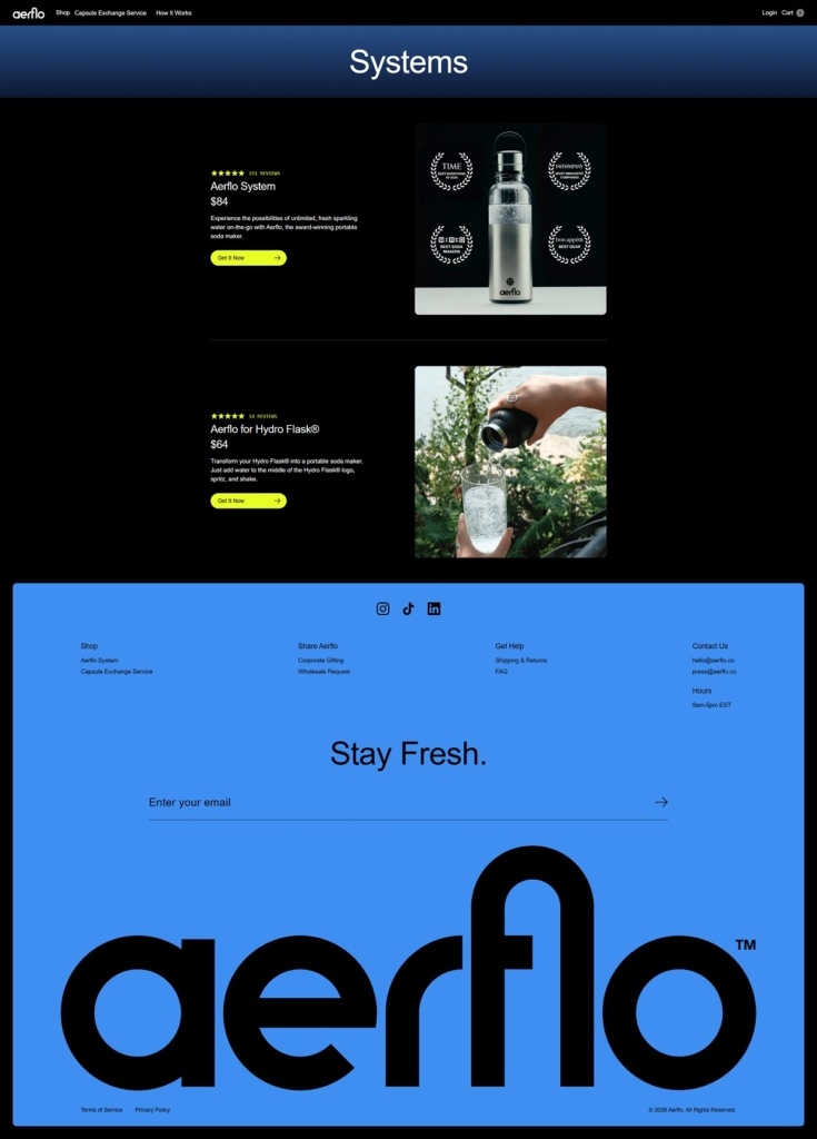
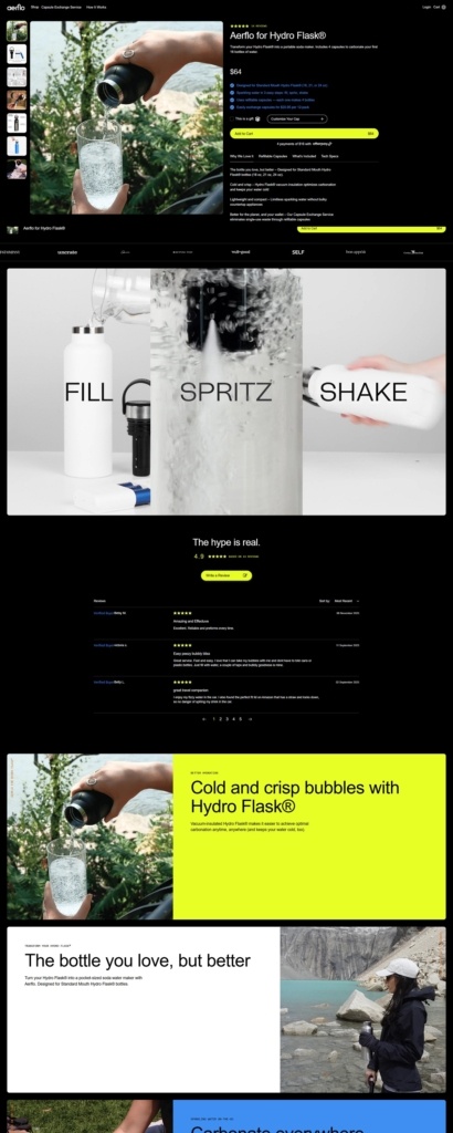
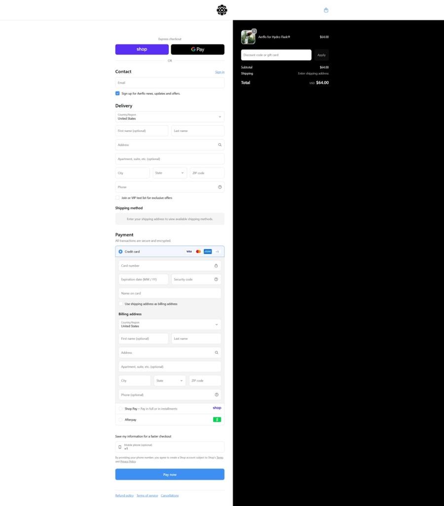
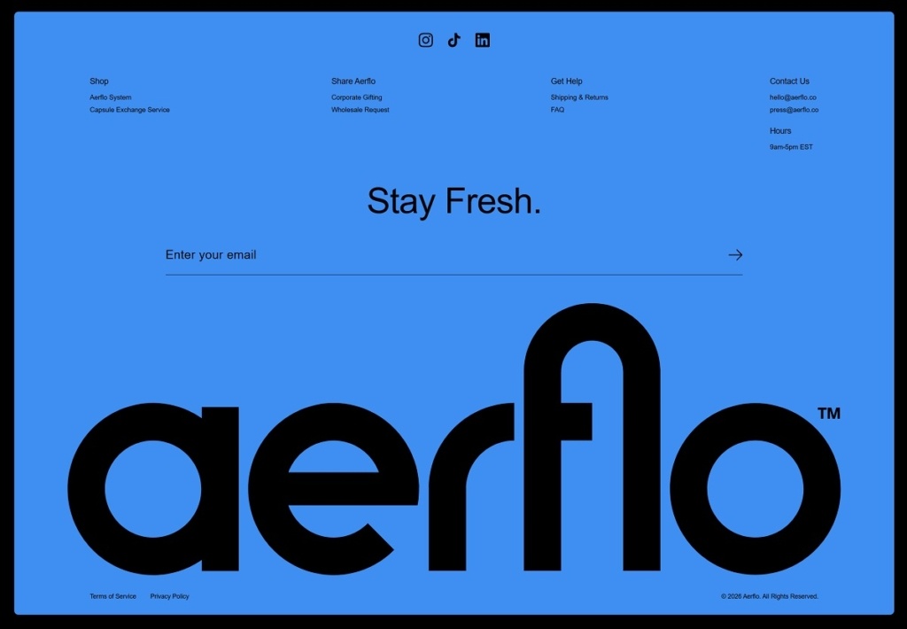
Aerflo sells a portable soda maker that lets you carbonate water on the go, either with the Aerflo bottle system or a version that fits standard-mouth Hydro Flask bottles, backed by a refillable Capsule Exchange Service for CO2 capsules. The website design is clean and product-led, opening with a background video, a bold hero headline, and a clear “Shop Systems” call to action. It keeps the page scannable with step-by-step “How It Works” blocks plus prominent press and review logos for trust.
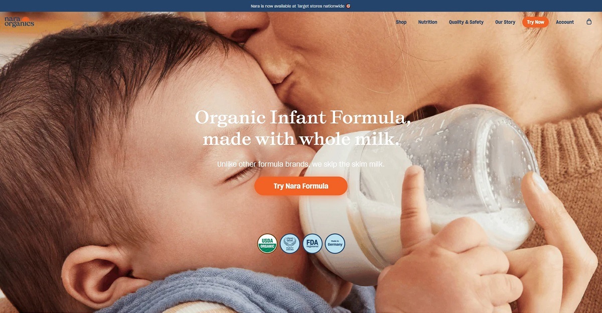
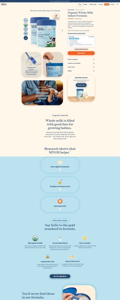
Nara.com is the online home of Nara Organics, a brand selling organic infant formula and related baby nutrition products formulated with whole-food ingredients, healthy fats, and prebiotics to support early growth and development. The website uses a straightforward, wellness-focused design with clear navigation, strong product visuals, and benefit-oriented copy that explains nutritional features and subscription options for parents. Overall, the layout is functional and informative, aimed at helping caregivers understand product benefits and make purchases with confidence.
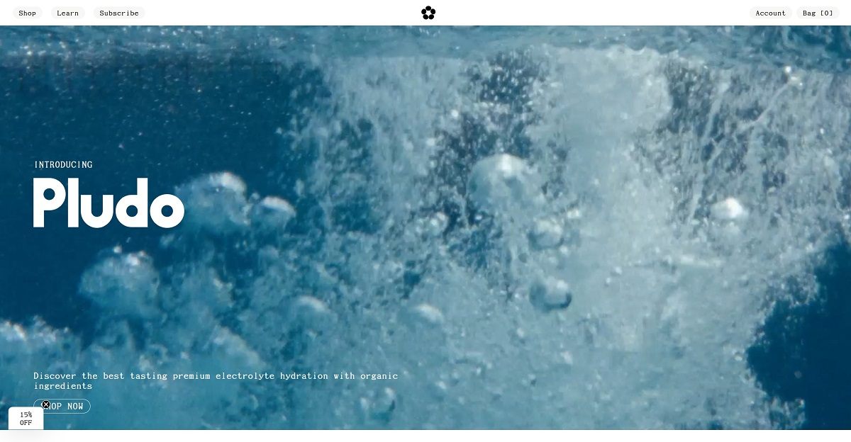
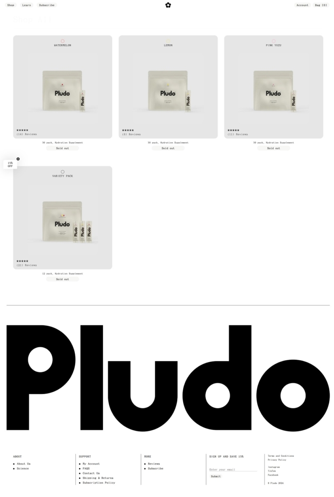
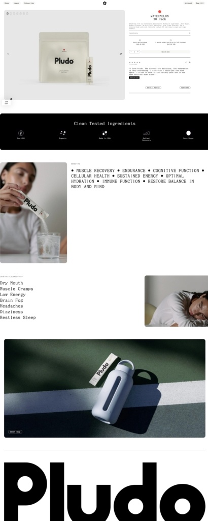
Pludo Labs offers premium electrolyte hydration supplements in single-serve flavours like Lemon, Watermelon and Pink Yuzu, formulated with electrolytes, trace minerals and amino acids to support hydration, recovery and energy. The website uses a clean, modern e-commerce layout with clear navigation, bold product visuals, and benefit-focused copy that highlights ingredients and functional effects. Overall, the design is straightforward and product-centric, making it easy to browse flavours, understand benefits, and purchase.
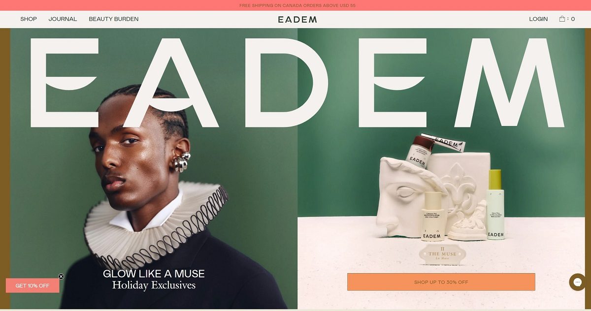
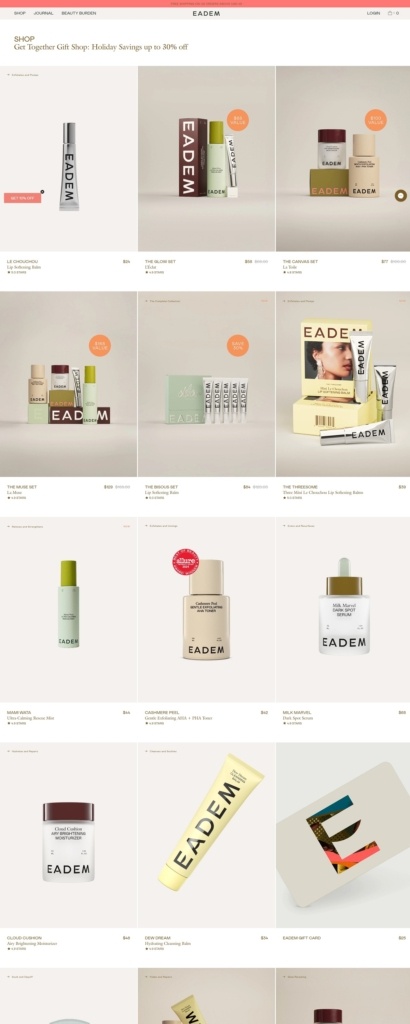
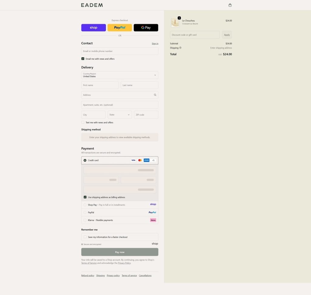
EADEM’s website uses a clean, modern e-commerce design with generous white space, clear navigation, and high-quality product and lifestyle photography. Their products are science-backed skincare and lip care—such as a cleansing balm, dark-spot serum, moisturiser/mist, exfoliating toner, and lip softening balm—positioned for safe use across complexions and commonly aimed at concerns like hyperpigmentation.
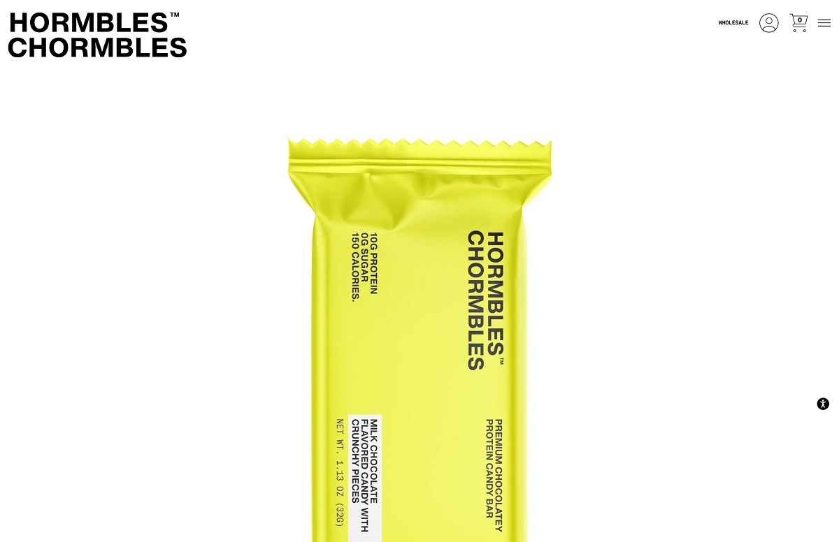
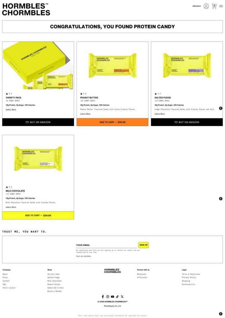
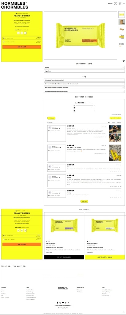
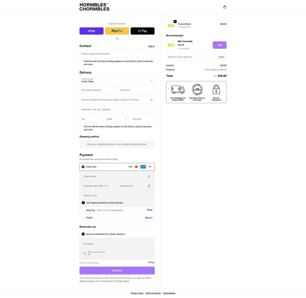
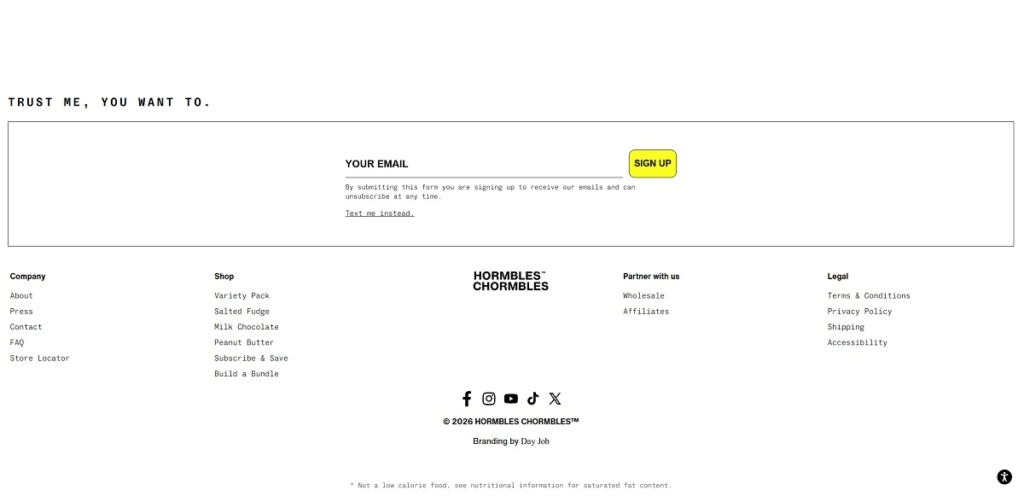
Hormbles sells “Chormbles” protein candy bars—chocolate-style bars positioned as candy with added protein and zero sugar, available in flavours like Salted Fudge, Milk Chocolate, Peanut Butter, and Cookies & Creme. The website uses a clean, modern e-commerce layout with bold product imagery, playful copy, and simple pathways to shop single flavours, build bundles, or subscribe.
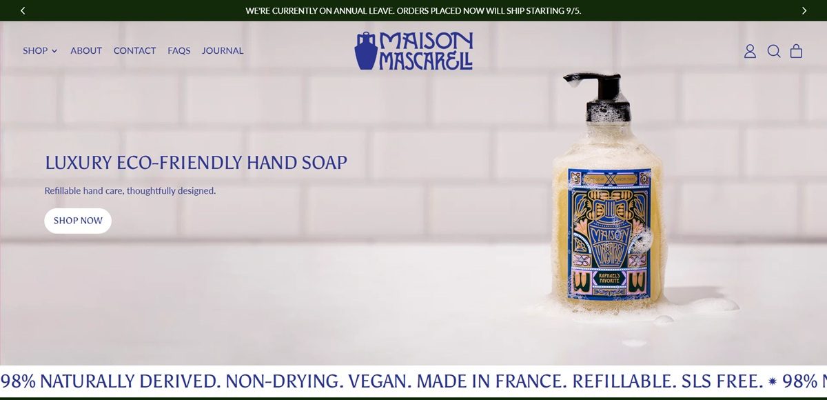
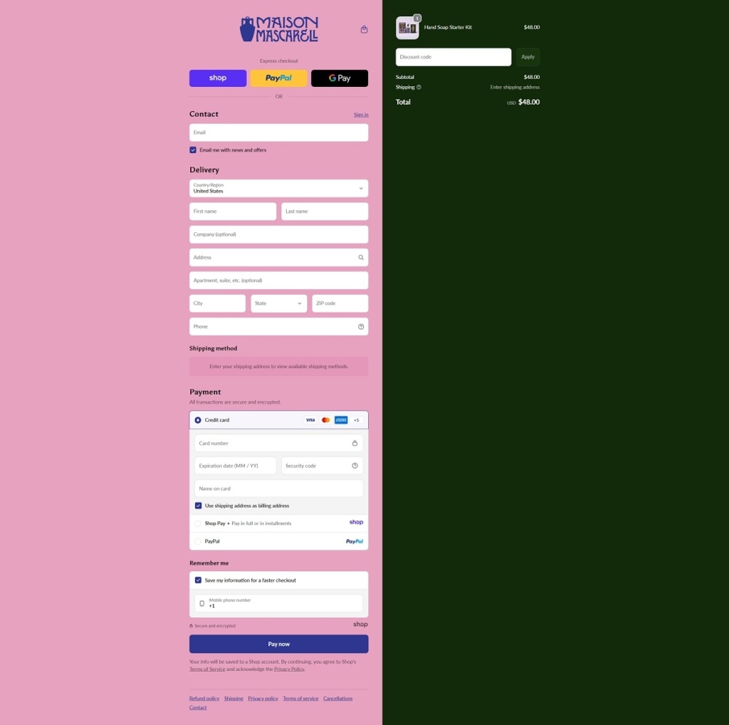
Maison Mascarell is a French maker of refillable luxury hand soap, selling a starter kit built around a reusable glass dispenser and concentrate refill tablets. The catalogue is small: Starter Kits, Refills and Bundles sit under a single Shop menu, alongside About, FAQs and a Journal. Positioning runs on the line “indulgence meets sustainability,” backed by stated claims of 98 percent naturally derived, vegan, SLS-free and made in France, on a Shopify store.
Website Design
A dark green and ochre scheme. The default color scheme sets a deep forest green background, rgb(19,42,10), against white text, with a golden ochre accent, rgb(140,97,0), and a tan-gold card tone, rgb(163,129,51). Five further schemes exist in the theme, but this dark green combination appears most across the page.
Serif headings over a sans body. Headings are set in Asul, a serif, while body and interface copy runs in Lato, a sans-serif, confirmed directly in the theme’s font-stack variables.
Rounded image blocks. Custom section styles round product and lifestyle photography to a 10 to 20 pixel radius and hold images to a square aspect ratio, with a dark gradient overlay fading from near-black to transparent behind captions.
A three-panel approach section. A dedicated “Our Approach” layout splits into three equal columns, each an image with a centered caption overlay, used to walk through the brand’s process rather than a single hero claim.
Shopping Experience
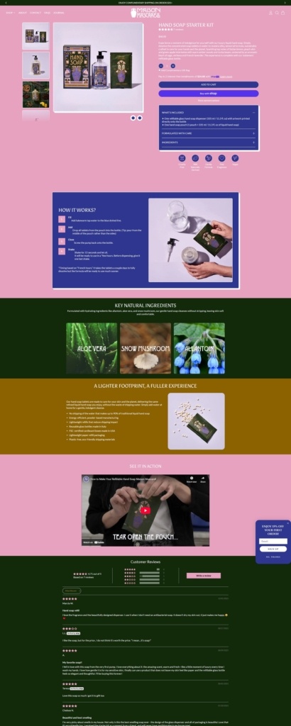
One hero product, several entry points. The Hand Soap Starter Kit anchors the range at $48, containing one 335ml refillable glass dispenser plus one soap pouch concentrate, with Refills priced from $15 and Bundles from $55 as the other purchase paths.
A simple, one-time buy box. The starter kit page offers a single variant selector (shown as “Default Title”), a quantity adjuster and an option to add a complimentary gift bag, with one Add to Cart button and no subscribe-and-save toggle visible.
Process explained inline. A “How It Works” block walks through dissolving the tablet in water using an animated illustration, placed directly on the product page rather than tucked into a help article.
Reviews visible on the product page. The sampled starter kit carries seven customer reviews, the large majority five-star, referencing fragrance, gentle formula and packaging.
Brand Storytelling
Ingredient names used as proof. Formulation copy names specific actives, allantoin, aloe vera and snow mushroom, and states the scent combines Italian lemon, peach skin and green apple over amber woods and tonka bean.
Sustainability argued on shipping weight. The case for refills centers on reduced water shipped in concentrate form, alongside energy-efficient manufacturing and reusable Italian glass bottles.
A named recycling program. A “Beauty Collection Program” is referenced for returning packaging, extending the sustainability claim past the refill model itself.
Notable Features
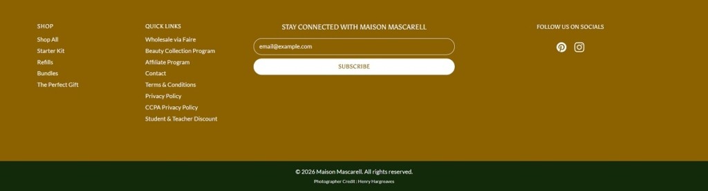
Wholesale named directly. The footer lists wholesale routes through Faire and Airgoods, alongside an affiliate program, positioning the brand for retail partners as well as direct shoppers.
A gift-specific bundle. The Perfect Gift bundle is priced separately at $65 from the standard bundles, aimed at a gifting occasion rather than personal use.
Newsletter framed as early access. Signup copy offers “insider access to new launches, exclusive deals” rather than a generic discount code.
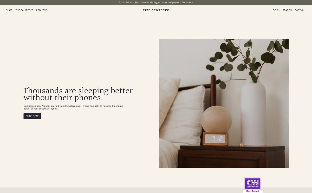
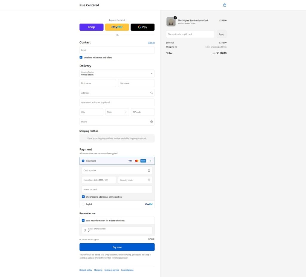
Rise Centered sells a sunrise simulation alarm clock crafted from natural materials like Himalayan salt and wood, designed to help users wake gently with gradually increasing light rather than loud sounds. Their website features a clean, wellness-oriented design with simple navigation, strong product visuals, and clear messaging about how the clock works and its benefits for sleep and morning routines. Overall, the layout is straightforward and functional, making product features and purchase options easy to explore.
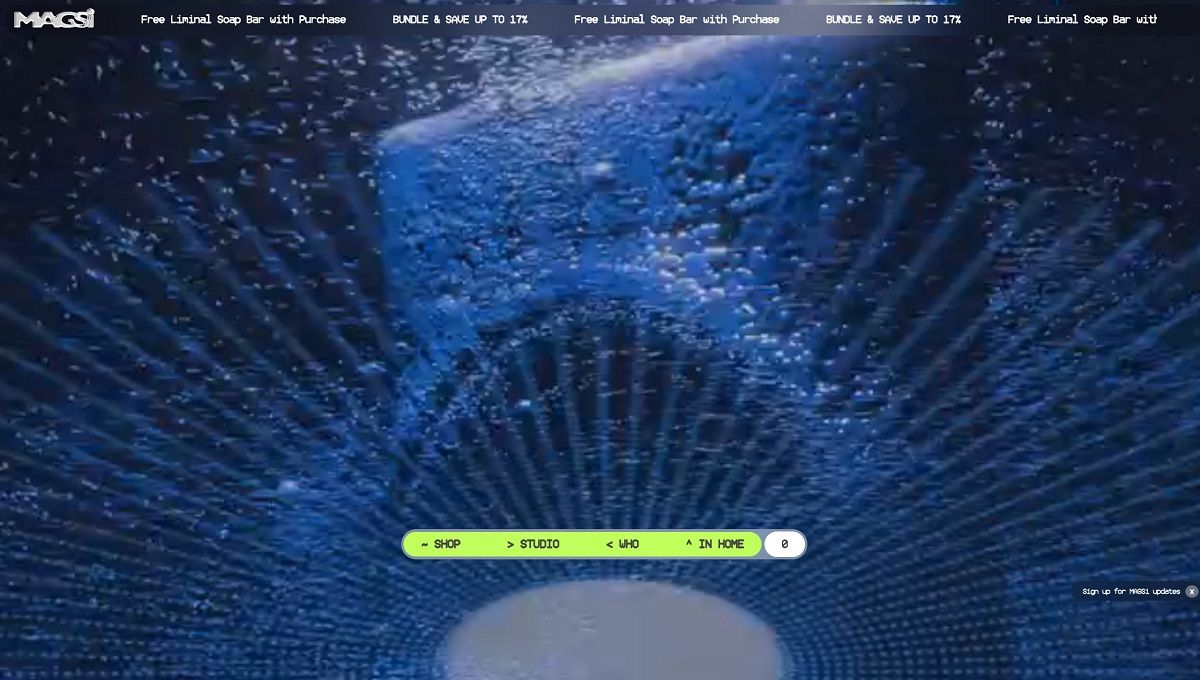
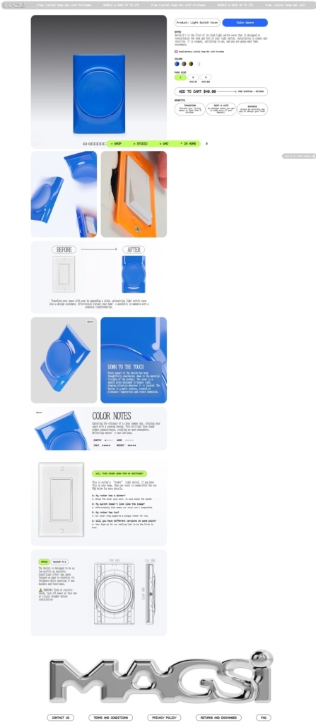
MagsiDesign offers decorative, renter-friendly light switch covers and colourful “liminal bars” that upgrade ordinary switches into intentional design elements. The website features a clean, modern e-commerce layout with simple navigation, bold product visuals, and benefit-focused copy that highlights ease of installation and aesthetic impact. Overall, the design supports quick browsing of colour options and product details while reinforcing a lifestyle-oriented approach to small interior-design upgrades.
MagsiDesign Shop Category Page Example
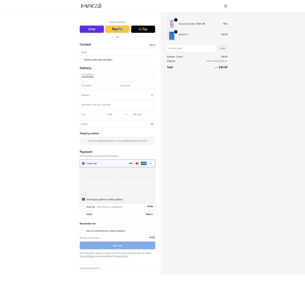
MagsiDesign Checkout Page Example
MagsiDesign Footer Example
Join our community for the latest trends and ecommerce tips.

 By Jibin Kumar