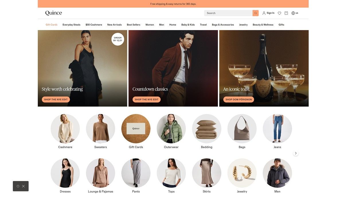
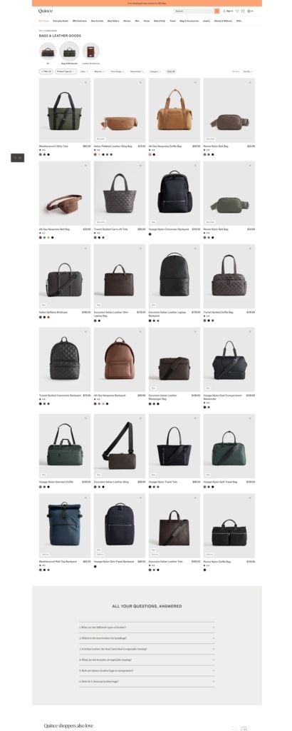
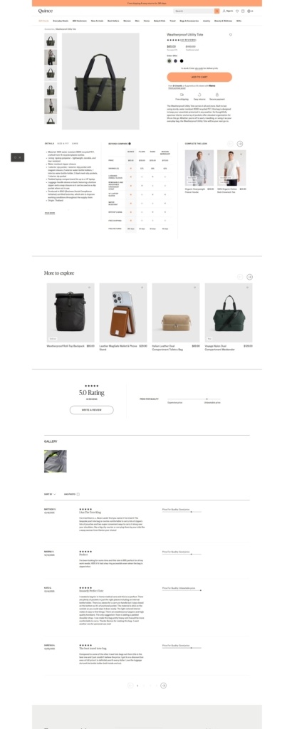
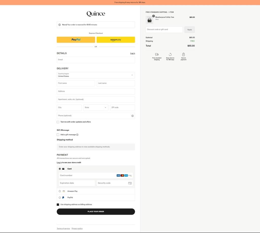
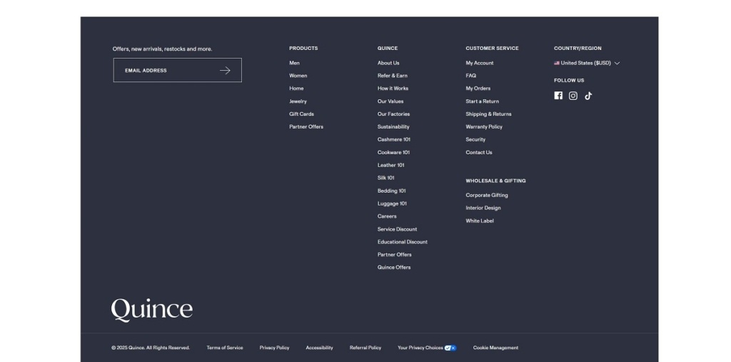
Quince offers a wide range of affordable, high-quality essentials — from clothing and cashmere to home goods, accessories, and beauty — emphasising simple, timeless design. Their website features a clean, minimalist layout with large product photography, intuitive filters, and straightforward navigation that makes browsing effortless.
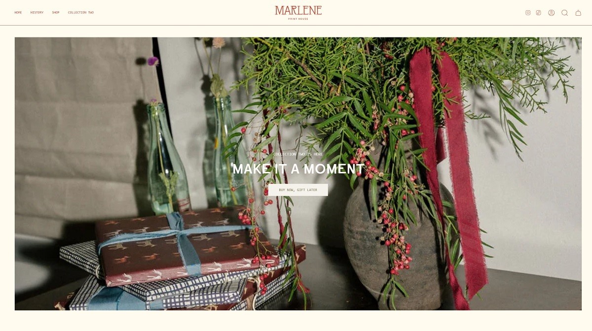
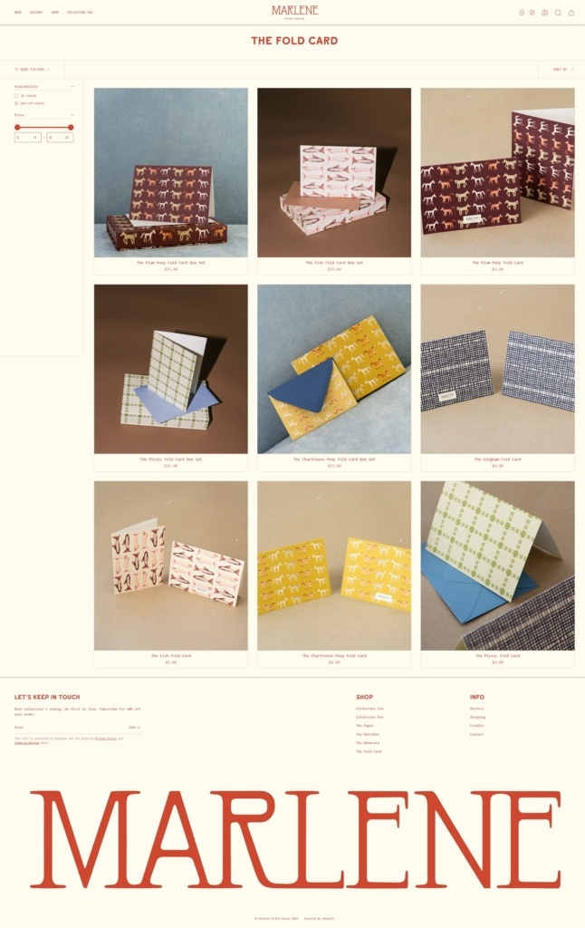
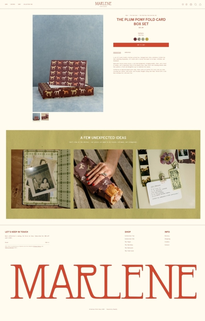
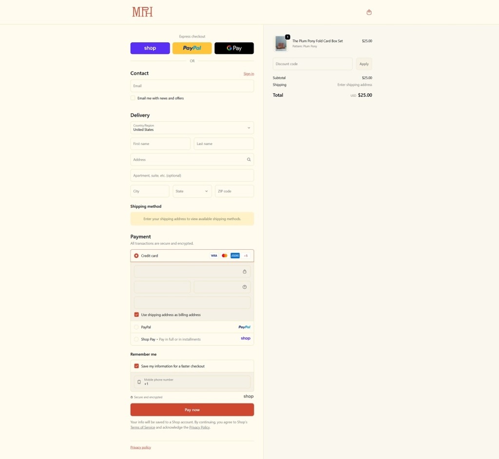
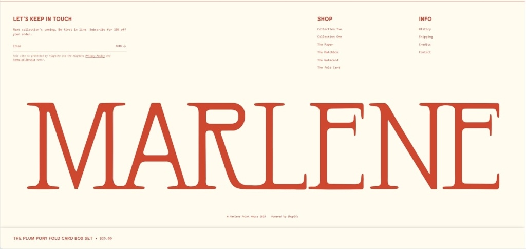
Marlene Print House is a creative studio and online shop specialising in risograph and art prints, along with stationery and paper goods produced in small, carefully crafted runs. The website features a clean, editorial-style design with generous white space, soft colour palettes, and a gallery-like layout that puts texture and print detail front and centre. The overall experience feels calm, artistic, and thoughtfully curated, mirroring the hands-on nature of the products.
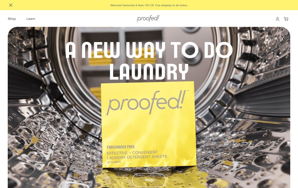
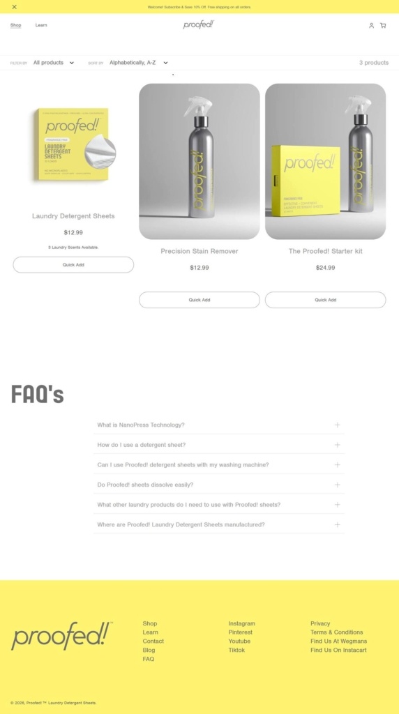
Proofed! sells plastic-free laundry detergent sheets and a companion stain remover spray, on the domain liveproofed.com, positioned for environmentally conscious households concerned about microplastic pollution from traditional detergent packaging. The catalogue is small: detergent sheets, a stain remover and a starter kit, priced at USD12.99 to USD24.99, sold direct alongside retail listings at Wegmans and Instacart. Built on Shopify.
Website Design
Grey led, low colour interface. Body copy and interface chrome run in mid greys, #6d6d6d and #a1a1a1, against light grey and white grounds, with a near-black #3a3a3a reserved for headings. Colour is used sparingly, appearing mainly as a red accent, #d20000, on sale or promotional callouts.
A bold display face for headlines. Headings are set in Italian Plate 7 Bold, a heavy serif-adjacent display face, over Nimbus Sans Regular body copy, giving the page a print-poster feel above denser product text.
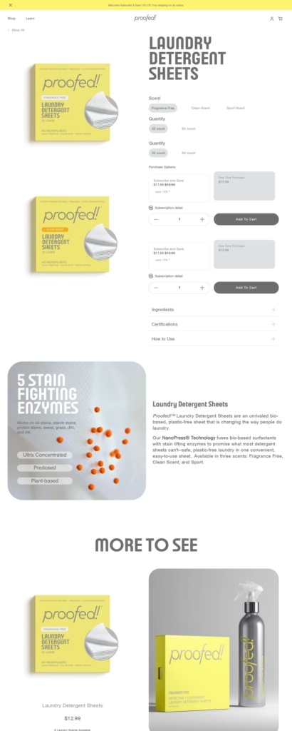
Product photography on white. Sheets and the stain remover bottle are shot as clean product-on-white images, consistent with the site’s restrained, low colour layout.
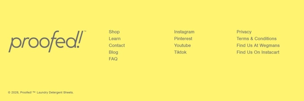
A short, task-focused main menu. Navigation is limited to Shop, Learn, Contact, Blog and FAQ, with Instagram, Pinterest, YouTube, TikTok and Facebook icons repeated in the header and footer, keeping the top-level structure narrow around a small catalogue.
Shopping Experience
A three-item catalogue. The shop lists Laundry Detergent Sheets, a Precision Stain Remover and a Starter Kit bundling the two, the sheets and remover each at USD12.99 and the kit at USD24.99. Sheets are offered in three scent options.
Enzyme formulation is the sell. Product copy leads with a “proprietary blend of 5 effective enzymes” for the stain remover, and branded NanoPress manufacturing for the sheets, both stated directly on product pages rather than through lifestyle framing.
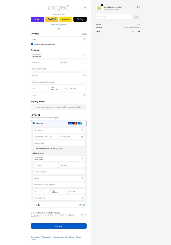
Retail listed alongside direct purchase. The footer names Wegmans and Instacart as stockists next to the direct Shopify checkout, positioning the site as one of several ways to buy the same products.
Brand Storytelling
“Laundry Made Light” as the core line. The tagline frames the product around convenience and low environmental footprint together, and the brand describes itself as “The Only 100% Plastic Free Sheet,” contrasting directly with PVA and PVOH-based competitor sheets.
Certifications carry the trust case. Dermatologist testing, USDA bio-based certification and Leaping Bunny cruelty-free status are stated on product pages rather than folded into general marketing copy.
A named founder voice in the FAQ. The FAQ section references a founder, Sherry, directly, and explains the proprietary NanoPress manufacturing process by name, giving the brand story a specific, sourced explanation rather than a generic sustainability pitch.
Notable Features
Press mentions in the footer. Real Simple, CNN, Martha Stewart, Home & Gardens and The Spruce are credited directly in the site footer as coverage.
Hypoallergenic positioning throughout. Both products are marketed as hypoallergenic and quick-dissolving with no residue, a claim repeated across the homepage, FAQ and product descriptions.
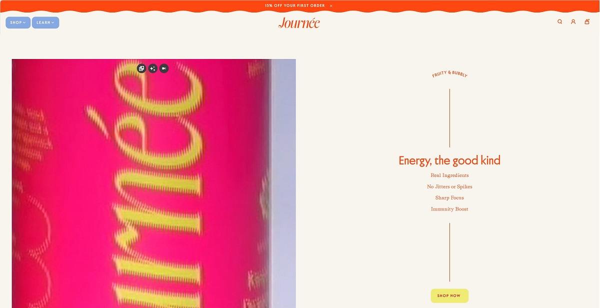
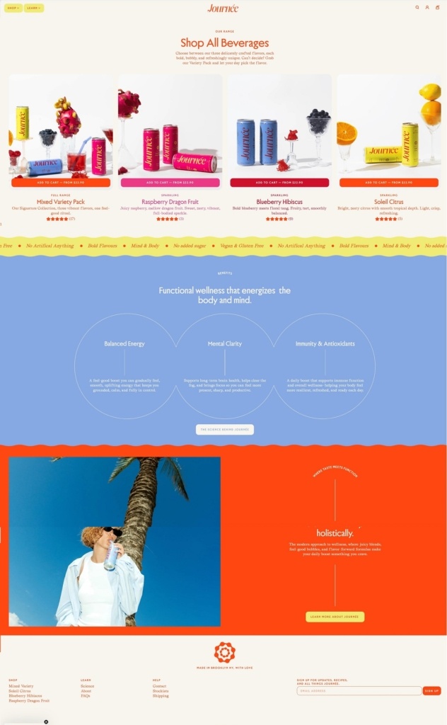
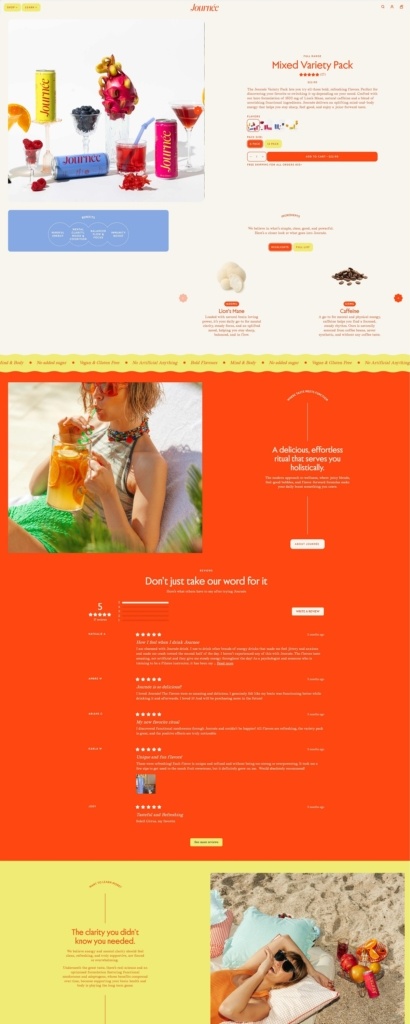
Drink Journée’s website is bright and minimalist, with clean navigation and high-quality imagery that puts the focus squarely on their beverages. Their product line centres on sparkling antioxidant waters made with natural botanicals and functional ingredients for hydration and wellness. The overall design feels fresh and approachable, making it easy to explore flavours, benefits and shop online.
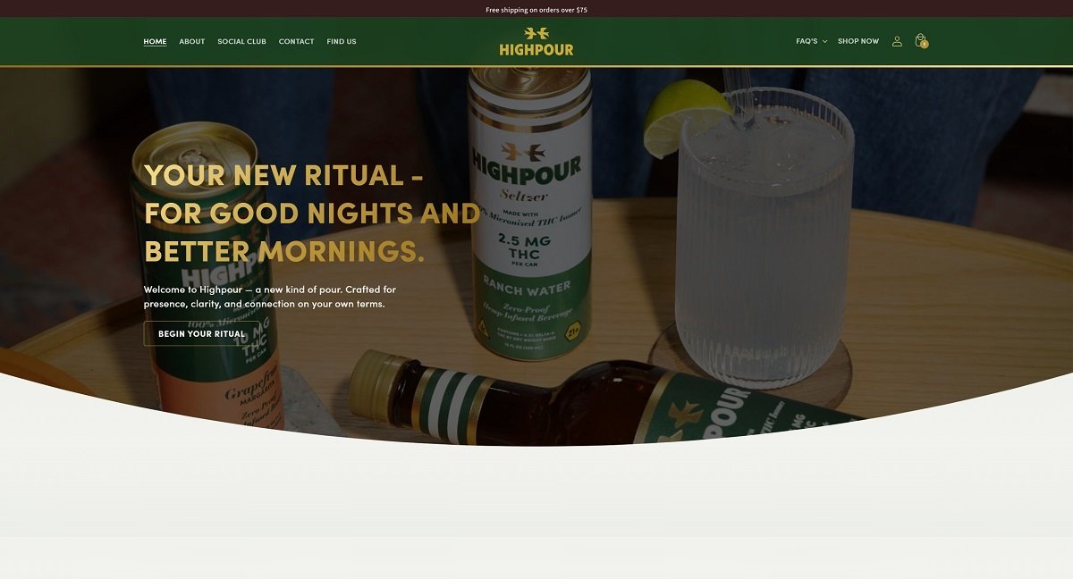
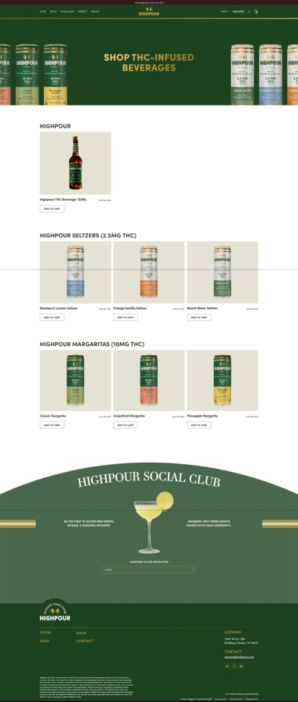
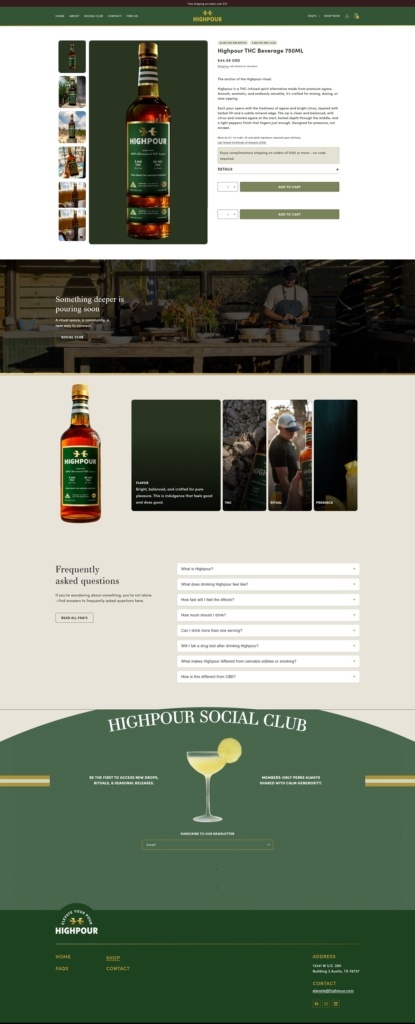
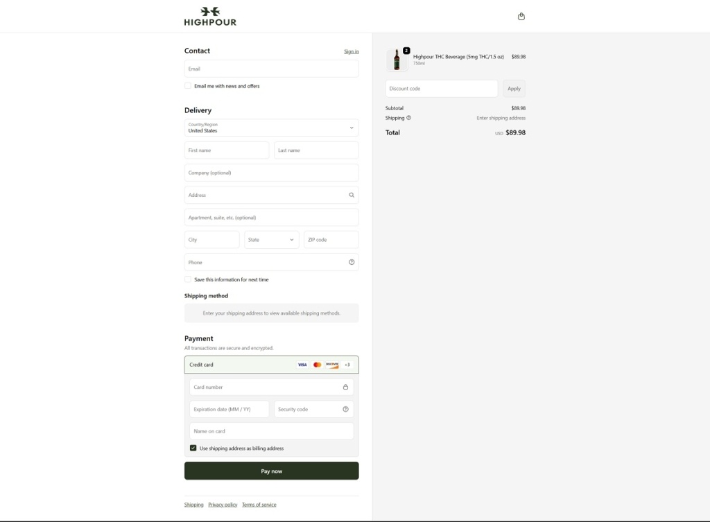
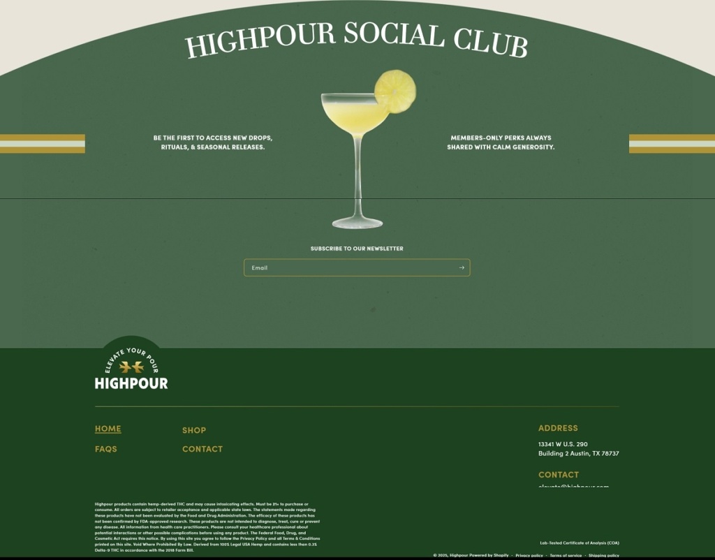
Highpour offers a range of premium hemp-derived THC beverages — including THC-infused seltzers and margarita-style drinks designed as a non-alcoholic alternative for social occasions — with clear dosing and bold flavour profiles. The website uses a clean, modern e-commerce layout with straightforward navigation, high-quality product imagery, and clear product details that make browsing and purchasing easy for adult visitors.
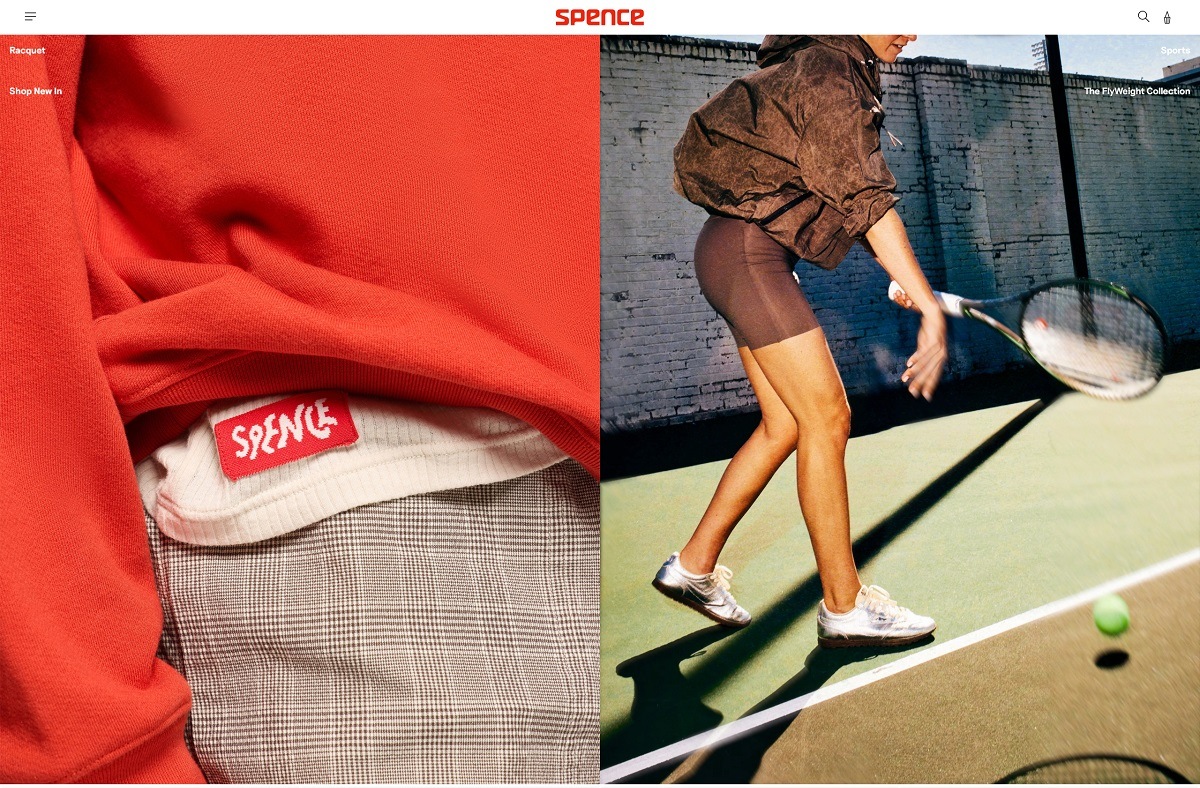
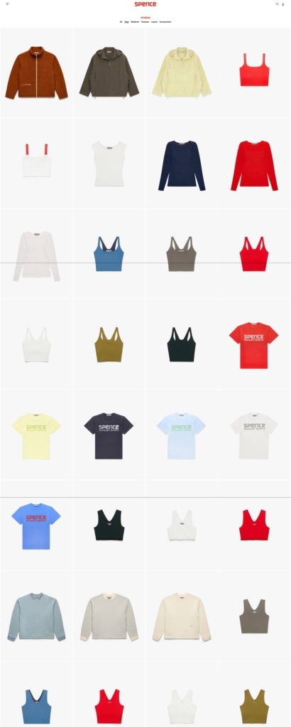
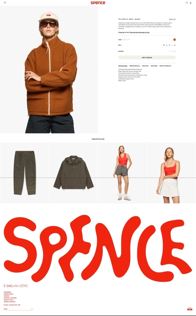
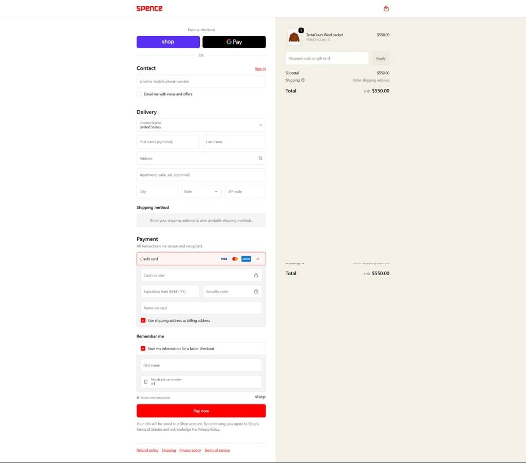
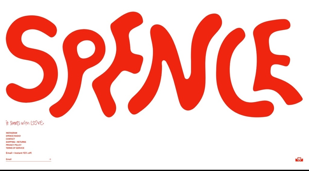
Spence offers a curated range of premium men’s apparel and accessories — including shirts, knitwear, outerwear, and essentials — designed with attention to quality fabrics and timeless styling. Their website features a clean, refined aesthetic with generous white space, clear navigation, and crisp product imagery that highlights craftsmanship and fit. The overall design feels modern and elevated, making exploration and shopping straightforward and visually engaging.
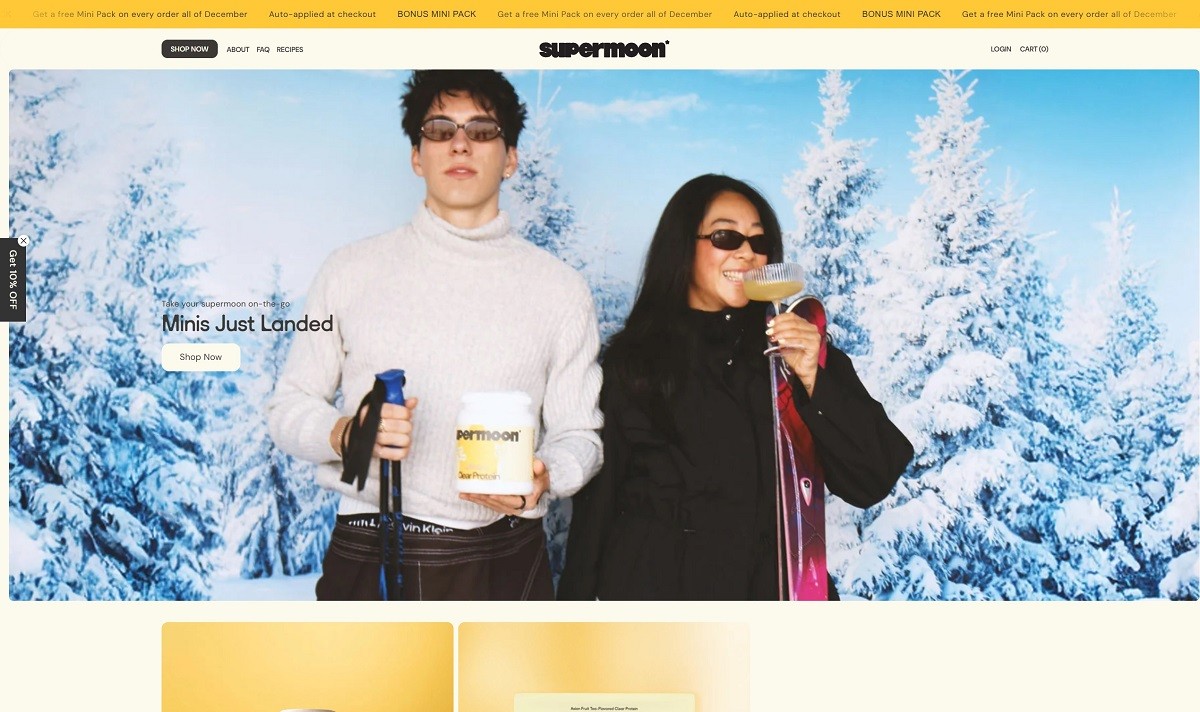
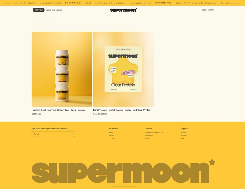
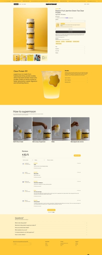
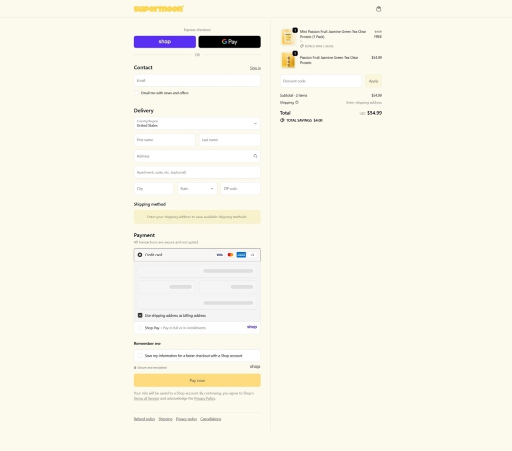
Supermoon offers a range of “clear-whey” protein drinks with 22 g protein per serving — flavored like fruity Taiwanese teas, low-calorie, easy to digest and free from chalky texture. Their website uses a clean, modern e-commerce design: minimalist layout, clear navigation, strong product photography and concise copy that highlights product benefits (nutrition facts, taste, easy mixing).
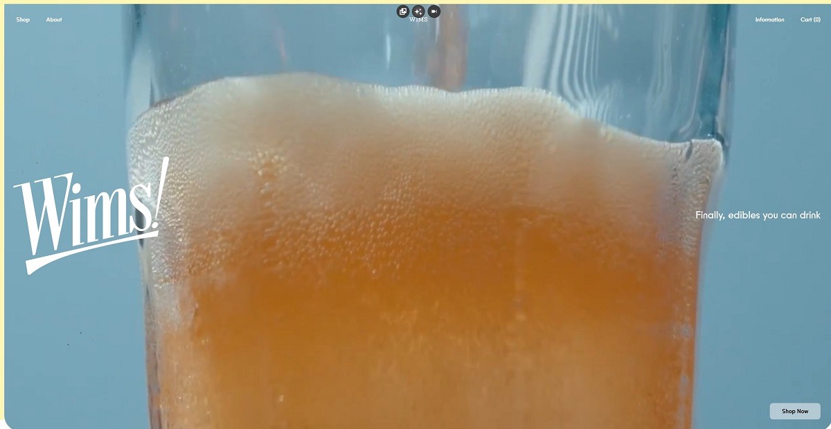
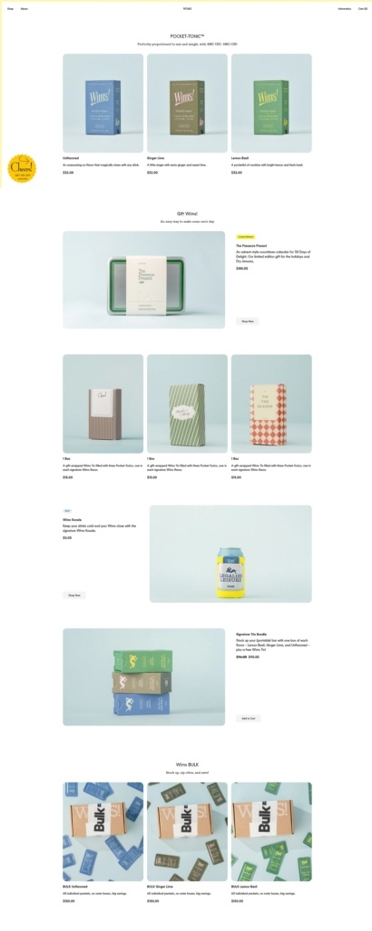
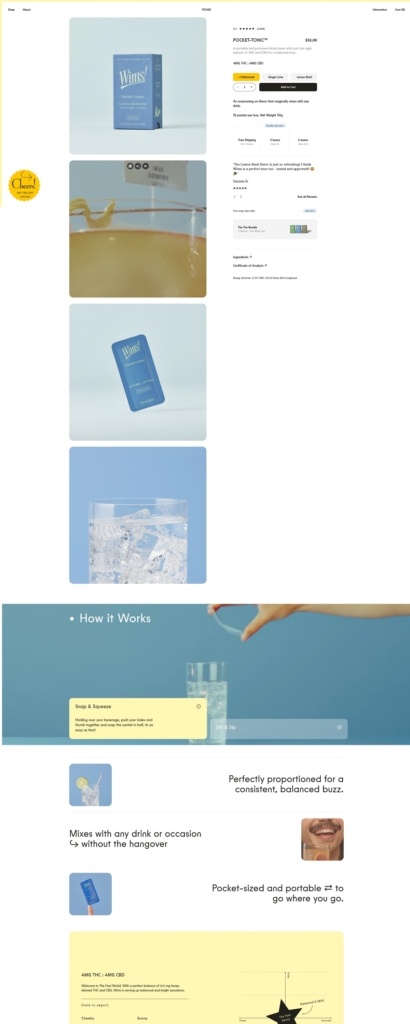
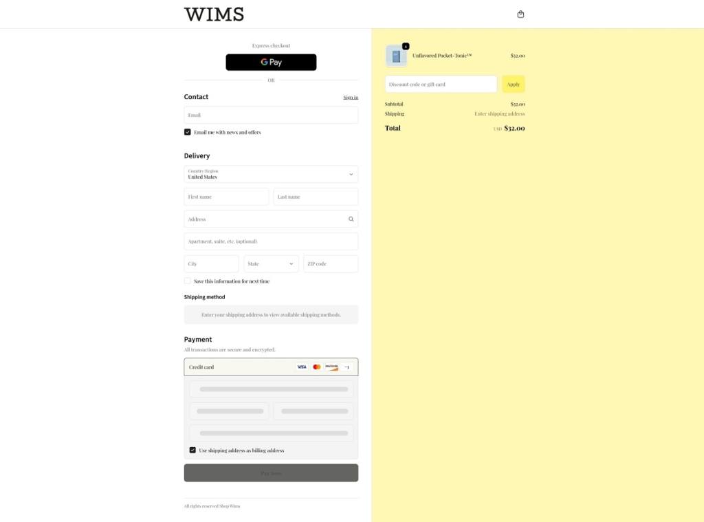
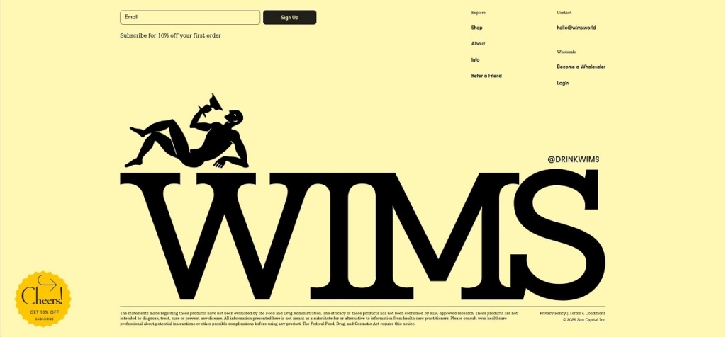
Wims! offers pocket-sized drink mixers — compact sachets that deliver 4 mg THC + 4 mg CBD per serving, available in flavours like Lemon Basil, Ginger Lime, or unflavoured for mixing into cocktails, sodas or mocktails. Their website design is clean and modern, with clear category navigation, bold imagery, and simple “snap-and-mix” usage instructions — making browsing, selecting flavours, and purchasing straightforward.
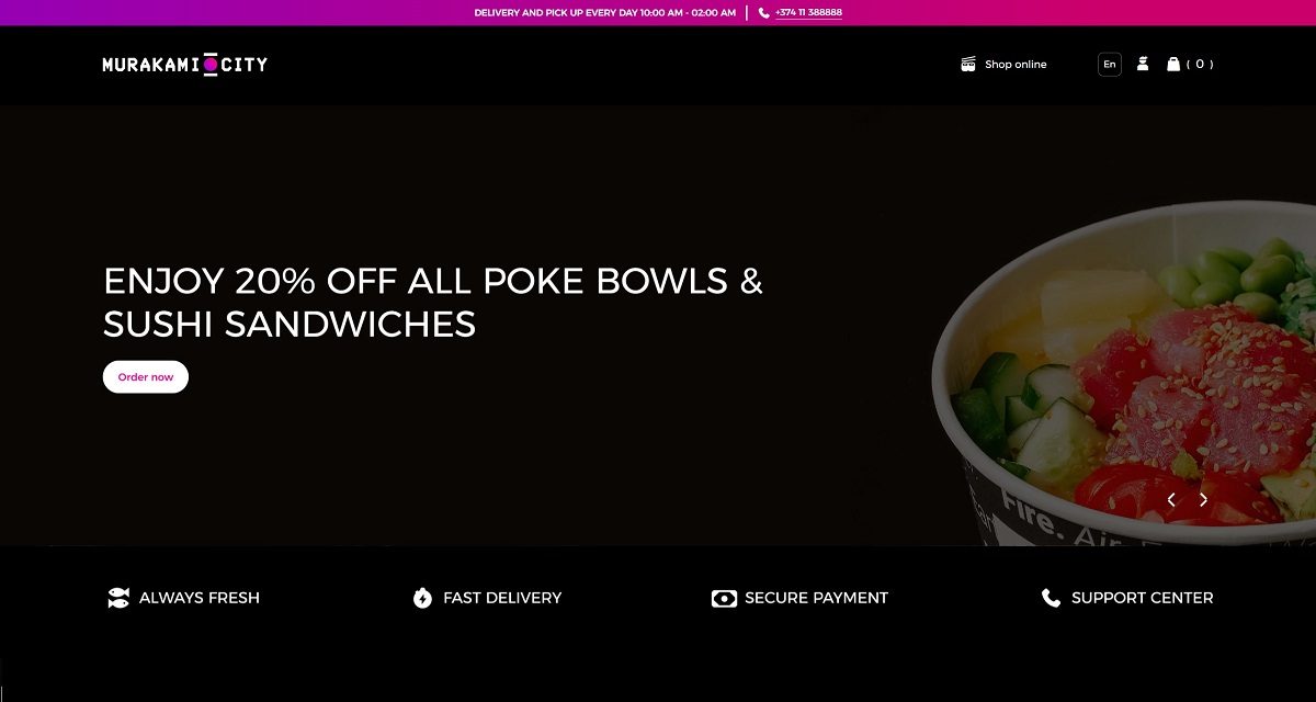
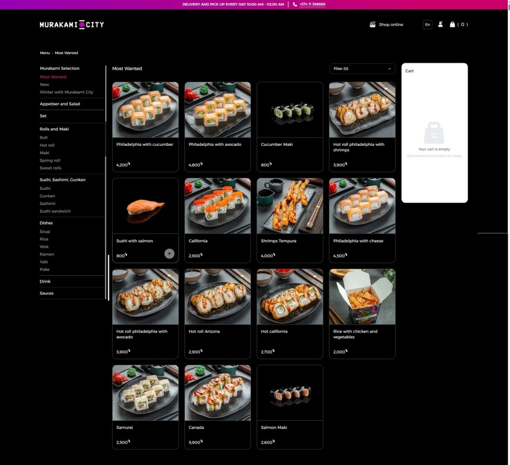
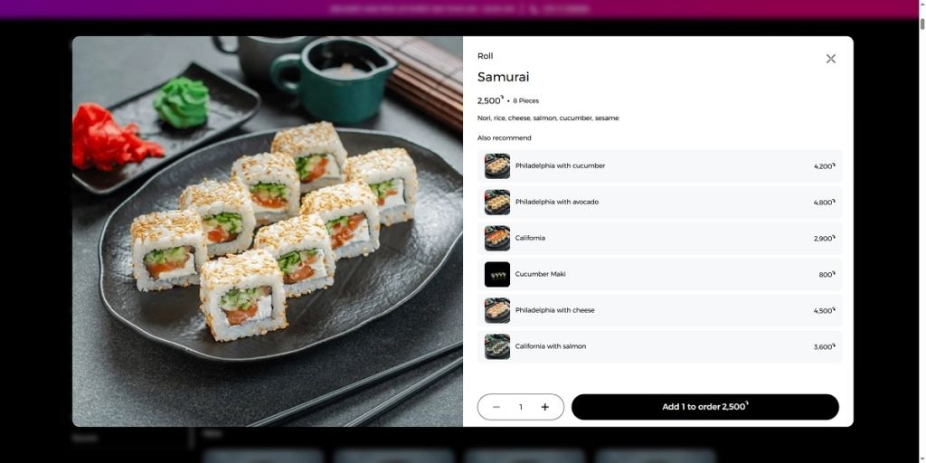
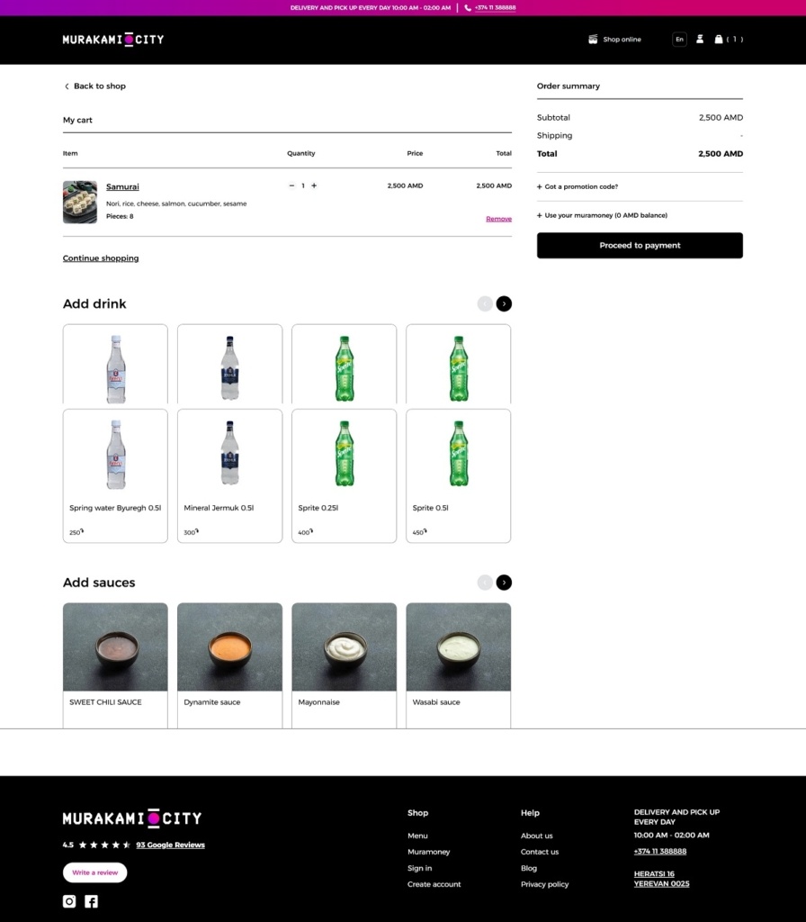
Murakami City operates an online platform for ordering Japanese food — primarily sushi and poke bowls — with delivery across Yerevan and nearby areas. Their website uses a clean, functional e-commerce design: a streamlined UI/UX, clear navigation, bold food photography and a smooth ordering flow that makes browsing the menu and placing orders intuitive and efficient.
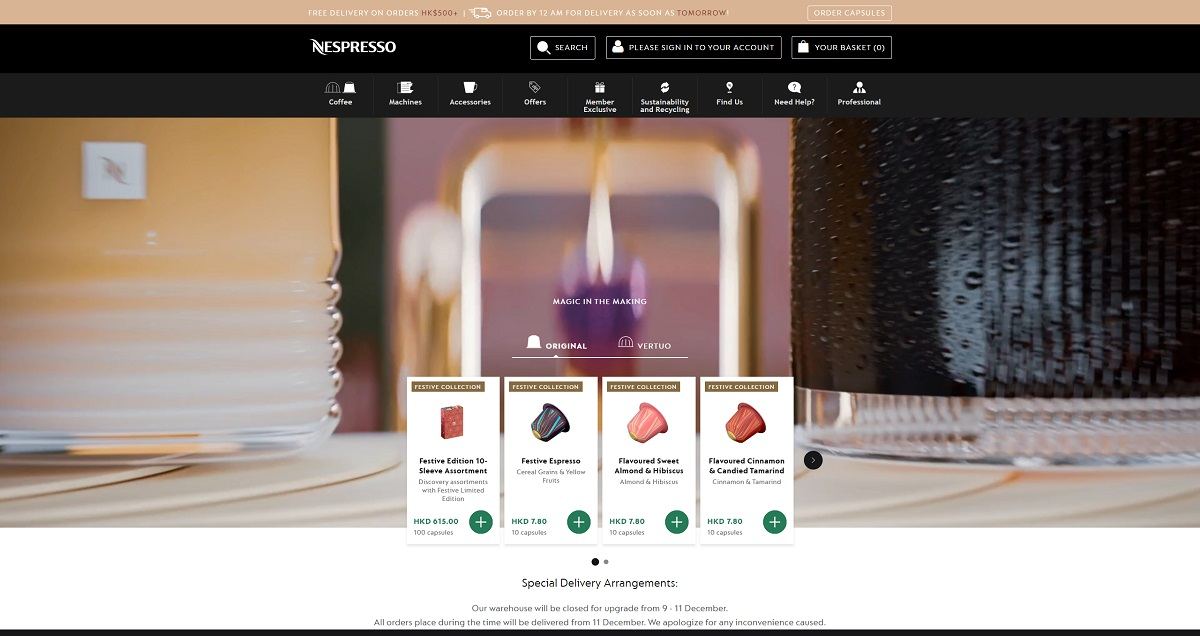
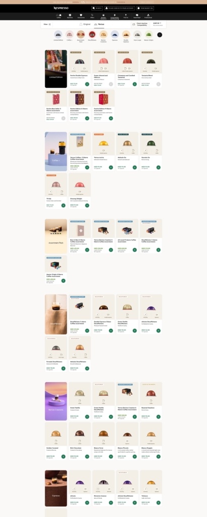
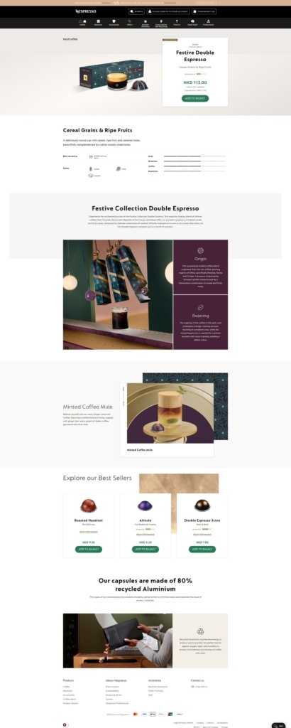
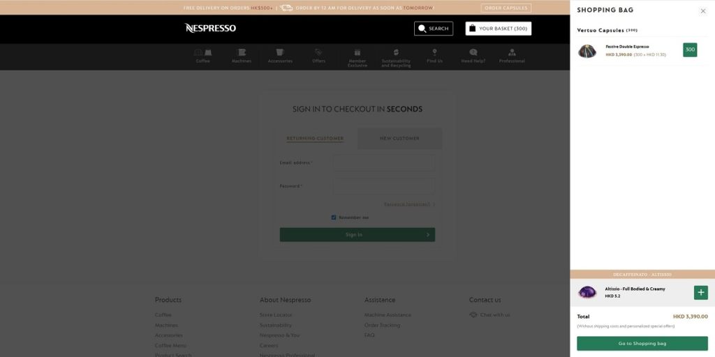
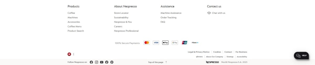
The website of Nespresso presents a clean, modern layout with intuitive navigation — clearly separating categories like Coffee, Machines, and Accessories — and uses sharp product photography and a minimalist design that reflects its premium positioning. Their product offering includes single-serve coffee capsules/pods, a range of espresso and coffee machines (Original and Vertuo lines), and related accessories for a complete at-home coffee experience.
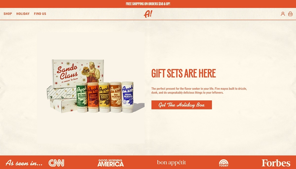
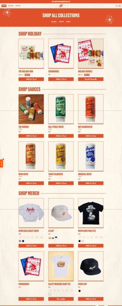
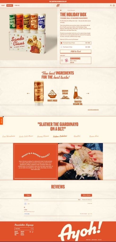
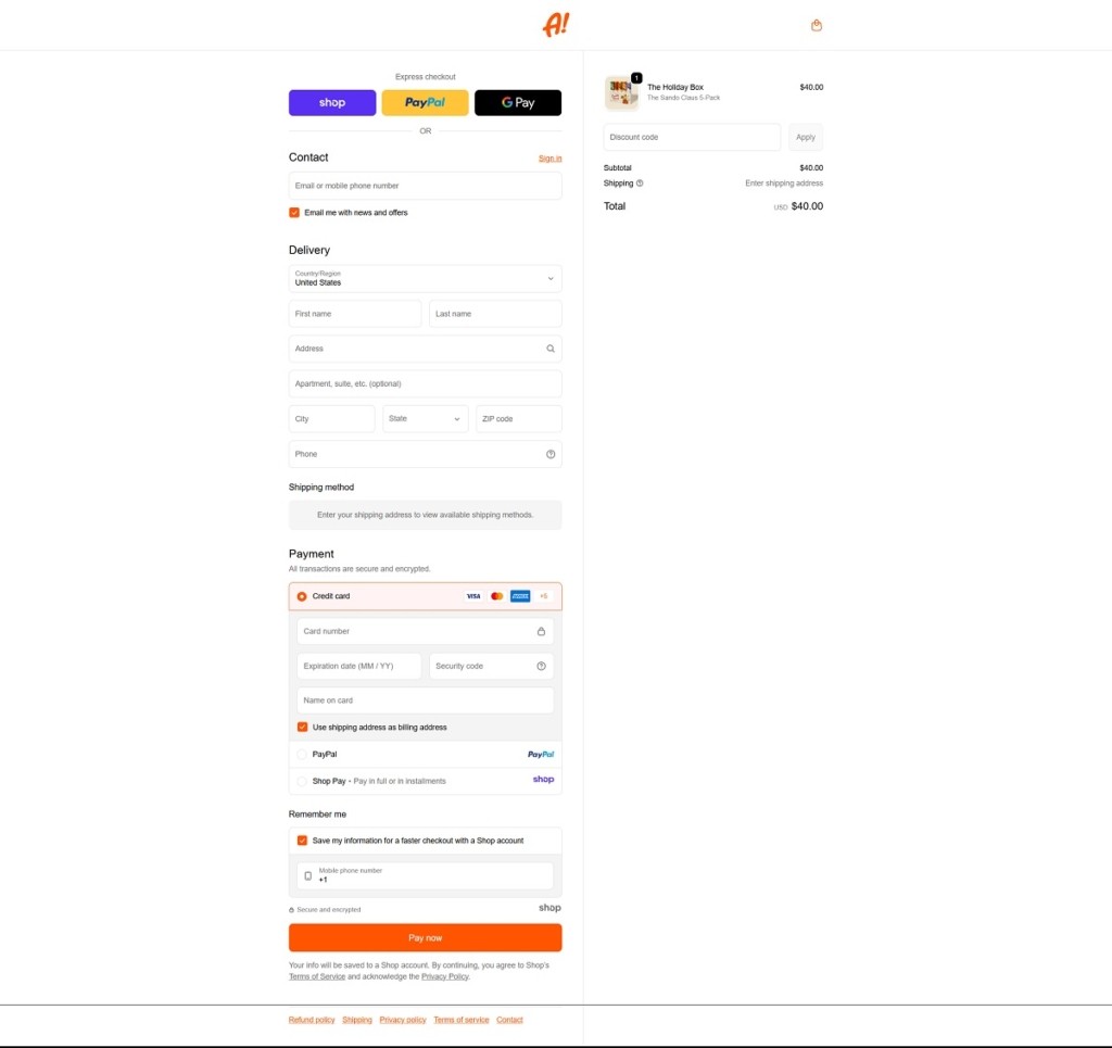
Ayoh! sells a line of “sando sauces” — mayo-based condiments infused with herbs, pickles, spices or chiles — meant to elevate sandwiches, fries, burgers, and snacks. The website uses a clean, structured layout with clear navigation and high-quality imagery that highlights both the products and their suggested food pairings. The overall design is straightforward and functional, making it easy for users to browse, explore flavours, and complete purchases.
Littlefoot Matcha offers organic, ceremonial-grade matcha and related tea accessories sourced from small farms in Shizuoka, Japan — a line crafted to bring high-quality matcha and tea rituals into everyday life. Their website features a clean, minimalist design with generous white space, clear navigation, and striking product photography that invites you into a calm and refined browsing experience.
Littlefoot Matcha Shop Page Example
Littlefoot Matcha Product Page Example
Littlefoot Matcha Checkout Page Example
Littlefoot MatchaFooter Example
Join our community for the latest trends and ecommerce tips.