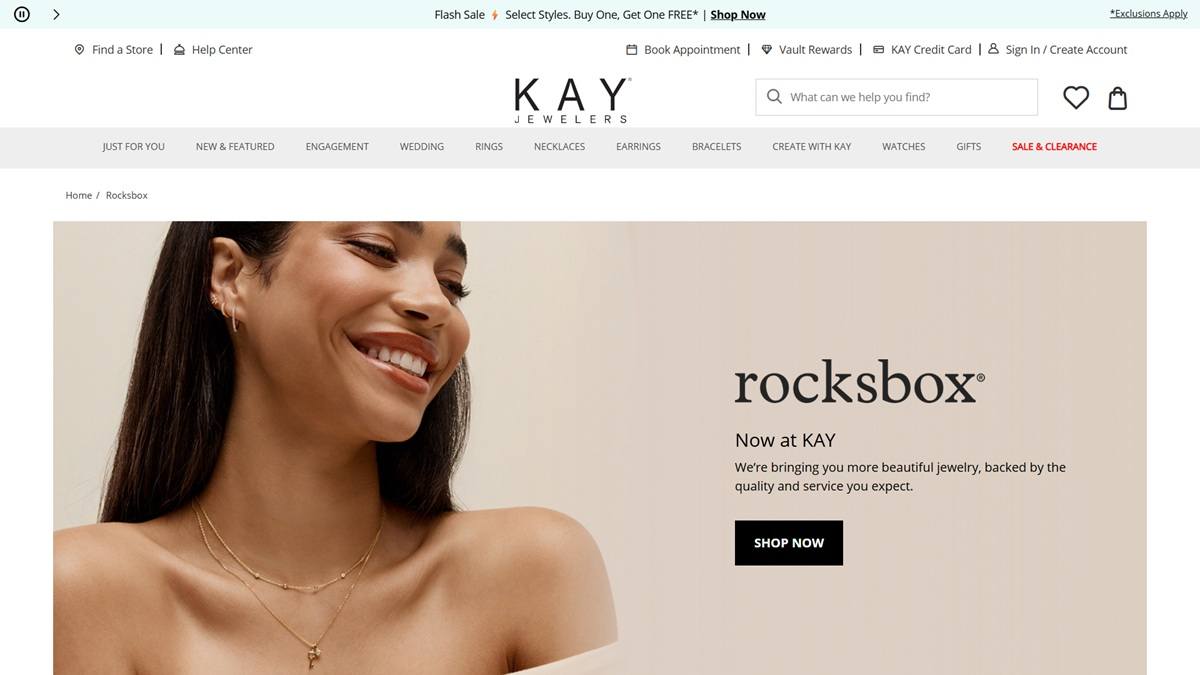
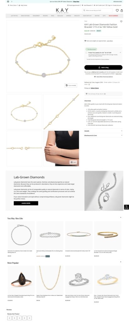
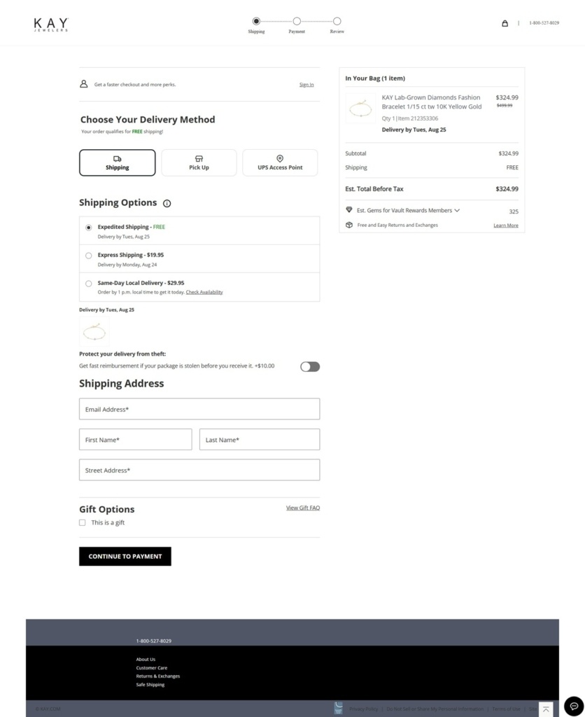
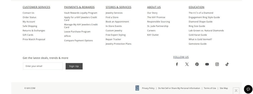
Rocksbox’s site is stylish and polished, with a clean layout, clear category navigation, and featured visuals that spotlight pieces in real contexts. Their product range is curated jewelry — rings, necklaces, earrings, bracelets — often from designer and conscious-material lines. The site blends commerce with brand story: emphasizing craftsmanship, designer collaborations, and sustainability alongside ease of shopping.
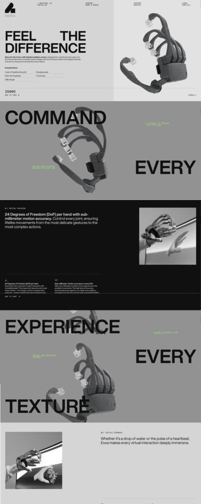
Haptikos’s website is polished, futuristic, and immersive, using bold visuals, large hero sections, and clean typography to invite exploration. Their flagship product is a high-precision exoskeleton glove system offering ~24 degrees of freedom per hand, sub-millimeter motion tracking, tactile feedback, and ~8-hour continuous usage.
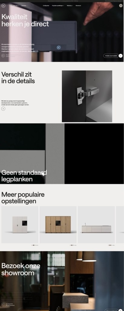
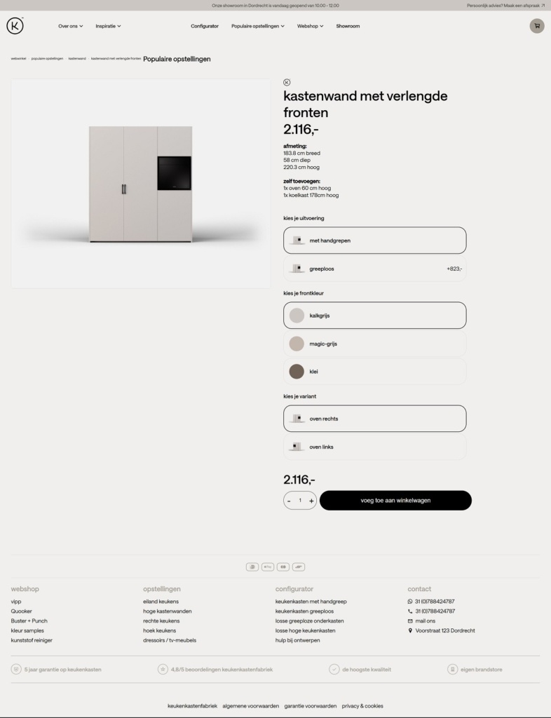
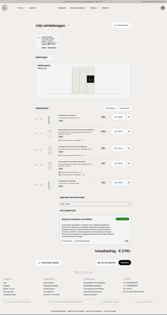
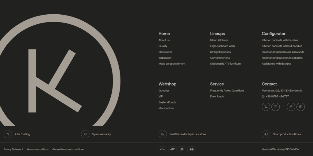
KeukenKastenFabriek’s website is modern and highly functional, with an interactive kitchen configurator, clean layouts, and emphasis on customization and transparency. Their product line centers on modular kitchen cabinets, full kitchen setups, and related accessories — all touted as factory-premounted and quality engineered.
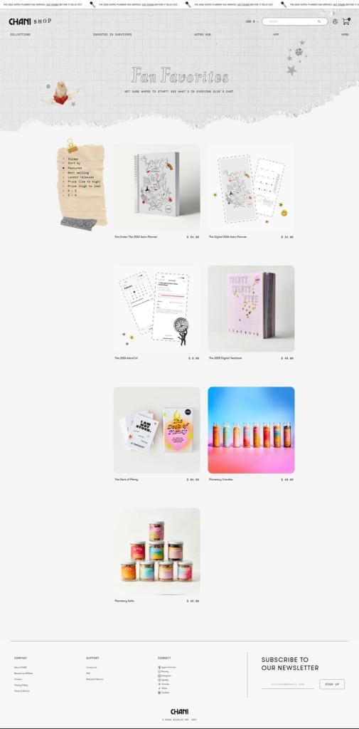
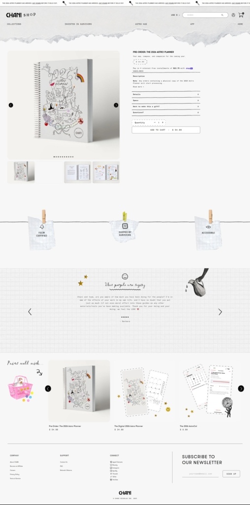
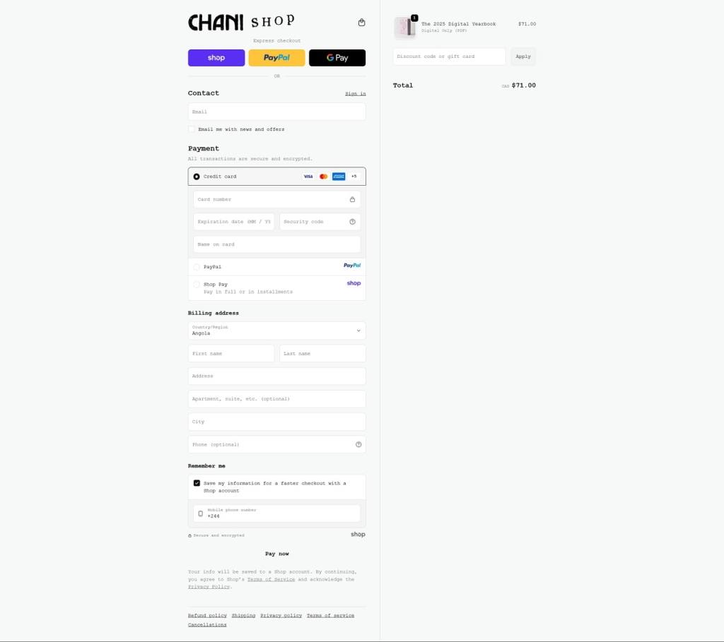
CHANI Shop presents a whimsical, beautifully designed site with strong visual storytelling: soothing colour tones, planetary & celestial motifs, and rich imagery that evoke ritual, astrology, and mindfulness. Their products are a curated blend of astrology-tools: planners & calendars, ritual items like candles & salts, decks & cards, plus stylish accessories. There’s also a strong values framing: responsibly sourced materials, sustainable packaging, ethical partnerships and a feel of magic + intentional living woven throughout.
HHHusher sells one piece of studio hardware: a patented hi-hat enclosure that clamps onto the stand and stops hi-hat spill reaching the snare microphone. The audience is studio drummers and recording engineers, with live and broadcast use as secondary cases. The catalogue is the enclosure plus three spare parts, priced in Canadian dollars and shipped to Canada and the United States. The front end is a custom Nuxt build running on Shopify for cart and checkout, with an English and French toggle in the header.
Website Design
Bone and near black. Two colours do almost all the work, a warm bone white and a near black charcoal, with a muted tan for the logo mark. Sections alternate between the two grounds, so the page reads as a stack of inverted panels rather than one continuous scroll.
Three typefaces, three jobs. Aeonik Black sets display lines at very large sizes, Universal Sans carries running copy, and Aeonik Fono, a fixed width companion, handles nav items, numbered labels and the specification tables. The Fono is small and upper case, giving the technical sections an instrument manual quality.
Numbered rather than listed. Content is indexed throughout: 01 Studio, 02 Live and 03 Broadcast for use cases, 01 to 06 for microphone setups, 01 Product and 02 Features for the FAQ. Each block pairs a photograph on a flat ground with a short paragraph and a Discover More link.
Shopping Experience
One page holds the catalogue. There is no collection grid. Products sits at a single URL carrying the enclosure, its description, a review wall and a specification table covering dimensions, weight, materials, compatible hi-hat diameters and stand post sizes.
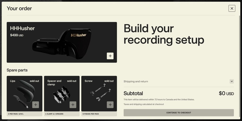
An order drawer built as a configurator. Adding to cart opens a panel headed Build your recording setup, with the enclosure at the top and the three spare parts as tiles beneath it. Each tile carries a plus button, a pack description and, where it applies, a sold out label in place rather than a hidden listing, so accessories are chosen in the same step as the main unit.
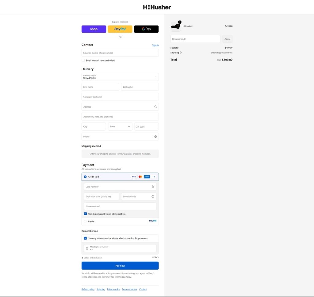
Stock Shopify checkout. Express buttons for Shop Pay, PayPal and Google Pay sit above the contact and delivery form, with card fields, a discount code box and the order summary held to the right.
Brand Storytelling
The problem before the product. The FAQ opens by defining hi-hat bleed, then explains the inversion behind the design: instead of isolating the snare microphone from the hi-hats, the enclosure isolates the hi-hats from the microphone. The patent is credited to that idea.
Engineering shown as constraints. Separate blocks cover the convex inner panels, the frequency specific damping materials, the side clamp system and the Velcro neoprene lip system, down to the note that the lips can be trimmed with scissors.
Notable Features
A microphone setup carousel. Six named placements, from Side Address to Stereo Source Snare, each get a photograph and a note on why the position works with the enclosure fitted.
Named endorsements. Testimonials run under Real Drummers. Real Results. and carry full names of drummers and engineers.
Bilingual and compact. A French version sits at /fr, and the whole site is four routes: overview, products, FAQ and terms of use.
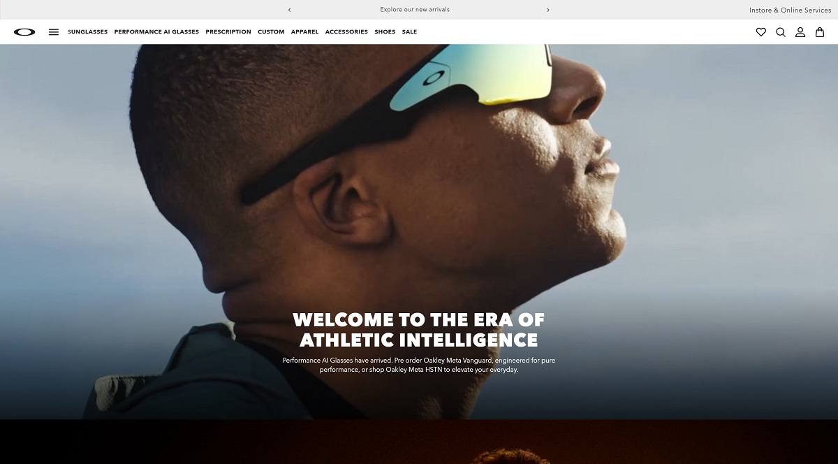
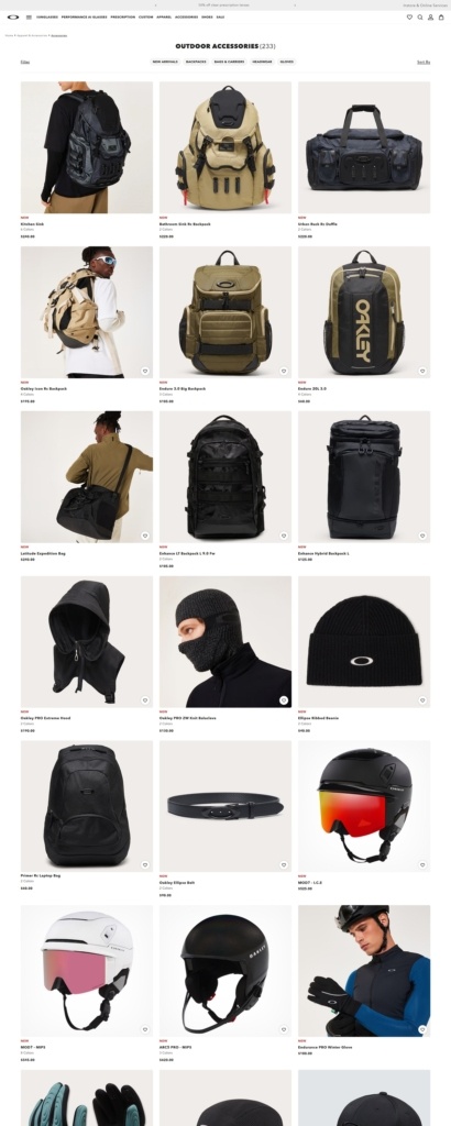
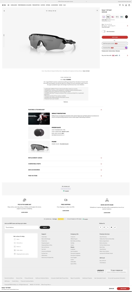
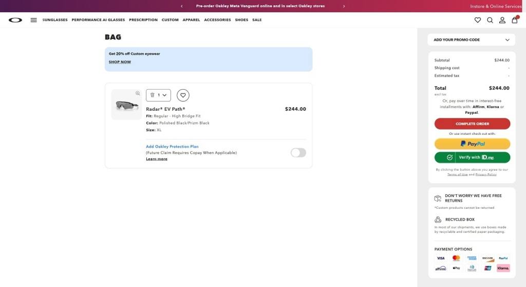
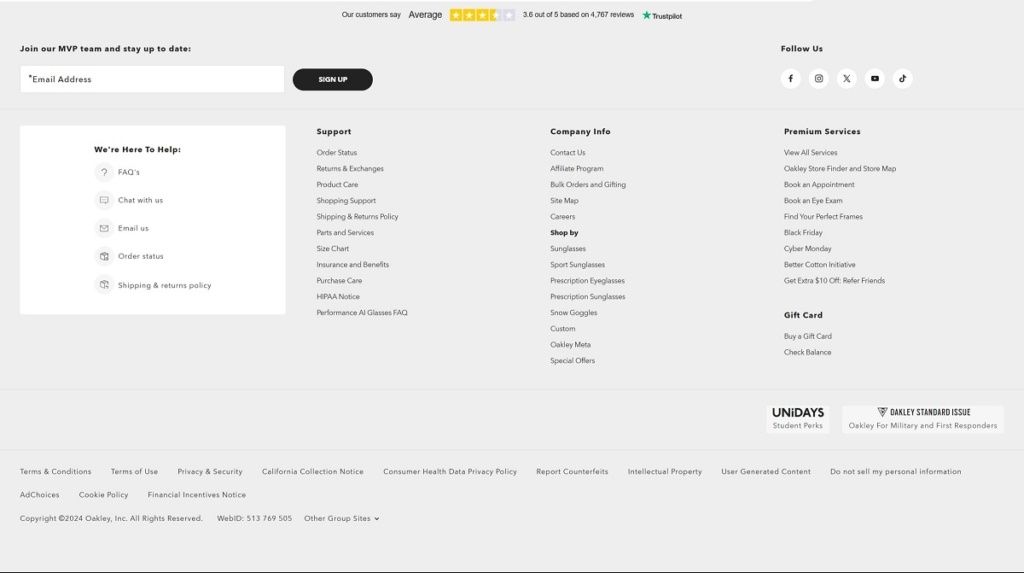
Oakley’s website features a sleek, performance-driven design with bold visuals and simple navigation by sport or category. The brand focuses on premium eyewear like sunglasses, prescription frames, and sport goggles, while also offering apparel, helmets, and accessories. Innovation stands out through technologies such as Prizm™ lenses and custom frame options, blending high performance with style.
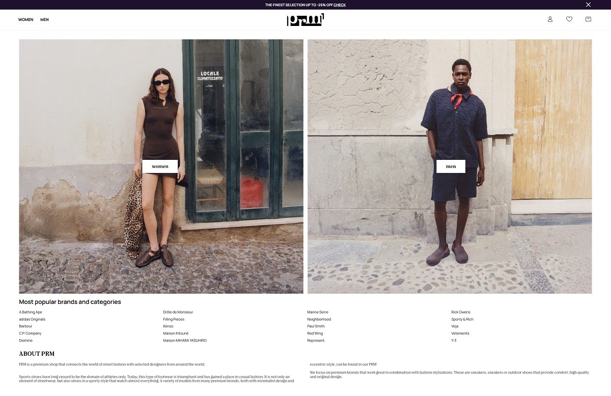
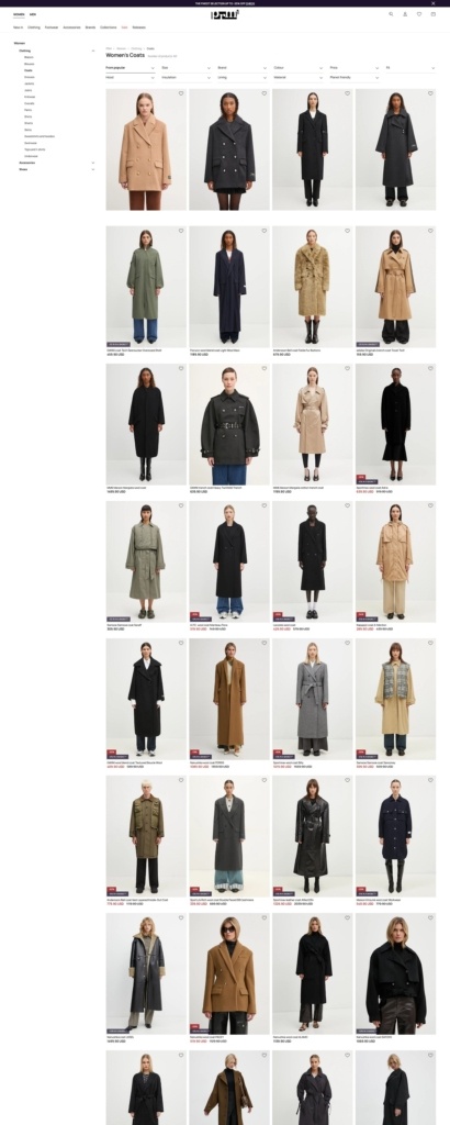
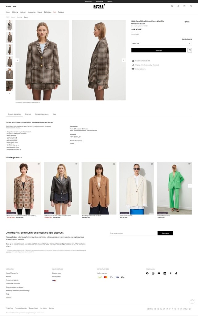
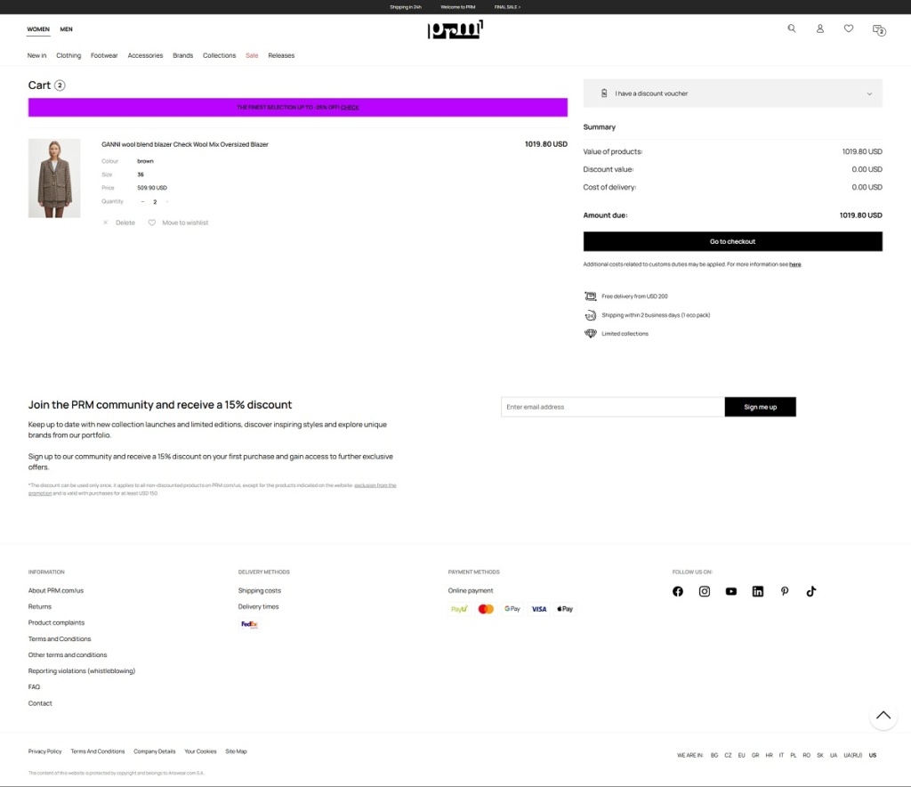
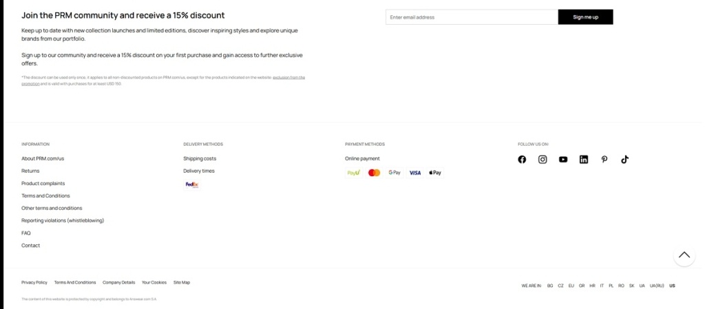
PRM offers a curated selection of premium streetwear and fashion pieces—sneakers, apparel, and accessories—from high-end brands like adidas, Birkenstock, Vetements, and more. The website features clear category navigation, strong visual hierarchy, and large product grid layouts with high‑quality images, making it easy to explore by brand, style, or trend.
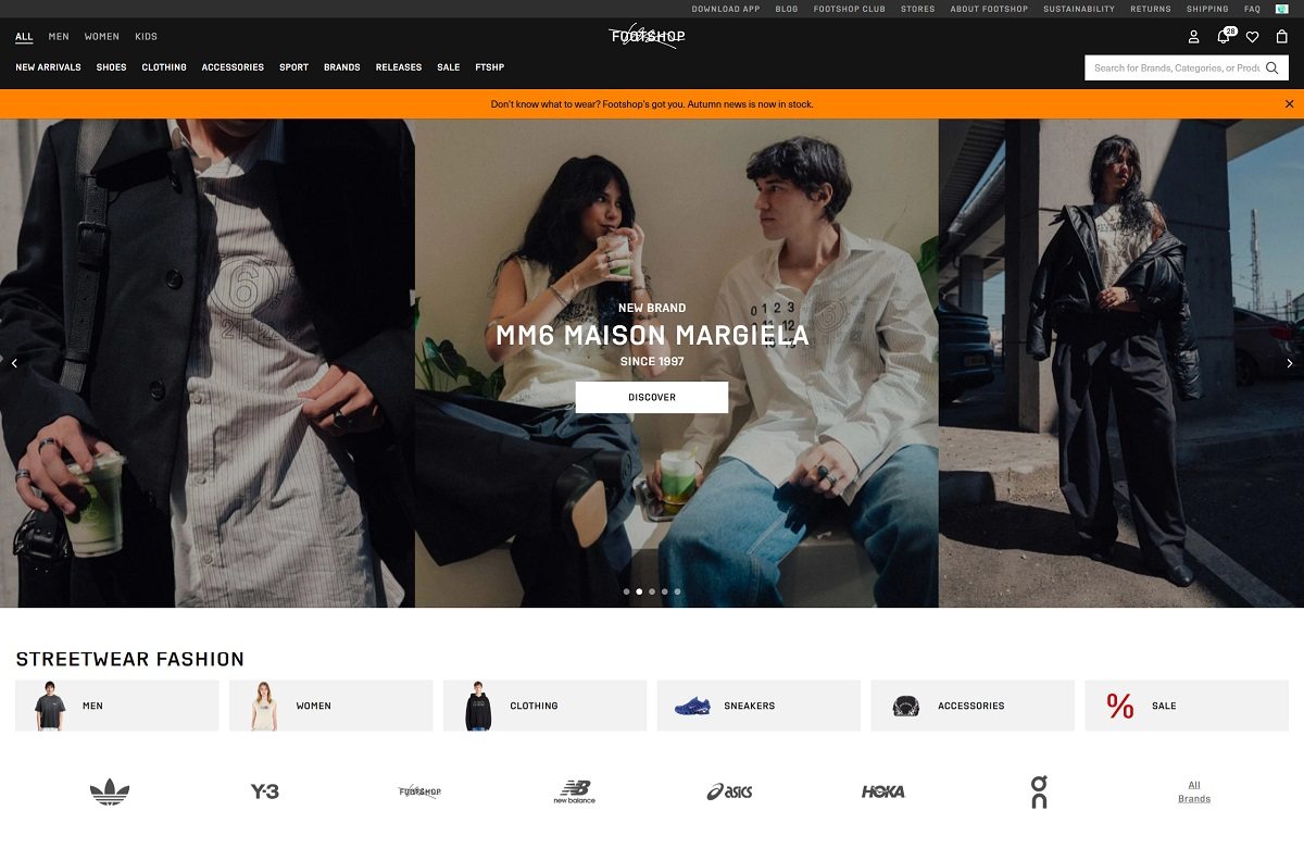
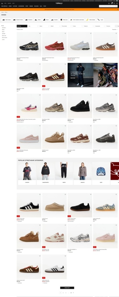
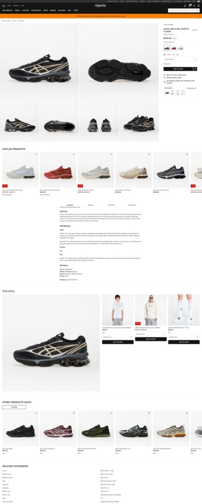
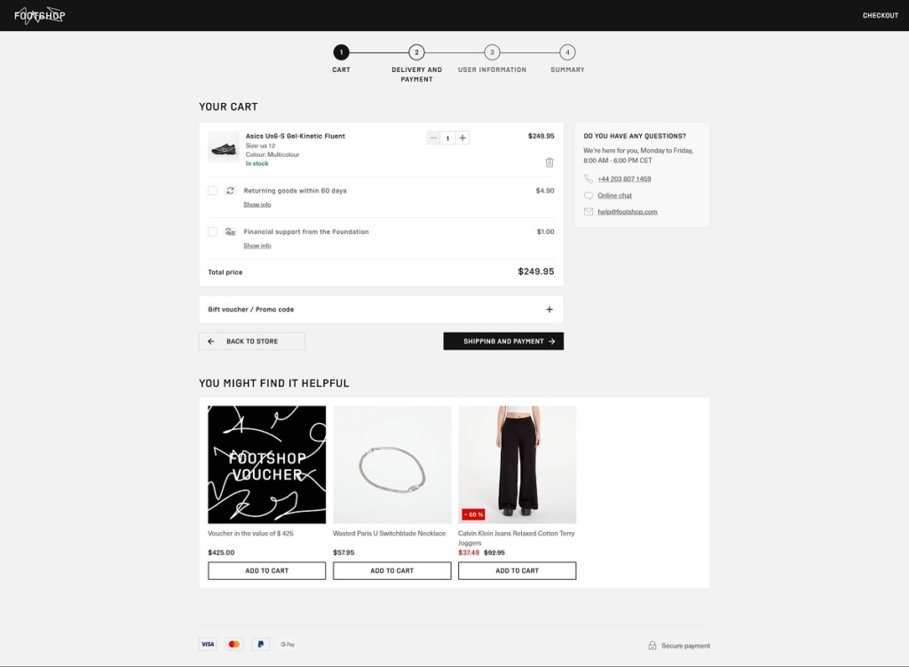
Footshop offers a wide selection of sneakers, streetwear, and accessories from premium and limited-edition brands like adidas, Converse, Vans, and New Balance. Their website uses a clean, modern layout with strong visuals, intuitive filters (by brand, style, sale, etc.), and high‑quality imagery that highlights product details. The design reflects a culture‑driven aesthetic, bridging subcultures and fashion through well‑curated collections and engaging drop campaigns.
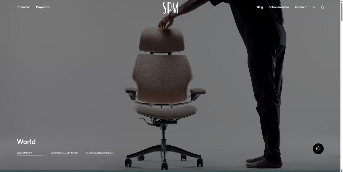
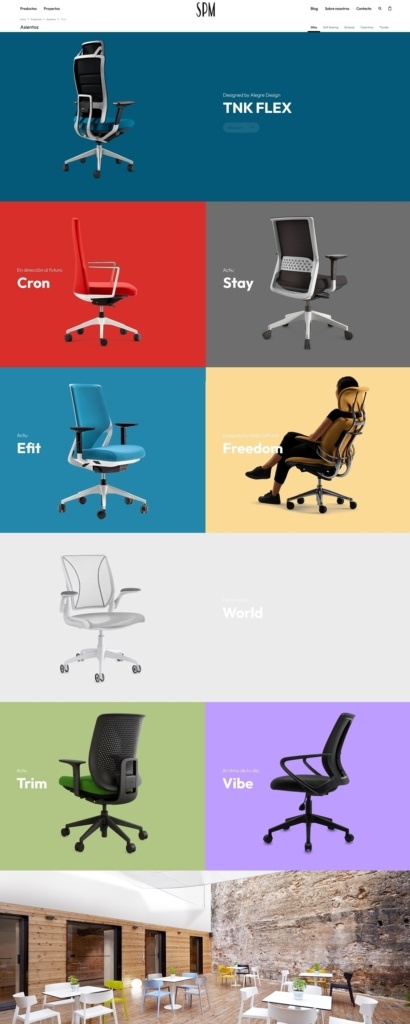
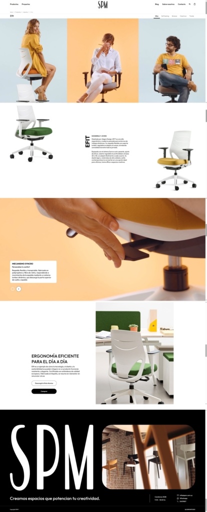
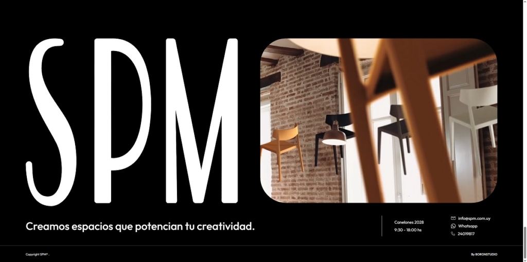
SPM specializes in interior architectural products like seating, storage solutions, acoustic panels, and modular flooring, often featured in high-profile projects such as theatres and corporate spaces. Their website showcases these offerings with a refined, professional aesthetic—featuring clean, modular layouts and structured navigation that seamlessly guides visitors from product categories to architectural case studies. High-quality visuals and focused storytelling underscore SPM’s dedication to ergonomic design and creative spatial solutions.
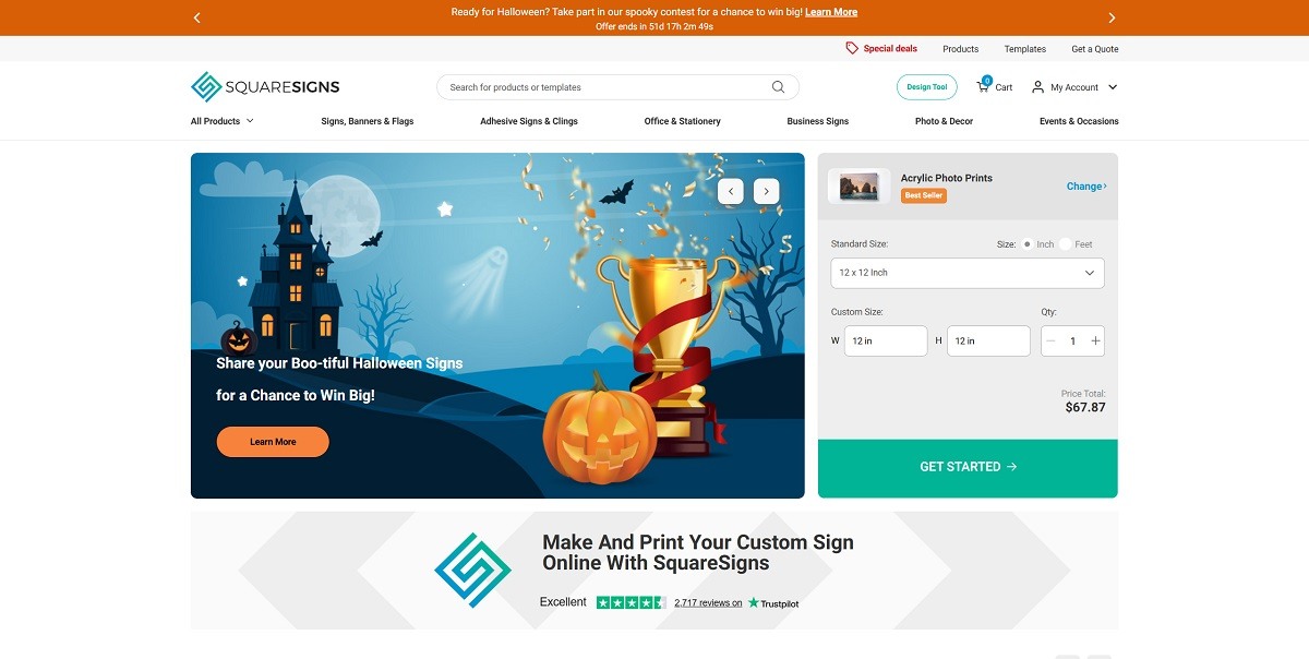
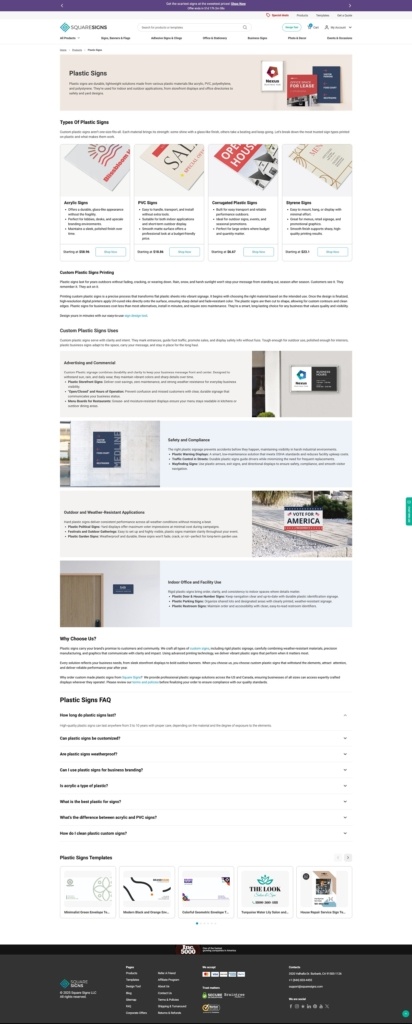
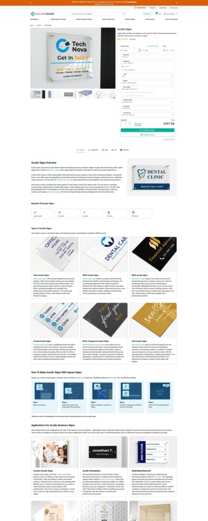
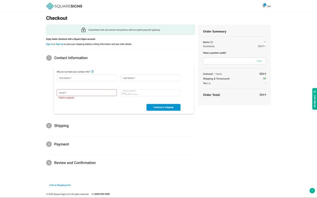
Square Signs enables you to design and order over 90 types of custom signage—from yard signs and banners to decals, acrylic prints, and event displays. Their website features a clean, modular layout paired with an intuitive drag-and-drop design tool, hundreds of editable templates, flexible size options, and live preview capabilities.
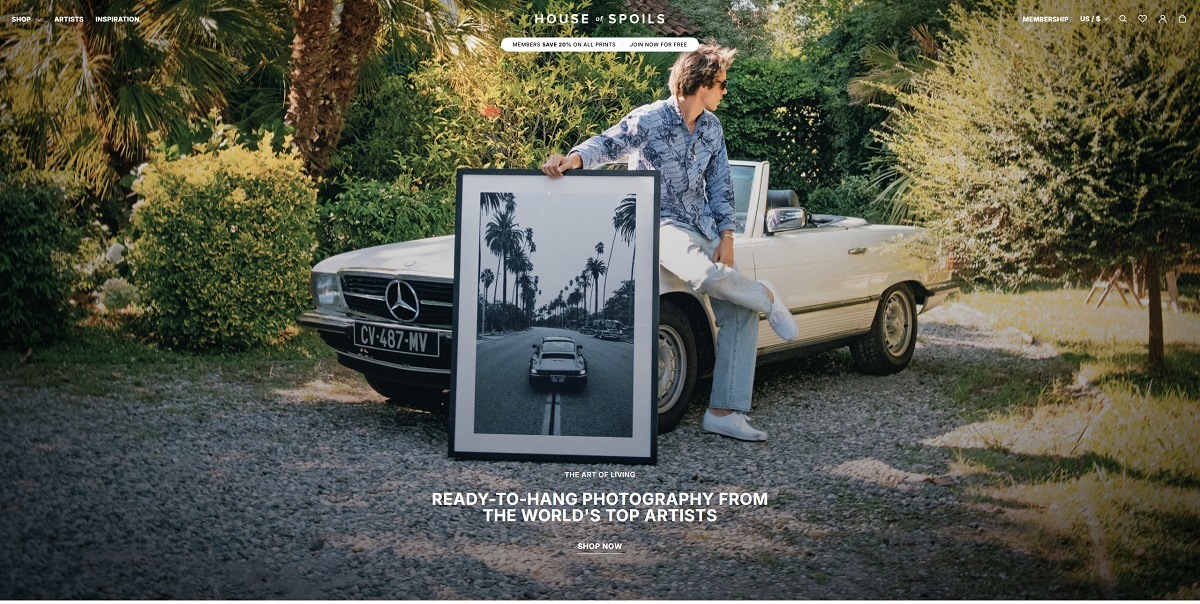
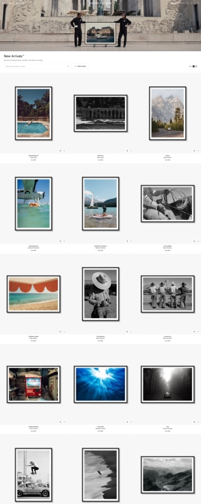
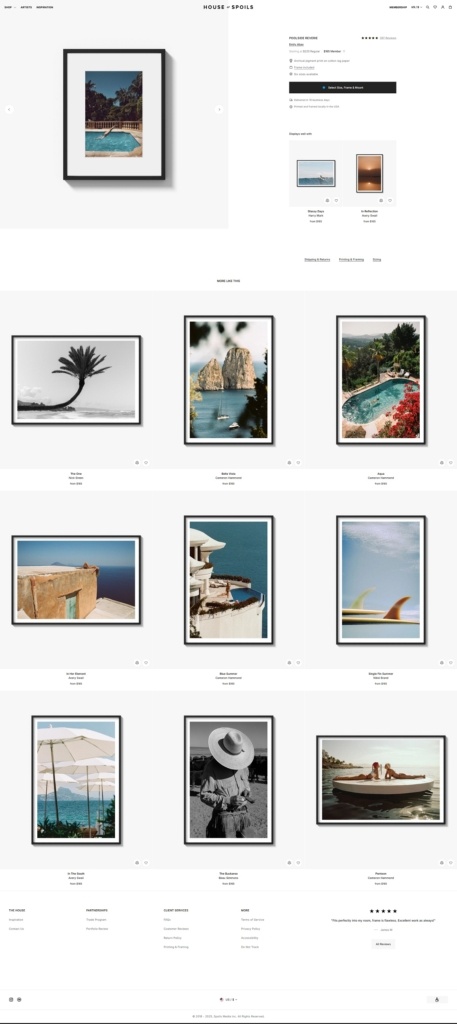
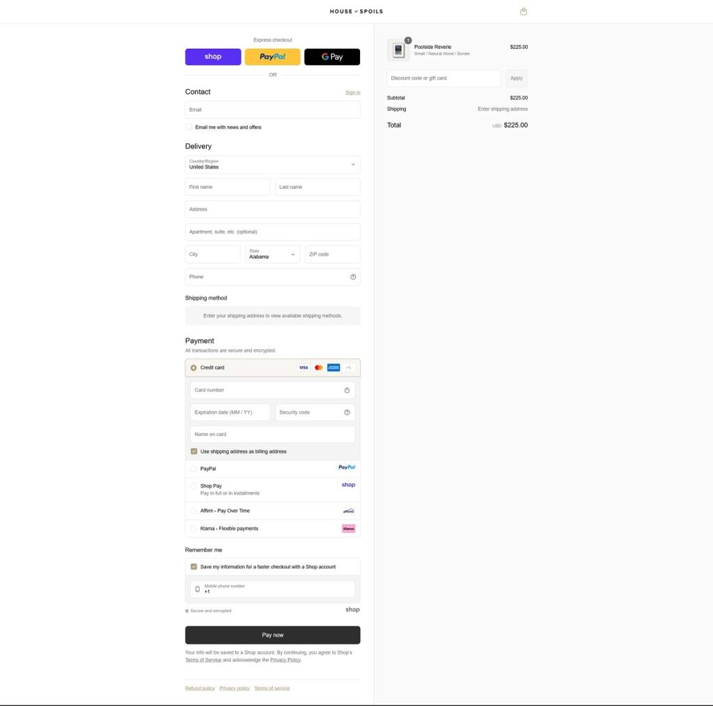
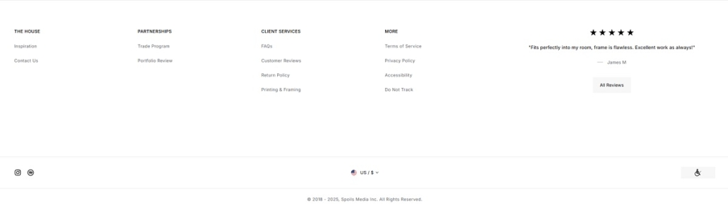
House of Spoils offers a beautifully curated collection of ready-to-hang, framed photography prints from leading global artists, plus select apparel and gift cards. The website features a clean, modular layout with high-resolution visuals, category filters (like themes and artists), and an elegant design recognized for enhancing UX and artistic storytelling. Membership perks, immersive campaign galleries, and editorial touches invite exploration and reinforce the premium, artful experience.
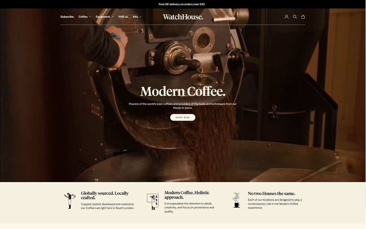
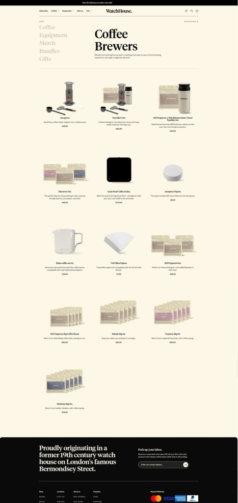
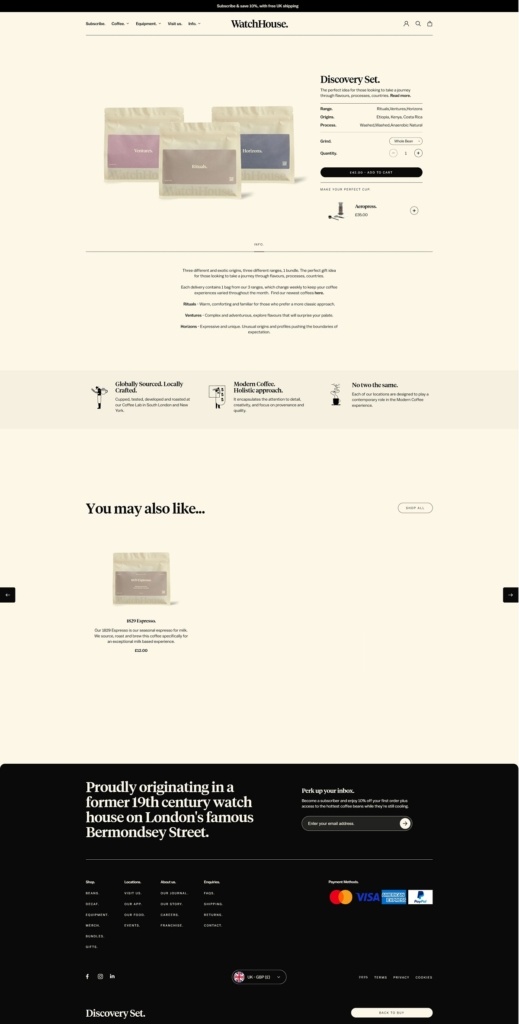
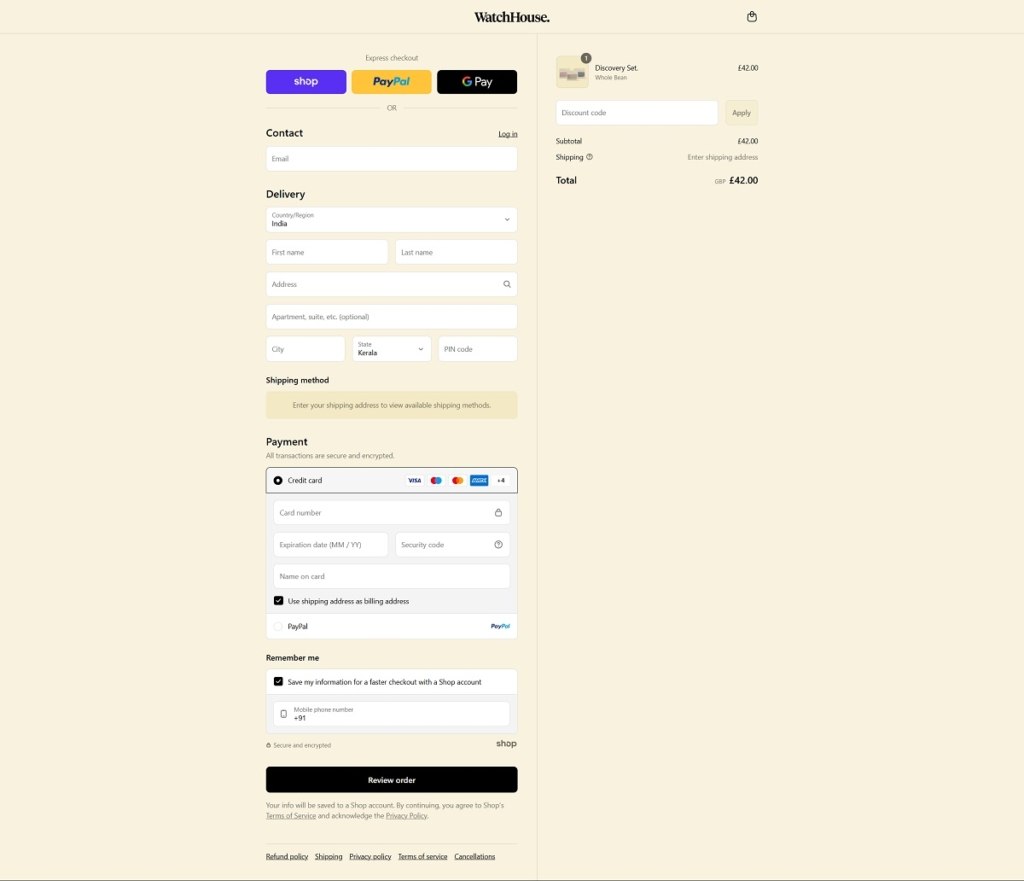
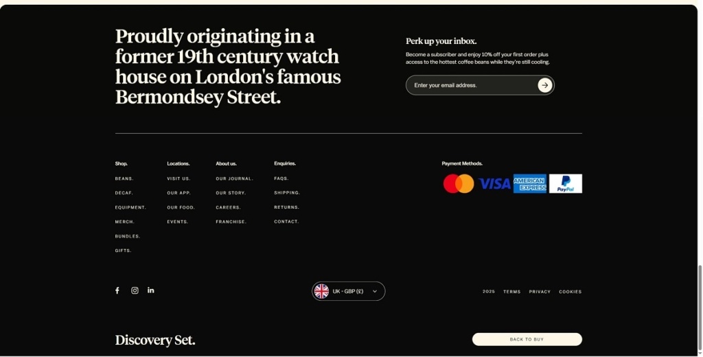
WatchHouse presents a premium coffee experience through a beautifully designed website with elegant typography, subtle animations, and high-res visuals. Products include specialty coffee beans, brewing gear, subscriptions, and branded merchandise. The site is easy to navigate with clean layouts, intuitive filters, and strong storytelling. It mirrors the brand’s modern café aesthetic with a refined, immersive digital feel.
Shop Category Page Example
Product Page Example
Checkout Page Example
Footer Example
Join our community for the latest trends and ecommerce tips.

 By Jibin Kumar