Archives: Websites

eCommerce Websites

Elisabet

We are talking about the family, profession, tradition of the three Vallasciani brothers who founded and consolidated the Elisabet shoe factory and the generation of the children who collected the heritage, preserving the beating heart of the company, taking care of its evolution and projecting it into the future.

Future Fonts

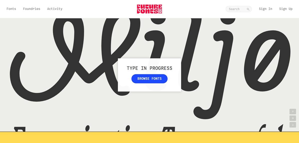
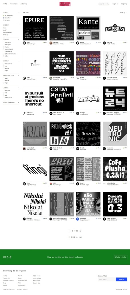
Future Fonts sells typefaces that are still being drawn, letting buyers license and use a font while its designer continues to refine it. The premise is stated on the shop page itself: “Everything is in progress.” Fonts are tracked by status, In Progress, Finished or Dormant, and by version number, so a face like Epure shows as v0.1 while Tekst or CSTM Xprmntl carry higher numbers. The site credits foundry Vectro as its creator. Built as a custom web application rather than a template storefront.

Website Design

Black-on-white grids with one green accent. Type specimens are shown as square black cards holding the typeface’s own name in white, arranged in a dense grid; a green promotional banner across the footer is the site’s only strong color. Interface type runs in Helvetica Neue, with a custom monospace face, VCTR Mono Web, used for labels and metadata.

The product itself is the visual. Rather than lifestyle photography, every card and every product page is built from the typeface in use, headline-sized, so browsing the shop is also a way of sampling each font.

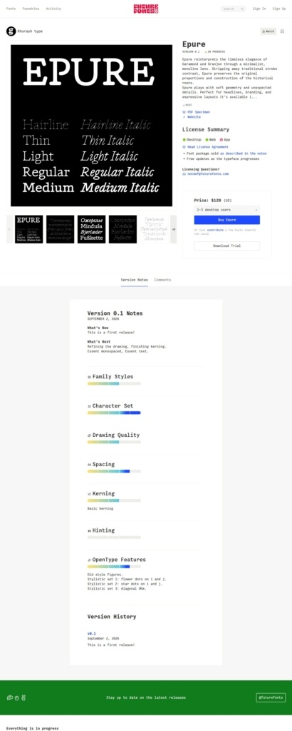
Version history kept visible on the page. A typeface’s product page runs its own changelog, for example “Version 0.1 Notes” with a dated entry, “What’s New” and “What’s Next” summaries, and progress bars for family styles, character set, spacing and kerning.

Shopping Experience

Filter by what a font can do. The shop page filters by Status, Category (Sans, Serif, Script/Brush), Features (Variable, Monospace, Italic, Icons/Emoji, Optical Variants, Color), Suggested Size and License, a structure built around typographic properties rather than simple alphabetical browsing.

Buy in progress, not finished. The Epure product page prices the font at $120 for 1 to 3 desktop users, with a License Summary showing Desktop, Web and App options, a Download Trial button beside Buy, and a note that “Font package sold as described in the notes.”

Progress reported like a product roadmap. Each font’s Drawing Quality, Spacing, Kerning, Hinting and OpenType Features are each shown as a separate progress indicator, so a buyer can see exactly how finished the typeface is before paying.

Brand Storytelling

The name is the pitch. “Future Fonts” and the repeated line “Everything is in progress” frame every purchase as backing a typeface’s development rather than buying a finished product, a positioning distinct from a standard type shop.

A foundry of foundries. Rather than one in-house team, listings credit independent type designers and studios by name, crediting the platform itself as “Created by Vectro” in the footer.

Notable Features

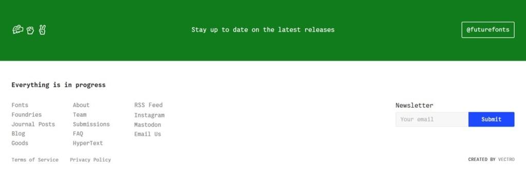
Update notifications by design. A newsletter signup in the footer is framed specifically as a way to “stay up to date on the latest releases,” tying communications directly to the in-progress model.

A public roadmap for the platform. Footer links to Journal Posts, a Blog, Submissions and an FAQ suggest an active editorial and contributor pipeline sitting behind the shop itself.

Foundries browsable as their own section. A dedicated Foundries link in the main navigation lets shoppers browse by studio rather than only by individual typeface.

Future Fonts Shop page example

Future Fonts Product page example

Future Fonts footer example

LN-CC

LN-CC is a progressive, innovative and conscious retail concept. Existing in both a physical store space, housed within an art based installation and an online store that echoes the same attention to detail and forward thinking approach, LN-CC presents its own individual interpretation of luxury, redefining the perception of modern retailing in a personally curated and considered way.

Jacamo

Jacamo is a UK menswear retailer selling clothing in sizes S to 5XL, spanning casualwear, formalwear, footwear and accessories from its own label and named brands such as Polo Ralph Lauren, BOSS, Tommy Hilfiger and Tommy Jeans. The company trades under J D Williams and Company and runs its own store credit product, Jacamo Pay. The live site blocks automated access, so this description is drawn from the gallery screenshots below, whose footer capture reads “(c) Jacamo 2026,” matching the current year.

Website Design

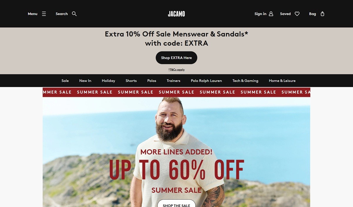
A black header over a light grid. The site runs a black top navigation bar against an off-white product grid, with a bold sans headline typeface used for the logo and section titles.

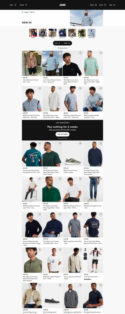
Dense, image-led category grids. The New In category page shows several rows of four-across product photography, each card carrying a heart/save icon, a price and a product name beneath the image.

A promotional banner breaks the grid. A full-width dark banner for Jacamo Pay, reading “Pay nothing for 6 weeks” with a 44.9% APR variable notice, interrupts the product grid partway down the page, mixing credit marketing directly into browsing.

Shopping Experience

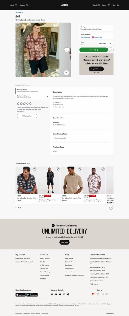
Product pages built around size guidance. The captured example, a GBP45 Only & Sons Bart Crochet Shirt, shows a size guide link, a “Select size” step before adding to bag, and a “Viewed X times in the last 12 hours” social proof line.

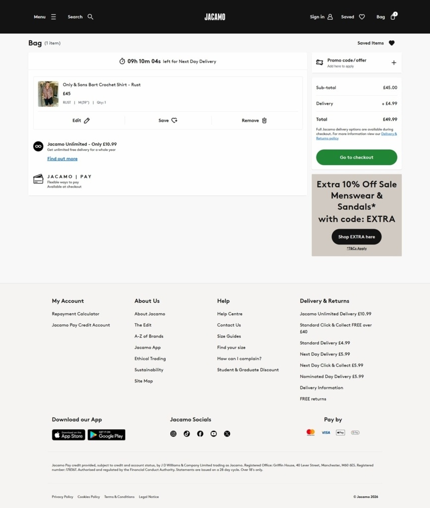
Delivery options shown at the bag. The bag page lists Jacamo Unlimited annual delivery at GBP10.99, next to standard delivery at GBP4.99 and next-day options at GBP5.99, all visible before checkout starts.

Discount codes layered on sale pricing. An “Extra 10% Off Sale Menswear & Sandals” code banner appears on both product and bag pages, stacked on items already marked down, for example GBP175 cut to GBP99.

Brand Storytelling

Size range stated as the reason to exist. The brand states it exists “to provide nothing but legendary style choices to today’s modern man,” in sizes S to 5XL, framing size inclusivity as the core proposition rather than a footnote.

Everyday occasions over aspiration. Copy centres on “evenings and weekends” rather than aspirational lifestyle imagery, keeping the tone practical and plain spoken.

Notable Features

A dedicated credit account. Jacamo Pay is built into checkout as a regulated credit product, stated as subject to the Financial Conduct Authority and restricted to customers over 18, rather than routed through a third-party provider.

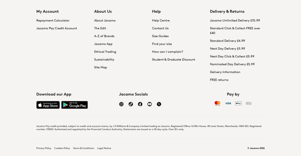
App and policy links in the footer. The footer promotes a dedicated app, available on the App Store and Google Play, and links out to Ethical Trading and Sustainability pages alongside the standard account and help sections.

A repayment calculator under My Account. Alongside standard order history, the My Account footer column links to a repayment calculator, reinforcing that Jacamo Pay credit is treated as a core account feature rather than an optional add-on.

Jacamo Shop Category page example

Jacamo Product page example

Jacamo Checkout page example

Jacamo footer example

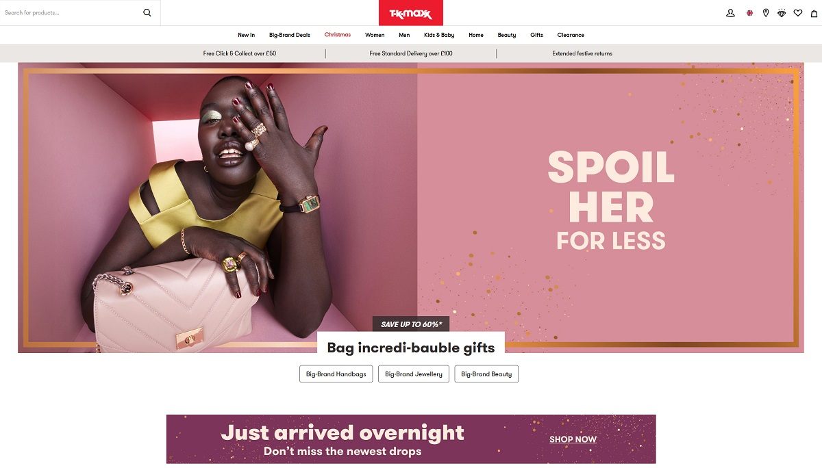
TK Maxx

TK Maxx is an off-price retailer offering a wide range of products, including fashion for men, women, and children, as well as homeware, beauty items, and gifts. Their inventory features designer and brand-name merchandise at prices up to 60% less than the recommended retail price. The website has a clean and user-friendly design, with intuitive navigation that allows customers to easily browse various categories and discover new arrivals.