Eckō Unltd. is an American-based brand of urban lifestyle clothing and accessories founded by Marc Milecofsky, a fashion designer.
Ecko Unltd.


eCommerce Websites
Eckō Unltd. is an American-based brand of urban lifestyle clothing and accessories founded by Marc Milecofsky, a fashion designer.
Element is a skateboard brand founded in 1992 that now sells skate hardware alongside men’s, women’s and youth clothing, footwear and accessories. The store describes itself as “a streetwear brand with Skateboarding at its roots”. It runs on Salesforce Commerce Cloud with a region switch covering seventeen countries, each a localised storefront, and product pages name the loyalty scheme as the Boardriders Europe programme.
Greyscale with a single brand red. The interface is built on a near black #181818 and a grey ladder through #565656, #8B8B8B, #E5E5E5 and #F8F8F8. Red #B12534 carries the logo and sale flags, with green #039855 held back for stock states.
Poppins for everything, one display face above it. Poppins sets navigation, body copy, prices and buttons across the whole site. A second face, Styleash Global, appears on campaign headings, and an in house icon font handles the interface glyphs.
Editorial blocks in place of a homepage feed. The homepage stacks full width campaign panels, collaboration tiles and a skateboard section split into Complete Skateboards, Decks and Wheels, then hands off to filtered category pages rather than showing product cards.
A deep catalogue with deep filters. Men’s clothing alone returns 514 results. Filters cover colour, size, type of product, a price slider spanning 4.00 to 176.00 pounds, and a sustainability group of Organic, PFC Free and Recycled. Sorting offers price and best sellers.
Tiles carry four signals at once. Each card shows a New arrival flag where it applies, a number for available colourways, a material tag such as organic cotton, then the product name, a one line descriptor and the price.
Product pages front load compliance and delivery. A polo page shows the price, a size row from XS to XL, an out of stock state on the selected colour, an Eco-Bonus loyalty line, a dated delivery estimate, an Environmental Footprint panel and a features block listing style code, fabric weight and fit.
Membership is the shipping offer. Free shipping and free returns are attached to the My Element programme rather than to an order threshold, returns run to thirty days, and return labels are free for members.
Skateboarding is kept structurally, not decoratively. Skateboards is a top level menu holding Complete Skateboards, Decks, Wheels, Bearings, Trucks, Grip Tape and Flat Bar and Rails, sitting beside Team, Blog, Lookbook and a set of Product Guides.
Sustainability behaves as a filter, not a manifesto page. Conscious By Nature appears as a shoppable collection inside men’s, women’s and youth, then returns as a filter facet and again as a per product material tag.
A seventeen country region switch in the footer. Countries are grouped as Americas, APAC and Asia, and Europe, with each entry leading to its own storefront and currency.
Collaboration ranges get navigation, not banners. Element x Floor, Element x Timber, Element x Gabriel Alcala, Icon and Lowcase are menu entries inside the gender categories rather than homepage tiles.
Service is routed before it is asked for. A Need help panel gathers order access, shipping, returns, payment, gift card and data protection links, with a live chat entry and an FAQ beneath it.
Rivendell Bicycle Works are selling lugged steel bicycle frames, wool cycling clothes, cotton bike luggage and leather saddles ever since 1994.
Tradestone Confections are artisan chocolates, delicious confections & gourmet goodies handcrafted in Conshohocken, PA, by Chefs Chip Roman and Fred Ortega.
Spurcycle is a San Francisco bicycle accessories startup, focused on making everyday cycling more every day.
Atelier de l’Armée are offering products that are well constructed and skillfully crafted with fine regard for detail.
Maison Kitsune is a French / Japanese record label and clothing brand.
Started in Soho, London in 1996, the Kokon To Zai Multi-brand and music store destination quickly became a creative hub of activity, and gained a following for the unique pieces it sold.
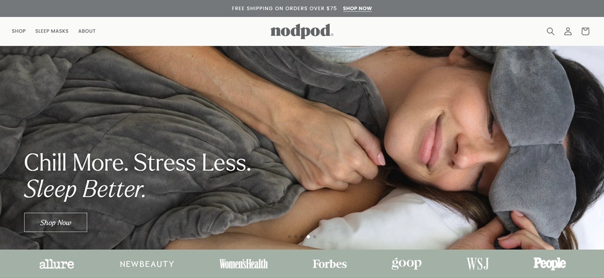
Nodpod sells weighted sleep and wellness accessories built around a Deep Touch Pressure premise, led by a weighted eye mask and extending into a weighted body wrap, silk pillowcases and smaller accessories, aimed at buyers seeking stress relief and better sleep. Built on Shopify.
Assistant carries both headings and body. The site uses a single typeface, Assistant, across display and running text, a restrained choice that keeps headline and body type close rather than contrasted.
An off-white base with muted accent color. Pages sit on a warm off-white ground (#fafaf9) rather than pure white, with body copy in a soft charcoal gray, letting color arrive mainly through product swatches rather than a fixed brand hue.
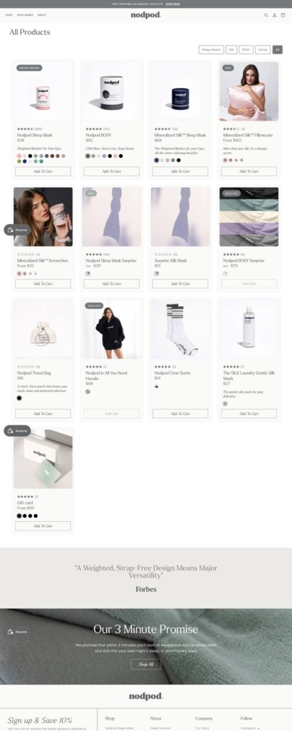
A wide, muted palette across variants. Product swatches span sage green, blush pink, sand, mustard, muted purple, olive and deep brown, a range wider than most single-product sites, used to differentiate mask and pillowcase colorways.
A narrow core range with one extension. The Sleep Masks category holds the Nodpod Weighted Sleep Mask at $38 and the Mineralized Silk Weighted Sleep Mask at $68, with a body-worn extension, Nodpod BODY, priced at $92.
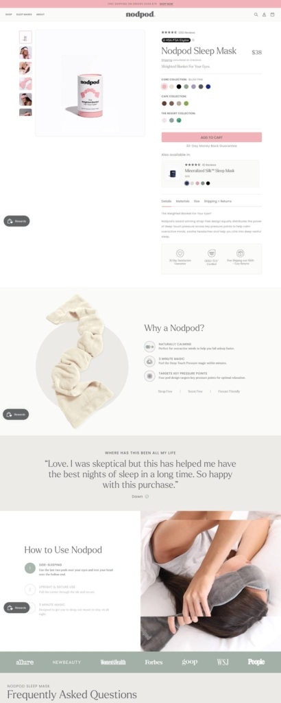
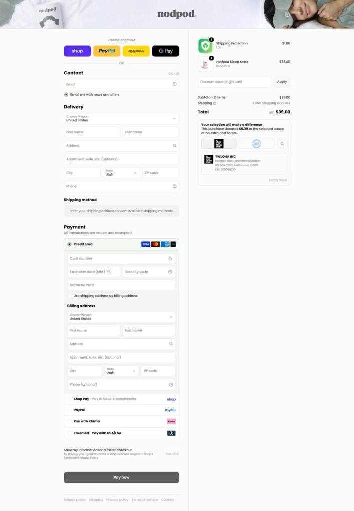
Reimbursement account support built in. Products are marked HSA and FSA eligible through Truemed at the point of purchase, rather than a policy mentioned only in an FAQ.
Standard thresholds stated plainly. Free shipping applies above $75, with a 30-day return guarantee stated in the same policy block, both common terms for a mid-priced accessories brand.
Deep Touch Pressure as the scientific anchor. Copy repeatedly returns to Deep Touch Pressure, the sensory principle behind weighted products, used to justify both the eye mask and the newer Nodpod BODY wrap.
Trademarked descriptors used as taglines. The site refers to its mask as “The Weighted Blanket For Your Eyes” and the body product as “The Weighted Pod For Your Body,” both carrying trademark marks and functioning as explainer taglines rather than plain product names.
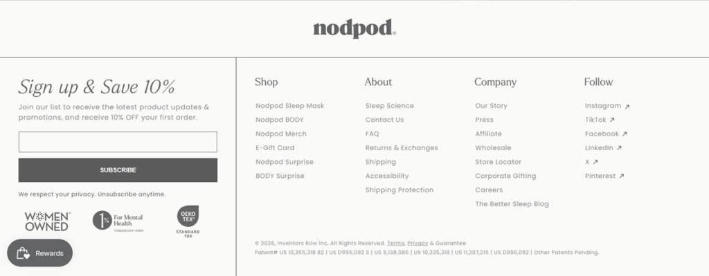
Founder and cause signals in the navigation. An About dropdown separates Our Story, Sustainability, Impact and Sleep Science into individual pages, and the footer states the brand is female-founded, with 1 percent of proceeds directed to mental health causes.
Press mentions used as social proof. The homepage cites placement in Allure, Vogue and the Wall Street Journal, a media-credibility signal rather than a customer review count.
Care instructions doubling as reassurance. The masks are stated as machine washable and the silk pillowcase line carries its own material and care notes, addressing a common hesitation with fabric-covered weighted goods.
OEKO-TEX certification stated on the product. Textile safety certification is stated as fact on the product pages rather than shown only as a badge, tying back to the wellness positioning of the goods themselves.
Founded in a Napa, California farmhouse in 2005 and now based in Silicon Valley, 100% PURE® is an organic cosmetics beauty firm focused on providing healthy skin care, color cosmetics plus bath and body products.
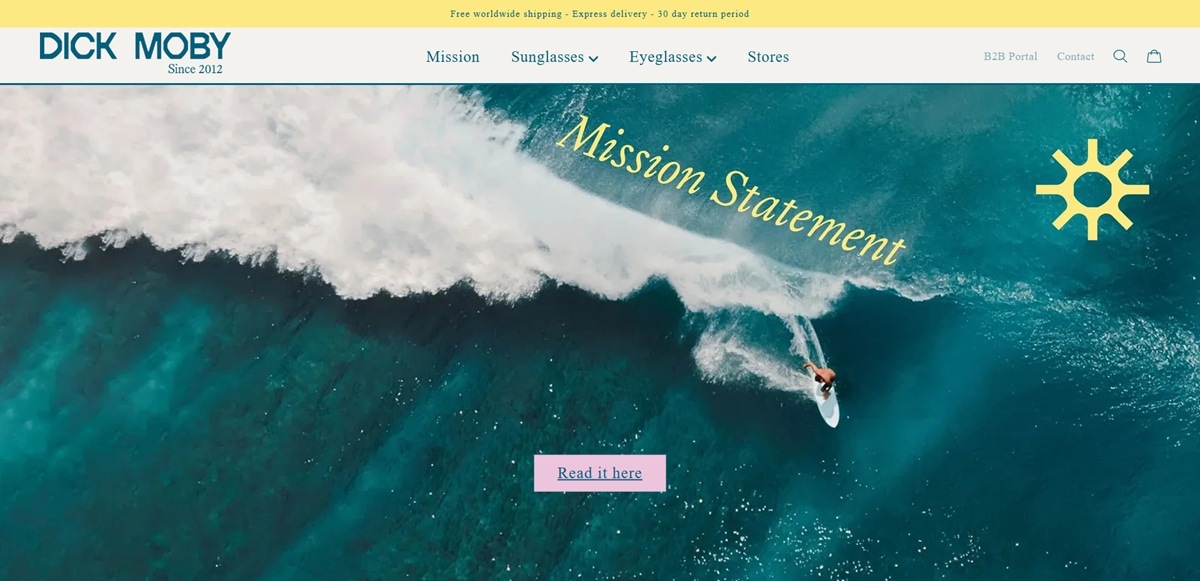
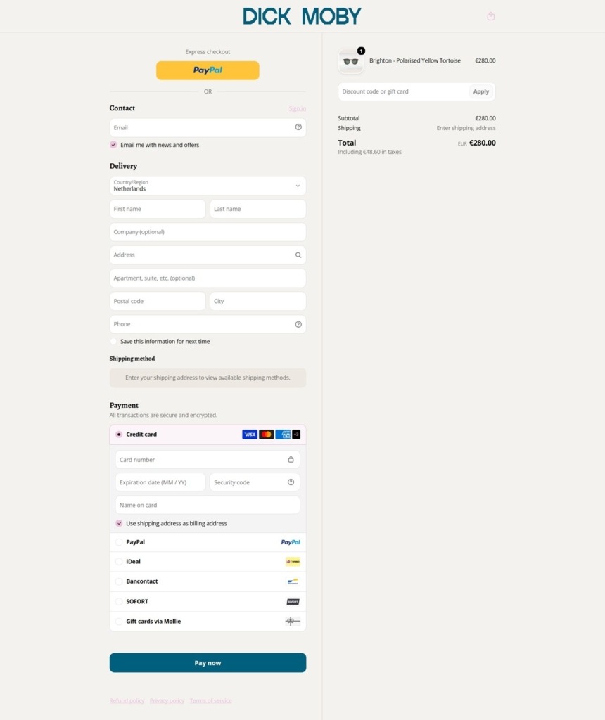
Dick Moby is a Dutch eyewear brand based in ‘s-Hertogenbosch, selling sunglasses and prescription eyeglasses made from biodegradable acetate, recycled acetate and recycled metal, handmade in Italy and fitted with ZEISS lenses. Frames run from about 109 euro in the sample sale to 275 euro in the current collection. The position is stated in the page title itself: waste nothing, see everything. Built on Shopify.
Avenir doing all the work. Both the heading and body families resolve to AvenirLT Pro Roman, one geometric sans in a single weight, with Assistant as the fallback. There is no display face and no serif in the system.
Dark navy ink on cream. Base text is set at rgb(22, 25, 58), a deep navy rather than black, against off-white grounds of #FCFAF6 and #FCFAED. A teal #005F7C and a green #00B495 appear on the mission content and nowhere in the shop.
Menus that explain as they navigate. The Sunglasses drop-down carries a lens panel inside it, stating that every pair has full UVA and UVB protection with anti-scratch and anti-reflective coating. The panel repeats in the mobile menu and in the eyeglasses drop-down.
Three filtering axes in one menu. Sunglasses and eyeglasses each split into men’s and women’s, then into shape (aviator, round, square, cat-eye, hexagon, oversized), then separately into material. Material sits beside shape as an equal way in.
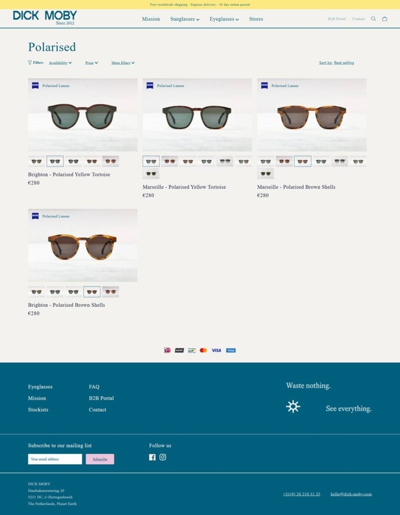
Colourways sold as separate products. Each finish is its own listing rather than a swatch on a shared page: Sydney in Dusk sky and Sydney in Milky Espresso are two products at 268 euro each.
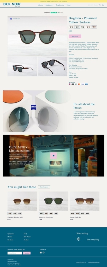
What comes in the box, stated in the listing. Every description ends with a fixed block naming the ZEISS lenses, a free recycled leather case and a free recycled PET pouch, then free shipping, a 30 day try at home and a full refund with no questions asked.
Measurements as plain numbers. Lens, nose and temple widths are given in millimetres on the product page, beside a virtual try-on control placed with the image gallery.
A mission section with figures attached. The homepage quantifies impact per thousand frames produced: 924kWh of energy, 263kg of CO2 and 5,000 litres of water saved against an industry average, credited to an external researcher working from the Ansys Granta Materials Data Library.
Certificates listed one by one. Bio-acetate as Mazzucchelli M49 tested to ISO 14855, recycled metal to Recycled Claim Standard 2.0, the ZEISS bio-nylon lens to REDcert2, the PET pouch to SCS Recycled Content and the leather case to OEKO-TEX each get a line.
A release schedule used as an argument. The brand states it runs one collection a year, reasoning that more frequent launches leave overstock in its warehouse or in the customer’s wardrobe.
Virtual try-on in the product gallery. A TRY ON control sits with the images rather than in a separate tool.
B2B portal in the top navigation. Wholesale access sits beside Stores and Contact instead of being buried in the footer.
Trustpilot near the cart. The rating widget sits by the cart drawer, not only on the homepage.
Project 7 are a specialty gum and mint brand dedicated to bringing great flavor back into your day while at the same time giving back to 7 areas of need.


