Summer Fridays is known for its line of skincare must-haves, including everything from lip balm to overnight moisturizing masks and cleansers. Clean, vegan, cruelty-free products
Summer Fridays


eCommerce Websites
Summer Fridays is known for its line of skincare must-haves, including everything from lip balm to overnight moisturizing masks and cleansers. Clean, vegan, cruelty-free products
Harper Wilde takes the B.S. out of Bra Shopping. Harper Wilde empower women by providing them with more fairly-priced products, at nearly half of what competitors charge.
Heist is a foundation-wear brand on a mission to support women everywhere, to inspire style with confidence and to leave no mark as we do so.
Super comfortable, breathable, everyday sneakers made from sustainable materials. Built to last—designed to be recycled.
Florence by mills is a clean beauty brand that is made for all skin types.
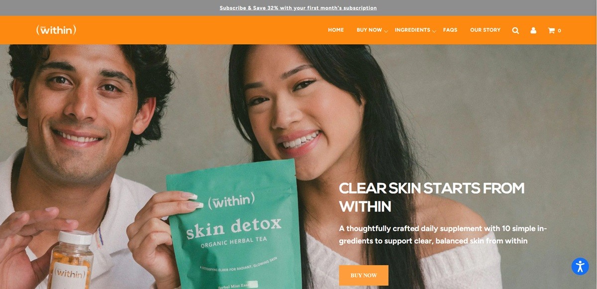
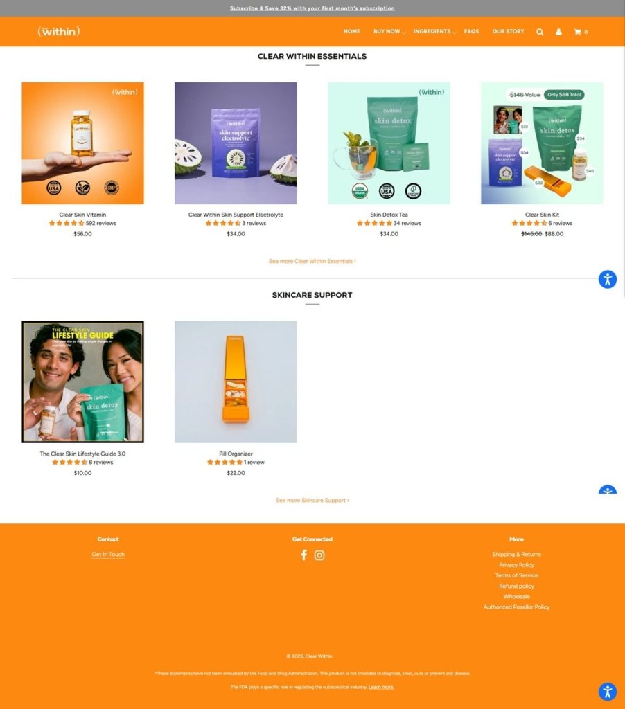
Clear Within is a US supplement brand selling an ingestible approach to acne: a ten ingredient daily capsule at $56, a six herb Skin Detox Tea at $34, an electrolyte powder at $34, a pill organiser at $22 and a downloadable lifestyle guide at $10, with a combined kit at $88. The hero states the proposition as “Clear skin starts from within”, aimed at buyers who have already tried topicals. Built on Shopify with a page builder over the theme.
Near-black type on white, orange for interaction. The stylesheet sets a soft near-black as the text colour against white and pale grey panels, with a single saturated orange reserved for stars, review controls and primary buttons. Nothing else in the palette competes.
Two type systems on the same page. The theme loads Figtree with Nexa Bold for display, but the page-builder sections hard-code Avenir Next inline on their text spans, so marketing blocks and theme furniture render in different faces.
Long scrolls built from stacked modules. Homepage and product pages alike are assembled from full-width blocks in sequence: a claim, a certification row, an explainer, testimonials, a capture form. Each is centred and separately grounded, so the page reads as a sequence of slides.
Six listings and a subscription default. The catalogue is small enough that the nav lists it in full under Buy Now. An announcement bar offers 32% off a first subscription month, and the buy box carries a ReCharge plan set to deliver every 28 days beside the one-time option.
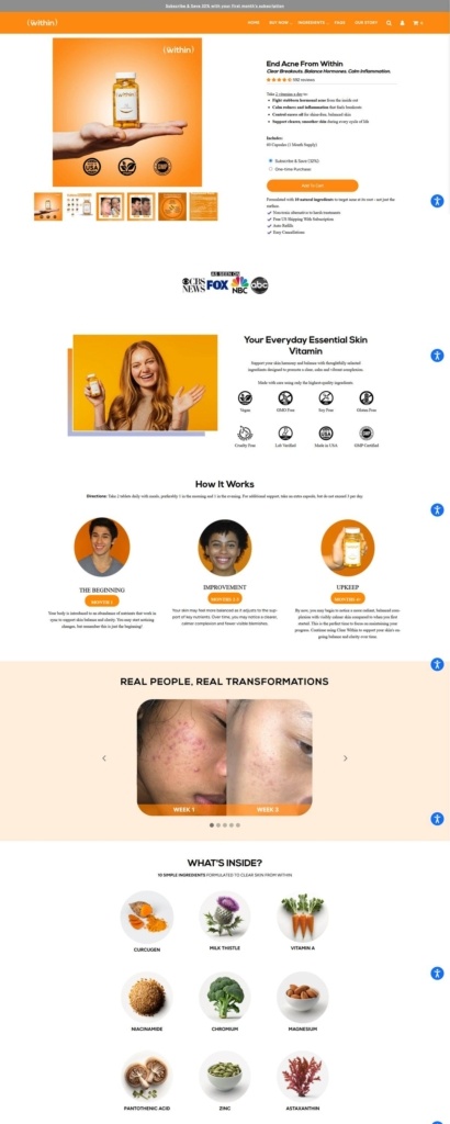
Ingredients treated as a section, not a label. A separate Ingredients menu item leads to per-product breakdowns. The capsule page names all ten components, from Curcugen and milk thistle through niacinamide, zinc, astaxanthin and selenium, and the tea page gives each of its six roots and herbs a line of explanation.
Expectations set on a timeline. Rather than a results claim, the page divides progress into Month 1, Months 2 to 3 and Months 4 plus, hedging what a buyer may notice at each stage. Dosage sits immediately above it.
Guarantees repeated per product. Three blocks close every product page: sourcing and certification, next business day shipping with tracking, and a 30 day money back guarantee with subscription cancellation. Free US shipping is tied to subscribing.
Founded by two friends. The story block describes two people who had exhausted conventional skincare and medication before working with holistic practitioners, then frames the brand as an attempt to pass that on.
Careful claim language. Copy consistently says support, promote and may notice rather than treat or cure, and the footer carries the full FDA disclaimer that the statements have not been evaluated and the product is not intended to diagnose or treat disease.
A dermatologist endorsement panel. A named board certified dermatologist is quoted directly on the capsule page.
Judge.me reviews at volume. The capsule page carries 648 reviews with names and dates, alongside a before and after section.
Non-product items in the range. A pill organiser and a paid lifestyle guide are sold as separate listings, extending the basket beyond the supplement itself.

Capsule create products to eliminate bad smells in a better way. Built to be refilled, reused and recycled.
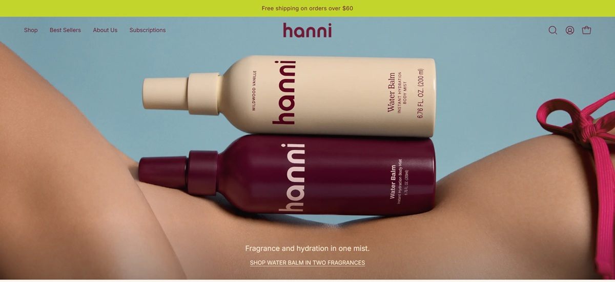
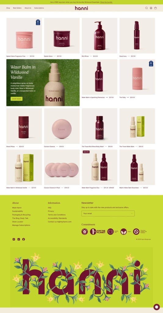
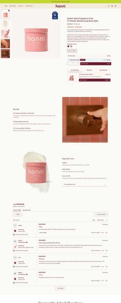
Hanni sells bodycare, a range that now covers in-shower moisturizers, body wash, cleansing bars and exfoliating and shaving tools, built out from its original sustainable shaving concept into a broader daily routine. The site’s own line reads “Bodycare so good, you’ll never skip it.” Named products include Splash Salve, Rich Rinse Body Wash, Water Balm, Cocoon Cleanse, a Shave Pillow and a Shower Scarf. Built on Shopify, with Okendo for reviews and Recharge for subscriptions.
Inter paired with Petrona. Interface text runs in Inter, a plain grotesque, while a serif called Petrona is set aside for display moments, giving the brand a softer, more editorial accent against its functional sans-serif base.
Cream grounds, one saturated accent. The palette leans on warm off-whites and pale tan tones, offset by a single strong magenta used sparingly, plus a pale blue that appears in secondary spots rather than as a core brand color.
An announcement bar for new drops. The top of the site carries a rotating banner, seen at the time of research promoting a limited-edition Water Balm scent and the site’s free shipping threshold, ahead of any product content.
Two ways to browse the same catalogue. Products are grouped both By Routine, covering Cleanse, Moisturize, Exfoliate and Shave, and By Fragrance, covering Sparkling Palmarosa, Wildwood Vanille and a fragrance-free line, letting a shopper start from either the step or the scent.
Bundles priced as a discount. Named sets such as The Works, Everything Shower Edit and Travel Sizes group multiple products together; the Everything Shower Edit is listed at 91 dollars against a 107 dollar combined price for the same items bought separately.
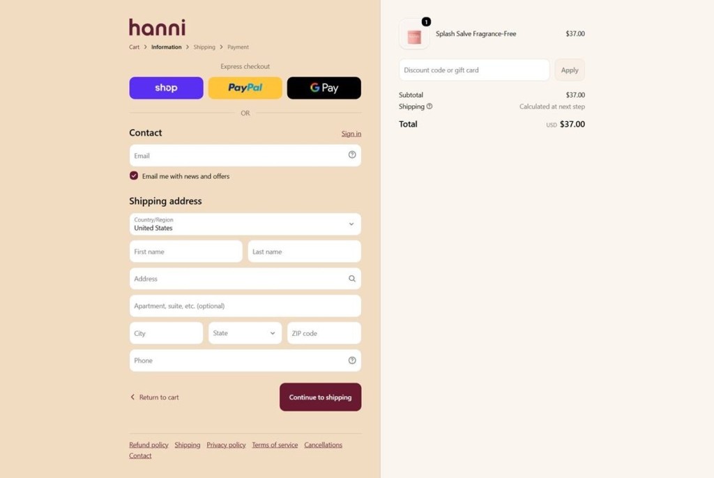
Everyday price points. Single products seen on the site run from 19 to 37 dollars, with free shipping applied at checkout on orders over 60 dollars, a threshold the cart repeats to shoppers below it.
Subscribe and save built in. A dedicated Subscriptions page offers recurring delivery through Recharge, positioned as a standing option rather than a one-time upsell at checkout.
Standards broken into named pillars. An About section splits its claims into Clean Ingredients, Sustainability, and Packaging and Recycling, rather than folding them into one general mission statement.
A blog under its own name. Editorial content sits under a section called Body Talk, giving the brand’s content marketing a distinct identity from the shop itself.
A named community program. A page titled “Become a Smooth Operator” frames repeat customers or referrals as membership in a named group rather than a generic loyalty scheme.
Curated picks attributed to a person. A “Brittany’s Favorites” collection attributes a set of product picks to a named individual, giving the merchandising a personal, staff-recommendation feel rather than an algorithmic one.
A persistent free-shipping nudge. The cart restates how much more a shopper needs to spend to reach free shipping, updating as items are added.
Reviews surfaced through a dedicated widget. Product ratings and reviews are handled by an embedded Okendo widget rather than a built-in Shopify review block, styled to match the site’s own color system.
All-Natural, Reusable, and Biodegradable Wax Food Wraps. Earth & Ocean Friendly
The Outset creates purposeful products that are consciously clean and mindfully designed to elevate your every day.
Coffee Company that produces single serve pour overs
Adda Veggie makes plant-based meal starters that are designed to be mixed with fresh vegetables to create delicious, complete meals.


