Archives: Websites

eCommerce Websites

DreamCloud

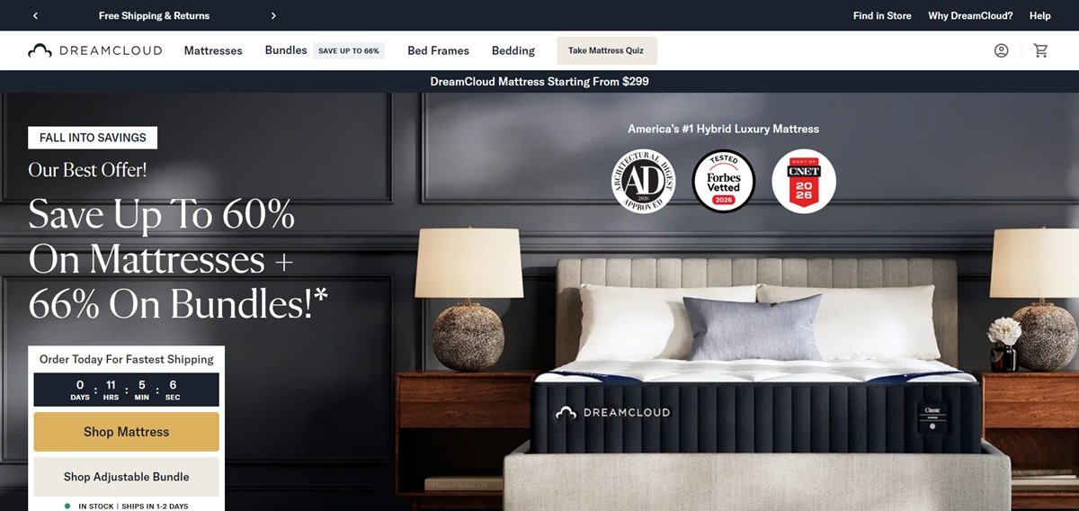
DreamCloud is a US direct-to-consumer mattress brand, part of Resident, selling hybrid and memory foam mattresses alongside adjustable bases, bed frames, bedroom sets, toppers, sheets, protectors and pillows. Mattresses are listed from $299, with the Premier Hybrid at $1,099 in queen. The line splits into two constructions carrying four tiers each, Classic, Premier, Luxe and Ultra, plus a PressureSmart model. Positioning is luxury at a discount, stated as “Premium Materials at Half the Price” and backed by a 365 night trial and a Forever Warranty. Built as a custom Next.js storefront.

Website Design

Navy, gold and warm cream. The palette works a deep navy #1B222E against a gold #DDB15E, with a darker #B77D25 for text on light grounds, over warm neutrals #EEEAE2 and #F8F7F5. Gold carries banners and highlights rather than buttons.

Flecha M with GT America. Headings use Flecha M, a serif with a matching italic, and GT America in three weights carries body and interface text. Both are self-hosted as woff2.

Two navigation tiers. A secondary strip holds Find in Store, My Account, Why DreamCloud and Help above the primary bar of Mattresses, Bundles, Bed Frames, Bedding and the quiz, so service links never crowd the catalogue.

Shopping Experience

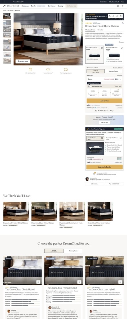
Promotion owns the top of the page. A countdown timer and a Fall Into Savings offer bar repeat at the head of homepage and product pages, alongside an “In Stock | Ships In 1-2 days” line and an asterisked terms link.

A sticky buy bar. Product pages pin size, price and Add To Cart to the top of the viewport, so the price stays visible through several screens of construction detail.

Upgrades priced inside the buy box. Rather than sending shoppers to a comparison page, the product page offers upgrade cards in line: one tier down at minus $500, one tier up at plus $500, each listing height and top construction. A Hybrid and Memory Foam toggle swaps construction in place.

Brand Storytelling

Survey figures instead of adjectives. Claims come as numbers with a footnote: 4 in 5 back pain sufferers said the mattress helped some or a lot and 84% called it soft, supportive and luxurious, each sourced to a randomised survey of owners.

Reviews segmented rather than pooled. Three separate tallies of 1,900, 4,100 and 61,700 reviews appear beside a 4.8 average and a claim of 2.5 million sleepers.

Award placements disclosed on the page. The publication logo row is followed by a note that the company “has certain affiliate advertising relationships with the above publications” and “has no editorial influence over such reviews or awards”.

Notable Features

A quiz as a primary entry point. Take Mattress Quiz sits in both navigation tiers and repeats mid-page, offered as an alternative to browsing.

Retail locator alongside the online funnel. The site points to more than 1,000 stockists through a Find A Store link, with sleep specialists reachable by chat, email and phone.

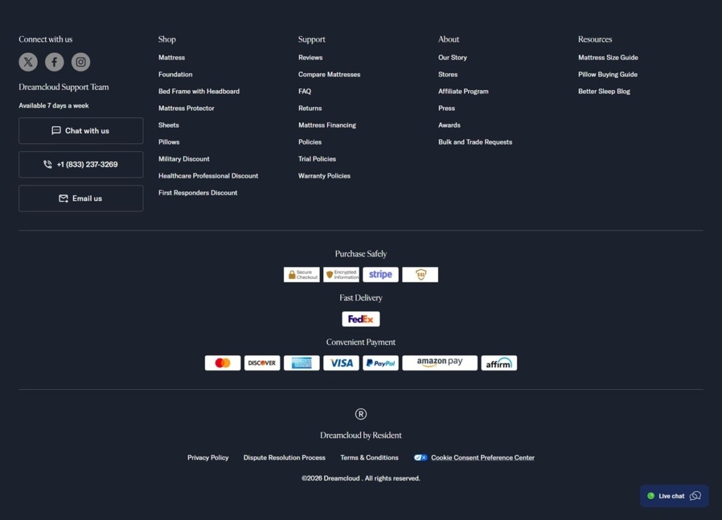
Scarcity and occupational discounts. A line under the buy box reports how many shoppers hold the item in their carts, and military, healthcare and first responder discounts each hold a footer link.

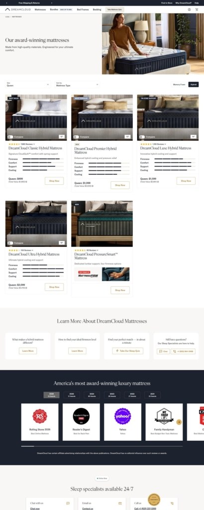
DreamCloud Shop Category page example
DreamCloud Product page example
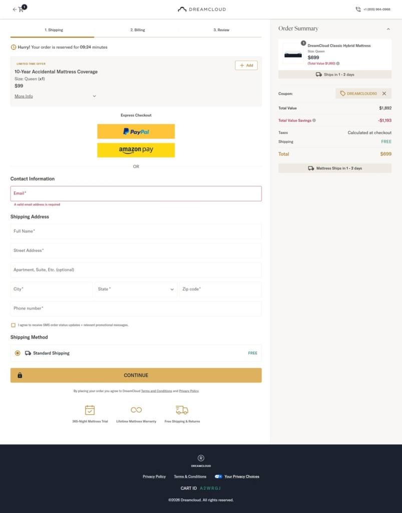
DreamCloud Checkout page example
DreamCloud footer example
Donald Pliner

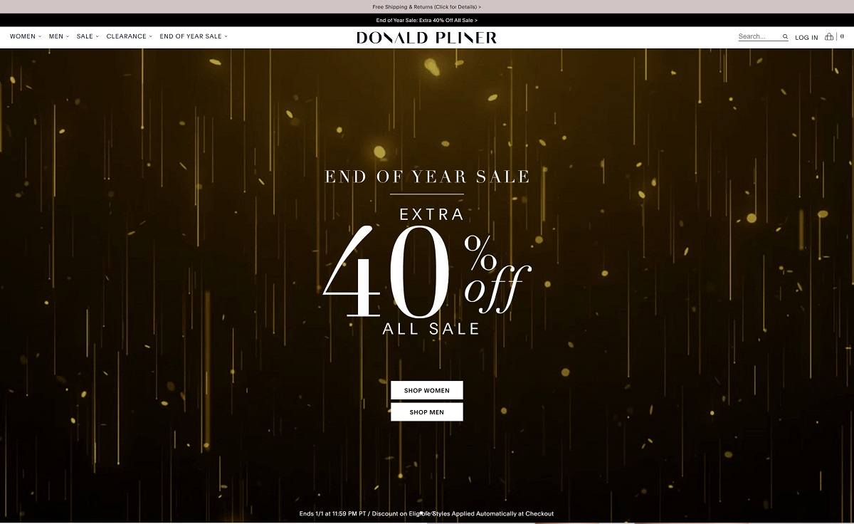
Donald Pliner offers luxury footwear and accessories for men and women, known for innovative designs and high-quality craftsmanship. The website features a clean, user-friendly design with detailed product descriptions and high-quality imagery for a seamless shopping experience.

Corey Egan

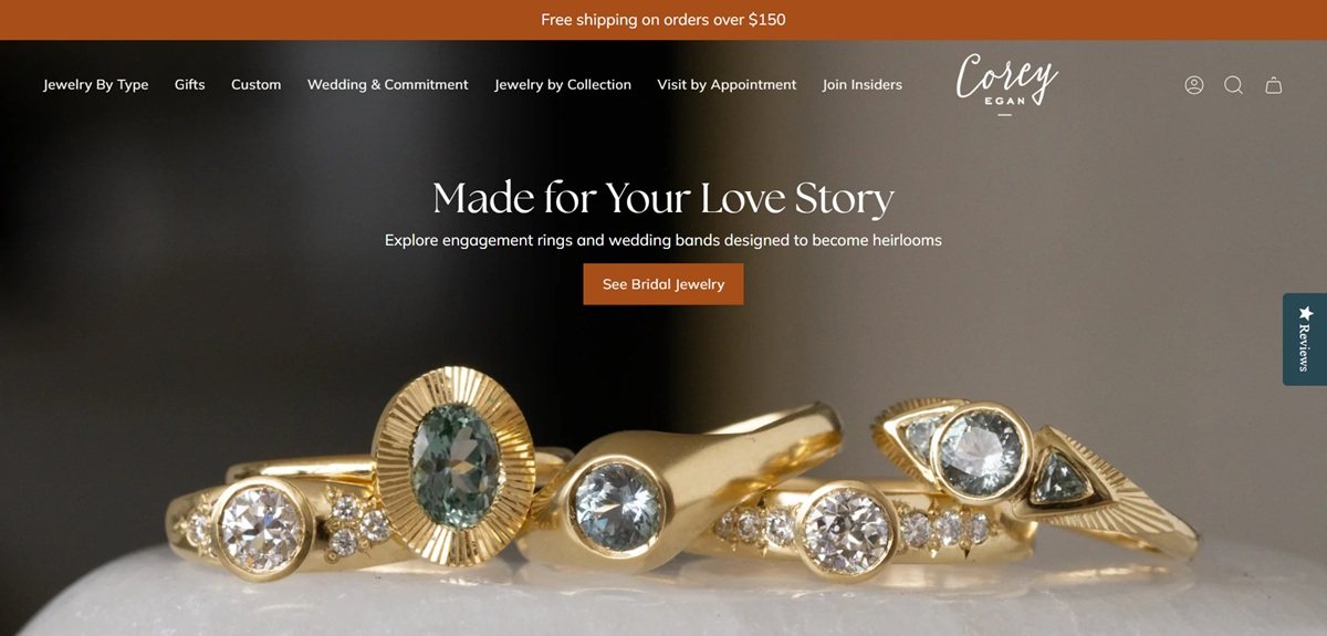
Corey Egan is a fine jewellery studio in Berkeley, California, selling earrings, rings, necklaces, bracelets and pendants in sterling silver and 14k yellow gold, plus engagement rings, wedding bands and a custom design service. The homepage states the pitch as “Artful Fine Jewelry for the Collector in You”, inspired by organic silhouettes, textures, light and shadows. Prices span $105 studs to gemstone pieces above $5,000. Built on Shopify.

Website Design

Cormorant with Muli. Cormorant, a high-contrast serif, is self-hosted in a single weight for display, while Muli is loaded in six cuts including italics and carries body copy, navigation, product names and prices. That contrast does most of the hierarchy work, since the layouts are plain white grids.

Ink on white with a slate teal. Text sits at rgb(28,28,28) on white. Buttons and outlines take a dark slate teal, rgb(40,72,83), and a deeper green is used as the secondary accent. Nothing else is coloured, which leaves the gemstones as the only saturation on the page.

Menus doing the heavy lifting. Five top-level items each open a multi-column panel: Jewelry By Type, Gifts, Custom, Wedding & Commitment and Jewelry by Collection. The collection panel alone lists more than a dozen named ranges, so the menu functions as the site map.

Shopping Experience

Three ways in. Shoppers browse by product type, by collection, or through merchandised shelves: price bands from Under $150 to $1000 and up, personality picks for the maximalist, the minimalist and the colour-lover, and a zodiac list.

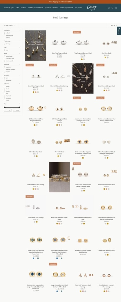
Filters written for gemstone buying. Collection pages filter on availability, product type, metal, gemstone, birthstone month, collection and a price range. Availability splits In Stock from Made to Order, which sets expectations before a shopper commits.

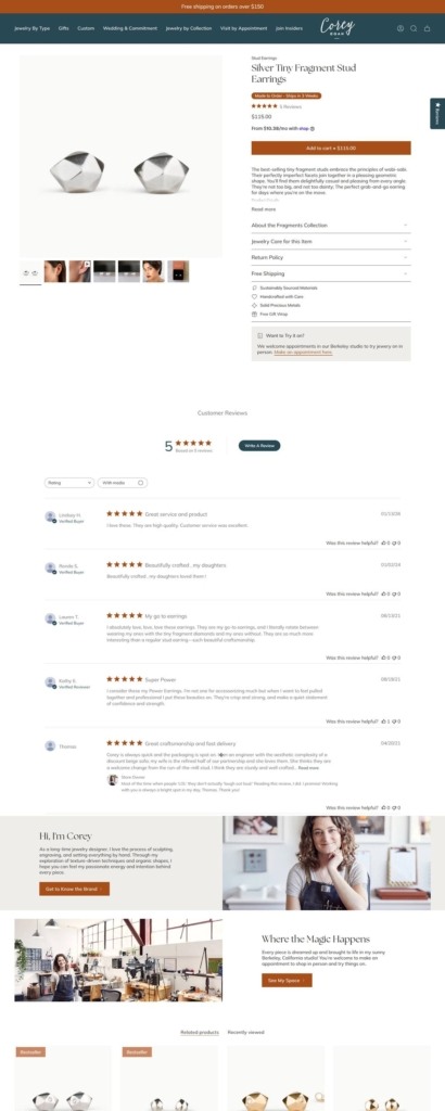
Stock size stated in the buy box. Product pages show price, a metal selector, then a plain note such as “Stock Size: 7” explaining that another size adds a week for resizing. Sold-out variants swap Add to cart for a Notify Me email capture, and final sale items carry a returns warning above the fold.

Long-form product copy. Below the buy box sit a descriptive paragraph, a details block giving material, carat weight, setting, measurements in millimetres and finish, then an essay on the gemstone and a note on the collection.

Brand Storytelling

Written in the first person. Custom prompts read as the designer speaking, and the Creek collection note describes her own edges softening as a new mother, consistent from homepage banner to product footnote.

Materials named as recycled. Recycled precious metals and recycled diamonds are stated in the same details block as the measurements rather than on a separate sustainability page.

Notable Features

Custom design as a full funnel. Three linked pages cover how the process works, an inquiry form and a portfolio of past commissions, all in the top navigation.

Appointment booking for the studio. A homepage panel invites shoppers to book an appointment to shop in-stock jewellery at the Berkeley studio, and Visit by Appointment sits in the header.

Seasonal drops and an insiders list. The homepage leads with a one-of-a-kind seasonal collection, a spring capsule is banner-linked from collection pages, and Join Insiders sits beside the account link.

Corey Egan Shop Category page example

Corey Egan Product page example

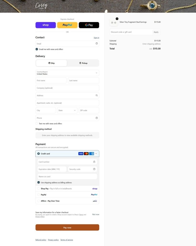
Corey Egan Checkout page example

Corey Egan footer example

Convenient Height

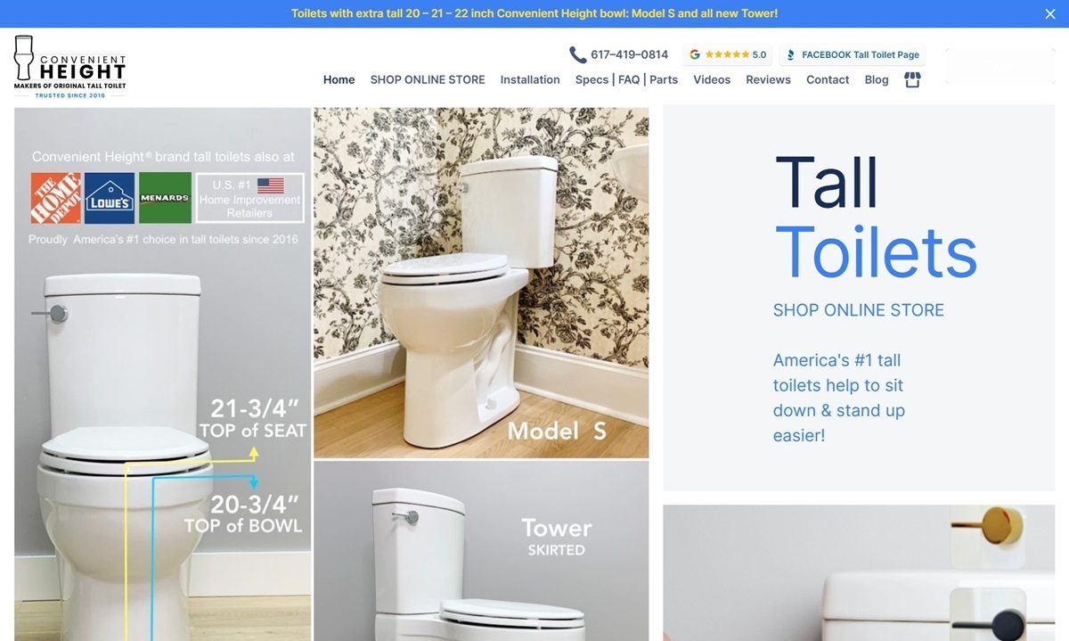
Convenient Height specializes in extra-tall toilets designed to assist users in sitting down and standing up with greater ease. Their flagship models, such as the Model S and The Tower, feature bowl heights of 20 to 21 inches, exceeding standard ADA requirements. These toilets incorporate a sleek, elongated design, dual-flush technology, and slow-close heavy-duty seats, blending functionality with modern aesthetics.