BOHEMIAN TRADERS stock classic styles for the modern bohemian, seeking to blend classic European styles and cuts with a bohemian twist. Since our inception, our aim has been to provide size inclusive fashion basics for the modern woman.
„bBox“ depicts an imaginary area in digital type design (bounding box). Its dimensions are defined by the vertical and horizontal measurements of the largest glyphs within the font. Consequently, the dimensions of the bBox are not fixed. Though the bBox comprises every digital typeface, it does not limit the typeface. We are used to thinking outside the box. By putting our ideas into the bBox, we let it prosper.
LNA was launched in 2007 by California natives Lauren Alexander and April Leight. Beginning with the idea of creating the perfect men’s inspired t-shirt for women, LNA has since evolved into producing full, seasonal collections.
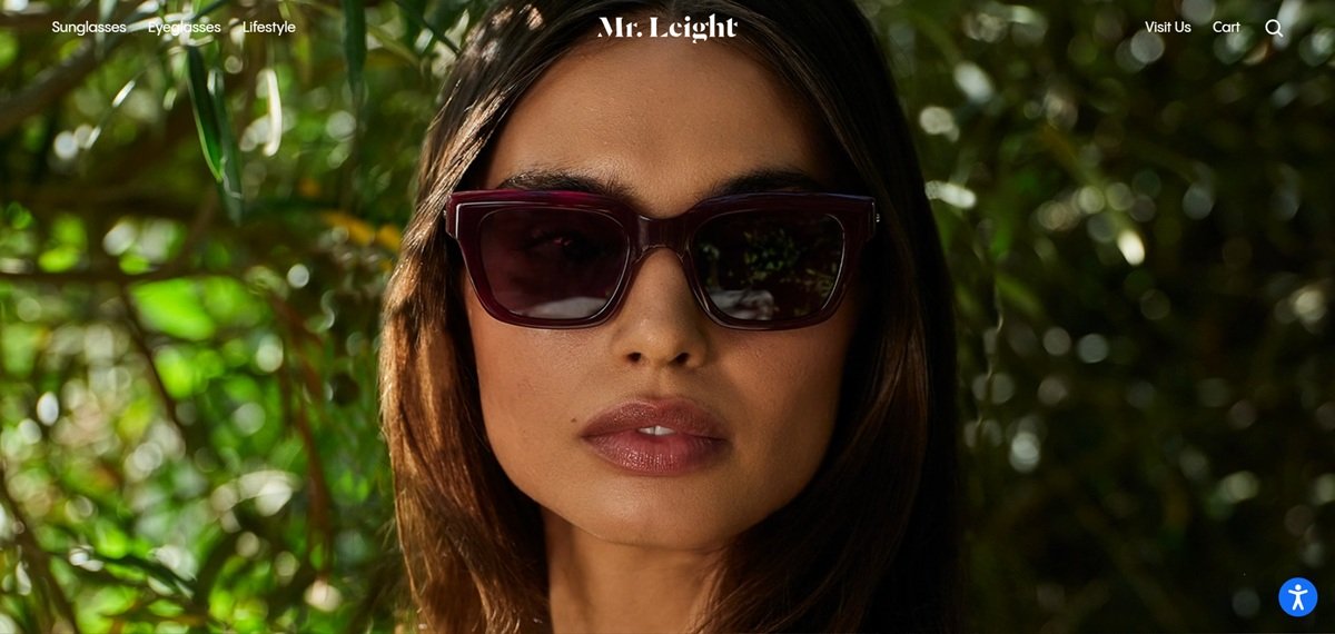
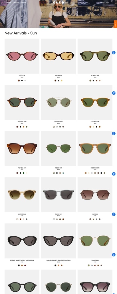
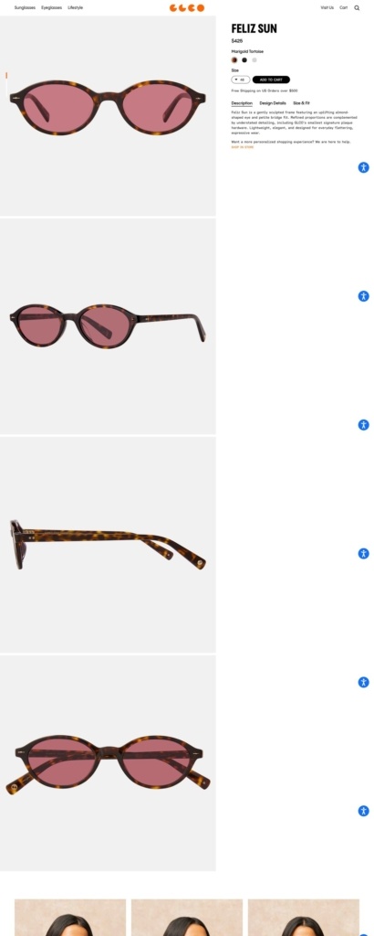
A collaboration between father and son, Larry and Garrett Leight, Mr. Leight bridges multiple generations of design and craftsmanship to deliver superlative contemporary eyewear. Together, they are committed to creating uncommonly thoughtful, beautiful, and original designs that combine the classic and the new and reflect the spectrum of their immense eyewear knowledge and expertise.
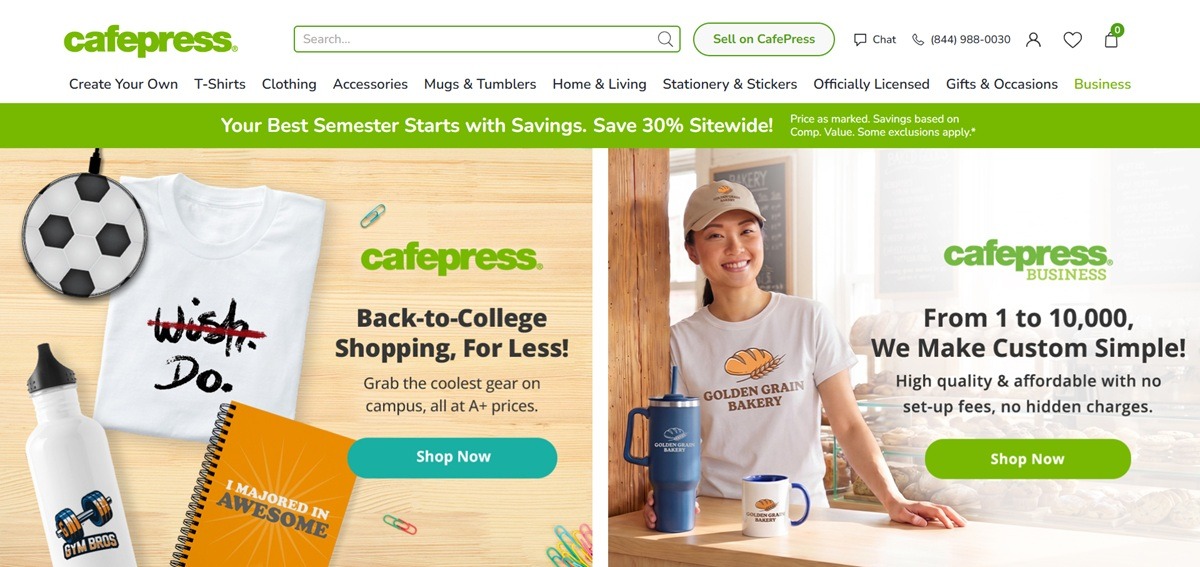
CafePress sells customizable merchandise, apparel, mugs, home decor, stationery and accessories that shoppers personalize with their own text, photos or a design chosen from the catalogue, under the line “Make it yours.” The nav runs Create Your Own, T-Shirts, Clothing, Accessories, Mugs & Tumblers, Home & Living, Stationery & Stickers, Officially Licensed and Gifts & Occasions, with a separate Business portal for bulk and Sell on CafePress accounts, and the storefront geo redirects UK visitors to a co.uk version of the same catalogue.
Website Design
Lato across the interface. Headings, navigation and product copy all run on Lato, with the brand’s green logotype the only strong colour against mostly white and pale neutral backgrounds.
A green accent used sparingly. Green marks the logo, sale badges and primary buttons, while product photography stays neutral, plain garment mockups on a model or flat lay, so the colour reads as branding rather than decoration.
A full width sitewide promo bar. A green banner runs beneath the header announcing the current sitewide discount, currently 30 percent off, ahead of any product content.
Shopping Experience
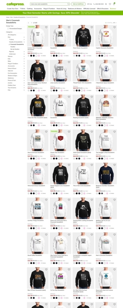
Design driven product cards. Each product in a category such as Men’s Crewneck Sweatshirts shows the printed design, a starting price, and colour swatch dots plus a quick size dropdown, so shoppers can compare artwork and colourway before opening the page.
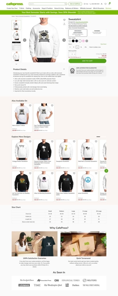
Cross format suggestions on the product page. A sweatshirt product page includes an Also Available On row showing the same design applied to a T-shirt, alongside an Explore More Designs grid of unrelated artwork in the same category.
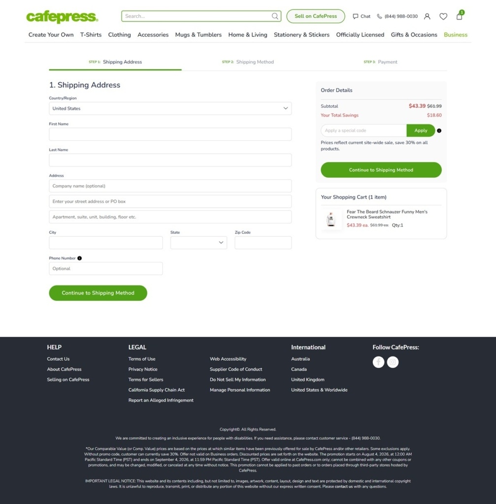
A three step, named checkout. Checkout is split into Shipping Address, Shipping Method and Payment steps with a progress indicator at the top, and the order summary tracks total savings against the sitewide promotion separately from the subtotal.
Brand Storytelling
Press logos as the trust signal. A Why CafePress section runs directly under the product grid with As Seen In logos for outlets including the New York Times, CNN, Reuters and the Wall Street Journal, alongside photos illustrating the satisfaction guarantee and quick turnaround claims.
Guarantee and turnaround named directly. The two trust panels are titled 100% Satisfaction Guarantee and Quick Turnaround, pairing a lifestyle photo with a short written claim for each.
Notable Features
Officially licensed lines sit beside custom design. Peanuts, Betty Boop and JoyPixels branded product ranges are called out in the main nav next to the fully custom Create Your Own tool, mixing licensed and personalized merchandise in one catalogue.
A separate seller portal. A Sell on CafePress link in the header routes to a distinct storefront for merchants, kept apart from the consumer shopping nav.
Phone and chat support sit in the header, not the footer. A phone number and a Chat link appear next to search at the very top of the page, ahead of the account and cart icons, rather than being pushed down to the Help column with the rest of customer service.
Refinery29 is the leading global media company focused on young women. We inspire, entertain, and empower our audience through optimistic and diverse storytelling, experiences, and points of view.
We offer the world’s best cargo rack systems for pickup trucks and trailers. Whether it’s work or play, our innovative hauling accessories make your life easy!
Join our community for the latest trends and ecommerce tips.