Natural haircare formulated for moisture, strength + growth.
Hello Hair


eCommerce Websites
Natural haircare formulated for moisture, strength + growth.
Perk by Kate is a Singapore lingerie label founded in 2012, selling bras, bralettes, underwear, bodysuits, camisoles and loungewear online and through its own stores. Sizing runs from XS to 3XL and 30A to 42B, with prices between 18 and 99 Singapore dollars. The site describes the range as “lingerie that gets better every year” and organises much of it around the signature styles it calls Icons. Built on Shopify.
Berry, cream and gold. The palette sets a deep plum (#7b1f4e) for headings against a warm cream page (#faf7f4), with a dusty pink (#d4b8c0) for borders, a muted gold (#c9a96e) as accent and a darker berry for saving flags. A deep green serves as a contrast ground on some sections.
A three family type system. Archivo carries the body and interface, ITC Stepp the display lines, Jost the supporting labels. Section headings sit in small capitals above a larger display line, so blocks open with a two tier title.
Editorial rather than catalogue. Campaign rows titled “As seen on” credit named customers and creators, each with a Shop Her Look link, and the homepage alternates these with product carousels rather than stacking grids.
Navigation by situation, not category. Alongside the conventional Bralettes and Bras menu, a Your POV panel sorts the range by shape (Regular, Small Frame Full Bust, Curvy), by occasion (Day To Day, Travel, Date Night), by season (In a self-love era, I’m healing, I’m a mum) and by aesthetic (Lingerie as Outerwear, Cottagecore).
Quick Buy on every card. Product cards open a size and colour selector in place, and stock state is written out rather than implied, with separate lines for in stock, low inventory and out of stock.
Cross sell inside the product page. A Complete the Look block sits under the add to cart button with its own colour and size dropdowns, so a second item joins the order without leaving the page.
A cart drawer that handles pre-orders. The drawer carries order notes, a gift note, and a checkbox acknowledging that pre-order items ship in a later month.
The founder speaks in first person. A homepage note is signed by Kate and states the origin directly: “I started PBK in 2012 because I couldn’t find a bra that actually fitted me. I assumed I was the problem. I wasn’t, and neither are you.” Product pages repeat the device in a Why Kate Loves It panel.
Customers as evidence. A Love Notes section runs long quotes with names and roles attached, including a breast cancer survivor describing post surgery fitting, and hashtags such as #ShowYourCurvy group customer photography into shoppable galleries.
Fit guidance as a menu item. Solutions gathers maternity and nursing, small frame full bust, curvy and sensitive skin ranges, with a Fit and Style Guide, the stores and PBK Experiences in the same menus.
Stated commitments in the value bar. Free shipping on all orders, a sixty day exchange and return window, a reusable laundry travel bag with each purchase, OEKO-TEX certified production and one percent of annual profits set aside for women in underserved communities.
Organic, raw, sprouted nut bar.
We create wooden watches from each experience we have with nature.
Trendon is a multi-brand clothing store, footwear, accessories.
Visit the ASSOS online shop and begin the journey to discover the technologically advanced high premium cycling apparel.
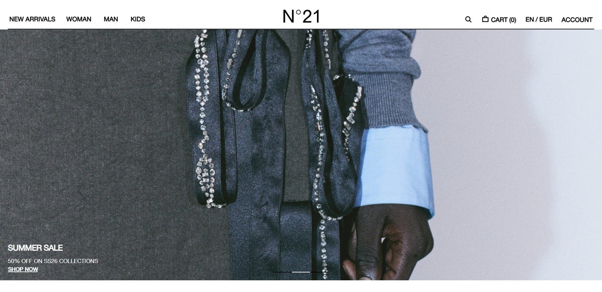
N21 is the Milan ready-to-wear label created and directed by Alessandro Dell’Acqua, selling womenswear, menswear, kidswear, footwear and accessories direct alongside its flagship stores. The brand describes its proposal as “a modern and deeply feminine wardrobe, enriched with touches and details inspired by the men’s wardrobe”, and the store carries the full seasonal catalogue rather than a capsule. Built on Shopify.
Black, white and a single blush. The theme variables run three grounds: white, black and a muted blush, used as full-width section backgrounds so the homepage alternates between them. Nothing else competes with the photography, which is presented edge to edge and unframed.
Helvetica Neue and nothing else. Body copy, menus and buttons all draw on Helvetica Neue in regular and bold. Buttons are set upper case with very wide letter spacing, which is the only real typographic gesture on the page and does most of the work of signalling hierarchy.
Campaign banners over product rows. The homepage stacks full-bleed seasonal panels, FW26 new arrivals, the FW26 capsule and the kidswear collection, each with a single call to action, and drops four-up product carousels between them.
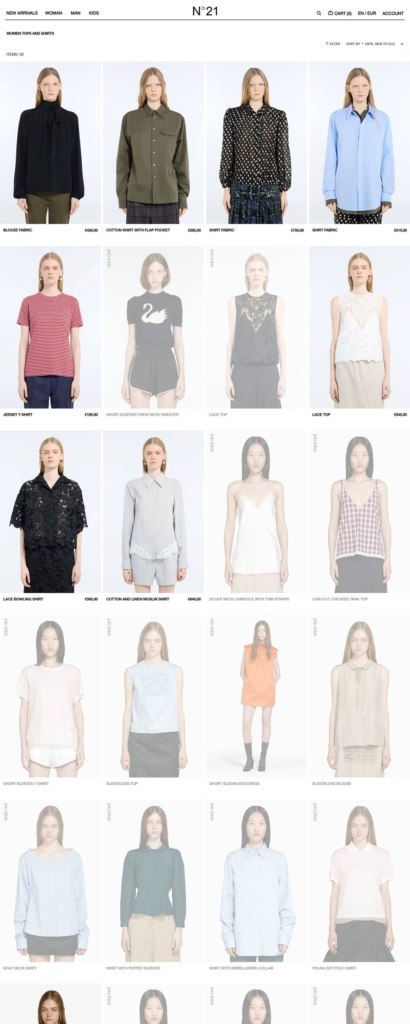
A large, faceted catalogue. The Women collection alone lists 336 items. Filters cover gender, product type and colour, and a sort menu offers relevance, best selling, alphabetical, price and date order. The facet values are not normalised, so colour lists both black and nero and product type repeats Jackets.
Region and currency chosen by the shopper. A selector offers English or Italian and around sixty shipping destinations, each bound to GBP, EUR or USD, and the panel states the current pairing in a sentence before you commit.
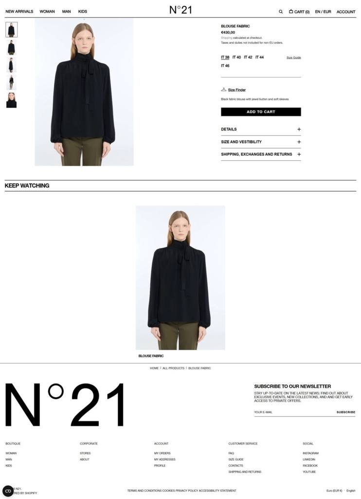
Product pages built around the size grid. Sizes are shown in Italian numbering with unavailable variants labelled rather than hidden, and a Notify me button sits beside Add to Cart. The size guide opens inline and converts IT to US, UK, FR, JP, KR and CN, with bust, waist and hip measurements, kids sizing by height and accessory bands for socks, hats and belts.
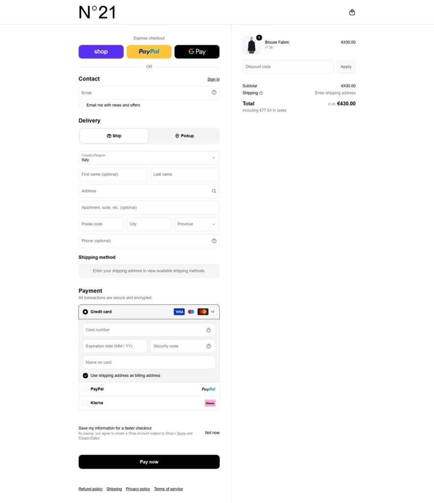
Duties stated before checkout. The price line carries “Shipping calculated at checkout. Taxes and duties not included for non-EU orders”, and the shipping panel repeats that buyers outside the EU pay customs themselves. Returns are free within the EU.
History kept to one page. The About page dates the debut collection to Milan Fashion Week in February 2010 and calls the mix of feminine and masculine elements one of the brand’s signature codes. No founder narrative appears elsewhere.
Retail presence as proof. A Stores page lists the Milan flagship on Via Santo Spirito, the Ginza Six flagship in Tokyo, and corner stores across Fukuoka, Nagoya, Osaka, Kyoto and Seoul, each with a phone number, a local email address and a map link.
Composition and product code in the accordion. Every product exposes colour, fibre composition, the internal product code and country of manufacture.
Fit stated by the model. A vestibility note gives the model’s height and the size worn, then names the intended cut.
Complete your look. Product pages close with a styled cross-sell row drawn from the same shoot.
Evodesk is the revolutionary standing desk solution that introduces life enhancing movement into your day.
Le Coq Sportif is a French company producing sports equipment such as shoes, shorts, and t-shirts. It was founded in 1882 by Émile Camuset and located in Entzheim, France-Germany border
A French brand, selling shoes and clothing since 1978.


