Buddha to Buddha is notorious for its bracelets, rings and other blings and worn by famous names like Doutzen Kroes, Van Persie, Afrojack and Snoop Dogg.
Buddha to Buddha


eCommerce Websites
Buddha to Buddha is notorious for its bracelets, rings and other blings and worn by famous names like Doutzen Kroes, Van Persie, Afrojack and Snoop Dogg.
Garrett Leight California Optical is a luxury eyewear brand based in Los Angeles.
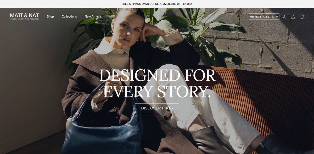
Matt & Nat sells vegan leather backpacks, crossbody bags, totes, weekender bags and accessories under the line “vegan. cruelty free. recycled.,” with linings made from recycled plastic bottles across the range. The nav runs Shop, Collections, Backpacks, Crossbody, Totes, Weekender Bags, Briefcases, Shoulder Bags, Footwear and Accessories, with Our Materials and Transparency pages set alongside the shop, free shipping over 100 dollars, and Klarna offered at checkout.
Black, white and one warm accent. The interface runs on a black and white base, with pure black text and white backgrounds confirmed in the site’s own colour variables, and a warm tan used for secondary accents against the otherwise monochrome layout.
Assistant as the single typeface. Headings and body copy both run on Assistant, a plain sans serif, keeping typography consistent from the wordmark down to product labels.
A wordmark with its own strapline. The MATT & NAT logo carries “vegan. cruelty free. recycled.” set directly beneath it in small type, repeating the brand’s core claim in the header on every page.
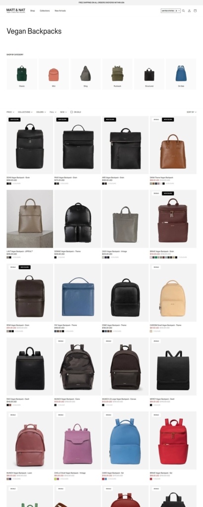
A five column grid with an icon shortcut row. The Vegan Backpacks category opens with photo icons for Classic, Mini, Sling, Rucksack, Structured and On Sale before the main grid, and each product card shows small colour swatch dots under the price.
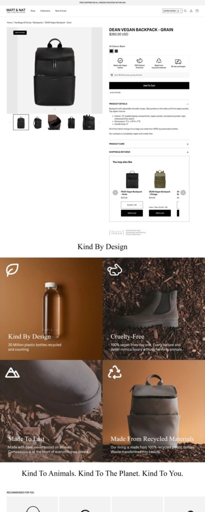
A spec heavy product page. A page such as the Dean Vegan Backpack lists interior and exterior details and dimensions in a Product Details accordion, with icon call outs for vegan leather, ethical practices, recycled materials and a 30 day returns window placed directly under the price.
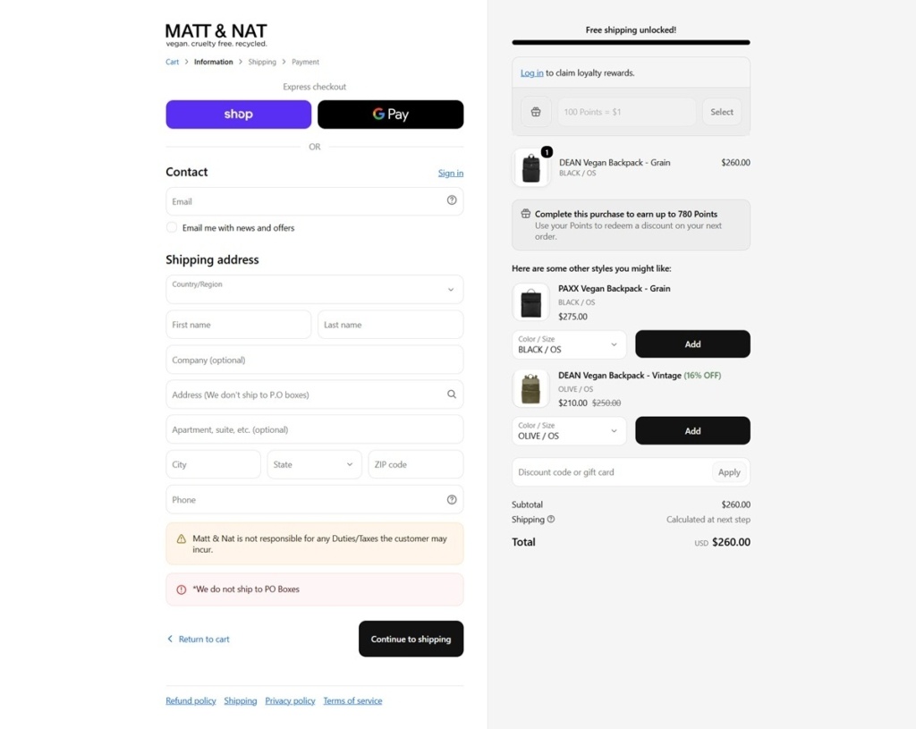
Loyalty points shown inside checkout. The checkout sidebar states the purchase will earn up to 780 Smile Loyalty points and invites shoppers to log in and redeem existing points before paying, alongside Shop Pay and Google Pay express options.
Four claims, four photographs. A Kind By Design section pairs four material claims, plastic bottles recycled, cruelty free, made to last, made from recycled materials, each with its own icon and close up photograph rather than a single sustainability paragraph.
A closing line in three sentences. The section ends on “Kind To Animals. Kind To The Planet. Kind To You.,” compressing the brand’s ethics into a repeated three part structure.
PO box and duties restrictions stated in checkout. The shipping form states directly that Matt & Nat does not ship to PO boxes and that the company is not responsible for duties or taxes the customer may incur.
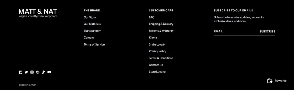
A Rewards shortcut fixed to the footer. A small Rewards icon sits in the bottom corner of the black footer independent of the main Customer Care links, giving the loyalty program its own persistent entry point.
A named capsule collection gets its own tagline. Studio 901 is promoted under the line “Live Beautifully,” a separate strapline from the core “vegan. cruelty free. recycled.” positioning, used specifically for that sub range rather than the whole catalogue.
MOVE SHOP was born in 2002 as natural consequence of the growth of people, who were born and raised into Street Culture.
For busy men and women on the go, Stitch FixⓇ is the personal styling service tailored to your taste, budget and lifestyle that helps you look and feel your best every day.
Stolen Girlfriends Club is an internationally recognised New Zealand fashion label.
Creating meaningful reminders for an inspired and mindful life. Individually crafted for everyday wear.
We’ve been doing this since 1973, follow along and know the feeling.
Born from a vision of democratizing access to luxury goods, we use the same raw materials as luxury retailers to create products sold at accessible, honest prices.
A new iOS app for making and sharing fun videos with text, effects, graphics, and more.
Exclusive fashion accesories for your original style.


