The OG indie bridal shop with 12 U.S. locations.
Lovely Bride


eCommerce Websites
The OG indie bridal shop with 12 U.S. locations.
clémence is an independent clothing label focused on creating garments in small, thoughtful runs with a strong emphasis on premium fabrics and solid construction.
Rugged, simple, functional leather goods.
haikure makes its products with respect for people and the environment, using eco-sustainable materials and processes.
A candy store for book aficionados, offering the latest and greatest on fashion, photography, architecture, interior and graphic design.
SoYoung creates beautiful linen lunch bags, backpacks, and unisex diaper bags for the aesthetically and eco conscious.
A shop for rebel girls with good manners.
Beautiful handcrafted shoes, made in Italy.
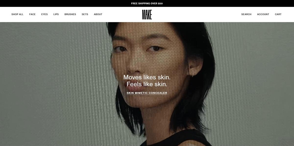
MAKE Beauty is a makeup and skincare brand sold through its own Shopify storefront, covering complexion, face, eyes and lips products alongside brushes and sets. The site states its positioning directly as “multifunctional makeup and skincare designed for creative self-expression and personal experimentation,” with prices running from around 21 to 144 dollars. Collections split into Makeup, Skincare, Complexion, Face, Eyes, Lips and a Sale category, plus a Best Selling collection.
A black, white and grey system. Colour variables define pure black and white as the accent pair, with a run of greys from e6e6e6 down to 1a1a1a for shading and hover states. Sale and saving badges use black backgrounds with white text rather than a colour callout.
Neue Haas Grotesk Text throughout. Headings, body copy, labels and buttons all reference the same font stack, Neue Haas Grotesk Text, giving the site a single consistent typeface rather than a display and body pairing.
Product photography against plain grounds. Listings favour flat product shots on neutral backgrounds, with the black and white palette leaving colour to come from the products themselves.
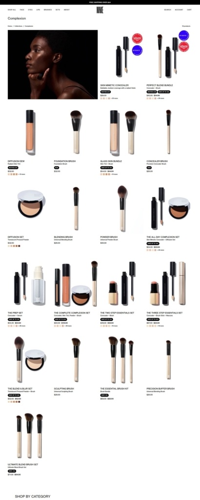
A conventional Shopify catalogue. Collections pages list products in a grid with price shown directly on each card, for example the Skin Mimetic Concealer at 28 dollars, without the price hidden behind a click-through.
Bundle savings marked on the product. Sets and bundles carry stated discounts, such as “Save 15%” and “Save 16%,” visible on the listing rather than only at checkout.
A dedicated Sale collection. Reduced items sit in their own navigation entry alongside the regular product categories rather than mixed into general listings.
The tagline sits on skin, not on marketing language. The homepage copy reads “Moves likes skin. Feels like skin,” tying the brand statement directly to how the product performs on the body rather than to abstract claims.
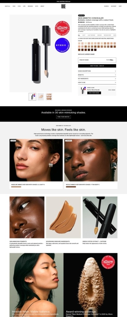
An award called out by name. The Skin Mimetic Concealer is labelled as winner of “Allure Best Concealer” on its product callouts, using third-party recognition rather than the brand’s own claims.
“Multifunctional” as the recurring word. Meta copy and on-page text both describe the range as multifunctional makeup and skincare, repeating the same positioning in the page title and the product descriptions.
Bestseller and hero products surfaced early. The Skin Mimetic Concealer and Lash Prototype Mascara appear as featured items on the homepage rather than requiring a category click-through.
Account and login built into the header. Log in and account creation sit in the top navigation alongside search and cart, standard for a Shopify build but placed prominently here.
Multi-chromatic naming for eye products. Product names like Multi-Chromatic Eyeshadow carry a consistent descriptive naming pattern rather than seasonal or numbered shade names alone.
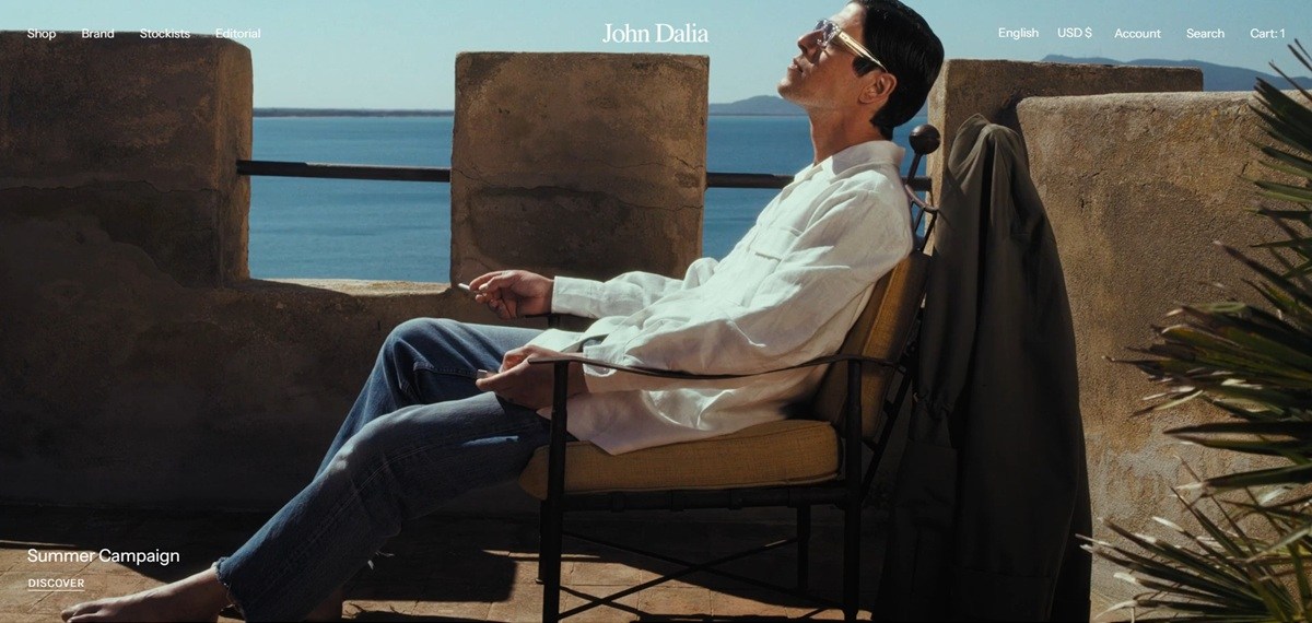
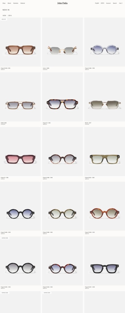
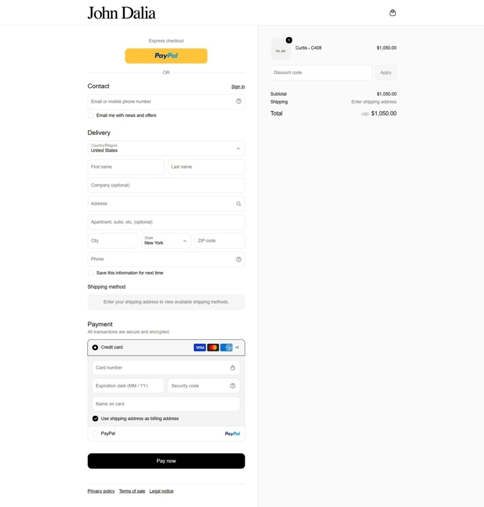
John Dalia is a French eyewear house selling handcrafted frames across several named collections, including Curtis, Dane, Miles and a numbered Project series, priced from roughly 440 to 825 euros. The catalogue mixes acetate and metal frames, several in rimless construction, aimed at a buyer already comfortable with designer pricing. The site runs in English and French on Shopify, with prices shown in euros.
Near-black text on warm paper tones. The palette holds to #212121 for type against off-white grounds around #fcfbf9 and #f7f4ef, with a tan accent close to #daceb5 appearing in swatches and highlight tags, and a red reserved for sale or limited flags.
Karla and Instrument Sans for a quiet pairing. Body copy runs in Karla, a rounded sans, alongside Instrument Sans for finer set text, giving the shop a soft, unfussy voice rather than a loud display face.
A wordmark logo and little else in the header. The header keeps to Shop, Brand, Stockists and Editorial plus search, account and cart, with the John Dalia name set in a serif logotype as the only ornament. There is no hero banner competing for attention beneath it, so the eye moves straight to the product grid.
A dense shop grid with status tags. The category page shows three frames per row with a view-density toggle for two, three or five columns, and cards marked Sold Out or Coming Soon sit alongside purchasable ones rather than being hidden.
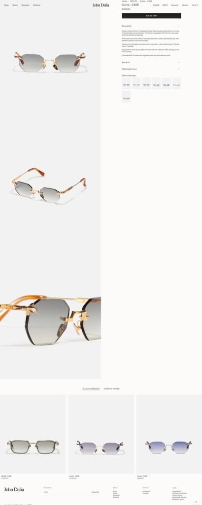
Product pages stack the photography. Each listing runs three vertical images of the frame against a plain ground, paired with a fixed right column holding the price, an Add to Cart button and Size & Fit and Shipping & Returns accordions.
Colorways as small swatches beneath the price. Where a frame comes in more than one finish, the alternates appear as a swatch row under the accordions, with Related Products and Recently Viewed carousels below the fold.
Collections carry the naming, not paragraphs of copy. Curtis, Dane, Miles and the Project series function as the story themselves, each a self-contained line rather than one explained through a separate brand narrative page.
Editorial stands apart from the shop. A dedicated Editorial section is separated from Brand and Stockists in the header, positioned as lifestyle content rather than folded into the product pages. It gives the catalogue somewhere to be shown worn, away from the plain product photography.
A named edition marks the current drop. New arrivals are grouped under a numbered edition, currently Edition 11, giving repeat visitors a clear marker for what has changed since the last release.
A dual-language shop. A language switcher covers English and French, and a long country selector sits alongside it for shipping, with euro pricing held constant across the list.

UPPERCASE is a Calgary publishing house that sells its own print output directly: a quarterly magazine for the creative and curious, the Encyclopedia of Inspiration book series, the Little U children’s titles, back issues and access to a digital archive. The readership is designers, illustrators, craftspeople and paper lovers, and the shop carries subscriptions, renewals, gift subscriptions and wholesale cases alongside single copies. Publisher Janine Vangool describes the business as a “one-woman operation”. Built on Shopify using the Motion theme.
White page, black type, one soft blue. The body is plain white with black text and the only sustained block of colour is the footer, a pale blue panel carrying near-black lettering. Everything in between is coloured by the covers and spreads themselves.
Two sans faces and no serif. Type is Figtree for headings and navigation with Instrument Sans as the second face. For a publisher whose subject is typography and craft, the interface stays deliberately quiet.
Buttons that move. Primary buttons are solid near-black with a small arrow graphic parked off the right edge. On hover the arrow slides inward and the button pads out to meet it, the only motion in the layout.
A homepage of stacked promo blocks. Sections run full width, one idea each: the next volume, the newest release, a reprint, the sustainability page, the back issue archive. Each block pairs a photograph of the printed object with a short paragraph and one link.
Sixty-eight products across four pages. The all-products grid mixes books, back issues, subscriptions, wholesale cases and Little U titles into one alphabetical list rather than separating them by type.
Quick View instead of a page load. Grid cards open a modal carrying price, description, page count, trim size and, on some titles, a selected press list, so a buyer can read the full pitch without leaving the grid.
Bundles carry the discounting. Sale pricing is applied at bundle level rather than per title. The Encyclopedia Bundle 2025 drops from $765.00 to $575.00 CAD, and thirteen back issues sell together at $150.00 against $312.00 bought individually.
Currency conversion, limited shipping. A switcher offers more than thirty currencies with CAD as the default, while the stated shipping list covers Canada, the USA, the UK, Western Europe, Australia, New Zealand and parts of Asia. European buyers are pointed to a London distributor for books and back issues.
Written in the first person. Copy is signed by the publisher throughout: “I’m Janine, the publisher, editor, designer (and customer service, too!) of this one-woman operation.”
Instructions before the sell. A panel headed “please read this before placing your order” sits on the homepage and covers customs, address changes, receipts and a request to proof names and addresses carefully.
Crowdfunding inside the storefront. The next volume is sold as a pre-order backed by a crowdfunding module on the site itself, not an external platform.
Community routes in the main nav. Stockists, a membership circle, submissions and a weekly newsletter sit beside the shop columns, so a reader can subscribe, contribute or find a retailer from one menu.
Fine Bags Made with Innovative Fabrics.


