Archives: Websites

eCommerce Websites

The Hungarian Wine Society

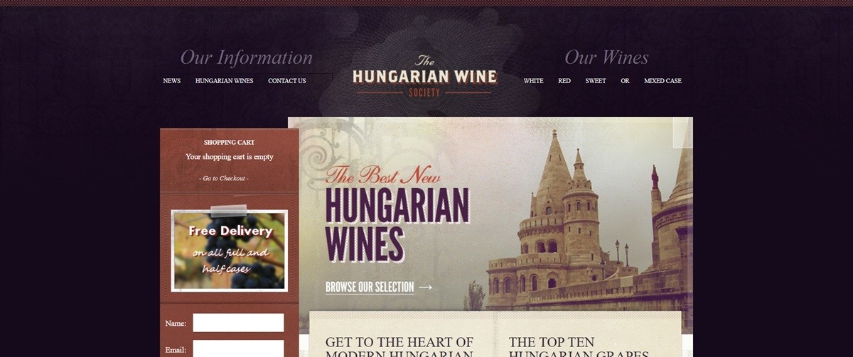
Hungarian Wine Society sells Hungarian wine by the bottle and in mixed cases across white, red and sweet categories, aimed at UK wine drinkers looking past mainstream regions. The homepage states the mission as “Get to the Heart of Modern Hungarian Wine Making” and adds “No membership fees, no sign up! Just lots of good wine. And lots of good information too.” Built on WordPress with the WP eCommerce plugin, a smaller and older toolset than the Shopify or WooCommerce base most current wine retailers run on.

Website Design

A plum and rust palette. Page furniture runs on deep aubergine tones, close to #43254A and #492145, paired with a rust red near #ba4c37 and a tan gold around #8d7959. The combination reads as old-world and wine-adjacent rather than a neutral ecommerce default.

Arial throughout, no webfont. Headings and body copy both fall back to the system Arial stack. There is no licensed or custom typeface loaded anywhere in the theme, which keeps the page light but gives it a plain, unstyled feel next to more produced competitors.

A slider-led homepage over a grid. The top of the page is a rotating promotional banner rather than a product grid, followed by editorial blocks on Hungarian winemaking before any bottle appears. Commerce is secondary to content on first load.

Shopping Experience

Three straightforward categories. White, red and sweet wines are the only top-level splits, plus a mixed-case option, with no further filtering by grape, region or price visible on the category pages.

Prices span a wide range. Individual bottles run from 15.99 to 34.99 pounds, with cases from 95.94 to 209.94 pounds, giving the range both entry-level and collector-tier options.

Educational content sits ahead of checkout. A “Top Ten Hungarian Grapes” feature and ongoing blog posts on regions and producers are placed in the main navigation, alongside the shop categories rather than in a separate resources section.

Brand Storytelling

Expertise is the pitch, not scale. Copy leans on producer credentials, citing “several winners of The Hungarian Winemakers of the Year,” rather than volume, discounts or fast delivery.

The differentness is named directly. The site asks shoppers to try “something that little bit different,” positioning Hungarian wine as a discovery category against more familiar French or Italian shelves.

Notable Features

A newsletter tied to monthly offers. Sign-up is pitched specifically for “exclusive monthly offers” rather than generic updates, giving it a clear reason to subscribe.

A single social channel. Only a Facebook link appears in the footer, with no Instagram or X presence integrated into the design.

Designer credit left in the footer. The theme footer still carries an attribution link to its original builder, a leftover from the site’s original launch rather than an active brand feature.

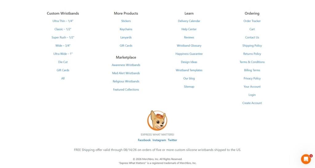
The Hungarian Wine Society Shop Category page example
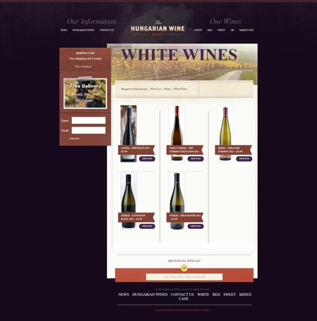
The Hungarian Wine Society Product page example
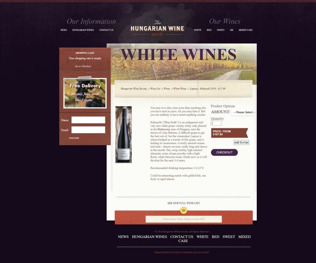
The Hungarian Wine Society Checkout page example
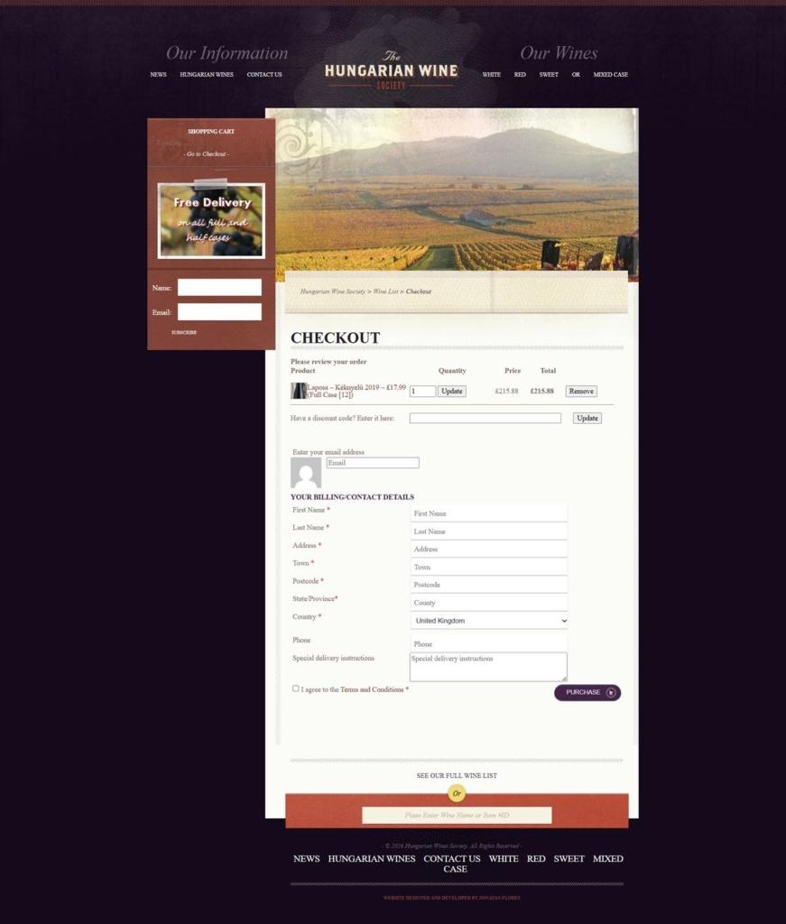
The Hungarian Wine Society footer example

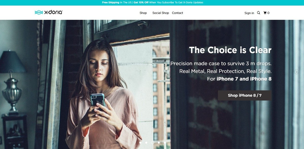
X-Doria

X-Doria’s storefront at xdorialife.com now trades under the Raptic name, selling magnetic and Kevlar-weave phone cases, tempered glass screen protectors, Apple Watch bands and compact power banks for iPhone, Samsung Galaxy Z Fold and Apple Watch devices. Prices on the accessories grid run from about twenty to thirty dollars. The store runs on Shopify, with express checkout through Shop Pay, PayPal and Google Pay.

Website Design

A bold wordmark replacing a softer one. The current shop carries a heavy sans-serif RAPTIC logo with a red diagonal accent stroke, a harder mark than the thin teal wave X-Doria logo that still appears in this gallery’s footer capture.

A black header over a white grid. A black promo ticker runs return policy, shipping and new-arrival messages above a plain white nav bar listing Phone Cases, Accessories, Power and Contact Us, with search, account and cart icons at the right.

A mixed button palette. Purple marks Shop Pay, yellow marks PayPal, and a dark maroon-red carries Add To Cart and Pay Now, while an unrelated orange appears only on the Write A Review button, so no single accent color runs through the whole checkout path.

Shopping Experience

A dense, sortable accessories grid. The category page groups cases, watch bands, screen protectors and power banks together under one Accessories heading, sorted Date, new to old, with a price and short spec-heavy title under each thumbnail and one item marked Sold Out.

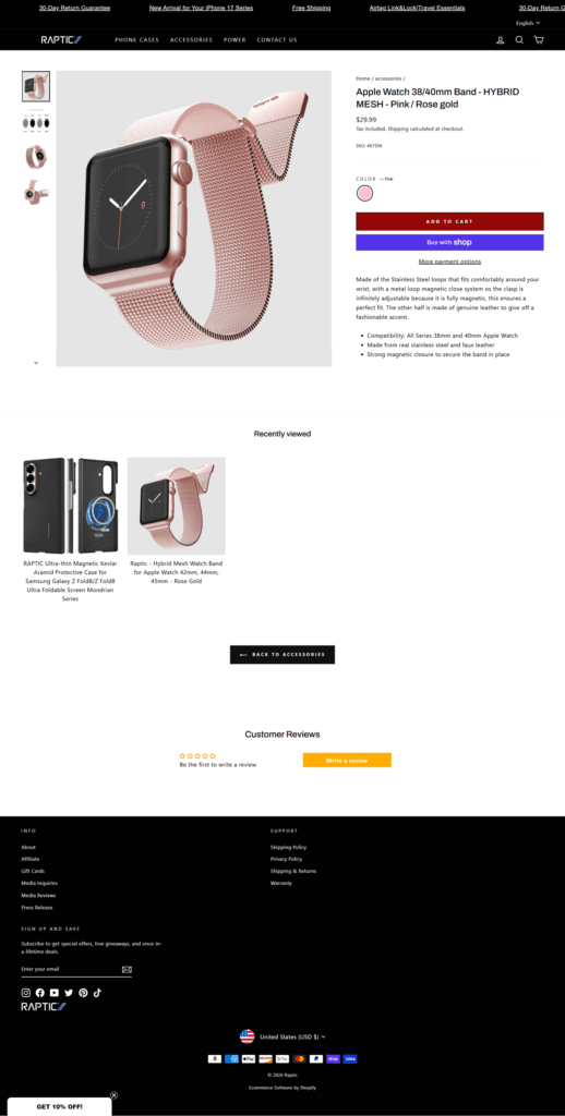
A two-button add-to-cart. Product pages pair a red Add To Cart button with a separate purple Buy With Shop button and a More Payment Options link, giving a faster express path before the standard cart flow.

Specs over story on product pages. The Apple Watch band listing describes materials and fit in bullet points, stainless steel loops, faux leather, magnetic closure, and 38/40mm compatibility, rather than lifestyle copy.

A star-rating module built into the page. Customer Reviews sits directly beneath a Recently Viewed row and a Back To Accessories link, with a star rating and an orange Write A Review button rather than a separate reviews tab.

Brand Storytelling

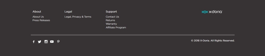
Two brand eras in one gallery. The shop, product and checkout captures show the current Raptic identity, while the separately captured footer still carries a 2018-dated X-Doria wordmark and copyright, evidencing the rebrand directly inside this entry’s own screenshots.

Copy tied to current hardware. The promo ticker references “New Arrival for your iPhone 17 Series,” anchoring the store’s messaging to a specific, current device generation rather than generic protection claims.

A plain policy footer. The X-Doria era footer lists About, Legal and Support columns with Press Releases, Warranty and an Affiliate Program link, alongside five social icons.

Notable Features

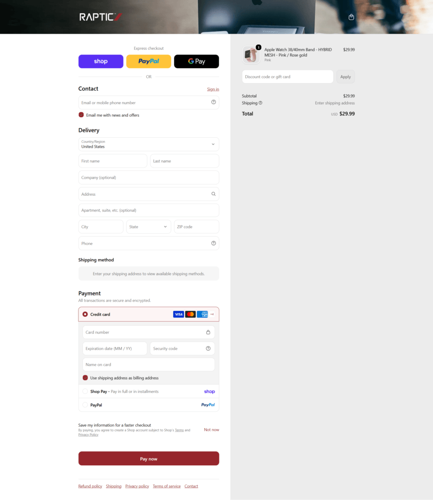
Three express checkout options before the form. Shop, PayPal and Google Pay buttons sit above the standard email and delivery fields, each keeping its own brand color rather than being restyled to match the store.

A discount code field inside the summary. The order summary panel carries its own discount or gift card field next to the subtotal, separate from the main payment form.

X-Doria Shop Category page example

X-Doria Product page example

X-Doria Checkout page example

X-Doria footer example

Stella McCartney

Stella McCartney launched her eponymous fashion house in a partnership with Kering as a 50/50 joint venture and showed her first collection in Paris in October 2001. Her collections include women’s ready-to-wear, accessories, lingerie, eyewear, fragrance and kids.

Wristband Bros

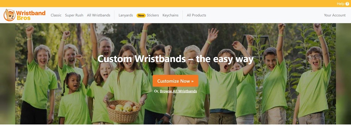
Wristband Bros sells customized silicone wristbands in styles including Ultra Thin, Classic, Super Rush, Wide, Ultra Wide and Die Cut, alongside lanyards, stickers, keychains and gift cards. The audience is event organizers, schools, brands and causes ordering in bulk, with marketplace collections built around awareness, medical alert and religious wristbands. The homepage states the tagline “Express What Matters!” and promises delivery guaranteed by the customer’s event date. The front end runs on a Bootstrap-based grid rather than a hosted platform theme.

Website Design

A single green accent on a neutral base. Buttons and links run on one flat green, closer to an emerald than a brand-specific hue, set against white panels and a dark grey navbar. The effect reads as a utility color chosen for contrast rather than a designed brand palette.

System fonts, not a custom face. Body and heading text fall back to the operating system stack, Segoe UI on Windows and San Francisco on Mac, with no webfont loaded. Type is functional and unstyled, prioritizing load speed over a distinct voice.

A stacked, form-first homepage. Sections run top to bottom in full-width bands: hero claim, a row of trust badges, a strip of customer logos, then a grid of wristband styles as image tiles leading into the “Why Wristband Bros” benefit list.

Shopping Experience

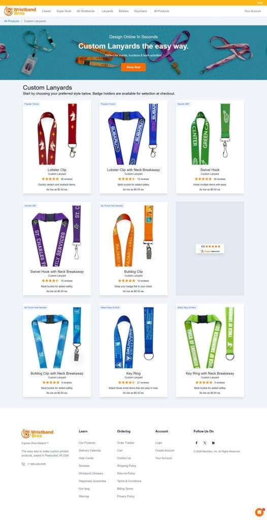
Configuration starts at the style tile. Each wristband style, Classic, Ultra Thin, Wide and so on, is its own image tile rather than a filtered catalogue, so shoppers pick a format before quantity or color.

No price appears before the builder. Neither the homepage nor the style grid shows a per-unit cost; pricing only surfaces once a shopper enters the customization flow, which suits a made-to-order product but removes any at-a-glance comparison.

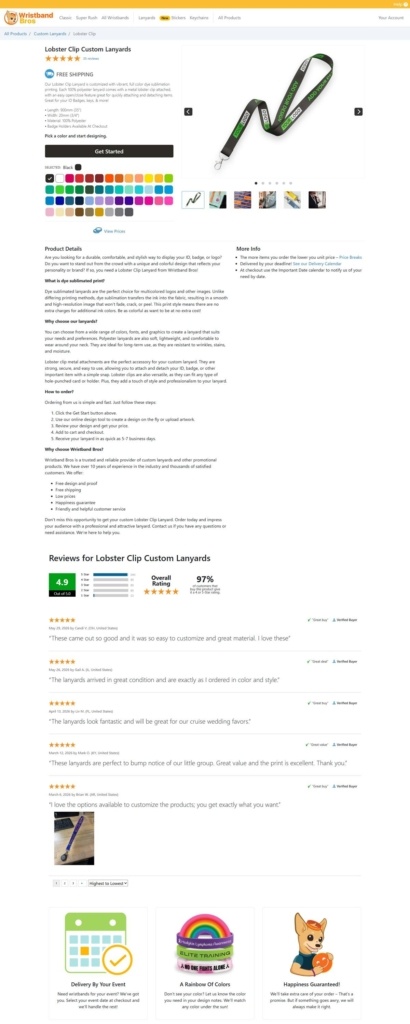
Guarantees are written into the funnel. A “Happiness Guarantee” and a delivery-by-deadline promise with a stated refund are both placed directly under the hero, ahead of any product detail.

Brand Storytelling

The tagline carries the positioning. “Express What Matters!” repeats across the benefit section and ties the product to causes and events rather than to the wristband as an object.

Logos stand in for testimonials. Twitter, Bruno Mars and American Airlines are shown as past users, a name-drop approach to credibility rather than written case studies or reviews.

Notable Features

A delivery calendar in the main navigation. Shoppers can check turnaround against their event date directly from the header, ahead of adding anything to a cart.

Marketplace collections for specific causes. Awareness, medical alert and religious wristband collections are grouped separately from the core style selector, aimed at repeat, cause-specific buyers.

Gift cards and live chat sit alongside the shop. Both are given their own navigation entries rather than being buried in account or footer menus, keeping support and non-standard purchases one click from any page.

Wristband Bros Shop Category page example

Wristband Bros Product page example

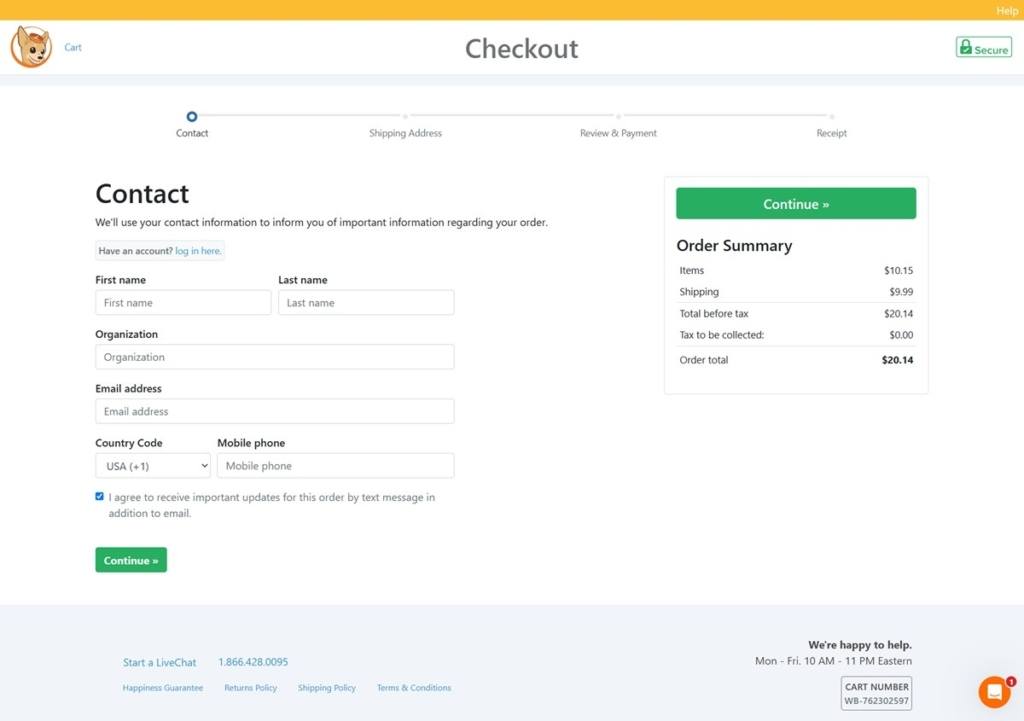
Wristband Bros Checkout page example

Wristband Bros footer example

Brdr. Kruger

Brdr. Krüger is a Danish furniture company founded in Copenhagen in 1886 and described on its own site as Denmark’s oldest family-owned furniture company, now in its fifth generation. It sells dining chairs and tables, side and coffee tables, bar stools, lounge chairs, sofas, lighting and accessories, made in a craft atelier near Copenhagen and shown in a flagship store at Bredgade 28. Prices run from 40 euro for a material sample to 15,190 euro for the largest table. Built on WordPress with WooCommerce.

Website Design

Long sections under small capitalised labels. Every homepage block opens with an eyebrow in capitals, such as OUR HERITAGE or DESIGN IN DIALOGUE, followed by a full-sentence heading and a paragraph of running text. The page reads closer to a catalogue essay than to a storefront.

Named pieces as a fixed row. A horizontal strip of the Bølling Tray Table, HB Collection, ARV Chair, Ekko Chair and F Chair is labelled Brdr. Krüger Icons, giving the range a small set of permanent entry points above the full shop grid.

Editorial placed level with the shop. Stories, Projects and Designers carry the same visual weight as the product sections, and a feature on a designer’s home sits between the icon row and the projects block rather than in a blog.

Shopping Experience

One grid, priced from. The shop page lists roughly thirty entries in one ungrouped grid, each showing a from price in euro and an All the variants here link, so the grid works as a range index rather than a set of buyable items.

Variants chosen on the product page. A product page presents a Material select, a Clear selection control, a quantity field and a Buy button, with finish, upholstery and armrest options explained in the copy below rather than shown as swatches.

Fulfilment stated at the point of sale. Product pages carry a line reading Make to order in Denmark. Delivering worldwide, with shipping cost deferred to the cart and free shipping inside Denmark.

A factory sale inside the main catalogue. Ex-display pieces are listed as ordinary products with a Sale flag and a frank note, one chair stating that it has served as a display model and is still in great condition despite being used.

Brand Storytelling

Continuity in place of a founding myth. The heritage text names the founding brothers, Theodor and Ferdinand Krüger, then argues that tradition is not about standing still and stays alive by remaining close to making and material.

Designers credited at length. Product copy attributes each piece, links to the designer and describes the commission, including a collection developed with David Thulstrup for the restaurant Noma.

Notable Features

A separate track for professionals. B2B login, price list, 3D files, catalogue images and maintenance documents are grouped for architects and specifiers, apart from the consumer shop.

Samples sold as products. Wooden, metal, compact laminate, webbing and leather sample sets are listed at 40 euro each, with a complete sample box at 250 euro.

A dealer network beside the store. Find a dealer runs alongside the Copenhagen flagship page, which invites private and professional visits alike.