Luxury ethical ladieswear brand – designed in Manchester and made in Europe. Contemporary fashion bought to you in a responsible way.
Beaumont Organic


eCommerce Websites
Luxury ethical ladieswear brand – designed in Manchester and made in Europe. Contemporary fashion bought to you in a responsible way.
Cotton Bureau is a curated online community for high-quality graphic design tees, hoodies, and more.
A Toronto based longboard skate shop and brand located in Kensington Market. Spreading stoke and selling boards since 2008.

Bittermilk sells handcrafted cocktail mixers out of Charleston, South Carolina, bottled to a simple ratio with a spirit of the buyer’s choice. The line runs numbered releases such as No. 1 Bourbon Barrel Aged Old Fashioned and No. 4 Smoked Honey Whiskey Sour at 18 dollars a bottle, alongside multi-packs, a cocktail tumbler set and a gift card. The same Purchase page also carries Tippleman’s cocktail syrups, a sibling brand sharing the storefront and checkout. The site runs on WordPress with a Shopify-hosted cart.
A stated palette, not a guess. The theme file names its own colors: a cream background, a red used for the wordmark and banners, an olive gold for buttons and badges, and a dark grey for body text, giving the whole site one consistent, documented system.
Athelas for copy, proxima nova for structure. Product descriptions and tasting notes run in Athelas, a serif suited to the italic recipe text on the product page, while navigation labels are set in proxima nova, upper case and letter spaced.
Ornament borrowed from apothecary labels. A scalloped red banner with small cross flourishes and a circular badge mark closes out both the footer and the product page, echoing the die cut label glued to the bottles themselves.
Flat shipping stated before anything else. An “8 dollar flat rate standard shipping on all orders” banner sits above the navigation on the shop page, ahead of any product content.
One page, several formats. The Purchase grid mixes single bottles, multi packs from 6 to 24 servings, a pick any 4 tumbler set, apparel and an 180 dollar Jar Bar bundle, with the Tippleman’s syrup range listed underneath as its own section.
An order form instead of a simple add button. The product page presents a Bottle No. and Qty table with a running sub total, closer to a wholesale order sheet than a typical single click add to cart.
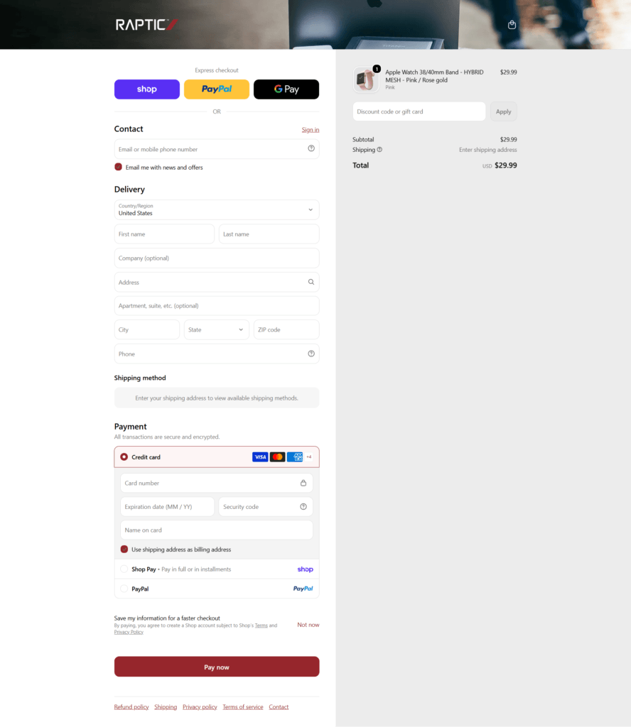
A shared, multi brand checkout. Checkout carries Bittermilk, Barcoop Bevy and Tippleman’s marks together in the header, with a purple Shop express button above the standard delivery and card fields and a dark Pay Now button at the bottom.
The formula stated plainly. Product copy explains the method directly: “a bittering agent, a sweetener, and an acid,” summed up in the line “the labor is in the bottle.”
Press mentions used as proof. The product sidebar lists a Garden and Gun Made in the South Award win from 2013 alongside Vanity Fair, The Wall Street Journal, Southern Living, Town and Country and Family Circle, stacked as plain text rather than logos.
A tagline that plays on the name. “This isn’t the bitter end” closes the page in a red banner with the same circular badge mark, turning the product name into the sign off.
A named inbox for order questions. The product page points buyers to orders@bittermilk.com for delivery timing rather than a contact form or chat widget.
Two brands, one checkout. Tippleman’s syrups and Bittermilk mixers are purchased and shipped together from the same cart, sharing shipping and payment rather than running as separate stores.


Egyptian cotton linens, woven in Europe and custom sewn in Canada. We change the way you sleep.
Poketo is a lifestyle brand and purveyor of design-driven wares meant to instill art into everyday living.
Beardbrand is a men’s grooming company that is focused on beard care products.
Ethical, sustainable & organic textiles, designed and screen printed by hand in the Younghusband Woolstore, Melbourne.
Urbanears is a collective out of Scandinavia, making headphones that fit your everyday life.
Cereal is a bi-annual magazine about travel and style.
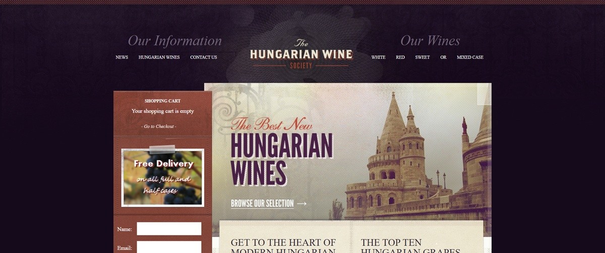
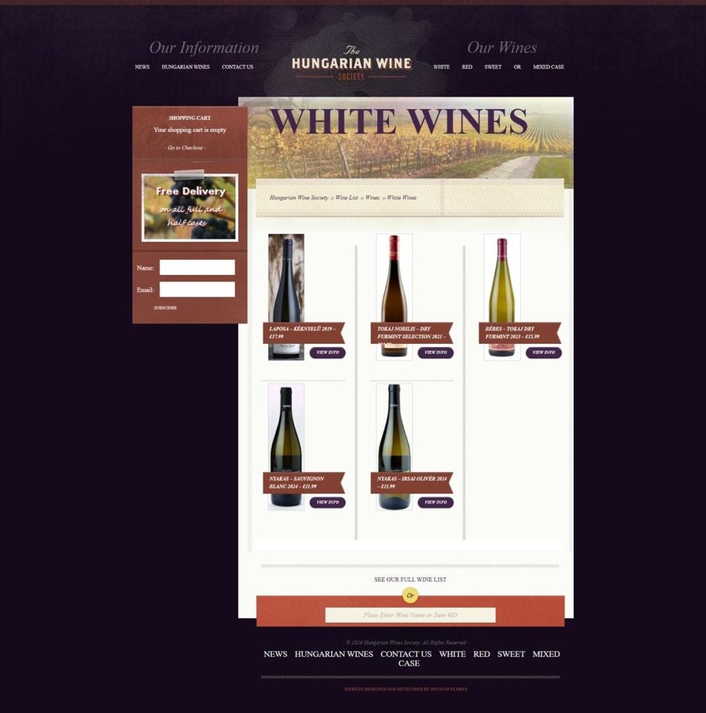
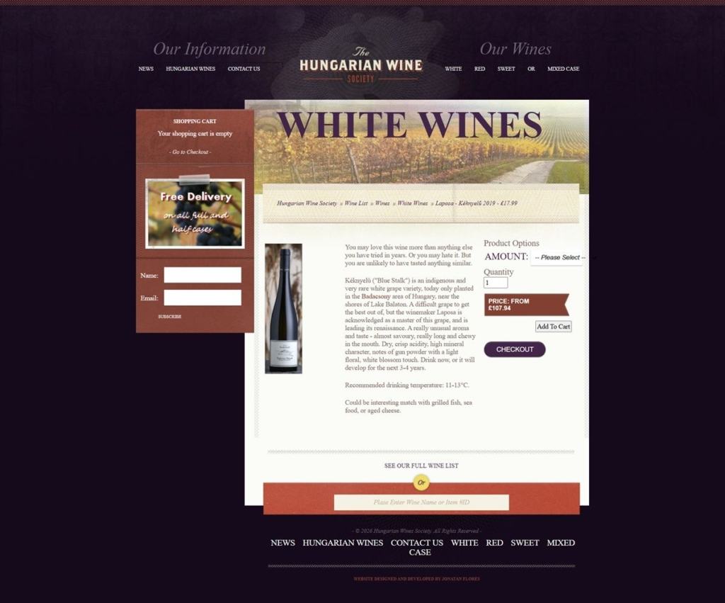
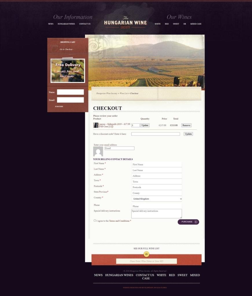
Hungarian Wine Society sells Hungarian wine by the bottle and in mixed cases across white, red and sweet categories, aimed at UK wine drinkers looking past mainstream regions. The homepage states the mission as “Get to the Heart of Modern Hungarian Wine Making” and adds “No membership fees, no sign up! Just lots of good wine. And lots of good information too.” Built on WordPress with the WP eCommerce plugin, a smaller and older toolset than the Shopify or WooCommerce base most current wine retailers run on.
A plum and rust palette. Page furniture runs on deep aubergine tones, close to #43254A and #492145, paired with a rust red near #ba4c37 and a tan gold around #8d7959. The combination reads as old-world and wine-adjacent rather than a neutral ecommerce default.
Arial throughout, no webfont. Headings and body copy both fall back to the system Arial stack. There is no licensed or custom typeface loaded anywhere in the theme, which keeps the page light but gives it a plain, unstyled feel next to more produced competitors.
A slider-led homepage over a grid. The top of the page is a rotating promotional banner rather than a product grid, followed by editorial blocks on Hungarian winemaking before any bottle appears. Commerce is secondary to content on first load.
Three straightforward categories. White, red and sweet wines are the only top-level splits, plus a mixed-case option, with no further filtering by grape, region or price visible on the category pages.
Prices span a wide range. Individual bottles run from 15.99 to 34.99 pounds, with cases from 95.94 to 209.94 pounds, giving the range both entry-level and collector-tier options.
Educational content sits ahead of checkout. A “Top Ten Hungarian Grapes” feature and ongoing blog posts on regions and producers are placed in the main navigation, alongside the shop categories rather than in a separate resources section.
Expertise is the pitch, not scale. Copy leans on producer credentials, citing “several winners of The Hungarian Winemakers of the Year,” rather than volume, discounts or fast delivery.
The differentness is named directly. The site asks shoppers to try “something that little bit different,” positioning Hungarian wine as a discovery category against more familiar French or Italian shelves.
A newsletter tied to monthly offers. Sign-up is pitched specifically for “exclusive monthly offers” rather than generic updates, giving it a clear reason to subscribe.
A single social channel. Only a Facebook link appears in the footer, with no Instagram or X presence integrated into the design.
Designer credit left in the footer. The theme footer still carries an attribution link to its original builder, a leftover from the site’s original launch rather than an active brand feature.

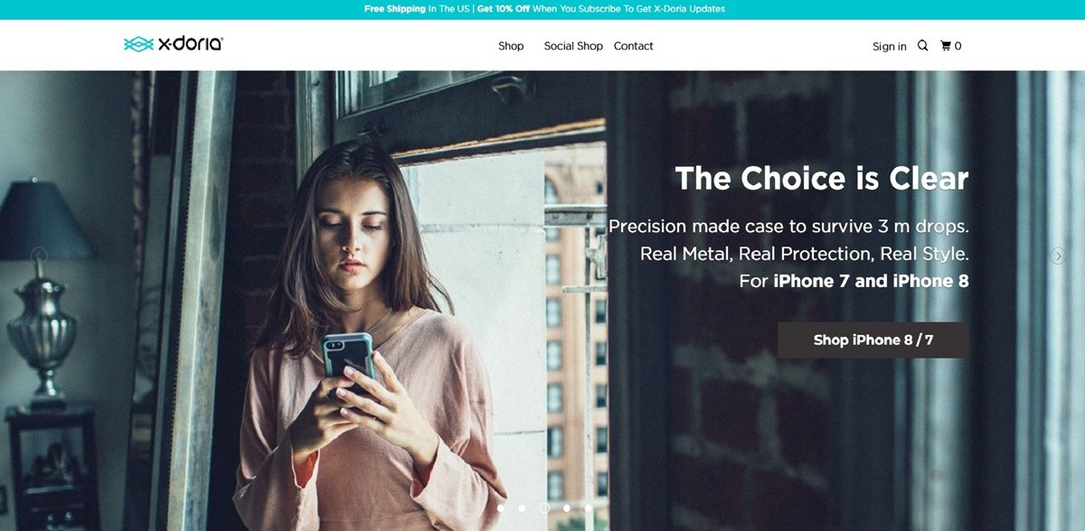
X-Doria’s storefront at xdorialife.com now trades under the Raptic name, selling magnetic and Kevlar-weave phone cases, tempered glass screen protectors, Apple Watch bands and compact power banks for iPhone, Samsung Galaxy Z Fold and Apple Watch devices. Prices on the accessories grid run from about twenty to thirty dollars. The store runs on Shopify, with express checkout through Shop Pay, PayPal and Google Pay.
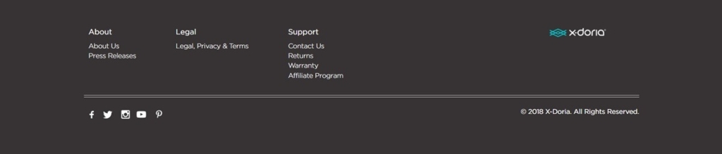
A bold wordmark replacing a softer one. The current shop carries a heavy sans-serif RAPTIC logo with a red diagonal accent stroke, a harder mark than the thin teal wave X-Doria logo that still appears in this gallery’s footer capture.
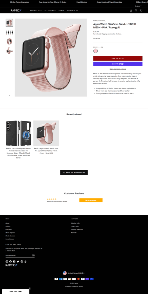
A black header over a white grid. A black promo ticker runs return policy, shipping and new-arrival messages above a plain white nav bar listing Phone Cases, Accessories, Power and Contact Us, with search, account and cart icons at the right.
A mixed button palette. Purple marks Shop Pay, yellow marks PayPal, and a dark maroon-red carries Add To Cart and Pay Now, while an unrelated orange appears only on the Write A Review button, so no single accent color runs through the whole checkout path.
A dense, sortable accessories grid. The category page groups cases, watch bands, screen protectors and power banks together under one Accessories heading, sorted Date, new to old, with a price and short spec-heavy title under each thumbnail and one item marked Sold Out.
A two-button add-to-cart. Product pages pair a red Add To Cart button with a separate purple Buy With Shop button and a More Payment Options link, giving a faster express path before the standard cart flow.
Specs over story on product pages. The Apple Watch band listing describes materials and fit in bullet points, stainless steel loops, faux leather, magnetic closure, and 38/40mm compatibility, rather than lifestyle copy.
A star-rating module built into the page. Customer Reviews sits directly beneath a Recently Viewed row and a Back To Accessories link, with a star rating and an orange Write A Review button rather than a separate reviews tab.
Two brand eras in one gallery. The shop, product and checkout captures show the current Raptic identity, while the separately captured footer still carries a 2018-dated X-Doria wordmark and copyright, evidencing the rebrand directly inside this entry’s own screenshots.
Copy tied to current hardware. The promo ticker references “New Arrival for your iPhone 17 Series,” anchoring the store’s messaging to a specific, current device generation rather than generic protection claims.
A plain policy footer. The X-Doria era footer lists About, Legal and Support columns with Press Releases, Warranty and an Affiliate Program link, alongside five social icons.
Three express checkout options before the form. Shop, PayPal and Google Pay buttons sit above the standard email and delivery fields, each keeping its own brand color rather than being restyled to match the store.
A discount code field inside the summary. The order summary panel carries its own discount or gift card field next to the subtotal, separate from the main payment form.