The leading designer and maker of innovative self-adhesive surface graphics since 2002. Plus graphic art clocks, home goods and bags.
Blik


eCommerce Websites
The leading designer and maker of innovative self-adhesive surface graphics since 2002. Plus graphic art clocks, home goods and bags.
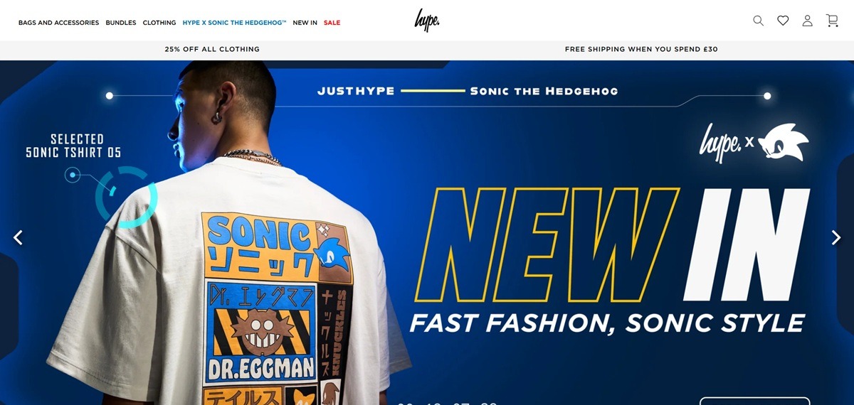
HYPE. is a British streetwear label from Leicester whose online store is now weighted heavily toward school and kids’ gear. The catalogue leads with backpacks, lunch bags, water bottles, pencil cases, drawstring bags and bundle sets, backed by boys’, girls’, kids’ and mens clothing lines covering t-shirts, hoodies, tracksuits, joggers, jackets and footwear. A licensed Hype x Sonic the Hedgehog range runs across most of those categories. Prices are in pounds, with backpacks typically at £30 to £32 and lunch bags at £15 to £18. Built on Shopify.
Gotham on white, with one blue. The theme sets Gotham over a Helvetica and Arial fallback, in near black on white and light grey grounds. A single strong blue carries links, badges and calls to action, with red reserved for sale pricing.
Category first navigation. The header opens into wide dropdowns that list a collection under every heading, so Bags and Accessories, Boys, Girls, Kids, Menswear and Sale each expose eight to ten sub collections without a second click.
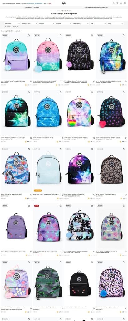
Product grids built around print. Cards are photographed flat against white with the pattern filling the frame, which suits a range where most of the difference between two backpacks is the print rather than the shape.
Filters sized for a large catalogue. A backpack collection filters by product type, colour across thirteen named options, gender and stock status, with counts on every value and a live tally of in stock items.
Three separate shortcut systems. The Sale menu offers Shop By Price bands at under £10, £20 and £30; the kids’ menu offers Shop By Size from 3/4 Years to 13/14 Years; and a Bestsellers block on the homepage splits by product type.
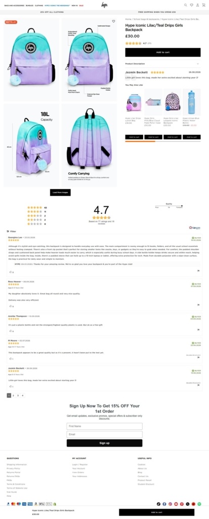
Specification lists rather than lifestyle copy. Product pages open with two or three sentences of tone, then switch to a bulleted feature list giving strap padding, reflective piping, laptop sleeve fit, fabric, dimensions in centimetres, litre capacity and water resistance.
Thresholds stated in the header. A rotating announcement bar carries the current offer and the free shipping line, set at £30, so both sit above every page rather than surfacing at checkout.
An origin story kept in the footer. The About HYPE. text describes a start in a small Leicester office, staff riding skateboards between units and rooftop photoshoots, and names Jay-Z, Cara Delevingne and Tom Hardy as past wearers.
Licensing as the current narrative. The Sonic the Hedgehog partnership occupies the first slot in the main menu and has its own set of sub collections, making a licensed character rather than the label’s own graphics the lead story on the homepage.
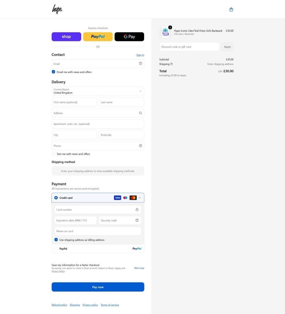
Payment methods explained on their own pages. Klarna, Clearpay and Revolut each get a dedicated page in the footer navigation, alongside the standard card and wallet marks.
A country selector covering most of the world. Shoppers can switch region from a list of well over a hundred countries, which changes pricing and shipping for that market.
A product recall page in the help menu. Sitting beside returns, FAQs and the size guide, it is an unusually direct piece of compliance content for a fashion storefront.
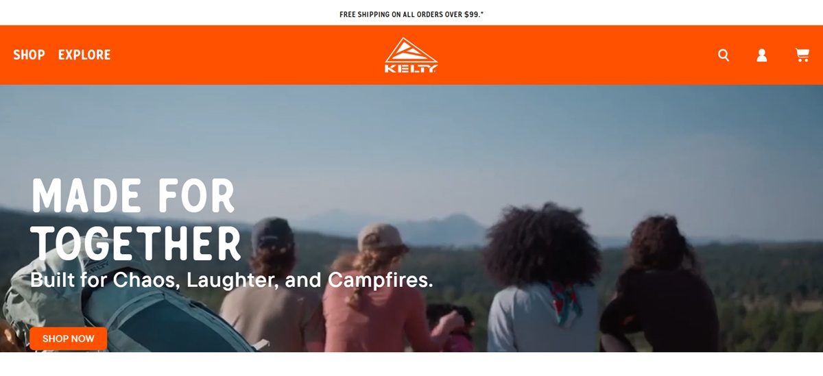
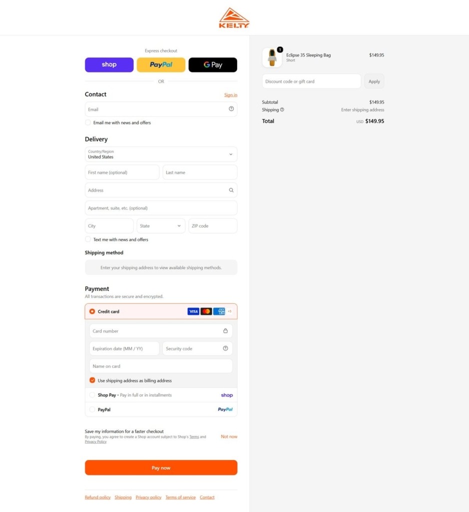
Kelty sells camping and backpacking equipment, including tents, sleeping bags, sleeping pads, backpacks, camp furniture and organizational gear, through its own direct Shopify storefront. The range is built for a wide span of outdoor users, from families on a park day or at a festival to serious backpackers and overlanders, and the site groups products by activity as much as by gear type. The stated positioning is “Built for Play,” extended in copy to “we’re built for playing together,” framing the gear around shared outdoor time rather than solo performance.
An orange and charcoal system. The interface runs a bright safety orange against near-black charcoal and an off white ground. A secondary tan and khaki scale, from pale blush to deep olive brown, sits behind photography and section dividers.
Expanded display type over a plain sans. Headlines use TT Commons Pro Expanded and a display face called Gunnar, both wide and heavy, while body copy and navigation run on the narrower TT Commons Pro. The contrast gives headers a blocky, outdoor-gear-catalog weight against restrained interface text.
Campaign imagery up front. The homepage leads with seasonal campaign sections, including festival-focused gear pushes and social content tagged BUILTFORPLAY, before settling into standard new-arrival and featured-product grids.
Two ways into the catalog. Main navigation splits into Camping, Backpacking and Adventures, then repeats the same products under a straight Product Type index, so a shopper can browse by trip type or go straight to a gear category.
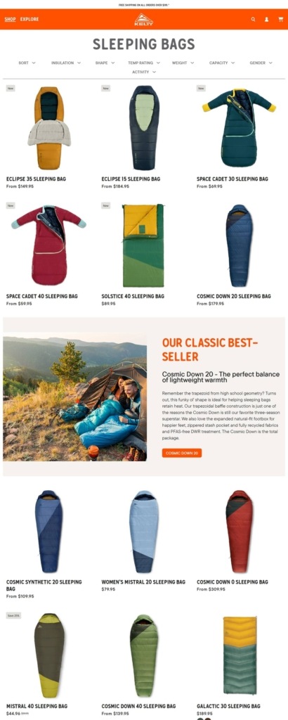
Prices shown at every step. Collection cards carry visible prices, from about $60 for kids’ sleeping bags to $390 and up for tents, with a standing sale section for discounted stock.
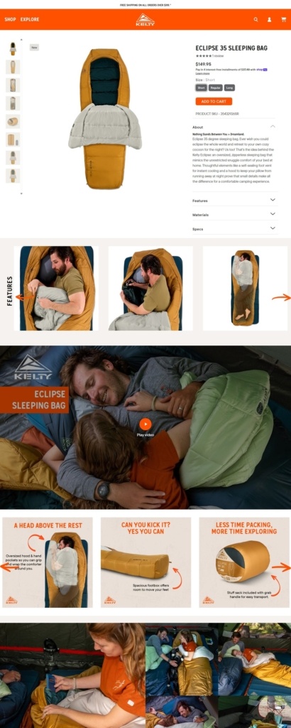
Full express checkout. Product pages offer Apple Pay, Google Pay, Shop Pay and PayPal as one-tap options ahead of standard card entry, and a Stamped reviews widget sits on product pages beneath the buy box.
Shipping threshold stated plainly. Free shipping applies to orders over $99, surfaced near the cart rather than buried in a policy page.
The tagline carries the message. “Built for Play” and its longer form about playing together recur across campaign sections, positioning the gear as a way to create group memories rather than as technical equipment first.
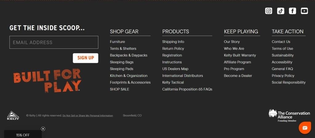
A warranty as the quality signal. The Kelty Built Warranty is named directly on the site, standing in for the kind of durability claims the brand otherwise avoids making outright.
Social proof through hashtag content. The BUILTFORPLAY tag pulls customer and campaign photography into the homepage, tying the play positioning to real outdoor use rather than product shots alone.
Sale section kept separate from the main grid. Discounted items are grouped on their own rather than mixed into category listings, keeping the full-price browsing experience uncluttered.
A California hazard notice on relevant listings. Products carry the state’s required cancer and reproductive harm warning where applicable, a compliance detail rather than a marketing one.
Return and warranty information linked from the footer. Both the return policy and the warranty program are reachable from global navigation, keeping post-purchase questions close at hand rather than routed through support.
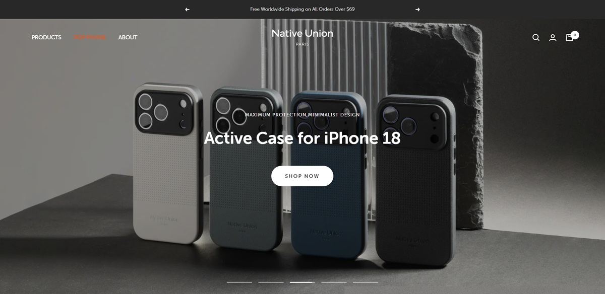
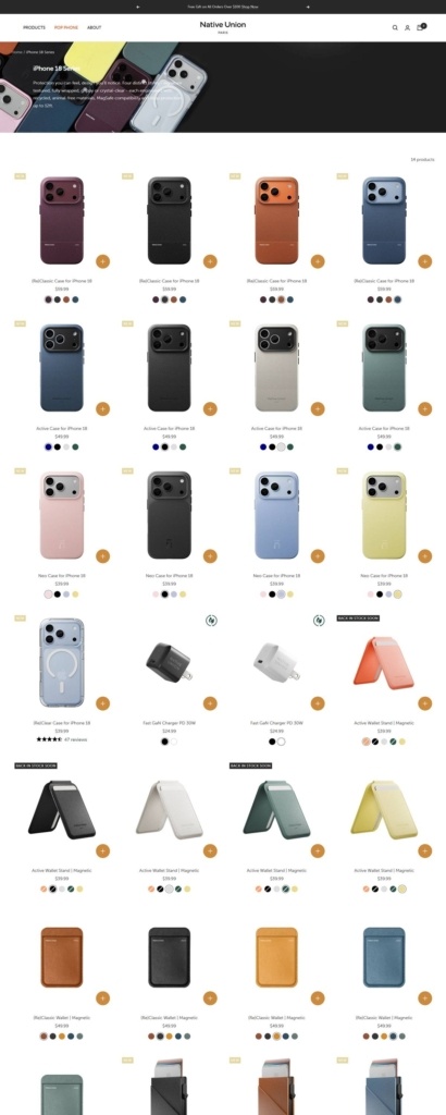
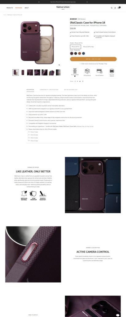
Native Union designs accessories for Apple hardware and sells them direct, covering iPhone and AirPods cases, Apple Watch bands, power banks, cables and chargers, bags and sleeves, and a small range of desk pieces. The catalogue is organised by device generation rather than by category, and prices run from 19.99 dollars for a cable to 139.99 dollars for a three in one magnetic charger. The homepage states the position in two lines under the hero: “Designed in Paris” and “Delivering Worldwide”. Built on Shopify.
A warm neutral ground. The theme background is set to #f6f5f0, a warm off white, with copy and headings at a soft near black rather than pure black. The interface holds almost no other colour, reserving an orange (#ef521b) for highlighted menu items and a red for low stock warnings, so photography carries the palette.
Museo Sans throughout. Type is loaded from Typekit as Museo Sans, with condensed, display and rounded cuts in the same request, and Neue Haas is named alongside it. One humanist sans handles headings, body and labels at different weights.
Hardware led navigation. The main menu splits into Selection, iPhone Cases, AirPods Cases, Carry, Apple Watch Bands, Power, Desk Essentials and POP Phone. Each panel then lists device generations, so the first choice a shopper makes is which phone or watch they own.
Quick add inside the grid. Every product card carries a plus Add to cart control that expands in place into Select Model and Select Color rows with colour swatches, so an order can be completed without opening the product page at all.
Filters built around devices. The iPhone Cases collection lists 38 products and filters on price, availability, colour, collection, product type and device, the last running from iPhone 12 up to iPhone 18 Pro Max. Availability counts are shown in the filter itself.
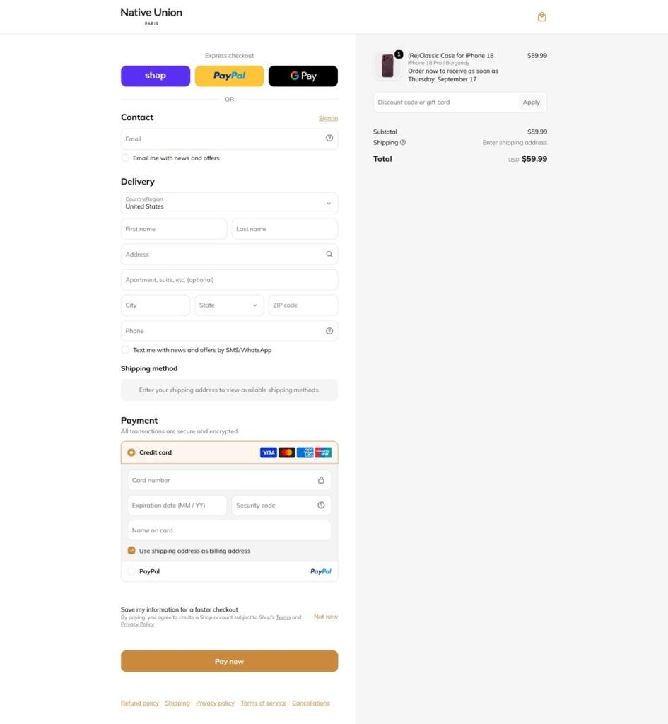
Delivery dates before checkout. The cart drawer prints “Order now to receive as soon as” with a named date. Express payment covers Shop Pay, Apple Pay, Google Pay and PayPal.
Less but better. The design principle is stated plainly in a homepage panel: “We believe in ‘Less but Better’. Better design, better quality.” Sustainability is argued through materials rather than slogans, with recycled frames, animal free leather alternatives and recycled microfiber linings listed as product bullets.
Certification in the buy box. A B Corp Certified badge sits beneath the add to cart button, next to 30 Day Returns, Secure Checkout and Recycled Materials.
Review volume on the homepage. A block reports 4.7 out of 5 across 12,589 reviews, followed by named buyer quotes that cover warranty replacements and customer service as much as the products.
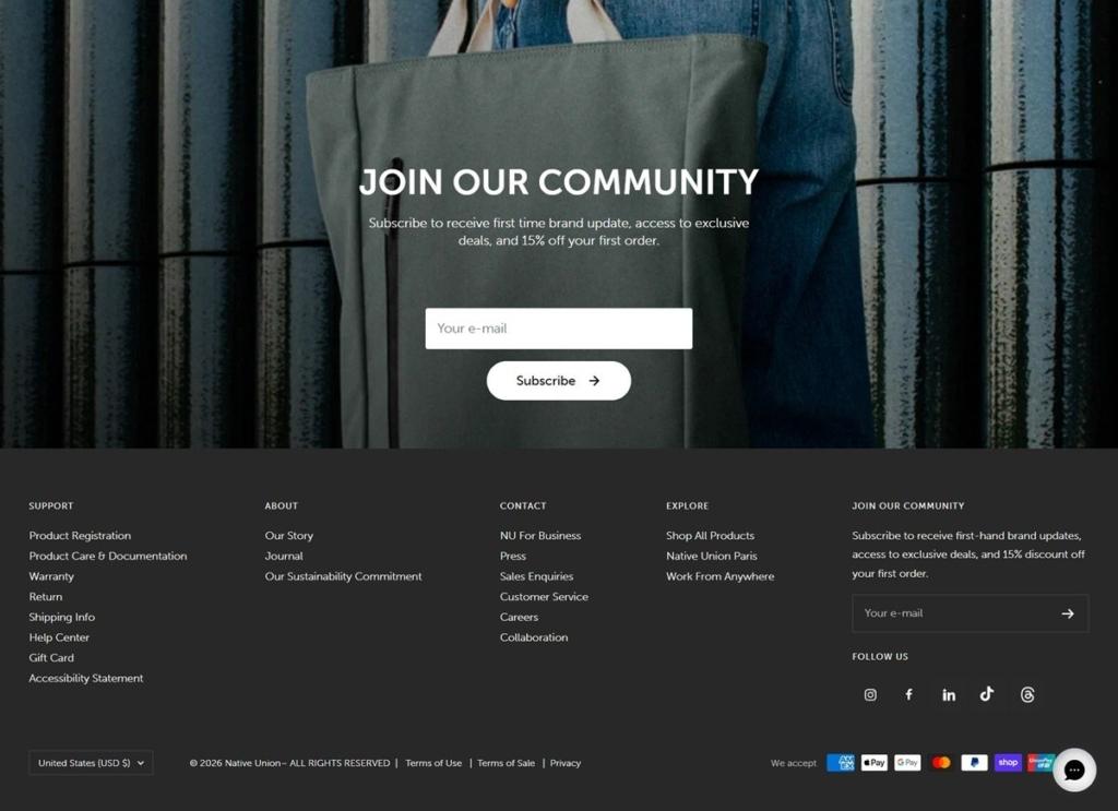
Registration and warranty as navigation. Product Registration, Product Care and Documentation, and Warranty each get a footer link, and product pages state a two year limited warranty beside the returns window.
Currency switching by market. A country selector in the footer swaps between USD, EUR, GBP, JPY, SEK, DKK, AUD and others across roughly sixty listed markets.
Molly & Me Pecans started in 2008 when Kay Holseberg started picking up pecans at her family’s farm, trying different recipes, and sharing them with family and friends. Kay harvests her own pecan trees and buy from other local farmers, then cooks them in a cookhouse on the farm.
Present & Correct sells curated stationery and desk accessories, from vintage pencils and pen trays to notebooks, clips and office games, organized by activity rather than category. The brand has traded since 2009, with a Bloomsbury shop in London backing the online store, and the copy states it plainly: “Shipping worldwide or visit our Bloomsbury store.” Built on Shopify.
Near-black text with a single cobalt accent. The site runs on off-white and light gray grounds with near-black type, and reserves a cobalt blue for the one accent role, mostly links and small highlights, so the palette reads as neutral until that blue appears.
One sans-serif throughout. Both headings and body copy are set in Assistant, a single sans-serif family, with no serif contrast. Section labels in the top navigation run in small, letter-spaced capitals.
A graph-paper hero band. Category landing pages open with a full-width grid pattern, like ruled paper, with a single word such as “NEW” centered over it before the product grid begins. It is one of the few decorative devices on an otherwise plain layout.
A dense four-column grid. Product cards show a plain product photo on a light gray card, the name underneath, and the price in GBP, for example a Midori Brass Fountain Pen at 85.00 GBP alongside a Greek Paperclips tin at 4.50 GBP. Sold-out items carry a small black tag over the image rather than being hidden.
Filter by availability and price, sort several ways. Collection pages carry Availability and Price filters plus a sort menu covering Featured, Best selling, Alphabetical, Price and Date, with results paginated across several pages per category.
Named, browsable categories. The main navigation splits the catalogue into New, Mail, Give, Notes, Write, Organise, Read and Ephemera, framing the range around what a shopper is doing rather than a single “Stationery” label.
A single line carries the history. Rather than a dedicated About page in the primary flow, the founding date and shop location sit in one sentence near the top of the site, keeping the brand story brief.
Object photography does the talking. Products are shot plainly, mostly single items or small groupings on neutral backgrounds, letting design-forward items like the Enriceras wax crayons or a set-square beaker carry the tone without further styling.
An announcement bar for real store news. A black strip above the header is used for operational notices, such as store closures, rather than a standing promotional message.
A gift icon in the header. Alongside search, the header carries a distinct gift-box icon rather than a generic account or wishlist icon, matching the Give category in the navigation.
A credited site builder in the footer. The footer names “The Printer’s Son” as the site’s builder beneath the copyright line, an unusual bit of transparency for a retail footer.
This online shop is like an open-air flea market where the owners offer the fruits of their partnerships with friends whose work inspires them.
COS is a fashion brand for women and men who want modern, functional, considered design.
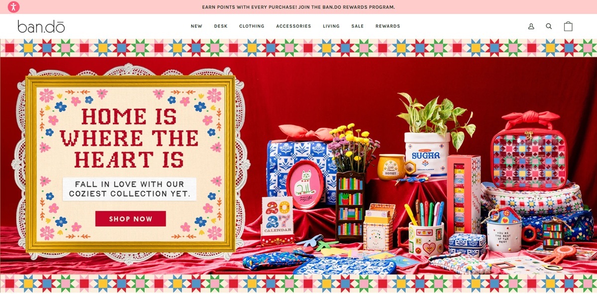
ban.do is an LA lifestyle brand selling across four categories: Desk (planners, notebooks, stickers), Clothing, Accessories (bags, jewelry, roller skates) and Living (home decor, candles, self-care items), mixing its own branded goods with other labels it stocks. The store targets shoppers drawn to playful, self-expressive design and runs on Shopify.
Karla in two weights carries the whole site. No secondary display face loads; Karla’s bold weight sets headings and buttons while the regular weight handles body copy and product details, keeping the typography consistent even as the color blocking changes page to page.
Pink, dark green and red as the working palette. A pink top banner and pale pink section backgrounds pair with a dark forest green (used on the Add to Bag and Pay Now buttons) and a red-to-coral accent for sale pricing and status dots.
Photography-led product grids. Rather than flat product shots, most cards show the item worn by a model against plain or lightly styled backgrounds, keeping a consistent fashion-catalogue look across Tops, Dresses and Accessories alike.
Circular category icons above the grid. The Tops page opens with a row of round photo bubbles for subcategories (Tees and Sweatshirts, Tops, Sweaters, Bottoms, Dresses and Jumpsuits, Jackets, Active and Lounge) rather than a plain text filter bar.
A promotional tile embedded in the grid. A bright, color-blocked ad card for the ban.do Rewards program sits inline among the product photos partway down the Tops grid, breaking up the shopping rhythm with a signup prompt.
Accordion detail on product pages. The Lace Trim Cami Top page shows thumbnails, a size grid, a dark green Add to Bag button, a Shop Pay installment note, then two collapsed accordions for Description and Shipping and Returns, with bullet-point fit details inside Description.
Multiple express payment options at checkout. Checkout offers Shop, PayPal and Google Pay as express buttons above the form, and the card payment step additionally lists Shop Pay, PayPal and Afterpay, with a dark green Pay Now button.
A wellbeing mission stated directly. Brand copy reads “We exist to help you be your best and we encourage joy,” tying the product range to self-care and mental health awareness rather than framing items as purely decorative.
A named loyalty layer. The ban.do Rewards program is promoted in the top banner, in the product grid and again at checkout (“Don’t miss out! Log in to earn and redeem rewards”), making the loyalty program a recurring visual element rather than a one-off footer link.
Loop-powered returns. The storefront integrates Loop Returns for self-service exchanges and refunds, referenced in the Shipping and Returns accordion on product pages.
“Brighten Up Your Inbox” signup block. The newsletter capture on product pages breaks from generic subscribe language, running its own header line and offering 10 percent off the next order against a solid pink panel.
A four-column footer split by audience. The footer separates Help and Info, Company, Work With Us (wholesale, careers, influencer program) and Privacy and Accessibility into distinct columns, surfacing B2B and partnership links alongside standard customer support ones.


Located by the harbour in Copenhagen, Studio Arhoj is a Danish interior & design studio run by Anders Arhoj. Originally founded in Tokyo in 2006, Studio Arhoj is now based in Denmark.
Fully-customized prescription glasses delivered to your door starting at $99.
Riiot Labs showcases its Blue pool sensor with a single-product site that, simply put, looks gorgeous.


