JOI creates plant milk concentrates made from single, whole ingredients, with zero preservatives or added sugar.
JOI


eCommerce Websites
JOI creates plant milk concentrates made from single, whole ingredients, with zero preservatives or added sugar.
The Lost Explorer Mezcal is a small batch handcrafted mezcal cultivated on ancestral Miztec land in the sun-soaked Valles Centrales, Oaxaca.
Oats in Coats is all about making breakfast fun for everyone! Their cereals are made with real fruits and veggies with no added sugars or GMOs
A unique new medical boutique focusing on cosmetic dermatology.
Tenneyson is a complex, botanical drink that nourishes the mind and body without the harmful impacts of traditional spirits.
Camp Spice uses organic, all natural herbs and spices to create essential seasonings for all cooking environments.
Maison Hanae is a luxury home fragrance brand providing sublime moments through an exclusive olfactory experience.
Herb & Olive is an e-commerce website that offers a wide range of organic olive oil for cooking.
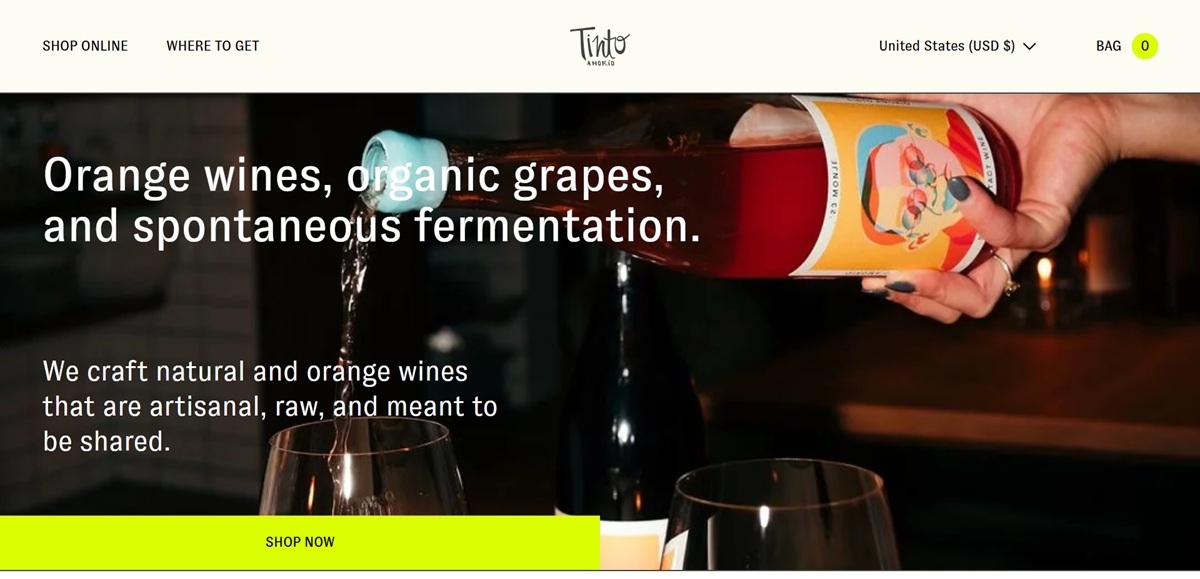
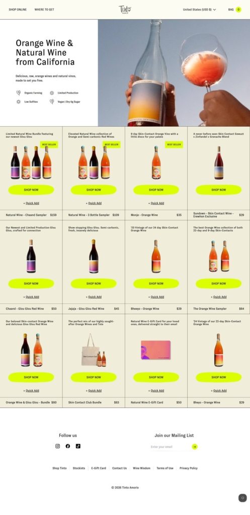
Tinto Amorío is a California producer of natural, organic and orange wines, selling direct alongside a small merchandise line. The range covers skin contact orange wines such as Monje and Bheeyo, semi-carbonic glou glou reds including Jajaja and Chaand, a rosé and lower-alcohol spritzes, priced from $29 a bottle up to $159 for the largest sampler, plus bundles, totes and an e-gift card. The positioning is stated on the homepage: “We craft natural and orange wines that are artisanal, raw, and meant to be shared.” Built on Shopify, with an age gate at the door and currency switching across the United States, the United Kingdom and six European markets.
Navy, chartreuse and hot pink. A deep navy carries the type and the header, with an acid chartreuse and a hot pink used for badges, buttons and highlight text. The combination is closer to a beverage startup than to a traditional wine label.
GT Zirkon as the brand face. The site self-hosts GT Zirkon in book, regular and bold weights and uses it for almost everything, with Inter, Poppins and Urbanist appearing in secondary interface elements.
Bottle photography on flat colour. Bottles are shot straight on against solid fields rather than vineyard scenes, which keeps the labels legible at thumbnail size across the grid.
An age gate before anything else. The first interaction is a yes or no question, “Are you 21 or older?”, and the answer is required before the catalogue is reachable.
A short grid with quick add. The natural wine collection runs to about a dozen entries, each card carrying a one-line description, the price and both Shop Now and a Quick Add control, with Best Seller flags on the strongest lines.
Shipping threshold built into the cart. A persistent banner offers free shipping on six bottles or more, and the cart drawer counts down how far an order is from that threshold before the checkout button.
Terms stated at the point of purchase. The cart notes that someone 21 or older must sign for deliveries and that sales are final, rather than leaving both to a policy page.
A founder story used as positioning. The homepage recounts that Anish founded Tinto after a near-fatal car accident and six months in hospital, following time spent in Spain where he first met minimal intervention wines.
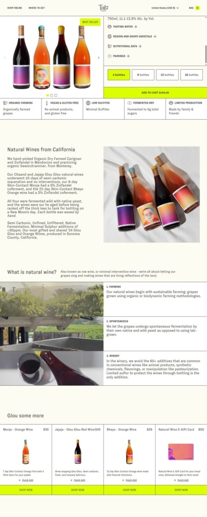
Process explained in three steps. A Farming, Fermentation and Winery sequence sets out organic and biodynamic growing, spontaneous fermentation with native yeast, and the avoidance of the sixty or more additives common in conventional wine.
A subscription framed as a club. The Skin Contact Club runs as a recurring bundle rather than a plain repeat order, with its own branded tote.
Food pairing as content. A Wine Wisdom section publishes recipes with ingredient lists and preparation steps, each tied to a bottle through a Shop Now link.
Multi-market pricing. Store switching covers USD, GBP, EUR and DKK, with localised paths for German, French, Dutch and Danish shoppers.

Plant Based Skincare to ascend mind, body & spirit. Made with only vegan, natural and organic ingredients.
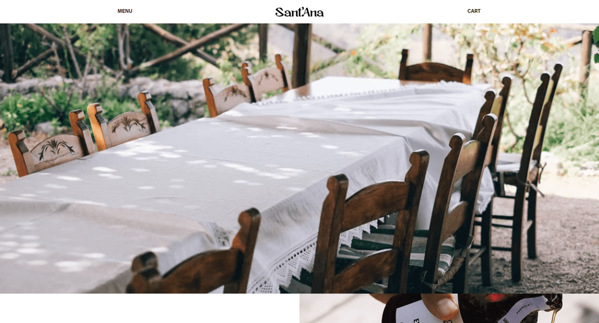
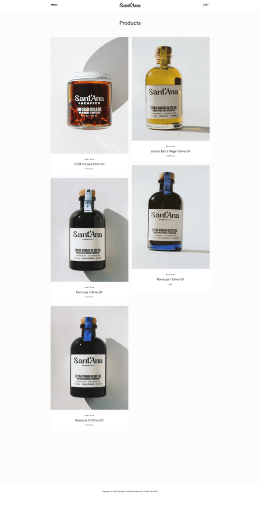
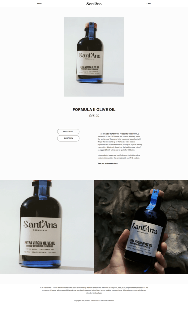
Sant’Ana’s website uses a minimal, editorial Shopify design with sparse navigation, poetic food-and-medicine storytelling, and product sections centered on olive oil imagery. The business sells Cretan extra virgin olive oil and CBD-infused culinary oils, including different CBD strengths and a CBD chili oil. The brand is positioned around ancient herbal traditions, high-quality Greek olive oil, culinary wellness, and cannabinoid-infused food products.
Deloce makes canned espresso martinis made from 100% Arabica cold-pressed espresso and gluten-free vodka.


