
 By Catalin Zorzini
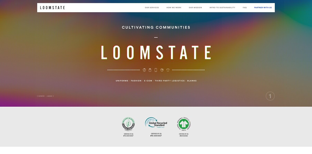
Loomstate is a sustainable apparel company focused on organic cotton clothing, custom uniforms, branded fashion programs, ecommerce operations, blanks, and fulfillment services. Founded in 2003, the company works both as a clothing brand and as a production partner for other businesses, including restaurant and hospitality companies. Its positioning centers on traceable materials, lower-impact manufacturing, long-term supplier relationships, and social benefits for the farming and manufacturing communities involved in its supply chain.
Website Design
Loomstate’s website is built more like an editorial sustainability report than a conventional apparel storefront. Large photography, oversized headlines, repeated typographic phrases, and long scrolling sections are used to explain the company’s process and philosophy before pushing visitors toward a commercial action.
The visual direction combines fashion imagery with documentary-style photographs of cotton farms, agricultural workers, manufacturing environments, uniforms, and finished garments. This creates a deliberate connection between the final product and the people and places involved in making it. Partner logos and portraits are integrated into the same visual system, reinforcing the business-to-business side of the company.
Typography is bold and frequently oversized, with headings repeated across the width of sections to create rhythm as visitors move down the page. Smaller blocks of uppercase copy, statistics, captions, and explanatory paragraphs introduce a more report-like layer beneath the larger editorial statements.
The color palette remains comparatively restrained, allowing photography and natural materials to provide much of the visual character. Generous spacing helps separate what is otherwise a substantial amount of sustainability information, while alternating text, photography, data, and quotations prevents the longer pages from becoming continuous walls of copy.
Shopping Experience
The main Loomstate website does not follow a standard direct-to-consumer ecommerce structure. There is no persistent Shop navigation, product grid, cart, or conventional checkout flow on the primary site. Instead, the central conversion goal is to begin a commercial relationship with Loomstate.
Navigation focuses on Our Services, How We Work, Our Mission, sustainability information, FAQs, and a prominent Partner With Us action. The Services section then divides the offer into Uniforms, Fashion, E-commerce, Third-party Logistics, and Blanks.
This architecture reflects Loomstate’s role as an apparel and operational partner rather than simply a clothing retailer. Visitors first identify the service relevant to their organization, explore its capabilities and sustainability credentials, and are then directed toward a contact or collaboration form.
The ecommerce service itself is presented as part of a broader operational offering, alongside garment design, manufacturing, warehousing, and fulfillment. Loomstate also operates branded commerce experiences for partners, but the main corporate website remains focused on lead generation rather than individual product conversion.
Brand Storytelling
Storytelling is the strongest element of the site. Loomstate traces its clothing from cotton seed through materials, processing, manufacturing, distribution, use, extended garment life, and eventual reuse or recycling.
Rather than presenting sustainability as a short certification panel, the site dedicates entire sections to farming practices, supplier relationships, chemical inputs, worker conditions, organic cotton, packaging, and garment longevity. Relationships with Chetna Organic farmers in India receive substantial attention, as do the economic effects of long-term purchasing agreements.
Quantitative impact figures are integrated throughout the layouts, including measurements related to pesticide avoidance, rainwater use, farmer income, recycled materials, and land supported by organic farming.
The brand tone is values-led but practical. Environmental arguments are repeatedly connected to manufacturing processes, commercial partnerships, and operational decisions rather than existing only as lifestyle messaging.
Notable Features
The most distinctive feature is the way the site visualizes the complete clothing lifecycle. A process framework moves through materials, manufacturing, distribution, product use, enhanced lifetime, and end-of-use, turning supply-chain information into a navigable piece of brand content.
Impact statistics appear repeatedly as large visual elements, while partner testimonials and recognizable client logos provide a commercial counterpoint to the sustainability narrative.
Loomstate also treats services that would normally belong to separate companies—apparel development, uniforms, blank garments, ecommerce, warehousing, and fulfillment—as parts of one integrated offering. As a result, the website functions less like a traditional fashion store and more like a sustainability-focused commerce platform and capabilities presentation, using editorial design to connect environmental values with the operational side of producing and selling apparel.


