Archives: Websites

eCommerce Websites

Paustian

Paustian is a Danish furniture and interior design retailer selling designer seating, tables, lighting and storage from brands such as HAY, Parachilna and Nelson alongside its own Paustian Collection, plus project services for offices and commercial fit outs. Founded in 1964, the site serves both private shoppers and businesses through a Privat and Erhverv toggle, with prices shown in DKK or EUR across a shop of more than 700 products.

Website Design

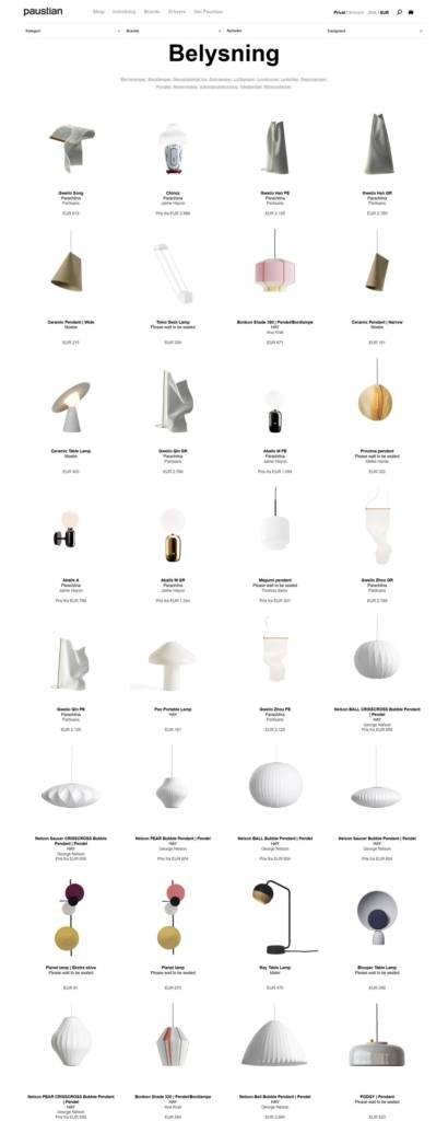
A plain black wordmark, nothing else. The lowercase paustian logotype sits alone at top left in black on white, with no colour blocking or brand accent anywhere in the header or product grid.

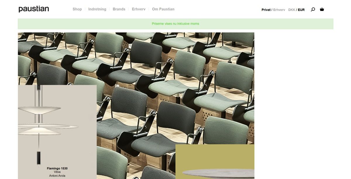
Product photography on empty white. Every catalogue and product image floats on a bare white ground with no props or lifestyle staging, letting each lamp or chair read as an object rather than a scene.

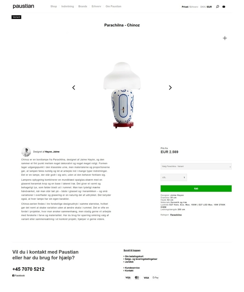
A single narrative pause on product pages. Category names and specifications run in a plain sans serif, while a short designer biography beside a portrait photo, for example Jaime Hayon on the Parachilna Chinoz lamp, is the one place the page slows down for text.

Shopping Experience

A large, filterable catalogue. The shop lists hundreds of products across categories such as Akustik, Belysning, Borde and Stole, sorted by popularity, newest or price, with a left hand category sidebar for narrowing the view.

Designer credited on every card. Each product shows a price from figure alongside the brand and the individual designer’s name, treating attribution as a standard catalogue field rather than an extra.

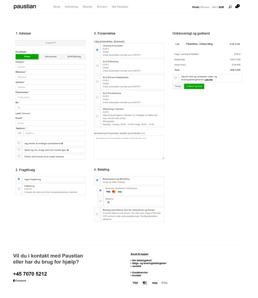
A Danish language, multi step checkout. Checkout runs through four named steps, Adresse, Fragttilvalg, Forsendelse and Betaling, offers delivery, warehouse pickup or kerbside collection, and accepts payment card, MobilePay or invoice for institutions with a CVR number.

Brand Storytelling

Business framing on the homepage. The current homepage speaks directly to commercial buyers, stating the company delivers furnishings that work in practice and acts as one partner responsible for the entire process from design to installation.

Founding date as the credibility marker. Paustian dates itself to 1964 and frames its role around experience managing large scale interior projects rather than product novelty.

Notable Features

A private and business toggle throughout. Every page carries a Privat and Erhverv switch, and checkout itself asks whether the buyer is Privat, Virksomhed or EAN and Offentlig, tailoring the invoicing path to each.

A dedicated Cases section. Completed commercial projects are documented separately from the product catalogue, giving Paustian a portfolio alongside its shop rather than folding project work into product pages.

Services listed as named line items. Under Erhverv the site breaks its offer into Totalloesninger, Projektstyring, Flytning og Logistik, Indretning, Leasing og Leje, Special Inventar and Moebelpleje, so a business buyer can see project management and furniture care listed as separately requestable services rather than bundled into one generic offering.

Three physical addresses back the online shop. The footer lists offices in Vaerloese, Aarhus and Herning with a direct phone number, giving the retailer a regional presence a purely online furniture shop would not show.

Paustian Shop Category page example
Paustian Product page example
Paustian Checkout page example
Paustian footer example

Galerie Stimmung

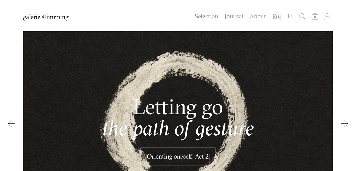
Galerie Stimmung is a French online gallery selling 19th and 20th century craft, design and art, covering ceramics and objects, lamps, furniture and graphic arts by French and international makers. Stock is one of a kind, and listed prices across the main selection run from € 350 to € 6,000, including a Wilhelm Kåge bowl for Gustavsberg at € 900 and a Delphin Massier wall dish at € 6,000. Built on Shopify.

Website Design

Near monochrome. Black type sits on white with a mid grey, #9B9B9B, for secondary text and pale panels at #F5F5F5. A muted red, #B84949, and a warm brown, #988980, are the only other colours, used for links and small marks.

One serif throughout. GT Sectra Fine Book, with its italic, carries headings, prices and body copy alike, joined by a custom display face cut for the gallery. There is no sans serif anywhere in the type stack.

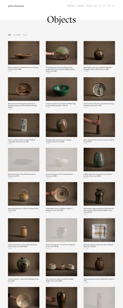
Objects on plain ground. Photography is cut out or shot against white, and grids leave wide margins so a single ceramic reads at the scale of a catalogue plate rather than a product thumbnail.

Shopping Experience

Six categories and nothing else. Navigation is Sélection, Objets, Lampes, Meubles, Arts graphiques and Divers, with Journal and À propos beside them. There are no filters, no sort controls and no faceted search.

Sold pieces stay on the shelf. Items already sold remain in the grid with the price replaced by “Vendu / Sold out”, so the collection reads as an archive as much as a shop.

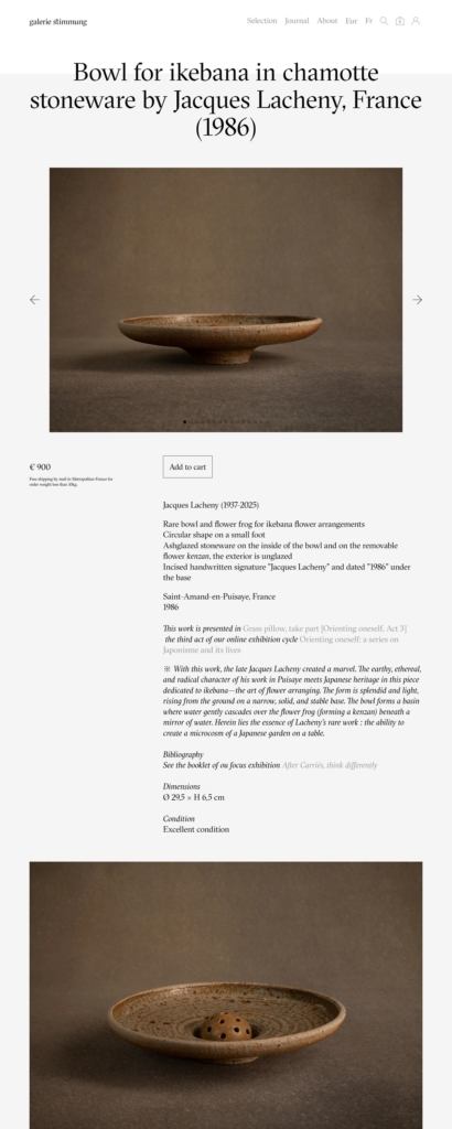
Product pages are catalogue entries. A listing gives maker and dates, form, material, glaze, factory marks and date letters, place and period of manufacture, dimensions in centimetres and a condition line. Beneath that sit an interpretive paragraph, a bibliography citing museum collections and published monographs, and a sourced biography of the maker.

Bilingual and multi-currency. Every string exists in French and English behind a single toggle, and prices convert across eight currencies. Free postal delivery is offered within metropolitan France on orders under 10kg.

Brand Storytelling

Selling through exhibitions. The homepage leads with an online exhibition cycle on Japonisme, divided into numbered acts with their own titles. Product pages name the act a piece appears in, so stock and curation share the same surface.

Scholarship as tone. Descriptions read as gallery wall text, with references to museum shows and V&A holdings, rather than as sales copy. Prices are stated once and never framed as offers.

Notable Features

Suggestions instead of related products. Under each entry a row headed Suggestions and See also shows six further pieces drawn from across the gallery rather than from one category.

A journal in the main navigation. Journal sits at the same level as the product categories, and its exhibition posts are the primary editorial route into stock.

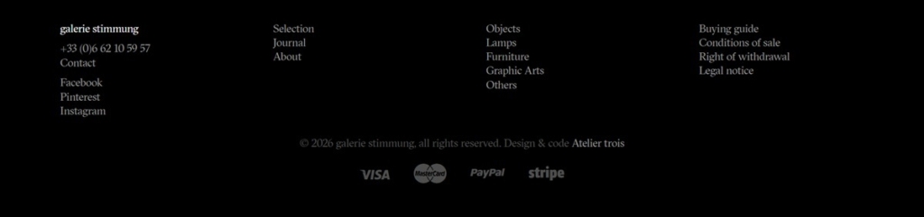
Contact by telephone first. The footer leads with a French mobile number, placed above the legal links for buying guide, conditions of sale and right of withdrawal, and credits the build to Atelier trois.

Galerie Stimmung Shop Category page example

Galerie Stimmung Product page example

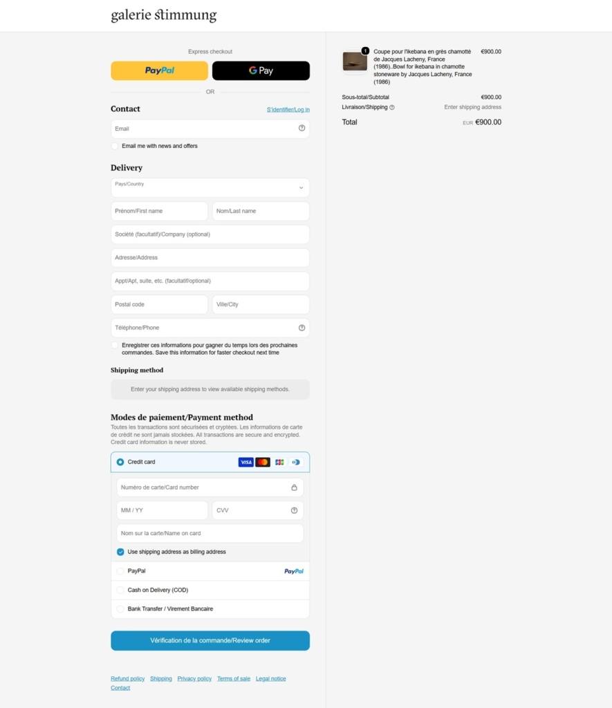
Galerie Stimmung Checkout page example

Galerie Stimmung footer example

Milk Makeup

At Milk Makeup, we believe it’s not just about how you create your look; it’s what you do in it that matters. We see personal style as the ultimate form of self expression and encourage experimentation — from bare to bold, and everything in between. Whatever your look, we’re into it.