Archives: Websites

eCommerce Websites

Rawdish

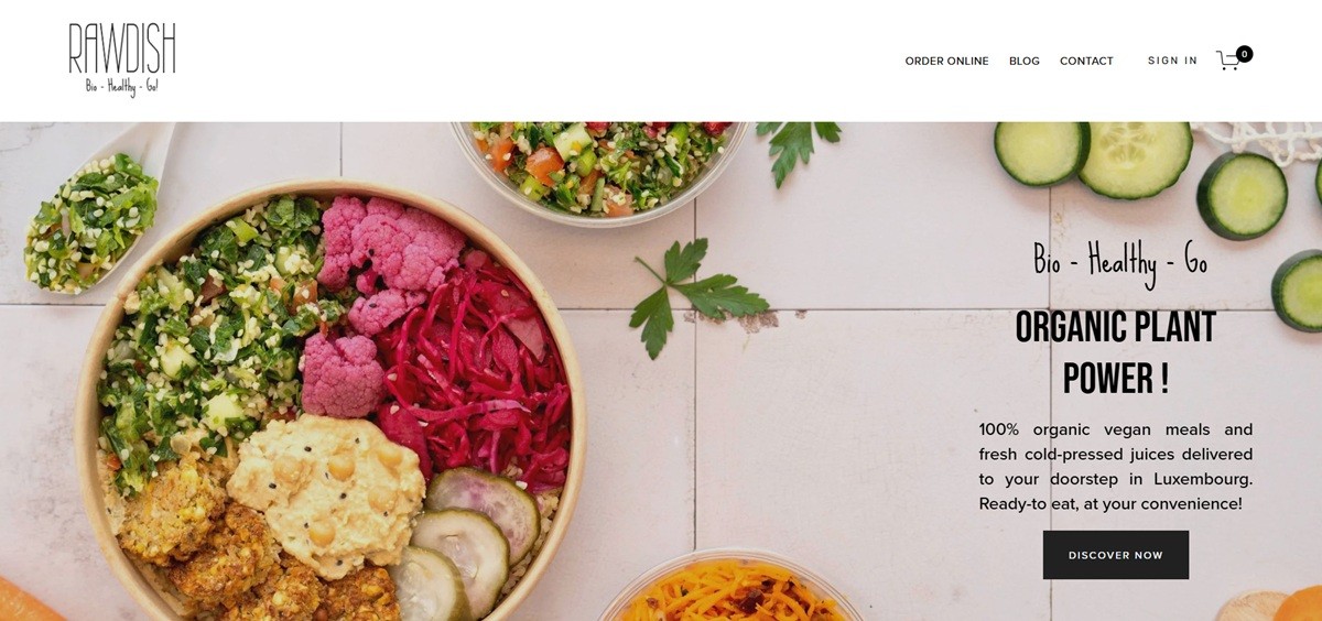
Rawdish is a Luxembourg food producer selling organic plant-based ready meals, cold-pressed juices, salads, desserts and multi-day detox boxes from a shop at 2a Place de Paris in Luxembourg City. Meals run from about 4.95 euro for a small salad to 15.69 euro for a hot dish, and the organic certification is stated in the footer as LU-BIO-02. Orders are taken on the site and through the Wedely, Foozo and Wolt delivery platforms. Built on Squarespace.

Website Design

Bebas Neue over Proxima Nova. Headings are set in Bebas Neue, a condensed all-caps display face, at 50px, against body copy in Proxima Nova Light at 20px. A third setting, Rubik at 12px in capitals with wide tracking, handles navigation and small labels.

Near-black text on white. Type colours cluster on #1D1D1D, #272727 and #212121, with #EBEBEB and #F6F6F6 for dividers and tinted blocks. The food photography carries the colour on its own.

One long index page. The homepage is a sequence of named anchor sections covering the hero, the range, a delivery announcement, featured products, detox, stockists and reviews, each opened by a short capitalised heading.

Shopping Experience

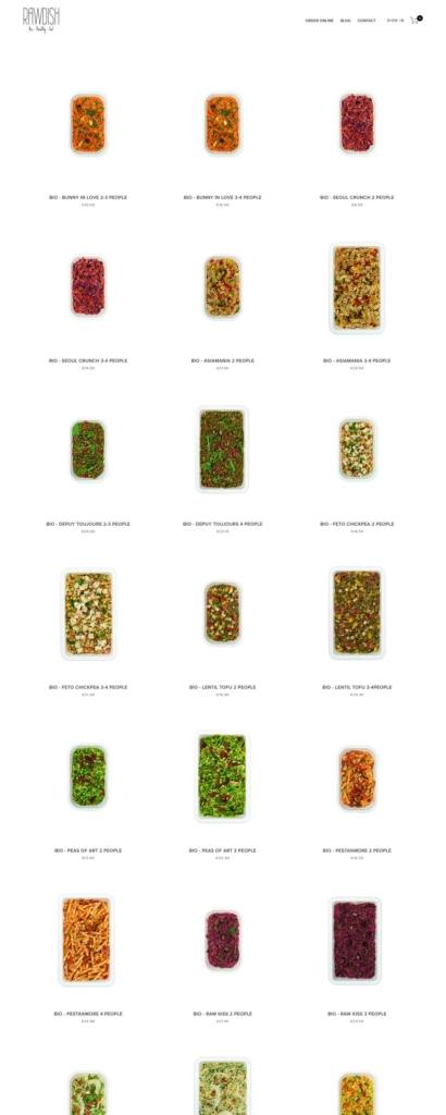
Ingredients in the listing, not behind a click. Product cards carry the full ingredient declaration in French with allergens in capitals, plus weight in grams and the price. The card is doing the work of a pack label.

Category filters above the grid. The Hot Meals page adds an All, Group Meals, Hot Meals, Power Treats and Salads filter row, while the top navigation splits the range into Family meals, Hot Meals, Cold-Pressed Juices, Salads, Desserts, Detox and Gift Cards.

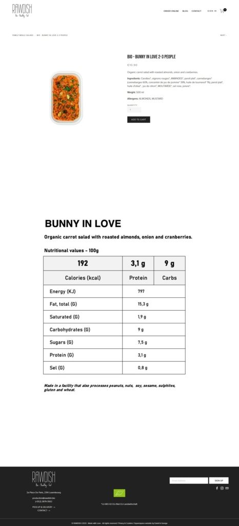
A short product page. The product view repeats title, price and the ingredient block, offers a quantity field and an Add To Cart button, and adds previous and next links to the neighbouring items in the same category.

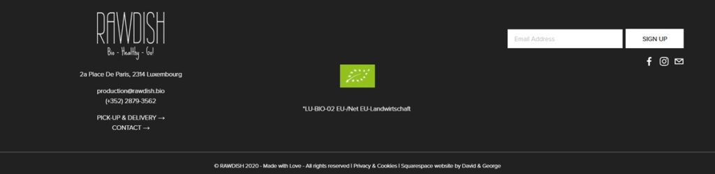
Collection and delivery treated as separate journeys. Order Online, Pick-Up & Delivery, Store Location and Our Stockists are distinct pages, and the footer lists the address, phone number and weekday hours of 9:30 to 17:00.

Brand Storytelling

The claim is the certification. Copy leads on 100% organic, the bio certification code and the French asterisk convention marking every organic ingredient, rather than on lifestyle language.

An environmental argument in plain terms. A homepage panel states that animal agriculture is one of the largest contributors to global greenhouse gas emissions and frames reduced meat and dairy consumption as the reader’s own lever.

Notable Features

Four benefit tiles. Energizing, Power, Convenient and Nutrient rich each carry a single explanatory line, placed between the sustainability text and the customer reviews.

Detox sold by duration. Boxes come in one, three and five day lengths, described as matched to previous experience rather than to a stated goal.

Third-party ordering promoted on the homepage. Wedely, Foozo and Wolt each get named placement, with a banner announcing the Wolt listing as new.

Rawdish Shop Category page example
Rawdish Product page example
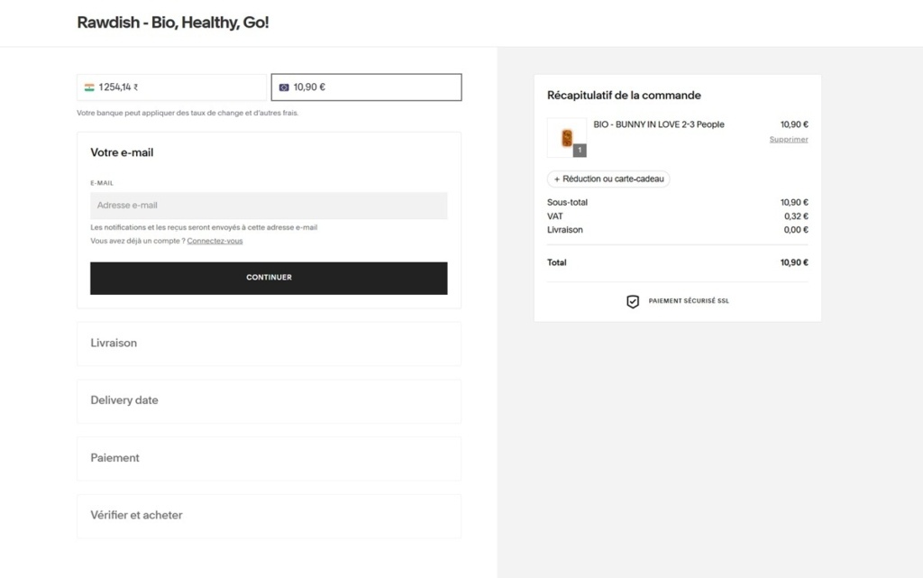
Rawdish Checkout page example
Rawdish footer example
Drifter Bags

Established in 1977, Drifter Sport and Travel Bags, Inc. began as a parachute rigging business. Our main customers, skydivers, demanded that their parachutes be made of the highest quality material available. Their lives depended on the quality of our products.

Hey Shop

In 2014, graphic design and illustration studio Hey launched an online shop. HeyShop is the place where we can share with the public our personal creations. Geometrical, colourful, typographical and bold designs and illustrations are brought to posters, tote bags, books and notebooks.

We are only a small studio so the posters will be made on demand (once payment is received) using digital printing and high quality paper.

OWL

OWL is a Berlin eyewear brand selling prescription glasses and sunglasses in a small, fixed range of frame shapes, each offered as both optical and sun lenses. The homepage states the mission directly: “We put our heart and soul into the intricate details of a new era of glasses.” The shop itself is a single long scrolling page rather than a conventional grid, built on a custom Ruby on Rails site rather than an off-the-shelf platform.

Website Design

A near-white, low-color interface. Backgrounds and dividers sit in a narrow band of light greys, with near-black used for text and a custom icon font called owl for interface symbols. Body copy runs in plain Arial rather than a licensed typeface, keeping attention on the product photography.

Video as the homepage centerpiece. The homepage holds a single centered logo mark, the claim “Nicely Crafted Glasses,” and a looping autoplay video, with no product grid or navigation clutter competing for attention.

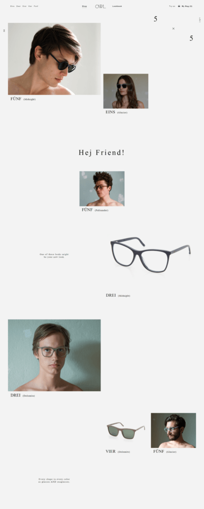
A scrolling shop instead of a grid. The shop page runs as one continuous scroll mixing product shots, color names and short lines of copy, rather than paginated categories.

Shopping Experience

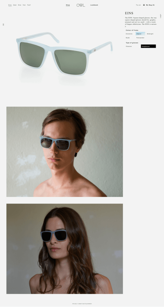
Five shapes, five colors. The range is named with German numbers, Eins, Zwei, Drei, Vier and a fifth style, each available in five colorways: Dolomite, Glacier, Midnight, Nude and Palisander, and each sold as either glasses or sunglasses.

One price, stated plainly. The site gives a frame-plus-prescription-lenses price of 150 Euro, qualified on the page itself as “most of the time,” rather than a per-style price list.

Try-on in person. A Try-on link in the header routes to a store finder, positioning in-person fitting as part of the buying path alongside the online shop.

Brand Storytelling

A founding question, answered. The About page opens with, “Why do we have a hallway full of shoes, but only one pair of glasses?” and walks through the reasoning that good glasses are expensive, good lenses more so, and cheap glasses look cheap, before introducing the brand as the answer.

Three named founders. The About page identifies David, Lars and Phil as three friends from Berlin and Hamburg, with a joking caption that one of them had to take the group photo.

A conversational, first-person voice throughout. Copy on the shop page reads like notes from the team: “Hej Friend!”, “Unisexy,” and progress comments such as “You’ve scrolled one fourth of the way. Nice.” appear between product shots rather than standard merchandising copy.

Notable Features

A phone number to a named founder. The site lists a direct mobile number for David rather than a general support line, alongside an email address for questions.

Coatings included as standard. The shop page states that all prescription lenses come with anti-scratch and anti-reflective coatings as part of the base price.

Shipping across Europe. The site notes shipping now reaches customers across Europe, framed on the page as a milestone rather than a routine policy line.

OWL Shop page example

OWL Product page example