Archives: Websites

eCommerce Websites

OWL

OWL is a Berlin eyewear brand selling prescription glasses and sunglasses in a small, fixed range of frame shapes, each offered as both optical and sun lenses. The homepage states the mission directly: “We put our heart and soul into the intricate details of a new era of glasses.” The shop itself is a single long scrolling page rather than a conventional grid, built on a custom Ruby on Rails site rather than an off-the-shelf platform.

Website Design

A near-white, low-color interface. Backgrounds and dividers sit in a narrow band of light greys, with near-black used for text and a custom icon font called owl for interface symbols. Body copy runs in plain Arial rather than a licensed typeface, keeping attention on the product photography.

Video as the homepage centerpiece. The homepage holds a single centered logo mark, the claim “Nicely Crafted Glasses,” and a looping autoplay video, with no product grid or navigation clutter competing for attention.

A scrolling shop instead of a grid. The shop page runs as one continuous scroll mixing product shots, color names and short lines of copy, rather than paginated categories.

Shopping Experience

Five shapes, five colors. The range is named with German numbers, Eins, Zwei, Drei, Vier and a fifth style, each available in five colorways: Dolomite, Glacier, Midnight, Nude and Palisander, and each sold as either glasses or sunglasses.

One price, stated plainly. The site gives a frame-plus-prescription-lenses price of 150 Euro, qualified on the page itself as “most of the time,” rather than a per-style price list.

Try-on in person. A Try-on link in the header routes to a store finder, positioning in-person fitting as part of the buying path alongside the online shop.

Brand Storytelling

A founding question, answered. The About page opens with, “Why do we have a hallway full of shoes, but only one pair of glasses?” and walks through the reasoning that good glasses are expensive, good lenses more so, and cheap glasses look cheap, before introducing the brand as the answer.

Three named founders. The About page identifies David, Lars and Phil as three friends from Berlin and Hamburg, with a joking caption that one of them had to take the group photo.

A conversational, first-person voice throughout. Copy on the shop page reads like notes from the team: “Hej Friend!”, “Unisexy,” and progress comments such as “You’ve scrolled one fourth of the way. Nice.” appear between product shots rather than standard merchandising copy.

Notable Features

A phone number to a named founder. The site lists a direct mobile number for David rather than a general support line, alongside an email address for questions.

Coatings included as standard. The shop page states that all prescription lenses come with anti-scratch and anti-reflective coatings as part of the base price.

Shipping across Europe. The site notes shipping now reaches customers across Europe, framed on the page as a milestone rather than a routine policy line.

OWL Shop page example
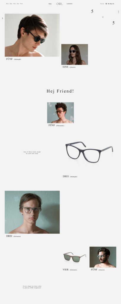
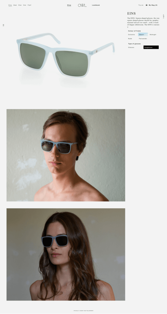
OWL Product page example
Aria

Aria is a London home and interiors retailer selling contemporary furniture, lighting, kitchenware, tableware and decorative accessories from brands including Flos, Ligne Roset, Fermob, Kartell, Fritz Hansen and Bolia. The business runs a showroom at Barnsbury Hall in Islington and pairs the online store with an interior styling appointment service. Built on Shopify.

Website Design

A serif wordmark over a plain sans. ARIA is set as a wide-tracked serif wordmark in the header, with Jost used as a display face for headings and Lato for body copy and navigation.

A monochrome ground with one red accent. The site runs light grey (#f5f5f5) and white backgrounds with black (#000000) text and UI, reserving red (#c40707) for Sale badges and reduced prices.

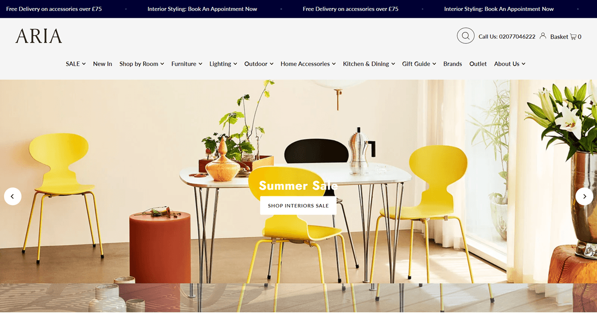
A ticking announcement bar. Free delivery and styling messages scroll across a bar above the header, alongside a Book An Appointment Now link for the interior design service.

Shopping Experience

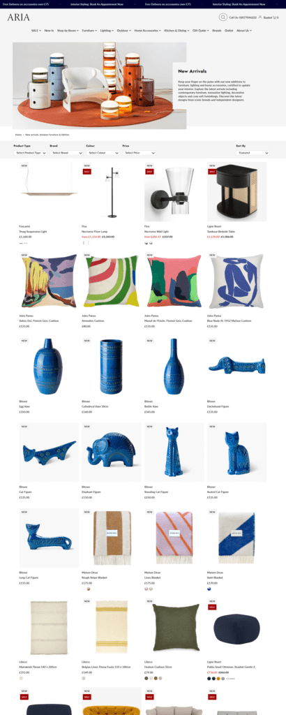
Four-way filtering on category pages. Product Type, Brand, Colour and Price dropdowns sit above the grid next to a Sort By control, with New and Sale tags in the corner of each product photo.

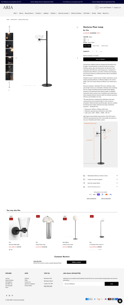
A thumbnail column and a dimensioned diagram. Product pages pair a scrollable strip of thumbnails with a large image, and lighting listings add an annotated line drawing giving exact measurements beneath the main photo.

Variant selection as swatches and dropdowns. The lamp example carries a colour swatch and a Style dropdown for different shade configurations, with a quantity stepper and delivery estimate above the Add to Basket button.

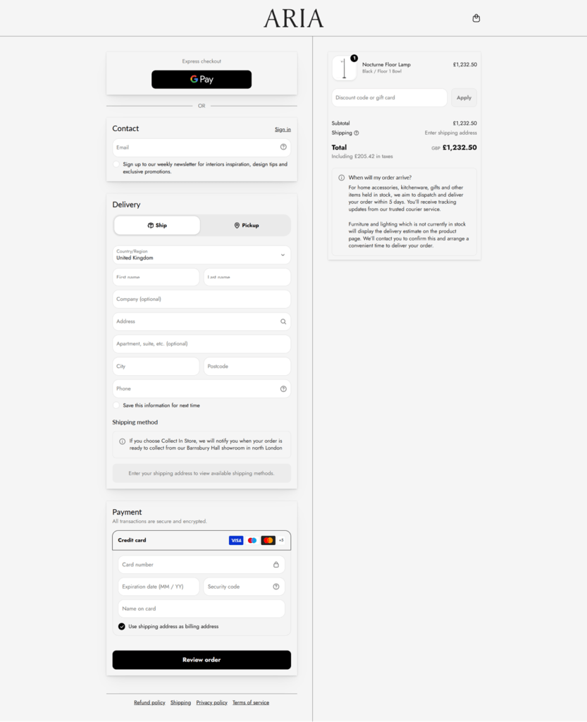
A ship-or-pickup checkout. Shoppers choose delivery or Collect In Store at the top of the Shopify checkout, with Google Pay as the only express option shown and a note that pickup is confirmed from the Barnsbury Hall showroom.

Brand Storytelling

Designer copy inside the product description. The Nocturne Floor Lamp listing carries an italicized paragraph crediting Flos and its designer, describing the piece’s materials and lighting behaviour rather than lifestyle copy.

Service icons in place of a brand story. Beneath the buy box, a row of icons promotes nationwide delivery, a team of experts to contact, the London showroom, and an interior planning service.

Notable Features

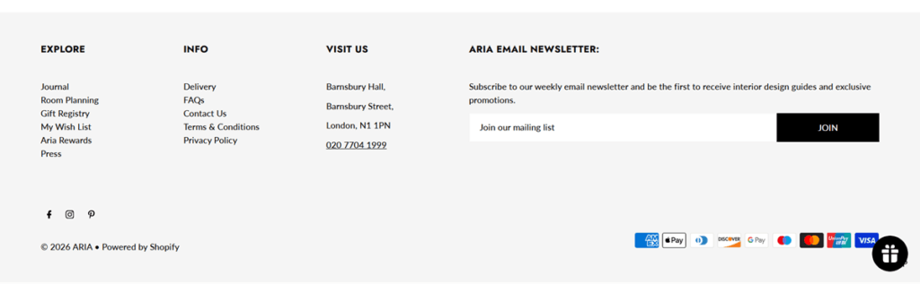
Aria Rewards and a gift registry. The footer lists Gift Registry, My Wish List and Aria Rewards as separate account links, next to a circular gift icon near the payment logos.

A prompt for the first review. Product pages with no reviews yet show a “Be the first to write a review, and gain Rewards Points” message instead of leaving the space blank.

Delivery timing spelled out at checkout. The order summary explains that in-stock items dispatch within days, while special-order furniture and lighting carry their own delivery estimate arranged directly with the customer.

Aria Shop Category page example

Aria Product page example

Aria Checkout page example

Aria Footer example

Simply Chocolate

Simply Chocolate is based in Copenhagen. Up here it’s too cold to grow cocoa beans. But it´s hot enough to have a love affair with great chocolate. Copenhagen is a very old city with a highly vibrating pulse and plenty of room to nurture a new kind of chocolate. Since we began in 2011, a lot of people have shared our desire. Not just for what we do, but apparently also for how we do it. We appreciate that.

Concrete Matter

Concrete Matter is an Amsterdam menswear and concept store trading from Gasthuismolensteeg 12 in the Nine Streets district, selling curated vintage alongside recent make labels including Pike Brothers, Cathcart London and Pendleton plus its own line. The catalogue runs to jackets, pants, knitwear, shirts, vests, coveralls, hats, gloves, books, eyewear and a Mantiques category of objects. The store sets its position as “premium quality goods and rare finds for the everyday man”. Built on Shopify, with this English storefront served from an eng subdomain.

Website Design

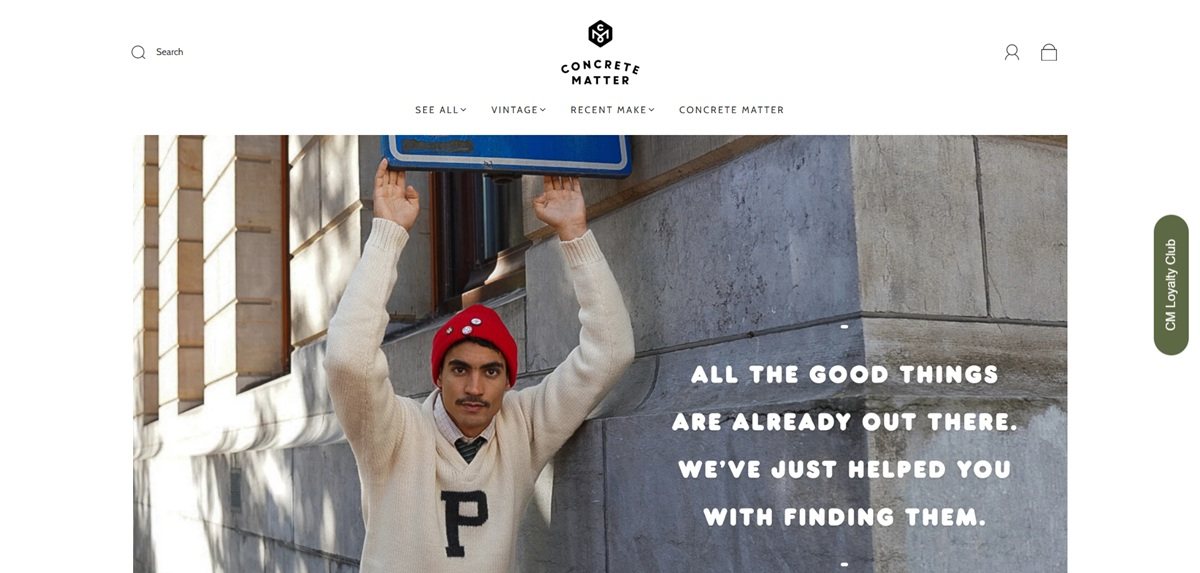
One typeface across the whole site. Cabin is set as the primary font, the header font and the button font, at weights 400 and 700. There is no display face and no serif.

A near neutral interface. Body text sits at #333333 on a white ground, with #f5f5f5, #ebebeb and #e0e0e0 for panels and links held at a low contrast grey #a9a9a9. The single accent is the button green #5a774c, which deepens to #68815c on hover.

Navigation splits new make from vintage. The mega menu runs three columns: Concrete Matter’s own categories, a Vintage column that breaks jackets down to Leather, Leisure, Military, Varsity and Work, and a Recent make column organised by brand.

The grid does the work. The homepage is almost entirely product: a What’s new in store grid, a Departments row of Hats, Varsity jackets, Gloves and Leather Jackets, then own-label goods, with a single Our story paragraph near the foot.

Shopping Experience

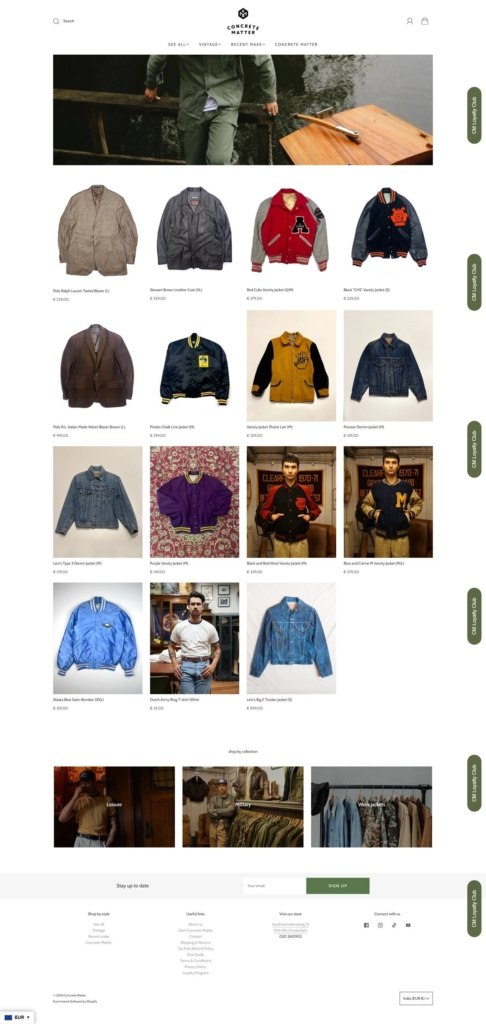
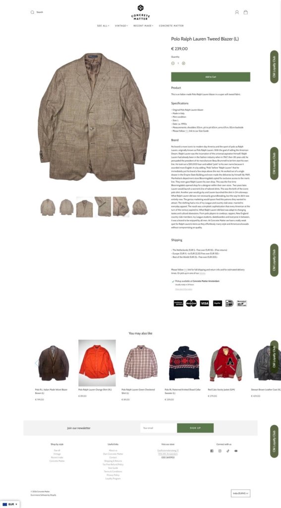
Sizes are printed in the product title. Because most stock is single-piece vintage, titles carry the size in brackets, as in “Polo Ralph Lauren Tweed Blazer (L)” or “Vintage Duck Camo Hunting Vest (S)”. Prices are shown in euros with a comma decimal.

Sold out is left on display. A large share of the new-in grid is marked Sold out rather than hidden, which reads as a record of what the buyers found as much as a shopping list.

Product pages are four accordions. Product, Specifications, Brand and Shipping. The Brand accordion carries a full history of the label rather than boilerplate, and Shipping states the tiers directly: 5 euros in the Netherlands free over 50, 11 to 22,50 in Europe free over 150, 25 for the rest of the world free over 200.

Brand Storytelling

The About page is a timeline of addresses. It runs from a 2012 idea and a Haarlemmerdijk pop-up through the 2013 store, the 2016 move into the Nine Streets, the 2017 closure of the first shop and a pandemic-era opening in Haarlem.

Vintage is framed as a position, not a category. The closing section calls the demand for curated vintage “a counter movement to the wasteful practices of fast fashion and over consumerism”.

Notable Features

A View in your space AR viewer. Product pages offer an augmented reality preview, unusual for single-piece vintage stock.

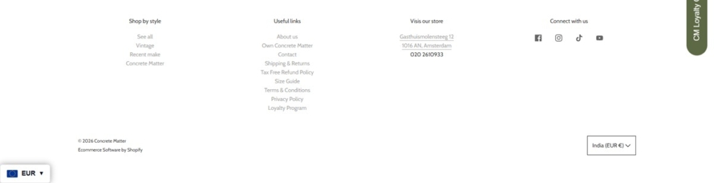
Tax free refund policy and a loyalty programme. Both get their own footer pages, aimed at the store’s walk-in tourist trade as much as online buyers.

A country switcher without currency switching. Every destination in the list is priced in euros, so international shoppers see one currency throughout.