Partners Sam Hecht and Kim Colin formed London design office Industrial Facility to explore the junction between industrial design and the world around us.
Retail Facility


eCommerce Websites
Partners Sam Hecht and Kim Colin formed London design office Industrial Facility to explore the junction between industrial design and the world around us.
The Line is a modern and personal approach to retail. Guided by a distinctive point of view that prizes craftsmanship, versatility, and ease, we bring together carefully chosen products from established and emerging designers.
Our goal is to carefully design and produce a collection of clothing inspired by the local surf scene, the sealife and the fishermen neighborhood of La Barceloneta.
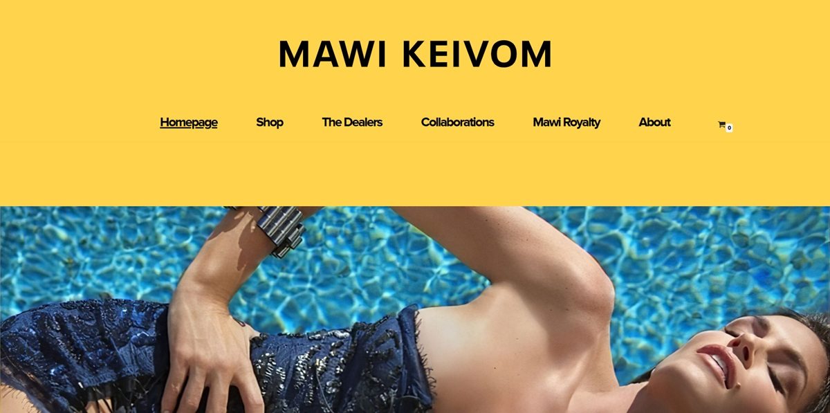
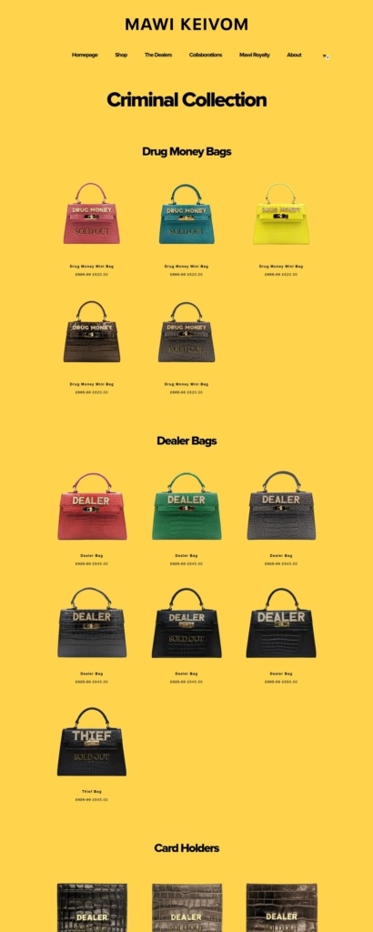
MAWI is the London accessories label of designer Mawi Keivom, trading under a MAWI KEIVOM wordmark and built now around one line, the Criminal Collection: croc embossed Italian leather top handle bags and card holders whose hardware reads DRUG MONEY, DEALER and THIEF. The brand made its name on statement jewellery and on collaborations with Disney Couture, Swarovski and Hugo Boss, and the store now narrows that history to eighteen listings. It runs on WordPress and WooCommerce.
One colour does all the work. Every page sits on a flat saturated yellow, edge to edge, with black type and a black footer. There is no secondary ground, no card background and no rules, so cut out products are the only imagery.
Proxima Nova, bold and semibold. Type is limited to two weights. The wordmark runs in wide tracked capitals at the top of every page, section titles sit centred beneath it, and product names are set small in letter spaced caps.
Centred and symmetrical. The layout is one centred column: wordmark, horizontal nav, section heading, then a three across grid. The basket icon is the only element pushed to a corner.
Eighteen products in three groups. The collection page lists Drug Money Bags, Dealer Bags and Card Holders on one scroll. Drug Money Mini Bags show £885.00 struck through at £620.00, Dealer and Thief Bags £925.00 at £645.00, and every card holder £175.00.
Sold out is left on display. Eleven of the eighteen listings carry a SOLD OUT overlay printed across the photograph, including all six card holders, and they keep their place in the grid.
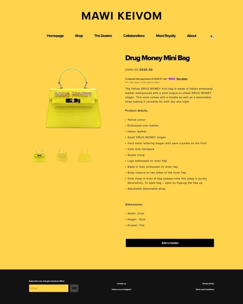
Specification led product pages. The bag sits left with three thumbnails beneath it and the detail right: strikethrough price, a Klarna line offering three interest free payments of £206.67, a short paragraph, then eleven Product details bullets, Dimensions in centimetres and a black Add to basket button.
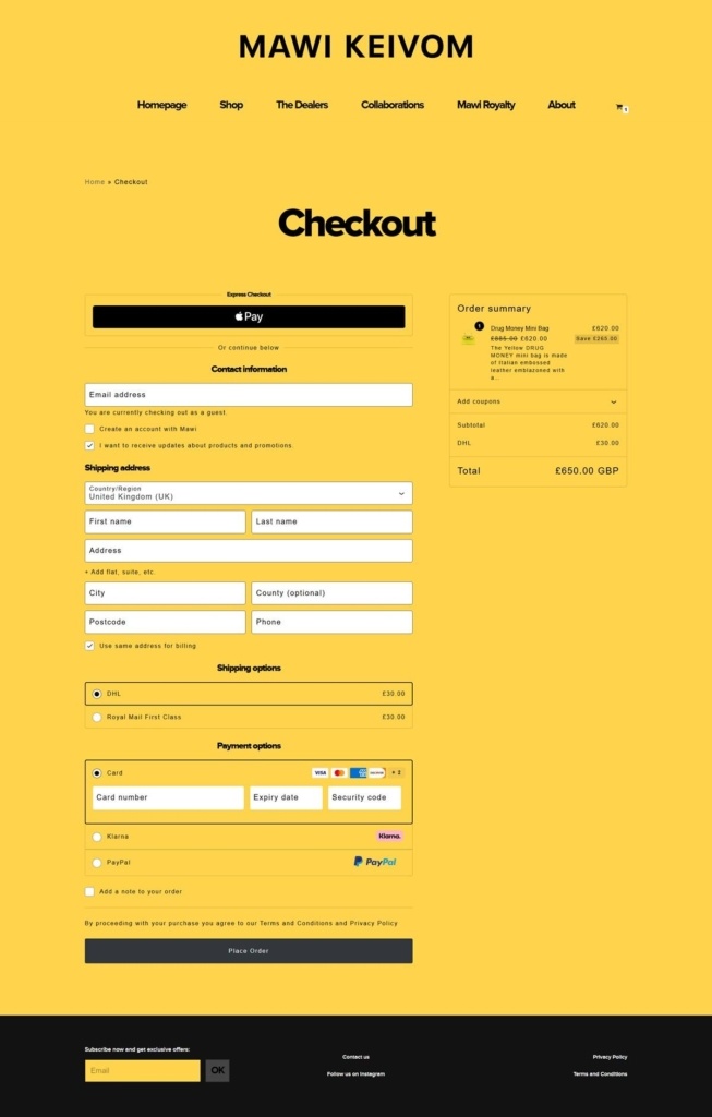
A complete checkout on one page. An Apple Pay button opens above an “Or continue below” divider, then contact, shipping address, shipping options and payment run in sequence. Guest checkout is the default, shipping is DHL or Royal Mail First Class at £30.00 either way, and payment is card, Klarna or PayPal.
Contraband as a running joke. The naming is one sustained gag: a Criminal Collection of Dealer, Drug Money and Thief bags, a section called The Dealers, and Instagram captions in the same register.
Three sections of receipts. Mawi Royalty lists more than forty names who have worn the brand, from Madonna and Rihanna to Deepika Padukone, Editorials lists placements in titles including Vogue Italia and Harper’s Bazaar, and Collaborations gives each partnership a paragraph of prose. The first two are image grids rather than case studies.
An archive drop held back. Homepage and Shop both carry a Mawi Archives panel reading “The new Archive Drop is coming soon…”, with no date behind it.
Instagram closes the homepage. A grid of Instagram posts sits below the collection panels, captioned in the same voice as the product names, above a footer that repeats “Subscribe now and get exclusive offers:” on every page.
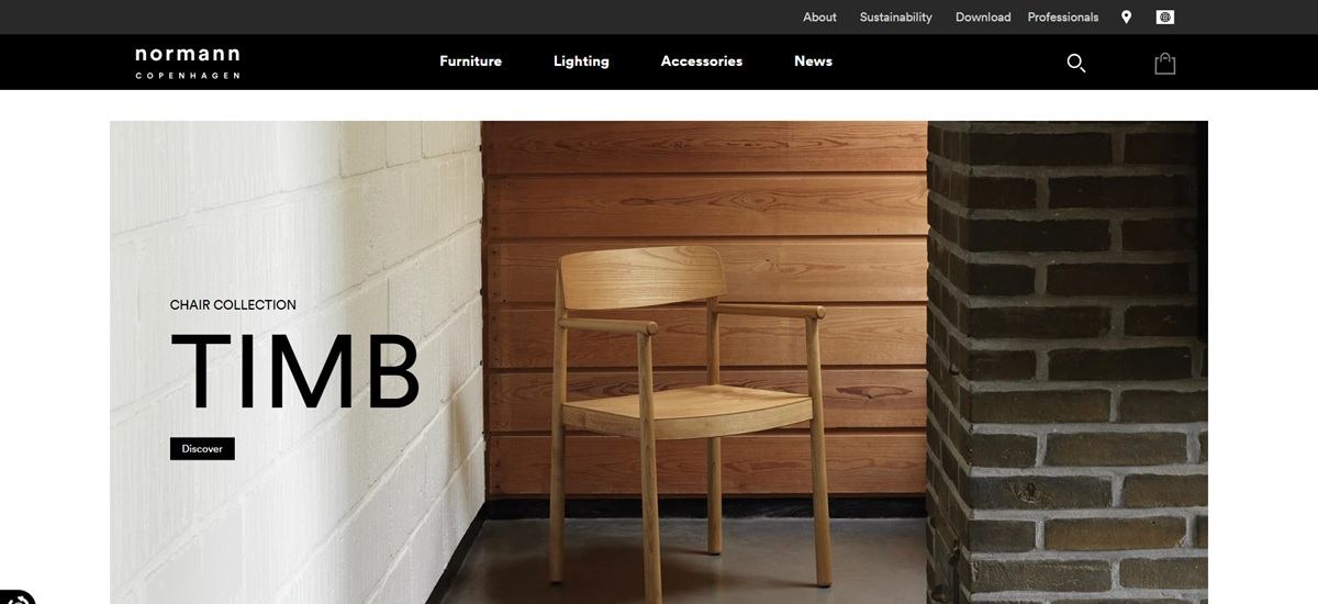
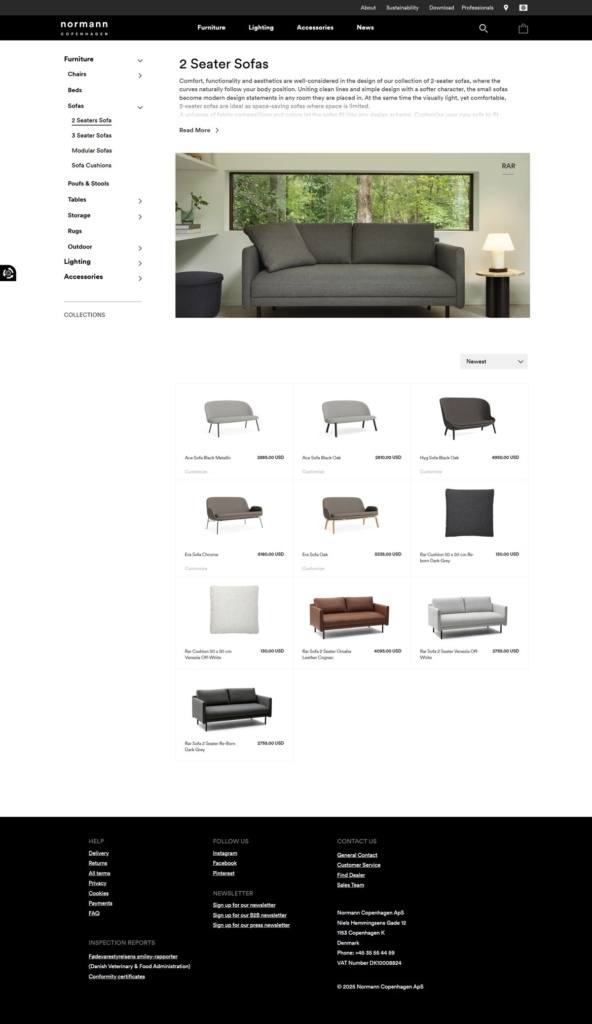
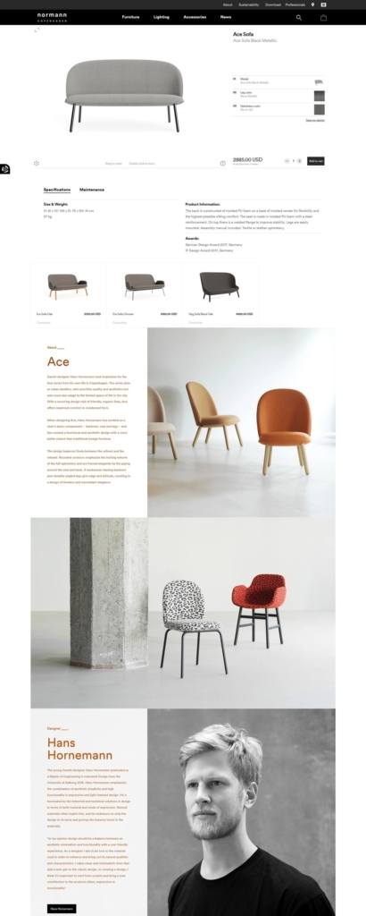
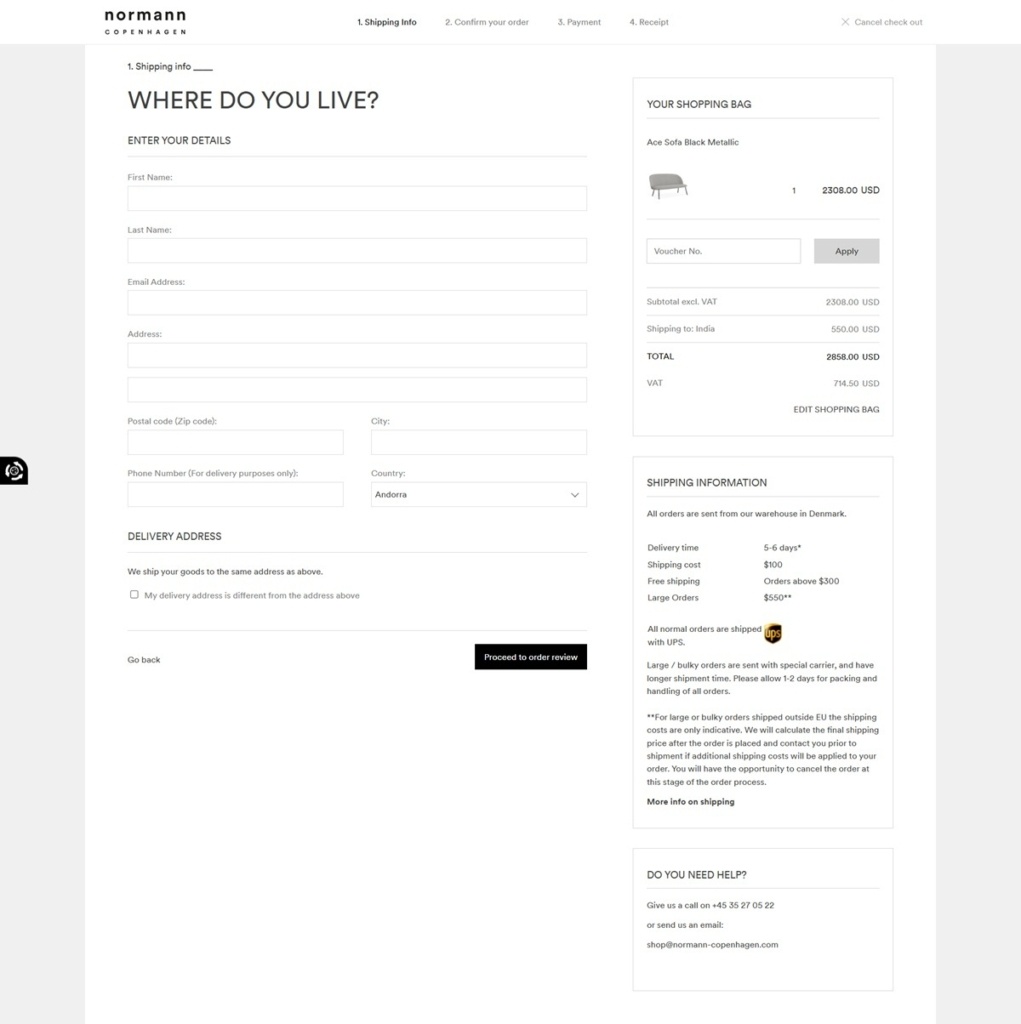
Normann Copenhagen is a Danish design company with the mission to create original and innovative products in a simple and contemporary design that withstands the test of time. Or in other words, to challenge conventional thinking and make the ordinary extraordinary through great design.

Designed by Steven Alan in New York, our prescription eyeglasses and sunglasses are thoughtfully crafted each season to blend contemparory and emerging trends for an urban audience.
Luxe layers designed in NYC.
D&AD is a London based charity serving the commercial creative industries, and its site is the shopfront for what it sells: replica D&AD Pencils, printed Annuals, award certificates, masterclass places and event tickets. Buyers are agencies, studios and students rather than general retail. The mission is stated plainly on the homepage: “We celebrate, stimulate and enable excellence in commercial creativity”. The front end is custom built and served through CloudFront over a headless Shopify storefront.
Yellow against charcoal. The palette sits in a small token set: one brand yellow at rgb(255 199 0), charcoal at rgb(22 22 22) with a lighter rgb(42 42 42), and quiet grounds in sand rgb(240 238 233) and light lilac rgb(235 232 245). Yellow is kept for type and pill buttons on the dark panels.
One typeface, two weights. Everything is set in Universal, a self hosted webfont loaded as four files: regular and medium, each with an italic. No serif and no separate display cut, so hierarchy runs on size, weight and case alone.
Editorial grid, awards imagery. Pages stack full width strips of winning work, portrait led features and course cards. Photography does the decorating, and flat colour blocks separate one strip from the next.
Three shop sections, one basket. The shop splits into Pencils, D&AD Annuals and Certificates, with Masterclasses and Event tickets listed beside them in the footer. A persistent Basket sits in the header next to Sign in.
Currency switching in the header. GBP, EUR and USD are offered side by side, though course pricing can override it: the masterclass “AI for Creativity: Amplify your creative practice” is listed at £295 with the note “(GBP only)”.
Buying a Pencil means finding it first. The Pencils page is not a product grid. It offers a Find your Pencils search by title, credits or keyword against the awards archive, an Add credits path for a missing credit, and a block asking “Need help buying your pencil?”.
Terms before the sale. The same page asks buyers to allow four to six weeks from receipt of payment for dispatch, and notes that delivery times vary by destination.
The Pencil is the whole system. Awards, shop and archive share one object. The family runs Black, Yellow, Graphite and Wood Pencil, and those names recur across the awards pages, the shop and the annual.
Proof by archive. Work carries the D&AD Awards archive and the New Blood Awards archive, so a visitor can move from a winning entry to the Pencil or Annual that records it.
Digital goods beside physical. Certificates sells a D&AD Awards digital certificate and an accreditation letter from the same shop as printed Annuals spanning 2011 to 2019.
Dated course inventory. Masterclass cards carry a next date, a format of In-person, Online or On-demand, a price and the named course leaders, so the listing reads as a schedule rather than a catalogue.
Accounts that hold more than orders. Sign in, Create an account and Bookmarks sit together in the footer, so an account saves work from the archive as well as purchases.
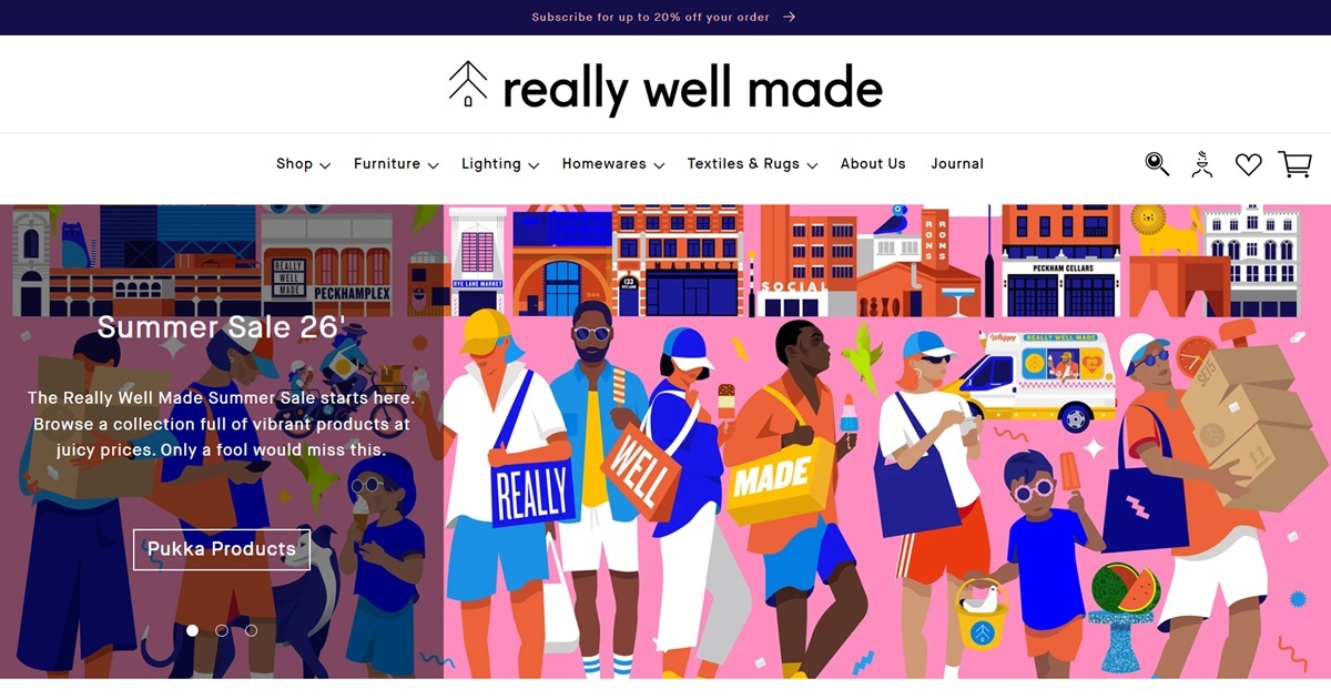
Really Well Made is a London furniture and homewares retailer trading from a showroom in Peckham and a Shopify storefront, selling design-led sofas, beds, lighting, textiles and kitchenware from brands including HAY, Muuto, String Furniture and Ferm Living. The site describes itself as "an independent London retailer of modern furniture and homewares," and it pairs its curated brand catalogue with in-house showroom stock, made-to-order pieces and next-day delivery on items already in the Peckham warehouse.
Indigo frames a white canvas. A deep indigo (#140e4b) runs the top announcement bar and full footer, bracketing an otherwise white and pale-grey body. The effect keeps every product photograph, mostly warm oak, walnut and boucle upholstery on plain grounds, as the only source of colour on the page.
One sans-serif, two weights. Both headings and body copy run in MaisonNeue, with headings set lighter and slightly condensed against a heavier body weight, so the two never fully separate the way a serif-and-sans pairing would.
A terracotta accent for hover states. A warm rust tone (#b96c40) shows up on interactive elements against the mostly monochrome palette, giving buttons and links a single warm signal on an otherwise cool, neutral page.
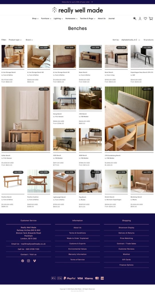
Multiple ways into the same catalogue. The main navigation lets shoppers browse by product type (Furniture, Lighting, Homewares), by brand or designer, or by room (Bathroom, Bedroom, Kitchen, Living, Workspace), with further curated views for Bargain Corner, Latest Additions and Ready to Ship.
Black discount badges on every card. Grid listings carry a black "Save 20%" tag with the original and reduced price both shown, so markdown depth is visible before a shopper opens the product.
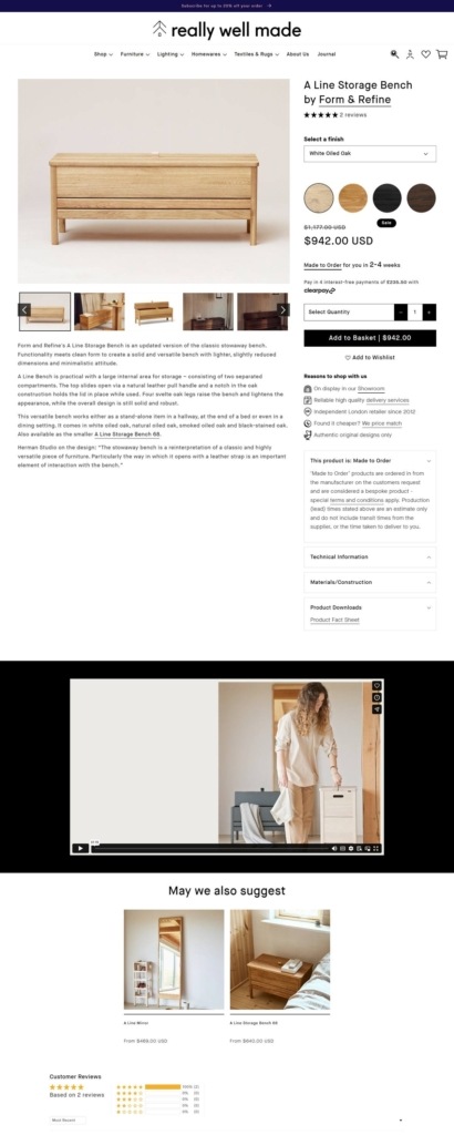
A detailed product page. Individual pages show a colour or finish selector, an interest-free instalment option through Clearpay, and a stacked list of reasons to buy from the retailer, on display in the showroom, reliable delivery, independent since 2012, alongside accordions for technical information and materials.
Reasons to shop with us, stated plainly. Rather than a narrative brand story, the site lists concrete claims next to the buy box: physical showroom access, "we price match," and an independent retailer history going back over a decade.
Made to order as a selling point. Certain pieces are flagged as made to order with a stated lead time, turning a potential wait into a piece of information rather than a hidden delay.
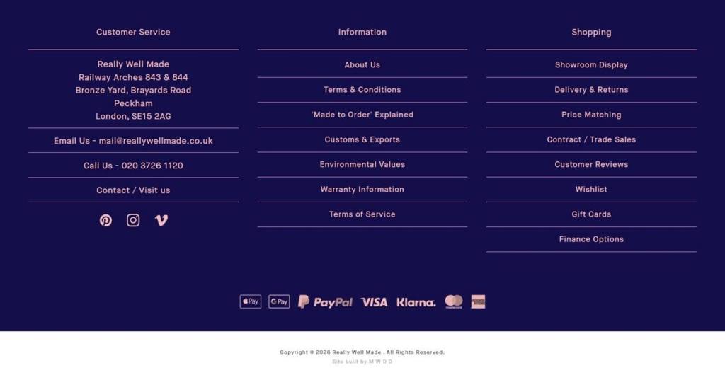
A dedicated showroom collection online. A "Showroom Display" section lets shoppers browse items physically available to view or collect in Peckham, connecting the digital catalogue back to the bricks-and-mortar store.
Trade and contract sales as a separate track. A "Contract / Trade Sales" link in the footer signals a business channel alongside the consumer storefront, aimed at designers and commercial buyers rather than home shoppers.
Reviews built into navigation. "Customer Reviews" appears as its own footer link rather than a widget buried on product pages, treating feedback as a destination in its own right.
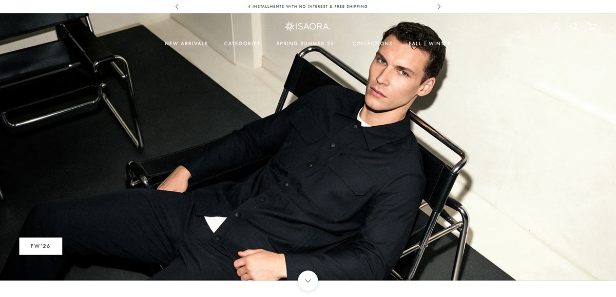
Isaora is a men’s technical apparel label selling performance outerwear, tailored jackets, training pieces and everyday shirting built from engineered fabrics. The catalogue is organised by garment type across outerwear, pants, tops and shorts, with seasonal drops running alongside three standing collections: Performance Outerwear, Techno Tailoring and Training. The footer states the positioning directly: the brand is “for the modern urban individual who refuses to choose between style and performance”. Built on Shopify.
One typeface, one weight. Jost is set as both the heading and the body family at a single regular weight, so hierarchy comes from size, tracking and case rather than from contrast between two faces.
A monochrome frame. Text sits near black on white with borders in a light grey, and the only saturated colour on a page comes from the garments themselves.
Upper case as structure. Navigation labels, product titles and colour names are all set in capitals, which keeps long option lists visually even and gives the grid a uniform rhythm.
Colour runs on the card. Every tile carries a Choose options control plus the full colour list spelled out by name. The Ultra Mercerized Tee shows ten, from Coronet Blue to Lichen Green, so a shopper sizes up the range before opening anything.
A fine-grained category tree. Outerwear alone splits into nine named jacket types, including down vest, insulated jacket, parka, waterproof lightweight jacket, shirt jacket and rain and wind jacket. Pants and tops break down the same way.
Sold out stays in the grid. Out of stock styles such as the Airy Chino and Ether Chino remain on the homepage carousel with a Sold out label rather than being hidden.
Construction-led product pages. SKU, colour, sizes S to XXL, a quantity stepper and Add to cart sit above a bulleted build list covering laser-cut underarm perforations, bonded sleeve and hem finishes, double-knit construction and a wrinkle-resistant structure, then fabric composition and care.
Fabrics are named as assets. A footer column is given over to Fabrics and Technologies, listing Seersucker Fabric, Sensitive Fabric, EX-443 Fabric, Bonded Technology and Laser Technology, each carrying a registered mark.
A stated design method. A homepage band headed Style Evolution runs the line “clean lines, strong stance, freedom of movement” and explains that designs inspired by classic lines have been reinterpreted with modern sports silhouettes.
Journal entries argue the wardrobe. Blog posts on the homepage frame the seasonal collection around travel and packing rather than around trend, describing a lighter, multi-purpose wardrobe.
Shop the Look. Several homepage sections pair two or three garments as one outfit, each with its own Choose options control, so a look can be bought piece by piece without leaving the module.
Regional currency. Prices resolve to the visitor’s region, appearing in pounds on one pass and euros on another, with the same checkout wallets offered throughout.
Payment and welcome offers in the announcement bar. A rotating strip carries a 15 percent first order code and four interest-free installments with free shipping.


We’re tired of the things we own falling apart around us and we bet you are too. We believe in smarter, simpler products made from the best materials possible, in using time-honored techniques to make products that last and in responsible sourcing and a transparent process. That’s what makes our products Well Made.
Artisan marshmallows in unexpected flavours. Handcrafted from fluff to cut.


