By Jibin Kumar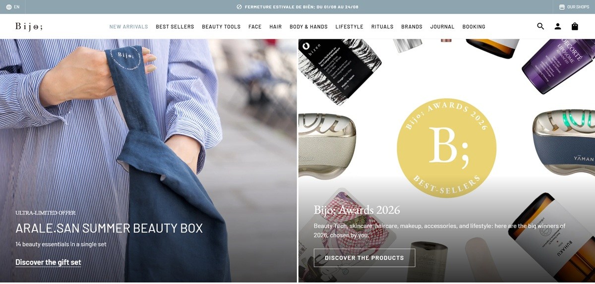
Bijo; is a Paris based retailer of Japanese beauty products and treatments, selling skincare, haircare, body care and beauty technology devices alongside in-store facials, acupressure sessions and workshops. The catalogue spans multiple Japanese brands including YA-MAN, COREFIT, DECORTE and BIORE, with tools priced from EUR230 to EUR560 and skincare from EUR13 to EUR54. Built on Shopify.
Website Design
A sage and near-black palette. Text and headings run in a near-black #303030, set against white and pale grey #f1f1f1 grounds. Buttons and borders pick up a muted sage-blue, #88a5af, that recurs on category tiles and calls to action rather than a bright accent.
Serif headings over sans body. Body copy and lower-level headings are set in Barlow, a grotesque sans, while the top heading level switches to Cormorant, a high-contrast serif, and second-level headings use EB Garamond. The pairing separates editorial-style intros from the denser product grid.
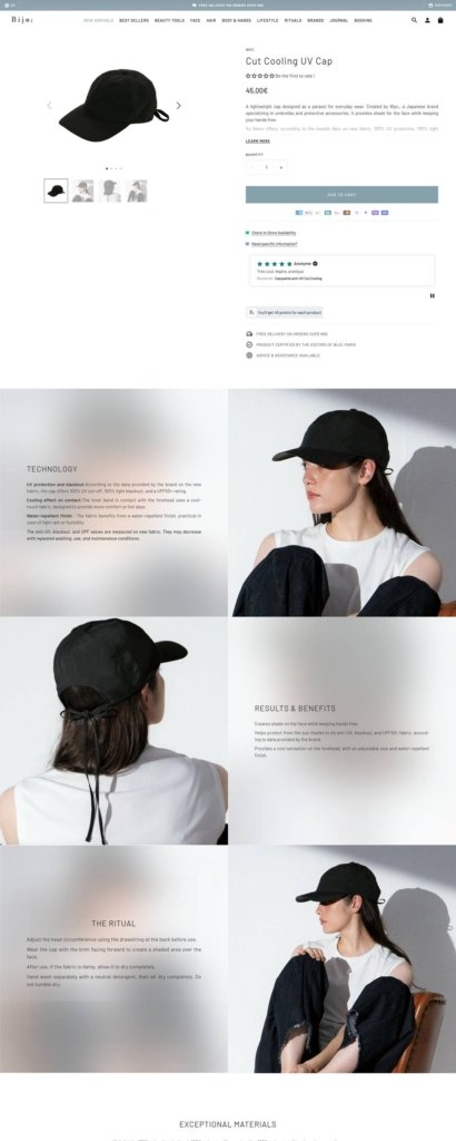
Product photography mixed with lifestyle shots. Tool and skincare listings are shot on plain grounds, while workshop and treatment pages use portrait photography of stylists and clients, reflecting the split between retail and in-person services.
Shopping Experience
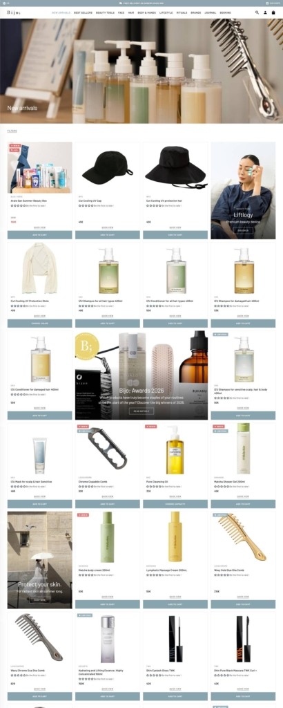
A broad, multi-format catalogue. Products range from skincare and haircare to beauty devices such as the Face-Pointer II and HORiZONE, plus lifestyle items like matcha and incense. Bookable services, including facials, scalp treatments and acupressure, and workshops sit alongside physical goods in the same navigation.
Financing at checkout. Higher-priced tools, several in the EUR230 to EUR560 range, are paired with ALMA instalment payment over three to four instalments, a detail suited to the beauty-tech price point.
A free shipping threshold. Standard delivery is free above EUR80, with accessories and smaller items priced from EUR15.
Brand Storytelling
Positioned as an immersion into Japanese beauty. The brand states it offers “an immersion into the heart of Japanese beauty,” built around consistency and prevention rather than one-off treatments.
Print and education extend the retail offer. A published book, “Ma revolution beaute du visage,” co-written with Ena Narumi, and a “My Beauty Tool questionnaire” position the store as an educator on Japanese beauty ritual, not only a seller of imported goods.
Multiple physical shops linked from the same site. The site references several Bijo shops in addition to the online store, so the Shopify catalogue functions as a shared backend for both in-person retail and online orders rather than a purely digital operation.
Notable Features
Seasonal in-store events. A “SUPER JAPAN” popup ran from August 29 to October 18, tying the online catalogue to a temporary physical presence in Paris.
Gift cards and studio bookings share the cart. Both e-gift cards and paid treatment bookings, such as a master beauty tool workshop, checkout through the same Shopify cart as physical products, rather than a separate booking system.
Named brands used as a trust signal. Rather than a single house line, the catalogue is organised around named Japanese brands such as YA-MAN, COREFIT, RUHAKU and DECORTE, letting the store position itself as a curated importer of established labels rather than a manufacturer of its own.
Bijo; Shop Category page example
Bijo; Product page example
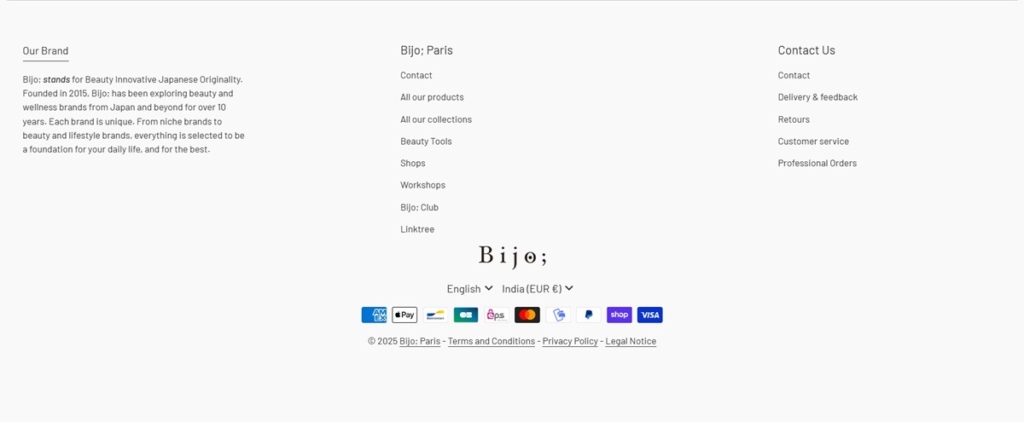
Bijo; footer example